Comments (14)
 junedchhipa
commented on May 1, 2024
2
junedchhipa
commented on May 1, 2024
2
@RicardoMoraisPOR Do you want to explode a single slice at a time?
You can use toggleDataPointSelection method of ApexCharts.
If you want to do it on the initial load, it can be done this way
chart: {
  type: 'pie',
  events: {
    animationEnd: function(ctx) {
      ctx.toggleDataPointSelection(2)
    }
  }
}
from apexcharts.js.
junedchhipa
commented on May 1, 2024
1
I think that the expansion should be based on values, not hardcoded.
So, a Polar Area Chart is best suited. I will add it to the roadmap.
from apexcharts.js.
junedchhipa
commented on May 1, 2024
1
Almost done with the Polar Area Charts

A minor version 3.18.0 will be released soon with these.
from apexcharts.js.
junedchhipa
commented on May 1, 2024
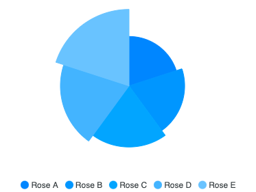
If I'm not wrong, are you proposing something like this?
This is from echarts, and they give an option called roseType: radius which changes the radius of each pie depending on the value. Bigger the value, the bigger the radius. The smallest value becomes the 1st pie and the largest value becomes the last pie.
I just played with random values appended to each pie of the slice and got something like this

which is not far from what I see on echarts demo page.
In future, an option can be given in options.plotoptions.pie.roseType - which user can set to enable this.
from apexcharts.js.
 andjules
commented on May 1, 2024
andjules
commented on May 1, 2024
Actually, what I really want is the ability to do this:
However, your demo above is great.
I actually don't like the eCharts rose style (where radius is also based on slice value; I think it exaggerates data differences), but I like that by appending data in apexcharts, you could emphasize different slices (not dependent on their pie values).
from apexcharts.js.
junedchhipa
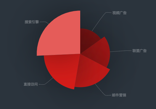
commented on May 1, 2024
Ok, got your point.
So, I tried to provide a custom radius size to a particular slice, and it resulted in this

As you can see, it exaggerated the data in the last slice. The best solution is to just move the slice outwards (that is, what you call explode) - not expanding the radius.
I will see what I can do to move the slice oytwards / explode, sounds like a good idea, and many charts already implement it.
from apexcharts.js.
andjules
commented on May 1, 2024
Thanks! It would be great if we had an option to move the slice (offset) from center.
In the meantime, how can I recreate the what you did above, with series-5? What option would I use?
Thanks again
from apexcharts.js.
junedchhipa
commented on May 1, 2024
This is the branch which contains the custom-radius code
https://github.com/apexcharts/apexcharts.js/tree/pie-slices__custom-radius DELETED
I have not merged it into master as I think, I need to find a better solution for exploding.
Thanks :)
from apexcharts.js.
andjules
commented on May 1, 2024
Awesome, Thanks!
…On Sat, Aug 4, 2018 at 1:50 PM, Juned Chhipa ***@***.***> wrote:
This is the branch which contains the custom-radius code
https://github.com/apexcharts/apexcharts.js/tree/pie-slices__custom-radius
In the samples, you will find example - /samples/pie/pie-with-custom-
slice-size.html
I have not merged it into master as I think, I need to find a better
solution for exploding.
Thanks :)
—
You are receiving this because you authored the thread.
Reply to this email directly, view it on GitHub
<#16 (comment)>,
or mute the thread
<https://github.com/notifications/unsubscribe-auth/AAirF9tp0DTL-QkUSHu5vFeuoqZ5cV2Uks5uNd7UgaJpZM4Vu_LN>
.
from apexcharts.js.
 RicardoMoraisPOR
commented on May 1, 2024
RicardoMoraisPOR
commented on May 1, 2024
Hello, first of all, ApexCharts is an amazing chart lib with great documentation. Amazing Job.
I would like to know the situation for this Featured, it seems it wasn't implemented and this request was made a long time ago, I was looking for something like what you had manage to achieve here: #16 (comment) , I noticed that there was a branch with the implementation but it was deleted.
If this featured is not going to be implemented in a near future, how can I achieve that behavior? it seems that I only need to change the Radius of an individual Slice, but I can't find any doc related on how to access each series options nor create an individual option for a specific one.
I would like to have some guidance, I didn't create a new issue since this one exists, I would gladly transcribe this into an Issue format if that's the case.
from apexcharts.js.
RicardoMoraisPOR
commented on May 1, 2024
@junedchhipa Not quite, quoting:
The best solution is to just move the slice outwards (that is, what you call explode) - not expanding the radius.
What I actually want is the Radius expansion in a pie/donut chart, that's why I said I would gladly transcribe this into an Issue format since what I was looking for is not quite what this issue refers to.
And yes, the toggleDataPointSelection works as expected for the explode functionality, what are my options for the expansion one?
from apexcharts.js.
RicardoMoraisPOR
commented on May 1, 2024
A minor version 3.18.0 will be released soon with these.
Yes! that's exactly what I was looking for! thank you for your time and work!
from apexcharts.js.
 sandeshsapkota
commented on May 1, 2024
sandeshsapkota
commented on May 1, 2024
Ok, got your point.
So, I tried to provide a custom radius size to a particular slice, and it resulted in this
As you can see, it exaggerated the data in the last slice. The best solution is to just move the slice outwards (that is, what you call explode) - not expanding the radius.
I will see what I can do to move the slice oytwards / explode, sounds like a good idea, and many charts already implement it.
@junedchhipa Hi ! thank you for a great library. I am trying to achieve the same like this but could not achieve.
here is the code that I have tried.
 events: {
                       animationEnd: function(ctx) {
                            ctx.toggleDataPointSelection(2)
                        },
              }
if I pass the value of parameter greater then 4 there would be a error . here is the screenshot .

from apexcharts.js.
 allindeveloper
commented on May 1, 2024
allindeveloper
commented on May 1, 2024
@RicardoMoraisPOR Do you want to explode a single slice at a time?
You can usetoggleDataPointSelectionmethod of ApexCharts.If you want to do it on the initial load, it can be done this way
chart: {
  type: 'pie',
  events: {
    animationEnd: function(ctx) {
      ctx.toggleDataPointSelection(2)
    }
  }
}
Please any ideas on how i can the expansion bigger
from apexcharts.js.
Related Issues (20)
- chart line doesn't match with value when use logarithmic in yaxis option HOT 1
- XAxis text cannot be displayed for e.g.: "InvalidFile", "InvalidFileName", "Invalid", "InvalidMessageLength", ...
- Stack bar miss align text HOT 1
- XAxis Annotations multiline misalignment
- Graphs not loading correctly on mobile
- X-axis labels are prematurely trimmed when rotate is enabled for horizontal bar charts
- X-axis labels don't auto-rotate after crossing a threshold in horizontal bar charts
- axes overlapping issue since 3.46.0 update HOT 2
- Export to CSV with unformatted values
- Grouped Stacked Bars for Timeline (Range Bar) Chart
- A mess of style
- Show datalabel on barcharts even if label is wider than the bar
- Problem with overlapping labels on YAxis with LineChart HOT 1
- Horizontal range bar sparkline charts have extra padding since v3.40.0
- timeline chart - panning causes zoom level change HOT 4
- In bar charts, the alwaysDrawDataLabel option is always true.
- Version 3.46.0 causes Area Chart Gradient to "Glitch" when Hiding / Showing Data Series HOT 2
- Sync timeline and line chart
- Graphs bugging out in Apex charts HOT 1
- Treemap chart is not showing data properly in Angular. HOT 1
Recommend Projects
-
 React
React
A declarative, efficient, and flexible JavaScript library for building user interfaces.
-
Vue.js
🖖 Vue.js is a progressive, incrementally-adoptable JavaScript framework for building UI on the web.
-
 Typescript
TypeScript is a superset of JavaScript that compiles to clean JavaScript output.
-
TensorFlow
An Open Source Machine Learning Framework for Everyone
-
Django
The Web framework for perfectionists with deadlines.
-
 Laravel
A PHP framework for web artisans
-
D3
Bring data to life with SVG, Canvas and HTML. 📊📈🎉
-
Recommend Topics
-
javascript
JavaScript (JS) is a lightweight interpreted programming language with first-class functions.
-
web
Some thing interesting about web. New door for the world.
-
server
A server is a program made to process requests and deliver data to clients.
-
Machine learning
Machine learning is a way of modeling and interpreting data that allows a piece of software to respond intelligently.
-
Visualization
Some thing interesting about visualization, use data art
-
Game
Some thing interesting about game, make everyone happy.
Recommend Org
-
Facebook
We are working to build community through open source technology. NB: members must have two-factor auth.
-
Microsoft
Open source projects and samples from Microsoft.
-
Google
Google ❤️ Open Source for everyone.
-
Alibaba
Alibaba Open Source for everyone
-
D3
Data-Driven Documents codes.
-
Tencent
China tencent open source team.
from apexcharts.js.