Comments (10)
 nimbupani
commented on May 5, 2024
nimbupani
commented on May 5, 2024
maximum-scale is to prevent zooming in or zooming out when the mode is altered from portrait to landscape.
"Mobile browsers handle orientation changes slightly differently. For example, Mobile Safari often just zooms the page when changing from portrait to landscape, instead of laying out the page as it would if originally loaded in landscape. If web developers want their scale settings to remain consistent when switching orientations on the iPhone, they must add a maximum-scale value to prevent this zooming, which has the sometimes-unwanted side effect of preventing users from zooming in:
<meta name="viewport" content="initial-scale=1, maximum-scale=1">"
from http://hacks.mozilla.org/2010/05/upcoming-changes-to-the-viewport-meta-tag-for-firefox-mobile/
from html5-boilerplate.
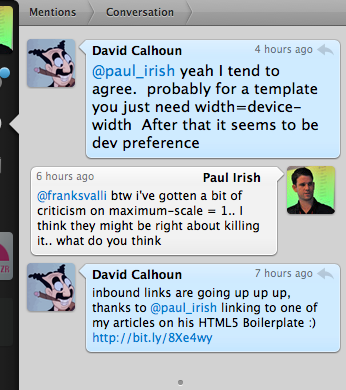
 paulirish
commented on May 5, 2024
paulirish
commented on May 5, 2024
from the man who recommended it.. http://paulirish.com/i/e020.png
maximum scale looks on its way out.
initial-scale, then.. retain?
from html5-boilerplate.
nimbupani
commented on May 5, 2024
This is what Safari doc says about initial-scale:
"The initial scale of the viewport as a multiplier. The default is calculated to fit the webpage in the visible area. The range is determined by the minimum-scale and maximum-scale properties.
You can set only the initial scale of the viewport—the scale of the viewport the first time the webpage is displayed. Thereafter, the user can zoom in and out unless you set user-scalable to no. Zooming by the user is also limited by the minimum-scale and maximum-scale properties."
from html5-boilerplate.
paulirish
commented on May 5, 2024
new comment:
Just finished my first site using the Boilerplate, and it was causing horizontal scroll bars on the iPad. Discovered the culprit was line 23 in index.html:
meta name="viewport" content="width=device-width; initial-scale=1.0; maximum-scale=1.0;"
Commenting it out fixed it. I like how the iPad zooms to fit the page width automatically. So what is the point of forcing it to 1:1 scale?
from html5-boilerplate.
paulirish
commented on May 5, 2024
I've discussed things with Matt Henry (@greenideas.. mobile expert) and Divya..
here's the plan:
<meta name="viewport" content="width=device-width; initial-scale=1.0">
and
/* Uncomment if you don't want iOS and WinMobile to mobile-optimize the text for you
j.mp/textsizeadjust
html { -webkit-text-size-adjust:none; -ms-text-size-adjust:none; } */
from html5-boilerplate.
paulirish
commented on May 5, 2024
fixed in 7a33f72
from html5-boilerplate.
 sporkd
commented on May 5, 2024
sporkd
commented on May 5, 2024
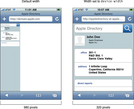
I couldn't figure out why one of my sites using html5boilerplate was only 320px wide on the iPhone and was zoomed way in like this pic (on the right): http://developer.apple.com/library/safari/documentation/appleapplications/reference/safariwebcontent/Art/toosmall.jpg
Also, background images were cut off outside the 320px wide window.
I finally figured out that by changing initial-scale to auto, it fixed everything and zoomed out to show the whole 980px wide site. I also tried setting width to 980, but the combination of width=device-width and initial-scale=auto seemed to work best (i.e. similar to when the viewport tag is not included at all... the defaults)
Mind you, I don't yet have a mobile version of my site, nor does it dynamically scale in width, however, I think the current default will be confusing to many people with 980px wide sites that can't be un-floated. I still think there's value to having the tag there, but I don't know if zooming in to 320px by default is what people will want. Or at least a comment with a link to the viewport docs might help: http://developer.apple.com/safari/library/documentation/appleapplications/reference/safariwebcontent/UsingtheViewport/UsingtheViewport.html#//apple_ref/doc/uid/TP40006509-SW28
Peter
from html5-boilerplate.
nimbupani
commented on May 5, 2024
Peter, the viewport comment links to this issue, where your links (and issues) are visible. I think that is ample?
Also, my view is when a site is zoomed out, a user would anyway click to zoom in, as at that view, the links and text are way too small to see.
Do re-open if you think this is not satisfactory.
from html5-boilerplate.
 yellow1912
commented on May 5, 2024
yellow1912
commented on May 5, 2024
initial-scale=1 I have an issue on iphone: for the divs that I have the width set at 100% the background color only gets spanned exactly the width of the device (while the whole website itself is displayed much larger than the device's width)
using "auto" fixes it
from html5-boilerplate.
 Kusadam
commented on May 5, 2024
Kusadam
commented on May 5, 2024
I tried all but nothing http:/kusadam.com
from html5-boilerplate.
Related Issues (20)
- bug: `src\img\.gitignore` should be `src\img\.gitkeep` ? HOT 2
- Expand Theme Color meta tag docs (extend.md) HOT 1
- update twitter card docs HOT 4
- HTML REPOSITRY
- Document color-scheme meta attribute HOT 5
- Normalize.css still referenced in index.html HOT 2
- [feat] : Enhance Accessibility Documentation for Inclusive Web Development
- Projet 1
- My First Code Start With Html ( Markup language )
- Bankai
- ELISANDER
- Html
- H
- Texte HOT 2
- Documentation HOT 1
- White
- Add a File/Folder structure HOT 2
- Form HOT 1
- Update to Gulp v5
- Release 9.0.1
Recommend Projects
-
 React
React
A declarative, efficient, and flexible JavaScript library for building user interfaces.
-
Vue.js
🖖 Vue.js is a progressive, incrementally-adoptable JavaScript framework for building UI on the web.
-
 Typescript
TypeScript is a superset of JavaScript that compiles to clean JavaScript output.
-
TensorFlow
An Open Source Machine Learning Framework for Everyone
-
Django
The Web framework for perfectionists with deadlines.
-
 Laravel
A PHP framework for web artisans
-
D3
Bring data to life with SVG, Canvas and HTML. 📊📈🎉
-
Recommend Topics
-
javascript
JavaScript (JS) is a lightweight interpreted programming language with first-class functions.
-
web
Some thing interesting about web. New door for the world.
-
server
A server is a program made to process requests and deliver data to clients.
-
Machine learning
Machine learning is a way of modeling and interpreting data that allows a piece of software to respond intelligently.
-
Visualization
Some thing interesting about visualization, use data art
-
Game
Some thing interesting about game, make everyone happy.
Recommend Org
-
Facebook
We are working to build community through open source technology. NB: members must have two-factor auth.
-
Microsoft
Open source projects and samples from Microsoft.
-
Google
Google ❤️ Open Source for everyone.
-
Alibaba
Alibaba Open Source for everyone
-
D3
Data-Driven Documents codes.
-
Tencent
China tencent open source team.
from html5-boilerplate.