Comments (4)
 jacob-long
commented on June 12, 2024
jacob-long
commented on June 12, 2024
It should be doing what you want it to, so something must be going wrong. Here's an example of the intended output:
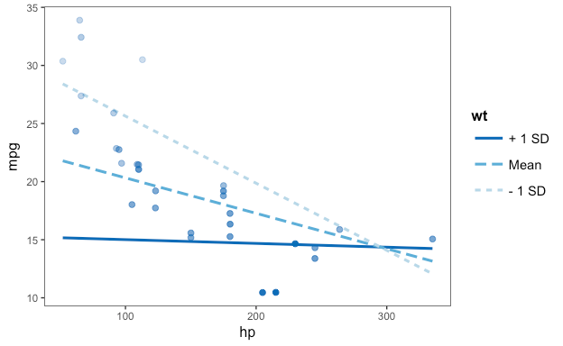
I'll give a note on how the coloring of plotted points for continuous moderators works. Since ggplot2 won't let me color the lines with three different colors (a discrete scale) plus points with a continuous scale, I use a little trick. I take the darkest of the moderator colors and then scale the points' alpha, making them more transparent when the moderator is low.
With that in mind, one possibility other than a true bug that could make all the points appear to be the same color is if moderator is highly skewed.
from interactions.
 J0PR
commented on June 12, 2024
J0PR
commented on June 12, 2024
I noticed this when changing the color to something other than "blues"; with that scale things look OK. This happens because the color of the points was set by taking the color of the "+ 1 SD" and then changing the alpha values, which is close to what that colorscale does. Here's how it looks with another colorscale:

As you can see, the points are just purple, with a varying degree of alpha values.
I edited the "else if" on line 429 to:
    else if (!is.factor(d[, modx])) {
      d$sd_split[d[[modx]] > mean(d[[modx]]) + sd(d[[modx]])] <- colors[1]
      d$sd_split[d[[modx]] < mean(d[[modx]]) + sd(d[[modx]])] <- colors[2]
      d$sd_split[d[[modx]] < mean(d[[modx]]) - sd(d[[modx]])] <- colors[3]
      p <- p + geom_point(data = d, aes_string(x = pred,
        y = resp, size = "the_weights"), colour = d$sd_split,
        inherit.aes = FALSE, show.legend = FALSE)
    }
This solved the problem for my particular plot (also interaction with 2 scale variables).
from interactions.
jacob-long
commented on June 12, 2024
That's a really interesting solution to this issue. As you noticed, the "trick" I use with continuous moderators is to use the alpha aesthetic. The predicted values of the moderator are discrete and the current version of ggplot2 won't allow me to mix discrete and continuous color scales (there is some discussion of allowing that in the future: tidyverse/ggplot2#2570).
Of course, my trick only works if one of the continuous color scales is used (e.g., "Blues", "Reds", "Greys") and looks odd like you found if something like "PuRd" is used. I'll give some thought to how cleanly I can detect the use of the other color scales and how they look with this scheme.
from interactions.
 MikeBurkePhD
commented on June 12, 2024
MikeBurkePhD
commented on June 12, 2024
I noticed this when changing the color to something other than "blues"; with that scale things look OK. This happens because the color of the points was set by taking the color of the "+ 1 SD" and then changing the alpha values, which is close to what that colorscale does. Here's how it looks with another colorscale:
As you can see, the points are just purple, with a varying degree of alpha values.I edited the "else if" on line 429 to:
    else if (!is.factor(d[, modx])) {
      d$sd_split[d[[modx]] > mean(d[[modx]]) + sd(d[[modx]])] <- colors[1]
      d$sd_split[d[[modx]] < mean(d[[modx]]) + sd(d[[modx]])] <- colors[2]
      d$sd_split[d[[modx]] < mean(d[[modx]]) - sd(d[[modx]])] <- colors[3]
      p <- p + geom_point(data = d, aes_string(x = pred,
        y = resp, size = "the_weights"), colour = d$sd_split,
        inherit.aes = FALSE, show.legend = FALSE)
    }
This solved the problem for my particular plot (also interaction with 2 scale variables).
I am having this same exact issue. @J0PR where exactly did you edit the code? I am hoping your solution works for me too.
from interactions.
Related Issues (20)
- cannot change axis labels in sim_slopes HOT 2
- Create confidence interval around johnson-neyman point HOT 1
- mod2.labels issue HOT 1
- Interaction lines on top of data points
- Change Facet Labels in Mod2 HOT 1
- interact_plot with 3-way interaction error: contrasts can be applied only to factors with 2 or more levels HOT 1
- ymin and ymax are of different distance from the mean in cat_plot when used with glm.nb
- sim_slopes error HOT 1
- guidance on extensions
- Cat_plot converts numeric predictor variable to categorical without warning
- Corrigendum HOT 1
- Difference between "significant' and "not significant" is not itself statistically significant HOT 2
- point.shape not working in interact_plot()
- Change Legend Text
- Changing the x.label in Johnson Neyman plot using sim_slopes
- rlang strangeness with sim_slopes HOT 3
- latent interaction
- Change Confidence Interval in interact_plot HOT 1
- Issue with inclusion of "weights" HOT 5
- Ability to edit labels and grid for 3-way interaction jnplot
Recommend Projects
-
 React
React
A declarative, efficient, and flexible JavaScript library for building user interfaces.
-
Vue.js
🖖 Vue.js is a progressive, incrementally-adoptable JavaScript framework for building UI on the web.
-
 Typescript
TypeScript is a superset of JavaScript that compiles to clean JavaScript output.
-
TensorFlow
An Open Source Machine Learning Framework for Everyone
-
Django
The Web framework for perfectionists with deadlines.
-
 Laravel
A PHP framework for web artisans
-
D3
Bring data to life with SVG, Canvas and HTML. 📊📈🎉
-
Recommend Topics
-
javascript
JavaScript (JS) is a lightweight interpreted programming language with first-class functions.
-
web
Some thing interesting about web. New door for the world.
-
server
A server is a program made to process requests and deliver data to clients.
-
Machine learning
Machine learning is a way of modeling and interpreting data that allows a piece of software to respond intelligently.
-
Visualization
Some thing interesting about visualization, use data art
-
Game
Some thing interesting about game, make everyone happy.
Recommend Org
-
Facebook
We are working to build community through open source technology. NB: members must have two-factor auth.
-
Microsoft
Open source projects and samples from Microsoft.
-
Google
Google ❤️ Open Source for everyone.
-
Alibaba
Alibaba Open Source for everyone
-
D3
Data-Driven Documents codes.
-
Tencent
China tencent open source team.
from interactions.