Comments (14)
 sterre
commented on June 8, 2024
sterre
commented on June 8, 2024
A couple of observations:
I notice that p-cuts on this file looks better, but draws outside its cut rectangle. I see a similar out-of-range draw with p-cuts in alaska.prm, btw.
If I call overlay_array on a SigPlot with plotType=raster, layerType='2D', the x key displays X location instead of an x cut.
from sigplot.
sterre
commented on June 8, 2024
This is an example of the out-of-range drawing I mentioned. SigPlot size is 400px high, 600px wide. Look at the peak in the X cut. I think the right side of the Y cut is also from scanning over the peak previously.
Browser is Chrome 67.0.3396.99 (Official Build) (64-bit) on Linux.
from sigplot.
 maihde
commented on June 8, 2024
maihde
commented on June 8, 2024
Thanks for the detailed feedback on this issue!
The jsFiddle pulls sigplot from https://cdn.jsdelivr.net/npm/sigplot/dist/sigplot-debug.js which pulls the latest from NPM; but that package hasn't been updated recently. I'll get that updated.
I've also modified our build script to include the Git hash in the distributed files so there is no longer any ambiguity about what commit produced the files.
I'm able to reproduce the x-cut issue and will fix that and inform you when I have a new version for you to test.
from sigplot.
maihde
commented on June 8, 2024
@sterre I'm going to open separate issues for the two other behaviors you observed.
from sigplot.
maihde
commented on June 8, 2024
@jcsammy I just pushed a fix to master that should resolve this issue.
from sigplot.
maihde
commented on June 8, 2024
@sterre I cannot reproduce the 'x' button shows 'x' value instead of 'x-cut' on Raster. Here is the code that I'm using:
    plot.overlay_array(data, {
        subsize: 1000
    }, {
        layerType: "2D"
    });
I'm not sure what you mean by setting plotType="raster" because that isn't a setting supported by SigPlot.
Can you provide the overlay_array(...) call in it's entirety so I can attempt to reproduce the issue?
from sigplot.
sterre
commented on June 8, 2024
I think the x-button problem may be a non-problem. The plotType argument is actually in a library that uses SigPlot (Webler)--it just sets some values like grid to a different default. My overlay_array call didn't have a subsize argument. Nothing was visible (with an array of length 9), and x had the behavior I described. Adding subsize changed the behavior to an actual x cut.
Note that if the subsize equals the data length (one frame), the raster is still blank. (I expected a single row.)
Here's the call to reproduce that blankness:
var layer_options = {
  name: "Sample Data"
};

var raster_options = {
  autohide_panbars: true,
};

var data_header = {
  xunits: "Time",
  xstart: 100, // the start of the x-axis
  xdelta: 50, // the x-axis step between each data point
  yunits: "Power",
  subsize: 9,
};
var data = [1, 2, 3, 4, 5, 4, 3, 2, 1]; // the series of y-values


var raster = new sigplot.Plot(document.getElementById('raster'), raster_options);

raster.overlay_array(data, data_header, {layerType: '2D'});
Comment out subsize to see what I was misdiagnosing. JCS had mentioned a similar problem early in his investigation, so I jumped to conclusions.
from sigplot.
maihde
commented on June 8, 2024
@sterre gotcha, this is as I suspected. If you set layerType to '2D' but don't set a subsize then things get a bit-wonky because you have a type 1000 (i.e. 1D) file that is being rendered in a 2D format without a frame size.
I'm going to change it such that if you pass a header without a subsize to Layer2D, then the subsize is assumed to be the size of the file (i.e. your raster will have one line across the top).
I'm also going to add a framesize argument to the layer options so you can do something like this:
raster.overlay_array(data, type_1000_header, {layerType: '2D', framesize: 3});
from sigplot.
 jcsammy
commented on June 8, 2024
jcsammy
commented on June 8, 2024
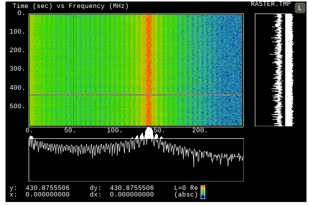
@maihde, testing on 2.0.0-rc2-9816ecd, x-cut works when the raster is at the default zoom level, but if you zoom in on the raster prior to hitting 'x' then the scale in X_CUT mode is not chosen appropriately and you cannot see the plot.
Steps to reproduce:
- load attached raster.tmp
- zoom in on raster from 100MHz to 150MHz and from 200 s to 300s
- press 'x'
=> switches to x-cut mode, but plot is not visible - zoom out full
=> x-cut is visible
from sigplot.
maihde
commented on June 8, 2024
@jcsammy I'm able to reproduce this so I'll will get it fixed.
I was looking at the inability to do a jsFiddle x-cut as well; this seems to be similar to the keypress handling issue in Jupyter notebooks. The interaction between jsFiddle and SigPlot is causing keypresses to be missed unless you ensure the plot area has received focus (by mouse-clicking on the plot or the white area next to the plot).
In other words jsFiddle steals the focus, so hovering the mouse over the plot isn't sufficient for SigPlot to get focus. You can give it a try here:
https://jsfiddle.net/62h3yqzk/
from sigplot.
jcsammy
commented on June 8, 2024
@maihde testing this issue on version {{{2.0.0-rc6-ad99ae5}}}
i don't think that x-cut is cutting the appropriate data if you are zoomed into the raster.
i have a file that has a signal for about 2/3 of the raster, then no signal for the final 1/3 of the raster. if i zoom in such that part of the view has signal and part doesn't, and then x-cut where there should be no signal, i still see signal in my x-cut. i believe it is taking the location of the mouse within the zoomed view, and then x-cutting the unzoomed data at that location (which does contain signal), then displaying that data zoomed in frequency.
put another way, if my raster was one column wide and each row was populated with the row number from 0-99. then i zoom in from 10-20 rows and x-cut the middle, i believe i would see an x-cut value of 50 as opposed to 15. this is just my hunch based on what i'm seeing, i haven't tried this particular test.
from sigplot.
maihde
commented on June 8, 2024
Thanks, I won’t have time to take a look at this until next weekend. There
are a few unit tests that I added for x-cut and y-cut...are you able to
copy and modify one of those to demonstrate the behavior you are seeing?
Michael
…On Fri, Oct 5, 2018 at 11:45 AM jcsammy ***@***.***> wrote:
@maihde <https://github.com/maihde> testing this issue on version
{{{2.0.0-rc6-ad99ae5}}}
i don't think that x-cut is cutting the appropriate data if you are zoomed
into the raster.
i have a file that has a signal for about 2/3 of the raster, then no
signal for the final 1/3 of the raster. if i zoom in such that part of the
view has signal and part doesn't, and then x-cut where there should be no
signal, i still see signal in my x-cut. i believe it is taking the location
of the mouse within the zoomed view, and then x-cutting the unzoomed data
at that location (which does contain signal), then displaying that data
zoomed in frequency.
put another way, if my raster was one column wide and each row was
populated with the row number from 0-99. then i zoom in from 10-20 rows and
x-cut the middle, i believe i would see an x-cut value of 50 as opposed to
15. this is just my hunch based on what i'm seeing, i haven't tried this
particular test.
—
You are receiving this because you were mentioned.
Reply to this email directly, view it on GitHub
<#24 (comment)>,
or mute the thread
<https://github.com/notifications/unsubscribe-auth/AAOCItoGmn6OuZvT3DHLVm2FyV_M51k6ks5uh5rTgaJpZM4Vjpld>
.
from sigplot.
jcsammy
commented on June 8, 2024
@maihde I tried using jsfddle to create an example that you can add to your unit tests https://jsfiddle.net/xykbvp3q/5/.
The interactive plot.xCut/yCut functions don't seem to be working for me, but this at least shows the problem.
Ideally both plots would show a line at 15, when you do their corresponding x/yCut at abscissa 15, but instead they show a plot at 50 because 15 is the middle of the zoom.
from sigplot.
maihde
commented on June 8, 2024
@jcsammy Thanks for the jsFiddle!
Within the jsFiddle environment plot keyboard presses will only take effect
if you first mouse-click on the plot. This is because the logic in SigPlot
for determining if the mouse if over the plot when the keypress is made is
interrupted in the jsFiddle environment. A similar behaviour happens
within Jupyter notebooks. I haven't found a good solution yet to working
around this.
As for the x-cut and y-cut issue you demonstrated, I've found the issue and
have a preliminary fix in place. I should have a fix published this
weekend for you to try out.
…On Mon, Oct 8, 2018 at 9:39 AM jcsammy ***@***.***> wrote:
@maihde <https://github.com/maihde> I tried using jsfddle to create an
example that you can add to your unit tests
https://jsfiddle.net/xykbvp3q/5/.
The interactive plot.xCut/yCut functions don't seem to be working for me,
but this at least shows the problem.
Ideally both plots would show a line at 15, when you do their
corresponding x/yCut at abscissa 15, but instead they show a plot at 50
because 15 is the middle of the zoom.
—
You are receiving this because you were mentioned.
Reply to this email directly, view it on GitHub
<#24 (comment)>,
or mute the thread
<https://github.com/notifications/unsubscribe-auth/AAOCIhZ5RHeeB5V7FEU3d0BZqQ2b05Frks5ui1WngaJpZM4Vjpld>
.
from sigplot.
Related Issues (20)
- When in L1 or L2 mode, allow ymin and ymax to be specified in log scale. HOT 1
- How do I set the z axis min and max using the options that are passed into sigplot HOT 1
- X cut doesn't match what's on screen HOT 4
- How can I put text next to an accordion vertical line? HOT 2
- Different Z-axis range handled in Y-axis than X-axis for raster plot HOT 2
- Display currently "selected" intensity value with raster plots HOT 6
- Plotting array layer of data with varied xdelta values HOT 14
- How to alter the axis labels (tick mark labels) to be full value rather than decimal version HOT 4
- Falling raster while zoomed in falls off the screen HOT 1
- unable to plot FFT HOT 9
- Plotting SP needs to be optimized. HOT 2
- Investigate implementing RDP
- m.initialize has a bug setting the subsize if the array input is array of data views HOT 2
- Exception when using downscale max and setting xdelta/start separately HOT 4
- Surface Plots HOT 2
- Plotting more than 32768 points HOT 1
- can we make the accordion vertical bars thicker? HOT 3
- how to plot only one element of a type 2000 HOT 2
- Accordion onmouseup change events guaranteed to not fire HOT 4
- Convert Layer1D to Layer2D and back HOT 4
Recommend Projects
-
 React
React
A declarative, efficient, and flexible JavaScript library for building user interfaces.
-
Vue.js
🖖 Vue.js is a progressive, incrementally-adoptable JavaScript framework for building UI on the web.
-
 Typescript
TypeScript is a superset of JavaScript that compiles to clean JavaScript output.
-
TensorFlow
An Open Source Machine Learning Framework for Everyone
-
Django
The Web framework for perfectionists with deadlines.
-
 Laravel
A PHP framework for web artisans
-
D3
Bring data to life with SVG, Canvas and HTML. 📊📈🎉
-
Recommend Topics
-
javascript
JavaScript (JS) is a lightweight interpreted programming language with first-class functions.
-
web
Some thing interesting about web. New door for the world.
-
server
A server is a program made to process requests and deliver data to clients.
-
Machine learning
Machine learning is a way of modeling and interpreting data that allows a piece of software to respond intelligently.
-
Visualization
Some thing interesting about visualization, use data art
-
Game
Some thing interesting about game, make everyone happy.
Recommend Org
-
Facebook
We are working to build community through open source technology. NB: members must have two-factor auth.
-
Microsoft
Open source projects and samples from Microsoft.
-
Google
Google ❤️ Open Source for everyone.
-
Alibaba
Alibaba Open Source for everyone
-
D3
Data-Driven Documents codes.
-
Tencent
China tencent open source team.
from sigplot.