Giter Site home page Giter Site logo

pedrobern / react-native-collapsible-tab-view Goto Github PK

View Code? Open in Web Editor NEW
771.0 10.0 155.0 82.87 MB

A cross-platform Collapsible Tab View component for React Native

License: MIT License

JavaScript 1.28% TypeScript 91.58% Ruby 2.05% Objective-C 0.21% Objective-C++ 1.72% Swift 0.07% Kotlin 2.93% C 0.06% Shell 0.10%
react-native react expo tabs tabview

react-native-collapsible-tab-view's Introduction

React Native Collapsible Tab View

Build Status Version MIT License Runs with Expo

๐Ÿš€ Version 6 released with Reanimated v3 support

React Native Collapsible Tab View is a versatile library for creating collapsible tab views using Reanimated.

  • Explore the examples for the source code of the Expo app.

Credits

The react-native-tab-view example app was used as a template for the demos.

Demo

Default Snap revealHeaderOnScroll revealHeaderOnScroll + Snap

Features

  • UI thread animations and interactions
  • High customizability
  • Full TypeScript support
  • Lazy loading with fade-in animation
  • DiffClamp header
  • Interpolated header
  • Scroll snap (with interpolated header)
  • Animated snap (with diffClamp header)
  • Scrollable tabs, inspired by the react-native-tab-view tab bar

Installation

To install the library, open a terminal in your project's root directory and run:

yarn add react-native-collapsible-tab-view react-native-pager-view

Then, add Reanimated, follow the official installation guide.

Quick Start

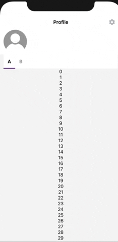
import React from 'react'
import { View, StyleSheet, ListRenderItem } from 'react-native'
import { Tabs } from 'react-native-collapsible-tab-view'

const HEADER_HEIGHT = 250

const DATA = [0, 1, 2, 3, 4]
const identity = (v: unknown): string => v + ''

const Header = () => {
  return <View style={styles.header} />
}

const Example: React.FC = () => {
  const renderItem: ListRenderItem<number> = React.useCallback(({ index }) => {
    return (
      <View style={[styles.box, index % 2 === 0 ? styles.boxB : styles.boxA]} />
    )
  }, [])

  return (
    <Tabs.Container
      renderHeader={Header}
      headerHeight={HEADER_HEIGHT} // optional
    >
      <Tabs.Tab name="A">
        <Tabs.FlatList
          data={DATA}
          renderItem={renderItem}
          keyExtractor={identity}
        />
      </Tabs.Tab>
      <Tabs.Tab name="B">
        <Tabs.ScrollView>
          <View style={[styles.box, styles.boxA]} />
          <View style={[styles.box, styles.boxB]} />
        </Tabs.ScrollView>
      </Tabs.Tab>
    </Tabs.Container>
  )
}

const styles = StyleSheet.create({
  box: {
    height: 250,
    width: '100%',
  },
  boxA: {
    backgroundColor: 'white',
  },
  boxB: {
    backgroundColor: '#D8D8D8',
  },
  header: {
    height: HEADER_HEIGHT,
    width: '100%',
    backgroundColor: '#2196f3',
  },
})

export default Example

Guides

Scrolling on the Header

To enable scrolling from the header, follow these steps:

  • If the HeaderComponent does not contain touchable components, set the pointerEvents prop to 'none'.
  • If the HeaderComponent does contain touchable components, set the pointerEvents prop to 'box-none' to ensure they function properly.

Note: If any child component within the HeaderComponent should not respond to touches, such as an <Image /> element, set its pointerEvents prop to 'none'. Otherwise, it may unintentionally become the target of a touch gesture on iOS devices and prevent scrolling.

API Reference

Core

Tabs.Container

Basic usage looks like this:

import { Tabs } from 'react-native-collapsible-tab-view'

const Example = () => {
   return (
     <Tabs.Container renderHeader={MyHeader}>
       <Tabs.Tab name="A">
         <ScreenA />
       </Tabs.Tab>
       <Tabs.Tab name="B">
         <ScreenB />
       </Tabs.Tab>
     </Tabs.Container>
   )
}

Props

name type default description
allowHeaderOverscroll boolean | undefined false Whether the header moves down during overscrolling (for example on pull-to-refresh on iOS) or sticks to the top
cancelLazyFadeIn boolean | undefined
cancelTranslation boolean | undefined
containerStyle StyleProp<ViewStyle>
headerContainerStyle StyleProp<AnimateStyle<ViewStyle>>
headerHeight number | undefined Is optional, but will optimize the first render.
initialTabName string | undefined
lazy boolean | undefined If lazy, will mount the screens only when the tab is visited. There is a default fade in transition.
minHeaderHeight number | undefined Header minimum height when collapsed
onIndexChange ((index: number) => void) | undefined Callback fired when the index changes. It receives the current index.
onTabChange (data: { prevIndex: number index: number prevTabName: T tabName: T }) => void Callback fired when the tab changes. It receives the previous and current index and tabnames.
pagerProps Omit<FlatListProps<number>, 'data' | 'keyExtractor' | 'renderItem' | 'horizontal' | 'pagingEnabled' | 'onScroll' | 'showsHorizontalScrollIndicator' | 'getItemLayout'> Props passed to the pager. If you want for example to disable swiping, you can pass { scrollEnabled: false }
renderHeader (props: TabBarProps<TabName>) => React.ReactElement | null
renderTabBar (props: TabBarProps<TabName>) => React.ReactElement | null (props: TabBarProps<TabName>) => MaterialTabBar
revealHeaderOnScroll boolean | undefined Reveal header when scrolling down. Implements diffClamp.
snapThreshold number | null | undefined null Percentage of header height to define as the snap point. A number between 0 and 1, or null to disable snapping.
tabBarHeight number | undefined Is optional, but will optimize the first render.
width number | undefined Custom width of the container. Defaults to the window width.

Tabs.Tab

Wrap your screens with Tabs.Tab. Basic usage looks like this:

<Tabs.Container ...>
  <Tabs.Tab name="A" label="First Tab">
   <ScreenA />
  </Tabs.Tab>
  <Tabs.Tab name="B">
   <ScreenA />
  </Tabs.Tab>
</Tabs.Container>

Props

name type
label string | ((props: TabItemProps<T>) => ReactNode) | undefined
name T

Tabs.Lazy

Typically used internally, but if you want to mix lazy and regular screens you can wrap the lazy ones with this component.

Props

name type
cancelLazyFadeIn boolean | undefined
startMounted boolean | undefined

Tabs.FlatList

Use like a regular FlatList.

Tabs.FlashList

Use like a regular FlashList.

Tabs.MasonryFlashList

Use like a regular MasonryFlashList.

Tabs.ScrollView

Use like a regular ScrollView.

Tabs.SectionList

Use like a regular SectionList.

Ref

You can pass a ref to Tabs.Container.

const ref = React.useRef()
<Tabs.Container ref={ref}>
method type
jumpToTab (name: T) => boolean
setIndex (index: number) => boolean
getFocusedTab () => T
getCurrentIndex () => number

Hooks

useCollapsibleStyle

This hook provides access to key styles for the collapsible tab view. It can be used to obtain the progressViewOffset and pass it to the RefreshControl of the scroll view.

const {
  contentContainerStyle,
  progressViewOffset,
  style,
} = useCollapsibleStyle()

Values

name type
contentContainerStyle { minHeight: number; paddingTop: number; }
progressViewOffset number
style { width: number; }

useAnimatedTabIndex

This hook returns an animated value representing the current tab index. As the tab view can be in between panes while swiping, this value is a floating-point number.

const tabIndex = useAnimatedTabIndex()

useFocusedTab

This hook returns the name of the currently focused tab.

const focusedTab = useFocusedTab()

useHeaderMeasurements

This hook returns the top distance and the header height. For an example of how to use this, check out the animated header example in the example folder.

const { top, height } = useHeaderMeasurements()

useCurrentTabScrollY

This hook returns the vertical scroll position of the current tab as an Animated SharedValue.

Since this library requires handling the onScroll event for its functionality, this is the only way to react to changes in the scroll position of the underlying scrollable component.

const scrollY = useCurrentTabScrollY()

Default Tab Bar

MaterialTabItem

Any additional props are passed to the pressable component.

Props

name type description
activeColor string | undefined Color applied to the label when active
inactiveColor string | undefined Color applied to the label when inactive
inactiveOpacity number | undefined
index number
indexDecimal SharedValue<number>
label string | ((props: TabItemProps<T>) => ReactNode)
labelStyle StyleProp<AnimateStyle<TextStyle>> Style to apply to the tab item label
name T
onLayout (((event: LayoutChangeEvent) => void) & ((event: LayoutChangeEvent) => void)) | undefined Invoked on mount and layout changes with {nativeEvent: { layout: {x, y, width, height}}}.
onPress (name: T) => void
pressColor string | undefined
pressOpacity number | undefined
scrollEnabled boolean | undefined
style StyleProp<ViewStyle> Either view styles or a function that receives a boolean reflecting whether the component is currently pressed and returns view styles.

Known Issues

Android FlatList Pull to Refresh

Refer to this open issue. We utilize scrollTo to synchronize the unfocused tabs. While it is intended for use with ScrollView, it works well with FlatList, until the RefreshControl is added. Note that this issue occurs only on Android.

Workaround: Check out the Android Shared Pull To Refresh example in the expo app. You can implement a single pull-to-refresh for the Tabs.Container.

iOS FlatList StickyHeaderIndices and iOS SectionList StickySectionHeadersEnabled

When using the stickyHeaderIndices prop on a FlatList or stickySectionHeadersEnabled on a SectionList, the sticky elements do not scroll up as the header collapses. This issue is specific to iOS.

See #136.

ref.setIndex

This is not an issue per se, but it's essential to be aware of it. When using containerRef.current.setIndex(i), if you set it to the current index, the screen will scroll to the top. You can prevent this behavior as follows:

const index = pageRef.current?.getCurrentIndex()
if (index !== nextIndex) {
  pageRef.current?.setIndex(nextIndex)
}

Alternative Libraries

If you do not require a full-featured tab view, consider another option: a simple segmented control / material tab bar without swiping or snapping, using only the React Native Animated API.

Contributing and running the Example

While developing, you can run the example app to test your changes.

First run yarn in root:

yarn

Then prepare the example:

cd example
yarn

Then run the example:

yarn ios

Please follow the angular commit message format.

Make sure your code passes TypeScript and ESLint. Run the following to verify:

yarn typescript
yarn lint

To fix formatting errors, run the following:

yarn lint -- --fix

Documentation changes

Edit the README_TEMPLATE, or update the docstrings inside the src folder, and run:

yarn docs

react-native-collapsible-tab-view's People

Contributors

alexco2 avatar alexpchin avatar andreialecu avatar dependabot[bot] avatar filipengberg avatar gkartalis avatar lucianobracco-geojam avatar mustafaskyer avatar paynegreen avatar pedrobern avatar sayem314 avatar tcorreiaubi avatar tiagocorreiaalmeida avatar

Stargazers

 avatar  avatar  avatar  avatar  avatar  avatar  avatar  avatar  avatar  avatar  avatar  avatar  avatar  avatar  avatar  avatar  avatar  avatar  avatar  avatar  avatar  avatar  avatar  avatar  avatar  avatar  avatar  avatar  avatar  avatar  avatar  avatar  avatar  avatar  avatar  avatar  avatar  avatar  avatar  avatar  avatar  avatar  avatar  avatar  avatar  avatar  avatar  avatar  avatar  avatar  avatar  avatar  avatar  avatar  avatar  avatar  avatar  avatar  avatar  avatar  avatar  avatar  avatar  avatar  avatar  avatar  avatar  avatar  avatar  avatar  avatar  avatar  avatar  avatar  avatar  avatar  avatar  avatar  avatar  avatar  avatar  avatar  avatar  avatar  avatar  avatar  avatar  avatar  avatar  avatar  avatar  avatar  avatar  avatar  avatar  avatar  avatar  avatar  avatar  avatar

Watchers

 avatar  avatar  avatar  avatar  avatar  avatar  avatar  avatar  avatar  avatar

react-native-collapsible-tab-view's Issues

Leaving some of the header at the top

Well, last question for today, is there any way to have some sort of header when the tab bar gets sticky? So if on scroll the header disappears and the title of the page is now out of sight, is there any place for some replacement title/part of the header to exist?

I can't figure out where it would go given the header is included in the component itself. This isn't a problem in the Example gifs where the title is just in the nav bar, but that's not always the case.

Any thoughts on this one?

Issue with customRenderTabBar

Hi @PedroBern I hope you had a nice Christmas and New Year.

I'm just looking into an issue when you use a custom tab bar. Everything works when you don't render a custom tab bar, however, when using a custom tab bar it seems like the preventDefault does not prevent clicking on the tab when the user is scrolling. Is this perhaps because the isGliding.current is being passed instead of isGliding?

Basically it becomes gittery.

The code below:

/**
   *
   * Wraps the tab bar with `Animated.View` to
   * control the translateY property.
   *
   * Render the header with `renderHeader` prop.
   *
   * Render the default `<TabBar />` with additional
   * `tabBarProps`, or a custom tab bar from the
   * `renderTabBar` prop, inside the Animated wrapper.
   */
  const renderTabBar = (
    props: SceneRendererProps & {
      navigationState: NavigationState<T>;
    }
  ): React.ReactNode => {
    return (
      <Animated.View
        pointerEvents="box-none"
        style={[
          styles.headerContainer,
          { transform: [{ translateY }] },
          headerContainerStyle,
        ]}
        onLayout={getHeaderHeight}
      >
        {renderHeader()}
        {customRenderTabBar ? (
          customRenderTabBar({
            ...props,
            ...tabBarProps,
            isGliding: isGliding.current,
          })
        ) : (
          <TabBar
            {...props}
            {...tabBarProps}
            onTabPress={(event) => {
              if (isGliding.current && preventTabPressOnGliding) {
                event.preventDefault();
              }
              tabBarProps?.onTabPress && tabBarProps.onTabPress(event);
            }}
          />
        )}
      </Animated.View>
    );
  };

Within my custom TabBar, I'm using (shortened version):

import { TabBar as RNTVTabBar } from 'react-native-tab-view';

const TabBar = (
  { badges, isGliding, ...props },
) => {
  return (
    <RNTVTabBar
      {...props}
      .
      .
      onTabPress={(event) => {
          if (isGliding) {
            event.preventDefault();
          }
          props?.onTabPress && props.onTabPress(event);
        }}
      />
  );
};

This is a video showing it working with no custom tab bar:

This is a video showing it not working with a custom tab bar:

Tabbar has low frame rates when scrolling between screens and onPress

Current behavior

I've copied the base example project into my project, except I added the scrollEventThrottle={12} to both Tab.FlatList and Tab.ScrollView. However, the blue indicator on the tabbar has low frame rate when scrolling horizontally or on pressing.

Expected behaviour

The blue indicator should animate smoothly

Code sample

import { View, Text, StyleSheet, Animated, Easing, ListRenderItem } from 'react-native'
import * as React from 'react'
import { useTabDismissOnHideActionListener } from '../../navigation/bottom-tab-navigator-utils';
import { useCallback, useEffect, useState } from 'react';
import Colors from '../../constants/Colors';
import Layout from '../../constants/Layout';

import {
    RefComponent,
    ContainerRef,
    createCollapsibleTabs,
    TabBarProps as TabProps,
} from 'react-native-collapsible-tab-view'
import TabBar from './MaterialTabBar'

import { default as Reanimated, EasingNode, Extrapolate, useAnimatedRef } from 'react-native-reanimated'

type TabNames = 'A' | 'B'
type HeaderProps = TabProps<TabNames>

const { useTabsContext, ...Tabs } = createCollapsibleTabs<TabNames>()

const {
    add,
    interpolate,

} = Reanimated


const HEADER_HEIGHT = 250
const TABBAR_HEIGHT = 48

const ChatScreen: React.FC<{
    navigation: any
}> = (props) => {
    const {
        navigation,
    } = props;

    const {
        show,
        animated
    } = useTabDismissOnHideActionListener(navigation)

    const [focusAnimationRef] = useState(new Animated.Value(0))
    const [focusAnimationAfterRef] = useState(new Animated.Value(0))

    const containerRef = useAnimatedRef<ContainerRef>()
    const tabARef = useAnimatedRef<RefComponent>()
    const tabBRef = useAnimatedRef<RefComponent>()

    const [refMap] = React.useState({
        A: tabARef,
        B: tabBRef,
    })

    const initialize = useCallback(() => {
        Animated.sequence([
            Animated.timing(focusAnimationRef, {
                toValue: 1,
                duration: 300,
                easing: Easing.bezier(.3, 1, 1, 1),
                useNativeDriver: true,
            }),
            Animated.spring(focusAnimationAfterRef, {
                toValue: 1,
                stiffness: 300,
                damping: 200,
                mass: 1,
                useNativeDriver: true,
            })
        ]).start()
    }, [])

    const reset = useCallback(() => {
        focusAnimationRef.setValue(0)
        focusAnimationAfterRef.setValue(0)
    }, [])

    useEffect(() => {
        navigation.addListener('focus', initialize)
        navigation.addListener('blur', reset)

        return () => {
            navigation.removeListener('focus', initialize)
            navigation.removeListener('blur', reset)
        }
    }, [])

    return (
        <View style={styles.container}>
            <Animated.View style={[styles.innerContainer, {
                opacity: focusAnimationRef,
                transform: [
                    {
                        translateX: focusAnimationRef.interpolate({
                            inputRange: [0, 1],
                            outputRange: [-Layout.width, 0],
                            extrapolate: 'clamp',
                        })
                    },
                    {
                        translateY: focusAnimationAfterRef.interpolate({
                            inputRange: [0, 1],
                            outputRange: [Layout.STATUS_BAR_HEIGHT, 0],
                            // extrapolate: 'clamp',
                        })
                    },
                ]
            }]}>
                <Tabs.Container
                    containerRef={containerRef}
                    TabBarComponent={TabBar}
                    HeaderComponent={Header}
                    headerHeight={HEADER_HEIGHT}
                    tabBarHeight={TABBAR_HEIGHT}
                    refMap={refMap}
                    // diffClampEnabled snapEnabled

                >
                    <ScreenA />
                    <ScreenB />
                </Tabs.Container>
            </Animated.View>
        </View>

    );
}

const ScreenB = () => {
    return (
        <Tabs.ScrollView
            name="B"
            scrollEventThrottle={12}
            showsVerticalScrollIndicator={false}
            showsHorizontalScrollIndicator={false}
        >
            <View style={[styles.box, styles.boxA]} />
            <View style={[styles.box, styles.boxB]} />
        </Tabs.ScrollView>
    )
}

const renderItem: ListRenderItem<number> = ({ index }) => {
    return (
        <View style={[styles.box, index % 2 === 0 ? styles.boxB : styles.boxA]} />
    )
}

const ScreenA = () => {
    return (
        <Tabs.FlatList
            name="A"
            data={[0, 1, 2, 3, 4]}
            renderItem={renderItem}
            keyExtractor={(v) => v + ''}
            scrollEventThrottle={12}
            showsVerticalScrollIndicator={false}
            showsHorizontalScrollIndicator={false}
        />
    )
}

const Header: React.FC<HeaderProps> = () => {
    return <View pointerEvents={'none'} style={styles.header} />
}


const styles = StyleSheet.create({
    container: {
        flex: 1,
        backgroundColor: Colors.themeColor,
    },
    innerContainer: {
        flex: 1,
        alignItems: 'center',
        justifyContent: 'center',
        backgroundColor: Colors.themeBlack,
        borderRadius: Layout.MODAL_BORDER_RADIUS
    },
    ////

    box: {
        height: 250,
        width: '100%',
    },
    boxA: {
        backgroundColor: 'white',
    },
    boxB: {
        backgroundColor: '#D8D8D8',
    },
    header: {
        height: HEADER_HEIGHT,
        width: '100%',
        backgroundColor: '#2196f3',
    },
})

ChatScreen.displayName = 'ChatScreen'

export default ChatScreen

Screenshots (if applicable)

What have you tried

Using `snapToOffsets` instead of the custom snap code

I noticed that there's some sort of loop happening when doing very small momentum scrolls within the header.

I'm not sure if this reproduces outside of my project, and I also use react-navigation via a WIP PR I'm working on for #7

What seems to be happening is that onMomentumScrollEnd triggers via the user gesture, then syncScrollOffset calls scrollScene which then also triggers onMomentumScrollEnd and then there's a battle between the two triggering a loop.

This seems to have also been reported here: https://stackoverflow.com/questions/61715531/abrupt-scrolltooffset-calls-in-onmomentumscrollend-react-native

However, it seems to be possible to use https://reactnative.dev/docs/scrollview#snaptooffsets with values of [0, headerHeight] to achieve the same behavior as the custom scroll snapping. Is there any reason not to use snapToOffsets?

A current workaround is to set disableSnap to true and add snapToOffsets to my own list views

Position of `ListEmptyComponent`

I'm just investigating the rendered position when you include a ListEmptyComponent. I believe the position is correct when you scroll to hide the header (i.e. the List EmptyComponent is in the middle of the screen). However, it displays too far down when the header is displayed (the default on page load).

For example in Contacts.tsx.

const ListEmptyComponent = () => (
  <View
    style={{
      alignItems: 'center',
      flex: 1, // Without it will dispay at the very top
      justifyContent: 'center',
    }}
  >
    <Text>No results.</Text>
  </View>
);

export default class Contacts extends React.Component {
  render() {
    return (
      <FlatList
        data={CONTACTS}
        keyExtractor={(_, i) => String(i)}
        renderItem={renderItem}
        ItemSeparatorComponent={ItemSeparator}
      />
    );
  }
}

// used in Collapsible TabView examples
export const AnimatedContacts = React.forwardRef<
  any,
  React.PropsWithoutRef<CollapsibleScenePropsAndRef>
>((props, ref) => {
  const [isRefreshing, startRefreshing] = useRefresh();

  return (
    <Animated.FlatList
      ref={ref}
      data={CONTACTS}
      keyExtractor={(_, i) => String(i)}
      renderItem={renderItem}
      ItemSeparatorComponent={ItemSeparator}
      ListEmptyComponent={ListEmptyComponent} // <--- Here
      refreshing={isRefreshing}
      onRefresh={startRefreshing}
      {...props}
    />
  );
});

Screenshot 2020-12-08 at 13 25 25

And

Screenshot 2020-12-08 at 13 25 34

CenteredEmptyList Example is Commented out

Currently, the CenteredEmptyList example differs from the v2 example, as it doesn't take value for the current tab/index.
How come this was commented out? What issue was being faced?

Screenshot 2021-01-31 at 11 58 40

Automated tests

Feature request

It would be great if a test suite could verify that everything is working properly. The interactions are pretty finicky and things can break in odd places by doing minor changes in others.

This would make the library much more maintainable and easier to refactor in the future, while giving more peace of mind to users that upgrades are safe.

Should be relatively easy to add gray box e2e testing using:
https://github.com/wix/Detox

Tests could be added to initiate scrolls and touches, then assert whether things are positioned correctly.

Another possibility is to convert the Example app to use Storybook:
https://storybook.js.org/
https://www.learnstorybook.com/intro-to-storybook/react-native/en/get-started/

It would then be possible to use loki to do screenshot diff testing for the stories (this wouldn't really test dynamic interactions though, only static rendering):
https://github.com/oblador/loki

Header gets stuck if a tab doesnt have enough content

First of all, thanks for creating this awesome wrapper!

As you can see, when I scroll down the A tab and switch to B, the header gets stuck and there is empty space between the header and the content. I guess the expected behaviour would be that the header resets to max height when switching to tab B.

Alt Text

How to get current tab from outside the TabContext?

  • How to get the currently focused tab from refMap, previously you could use navigationState.index?
  • How to listen to the change of the tab? (Connected to above)

If you want to conditionally display content based on the current tab, or you just want to know for some logic which tab is currently focused, you used to be able to work this out from navigationState.

When your Animated.FlatList needs to be nested within other components?

@PedroBern Here is an interesting one. One of the Collapsible Scenes within my Tabs is a HOC component which fetches data from a Search Service (Algolia), the results of which are displayed in a FlatList.

Due to the warning: VirualizedLists should never be nested inside plain ScrollViews with the same orientation - use another VirtualizedList-backed container instead. I have created a re-usable CollapsibleScene component that basically renders a FlatList with the content in the ListHeaderComponent and a null renderItem. (I could pass as children and use as data={[children]} too). Within this inner tabs' inner content, I have some components that wrap the FlatList, with some connectors etc for the search and then the Flatlist.

E.g.

export const AnimatedNestedEmptyContacts = React.forwardRef<
  any,
  React.PropsWithoutRef<CollapsibleScenePropsAndRef>
>((props, ref) => {
  const [isRefreshing, startRefreshing] = useRefresh();

  return (
    <Animated.FlatList
      ref={ref}
      data={[]}
      keyExtractor={(_, i) => String(i)}
      renderItem={null}
      ListHeaderComponent={
        // Could be HOC Component Here, e.g. Algolia InstantSearch
        <View style={styles.content}>
          {/* Could be Connector Component Here, e.g. Algolia Configure */}
          <FlatList
            data={[]}
            keyExtractor={(_, i) => String(i)}
            renderItem={renderItem}
            ItemSeparatorComponent={ItemSeparator}
            refreshing={isRefreshing}
            onRefresh={startRefreshing}
            ListEmptyComponent={ListEmptyComponent}
          />
        </View>
      }
      {...props}
    />
  );
});

When the nested FlatList has data, the outer FlatList will scroll and the content moves with the tabs etc. However, I'm struggling to replicate the centered ListEmptyComponent for this inner FlatList. Also, when scrolling on the non-nested Tab and switching, doesn't keep the inner FlatList aligned.

Please see video below:

So, taking a different tactic, I tried using useCollapsibleScene further down, e.g.

export const AnimatedNonNestedEmptyContacts = () => {
  const scenePropsAndRef = useCollapsibleScene('contactsNonNestedPopulated');

  const [isRefreshing, startRefreshing] = useRefresh();

  return (
    // Could be HOC Component Here, e.g. Algolia InstantSearch
    <View
      style={{
        flex: 1,
      }}
    >
      {/* Could be Connector Component Here, e.g. Algolia Configure */}
      <Animated.FlatList
        data={[]}
        keyExtractor={(_, i) => String(i)}
        renderItem={renderItem}
        ItemSeparatorComponent={ItemSeparator}
        refreshing={isRefreshing}
        onRefresh={startRefreshing}
        ListEmptyComponent={ListEmptyComponent}
        {...scenePropsAndRef}
      />
    </View>
  );
};

However, this also doesn't seem to be working.

Any ideas on how to solve this? I have made a PR for you to check out.

Padding showing when changing tabs.

Thank you for your great library!

When I have scrolled down on one tab so that the header is hidden and then change to another tab (via swipe or tap on the tab) that is scrolled all the way to the top, the paddingTop is showing. It would usually be obscured by the header and tabs but the header is shrunk because of the interaction with the previous tab.

Is there known solution for this? Or a canonical approach?
Thank you very much for your time.

Not work syncScrollOffsets

I tried to send a Pull Request, but was failed by the process.
Instead, I will send a diff of the js file.
Sorry about that.

Current behavior

Not work syncScrollOffsets.

Expected behaviour

Work syncScrollOffsets.

Code sample

It seems to be a ref problem.
The scrollToxxx method is not being accessed.

diff --git a/node_modules/react-native-collapsible-tab-view/lib/module/CollapsibleTabView.js b/node_modules/react-native-collapsible-tab-view/lib/module/CollapsibleTabView.js
index f7a3837..4909fe3 100644
--- a/node_modules/react-native-collapsible-tab-view/lib/module/CollapsibleTabView.js
+++ b/node_modules/react-native-collapsible-tab-view/lib/module/CollapsibleTabView.js
@@ -88,14 +88,14 @@ const CollapsibleTabView = ({
 
       if (newOffset !== null) {
         scrollScene({
-          ref: item.value,
+          ref: item.value.getNode(),
           offset,
           animated: false
         });
         listOffset.current[item.key] = offset;
       } else if (itemOffset < headerHeight || !itemOffset) {
         scrollScene({
-          ref: item.value,
+          ref: item.value.getNode(),
           offset: Math.min(offset, headerHeight),
           animated: false
         });
@@ -117,7 +117,7 @@ const CollapsibleTabView = ({
       listRefArr.current.forEach(item => {
         // scroll everything because we could be moving to a new tab
         scrollScene({
-          ref: item.value,
+          ref: item.value.getNode(),
           offset: newOffset,
           animated: true
         });
@@ -169,14 +169,14 @@ const CollapsibleTabView = ({
 
   const buildGetRef = React.useCallback(routeKey => ref => {
     if (ref) {
-      const found = listRefArr.current.find(e => e.key === routeKey);
-
-      if (!found) {
-        listRefArr.current.push({
+      listRefArr.current = listRefArr.current.filter((listRef) => {
+        return listRef.key !== routeKey
+      }).concat(
+        [{
           key: routeKey,
           value: ref
-        });
-      }
+        }]
+      );
     }
   }, []);
   /**

Jittery behaviour?

Hi @PedroBern, I've finally gotten around to have a look at the new v3 implementation.

On running the example, I see: You specified onScrollon a <ScrollView> but notscrollEventThrottle. You will only receive one event. Using 16 you get all the events but be aware that it may cause frame drops, use a bigger number if you don't need as much precision.

I don't know if it's related yet, but I'm also seeing quite jittery behaviour. Please see video:

simulator1.mov.zip

I haven't fully investigated this and will add more information if/when I find out more.

Header not showing

I've just tried to implement the basic example but the header isn't displaying? I'm on:

"react-native": "0.63.3"

Using:

  const [index, setIndex] = useState(0);

  const [routes] = useState([
    { key: 'first', title: 'First' },
    { key: 'second', title: 'Second' },
  ]);

  const _renderHeader = () => (
    <View style={styles.header}>
      <Text style={styles.headerText}>COLLAPSIBLE</Text>
    </View>
  );

  const _onTabPress = (tabProps) => {
    tabProps.jumpTo(tabProps.route.key);
  };

  const _renderTabBar = (props) => {
    return <TabBar {...props} onTabPress={_onTabPress} />;
  };

  return (
    <CollapsibleTabView
      navigationState={{ index, routes }}
      onIndexChange={setIndex}
      renderHeader={_renderHeader}
      renderScene={SceneMap({
        first: () => null,
        second: () => null,
      })}
      renderTabBar={_renderTabBar}
    />
  );

Any ideas?

Respond to scroll gestures on collapsible header

Feature request

In some cases, where the collapsible header covers a significant amount of the vertical screen space, a user might prefer or even be forced to start their scroll gesture on the collapsible header. There are a few cases I can think of where this may happen:

  • When the header is used to display larger amounts of content. Say you are developing a delivery app and want to display some pictures and information about a restaurant above a tab list of all their dishes. The header will initially cover most of the screen (see Illustration).
  • When using a small screen device. While phones with small screens admittedly seem to be a dying breed a bunch of them are still out there. Due to different scaling and aspect ratios most headers would likely cover >50% of the screen.
  • When using split screen mode on Android devices. Even regular sized collapsible headers like in the example app will cover almost all of the available window height (see Screenshot).

Currently, when starting a scroll gesture on the header nothing happens at all. It would be nice if there was a (opt-in) way for these gestures to be passed or translated to the ScrollView / FlatList inside the focused tab. This behavior would also be consistent with some native implementations collapsible headers (e.g the "Galaxy Store" App).

If anyone has ideas on how this could be implemented I would love to help and open a PR.

Screenshots

Large header Android Split Screen
Header with large amounts of content split_screen

How do I get the correct ref for a FlatList?

hi
I want to use some api on <FlatList />, like scrollToIndex, but I can't get the ref correctly.

<Animated.FlatList
  ref={this.flatListRef}
  {...scenePropsAndRef}
/>

componentDidMount() {
  setTimeout(() => {
    console.log(this.flatListRef.current); // null
  }, 3000);
}

What might I have missed?

Shared Pull To Refresh

Feature request

You may want to implement a pull to refresh that is shared across all tabs. This might just be good to be included in the examples.

Current behavior

Currently, the examples load a pullToRefresh from each tab's scene independently. I.e. if you do not implement a pull to refresh on each tab, then depending on what tab you are on you you'll get different behaviour.

TAB

  • Scene1: FlatList with images
  • Scene2: Static user information
  • Scene3: ScrollView with other information

Proposed solution

A shared pullToRefresh that implements a "refreshing" value that can be used trigger a useEffect in each scene.

Header not scrollable

Current behavior

Currently when I scroll on the header it doesn't move the position, despite adding pointer events.

Expected behaviour

Would expect it to scroll

Code sample

const { useTabsContext, ...Tabs } = createCollapsibleTabs()

const Page = () => {
    const [index, setIndex] = useState(0);
    const containerRef = useAnimatedRef()
    const postsTabRef = useAnimatedRef()
    const detailsTabRef = useAnimatedRef()
    const itemsTabRef = useAnimatedRef()
    const similarTabRef = useAnimatedRef()
    let refs = {
                    Posts: postsTabRef,
                    Details: detailsTabRef,
                    Items: itemsTabRef,
                    Similar: similarTabRef 
                }
    const [refMap, setRefMap] = React.useState(refs)
    const Header = () => {
        return (<View pointerEvents="box-none" style={{ width: windowWidth }}>
                  <TouchableOpacity onPress={toggleImage}>
                      <Image source={{ uri: thing.image || "https://picsum.photos/500" }} style={{ flex: 1, alignSelf: 'center', width: 200, height: 200, borderRadius: 200*.42 }} />
                  </TouchableOpacity>
                </View>
                )
          }

    return (<Tabs.Container
                containerRef={containerRef}
                headerHeight={headerHeight} // optional
                HeaderComponent={Header}
                refMap={refMap}
                scrollEnabled = {true}
                onIndexChange={setIndex}
                >
                <Tabs.ScrollView style={{ width: windowWidth, height: 600, backgroundColor: 'red'}} contentContainerStyle={{ height: "100%" }}>
                    <View><Text>Hello</Text></View>
                </Tabs.ScrollView>
                <Tabs.ScrollView style={{ width: windowWidth, height: 600, backgroundColor: 'orange'}} />
                <Tabs.ScrollView style={{ width: windowWidth, backgroundColor: 'yellow'}} />
                <Tabs.ScrollView style={{ width: windowWidth, backgroundColor: 'green'}} />

                </Tabs.Container>
        )
}

Screenshots (if applicable)

N/A, just imagine a header trying to be scrolled and not going anywhere

What have you tried

I've tried adding the relevant pointer-events

Add a default TabBar component

Feature request

Add a default TabBar component.

  • material design
  • scrollable support

Current behavior

The user must provide a custom tab bar.

Gap between header and content if lazy === true

Current behavior

<CollapsibleTabView lazy ...> do not sync scroll position of unmounted routes, as expected, because the routes are unmounted! But, when the routes are mounted, may start with a gap between the header and the content.

Expected behaviour

When mounting the lazy routes, they should know the header position and start with the correct scroll position.

Workaround

The current workaround is to handle the laziness by yourself. What actually can be a good thing, since the lazy prop of react-native-tab-view is pseudo-lazy. It loads all routes if you click on the last tab!

Two children with the same key `undefined` In a Bare React Native App

I'm seeing the error:

Warning: Encountered two children with the same key, `undefined`. Keys should be unique so that components maintain their identity across updates. Non-unique keys may cause children to be duplicated and/or omitted โ€” the behavior is unsupported and could change in a future version.

Ensure that children exists

In createCollapsibleTabs, we should ensure that children exists as this can be undefined:

Line 88:

const scrollY = useSharedValue([...new Array(children.length)].map(() => 0));

Line 106:

const [data] = React.useState(
  [...new Array(children.length)].map((_, i) => i)
)

Force a tab to start at a certain scroll position

Hey(once again), I was trying to force a tab to always start at a certain scroll position, this is a really specific behavior, what I tried to do was on the indexChange call the scrollTo on that tab to place it on the position where I need, example

      onIndexChange={(onChangeData) => {
            const {tabName} = onChangeData;
            if (tabName === TabKey.MAP) {
              (mapRef.current as ScrollView).scrollTo({
                y: IMAGE_SLIDER_HEIGHT - HEADER_BAR_HEIGHT,
                animated: true,
              });
            }
          }}

This works great for the current tab but the others tab don't sync their position properly, should I call another function or just update some value from the context? Thanks once again

Make `refMap` more customizable

  • It would be good to be able to pass a custom Component or custom Text to TabBarItem label
  • The keys may be sorted alphabetically by prettier if you use: sort-keys-fix/sort-keys-fix or sort-keys plugins
  • Unusual (I know) but an empty object would error in the current structure. We should perhaps handle this?

Currently, the refMap uses the keys to create the labels.

Line 150 in src/MaterialTabBar/TabBar.tsx

getLabelText = (name) => name.toUpperCase()

.
.
.

{Object.keys(refMap).map((name, i) => {
        return (
          <TabItemComponent
            key={name}
            index={i}
            name={name}
            label={getLabelText(name)}
            onPress={onTabPress}
            onLayout={scrollEnabled ? onTabItemLayout : undefined}
            scrollEnabled={scrollEnabled}
            indexDecimal={indexDecimal}
            {...tabItemProps}
          />
        )
      })}

However, if we changed the structure of refMap, it could take a label or component/icon to might allow for more customisation.

Something like:

const [refMap] = React.useState({
  screen1: { ref: ref, label: () => <FontAwesomeIcon icon={'images'} size={22} /> },
  screen2: { ref: ref, label: () => <Text>With Space</Text> }
})

Define a minimum header hight

Hi, love this plugin well written.
I'm trying to make a header with several animated objects in it that fade out but some will stay. So far i have not figured out where the final offset is calculated to keep some of the header without closing it compleately

[Object Map Iterator] in Tabs

Hi @PedroBern @andreialecu

When upgrading to 4.0.0-next.0 and running the basic version in a react-native application (not expo) as per:

import { Tabs } from 'react-native-collapsible-tab-view';
.
.
.

return (
  <Tabs.Container HeaderComponent={_renderHeader}>
      <Tabs.Tab name="A">
        <Tabs.FlatList
          data={[0, 1, 2, 3, 4]}
          keyExtractor={(v) => v + ''}
          renderItem={null}
        />
      </Tabs.Tab>
      <Tabs.Tab name="B">
        <Tabs.ScrollView>{null}</Tabs.ScrollView>
      </Tabs.Tab>
 </Tabs.Container>
)

I see [Object Map Iterator], where the tabs are meant to be:

I also see:

I'm also having a problem scrolling the header. I will add additional notes here as I investigate.

Scroll on Header not scrolling other tabs (iOS)

Current behavior

In the scroll on header example, if I go to contacts and scroll to the end, then tap the status bar, it correctly scrolls the current tab to the top.

However, all the other tabs are not synced.

Expected behaviour

All tabs should be scrolled to the top.

Screenshots (if applicable)

IMG_E4F8296E5D88-1

Integration with react navigation

Thank you for creating this!

I saw that you mentioned in satya164/react-native-tab-view#1096 (comment) that there would be integration with react-navigation.

I'm really interested in this, and would love to help by testing it. Alternatively, if you can share the private implementation you mentioned, I might be able to implement and test that as well, before a polished public release.

Update documentation for `react-native-reanimated` and bump version in Example

react-native-reanimated v2 has quite a bit more set-up. It's not immediately clear that when installing the library, you have to be using v2 of the library.

Also, things like Direct Debugging are things that people who install v2 may not be expecting.

Also, we should bump the version in the example to 2.0.0-rc.2

If you don't pass a value to `renderHeader`, the tabs don't show up

I have a couple of pages that require tabs that do not require a header. I thought that the default of renderHeader was () => null so passing no header would still display the tabs as if we were using react-native-tab-view.

<CollapsibleTabView<Route>
      navigationState={{ index, routes }}
      renderScene={renderScene}
      onIndexChange={handleIndexChange}
      // renderHeader={renderHeader}
      headerHeight={HEADER_HEIGHT}
      {...props}
    />

However, if you omit renderHeader, the tabs do not show.

Screenshot 2021-01-13 at 16 13 19

TabBar Item Label style required

Feature request

Please provide an option for changing the Tab Bar Item Label Style.
In #64, you provided an option for changing the tab bar background, that is great.

But need an option to change the existing label style without using custom 'TabItemComponent' as you mentioned in #70.

Waiting for your valuable reply.

Unable to resolve module @react-navigation/material-top-tabs

bundling failed: Error: Unable to resolve module `@react-navigation/material-top-tabs` from `node_modules/react-native-collapsible-tab-view/lib/module/MaterialTopTabsCollapsibleTabView.js`: @react-navigation/material-top-tabs could not be found within the project.

I used it without the integration with react-navigation, but the above error occurs.

Tab Screen is showing up blank

Current behavior

Currently I have 4 screens and set them each to have a width of the window. Despite this, when swiping from one to the other the next screen is visible but then when you get to the point of the index changing, it disappears. If you click to another tab the same thing happens, it's just blank.

Expected behaviour

I would expect to see the relevant screen on both swipe and when each tab is selected.

Code sample

const { useTabsContext, ...Tabs } = createCollapsibleTabs()

const Page = () => {
    const [index, setIndex] = useState(0);

    const containerRef = useAnimatedRef()
    const postsTabRef = useAnimatedRef()
    const detailsTabRef = useAnimatedRef()
    const itemsTabRef = useAnimatedRef()
    const similarTabRef = useAnimatedRef()
    let refs = {
                    Posts: postsTabRef,
                    Details: detailsTabRef,
                    Items: itemsTabRef,
                    Similar: similarTabRef 
                }
    const [refMap, setRefMap] = React.useState(refs)


    return (<Tabs.Container
                containerRef={containerRef}
                headerHeight={headerHeight} // optional
                refMap={refMap}
                scrollEnabled = {true}
                onIndexChange={setIndex}
                >
                <Tabs.ScrollView style={{ width: windowWidth, height: 600, backgroundColor: 'red'}} contentContainerStyle={{ height: "100%" }}>
                    <View><Text>Hello</Text></View>
                </Tabs.ScrollView>
                <Tabs.ScrollView style={{ width: windowWidth, height: 600, backgroundColor: 'orange'}} />
                <Tabs.ScrollView style={{ width: windowWidth, backgroundColor: 'yellow'}} />
                <Tabs.ScrollView style={{ width: windowWidth, backgroundColor: 'green'}} />

                </Tabs.Container>
        )
}

Screenshots (if applicable)

buggy.mov

What have you tried

I originally had the 4 <Tabs.ScrollView /> components as the ones that are actually use in my app. I've minimized down to the bare elements to try and see where I may be causing my error but even with this basic layout it isn't working.

I've tried alternative widths and flex: 1, etc. I can't figure out where the issue is.

Conditionally showing tabs after first render

Hi been a bit active on this repo today, hoping this is my last question (and thanks for the support so far).

I'm trying to conditionally set my ref map but it doesn't seem to like updates. Basically I'm trying to load pages that may or may not have content for the various pages, and if there's no content I don't want to show them.

Here's where I'm starting:

let refs = {
                    Posts: postsTabRef,
                    Details: detailsTabRef,
                    Items: itemsTabRef,
                    Similar: similarTabRef 
                }

Simple example of what I was trying/would like to achieve:
```
let refs = {}
refs['Posts'] = postsTabRef
if (details.length > 0){
refs['Details'] = detailsTabRef
}
if (items.length > 0){
refs['Items'] = itemsTabRef
}
if (similar.length > 0){
refs['Similar'] = similarTabRef
}
const [refMap, setRefMap] = React.useState(refs)


With this, was trying to check after an API call returns, could I update refMap and should I somehow ask it to refresh without re-rendering the children components?

I can currently update refs and it will render the right tabs, but when clicking them I'm currently getting scrollToIndex out of range, which just makes me think it renders first with some number of expected tabs, and then re-renders to show the tabs but on-click it doesn't recognize that tab actually belongs.

Any thoughts would be great!

Javascript example

I'm not using Typescript and can't figure out how to convert this to a Javascript example. It doesn't make sense for me to start using Typescript in the middle of this project. Does anybody have a javascript example?

Thank you!

Error: Element type is invalid - TabItem

Current behavior

Getting the following error while trying to use Tabs.Container on iOS:

Error: Element type is invalid: expected a string (for built-in components) or a class/function (for composite components) but got: undefined. You likely forgot to export your component from the file it's defined in, or you might have mixed up default and named imports.

Check the render method of TabItem.

Code sample

import {
  createCollapsibleTabs,
} from 'react-native-collapsible-tab-view';
import {useAnimatedRef} from 'react-native-reanimated';

const {useTabsContext, ...Tabs} = createCollapsibleTabs();

// ....

function ProgramCreation({route, navigation}) {
  const containerRef = useAnimatedRef();
  const aboutRef = useAnimatedRef();
  const feedRef = useAnimatedRef();

  const [refMap] = useState({
    A: aboutRef,
    B: feedRef,
  });

  const Header = ({title, height = 200}) => {
    return (
      <View style={[{height}]}>
        <Text style={styles.defaultText}>{title}</Text>
      </View>
    );
  };

  const AboutView = () => {
    return (
       <View/>
    )
  }

  const FeedView = () => {
    return (
       <View/>
    )
  }

  return (
    <Tabs.Container
      containerRef={containerRef}
      HeaderComponent={Header}
      headerHeight={200}
      refMap={refMap}>
        <AboutView />
        <FeedView/>
      </Tabs.Container>
  );
}

And my babel.config.js

module.exports = {
  presets: ['module:metro-react-native-babel-preset'],
  plugins: ['react-native-reanimated/plugin'],
};

What have you tried

I'm currently using bare react native. No expo or typescript.

I've tried installing this and react-native-reanimated using both npm and yarn...same result.

I was able to successfully run the example app through expo on my phone but no luck using my own app.

react-native: 0.62.2
react-native-collapsible-tab-view: 3.7.1,
react-native-reanimated: 2.0.0-rc.0 (also tried 2.0.0-rc.2)

RefreshControl wrong position on iOS

The RefreshControl be shown on top of the header where it should be shown at top of FlatList itself, is there any workaround so the RefreshControl stick at the top of FlatList

Support for Sectionlist

Hello, first of all, amazing package. This is something the rn community definetly needs! One question though. Do you plan to support Sectionlist, or is there a way to make it work with sectionlist?

Recommend Projects

  • React photo React

    A declarative, efficient, and flexible JavaScript library for building user interfaces.

  • Vue.js photo Vue.js

    ๐Ÿ–– Vue.js is a progressive, incrementally-adoptable JavaScript framework for building UI on the web.

  • Typescript photo Typescript

    TypeScript is a superset of JavaScript that compiles to clean JavaScript output.

  • TensorFlow photo TensorFlow

    An Open Source Machine Learning Framework for Everyone

  • Django photo Django

    The Web framework for perfectionists with deadlines.

  • D3 photo D3

    Bring data to life with SVG, Canvas and HTML. ๐Ÿ“Š๐Ÿ“ˆ๐ŸŽ‰

Recommend Topics

  • javascript

    JavaScript (JS) is a lightweight interpreted programming language with first-class functions.

  • web

    Some thing interesting about web. New door for the world.

  • server

    A server is a program made to process requests and deliver data to clients.

  • Machine learning

    Machine learning is a way of modeling and interpreting data that allows a piece of software to respond intelligently.

  • Game

    Some thing interesting about game, make everyone happy.

Recommend Org

  • Facebook photo Facebook

    We are working to build community through open source technology. NB: members must have two-factor auth.

  • Microsoft photo Microsoft

    Open source projects and samples from Microsoft.

  • Google photo Google

    Google โค๏ธ Open Source for everyone.

  • D3 photo D3

    Data-Driven Documents codes.