Giter Site home page Giter Site logo

balzss / luxbar Goto Github PK

View Code? Open in Web Editor NEW
710.0 710.0 57.0 1.59 MB

:cocktail: Featherweight, Responsive, CSS Only Navigation Bar

Home Page: https://balzss.github.io/luxbar/

License: MIT License

CSS 48.79% HTML 25.91% JavaScript 25.31%
css menu nav navbar navigation

luxbar's Introduction

Luxbar

Featherweight, Responsive, CSS Only Navigation bar

Screencap

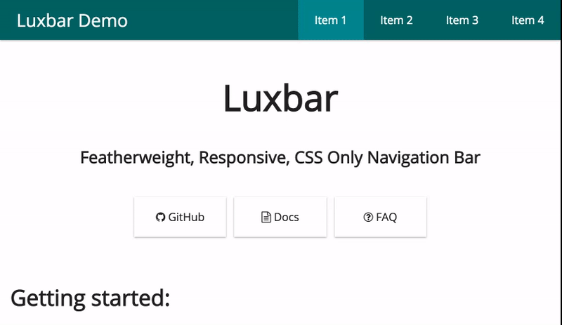
Try out all the options at the demo page!

Getting started

Get it with NPM:

npm install luxbar

Or with bower:

bower install luxbar

Or use the CDN:

<link rel="stylesheet" href="https://cdn.rawgit.com/balzss/luxbar/ae5835e2/build/luxbar.min.css">

Then head over to the demo page to generate your customized HTML code or use the one below as a base and see the docs for options. (Demo page is highly recommended for the newcomers)

<div class="luxbar luxbar-static">
    <input type="checkbox" id="luxbar-checkbox" class="luxbar-checkbox">
    <div class="luxbar-menu luxbar-menu-right luxbar-menu-dark">
        <ul class="luxbar-navigation">
            <li class="luxbar-header">
                <a class="luxbar-brand" href="#">Brand</a>
                <label class="luxbar-hamburger luxbar-hamburger-doublespin"
                        for="luxbar-checkbox"> <span></span> </label>
            </li>
            <li class="luxbar-item active"><a href="#">Home</a></li>
            <li class="luxbar-item dropdown"><a href="#">Users</a>
                <ul>
                    <li class="luxbar-item" ><a href="#">Max</a></li>
                    <li class="luxbar-item" ><a href="#">Edgar</a></li>
                    <li class="luxbar-item" ><a href="#">John</a></li>
                </ul>
            </li>
        </ul>
    </div>
</div>

Other

  • If you have any questions maybe it's already answered in the faq
  • If not then post your question to the issue page
  • If you found a bug or have a feature request post it there as well
  • You can message me directly at [email protected]
  • Licensed under the MIT license

luxbar's People

Contributors

balzss avatar pautomagi avatar pustur avatar tiliavir avatar webwelten avatar

Stargazers

 avatar  avatar  avatar  avatar  avatar  avatar  avatar  avatar  avatar  avatar  avatar  avatar  avatar  avatar  avatar  avatar  avatar  avatar  avatar  avatar  avatar  avatar  avatar  avatar  avatar  avatar  avatar  avatar  avatar  avatar  avatar  avatar  avatar  avatar  avatar  avatar  avatar  avatar  avatar  avatar  avatar  avatar  avatar  avatar  avatar  avatar  avatar  avatar  avatar  avatar  avatar  avatar  avatar  avatar  avatar  avatar  avatar  avatar  avatar  avatar  avatar  avatar  avatar  avatar  avatar  avatar  avatar  avatar  avatar  avatar  avatar  avatar  avatar  avatar  avatar  avatar  avatar  avatar  avatar  avatar  avatar  avatar  avatar  avatar  avatar  avatar  avatar  avatar  avatar  avatar  avatar  avatar  avatar  avatar  avatar  avatar  avatar  avatar  avatar  avatar

Watchers

 avatar  avatar  avatar  avatar  avatar  avatar  avatar  avatar  avatar  avatar  avatar  avatar  avatar  avatar  avatar  avatar  avatar  avatar  avatar  avatar  avatar  avatar  avatar  avatar  avatar  avatar  avatar  avatar  avatar  avatar  avatar

luxbar's Issues

IE11 too big header, list items partially/not visible

In IE 11.0.9600 in PC mode (window bigger than 768px) menu items are only partially visible.

Luxbar header is too big. While resizing it swipes the menu items out of the screen.
For width bigger than 995 no menu item was visible.

Below screenshot for ~800px width:

luxbar

When window is smaller than 768 it turns on hamburger mode, which works fine.

Luxbar mobile menu don't close after click on menu item (with inner anchor)

I've anchor with # in menu like this:

(...)
<li class="luxbar-item"><a href="#place-in-current-html">Item 1</a></li>
(... couple more menu items here)

then at the bottom of my Single Page app I've :

<div id="place-in-current-html"> A element where screen is scroll downed</div>

As expected it scrolls down to place-in-current-html div on both pc and mobile.

But on mobile (when menu is displayed after being hidden under "hamburger" icon), when you click on Item 1 menu, even thought page is scrolled to right element (as expected),
fullscreen luxbar menu hovers the page (until manually click on X button).

I think it should be hidden after click on link (Item 1), otherwise it seems menu is not working (on mobile) for end users.

Could you solve that?

Feature Request?

an option to fixed to top the navbar, and option to have scrollTo when using on a single page landing page?

thanks

Mobile menu stays open and full screen if resize browser up after opening

Hi there

Firstly, lovely simple menu.

One thing i often check with similar menus is if the mobile drop menu/overlay closes after you resize up the browser.

steps to recreate:

  1. resize down the browser down to mimic a mobile
  2. open the menu
  3. resize the browser back up to desktop size and notice the menu overlay is still open/full screen although the nav items have returned to desktop view

Should be fixable with a mediaquery to remove the overlay.

Thanks for great work.

Trying to implement luxbar into my React app JS

Hello,

I am trying to implement Luxbar into my React App JS but it isn't working and show me this in my browser :
capture d ecran 2018-02-12 a 11 25 01

my code is :

capture d ecran 2018-02-12 a 11 30 14

capture d ecran 2018-02-12 a 11 34 04

my packagejonson is :

capture d ecran 2018-02-12 a 11 31 57

Can you help me please ! Thank you very much !

Checkbox is visible | close

Hi,

first i want to thank you for this nice menu. I just got a little problem and i don't know how to fix it or why it is happening at my project.

When i implement the menu with the demo builder i always have the visible checkbox above the menu on my site. Could be something on my side, but maybe someone has an idea how to fix it.

checkboxvisible

The problem was on my side of the. I used a grid which messed with the CSS list properties.

Make variables overrideable

In the global variables, themes files etc add the !default flag so that users can easily override the styles.

Latest release not up to date

The variables aren't set to !default in the latest release, because the commit containing those changes was published in May 2017 whereas the latest release was published in February 2017.

Menu issues.

Resize window to show the menu icon. Then open the menu, and go back to full screen or a bigger window size. The menu is now full screen and can't escape.

Support for multi-level dropdown

In rare cases we need third and even fourth level of sub navigation. Will this be supported? would be glad to contribute when time.

Use autoprefixer

Since this project uses some features that are not yet safe to use without prefixes (namely flexbox) i would suggest to either include autoprefixer or making it mandatory to run the css through autoprefixer online before committing / contributing.

Add scss to npm

Hello. I'm seeing only CSS files in npm repository. I would like to use SCSS directly from npm. Possible?

Supported browsers and versions

I cant find any information about what the browser support is like for this project.

I am currently creating my own simple css grid system and would like to suggest to people who use it, to use your navigation, but unsure what to say is supported.

Many thanks in advance.

Accessible drop downs

I noticed drop downs are not accessible. They should open when you navigate with keyboard. You should avoid using display: none and use heights and visibility settings instead. I could maybe help to implement this as well when I have some free time.

Use a preprocessor

It would be cool to use a preprocessor such as Sass or LESS as it would make writing and maintaining this project easier.

Typo in README.md

In the HTML example, it should be:

<input type="checkbox" id="luxbar-checkbox" class="luxbar-checkbox">

in place of

<input type="checkbox" id="luxbar-checkbox">

Closing menu

hello
this is great work you have done. thanks a lot.
I got a question: is there an easy way to have the menu which will close automatically when clicking on any of link on a portable device instead of having to close it manually?
thanks for your help

Hamburger menu doesn't work

Hello,

Installed this awesome navbar!
On desktop all works perfect, but on mobile (<768px), i see a 'normal' menu-list (li) and there is no 'hamburger' for toggle the menu.

Double scrollbar issue in Chrome

I've not tested other browsers, but certainly in Chrome there's a double scrollbar appearing when the responsive/hamburger menu drops down.

I've recorded a video to show this, but Github doesn't like MP4 files, so here's a link... Luxbar.mp4

Why is the markup so redundantly verbose?

Your library looks very promising. I like the idea of a navigation bar I can plug into my site without being forced to use a bloated framework.

But one of the problems I have with some of the frameworks is that they are so verbose. It's not enough to say that something is a <button>; you have to say <button class="btn"> as the the element name weren't enough. It adds more cruft to the document for no reason.

I'm surprised that luxbar does the same thing. If I have a <div>, I understand that I need to use <div class="luxbar">. That's understandable. But if I have a <ul class="luxbar-navigation">, why must I use <li class="luxbar-item"> for each item? Shouldn't each <li> be a luxbar item by default? To me that's redundant.

I understand that there are other options such as <li class="luxbar-header">, but the CSS should be able to make the "luxbar-item" style the default.

Look at the example on the main page:

<li class="luxbar-item dropdown"><a href="#">Users</a>
  <ul>
    <li class="luxbar-item" ><a href="#">Max</a></li>
    <li class="luxbar-item" ><a href="#">Edgar</a></li>
    <li class="luxbar-item" ><a href="#">John</a></li>
  </ul>
</li>

Why?! So much redundancy. Why can't I do this?

<li class="dropdown"><a href="#">Users</a>
  <ul>
    <li><a href="#">Max</a></li>
    <li><a href="#">Edgar</a></li>
    <li><a href="#">John</a></li>
  </ul>
</li>

After all, the first <li> this example is itself in a luxbar navigation, so even it doesn't need a luxbar-item.

Responsive Bug

When the mobile menu is open and the screen is expanded past 767px the .luxbar-menu is still open. The following applied after line 382 should solve that for you.

#luxbar-checkbox:checked ~ .luxbar-menu { height: auto; }

*I'm aware it's probably not going to pop up often, but figured it'd help.

Provide a way to override media queries for changing when burger menu shows

I've tried overriding the media queries which have a hard coded value of 768px but this looks hacky and difficult to do.
It would be nice if we could pass in a width for when the burger menu appears and the menu collapses.

UPDATE:
If anyone wants to override the media tags to have the navbar switching from the buger menu to the extended navbar, then this is what I came up with. Just change the 1160px value to the desired width:

@media screen and (min-width: 768px) and (max-width: 1160px) { label#luxbar-hamburger { display: block; padding: 18px 24px 18px 24px; position: relative; cursor: pointer; } ul.luxbar-navigation { display: flex; flex-direction: column; list-style: none; padding-left: 0; margin: 0; } .luxbar-checkbox:not(:checked) ~ .luxbar-menu { overflow: hidden; height: 58px; } .luxbar-menu-right .luxbar-header { margin-right: initial; } }

Recommend Projects

  • React photo React

    A declarative, efficient, and flexible JavaScript library for building user interfaces.

  • Vue.js photo Vue.js

    🖖 Vue.js is a progressive, incrementally-adoptable JavaScript framework for building UI on the web.

  • Typescript photo Typescript

    TypeScript is a superset of JavaScript that compiles to clean JavaScript output.

  • TensorFlow photo TensorFlow

    An Open Source Machine Learning Framework for Everyone

  • Django photo Django

    The Web framework for perfectionists with deadlines.

  • D3 photo D3

    Bring data to life with SVG, Canvas and HTML. 📊📈🎉

Recommend Topics

  • javascript

    JavaScript (JS) is a lightweight interpreted programming language with first-class functions.

  • web

    Some thing interesting about web. New door for the world.

  • server

    A server is a program made to process requests and deliver data to clients.

  • Machine learning

    Machine learning is a way of modeling and interpreting data that allows a piece of software to respond intelligently.

  • Game

    Some thing interesting about game, make everyone happy.

Recommend Org

  • Facebook photo Facebook

    We are working to build community through open source technology. NB: members must have two-factor auth.

  • Microsoft photo Microsoft

    Open source projects and samples from Microsoft.

  • Google photo Google

    Google ❤️ Open Source for everyone.

  • D3 photo D3

    Data-Driven Documents codes.