Beautiful, accessible drag and drop for lists with React.js


See how beautiful it is for yourself - have a play with the examples!
- Beautiful, natural movement of items
- Clean and powerful api which is simple to get started with
- Unopinionated styling
- No creation of additional wrapper dom nodes - flexbox and focus management friendly!
- Plays well with existing interactive nodes such as anchors
- State driven dragging - which allows for dragging from many input types, including programatic dragging. Currently only mouse and keyboard dragging are supported
There are a lot of libraries out there that allow for drag and drop interactions within React. Most notable of these is the amazing react-dnd. It does an incredible job at providing a great set of drag and drop primitives which work especially well with the wildly inconsistent html5 drag and drop feature. react-beautiful-dnd is a higher level abstraction specifically built for vertical and horizontal lists. Within that subset of functionality react-beautiful-dnd offers a powerful, natural and beautiful drag and drop experience. However, it does not provide the breadth of functionality offered by react-dnd. So this library might not be for you depending on what your use case is.
This library is still fairly new and so there is a relatively small feature set. Be patient! Things will be moving rather quickly!
- Vertical lists ↕
- Horizontal lists ↔
- Movement between lists (▤ ↔ ▤)
- Conditional dragging and dropping
- Multiple independent lists on the one page
- Mouse 🐭 and keyboard 🎹 dragging
- Independent nested lists - a list can be a child of another list, but you cannot drag items from the parent list into a child list
- Flexible item sizes - the draggable items can have different heights (vertical) or widths (horizontal))
- Custom drag handle - you can drag a whole item by just a part of it
- A droppable list can be a scroll container (without a scrollable parent) or be the child of a scroll container (that also does not have a scrollable parent)
- Server side rendering compatible
This is a simple reorderable list. You can play with it on webpackbin

import React, { Component } from 'react';
import ReactDOM from 'react-dom';
import { DragDropContext, Droppable, Draggable } from 'react-beautiful-dnd';

// fake data generator
const getItems = count =>
  Array.from({ length: count }, (v, k) => k).map(k => ({
    id: `item-${k}`,
    content: `item ${k}`,
  }));

// a little function to help us with reordering the result
const reorder = (list, startIndex, endIndex) => {
  const result = Array.from(list);
  const [removed] = result.splice(startIndex, 1);
  result.splice(endIndex, 0, removed);

  return result;
};

// using some little inline style helpers to make the app look okay
const grid = 8;
const getItemStyle = (draggableStyle, isDragging) => ({
  // some basic styles to make the items look a bit nicer
  userSelect: 'none',
  padding: grid * 2,
  marginBottom: grid,

  // change background colour if dragging
  background: isDragging ? 'lightgreen' : 'grey',

  // styles we need to apply on draggables
  ...draggableStyle,
});
const getListStyle = isDraggingOver => ({
  background: isDraggingOver ? 'lightblue' : 'lightgrey',
  padding: grid,
  width: 250,
});

class App extends Component {
  constructor(props) {
    super(props);
    this.state = {
      items: getItems(10),
    };
    this.onDragEnd = this.onDragEnd.bind(this);
  }

  onDragEnd(result) {
    // dropped outside the list
    if (!result.destination) {
      return;
    }

    const items = reorder(
      this.state.items,
      result.source.index,
      result.destination.index
    );

    this.setState({
      items,
    });
  }

  // Normally you would want to split things out into separate components.
  // But in this example everything is just done in one place for simplicity
  render() {
    return (
      <DragDropContext onDragEnd={this.onDragEnd}>
        <Droppable droppableId="droppable">
          {(provided, snapshot) => (
            <div
              ref={provided.innerRef}
              style={getListStyle(snapshot.isDraggingOver)}
            >
              {this.state.items.map(item => (
                <Draggable key={item.id} draggableId={item.id}>
                  {(provided, snapshot) => (
                    <div>
                      <div
                        ref={provided.innerRef}
                        style={getItemStyle(
                          provided.draggableStyle,
                          snapshot.isDragging
                        )}
                        {...provided.dragHandleProps}
                      >
                        {item.content}
                      </div>
                      {provided.placeholder}
                    </div>
                  )}
                </Draggable>
              ))}
              {provided.placeholder}
            </div>
          )}
        </Droppable>
      </DragDropContext>
    );
  }
}

// Put the thing into the DOM!
ReactDOM.render(<App />, document.getElementById('app'));The core design idea of react-beautiful-dnd is physicality: we want users to feel like they are moving physical objects around
It is a fairly standard drag and drop pattern for things to disappear and reappear in response to the users drag. For a more natural drag we animate the movement of items as they need to move out of the way while dragging to more clearly show a drags effect. We also animate the drop of an item so that it animates into its new home position. At no point is an item instantly moved anywhere — regardless of whether it is dragging or not.
It is quite common for drag and drop interactions to be based on the position that user started the drag from.
In react-beautiful-dnd a dragging items impact is based on its centre of gravity — regardless of where a user grabs an item from. A dragging items impact follows similar rules to a set of scales ⚖️. Here are some rules that are followed to allow for a natural drag experience even with items of flexible height:
- A list is dragged over when the centre position of a dragging item goes over one of the boundaries of the list
- A resting drag item will move out of the way of a dragging item when the centre position of the dragging item goes over the edge of the resting item. Put another way: once the centre position of an item (A) goes over the edge of another item (B), B moves out of the way.
Drop shadows are useful in an environment where items and their destinations snap around. However, with react-beautiful-dnd it should be obvious where things will be dropping based on the movement of items. This might be changed in the future - but the experiment is to see how far we can get without any of these affordances.
react-beautiful-dnd works really hard to avoid as many periods of non-interactivity as possible. The user should feel like they are in control of the interface and not waiting for an animation to finish before they can continue to interact with the interface. However, there is a balance that needs to be made between correctness and power in order to make everybody's lives more sane. Here are the only situations where some things are not interactive:
- From when a user cancels a drag to when the drop animation completes. On cancel there are lots of things moving back to where they should be. If you grab an item in a location that is not its true home then the following drag will be incorrect.
- Starting a drag on an item that is animating its own drop. For simplicity this is the case - it is actually quite hard to grab something while it is animating home. It could be coded around - but it seems like an edge case that would add a lot of complexity.
Keep in mind that these periods of inactivity may not always exist.
For now, the library does not support drag axis locking (aka drag rails). This is where the user is restricted to only dragging along one axis. The current thinking is this breaks the physical metaphore we are going for and sends a message to the user that they are interacting with a piece of software rather than moving physical objects around. It is possible to ensure that a user can only drop in a single list by using props type and isDropEnabled. You can also do some visual treatment to the list onDragStart to show the user that this is the only place they can interact with.
Rather than using an index based approach for keyboard movement between lists, react-beautiful-dnd performs cross list movement based on inertia, gravity and collisions. You can find out more about how this works by reading the blog "Natural keyboard movement between lists".
When a user presses the mouse down on an element, we cannot determine if the user was clicking or dragging. Also, sometimes when a user clicks they can move the cursor slightly — a sloppy click. So we only start a drag once the user has moved beyond a certain distance with the mouse down (the drag threshold) — more than they would if they where just making a sloppy click. If the drag threshold is not exceeded then the user interaction behaves just like a regular click. If the drag threshold is exceeded then the interaction will be classified as a drag and the standard click action will not occur.
This allows consumers to wrap interactive elements such as an anchor and have it be both a standard anchor as well as a draggable item in a natural way.
(🐱🎁 is a schrodinger's cat joke)
react-beautiful-dnd does not create any wrapper elements. This means that it will not impact the usual tab flow of a document. For example, if you are wrapping an anchor tag then the user will tab to the anchor directly and not an element surrounding the anchor. Whatever element you wrap will be given a tab-index to ensure that users can tab to the element to perform keyboard dragging.
Traditionally drag and drop interactions have been exclusively a mouse or touch interaction. This library ships with support for drag and drop interactions using only a keyboard. This enables power users to drive their experience entirely from the keyboard. As well as opening up these experiences to users who would have been excluded previously.
In addition to supporting keyboard, we have also audited how the keyboard shortcuts interact with standard browser keyboard interactions. When the user is not dragging they can use their keyboard as they normally would. While dragging we override and disable certain browser shortcuts (such as tab) to ensure a fluid experience for the user.
Currently the keyboard handling is hard coded. This might be changed in the future to become customisable. Here is the existing keyboard mapping:
- tab tab ↹ - standard browser tabbing will navigate through the
Droppable's. The library does not do anything fancy withtabwhile users are selecting. Once a drag has started,tabis blocked for the duration of the drag. - spacebar space - lift a focused
Draggable. Also, drop a draggingDraggablewhere the drag was started with aspacebar. Users dragging with a mouse can still use space to scroll the window during a drag (super cool) - Escape esc - cancel an existing drag - regardless of whether the user is dragging with the keyboard or mouse.
Currently within a vertical list
- Up arrow ↑ - move a
Draggableupwards in aDroppable - Down arrow ↓ - move a
Draggabledownwards in aDroppable - Right arrow → - move a
Draggableto aDroppableto the right of the currentDroppable(move to new list) - Left arrow ← - move a
Draggableto aDroppableto the left of the currentDroppable(move to new list)
Currently within a horizontal list
- Up arrow ↑ - move a
Draggableto aDroppableto above the currentDroppable(move to new list) - Down arrow ↓ - move a
Draggableto aDroppableto below the currentDroppable(move to new list) - Right arrow → - move a
Draggableto the right in the currentDroppable - Left arrow ← - move a
Draggableto the left in the currentDroppable
There is current limitation of keyboard dragging: the drag will cancel if the user scrolls the window. This could be worked around but for now it is the simpliest initial approach.
With things moving a lot it would be easy for the user to become distracted by the animations or for them to get in the way. We have tweaked the various animations to ensure the right balance of guidance, performance and interactivity.
When you drop a dragging item its movement is based on physics (thanks react-motion). This results in the drop feeling more weighted and physical.
Items that are moving out of the way of a dragging item do so with a CSS transition rather than physics. This is to maximise performance by allowing the GPU to handle the movement. The CSS animation curve has been designed to communicate getting out of the way.
How it is composed:
- A warm up period to mimic a natural response time
- A small phase to quickly move out of the way
- A long tail so that people can read any text that is being animated in the second half of the animation
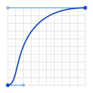
animation curve used when moving out of the way
# yarn
yarn add react-beautiful-dnd

# npm
npm install react-beautiful-dnd --saveSo how do you use the library?
In order to use drag and drop, you need to have the part of your React tree that you want to be able to use drag and drop in wrapped in a DragDropContext. It is advised to just wrap your entire application in a DragDropContext. Having nested DragDropContext's is not supported. You will be able to achieve your desired conditional dragging and dropping using the props of Droppable and Draggable. You can think of DragDropContext as having a similar purpose to the react-redux Provider component
type Hooks = {|
  onDragStart?: (initial: DragStart) => void,
  onDragEnd: (result: DropResult) => void,
|}

type Props = Hooks & {|
  children?: ReactElement,
|}import { DragDropContext } from 'react-beautiful-dnd';
class App extends React.Component {
onDragStart = () => {
/*...*/
};
onDragEnd = () => {
/*...*/
};
render() {
return (
<DragDropContext
onDragStart={this.onDragStart}
onDragEnd={this.onDragEnd}
>
<div>Hello world</div>
</DragDropContext>
);
}
}These are top level application events that you can use to perform your own state updates.
This function will get notified when a drag starts. You are provided with the following details:
initial.draggableId: the id of theDraggablethat is now dragginginitial.type: thetypeof theDraggablethat is now dragginginitial.source: the location (droppableIdandindex) of where the dragging item has started within aDroppable.
This function is optional and therefore does not need to be provided. It is highly recommended that you use this function to block updates to all Draggable and Droppable components during a drag. (See *Best practices for hooks *)
Type information
onDragStart?: (initial: DragStart) => void

// supporting types
type DragStart = {|
  draggableId: DraggableId,
  type: TypeId,
  source: DraggableLocation,
|}

type DraggableLocation = {|
  droppableId: DroppableId,
  // the position of the draggable within a droppable
  index: number
|};
type Id = string;
type DraggableId = Id;
type DroppableId = Id;
type TypeId = Id;This function is extremely important and has an critical role to play in the application lifecycle. This function must result in the synchronous reordering of a list of Draggables
It is provided with all the information about a drag:
result.draggableId: the id of theDraggablethat was dragging.result.type: thetypeof theDraggablethat was dragging.result.source: the location where theDraggablestarted.result.destination: the location where theDraggablefinished. Thedestinationwill benullif the user dropped into no position (such as outside any list) or if they dropped theDraggableback into the same position in which it started.
Because this library does not control your state, it is up to you to synchronously reorder your lists based on the result.
Here is what you need to do:
- if the
destinationisnull: all done! - if
source.droppableIdequalsdestination.droppableIdyou need to remove the item from your list and insert it at the correct position. - if
source.droppableIddoes not equaldestination.droppable, then you need to remove theDraggablefrom thesource.droppableIdlist and add it into the correct position of thedestination.droppableIdlist.
onDragEnd: (result: DropResult) => void

// supporting types
type DropResult = {|
  draggableId: DraggableId,
  type: TypeId,
  source: DraggableLocation,
  // may not have any destination (drag to nowhere)
  destination: ?DraggableLocation
|}

type Id = string;
type DroppableId = Id;
type DraggableId = Id;
type TypeId = Id;
type DraggableLocation = {|
  droppableId: DroppableId,
  // the position of the droppable within a droppable
  index: number
|};It is highly recommended that while a user is dragging that you block any state updates that might impact the amount of Draggables and Droppables, or their dimensions. Please listen to onDragStart and block updates to the Draggables and Droppables until you receive at onDragEnd.
When the user starts dragging we take a snapshot of all of the dimensions of the applicable Draggable and Droppable nodes. If these change during a drag we will not know about it.
Here are a few poor user experiences that can occur if you change things during a drag:
- If you increase the amount of nodes, then the library will not know about them and they will not be moved when the user would expect them to be.
- If you decrease the amount of nodes, then there might be gaps and unexpected movements in your lists.
- If you change the dimensions of any node, then it can cause the changed node as well as others to move at incorrect times.
- If you remove the node that the user is dragging, then the drag will instantly end
- If you change the dimension of the dragging node, then other things will not move out of the way at the correct time.
During a drag it is recommended that you add two styles to the body:
user-select: none;andcursor: grab;(or whatever cursor you want to use while dragging)
user-select: none; prevents the user drag from selecting text on the page as they drag.
cursor: [your desired cursor]; is needed because we apply pointer-events: none; to the dragging item. This prevents you setting your own cursor style on the Draggable directly based on snapshot.isDragging (see Draggable).
When an item is moved from one list to a different list, it loses browser focus if it had it. This is because React creates a new node in this situation. It will not lose focus if transitioned within the same list. The dragging item will always have had browser focus if it is dragging with a keyboard. It is highly recommended that you give the item (which is now in a different list) focus again. You can see an example of how to do this in our stories. Here is an example of how you could do it:
onDragEnd: move the item into the new list and record the id of the item that has moved- When rendering the reordered list, pass down a prop which will tell the newly moved item to obtain focus
- In the
componentDidMountlifecycle call back check if the item needs to gain focus based on its props (such as anautoFocusprop) - If focus is required - call
.focuson the node. You can obtain the node by usingReactDOM.findDOMNodeor monkey patching theprovided.innerRefcallback.
onDragStart and onDragEnd pairing
We try very hard to ensure that each onDragStart event is paired with a single onDragEnd event. However, there maybe a rogue situation where this is not the case. If that occurs - it is a bug. Currently there is no mechanism to tell the library to cancel a current drag externally.
Dynamic hooks
Your hook functions will only be captured once at start up. Please do not change the function after that. This behaviour will be changed soon to allow dynamic hooks.
Droppable components can be dropped on by a Draggable. They also contain Draggables. A Draggable must be contained within a Droppable.
import { Droppable } from 'react-beautiful-dnd';

<Droppable droppableId="droppable-1" type="PERSON">
  {(provided, snapshot) => (
    <div
      ref={provided.innerRef}
      style={{ backgroundColor: snapshot.isDraggingOver ? 'blue' : 'grey' }}
    >
      <h2>I am a droppable!</h2>
      {provided.placeholder}
    </div>
  )}
</Droppable>;droppableId: A requiredDroppableId(string)that uniquely identifies the droppable for the application. Please do not change this prop - especially during a drag.type: An optionalTypeId(string)that can be used to simply accept a class ofDraggable. For example, if you use the typePERSONthen it will only allowDraggables of typePERSONto be dropped on itself.Draggables of typeTASKwould not be able to be dropped on aDroppablewith typePERSON. If notypeis provided, it will be set to'DEFAULT'. Currently thetypeof theDraggables within aDroppablemust be the same. This restriction might be loosened in the future if there is a valid use case.isDropDisabled: An optional flag to control whether or not dropping is currently allowed on theDroppable. You can use this to implement your own conditional dropping logic. It will default tofalse.
The React children of a Droppable must be a function that returns a ReactElement.
<Droppable droppableId="droppable-1">
  {(provided, snapshot) => ({
    /*...*/
  })}
</Droppable>;
The function is provided with two arguments:
type DroppableProvided = {|
  innerRef: (?HTMLElement) => void,
  placeholder: ?ReactElement,
|}-
provided.innerRef: In order for the droppable to function correctly, you must bind theprovided.innerRefto the highest possible DOM node in theReactElement. We do this in order to avoid needing to useReactDOMto look up your DOM node. -
provided.placeholder: This is used to create space in theDroppableas needed during a drag. This space is needed when a user is dragging over a list that is not the home list. Please be sure to put the placeholder inside of the component for which you have provided the ref. We need to increase the side of theDroppableitself. This is different fromDraggablewhere theplaceholderneeds to be a sibling to the draggable node.
<Droppable droppableId="droppable-1">
  {(provided, snapshot) => (
    <div ref={provided.innerRef}>
      Good to go

      {provided.placeholder}
    </div>
  )}
</Droppable>;type DroppableStateSnapshot = {|
isDraggingOver: boolean,
|};The children function is also provided with a small amount of state relating to the current drag state. This can be optionally used to enhance your component. A common use case is changing the appearance of a Droppable while it is being dragged over.
<Droppable droppableId="droppable-1">
  {(provided, snapshot) => (
    <div
      ref={provided.innerRef}
      style={{ backgroundColor: snapshot.isDraggingOver ? 'blue' : 'grey' }}
    >
      I am a droppable!

      {provided.placeholder}
    </div>
  )}
</Droppable>;Droppables can only be dropped on byDraggables who share the sametype. This is a simple way of allowing conditional dropping. If you do not provide atypefor theDroppable, then it will only acceptDraggables which also have the default type.Draggables andDroppables both will have theirtypesset to'DEFAULT'when none is provided. There is currently no way to set multipletypes, or atypewildcard that will acceptDraggables of multiple any types. This could be added if there is a valid use case.- Using the
isDropDisabledprop you can conditionally allow dropping. This allows you to do arbitrarily complex conditional transitions. This will only be considered if thetypeof theDroppablematches thetypeof the currently draggingDraggable. - You can disable dropping on a
Droppablealtogether by always settingisDropDisabledto false. You can do this to create a list that is never able to be dropped on, but containsDraggables. - Technically you do not need to use
typeand do all of your conditional drop logic with theisDropDisabledfunction. Thetypeparameter is a convenient shortcut for a common use case.
This library supports dragging within scroll containers (DOM elements that have overflow: auto; or overflow: scroll;). The only supported use cases are:
- The
Droppablecan itself be a scroll container with no scrollable parents - The
Droppablehas one scrollable parent
Auto scrolling is not provided (yet!)
Currently auto scrolling of scroll containers is not part of this library. Auto scrolling is where the container automatically scrolls to make room for the dragging item as you drag near the edge of a scroll container. You are welcome to build your own auto scrolling list, or if you would you really like it as part of this library we could provide a auto scrolling Droppable.
Users will be able to scroll a scroll container while dragging by using their trackpad or mouse wheel.
Keyboard dragging limitation
Getting keyboard dragging to work with scroll containers is quite difficult. Currently there is a limitation: you cannot drag with a keyboard beyond the visible edge of a scroll container. This limitation could be removed if we introduced auto scrolling. Scrolling a container with a mouse during a keyboard drag will cancel the drag.
Draggable components can be dragged around and dropped onto Droppables. A Draggable must always be contained within a Droppable. It is possible to reorder a Draggable within its home Droppable or move to another Droppable. It is possible because a Droppable is free to control what it allows to be dropped on it.
Note: moving between
Droppables is currently not supported in the initial version.
import { Draggable } from 'react-beautiful-dnd';

<Draggable draggableId="draggable-1" type="PERSON">
  {(provided, snapshot) => (
    <div>
      <div
        ref={provided.innerRef}
        style={provided.draggableStyle}
        {...provided.dragHandleProps}
      >
        <h4>My draggable</h4>
      </div>
      {provided.placeholder}
    </div>
  )}
</Draggable>;
Note: when the library moves to React 16 this will be cleaned up a little bit as we will be able to return the placeholder as a sibling to your child function without you needing to create a wrapping element
draggableId: A requiredDraggableId(string)that uniquely identifies theDraggablefor the application. Please do not change this prop - especially during a drag.type: An optional type (TypeId(string)) of theDraggable. This is used to control whatDroppables theDraggableis permitted to drop on.Draggables can only drop onDroppables that share the sametype. If notypeis provided, then it will be set to'DEFAULT'. Currently thetypeof aDraggablemust be the same as its containerDroppable. This restriction might be loosened in the future if there is a valid use case.isDragDisabled: An optional flag to control whether or not theDraggableis permitted to drag. You can use this to implement your own conditional drag logic. It will default tofalse.
The React children of a Draggable must be a function that returns a ReactElement.
<Draggable draggableId="draggable-1">
  {(provided, snapshot) => (
    <div>
      <div
        ref={provided.innerRef}
        style={provided.draggableStyle}
        {...provided.dragHandleProps}
      >
        Drag me!
      </div>
      {provided.placeholder}
    </div>
  )}
</Draggable>;
The function is provided with two arguments:
type DraggableProvided = {|
  innerRef: (HTMLElement) => void,
  draggableStyle: ?DraggableStyle,
  dragHandleProps: ?DragHandleProvided,
  placeholder: ?ReactElement,
|}
Everything within the provided object must be applied for the Draggable to function correctly.
provided.innerRef (innerRef: (HTMLElement) => void): In order for theDroppableto function correctly, you must bind theinnerReffunction to theReactElementthat you want to be considered theDraggablenode. We do this in order to avoid needing to useReactDOMto look up your DOM node.
<Draggable draggableId="draggable-1">
  {(provided, snapshot) => <div ref={provided.innerRef}>Drag me!</div>}
</Draggable>;
Type information
innerRef: (HTMLElement) => voidprovided.draggableStyle (?DraggableStyle): This is anObjectornullthat contains an a number of styles that needs to be applied to theDraggable. This needs to be applied to the same node that you applyprovided.innerRefto. This controls the movement of the draggable when it is dragging and not dragging. You are welcome to add your own styles to this object – but please do not remove or replace any of the properties.
Ownership
It is a contract of this library that it owns the positioning logic of the dragging element. This includes properties such as top, right, bottom, left and transform. The library may change how it positions things and which properties it uses without performing a major version bump. It is also recommended that you do not apply your own transition property to the dragging element.
Warning: position: fixed
react-beautiful-dnd uses position: fixed to position the dragging element. This is quite robust and allows for you to have position: relative | absolute | fixed parents. However, unfortunately position:fixed is impacted by transform (such as transform: rotate(10deg);). This means that if you have a transform: * on one of the parents of a Draggable then the positioning logic will be incorrect while dragging. Lame! For most consumers this will not be an issue. We may look into creating a portal solution where we attach the dragging element to the body rather than leave it in place. However, leaving it in place is a really nice experience for everyone. For now we will leave it as is, but feel free to raise an issue if you this is important to you.
Usage of draggableStyle
<Draggable draggableId="draggable-1">
  {(provided, snapshot) => (
    <div>
      <div ref={provided.innerRef} style={provided.draggableStyle}>
        Drag me!
      </div>
    </div>
  )}
</Draggable>;
Extending with your own styles
<Draggable draggable="draggable-1">
  {(provided, snapshot) => {
    const style = {
      ...provided.draggableStyle,
      backgroundColor: snapshot.isDragging ? 'blue' : 'white',
      fontSize: 18,
    };
    return (
      <div>
        <div ref={provided.innerRef} style={style}>
          Drag me!
        </div>
      </div>
    );
  }}
</Draggable>;
Type information
type DraggableStyle = DraggingStyle | NotDraggingStyle;

type DraggingStyle = {|
  pointerEvents: 'none',
  position: 'fixed',
  width: number,
  height: number,
  boxSizing: 'border-box',
  top: number,
  left: number,
  margin: 0,
  transform: ?string,
  zIndex: ZIndex,
|}

type NotDraggingStyle = {|
  transition: ?string,
  transform: ?string,
  pointerEvents: 'none' | 'auto',
|};
provided.placeholder (?ReactElement)TheDraggableelement hasposition: fixedapplied to it while it is dragging. The role of theplaceholderis to sit in the place that theDraggablewas during a drag. It is needed to stop theDroppablelist from collapsing when you drag. It is advised to render it as a sibling to theDraggablenode. This is unlikeDroppablewhere theplaceholderneeds to be within theDroppablenode. When the library moves toReact16 theplaceholderwill be removed from api.
<Draggable draggableId="draggable-1">
  {(provided, snapshot) => (
    <div>
      <div ref={provided.innerRef} style={provided.draggableStyle}>
        Drag me!
      </div>
      {/* Always render me - I will be null if not required */}
      {provided.placeholder}
    </div>
  )}
</Draggable>;
provided.dragHandleProps (?DragHandleProps)everyDraggablehas a drag handle. This is what is used to drag the wholeDraggable. Often this will be the same node as theDraggable, but sometimes it can be a child of theDraggable.DragHandlePropsneed to be applied to the node that you want to be the drag handle. This is a number of props that need to be applied to theDraggablenode. The simplest approach is to spread the props onto the draggable node ({...provided.dragHandleProps}). However, you are also welcome to monkey patch these props if you also need to respond to them. DragHandleProps will benullwhenisDragDisabledis set totrue.
Type information
type DragHandleProps = {|
  onMouseDown: (event: MouseEvent) => void,
  onKeyDown: (event: KeyboardEvent) => void,
  onClick: (event: MouseEvent) => void,
  tabIndex: number,
  'aria-grabbed': boolean,
  draggable: boolean,
  onDragStart: () => void,
  onDrop: () => void,
|};
Standard example
<Draggable draggableId="draggable-1">
  {(provided, snapshot) => (
    <div>
      <div
        ref={provided.innerRef}
        style={provided.draggableStyle}
        {...provided.dragHandleProps}
      >
        Drag me!
      </div>
      {provided.placeholder}
    </div>
  )}
</Draggable>;
Custom drag handle
<Draggable draggableId="draggable-1">
  {(provided, snapshot) => (
    <div>
      <div ref={provided.innerRef} style={provided.draggableStyle}>
        <h2>Hello there</h2>
        <div {...provided.dragHandleProps}>Drag handle</div>
      </div>
      {provided.placeholder}
    </div>
  )}
</Draggable>;
Monkey patching
If you want to also use one of the props in
DragHandleProps
const myOnClick = event => console.log('clicked on', event.target);

<Draggable draggableId="draggable-1">
  {(provided, snapshot) => {
    const onClick = (() => {
      // dragHandleProps might be null
      if (!provided.dragHandleProps) {
        return myOnClick;
      }

      // creating a new onClick function that calls my onClick
      // event as well as the provided one.
      return event => {
        provided.dragHandleProps.onClick(event);
        // You may want to check if event.defaultPrevented
        // is true and optionally fire your handler
        myOnClick(event);
      };
    })();

    return (
      <div>
        <div
          ref={provided.innerRef}
          style={provided.draggableStyle}
          {...provided.dragHandleProps}
          onClick={onClick}
        >
          Drag me!
        </div>
        {provided.placeholder}
      </div>
    );
  }}
</Draggable>;type DraggableStateSnapshot = {|
isDragging: boolean,
|};The children function is also provided with a small amount of state relating to the current drag state. This can be optionally used to enhance your component. A common use case is changing the appearance of a Draggable while it is being dragged. Note: if you want to change the cursor to something like grab you will need to add the style to the body. (See DragDropContext > style above)
<Draggable draggableId="draggable-1">
  {(provided, snapshot) => {
    const style = {
      ...provided.draggableStyle,
      backgroundColor: snapshot.isDragging ? 'blue' : 'grey',
    };

    return (
      <div>
        <div
          ref={provided.innerRef}
          style={style}
          {...provided.dragHandleProps}
        >
          Drag me!
        </div>
        {provided.placeholder}
      </div>
    );
  }}
</Draggable>;It is possible for your Draggable to be an interactive element such as a <button> or an <a>. However, there may be a situation where you want your Draggable element be the parent of an interactive element such as a <button> or an <input>. By default the child interactive element will not be interactive. Interacting with these nested interactive elements will be used as part of the calculation to start a drag. This is because we call event.preventDefault() on the mousedown event for the Draggable. Calling preventDefault will prevent the nested interactive element from performing its standard actions and interactions. What you will need to do is opt out of our standard calling of event.preventDefault(). By doing this the nested interactive element will not be able to be used to start a drag - but will allow the user to interact with it directly. Keep in mind - that by doing this the user will not be able to drag the Draggable by dragging on the interactive child element - which is probably what you want anyway. There are a few ways you can get around the standard preventDefault behaviour. Here are some suggestions:
1. Call event.stopPropagation() on the interactive element mousedown
This is the simpler solution
On the child element, call event.stopPropagation() for the onMouseDown function. This will stop the event bubbling up to the Draggable and having event.preventDefault() called on it. The Draggable will not be aware that a mousedown has even occurred.
<input
  // stop event from bubbling up to Draggable where it will be prevented
  onMouseDown={e => e.stopPropagation()}
/>
2. Patch the onMouseDown event in provided
This is the more complex solution
If you cannot use the first solution, then you can consider patching the provided > onMouseDown function. The main idea of this approach is to add additional behaviour to the existing onMouseDown function - only calling it when it should be called.
class DraggableWithSelect extends Component {

  renderSelect = (provided) => {
    // Patched onMouseDown handler
    const onMouseDown = (event) => {
      // If mouse down is on a select, then do not
      // let react-beautiful-dnd do anything with it
      if(event.target.nodeName === 'SELECT') {
        return;
      }
      provided.dragHandleProps.onMouseDown(event);
    }

    // patching drag handle props
    const patched = {
      ...provided.dragHandleProps,
      onMouseDown,
    }

    return (
      <div>
        <div
          ref={provided.innerRef}
          style={getItemStyle(
            provided.draggableStyle,
            snapshot.isDragging
          )}
          {...patched}
        >
          <select>
            <option>One</option>
            <option>Two</option>
            <option>Three</option>
          </select>
        </div>
        {provided.placeholder}
      </div>
    );
  }

  render() {
    return (
      <Draggable draggableId="draggable-1">
        {this.renderSelect}
      </Draggable>
    );
  }
}react-beautiful-dnd is typed using flowtype. This greatly improves internal consistency within the codebase. We also expose a number of public types which will allow you to type your javascript if you would like to. If you are not using flowtype this will not inhibit you from using the library. It is just extra safety for those who want it.
// id's
type Id = string;
type TypeId = Id;
type DroppableId = Id;
type DraggableId = Id;

// hooks
type DropResult = {|
  draggableId: DraggableId,
  type: TypeId,
  source: DraggableLocation,
  // may not have any destination (drag to nowhere)
  destination: ?DraggableLocation
|}

type DraggableLocation = {|
  droppableId: DroppableId,
  // the position of the droppable within a droppable
  index: number
|};

// Droppable
type DroppableProvided = {|
  innerRef: (?HTMLElement) => void,
  placeholder: ?ReactElement,
|}

type DraggableStateSnapshot = {|
  isDraggingOver: boolean,
|}

// Draggable
type DraggableProvided = {|
  innerRef: (?HTMLElement) => void,
  draggableStyle: ?DraggableStyle,
  dragHandleProps: ?DragHandleProvided,
  placeholder: ?ReactElement,
|}

type DraggableStateSnapshot = {|
  isDragging: boolean,
|}

type DraggableStyle = DraggingStyle | NotDraggingStyle
type DraggingStyle = {|
  pointerEvents: 'none',
  position: 'fixed',
  width: number,
  height: number,
  boxSizing: 'border-box',
  top: number,
  left: number,
  margin: 0,
  transform: ?string,
  zIndex: ZIndex,
|}
type NotDraggingStyle = {|
  transition: ?string,
  transform: ?string,
  pointerEvents: 'none' | 'auto',
|}
type DragHandleProvided = {|
  onMouseDown: (event: MouseEvent) => void,
  onKeyDown: (event: KeyboardEvent) => void,
  onClick: (event: MouseEvent) => void,
  tabIndex: number,
  'aria-grabbed': boolean,
  draggable: boolean,
  onDragStart: () => void,
  onDrop: () => void
|}The types are exported as part of the module so using them is as simple as:
import type { DroppableProvided } from 'react-beautiful-dnd';We have created a sample application which exercises the flowtypes. It is a super simple React project based on react-create-app. You can use this as a reference to see how to set things up correctly.
react-beautiful-dnd currently uses flow 0.52 which is not the latest version. However, we are not able to upgrade until eslint-plugin-react supports it - more details
This codebase is typed with flowtype to promote greater internal consistency and more resilient code.
This code base employs a number of different testing strategies including unit, performance and integration tests. Testing various aspects of the system helps to promote its quality and stability.
While code coverage is not a guarantee of code health, it is a good indicator. This code base currently sits at ~95% coverage.
This codebase is designed to be extremely performant - it is part of its DNA. It builds on prior investigations into React performance that you can read about here and here. It is designed to perform the minimum number of renders required for each task.
Highlights
- using connected-components with memoization to ensure the only components that render are the ones that need to - thanks
react-redux,reselectandmemoize-one - all movements are throttled with a
requestAnimationFrame- thanksraf-schd - memoization is used all over the place - thanks
memoize-one - conditionally disabling
pointer-eventsonDraggables while dragging to prevent the browser needing to do redundant work - you can read more about the technique here - Non primary animations are done on the GPU
| Minimal browser paints | Minimal React updates |
|---|---|
 |
 |
This library supports the standard Atlassian supported browsers for desktop:
| Desktop | Version |
|---|---|
| Microsoft Internet Explorer(Windows) | Version 11 |
| Microsoft Edge | Latest stable version supported |
| Mozilla Firefox (all platforms) | Latest stable version supported |
| Google Chrome (Windows and Mac) | Latest stable version supported |
| Safari (Mac) | Latest stable version on latest OS release supported |
Currently mobile is not supported. However, there are plans to add touch support in the future
The documentation for this library is also available in other languages:
 Korean: leehyunggeun/react-beautiful-dnd
These translations are maintained by the community and are not reviewed or maintained by the maintainers of this library. Please raise issues on the respective translations if you would like to have them updated.
Alex Reardon - @alexandereardon - [email protected]
Jared Crowe - @jaredjcrowe - [email protected]


 React
React
 Typescript
 Django
 Laravel
 Facebook
 Microsoft
 Google
 Alibaba
 D3
D3
 Tencent