An Angular directive that creates a numeric keypad.
Comments and Pull Requests welcome!
npm install angular-keypad --savebower install angular-keypad --save- Angular.js (~1.4.0)
Include bc.AngularKeypad as a dependency in your project.
angular.module('YourModule', ['bc.AngularKeypad']);Use the directive anywhere in your HTML. The keypad will expand to fill the width of it's container while maintaining the aspect ratio of the keypad buttons.
<!-- Define the keypad: -->
<bc-keypad
  bc-number-model="vm.numbers"
  bc-max-length="{{ vm.neededLength }}"
></bc-keypad>Required: String
The directive will expose the current string of numbers to this model.
Optional: Integer
The directive will use this number to set a hard limit on how many characters are allowed in the
number model (vm.numbers in the example below).
<bc-keypad
  bc-number-model="vm.numbers"
  bc-max-length="4"
></bc-keypad>The included styles are 99% layout with just enough style to work out of the box. The true styles should be written at your project level using the associated classes.
Your project CSS should always be included after any library CSS files. This makes it easy for you to override or add to any styles added by this module. Below are the classes available for styling.
This targets the primary container (<div>) around the keypad.
This targets all buttons (<button>) on the keypad.
This targets the 'backspace' button (<button>) on the keypad.
The bc-keypad directive was written for mobile where :hover cannot be used for interaction
styles. At the time, we chose to implement the Material design 'ripple' effect to fill this gap.
As not everyone may want that style of interaction, this project does not automatically install the
angular-ripple library, but is however built to support it out of the box. Simply install the
angular-ripple in your primary project and you should see it working.
- angular-ripple: The original
angular-ripplelibrary. - KL-Moment/angular-ripple: Custom fork of
angular-ripplelibrary with better mobile support.
This module exposes KeypadConfigProvider which can be used to set project-wide defaults for the
directive. Setting options here will overwrite the directive's default options for all instances.
// ES6 Config Example
export function config(KeypadConfigProvider) {
    'ngInject';

        // Define a custom 'backspace' icon
        // This must be an SVG template
        KeypadConfigProvider.backspaceTemplate = myCustomTemplate;

        // Set a max length allowed for the model
        KeypadConfigProvider.maxLength = null;

        // Create a custom array or order of numbers
        KeypadConfigProvider.numbers = [1, 2, 3, 4, 5, 6, 7, 8, 9, 0];

}

// ES5 Config Example
angular.module('myModule')
    .config((KeypadConfigProvider) => {
        'ngInject';

        KeypadConfigProvider.backspaceTemplate = myCustomTemplate;

    })
;
The template must be a raw SVG. This enables you to override the color of the SVG via CSS.
You can define a custom backspace template for the keypad. By default it is using
ion-backspace-outline from ionicons.

KeypadConfigProvider.backspaceTemplate = myCustomTemplate;
Integer
The directive will use this number to impose a hard limit on how many characters the model can hold. This is useful for specific data items such as a phone number:
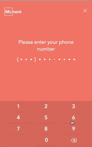
KeypadConfigProvider.maxLength = 6;
Array
This array of numbers is used to build out the keypad with ng-repeat. You can overwrite this array
with one of your own. Keep in mind that changing more than the order of numbers will likely
introduce layout bugs.
KeypadConfigProvider.numbers = [9, 8, 7, 6, 5, 4, 3, 2, 1, 0];
Demo using custom numbers array (Plunker)
npm run build- Build JS/CSS/HTML/SVGnpm run build:js- Build JSnpm run build:css- Build CSSnpm run watch:css- Watch CSS and rebuild on changenpm run watch:js- Watch JS/HTML and rebuild on changenpm run watch- Watch JS/CSS/HTML and rebuild on change
 React
React
 Typescript
 Django
 Laravel
 Facebook
 Microsoft
 Google
 Alibaba
 D3
D3
 Tencent