Giter Site home page Giter Site logo

costachung / neumorphic Goto Github PK

View Code? Open in Web Editor NEW
789.0 13.0 61.0 2.46 MB

🚀Neumorphic is a SwiftUI utility to build Neumorphism Soft UI (supports both *outer shadow and *inner shadow)

License: MIT License

Swift 100.00%
neumorphic neumorphism swiftui ios swift swift-library

neumorphic's Introduction

Neumorphic SwiftUI : Neumorphism Soft UI

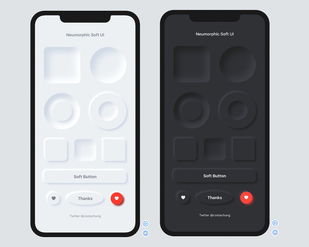
Neumorphic is a SwiftUI utility to build Neumorphism Soft UI easily using custom view modifier and custom button style. It supports all shapes.

Hi, I’m Costa. It is simple to create outer shadow in SwiftUI by writing two lines of code. However, we can’t easily create inner shadow in SwiftUI. That’s the reason why I build this tool to make it simple and reusable.

Image of Neumorphic SwiftUI

Installation

Requirements .iOS(.v13),.macOS(.v10_15)

Swift Package Manager

  1. In Xcode, open your project and navigate to File → Swift Packages → Add Package Dependency.
  2. Paste the repository URL (https://github.com/costachung/neumorphic/) and click Next.
  3. For Rules, select version.
  4. Click Finish.

Swift Package

.package(url: "https://github.com/costachung/neumorphic/", .upToNextMajor(from: "2.0.5"))

Usage

Import Neumorphic package to your view.

import Neumorphic

Simply use .softOuterShadow and .softInnerShadow methods to create outer shadow and inner shadow respectively.

Create Rounded Rectangle with Outer Shadow

Neumorphic SwiftUI Outer Shadow

RoundedRectangle(cornerRadius: 20).fill(Color.Neumorphic.main).softOuterShadow()

Create Rounded Rectangle with Inner Shadow

Neumorphic SwiftUI Inner Shadow

RoundedRectangle(cornerRadius: 20).fill(Color.Neumorphic.main).softInnerShadow(RoundedRectangle(cornerRadius: 20))

Create Circles

Neumorphic SwiftUI Circles

  HStack {
      Circle().fill(Color.Neumorphic.main).softOuterShadow()
      Circle().fill(Color.Neumorphic.main).softInnerShadow(Circle())
  }

Create Soft Button

Neumorphic SwiftUI Button

Button(action: {}) {
    Text("Soft Button").fontWeight(.bold)
}
.softButtonStyle(RoundedRectangle(cornerRadius: 20))

Create Soft Button with custom style

Neumorphic SwiftUI Button

HStack {
    Button(action: {}) {
        Image(systemName: "heart.fill")
    }.softButtonStyle(Circle())

    Button(action: {}) {
        Image(systemName: "heart.fill")
    }.softButtonStyle(Circle(), mainColor: Color.red, textColor: Color.white, darkShadowColor: Color(rgb: 0x993333, alpha: 1), lightShadowColor:Color("redButtonLightShadow"))
}

Customization

softInnerShadow

You can change the color, spread of the shadow, and the shadow radius of the inner shadow.

softInnerShadow<S : Shape>(_ content: S, darkShadow: Color, lightShadow: Color, spread: CGFloat, radius: CGFloat)

softOuterShadow

You can change the color, offset of the shadow, and the shadow radius of the outer shadow.

softOuterShadow(darkShadow: Color, lightShadow: Color, offset: CGFloat, radius:CGFloat)

Neumorphic SwiftUI Search bar

Example of using background method to add it under TextField:

            VStack {
                HStack {
                    Image(systemName: "magnifyingglass").foregroundColor(secondaryColor).font(Font.body.weight(.bold))
                    TextField("Search ...", text: $name).foregroundColor(secondaryColor)
                }
                .padding()
                .background(
                    RoundedRectangle(cornerRadius: 30).fill(mainColor)
                    .softInnerShadow(RoundedRectangle(cornerRadius: 30), darkShadow: darkShadowColor, lightShadow: lightShadowColor, spread: 0.05, radius: 2)
                )
            }
            .padding()

Or, something like this:

Neumorphic SwiftUI bar chart

ZStack(alignment: .bottom){
                RoundedRectangle(cornerRadius: 20).fill(mainColor)
                .softInnerShadow(RoundedRectangle(cornerRadius: 20), darkShadow: darkShadow, lightShadow: lightShadow, spread: 0.3, radius: 2)
                .frame(width: 30, height:150)
                
                RoundedRectangle(cornerRadius: 20).fill(barColor)
                    .frame(width: 30, height:100)
            }

Example Project

Check out the neumorphic-examples XCode project to see how to build neumorphic UI and buttons. If you use the default shadow colors of Neumorphic, you can also get dark mode support for free.

Soft Button Style Customization

softButtonStyle<S : Shape>(_ content: S, padding: CGFloat, mainColor: Color, textColor: Color, darkShadowColor: Color, lightShadowColor: Color, pressedEffect: SoftButtonPressedEffect)

Soft Button - Pressed Effects

ezgif-4-88fec6ab5eaa

                    HStack {
                        Spacer()
                        Button(action: {}) {
                            Text(".none").fontWeight(.bold)
                        }.softButtonStyle(Capsule(), pressedEffect: .none)
                        Spacer()
                        Button(action: {}) {
                            Text(".flat").fontWeight(.bold)
                        }.softButtonStyle(Capsule(), pressedEffect: .flat)
                        Spacer()
                        Button(action: {}) {
                            Text(".hard").fontWeight(.bold)
                        }.softButtonStyle(Capsule(), pressedEffect: .hard)
                        Spacer()
                    }

Soft Toggle

SoftSwitchToggleStyle

Screen Shot 2020-12-12 at 4 16 16 PM

Toggle("Toggle", isOn: $toggleIsOn)
  .softSwitchToggleStyle(tint: .green, labelsHidden: true)

SoftToggleStyle

b500

For example, Play and Stop Button

    Toggle(isOn: $toggleIsOn, label: {
        if toggleIsOn {
            Image(systemName: "stop.fill")
                .font(.title)
        }
        else{
            Image(systemName: "play.fill")
                .font(.title)
        }
    })
    .softToggleStyle(Circle(), padding: 20)

Auto, Light, and Dark Mode for iOS and MacOS

Default Neumorphic Colors

Access default neumorphic colors using Color.Neumorphic, for example,

Color.Neumorphic.main

Auto ColorScheme

  • Color.Neumorphic supports light and dark mode on both iOS and MacOS automatically by default.

Set the color scheme manually

  • When you use default neumorphic colors and you want to set the color scheme manually, you can do it by setting Color.Neumorphic.colorSchemeType to the type you want. For example, to force the color scheme in dark mode, use:
Color.Neumorphic.colorSchemeType = .dark

Contacts

https://twitter.com/costachung

License

Neumorphic Package is released under the MIT license. See the LICENSE file for more info.

neumorphic's People

Contributors

costachung avatar dkk avatar l1cardo avatar themisfit68 avatar

Stargazers

 avatar  avatar  avatar  avatar  avatar  avatar  avatar  avatar  avatar  avatar  avatar  avatar  avatar  avatar  avatar  avatar  avatar  avatar  avatar  avatar  avatar  avatar  avatar  avatar  avatar  avatar  avatar  avatar  avatar  avatar  avatar  avatar  avatar  avatar  avatar  avatar  avatar  avatar  avatar  avatar  avatar  avatar  avatar  avatar  avatar  avatar  avatar  avatar  avatar  avatar  avatar  avatar  avatar  avatar  avatar  avatar  avatar  avatar  avatar  avatar  avatar  avatar  avatar  avatar  avatar  avatar  avatar  avatar  avatar  avatar  avatar  avatar  avatar  avatar  avatar  avatar  avatar  avatar  avatar  avatar  avatar  avatar  avatar  avatar  avatar  avatar  avatar  avatar  avatar  avatar  avatar  avatar  avatar  avatar  avatar  avatar  avatar  avatar  avatar  avatar

Watchers

 avatar  avatar  avatar  avatar  avatar  avatar  avatar  avatar  avatar  avatar  avatar  avatar  avatar

neumorphic's Issues

Question: Disabled button style?

Hi,

We are implementing a neumorphic login screen using your library, so far looks great! 👍

I was wandering if there is a way to customize the style for the login button when it is disabled without extending SoftButtonStyle (or similar)? for example set it as 'flat' and with a different text color.

Support for Toggle

Hi,

I love the project, but needed support for Toggle instead of a normal button (to make the button stick when pressed)
I created a SoftToggleStyle based on SoftButtonStyle (with only minor modifications).

`
extension Toggle {

public func SoftToggleStyle<S : Shape>(_ content: S, padding : CGFloat = 16, mainColor : Color = Neumorphic.shared.mainColor(), textColor : Color = Neumorphic.shared.secondaryColor(), darkShadowColor: Color = Neumorphic.shared.darkShadowColor(), lightShadowColor: Color = Neumorphic.shared.lightShadowColor(), pressedEffect : SoftButtonPressedEffect = .hard) -> some View {
    self.toggleStyle(SoftDynamicToggleStyle(content, mainColor: mainColor, textColor: textColor, darkShadowColor: darkShadowColor, lightShadowColor: lightShadowColor, pressedEffect : pressedEffect, padding:padding))
}

public struct SoftDynamicToggleStyle<S: Shape> : ToggleStyle {
    
    var shape: S
    var mainColor : Color
    var textColor : Color
    var darkShadowColor : Color
    var lightShadowColor : Color
    var pressedEffect : SoftButtonPressedEffect
    var padding : CGFloat
    
    public init(_ shape: S, mainColor : Color, textColor : Color, darkShadowColor: Color, lightShadowColor: Color, pressedEffect : SoftButtonPressedEffect, padding : CGFloat = 16) {
        self.shape = shape
        self.mainColor = mainColor
        self.textColor = textColor
        self.darkShadowColor = darkShadowColor
        self.lightShadowColor = lightShadowColor
        self.pressedEffect = pressedEffect
        self.padding = padding
    }
    
    public func makeBody(configuration: Self.Configuration) -> some View {
        
        ZStack{
            
            ZStack{
                if pressedEffect == .flat {
                    shape.stroke(darkShadowColor, lineWidth : configuration.isOn ? 1 : 0)
                        .opacity(configuration.isOn ? 1 : 0)
                    shape.fill(mainColor)
                }
                else if pressedEffect == .hard {
                    shape.fill(mainColor)
                        .softInnerShadow(shape, darkShadow: darkShadowColor, lightShadow: lightShadowColor, spread: 0.15, radius: 3)
                        .opacity(configuration.isOn ? 1 : 0)
                }
                
                shape.fill(mainColor)
                    .softOuterShadow(darkShadow: darkShadowColor, lightShadow: lightShadowColor, offset: 6, radius: 3)
                    .opacity(pressedEffect == .none ? 1 : (configuration.isOn ? 0 : 1) )
            }
            
            configuration.label.foregroundColor(textColor)
            
        }
        .padding(padding)
        .scaleEffect(configuration.isOn ? 0.97 : 1)
    }
    
}

}
`

Using tabview.

This module is very useful !!
Do you plan to support tabviews?

'init(red:green:blue:alpha:)' is unavailable in iOS

Hello, I tried nearly everything to fix that error at all lines in ColorExtensions.swift which include CGColor(...) and give the message "'init(red:green:blue:alpha:)' is unavailable in iOS".
Maybe the solution is obvious but I'm a beginner and can't solve the problem on my own until yet.

Thanks for any kind of help.
Bildschirmfoto 2021-02-14 um 22 03 46

How to get rid off the frame modifier - get the size of the button view

Again I try to get the smallest size of a button for dynamic text sizes. Could you point me in the right direction? I have no idea how to get the button size determined by the SF Symbol size.

struct HeaderButtonRowView: View {
    var colorScheme: ColorScheme

    var body: some View {
        NeoColors.shared.colorScheme = colorScheme
        return HStack {
            Button(action: {
                logger.info("cancel")
            }) {
                HStack(alignment: .center, spacing: 10) {
                    Image(systemName: "xmark")
                        .font(Font.title.weight(.bold))
                }
                
            }
            .softButtonStyle(RoundedRectangle(cornerRadius: 15, style: .continuous), mainColor: NeoColors.shared.background(), textColor: NeoColors.shared.accent(), darkShadowColor: NeoColors.shared.dark(), lightShadowColor: NeoColors.shared.light())
//            .frame(width: 50, height: 50)
            Spacer()
            Button(action: {
                logger.info("OK")
            }) {
                Image(systemName: "checkmark").font(Font.title.weight(.bold))
            }
            .softButtonStyle(RoundedRectangle(cornerRadius: 15, style: .continuous), mainColor: NeoColors.shared.background(), textColor: NeoColors.shared.accent(), darkShadowColor: NeoColors.shared.dark(), lightShadowColor: NeoColors.shared.light())
            .frame(width: 50, height: 50)

        }
        .padding()
    }
}

Screen Shot 2020-05-31 at 16 52 57

By default, it should adapt to the system's colorScheme setting

Right now, .lightis used as the default colorScheme. Instead, the colorScheme should be taken from the system's colorScheme setting. Otherwise, when using the library, you have to make sure that Neumorphic's colorScheme updates with the system's colorScheme manually.

@Environment(\.colorScheme) can be used for that.

Custom Shapes?

Hey, thanks for your great framework.
While I am trying to use it a Rectangle() with my extension it throws error and does not accept it

struct RoundedCorner: Shape {
    var radius: CGFloat = .infinity
    var corners: UIRectCorner = .allCorners
    func path(in rect: CGRect) -> Path {
        let path = UIBezierPath(roundedRect: rect, byRoundingCorners: corners, cornerRadii: CGSize(width: radius, height: radius))
        return Path(path.cgPath)
    }
}
extension View {
    func cornerRadius(_ radius: CGFloat, corners: UIRectCorner) -> some View {
        clipShape( RoundedCorner(radius: radius, corners: corners) )
    }
}

Is there any workaround?

Add animation on button press

An animation modifier could be added to the makeBody function so the button "seems" to be pressed. Maybe also add a Bool parameter into the modifier for activating/deactivating the animation. Something like:

Button{...}.softButtonStyle(shape, animated: true)

SPM support

It would be great if you added Swift Package Manager support

Easy multicolor support

Found an excellent idea online
to get a neumorphic design compatible with all kind of color schemes,
but without having to provide color-assets or custom shadows for each color used:

The default dark and light shadows are just black and white and get blended onto the design

`.shadow(color: .white, radius: 15, x: -10, y: -10)

.shadow(color: .black, radius: 15, x: 10, y: 10)

.blendMode(.overlay)`

This could greatly simplify the implementation as the project supports more and more controls.

Just an interesting idea

Button state: keeping them as pressed option

Great package, made my life so much easier! Thank you for that.

I've implemented a custom TabBar/TabView. and was wondering if it would be possible to have a button state that remains pressed, when the tab is selected. Is that something already possible with the latest version?

Thank you :)

Recommend Projects

  • React photo React

    A declarative, efficient, and flexible JavaScript library for building user interfaces.

  • Vue.js photo Vue.js

    🖖 Vue.js is a progressive, incrementally-adoptable JavaScript framework for building UI on the web.

  • Typescript photo Typescript

    TypeScript is a superset of JavaScript that compiles to clean JavaScript output.

  • TensorFlow photo TensorFlow

    An Open Source Machine Learning Framework for Everyone

  • Django photo Django

    The Web framework for perfectionists with deadlines.

  • D3 photo D3

    Bring data to life with SVG, Canvas and HTML. 📊📈🎉

Recommend Topics

  • javascript

    JavaScript (JS) is a lightweight interpreted programming language with first-class functions.

  • web

    Some thing interesting about web. New door for the world.

  • server

    A server is a program made to process requests and deliver data to clients.

  • Machine learning

    Machine learning is a way of modeling and interpreting data that allows a piece of software to respond intelligently.

  • Game

    Some thing interesting about game, make everyone happy.

Recommend Org

  • Facebook photo Facebook

    We are working to build community through open source technology. NB: members must have two-factor auth.

  • Microsoft photo Microsoft

    Open source projects and samples from Microsoft.

  • Google photo Google

    Google ❤️ Open Source for everyone.

  • D3 photo D3

    Data-Driven Documents codes.