dooboolab-community / dooboo-ui Goto Github PK
View Code? Open in Web Editor NEWUI Framework which mainly targets Expo
License: MIT License
UI Framework which mainly targets Expo
License: MIT License


Hi. I'm having good time reading code from dooboo-ui.
But I think some test code in dooboo-ui needs improvements.
Is your feature request related to a problem? Please describe.
Quite a lot of test code is not self-explanatory, it's just snapshot testing.
// every test code is almost same as below

testingLib = render(component);

const json = testingLib.toJSON();

expect(json).toMatchSnapshot();
Describe the solution you'd like
I think it might be better if components are tested using assertions in testing-library, context, given.
Describe alternatives you've considered
If there are reasons to stick to snapshot testing(ofcourse there's some situation hard to test without it), I think at least code organizing with context/given, and removing let might be great.
// ex
let props: any;
let component: ReactElement;
let testingLib: RenderAPI;
Additional context
I found article which is similar to my opinion. Maybe it will let you understand my point.
I'm not experienced programmer so maybe there's something I missed. Then please let me know. If you think part of my idea is acceptable, I'll be working on it.
Thanks.
Previously, we deprecated @dooboo-ui/theme package and merged the theme to dooboo-ui which is the main package. The reason was that other UI frameworks also have their own ThemeProvider in their core package and we wanted to serve a similar experience to developers.
However, according to #104, and thinking further, we also want to minimize default design in separate dooboo-ui package libraries like @dooboo-ui/alert-dialog.
When trying to support the same theme to other coming package libraries, we found that we need to maintain theme in a separate package.
This can also lead to another advantage for other independent UI libraries who wish to use our theme package which is designed to support light and dark themes in default.
Describe the bug
Need to fix margin for the gap between the buttons.
The units for the web and mobile are different.
I forgot to check the style in web env.
My bad, I will fix the problem ASAP.
To Reproduce
Steps to reproduce the behavior:
got to : url > FAB > click FAB
https://dooboolab.github.io/dooboo-ui/
Expected behavior
Needs more gap between buttons
Screenshots

Desktop (please complete the following information):
Describe the bug
Unable to use Prompt in [AlertDialog]
To Reproduce
When click Prompt in storybook, error occurs.
Expected behavior
Type words in text input.
Screenshots
Video

I offer an image slider.
Image sliders(also known as image carousels or slideshows) can be a convenient way to display multiple images.
I think that there are many cases where multiple images need to be displayed on mobile.
It will be useful in such a situation.

Is your feature request related to a problem? Please describe.
Currently, packages such as AlertDialog does not support theme.
Describe the solution you'd like
Due to @dooboo-ui/theme, it is possible to support theme in package without installing entire dooboo-ui.
Is your feature request related to a problem? Please describe.
When I customized bacgkroundColor or color to dark, It's hard to see a [LoadingElement] since loading color is fixed with text.basic.
Describe the solution you'd like
I think providing a loading styles props would be great. And how about making the [LoadingElement] have the same color as the text color?
I like chained ternaries and I love how they used in this project.
But I think sometimes chained ternaries are not the best option. (depends on logic)
For example, I think above code snippet might be more readable and sustainable when written like this :
{
...

  background-color: ${({theme, type, outlined, disabled}) => {
    if (disabled) return undefined;

    if (outlined) return theme.background;

    return theme[type ?? 'primary'];
  }};
}
Please let me know your opinion on this. 😄
Is your feature request related to a problem? Please describe.
I'd like to change the file path of the project to the absolute path format.
Describe the solution you'd like
Because it uses many files such as components, storybooks, and styles, I think it will improve code readability if I modify it to the absolute path.
Describe alternatives you've considered
reactnative.dev
This official document describes how to install the babel-plugin-module-resolver to introduce an absolute path. You can also install the babel-plugin-root-import.
Additional context
Is there any problem installing this package or using the absolute path? I'd appreciate it if you could leave a comment.
There is an error with this repository's Renovate configuration that needs to be fixed. As a precaution, Renovate will stop PRs until it is resolved.
Location: renovate.json
Error type: The renovate configuration file contains some invalid settings
Message: Invalid configuration option: packageRule
Describe the bug
The Contribution Guide document contains an invalid link.
Looking at the history, it seems that it was added in 2019 and then disappeared at some point.
To Reproduce
Expected behavior
I want to know dooboolab's vision-and-mission and code of conduct.
Screenshots

Is your feature request related to a problem? Please describe.
I think it would be better to add rightElement props to [EditText] component.
For example, Password input can have lock icon on the right to toggle password value visibility.

Describe the solution you'd like
Add rightElement?: ReactElement props to [EditText].
Describe alternatives you've considered
A clear and concise description of any alternative solutions or features you've considered.
Additional context
Add any other context or screenshots about the feature request here.
Is your feature request related to a problem? Please describe.
In our docs, we provide each Dark and Light theme separately to show how they look different.
However, this document does not look natural because, in every doc, two different theme components are shown which makes user hard to read.
For example, in our doc

We don't want to copy and paste the same components to show
dark modecomponents.
Describe the solution you'd like
Use the switch to toggle the theme and check out different styles. Maybe using storybook-dark-mode might help.
Describe alternatives you've considered
N/A
Additional Context
https://betterprogramming.pub/building-dark-mode-for-storybook-and-web-applications-99d3a0b76312
Floating action button(FAB) is a very common component in touch based devices.
There are many libraries that supports floating action button, and it is good for highlights the most important action on the page.

I think we should support FAB.
I'm proposing FAB that has the following features:
I think switch statement is uselsss here. Am I missing something?
Describe the bug
[EditText] seems to have css compile error. In project code, renderContainer has paddingVertical: 8 when decoration is boxed.

But In my node_modules, It compiles to paddingTop: 8.
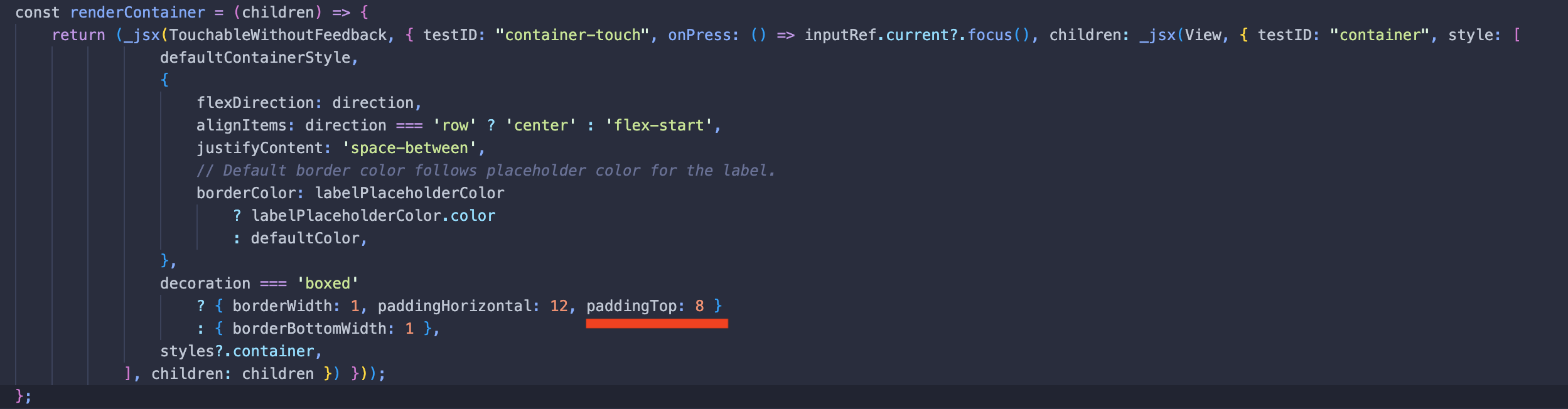
I'm currently using "dooboo-ui": "^0.2.0-rc.6".
Additional context
Add any other context about the problem here.
Describe the bug
function component link on first line in getting started is page not found
To Reproduce
Steps to reproduce the behavior:
Expected behavior
page is showing
Screenshots
none
Desktop (please complete the following information):
Smartphone (please complete the following information):
Additional context
Let's found this subject togeter!
if you have any impressed article for this subject, open PR or leave a comment
The Storybook v7 is out with many updates. Willing to migrate project.
In our dooboo-ui,dooboolab.com documentation, we'd like to remove many demos and use storybook knobs and action to visualize components.
We want to focus on implementation and not demos. In our doc, we need a minimal demo and the definition of components and props.
Is your feature request related to a problem? Please describe.
Support embedding default font to Typography would be wonderful.
Describe the solution you'd like
After loading fonts,
const [fontsLoaded] = useFonts({
  'RobotoSlab-Regular': require('../assets/fonts/RobotoSlab-Regular.ttf'),
});
Set default font like below should apply all Typography fontFamily.
setDefaultFontFamily('RobotoSlab-Regular');
Describe alternatives you've considered
N/A
Describe the bug
Custom theme type overrides default theme type even though I just make a bg property.
The theme values are works but typescript complains.

To Reproduce
Steps to reproduce the behavior:
export const light = {
  bg: {
    default: '#FFFFFF',
  },
};

export type CustomAppTheme = typeof light & DoobooTheme;

export const dark = {
  bg: {
    default: '#232323',
  },
};

export const theme = {
  light,
  dark,
};import '@emotion/react';
import type {DoobooTheme} from 'dooboo-ui';
import type {CustomAppTheme} from './theme';
type AllTheme = CustomAppTheme & DoobooTheme;
declare module '@emotion/react' {
export interface Theme extends AllTheme {
isMobile?: boolean;
isTablet?: boolean;
isDesktop?: boolean;
}
}
declare module 'dooboo-ui' {
export interface DoobooTheme extends AllTheme {
isMobile?: boolean;
isTablet?: boolean;
isDesktop?: boolean;
}
}Expected behavior
Properties which are not customized should be typed.
Describe the bug
I added @expo/match-media import statement on package/theme/ThemeProvider.tsx in #243.
But that statement is disappeared on other project's node_modules.
To Reproduce
Steps to reproduce the behavior:
"dooboo-ui": "^0.2.0-rc.3" in an expo project.node_modules/@dooboo-ui/theme/lib/ThemeProvider.js file.import '@expo/match-media'; statement are not showed.Expected behavior
A clear and concise description of what you expected to happen.
Screenshots
If applicable, add screenshots to help explain your problem.

import from '@expo/match-media' statement)
Additional context
N/A
Describe the bug
When run yarn build:storybook in macOS, sed command show error like below.
sed: eb-build/index.html: No such file or directoryTo Reproduce
yarn build:storybook command in consoleExpected behavior
it not showing error, and successfully replace /dooboo-ui with . globally.
Screenshots
If applicable, add screenshots to help explain your problem.
Desktop (please complete the following information):
Additional context
I researched it, i found it sed -i option is do differently by OS (GNU or macOS)
see stackoverflow answer
so, i changed web-build-postinstall.sh like below, then it works
sed -i '' -e 's/\/dooboo-ui/./g' web-build/index.htmlbut, i don't know that command will run at macOS. i think it maybe run on linux based container.. 🤔
so i'm not sure this issue need to be handled. 😅
Describe the bug
https://dooboo-ui.dooboolab.com/
On this demo page FAB, Icon, IconButton, LoadingIndicator, SwichToggle Components are not working.
with these error messages.

and It
To Reproduce
Describe the bug
When install dooboo-ui and use some components, error occured like below.
error: Error: Unable to resolve module react-native-vector-icons from /<some_path>/node_modules/dooboo-ui/Icon/index.js: react-native-vector-icons could not be found within the project or in these directories:
  node_modules/dooboo-ui/node_modules
  node_modules
I found missing package list
To Reproduce
npx react-native init <project_name> --template react-native-template-typescriptdooboo-ui by running yarn add doooboo-uidooboo-ui like Get Startedreact-native start and react-native run-androidExpected behavior
User don't need to install dependent packages, just installed automatically.
and don't occur "unable to resolve module error"
Screenshots
If applicable, add screenshots to help explain your problem.
Smartphone (please complete the following information):
dooboo-ui version : 0.1.23Additional context
Add any other context about the problem here.
I'm uncertain about how to use Accordion component.
if it's just expandable component, simple is better good. (one summary, one detail) like a below.
https://material-ui.com/components/accordion/#simple-accordion

if it's like a list, that component provides a lot of feature. (not only display but also clickable, linking..)
https://reactnativeelements.com/docs/next/main/usage/ListItem/ListItem/#listitem-accordion
https://material-ui.com/components/lists/#nested-list
To inject data props is very simple and awesome. (Unlike other UI framework, it's dooboo-ui's differentiation)
but i think this feature is limited in at least accordion. (because datum bodies type is string[])
In order to get a direction of how to improve, i would like to discuss them further.
Default theme is not applied correctly.
See this Codesandbox and remove ThemeProvider. It is not working properly.
Although writer provided theme with default prop / value, it is not applied.
This issue lists Renovate updates and detected dependencies. Read the Dependency Dashboard docs to learn more.
These updates have all been created already. Click a checkbox below to force a retry/rebase of any.
@babel/core, @babel/preset-react, @commitlint/cli, @commitlint/config-conventional, @dooboo/eslint-config-react-native, @emotion/react, @expo/metro-runtime, @react-native-community/datetimepicker, @react-native-community/slider, @storybook/addon-docs, @storybook/addon-essentials, @storybook/addon-links, @storybook/addon-ondevice-actions, @storybook/addon-ondevice-backgrounds, @storybook/addon-ondevice-controls, @storybook/addon-ondevice-notes, @storybook/addon-react-native-web, @storybook/addons, @storybook/react, @storybook/react-native, @storybook/react-webpack5, @testing-library/react-native, @types/jest, @types/node, @types/react-test-renderer, babel-plugin-react-native-web, eslint, eslint-plugin-storybook, expo, expo-font, expo-linear-gradient, husky, lerna, prettier, react, react-dom, react-native-vector-icons, react-test-renderer, storybook, storybook-dark-mode)babel-preset-expo, expo, expo-font, expo-linear-gradient, expo-screen-orientation, jest-expo)@storybook/addon-docs, @storybook/addon-essentials, @storybook/addon-links, @storybook/react, @storybook/react-webpack5, storybook)These are blocked by an existing closed PR and will not be recreated unless you click a checkbox below.
.github/workflows/ci.yml
actions/checkout v4actions/setup-node v4codecov/codecov-action v4.github/workflows/gh-pages.yml
actions/setup-node v4expo/expo-github-action v8peaceiris/actions-gh-pages v4.github/workflows/publish.yml
actions/checkout v4actions/setup-node v4expo/expo-github-action v8
lib/package.json
@dooboo-ui/theme ^0.12.14dooboolab-welcome ^1.3.2react-responsive ^10.0.0@emotion/native >=11.0.0@emotion/react >=11.0.0react >=16.9package.json
@emotion/native 11.11.0@emotion/react 11.11.1@expo/match-media ^0.4.0@expo/metro-runtime ^3.1.2expo ~50.0.5expo-font ~11.10.2expo-linear-gradient ~12.7.1expo-screen-orientation ~6.4.1react 18.2.0react-dom 18.2.0react-native-vector-icons ^10.0.3react-useinterval ^1.0.2@babel/core ^7.23.9@babel/preset-react ^7.23.3@commitlint/cli ^19.0.0@commitlint/config-conventional ^19.0.0@dooboo/eslint-config-react-native ^1.4.2@jest/types ^29.6.3@react-native-community/datetimepicker 8.0.0@react-native-community/slider 4.4.2@storybook/addon-docs ^7.6.13@storybook/addon-essentials ^7.6.13@storybook/addon-links ^7.6.13@storybook/addon-ondevice-actions ^7.6.11@storybook/addon-ondevice-backgrounds ^7.6.11@storybook/addon-ondevice-controls ^7.6.11@storybook/addon-ondevice-notes ^7.6.11@storybook/addon-react-native-web ^0.0.22@storybook/addons ^7.6.12@storybook/preset-typescript ^3.0.0@storybook/react ^7.6.10@storybook/react-native ^7.6.11@storybook/react-webpack5 ^7.6.10@testing-library/jest-native ^5.4.3@testing-library/react-hooks ^8.0.1@testing-library/react-native ^12.4.3@types/jest ^29.5.11@types/jest-plugin-context ^2.9.7@types/node ^20.11.15@types/react-responsive ^8.0.8@types/react-test-renderer ^18.0.7babel-loader ^9.1.3babel-plugin-react-docgen-typescript ^1.5.1babel-plugin-react-native-web ^0.19.10babel-preset-expo ^9.5.2babel-preset-react-app ^10.0.1commitlint-plugin-function-rules ^4.0.0cross-env ^7.0.3eslint ^8.56.0eslint-plugin-storybook ^0.6.15gh-pages ^6.1.1givens ^1.3.9husky ^9.0.9jest ^29.7.0jest-expo ^49.0.0jest-plugin-context ^2.9.0lerna ^8.0.2prettier ^3.2.4react-test-renderer ^18.2.0storybook ^7.6.10storybook-dark-mode ^4.0.0ts-jest ^29.1.2ts-node ^10.9.2react-docgen-typescript 2.2.2react-docgen-typescript 2.2.2react-docgen-typescript 2.2.2packages/CalendarCarousel/package.json
date-fns ^2.30.0dooboolab-welcome ^1.3.2@emotion/native ^11.0.0@emotion/react ^11.4.1@emotion/native >=11@emotion/react >=11react >=16.9date-fns *packages/GiftedChat/package.json
dooboolab-welcome ^1.3.2@emotion/native ^11.0.0@emotion/react ^11.4.1react >=16.9@emotion/react >=11@emotion/native >=11packages/PinchZoom/package.json
dooboolab-welcome ^1.3.2@emotion/native ^11.0.0@emotion/react ^11.10.4react >=16.9@emotion/react >=11@emotion/native >=11packages/theme/package.json
@expo/match-media ^0.4.0react-responsive ^10.0.0@emotion/native ^11.11.0@emotion/react ^11.11.1@emotion/native >=11@emotion/react >=11react >=16.9@expo/match-media >=0.4.0react-responsive >=9.0.0
Why don't we improve the calendar components for use with the input box?
When you touch the input box area, the calendar is displayed, and when you select a date, the corresponding date is entered in the input box.
It seems to be used a lot in this way.

I referred to airbnb's react-dates library
Is your feature request related to a problem? Please describe.
The @dooboo-ui/calendar-carousel component received from npm is returning only text component.
Describe the solution you'd like
I want to use the same calendar component as in the following example.
Describe alternatives you've considered
I think it is necessary to distribute the separate calendar component in the packages folder to npm.
Is your feature request related to a problem? Please describe.
Describe the solution you'd like
The options provided are as follows.
Additional context


Codesandbox or Snack, It will be awesome.Describe the bug
blank page in browser and error log on console after run script yarn web
To Reproduce
yarn webExpected behavior
have to show the storybook page like a github-pages
Screenshots

Desktop (please complete the following information):
Smartphone (please complete the following information):
Additional context
Storybook in docs directory is no problem
Is your feature request related to a problem? Please describe.
currently, there is no installation guide in Getting Started.
It's tiny doc, but necessary to users who are not familiar with development or this library.
and, contributing guide need to move from Getting Started to Contributing.
Describe the solution you'd like
move contributing section from Getting Started to Contributing.
add installation guide at Getting Started.
Additional context
If maintainer allow, i will do this documentation!
Describe the bug
map() should have its own key prop, but the key prop is missing or incorrectly represented.
As a result, the following warning appears.
Warning: Each child in a list should have a unique "key" prop.
To Reproduce
Steps to reproduce the behavior:
dooboo-ui clonenpm startExpected behavior
No more warning boxes, and users can use and manage their data well with key prop
Screenshots


Smartphone (please complete the following information):
Typography definitionIs your feature request related to a problem? Please describe.
It'd be good to have dooboo-ui's own AlertDialog or we should use the non fancy default dialog.
Describe the solution you'd like


Additional context
Above can be implemented in @dooboo-ui/alert-dialog as a seperate package because I think we might need react-native-modalbox.
Currently, ButtonGroup's default flex-direction is row. And border calculation is done base on it.
But, If I change it to column, It breaks.


Possible Solution: Enhance border calculation logic.
Material Design Tabs Component
Tabs components are commonly used. It will be useful for rendering other screens when selecting tabs.

I think it would be good to develop it so that we can set the number of tabs. I think it would be good to make a component with default tabs.
Describe the bug
When I add Image component directly into startElement, An error occurred like below.
  Warning: Failed prop type: Invalid props.style key `color` supplied to `Image`.
  Bad object: {
    "color": "#FFF"
  }
I think that cloneElement in this line makes a problem. Since color prop is not supported in <Image/>.
To Reproduce
Steps to reproduce the behavior:
Add <Image/> component directly into startElement in [Button]`
<Button
  startElement={<Image source={IC_MASK} />}
  text={getString('LOGIN')}
/>
Additional context
To fix this problem temporality, Wrap Image component with View.
<Button
  startElement={
    <View>
       <Image source={IC_MASK} />
    </View>
   }
  loading={isLoggingIn}
  text={getString('LOGIN')}
/>Describe the bug
Even if the app is set to dark mode in iOS, there is a problem that the dark mode theme does not apply when switching to the background.
In the past, I have made full requests on this issue.
Fix the dark mode release from iOS background
I thought I solved this problem at that time, but the frequency of occurrence decreased, but this problem still occurs.
The same problem occurs randomly.
expo/expo#10815 (comment)
This problem is very difficult to solve because it doesn't always happen when you return to the app from the background.
The issue appears to be a bug occurring in iOS and is also registered as an issue in the react-native repository.
facebook/react-native#28525
It is occurring over iOS 13.
facebook/react-native#28525 (comment)
facebook/react-native#28525 (comment)
I tried the following methods as a solution, but they were not solved.
import { Appearance, ColorSchemeName } from 'react-native';
import { useEffect, useRef, useState } from 'react';

export default function useColorScheme(delay = 500): NonNullable<ColorSchemeName> {
  const [colorScheme, setColorScheme] = useState(Appearance.getColorScheme());

  let timeout = useRef<NodeJS.Timeout | null>(null).current;

  useEffect(() => {
    Appearance.addChangeListener(onColorSchemeChange);

    return () => {
      resetCurrentTimeout();
      Appearance.removeChangeListener(onColorSchemeChange);
    };
  }, []);

  function onColorSchemeChange(preferences: Appearance.AppearancePreferences) {
    resetCurrentTimeout();

    timeout = setTimeout(() => {
      setColorScheme(preferences.colorScheme);   // <-- the preferences.colorScheme is light.
    }, delay);
  }

  function resetCurrentTimeout() {
    if (timeout) {
      clearTimeout(timeout);
    }
  }

  return colorScheme as NonNullable<ColorSchemeName>;
}
or
 const initAppearanceListener = () => {
    const listener: Appearance.AppearanceListener = ({ colorScheme } /* <-- ignore */) => {
      setColorScheme(Appearance.getColorScheme());
    };
    Appearance.addChangeListener(listener);
    return () => Appearance.removeChangeListener(listener);
  };
To Reproduce
Steps to reproduce the behavior:
Expected behavior
The dark theme should be maintained when returning the app from the background to the foreground.
Screenshots
Smartphone (please complete the following information):
Additional context
N/A
 React
React
A declarative, efficient, and flexible JavaScript library for building user interfaces.
🖖 Vue.js is a progressive, incrementally-adoptable JavaScript framework for building UI on the web.
 Typescript
TypeScript is a superset of JavaScript that compiles to clean JavaScript output.
An Open Source Machine Learning Framework for Everyone
 Django
The Web framework for perfectionists with deadlines.
 Laravel
A PHP framework for web artisans
Bring data to life with SVG, Canvas and HTML. 📊📈🎉
JavaScript (JS) is a lightweight interpreted programming language with first-class functions.
Some thing interesting about web. New door for the world.
A server is a program made to process requests and deliver data to clients.
Machine learning is a way of modeling and interpreting data that allows a piece of software to respond intelligently.
Some thing interesting about visualization, use data art
Some thing interesting about game, make everyone happy.
 Facebook
We are working to build community through open source technology. NB: members must have two-factor auth.
 Microsoft
Open source projects and samples from Microsoft.
 Google
Google ❤️ Open Source for everyone.
 Alibaba
Alibaba Open Source for everyone
 D3
D3
Data-Driven Documents codes.
 Tencent
China tencent open source team.