Beth Emborsky, Brodie Armstrong, Ellen Rud Gentile
Jupyter Notebooks, Python, Pandas, Matplotlib/Pyplot, SQL/PostGres, Flask, HTML, JavaScript, CSS, Bootstrap, Machine Learning: Google Colabs, Keras, SARIMA, LSTM,VECM.
Currently most Covid-19 predictive models are graphical and at the state level. County level and geographical data is available, but only with historical data. This does not allow state and local governments to take proactive measures.
The purpose of this project is to create a cloud-based web application with county-level geographical visualization of predictive models of the spread of the disease. This predictive visualization will allow government officials and individuals to take a more pro-active approach as they decide what measures are appropriate for mitigating covid-19 risks.
The web application includes interactive & insightful visualizations demonstrating the geographic, temporal, demographic & human-behavioral factors contributing to covid-19 spread such as:
- Population density
- Mobility
- County Average Age
- County % Gender breakdown
- Median Income
- Access to healthcare
- Restaurant & bar activity
- Number of cases, deaths
- Poverty Level
- Education Level etc.
The application allows users to visualize a county-level predictive model for each county in Texas.
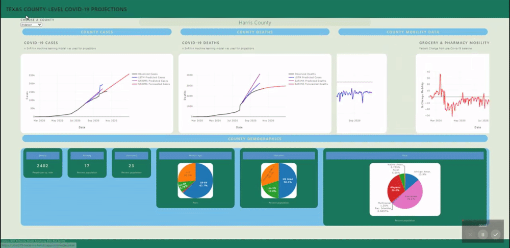
A back-end PostGres database was created using data from several sources (see below) and uploaded to Heroku for universal access. SQL views were created for each county's daily data and for all counties static data (demographics). These views are called by a Flask application.
Several machine learning models were fitted to project and forecast each county's cases and deaths. These models include SARIMA and LSTM univariate models and a VECM multivariate model.
- New York Times Covid-19 Data: https://github.com/nytimes/covid-19-data files: counties.csv, colleges.csv, mask-use-by-county.csv
- Google US Region Covid-19 Mobility Data: https://www.google.com/covid19/mobility/
- Texas Association of Counties Demographic Data: https://imis.county.org/iMIS/CountyInformationProgram/QueriesCIP.aspx
Of our data sources, case/ death count and mobility varied daily, while Demographics was considered constant with time. Therefore, we first made two datasets- one with the daily data and another with the constant data.
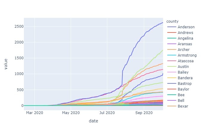
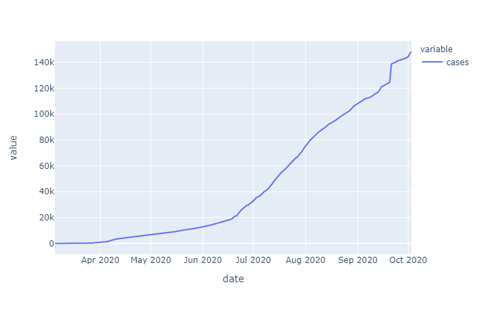
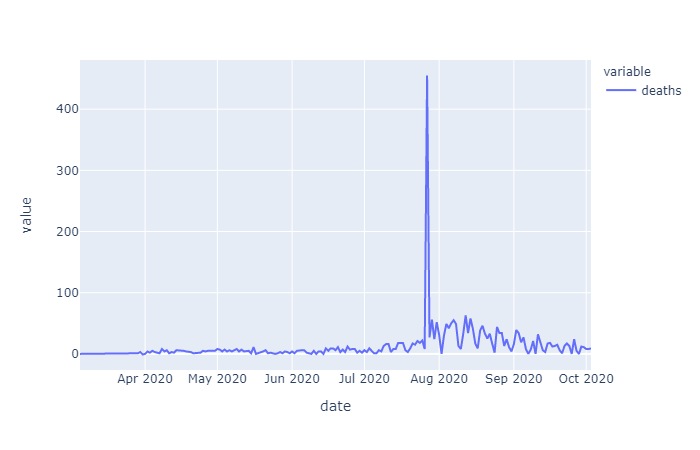
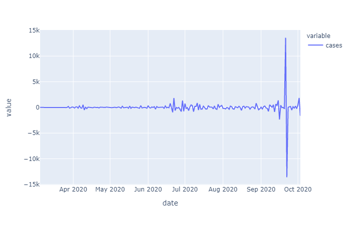
The initial raw data for cases varied by county but overall showed an exponential trend (as expected for a spreading disease). Initially just differencing was examined to see if the data could be stationarized, which according to augmented Dickey Fuller (ADF) test results, it could. However, conceptually it would make sense to first take the log of this exponentially trending data before differencing in order to remove the increase in variance over time. In the differenced data that is determined to be stationary by ADF you can see this increasing variance, with more time in the dataset, this trend may cause the ADF test to fail, if the data is not log transformed first. For now we will go with what the ADF tests conclude.

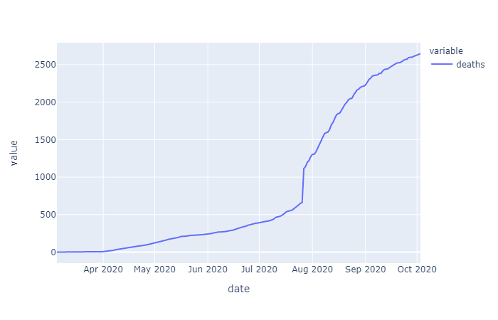
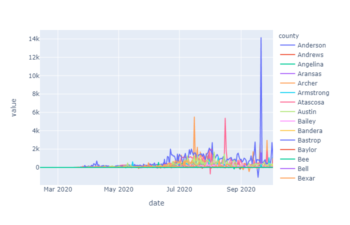
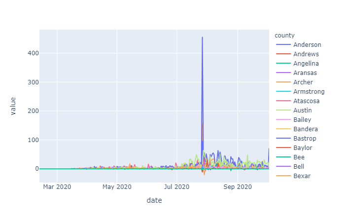
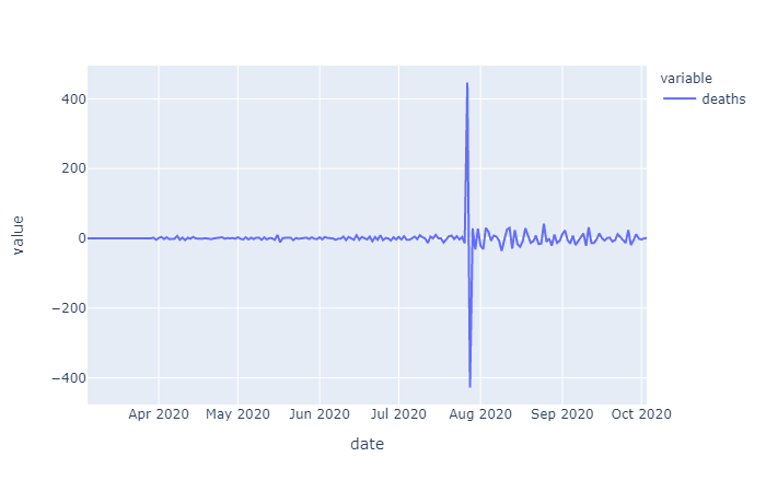
Differencing order was examined on the overall cases and deaths data as well as the Harris County specific data. Since the data on cases and deaths was cumulative daily, taking the one day first order difference gives us the daily number of added cases or deaths, taking the second order differencing give us the rate of change of cases/deaths over time:

The raw mobility data was more stationary than the cases data (no exponential trend), however we do see a deacrease in mobility around april onward, as stay at home orders were put in place. Many mobility metrics also show a subsequent relaxing after lapse of the stay at home order, however most metrics do not return to pre-covid levels. We isolated this investigation to Harris county for the sake of plot visibility:
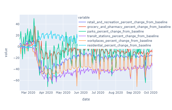
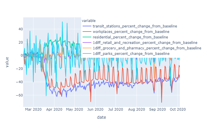
Each mobility metric was independently examined to determine the order of differencing required to make it stationary. Workplace and Residential mobility data was stationary for Harris county in the raw state, while all other mobility metrics for Harris County required first order differencing. Workplace and Residential mobility, without being differenced does show some trending, so it is likely that for other counties this data may also require first level differencing in order to stationarize.
Test train split was done on a slightly aribtrary date allowing about 75% of the early datapoints to be included in the train data, with the last dates being included in the test data.
Two univariate models, SARIMA and LSTM, and one mulitvariate model, VECM, were examined:
The SARIMA model can accept non-stationary and seasonal data, because its model algorithm performs these steps internally. However, the inputs for the SARIMA model can be used to define the steps. The inputs are as follows: SARIMA((p,d,q)(P,D,Q,m), where (p,d,q,) are trend related terms and (P,D,Q,m) are seasonality related.
- p = trend autoregression order,
- d = trend difference order,
- q = moving average order,
- P = seasonal autoregressive order,
- D = seasonal difference order,
- Q = seasonal moving average order,
- m = the number of timesteps in a single seasonal period (e.g. weekly season on daily data =7) Since Texas has 253 counties, each needing unique input parameters for their individual models and since we did not have the time in our two week project to look at these parameters individually, a function called auto-arima from a library called pmdarima was used to automatically determine the best model for each county, by running it in a loop and storing the ouput parameters to a dictionary with the key being the county name.
For each of the case and death datasets, we looped through the counties and fit the best model to that data and then ran it. The loop also ran test and train data and assessed model fit and ran projections and forecasts, the model results were stored in a dictionary and projections/forecasts/residuals for each counties cases and deaths were stored in an array of dataframes. These results were then added to the Heroku database so that they could be easily accessed and compared to the actual cases and deaths.
The LSTM model followed several techniques to transform the data prior to fitting the model:
- Data differenced
- Data was transformed to be supervised learning – used lag of +1
- Data split into train/test
- Data was scaled to -1 to 1 to mimic the tanh layer
- Data passed into split_sequence prior to passing into be fit
A CNN layer was added to make it more robust forming a LSTM-CNN hybrid model. The model was then fit using batch_size =1, epochs=200, neurons=4. A similar strategy to the SARIMA model was used to join LSTM model results to the database. The LSTM results were overall fairly accurate, but the model has not been completely tuned yet. Accuracy should improve as we optimize the tuning for each county's model. While the MSE on the LSTM model was frequently higher than that of the SARIMA model, it does appear to be more robust at anticipating changes in trend, whereas the SARIMA models generally seem to smoothen the predicted or forecasted data more (though it depends on the county).
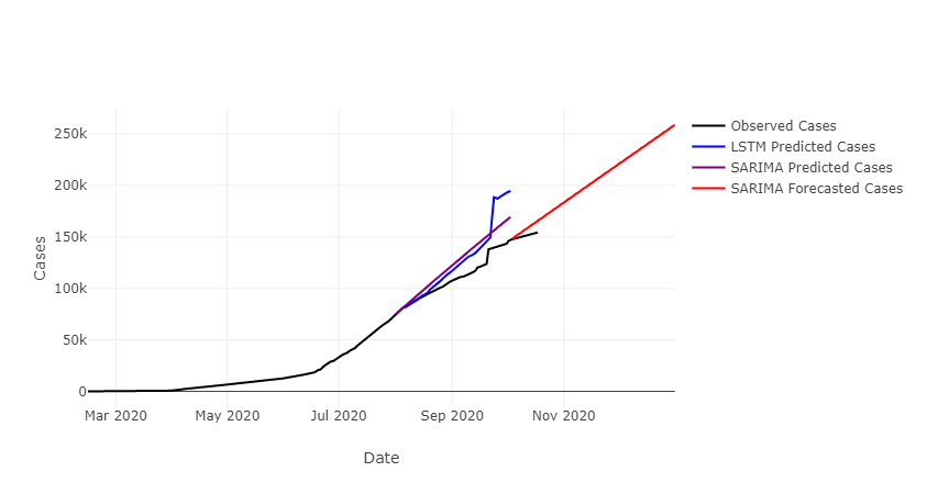
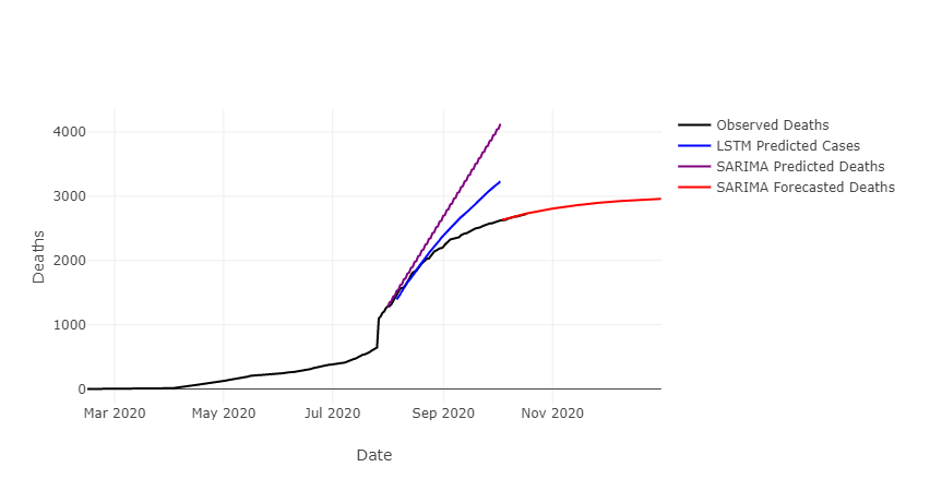

Looking at several counties, we see that the SARIMA residuals are often lower than those of the LSTM model, however the LSTM model seems to follow changes in trend better than the SARIMA model. The SARIMA model was optimally tuned for each county, whereas the LSTM model has not yet been optimized for each county. It may be that once the LSTM model has been better tuned it is more accurate than the SARIMA model.
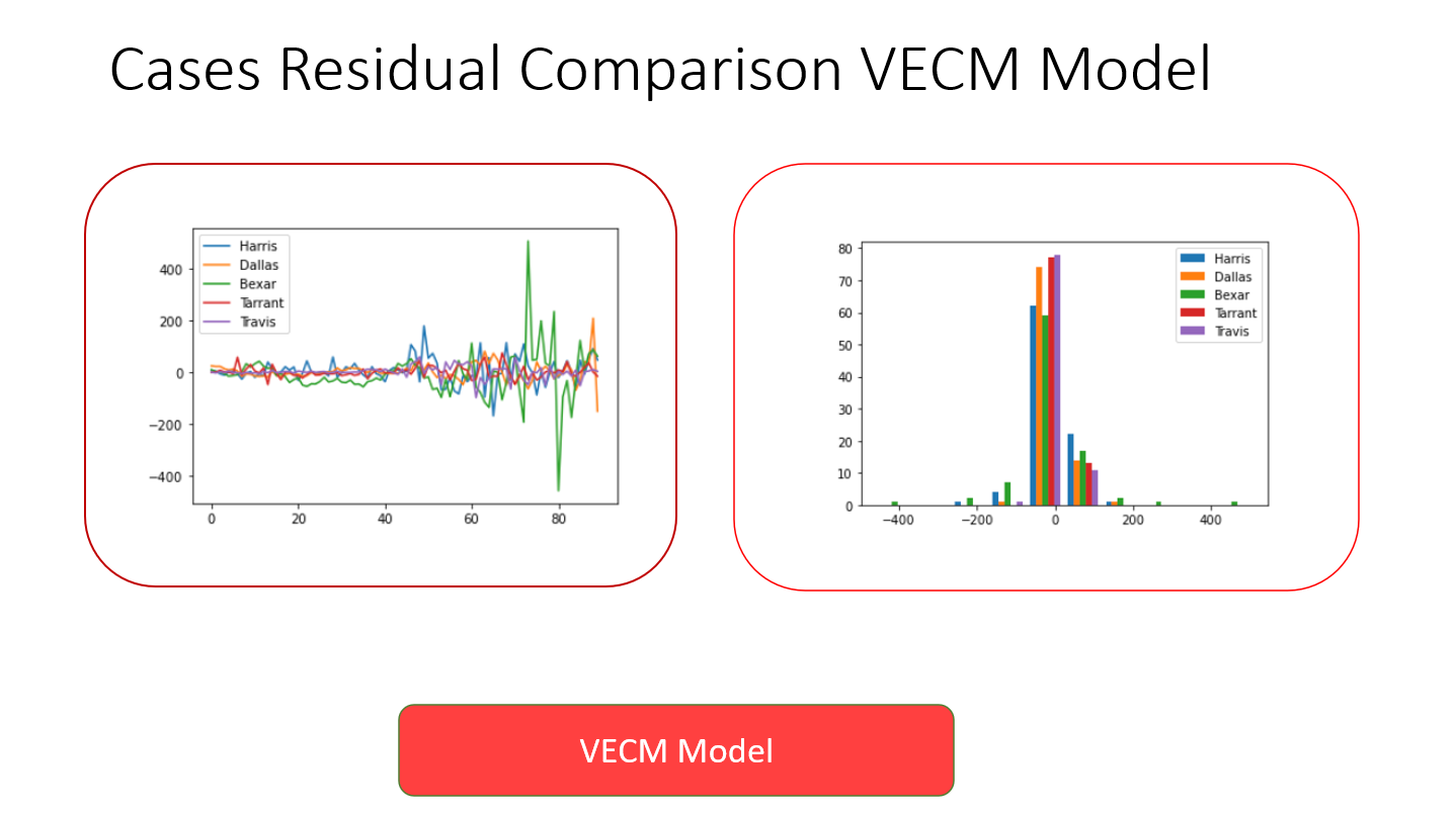
The results of the VECM model indicate that it needs further tuning before being added to the application. It is currently not very accurate, but is a good start at taking on a multivariate analysis of a very complex dataset.
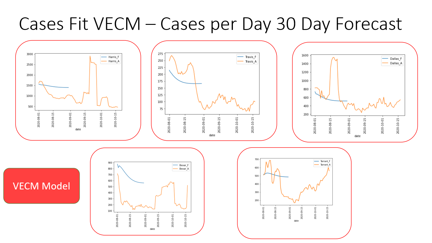
Since the results of a multivariate analysis could not be compared to the univariate analyses, residuals from this model were compared between the counties with the most complete datasets:
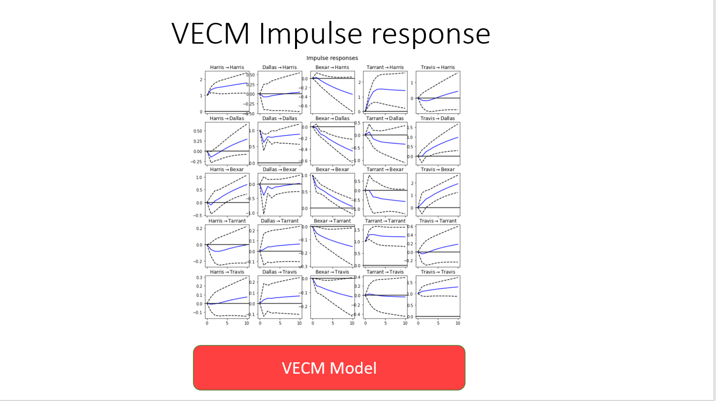
Impulse response was analysed to understand the impact of a given county's number of cases on the other counties case counts. This is a very interesting study given that there is some regular migration between counties that may cause certain groups of counties to trend together:
Future planned updates to the app include:
- Addition of multivariate models, forecasts from a number of models, error cones on forecasts, MSE & RMSE, and a county location map to demonstrate where a selected county is in the state.
- Optimization of the LSTM & VECM Models' tuning
- Fixing the bug of the non-responsive svg plots to enable better small screen viewing
- Investigating further parameters such as: Per capita cases, deaths and administered tests, and deaths as a percentage of cases.
SARIMA, LSTM, and VECM Machine learning models were used to model the change in Covid-19 cases and deaths over time in every Texas County. A full stack, interactive, web application was created and deployed in the cloud to allow users to visualize at the projections/forecasts from these models at the county level. National, State and Local govenrments may use this data to create pro-active policy measures. Inidviduals may use this data to gauge the risk in a county they or someone they know may live in or travel to.
All models were based on data up to 10/3/2020. Source data for cases/deaths/mobility were then downloaded and updated in Heroku database up to 10/18/2020 to see how projections compared.


