ab-datepicker is an accessible datepicker based on the example of the Open AJAX Alliance Accessibility Tools Task Force : http://www.oaa-accessibility.org/examplep/datepicker1/ and Inspired by http://wet-boew.github.io/wet-boew/demos/datepicker/datepicker-en.html
- Description
- Dependencies
- Demo
- Usage
- Configuration options
- Methods
- Events
- Theming
- Keyboard interaction
- ARIA 1.0 Markup
- Browser Compatibility
- Copyright and license
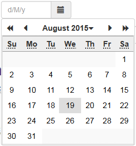
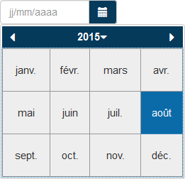
This DatePicker widget is a jQuery Plugin which allows the user to select a date. It implements the WAI-ARIA Date Picker design pattern of W3C.
The calendar portion of the date picker follows a table structure where days of the week and calendar day numbers are layed out in HTML table cells where WAI-ARIA semantics for a grid are applied. This provides context so an assistive technology can render the day of the week; its corresponding numeric calendar day, and week number if necessary.
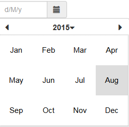
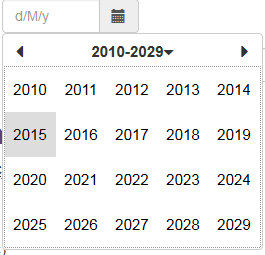
The calendar portion can be displayed in a numbers of ways, including as a popup in modal mode.
The datepicker component must be bound to an text input field of your document:
<input class="date form-control" id="date1" type="text" placeholder="d/M/y" title="format: dd/MM/y"/>For better accessibility, define an placeholder attribute and a title giving the input format to the screen reader.
Add the bootstrap and datepicker css to your page head
<link rel="stylesheet" href="path/to/bootstrap.min.css" type="text/css" />
<link rel="stylesheet" href="path/to/datepicker.css" type="text/css" />
or
<link rel="stylesheet" href="https://cdn.jsdelivr.net/npm/ab-datepicker@latest/css/datepicker.css" type="text/css" />
In case you use bootstrap4 markup (see the markup option), it is necessary to include font 'Font Awesome 5':
<link rel="stylesheet" href="path/to/font-awesome5.min.css" type="text/css" />Place the javascript files to the end of your document:
<script type="text/javascript" src="path/to/jquery.min.js"></script>
<script type="text/javascript" src="path/to/bootstrap.min.js"></script>
<script type="text/javascript" src="path/to/datepicker.min.js"></script>
or
<script type="text/javascript" src="https://cdn.jsdelivr.net/npm/ab-datepicker@latest"></script>Add this code to the end of your document:
    <script type="text/javascript">
    $(document).ready(function() {
    	$('.date').datepicker();
    });
    </script>
This code displays the default calendar (in english with the bootstrap 3 markup and the default theme : no colors)
ab-datepicker can be used with this AngularJS directive written by @dadoadk
First, place your "locales" file before "datepicker.min.js" For example, if your language is French, add this line :
<script type="text/javascript" src="path/to/locales/fr.min.js"></script>and give some options to the datepicker. See Configuration options below.
    <script type="text/javascript">
    $(document).ready(function() {
    	$('.date').datepicker({
			firstDayOfWeek: 1, // The first day of week is Monday
			weekDayFormat: 'narrow', // Only first letter for the weekday names
			inputFormat: 'd/M/y',
			outputFormat: 'dd/MM/y',
			titleFormat: 'EEEE d MMMM y',
			markup: 'bootstrap4',
			theme: 'blue',
			modal: false
		});
    });
    </script>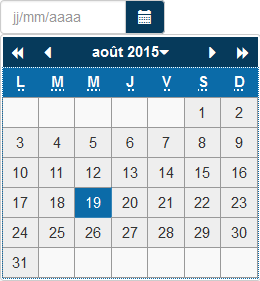
| Option | Description | Default | Example |
|---|---|---|---|
| allowSameDate | In the case of linked dates (start date and end date), this option indicates whether the two dates can be the same. This option is ignored if none of the 'next' or 'previous' option is set. | true | allowSameDate: false |
| buttonLabel | Accessibility label : 'aria-labelledby' attribute for the calendar button | Date.dp_locales.texts.buttonLabel (*) | Cliquez ou appuyez sur la touche Entrée ou la barre d'espace pour ouvrir le calendrier |
| buttonLeft | Place the calendar button to the left of the text field | false | buttonLeft: true |
| buttonTitle | Title attribute for the calendar button | Date.dp_locales.texts.buttonTitle (*) | Sélectionner une date ... |
| changeMonthButtonLabel | Accessibility label : title attribute for the calendar title when the current month is displayed | Date.dp_locales.texts.changeMonthButtonLabel (*) | changeMonthButtonLabel: "Cliquez ou appuyez sur la touche Entrée ou la barre d'espace pour changer le mois" |
| changeRangeButtonLabel | Accessibility label : title attribute for the calendar title when the current years range is displayed | Date.dp_locales.texts.changeRangeButtonLabel (*) | changeRangeButtonLabel: "Cliquez ou appuyez sur la touche ou sur la barre Entrée pour afficher les vingt années suivantes" |
| changeYearButtonLabel | Accessibility label : title attribute for the calendar title when the current year is displayed | Date.dp_locales.texts.changeYearButtonLabel (*) | changeYearButtonLabel: "Cliquez ou appuyez sur la touche Entrée ou la barre d'espace pour changer l'année" |
| closeButtonLabel | Accessibility label : 'aria-labelledby' attribute for the close button when the calendar is displayed in modal mode | Date.dp_locales.texts.closeButtonLabel (*) | closeButtonLabel: "Fermez le calendrier" |
| closeButtonTitle | Title attribute for the close button when the calendar is displayed in modal mode | Date.dp_locales.texts.closeButtonTitle (*) | closeButtonTitle: "Fermer" |
| datesDisabled | Array of dates to disable. array items are Date object or string | [] | datesDisabled: [new Date(2017, 12, 11), '12/12/2017'] |
| daysOfWeekDisabled | Array of the week days number to disable | [] | daysOfWeekDisabled: [0, 6] |
| firstDayOfWeek | Determines the first column of the calendar grid 0 = Sunday, 1 = Monday, .... |
Date.dp_locales.firstday_of_week (*) | firstDayOfWeek: 1 |
| gainFocusOnConstruction | Indicates if the datepicker should gain focus when it is constructed | true | gainFocusOnConstruction: false |
| inline | Display the datepicker inline inside a given div | false | inline: $('#inline-div') |
| inputFormat | date input format by the user. Dates and times are formatted according to CLDR Date Time patterns | Date.dp_locales.short_format (*) | inputFormat: 'd/M/y' |
| isDateDisabled | A function that is called for each date of the days calendar. Must return true if the date provided as argument must be disabled, false otherwise. | null | function (date) { return date < new Date(); } |
| isMonthDisabled | A function that is called for each date of the days calendar and each month of the months calendar. Must return true if the month provided as arguments (year and month number - 1 to 12) must be disabled, false otherwise. | null | function (year, month) { return year < 2000 |
| isYearDisabled | A function that is called for each date of the days calendar, each month of the months calendar and each year of the year calendar. Must return true if the year provided as argument must be disabled, false otherwise. | null | function (year) { return year < 2000; } |
| markup | The html markup to use | bootstrap3 | markup: 'bootstrap4' |
| max | The maximum/latest date that can be selected | null | max: '06/12/2016' |
| min | The minimum/earliest date that can be selected | null | min: '08/11/2015' |
| modal | Indicates if the calendar must be opened in modal mode, that is it keeps the focus until the user selects a date or clicks the close button | false | modal: true |
| next | Link the target input of the datepicker to the input of another datepicker that represents the end date of a range | null | next: '#enddate' or next: $('#enddate') |
| nextButtonLabel | Accessibility label : 'aria-labelledby' attribute for the next month button | Date.dp_locales.texts.nextButtonLabel (*) | nextButtonLabel: "Aller au mois suivant" |
| nextMonthButtonLabel | Accessibility label : 'aria-labelledby' attribute for the next year button | Date.dp_locales.texts.nextMonthButtonLabel (*) | nextMonthButtonLabel: "Aller à l'année suivante" |
| nextYearButtonLabel | Accessibility label : 'aria-labelledby' attribute for the next years range button | Date.dp_locales.texts.nextYearButtonLabel (*) | nextYearButtonLabel: "Allez aux vingt années suivantes" |
| onUpdate | A function that is called when the input box has been updated by the datepicker | function (value) {} | function (value) { console.log("date updated : " + value); } |
| outputFormat | date output format of the datepicker. Dates and times are formatted according to CLDR Date Time patterns | Date.dp_locales.short_format (*) | outputFormat: 'dd/MM/y' |
| prevButtonLabel | Accessibility label : 'aria-labelledby' attribute for the previous month button | Date.dp_locales.texts.prevButtonLabel (*) | prevButtonLabel: "Aller au mois précédent" |
| previous | Link the target input of the datepicker to the input of another datepicker that represents the start date of a range | null | previous: '#startdate' or previous: $('#startdate') |
| prevMonthButtonLabel | Accessibility label : 'aria-labelledby' attribute for the previous year button | Date.dp_locales.texts.prevMonthButtonLabel (*) | prevMonthButtonLabel: "Aller à l'année précédente" |
| prevYearButtonLabel | Accessibility label : 'aria-labelledby' attribute for the previous years range button | Date.dp_locales.texts.prevYearButtonLabel (*) | prevYearButtonLabel: "Aller aux vingt années précédentes" |
| startView | set the start view mode. Accepts: 'days', 'months', 'years', 0 for days, 1 for months and 2 for years | 0 | startView: 'years' |
| theme | name of the theme | default | theme: 'green' |
| titleFormat | Dates and times are formatted according to CLDR Date Time patterns | Date.dp_locales.full_format (*) | titleFormat: 'EEEE d MMMM y' |
| weekDayFormat | Display format of the weekday names - values are 'short' (first letter) or 'narrow' (first two letters) |
short | weekDayFormat: 'narrow' |
(*) Default value from the locale file
$('your date selector').datepicker('datesDisabled', dates);Sets a specific date or an array of dates to be disabled. The dates are Date objects or strings.
$('your date selector').datepicker('daysOfWeekDisabled', value);where value (type: array of number) is the list of days of the week that should be disabled.
$('your date selector').datepicker('disable');Disable the datepicker. This method has no effect on an inline datepicker.
$('your date selector').datepicker('enable');Enable the datepicker.
$('your date selector').datepicker('firstDayOfWeek', value);where value (type: integer) is the day of week (0: Sunday, 1: Monday, 2: Tuesday, ...)
$('your date selector').datepicker('getDate');Get the current Datepicker date object
$('your date selector').datepicker('hide');hide the calendar portion of the datepicker
$('your date selector').datepicker('inline', value);Display the datepicker inline inside a given div. value can be the id of a div, a jQuery object of a div or false.
$('your date selector').datepicker('inputFormat', formats);where formats (type: array of string) contains the acceptable input formats according to CLDR Date Time patterns
$('your date selector').datepicker('max', date);Define the biggest date the user can enter. The value of "date" (type: string) must conform to one of the formats defined with the "inputFormat" option
$('your date selector').datepicker('min', date);Define the smallest date the user can enter. The value of "date" (type: string) must conform to one of the formats defined with the "inputFormat" option.
$('your date selector').datepicker('next', selector);Define the date as the start date of a period. The value of "selector" (type: string or JQuery object) refers to the input that represents the end date of the period.
$('your date selector').datepicker('previous', selector);Define the date as the end date of a period. The value of "selector" (type: string or JQuery object) refers to the input that represents the start date of the period.
$('your date selector').datepicker('modal', bool);Defines the opening mode (modal or not) of the calendar portion of the datepicker. bool can be true or false.
$('your date selector').datepicker('outputFormat', format);where format (type: string) contains the output format according to CLDR Date Time patterns
$('your date selector').datepicker('setDate', date);Returns the internal date object of the datepicker
$('your date selector').datepicker('show');show the calendar portion of the datepicker
$('your date selector').datepicker('startview', view);where view (type: string|int) is the value of new start view: 'days', 'months', 'years', 0 for days, 1 for months and 2 for years
$('your date selector').datepicker('theme', name);where name (type: string) contains the name of your theme
$('your date selector').datepicker('weekDayFormat', value);where value (type: string) is one of this value : 'short' (first letter) or 'narrow' (first two letters)
This event is triggered, bound to target input box, once the date is changed by the datepicker.
This event is triggered, bound for all the datepicker of the page, before the display of the calendar portion of one of the datepicker
This event is triggered, bound for all the datepicker of the page, after the display of the calendar portion of one of the datepicker
This event is triggered, bound for all the datepicker of the page, when the calendar portion of one of the datepicker is closed
- Give a name to your theme;
- Create a CSS file with the styles below, having replaced 'default' by the name of your theme. Use the properties 'color', 'background-color', 'border-color', .....
a.datepicker-button.default {
}
a.datepicker-button.default:hover,
a.datepicker-button.default:focus {
	background-color: #DDD;
}
div.datepicker-calendar.default {
	background-color: #FFF;
}
div.datepicker-calendar.default div.datepicker-month-wrap {
}
div.datepicker-calendar.default div.datepicker-month-fast-prev.disabled,
div.datepicker-calendar.default div.datepicker-month-fast-next.disabled ,
div.datepicker-calendar.default div.datepicker-month-prev.disabled,
div.datepicker-calendar.default div.datepicker-month-next.disabled {
	color:  #999;
}
div.datepicker-calendar.default div.datepicker-month-fast-prev.enabled:hover,
div.datepicker-calendar.default div.datepicker-month-fast-prev.enabled:focus,
div.datepicker-calendar.default div.datepicker-month-fast-next.enabled:hover,
div.datepicker-calendar.default div.datepicker-month-fast-next.enabled:focus,
div.datepicker-calendar.default div.datepicker-month-prev.enabled:hover,
div.datepicker-calendar.default div.datepicker-month-prev.enabled:focus,
div.datepicker-calendar.default div.datepicker-month-next.enabled:hover,
div.datepicker-calendar.default div.datepicker-month-next.enabled:focus,
div.datepicker-calendar.default div.datepicker-month:hover,
div.datepicker-calendar.default div.datepicker-month:focus,
div.datepicker-calendar.default button.datepicker-close:hover,
div.datepicker-calendar.default button.datepicker-close:focus {
	background-color: #EEE;
	border-color:  #999;
}
div.datepicker-calendar.default table.datepicker-grid:focus {
	outline: 1px dotted #999;
}
div.datepicker-calendar.default tr.datepicker-weekdays {
	border-top:  1px solid #999;
	border-bottom:  1px solid #999;
}
div.datepicker-calendar.default table.datepicker-grid th {
	background-color: #EEE;
	border:  none;
}
div.datepicker-calendar.default table.datepicker-grid td {
	border:  none;
	color: #000;
}
div.datepicker-calendar.default table.datepicker-grid td.unselectable {
	color: #999;
}
div.datepicker-calendar.default table.datepicker-grid td.curDay,
div.datepicker-calendar.default table.datepicker-grid td.curMonth,
div.datepicker-calendar.default table.datepicker-grid td.curYear {
	background-color: #FFF0C4;
}
div.datepicker-calendar.default table.datepicker-grid td.empty {
	border:  none;
	background-color: #F9F9F9;
}
div.datepicker-calendar.default table.datepicker-grid td.selectable:hover,
div.datepicker-calendar.default table.datepicker-grid td.selectable.focus {
	background-color: #DDD;
}
div.datepicker-calendar.default table.datepicker-grid td.empty:hover {
	background-color: #F9F9F9;
}
div.datepicker-calendar.default button.datepicker-close {
	background-color: #522A3F;
	color: #FFF;
	border-color:  #EEE;
}- Add the CSS file to your page
- call the datepicker with the 'theme' option as follows :
$('your date selector').datepicker({
	............
	theme: 'the name of your theme',
	........
});- Left Move focus to the previous day. Will move to the last day of the previous month, if the current day is the first day of a month.
- Right Move focus to the next day. Will move to the first day of the following month, if the current day is the last day of a month.
- Up Move focus to the same day of the previous week. Will wrap to the appropriate day in the previous month.
- Down Move focus to the same day of the following week. Will wrap to the appropriate day in the following month.
- PgUp Move focus to the same date of the previous month. If that date does not exist, focus is placed on the last day of the month.
- PgDn Move focus to the same date of the following month. If that date does not exist, focus is placed on the last day of the month.
- Alt+PgUp Move focus to the same date of the previous year. If that date does not exist (e.g leap year), focus is placed on the last day of the month.
- Alt+PgDn Move focus to the same date of the following year. If that date does not exist (e.g leap year), focus is placed on the last day of the month.
- Home Move to the first day of the month.
- End Move to the last day of the month
- Tab / Shift+Tab If the datepicker is in modal mode, navigate between calander grid and close/previous/next selection buttons, otherwise move to the field following/preceding the date textbox associated with the datepicker
- Enter / Space Fill the date textbox with the selected date then close the datepicker widget.
- ARIA 1.0: [aria-activedescendant]
- ARIA 1.0: [aria-atomic]
- ARIA 1.0: [aria-controls]
- ARIA 1.0: [aria-haspopup]
- ARIA 1.0: [aria-hidden]
- ARIA 1.0: [aria-invalid]
- ARIA 1.0: [aria-labelledby]
- ARIA 1.0: [aria-live]
- ARIA 1.0: [aria-readonly]
- ARIA 1.0: [aria-selected]
- ARIA 1.0: [role="application"]
- ARIA 1.0: [role="button"]
- ARIA 1.0: [role="columnheader"]
- ARIA 1.0: [role="grid"]
- ARIA 1.0: [role="gridcell"]
- ARIA 1.0: [role="heading"]
- osx: Chrome 10.0+
- osx: Firefox 3.6+
- osx: Opera 11.0+
- osx: Safari 5.0+
- win: Chrome 10.0+
- win: Firefox 3.6+
- win: Internet Explorer 8.0+
- win: Opera 11.0+
- win: Safari 5.0+
© 2015-2019 Eureka2 - Jacques Archimède. Code released under the MIT license.


 React
React
 Typescript
 Django
 Laravel
 Facebook
 Microsoft
 Google
 Alibaba
 D3
D3
 Tencent