Popovers, tooltips for React Native.

🤖 Controlled and uncontrolled popovers
✍️ Customizable popover content (text, views)
🌐 Works on web, hover support
🙅♂️ No-dependency
🎒 Built with Typescript
👩🔬 Try the API sandbox
<Popable content="See profile">
  <Text>@eveningkid</Text>
</Popable>npm install react-native-popableIf working with React Native Web, you'll need at least version 0.15.0. It introduced hover events for Pressable which is used internally.
Add a popover around a given component. Uses Popover internally.
Every property coming from Popover can be used the exact same way that with Popable.
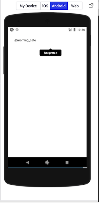
import { Popable } from 'react-native-popable';

export default () => (
  <Popable content="See profile">
    <Text>@morning_cafe</Text>
  </Popable>
);-
Optional
What should serve as the popover trigger, basically any React element.
<Popable content="See profile">
  <Image
    source={{ uri: ... }}
    style={{ width: 50, height: 50 }}
  />
</Popable>

<Popable content="See profile">
  <Text>@morning_cafe</Text>
</Popable>Popover content: can be a string or any React element (text, views).
If you just want the popover, without all the outside logic that comes from Popable, use Popover instead.
<Popable
  content={
    <View
      style={{
        padding: 10,
        alignItems: 'center',
        justifyContent: 'center',
        backgroundColor: 'white'
      }}
    >
      <Text>Anything :)</Text>
    </View>
  }
>
  <Text>@morning_cafe</Text>
</Popable>

<Popable content="See profile">
  <Text>@morning_cafe</Text>
</Popable>Upon what action should the popover be shown/dismissed: press, longpress or hover (web-only). Defaults to press.
<Popable action="hover" content="See profile">
  <Text>@morning_cafe</Text>
</Popable>Callback to monitor the popover visibility state. Called whenever visible changes (even through Popover internal state). Useful for side-effects.
<Popable
  onAction={(visible) => {
    if (visible) {
      Analytics.pressedProfilePopover();
    }
  }}
  content="See profile"
>
  <Text>@morning_cafe</Text>
</Popable>If the popover should be placed on the opposite side when it doesn't fit at the given position. If a popover is on the left of the screen and its position is left, the position will be turned to right by default. If strictPosition is true, the popover will remain on the left. Defaults to false.
<Popable strictPosition={true} position="left">
  @morning_cafe
</Popable>Style the Popover component using any View style property.
<Popable style={{ opacity: 0.8 }}>@morning_cafe</Popable>Style the wrapping View component using any View style property.
<Popable wrapperStyle={{ flex: 1, display: 'flex' }}>@morning_cafe</Popable>The UI component in Popable can also be used on its own.
import { Popover } from 'react-native-popable';

export default () => <Popover>@morning_cafe</Popover>;-
Optional
The popover content: will render text if a string is given or the given React elements otherwise.
<Popover>@morning_cafe</Popover>

<Popover>
  <Image
    source={{ uri: ... }}
    style={{ width: 50, height: 50 }}
  />
</Popover>If the popover should animate when the visible property changes. Defaults to true.
<Popover animated={false}>@morning_cafe</Popover>If the popover should bounce a little (spring) or not (timing). Defaults to timing.
<Popover animationType="spring">@morning_cafe</Popover>Background color for the popover and the caret.
<Popover backgroundColor="red">@morning_cafe</Popover>If the little caret (the "half-triangle") should be displayed. Defaults to true.
<Popover caret={false}>@morning_cafe</Popover>Position for the caret: left, center or right. Defaults to center.
<Popover caretPosition="right">@morning_cafe</Popover>If the popover should animate when it renders for the first time. This means that if visible is set to true, the popover will fade in after it mounted. Likewise, if visible is false, the popover will fade out. If this property is kept falsy, the popover will be displayed in its initial visibility state, without animating. It is very unlikely you would ever need this property. Defaults to false.
<Popover forceInitialAnimation>@morning_cafe</Popover>Limit the number of lines if children is a string. Corresponds to Text.numberOfLines which clips text with ... if the given text is more than a number of lines.
<Popover numberOfLines={1}>@morning_cafe_got_longer</Popover>If the popover should be visible. Will animate every value change if animated is true.
const [visible, setVisible] = useState(false);

<Popover visible={visible}>@morning_cafe</Popover>

<Button
  title="Toggle visibility"
  onPress={() => {
    setVisible((isVisible) => !isVisible);
  }}
/>Position for the popover: top, right, bottom or left. Changes the caret position. Defaults to top.
<Popover position="right">@morning_cafe</Popover>Every usual View property is available as well.
<Popover onLayout={...}>@morning_cafe</Popover>If you need to imperatively control the Popable component, you can use the usePopable hook. It lets you show and hide the Popable without needing to manage state yourself.
You typically won't need to use this hook, since react-native-popable intelligently hides popovers when users press or hover away. However, it comes in handy for features like menus.
const [ref, { hide, show }] = usePopable();

return <Popable ref={ref} />
If you prefer to not use the array syntax, you can destructure like so:
const { ref, hide, show } = usePopable();

return <Popable ref={ref} />If you're building a Popable menu, you'll want to hide the Popable when someone clicks a menu item.
import React from 'react';
import { StyleSheet, View, Text } from 'react-native';
import { Popable, usePopable } from 'react-native-popable';

import Menu from './menu';

export default function App() {
  const [ref, { hide }] = usePopable();

  return (
    <View style={styles.container}>
      <Popable ref={ref} content={<Menu onPressMenuItem={() => hide()} />}>
        <Text>Open Menu</Text>
      </Popable>
    </View>
  );
}Similar to the example above, you can show the Popable imperatively:
import React from 'react';
import { StyleSheet, View, Text } from 'react-native';
import { Popable, usePopable } from 'react-native-popable';

import Menu from './menu';

export default function App() {
  const [ref, { show, hide }] = usePopable();

  return (
    <View style={styles.container}>
      <Button title="Open Menu" onPress={() => show()} />

      <Popable ref={ref} content={<Menu onPressMenuItem={() => hide()} />}>
        <Text>Menu</Text>
      </Popable>
    </View>
  );
}
This is a rare use-case, since you'll typically use the children as the trigger of your Popable.
See the contributing guide to learn how to contribute to the repository and the development workflow.
MIT © eveningkid


 React
React
 Typescript
 Django
 Laravel
 Facebook
 Microsoft
 Google
 Alibaba
 D3
D3
 Tencent