A customizable, responsive SVG dial UI element.
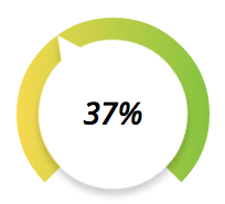
After becoming frustrated with the lack of flexibility and support of jQuery-knob, I decided to create my own SVG dial that allowed me to customize the look and feel of the dial.
Though this element is designed to be highly customizable, it doesn't deviate from the design structure of the notch in the bottom section, the dial, etc. However, colors, font styles, sizes, and some other items are all customizable.
This may fit your needs and asthetics, it may not.
This package is available for installation via npm and bower
$ npm install svg-dial$ bower install svg-dialThe only dependency this library has is on Snap.svg. It assumes this library is available to the module, and is configured to look for it in the AMD, CommonJS (Browserify) and global environments.
var SVGDial = require('svg-dial');

new SVGDial(document.getElementById('dial-container'), {
  onChange: function(percentage) {}
});define(['svg-dial'], function(SVGDial) {
new SVGDial(document.getElementById('dial-container'), {
onChange: function(percentage) {}
});
});...
<script type="text/javascript" src="https://cdnjs.cloudflare.com/ajax/libs/snap.svg/0.3.0/snap.svg-min.js"></script>
<script type="text/javascript">
new SVGDial(document.getElementById('dial-container'), {
onChange: function(percentage) {}
});
</script>
...new SVGDial(el, options);
Required: true
Type: HTMLElement, jQuery, String
Description: Can either be a DOM element, a jQuery object or a selector string.
Purpose: Identifies the target block element that the <svg> element will be build inside of.
Required: false
Type: Object
Description: The configuration options
Purpose: Defines default overrides and configuration options for the dial.
Default: false
Type: Boolean
Purpose: If set to true, disables the manipulation of the dial.
Default: 'white'
Type: String
Description: Valid Hex or CSS color, or array of valid Hex or CSS colors to create a linear gradient
Purpose: Specifies the color of the frame (the rectangular container the dial is nested in)
Default: 200
Type: Integer
Description: Number of pixels for both the width and height of the frame.
Purpose: Defines the size of the frame that the circular dial will be embedded in
Default: #888
Type: String, Array
Description: Valid Hex or CSS color, or array of valid Hex or CSS colors to create a linear gradient
Purpose: Specifies the color of the dial ring
Default: white
Type: String, Array
Description: Valid Hex or CSS color, or array of valid Hex or CSS colors to create a linear gradient
Purpose: Specifies the color of the inner circle and knob
Default: impact
Type: String
Description: Valid and available font family
Purpose: Uses this font family for the inner text that displays the percentage
Default: 24
Type: Integer
Purpose: Uses this font size for the inner text that displays the percentage
Default: none
Type: String
Description: Valid and available font style
Purpose: Uses this font style for the inner text that displays the percentage
Default: none
Type: String
Description: Valid and available font weight
Purpose: Uses this font weight for the inner text that displays the percentage
Type: Function
Event: Any change in the dial setting during a drag.
Arguments:
percentage: percentage between0and1that the dial is currently set at.
Type: Function
Event: The mouse down event on the dial
Arguments:
percentage: percentage between0and1that the dial is currently set at.
Type: Function
Event: The mouse up event on the dial
Arguments:
percentage: percentage between0and1that the dial is currently set at.
Type: Function
Event: The dial is loaded into the DOM
Arguments: none
Type: Object
Description: Same structure as the options object.
Purpose: Overrides initial settings during runtime.
Type: Integer
Description: Number between 0 and 1.
Purpose: Sets the value and position of the dial.


 React
React
 Typescript
 Django
 Laravel
 Facebook
 Microsoft
 Google
 Alibaba
 D3
D3
 Tencent