Giter Site home page Giter Site logo

hossein-zare / react-native-dropdown-picker Goto Github PK

View Code? Open in Web Editor NEW
971.0 9.0 295.0 1.17 MB

A single / multiple, categorizable, customizable, localizable and searchable item picker (drop-down) component for react native which supports both Android & iOS.

Home Page: https://hossein-zare.github.io/react-native-dropdown-picker-website/

License: MIT License

JavaScript 97.09% Shell 2.91%
picker dropdown menu react-native android ios javascript select multiple single

react-native-dropdown-picker's Introduction

React Native Dropdown Picker

GitHub repo Build Status PRs welcome react-native-dropdown-picker is released under the MIT license. Current npm package version. Weekly npm downloads Documentation


📱 Screenshots

Screenshot showing basic dropdown Screenshot showing badges Screenshot showing dark theme and parent items

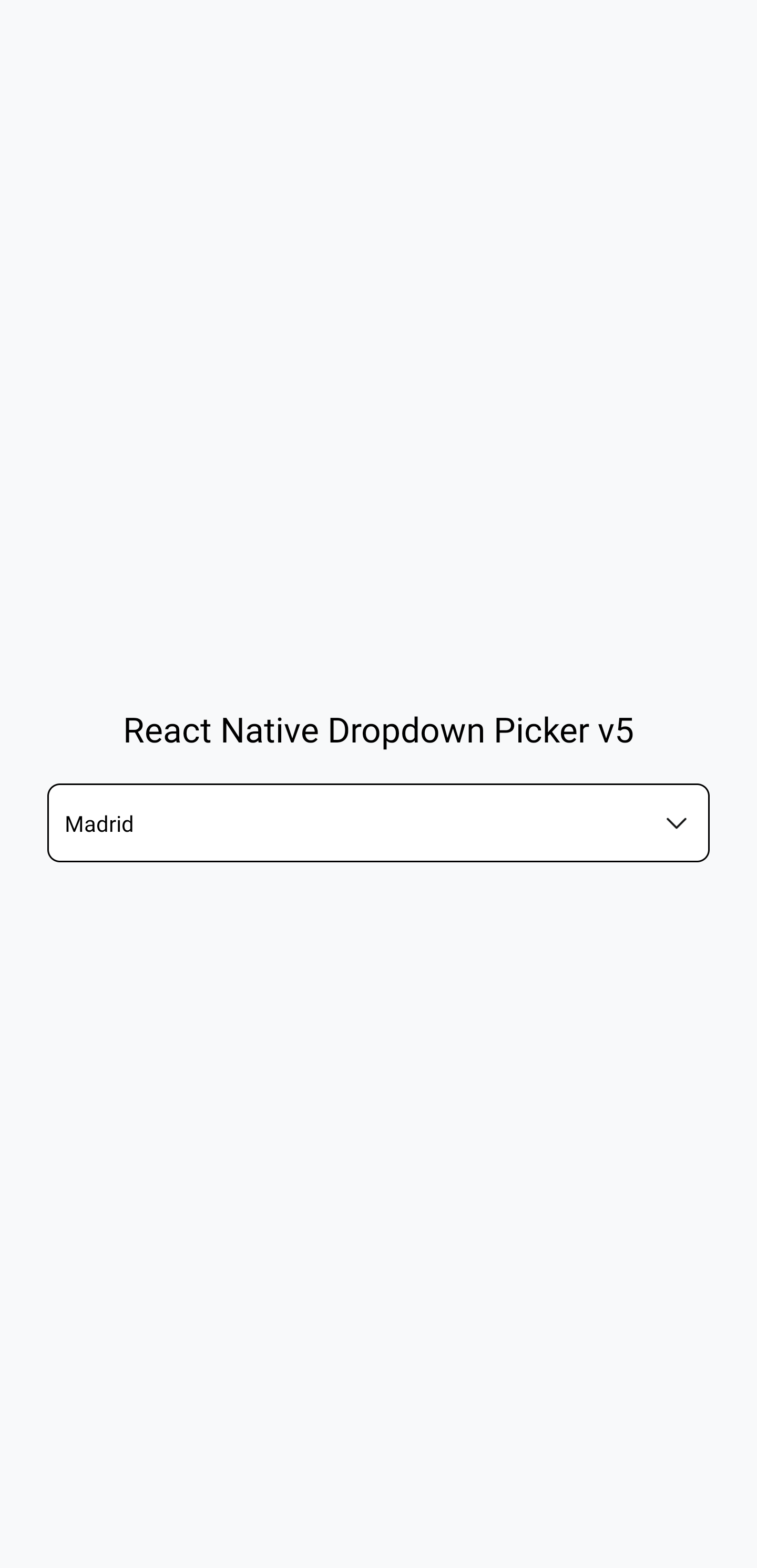
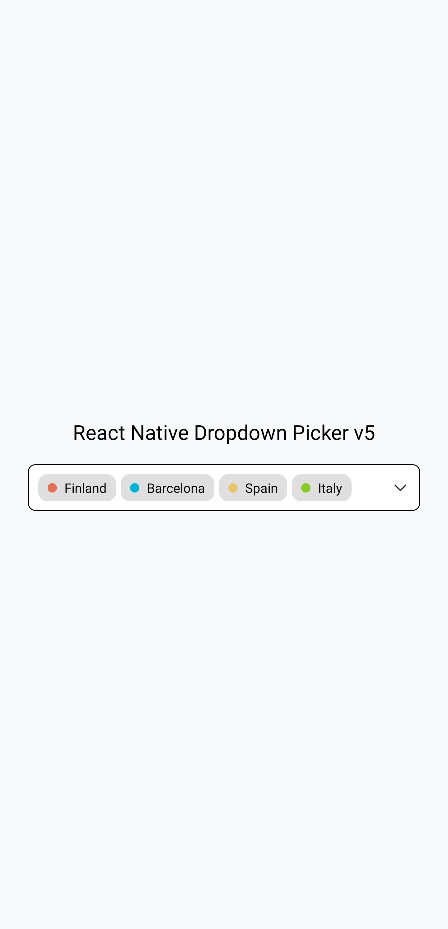
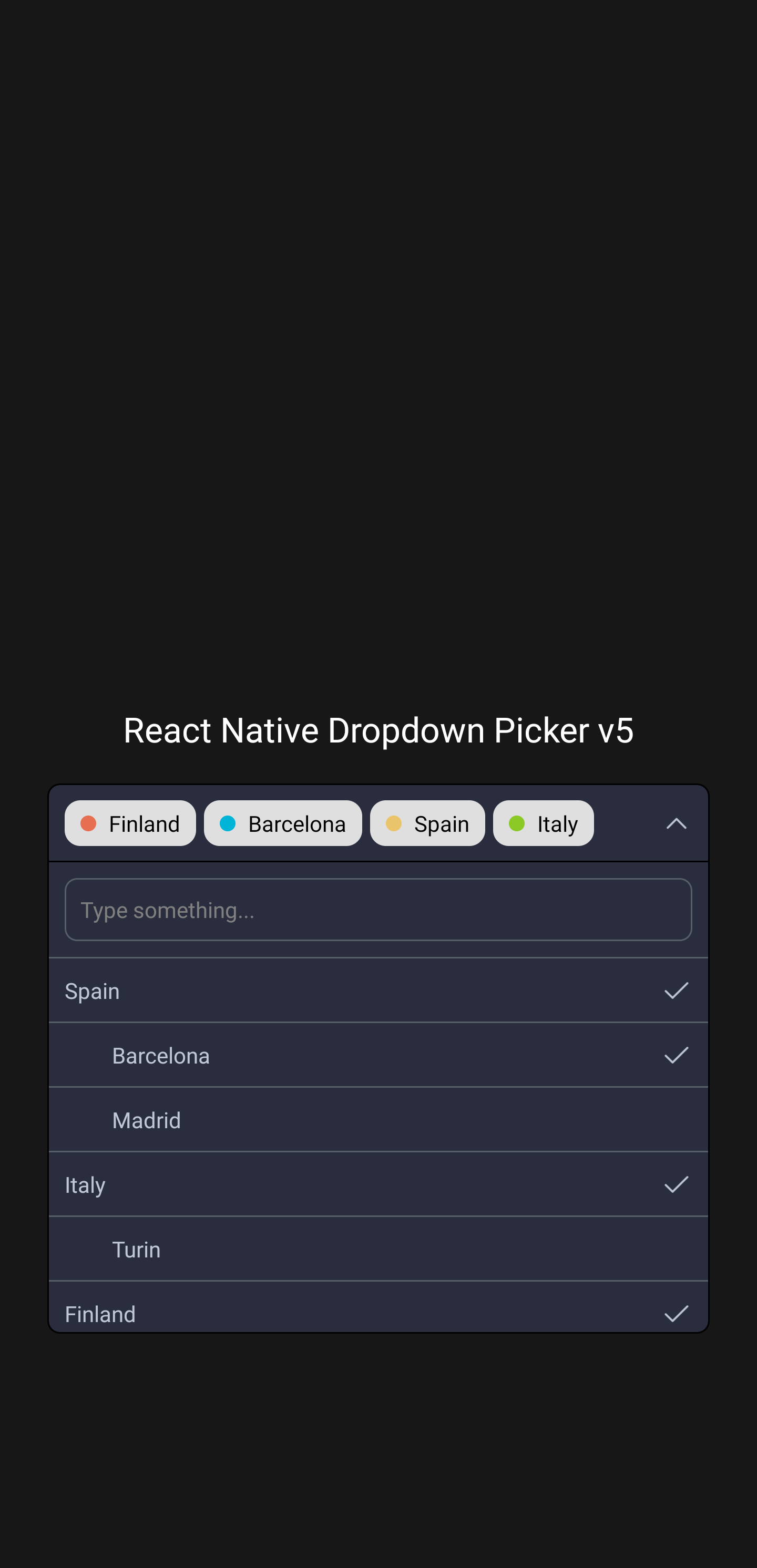
The above screenshots were taken from this example.

👋 Usage

Basic usage

The following code shows basic usage of this library:

import React, {useState} from 'react';
import {View, Text} from 'react-native';
import DropDownPicker from 'react-native-dropdown-picker';

export default function App() {
    const [open, setOpen] = useState(false);
    const [value, setValue] = useState(null);
    const [items, setItems] = useState([
        {label: 'Apple', value: 'apple'},
        {label: 'Banana', value: 'banana'},
        {label: 'Pear', value: 'pear'},
    ]);

    return (
        <View style={{flex: 1}}>
            <View
                style={{
                    flex: 1,
                    alignItems: 'center',
                    justifyContent: 'center',
                    paddingHorizontal: 15,
                }}>
                <DropDownPicker
                    open={open}
                    value={value}
                    items={items}
                    setOpen={setOpen}
                    setValue={setValue}
                    setItems={setItems}
                    placeholder={'Choose a fruit.'}
                />
            </View>

            <View style={{
                flex: 1,
                alignItems: 'center',
                justifyContent: 'center'
            }}>
                <Text>Chosen fruit: {value === null ? 'none' : value}</Text>
            </View>
        </View>
    );
}

Further information on usage

You can find more examples in the examples subdirectory. This subdirectory is a working Expo project demonstrating this library. It shows how to use this library with class components as well as with function components, and in TypeScript as well as in JavaScript. Navigate into the examples subdirectory, run npm install, and then run npx expo start to see the examples working.

For further information on how to use this library, read the usage documentation.

📄 Further documentation

The docs can be read at: https://hossein-zare.github.io/react-native-dropdown-picker-website

The docs can be edited at: https://github.com/hossein-zare/react-native-dropdown-picker-website

😕 Support and issues

If you have questions or need help, you can ask a question on Stack Overflow or make a GitHub issue. You can also make a GitHub issue to report a bug or make a feature request.

🚀️ Contributing

See CONTRIBUTING.md.

react-native-dropdown-picker's People

Contributors

alexanderarvidsson avatar angelk90 avatar antoinebrtd avatar blizzardnya avatar hless avatar hossein-zare avatar jamie-phlo avatar krisgilicze avatar loopingz avatar maclay74 avatar mangjuned avatar marcel-fly avatar mikehardy avatar mjmasn avatar mks-01 avatar mlecoq avatar pjl4 avatar prkgnt avatar rackles avatar randall71 avatar salopeklm avatar taeh98 avatar techie-pi avatar tek256 avatar thebluewall2 avatar timorss avatar tommysg avatar tsheaff avatar yhirano55 avatar yvocilon avatar

Stargazers

 avatar  avatar  avatar  avatar  avatar  avatar  avatar  avatar  avatar  avatar  avatar  avatar  avatar  avatar  avatar  avatar  avatar  avatar  avatar  avatar  avatar  avatar  avatar  avatar  avatar  avatar  avatar  avatar  avatar  avatar  avatar  avatar  avatar  avatar  avatar  avatar  avatar  avatar  avatar  avatar  avatar  avatar  avatar  avatar  avatar  avatar  avatar  avatar  avatar  avatar  avatar  avatar  avatar  avatar  avatar  avatar  avatar  avatar  avatar  avatar  avatar  avatar  avatar  avatar  avatar  avatar  avatar  avatar  avatar  avatar  avatar  avatar  avatar  avatar  avatar  avatar  avatar  avatar  avatar  avatar  avatar  avatar  avatar  avatar  avatar  avatar  avatar  avatar  avatar  avatar  avatar  avatar  avatar  avatar  avatar  avatar  avatar  avatar  avatar  avatar

Watchers

 avatar  avatar  avatar  avatar  avatar  avatar  avatar  avatar  avatar

react-native-dropdown-picker's Issues

In iOS, Dropdown is overlapping with the below content

I have used the code like mentioned in the example in my screen

<DropDownPicker
                items={[
                  {label: 'UK', value: 'uk'},
                  {label: 'France', value: 'france'},
                ]}
                defaultValue={'uk'}
                containerStyle={{height: 40}}
                style={{backgroundColor: '#fafafa'}}
                dropDownStyle={{backgroundColor: '#fafafa'}}
                onChangeItem={(item) => {
                  console.log(item);
                }}
              />

The dropdown in overlapping under the below content as shown like image.

Screenshot 2020-06-04 at 1 23 39 AM

---- Could you please help me on this?

Little dot on Android

Hey Hossein !

On android, a little dot appears when dropdown is closed (and disappears when dropdown is opened), an idea how to fix it ?

Screenshot 2020-06-04 at 18 46 58

Screenshot 2020-06-04 at 18 47 25

Searchable Error should be a React Component

Is your feature request related to a problem? Please describe.
As written in the title, the searchableError prop should be a React Component

Describe the solution you'd like
I would like to see the searchableError prop to be a React Component and not just a string, so that we can add functions like OnPress, etc. What i actually want is that, when they search for a value in the dropdown and it's not found, i want to show a button or any other component which will take them to the screen where they can add it. If there's already a way i could achieve that, kindly let me know.

Thanks,

Dropdown list performance improvement

Is your feature request related to a problem? Please describe.
I was trying to populate the dropdown with nearly 300 text items, then it get's bit laggy when opening the picker as all data items get populated.

Describe the solution you'd like
Use of a flatlist other than a scrollview would do. (I think)

Describe alternatives you've considered
Implementing a flatlist over the default scrollview.

Placeholder styles

Is there a way to implement placeholder styles such as font-family and colour? because the default placeholder style is bold and can come off as a pre-selected value.

using state variable as defaultValue has no effect

My defaultValue is a state variable which is updated after I render the DropDownPicker.
I would expect that the DropDownPicker will change his defaultValue based on my state variable even if it's updated.

const [ageFrom, setAgeFrom] = useState(14)

useEffect(() => {        
    if (filter === null) {
      return
    }
    setAgeFrom(filter.ageFrom)
  }, [filter]);


const ageFromDropDown = () => {
    const items = []
    for(var i = 14;i<=21;i++) {
      items.push({label: i, value: i})
    }
    items.push({value: 50, label: 50})    
    return items
  }

return 
<DropDownPicker
   items={ageFromDropDown}
   defaultValue={ageFrom}
   containerStyle={styles.dropDown}
   onChangeItem={item => setAgeFrom(item.value)}
/>

What is the best way to update the defaultValue after the DropDownPicker has been rendered?

Or at least I should be able to set the Value myself from outside.

Picker Gets Distorted on adding border properties on container Style

It Works fine when in container style we don't add border properties in container style .
<DropDownPicker
items={props.data}
defaultValue={props.value}
placeholder={'Grade set'}
placeholderStyle={{
fontFamily: Aller,
fontWeight: 'normal',
fontSize: 19 ,
color: ourLightTheme.colors.lightBlue
}}
labelStyle={{
fontFamily: Aller,
fontWeight: 'normal',
fontSize: 15 ,
color: ourLightTheme.colors.lightBlue
}}
selectedtLabelStyle={{
color: 'red'
}}
containerStyle={{
height: 40,
width: 150 ,
marginTop: 15,
// backgroundColor: ourLightTheme.colors.white ,
// borderWidth: 2 ,
// borderColor: ourLightTheme.colors.darkBlue ,
// borderRadius: 5
}}
style={{ backgroundColor: ourLightTheme.colors.white }}
itemStyle={{
justifyContent: 'flex-start'
}}
dropDownStyle={{backgroundColor: ourLightTheme.colors.white ,borderColor: ourLightTheme.colors.darkBlue, borderWidth: 2 }}
isVisible={visiblity}
onOpen={() => setVisiblity(true)}
onClose={() => setVisiblity(false)}
onChangeItem={item => props.onChangeItem(item.value)}
/>

But when I add border propeties to component style it completely gets distorted .

Screenshot (544)
Screenshot (545)

set dropDownStyle to override borderWidth failed

Describe the bug
A clear and concise description of what the bug is.

To Reproduce
Steps to reproduce the behavior:

Create an expo snack:
https://snack.expo.io/

Expected behavior
A clear and concise description of what you expected to happen.

Screenshots
If applicable, add screenshots to help explain your problem.

Info (please complete the following information):

  • OS: [iOS, Android]
  • Package version [e.g. 22]

Additional context
Add any other context about the problem here.

selectedLabelStyle ? (image in description)

Description:
labelStyle edits all of the label styles.
activeLabelStyle edits the active label style in the dropdown window only (when you open the dropdown).
However, the one that is seen before pressing on the dropdown (not sure what to call it) doesn't have a style to it.

Here's an image

Solution:
Adding a selectedtLabelStyle to edit the selected label text separately. (Maybe it's there and I missed it ?)

dropdown does not render inside a scrollview

This issue still persists if the dropdown is being opened inside a scrollview, it does not expand.
Although according to arrows it does register the touched event.
Version:
"react-native-dropdown-picker": "^2.1.8",

Only 4 options?

All of my dropdowns show only maximum 4 options, though they have more. When the number of options is > 4, at least the dropdown should have an inner scroll.

I don't know if I can display more options by increasing the height, but anyway, in one case I'm using the dropdown to select your birthdate, and the selector for the year includes the last 80 years. I can't increase the height for 80 options, that's crazy. In another case, you select your Country, that's not 80 options but there are a lot too. The content should be scrollable.

Dropdown background is transparent in IOS app while android has white background

Hello, I implemented this library some time ago in my react native app and everything was working fine (for android). Today I tested the same app in my iPhone but dropdown background is transparent. I can see the element (in my case text input) behind it and I can even touch it.

I tried updating the library to the latest version and also tried to re-implement it as in docs but still behavior is same on iPhone while android is working perfectly.

To Reproduce
Run the app with dropdown on iPhone (I have iPhone 11 (13.5))

Expected behavior

Dropdown should look and work similar on both, android and iPhone

Screenshots
Simulator_Screen_Shot_-iPhone_11-_2020-06-17_at_03 52 02

Info (please complete the following information):

  • OS: IOS
  • Package version : 3.0.5

ListView Scrollbar

Hi,

I think it would be a great idea to have a props to enable ListView props persistentScrollbar. It's more clear for users when the dropdown is small.

Placeholder text is not replaced by selection

Hi there!

I'm not sure if it's a bug, or if I'm not using it correctly, but if I use defaultNull with a placeholder, the placeholder text is not replaced by the selected value.

Here's my code:

<DropDownPicker
items={[
{label: 'Dr.', value: 'DR'},
{label: 'Prof.', value: 'PROF'}
]}
defaultNull
placeholder="Title"
onChangeItem={(t)=>this.setState({title:t.value})}
dropDownMaxHeight={240}
/>

Expected result:
After selecting e.g. "Dr." from the dropdown, "Title" should be replaced with "Dr."

Version: 2.1.4

Style of "Search" TextInput not working

Hi,

I'm using this version - "react-native-dropdown-picker": "^3.0.5".
I've tried changing the searchablePlaceholder style by using "searchableStyle" but not able to change the color of the TextInput.

I've added this to the DropDownPicker Component :

searchableStyle={{
 fontSize: 13,
 color: '#000',
 backgroundColor: '#fff'
}}

This changes the background color and font size but it is not changing the color of the text.

and same with searchableError - how can i change the color of the text.

It should change the color of the text but not changing.

overlapping in Android, working fine in iOS

Not possible to select in Android, untouchable

Screen Shot 2020-06-04 at 12 02 25

<View style={styles.container}>
      <View style={{zIndex: 10}}>
        <Text style={styles.label}>I want to go</Text>
        {activities.length !== 0 && (
          <DropDownPicker
            items={activities.map((activity) => ({
              label: activity.name,
              value: activity.id,
            }))}
            defaultValue={null}
            containerStyle={styles.dropdownContainer}
            style={{ borderWidth: 0, zIndex: 4 }}
            dropDownStyle={{borderWidth: 1, minHeight: 300 }}
            labelStyle={styles.boldText}
            activeLabelStyle={styles.activeText}
            zIndex={4}
            customArrowUp={<FYIcon size={20} name="down-open" />}
            customArrowDown={<FYIcon size={20} name="up-open" />}
            onChangeItem={(item) => setActivity(item.value)}
          />
        )}
        <Text style={styles.label}>somewhere in</Text>
        <DropDownPicker
          items={cities.map((city) => ({ label: city, value: city }))}
          defaultValue={null}
          containerStyle={styles.dropdownContainer}
          style={{ borderWidth: 0 }}
          dropDownStyle={{ borderWidth: 1, minHeight: 300 }}
          labelStyle={styles.boldText}
          activeLabelStyle={styles.activeText}
          zIndex={3}
          customArrowUp={<FYIcon size={20} name="down-open" />}
          customArrowDown={<FYIcon size={20} name="up-open" />}
          onChangeItem={(item) => setCity(item.value)}
        />
      </View>

Styles

container: {
    paddingTop: Platform.select({ ios: 110, android: 70 }),
    paddingBottom: 24,
    paddingHorizontal: 24,
    zIndex: 5,
    flex: 1,
    backgroundColor: 'white',
    justifyContent: 'space-between'
  },
  dropdownContainer: {
    width: 236,
    height: 60,
    borderBottomWidth: 1,
    borderColor: '#E0E0E0',
  },

Not able to select item from list that overlaps different view

Describe the bug
Could not select an item from the dropdown list.

To Reproduce
Render separate view under dropdown

Screenshots
7ls5lGbwle

Code

    <View>
      <Header leftComponent={{icon: 'close', color: '#fff'}}
          centerComponent={{text: 'Create a Parcel', style: {fontSize: 22, color: '#fff'}}}
          rightComponent={{text: 'SCAN', style: {fontSize: 18, color: '#fff'}}}
          placement="left"
          backgroundColor = '#1CB394'
          containerStyle = {styles.header}
          leftContainerStyle= {{marginBottom: 28}}
          rightContainerStyle={{marginBottom: 20, paddingRight: 8}}
          centerContainerStyle= {{marginBottom: 22, marginLeft: 18}}
      />

      <View style={{height: 'auto', maxHeight: screenHeight - 90,}}>
        <ScrollView style={{alignSelf: "stretch", width: "100%"}}>              
          <View style={{paddingHorizontal: 15, alignSelf: "stretch", width: "100%", backgroundColor: '#fff', 
          zIndex: 10 
        }}>
            <View style={{marginTop: 15, flexDirection: 'row', alignItems: 'center', alignSelf: 'stretch', justifyContent: 'center'}}>
                <Button buttonStyle={(this.state.direction == "In" ? {backgroundColor:"#1CB394", borderColor: '#333'} : {backgroundColor:"white", borderColor: '#333'})} titleStyle={styles.buttonStyle} type="outline" title="Incoming" 
                onPress={() =>{
                  this.setState({direction: "In"})
                }}></Button>
                <Button buttonStyle={(this.state.direction == "Out" ? {backgroundColor:"#1CB394", borderColor: '#333'} : {backgroundColor:"white", borderColor: '#333'})} titleStyle={styles.buttonStyle} type="outline" title="Outgoing"
                onPress={() =>{
                  this.setState({direction: "Out"})
                }}
                ></Button>
            </View>
            <DropDownPicker
                    items={this.state.buildingList}
                    // defaultValue={"Picked Up By"}
                    placeholder="Choose building"
                    containerStyle={{height: 40, marginTop: 10}}
                    style={{backgroundColor: 'white', color: "gray"}}
                    dropDownStyle={{backgroundColor: '#fafafa'}}
                    onChangeItem={item => {
                    this.setState({
                      selectedBuilding: item.value
                    });
                    console.log("item is ",item.value);
                    this._getUnits(item.value.id);
                  }}
                  
                  zIndex={30}
                />
            <DropDownPicker
                    items={this.state.unitsList}
                    // defaultValue={"Picked Up By"}
                    placeholder="Choose unit"
                    containerStyle={{height: 40, marginTop: 10, width:"50%"}}
                    disabled={(this.state.selectedBuilding == null ? true : false)}
                    style={{backgroundColor: 'white', color: "gray"}}
                    dropDownStyle={{backgroundColor: '#fafafa', position:'absolute'}}
                    onChangeItem={item => {this.setState({
                      selectedUnit: item.value
                    })
                    console.log("I am clicked");
                    this._getRecipients(item.value.id)
                  }}
                  zIndex={20}
                />             
            <DropDownPicker
                    items={this.state.recipientList}
                    // defaultValue={"Picked Up By"}
                    placeholder="Choose resident"
                    containerStyle={{height: 40, marginTop: 10,marginBottom: 30}}
                    disabled={(this.state.selectedUnit == null ? true : false)}
                    style={{backgroundColor: 'white', color: "gray"}}
                    dropDownStyle={{backgroundColor: '#fafafa'}}
                    onChangeItem={item => this.setState({
                      selectedResident: item.value
                    })}
                    
                  zIndex={10}
                />    
          </View>              
          
          <View  style={{paddingHorizontal: 15, alignSelf: "stretch", width: "100%"}} >
            <Input containerStyle={{marginTop: 15}} placeholder='Parcel type' disabled={(this.state.selectedResident == null ? true : false)}/>   
            <Input containerStyle={{width: "50%"}} placeholder='# of Pieces' disabled={(this.state.selectedResident == null ? true : false)}/>   
            <Input placeholder='Courier' disabled={(this.state.selectedResident == null ? true : false)}/>   
            <Input placeholder='Barcode' disabled={(this.state.selectedResident == null ? true : false)}/>
            <View style={{flexDirection: 'row'}}>
              <Input containerStyle={{width: "50%"}} placeholder='Date' disabled={(this.state.selectedResident == null ? true : false)}/>
              <Input containerStyle={{width: "50%"}} placeholder='Time' disabled={(this.state.selectedResident == null ? true : false)}/>
            </View>
            <Input placeholder='Description' disabled={(this.state.selectedUnit == null ? true : false)}/>


            <View style={{marginTop: 30, marginBottom: 10}}>
              <Button buttonStyle={{backgroundColor: "#1CB394", justifyContent: "center"}} title="Save" ></Button>
            </View>
          </View>
        </ScrollView>
      </View>
      {
                this.state.loaderVisible ?
                    <View style={{
                        backgroundColor: '#bbb', opacity: 0.7, width: screenWidth, height: screenHeight,
                        position: 'absolute', justifyContent: 'center',
                    }}>
                        <ActivityIndicator color="#1CB394" size={60} style={{ alignSelf: 'center' }}>
                        </ActivityIndicator>
                    </View>
                    :<View></View>
        }
    </View>

Info (please complete the following information):

  • OS: Android(Emulator)

Notes
I look through "Index" problems but was not able to find any solution that will work for me.

Search bar is not responsive if the dropdown is on top

TL;DR
Here's an image.

Bug description:
The dropdown is below other views (they display on top of it).
If I try to add an elevation to the dropdown style, the view looks good however the search doesn't display the keyboard when pressed.
zIndex has no effect (maybe I used it wrong).

Here's the code:
App.js:

return (
    <SafeAreaView>
      <MyDropView />
      <AdComponent />
      <OtherComponent />
    </SafeAreaView>
  );

MyDropView.js:

return (
    <View style={{flexDirection: 'row'}}>
      <DropDownPicker
        searchable={true}
        searchablePlaceholder="Search..."
        searchableError={() => 'Not found'}
        ...
        containerStyle={{height: 40, width: '100%'}}
        dropDownStyle={{ elevation: 1 }} // The dropdown is on top, but search in unresponsive
      />
    </View>
  );

Expected behavior
The dropdown is displayed on top of all view and the search feature works.

Info:

  • OS: [Android]
  • Package version [28]

Arrow don't show

Hello,

I'll try to explain the best I can my issue as simple as it is.

I added the package to my app and implement it in one of my view, the problem is that a crossed square is at the place of the arrow at the right of the dorpdown.

I tried to add a style to it, like a marginRight, but except a slide on the left nothing change, the arrow is still a crossed square.

Do you have a solution ?

How to handle nested scroll here?

First of all, it is really nice DropDownPicker.

I have one ScrollView and inside that scroll view I have multiple dropdowns. however the dropdown scrolling is no more working in that case.

<ScrollView>
                <View style={styles.childBaseContainer}>
                  <DropDownPicker/>
                  <DropDownPicker/>
                  <DropDownPicker/>
                </View>
</ScrollView>

Android : onChangeItem is not called when I select an item

Describe the bug
On Android the onChangeItem is not called when I select an item.
Works on iOS.

I have upgraded the package 2.1.3 to 3.0.4 and I stil have the issue.

Info (please complete the following information):

  • OS: [Android]
  • Package version [2.1.3, 3.0.4]

I have tried with the example on snack.expo.io, the example in the README, no changed, I still have the issue :'(

That's never works on Android.

Please help me,

Thanks in advance

zIndex has no effect

Using iOS simulator the dropdowns are going behind my other text inputs on the screen when open. I've set the zIndex as high as 50000 with no luck.

<DropDownPicker items={[ { label: "1", value: 1 }, { label: "2", value: 2 }, { label: "3", value: 3 }, { label: "4", value: 4 }, { label: "5", value: 5 }, ]} containerStyle={{ marginHorizontal: 12, marginVertical: 10, flex: 1, width: "50%", }} zIndex={50000} defaultNull placeholder="Total Courts" onChangeItem={(item) => console.log(item.label, item.value)} />

Multiple Picker dropdown gets hidden below another Picker component in Android

Describe the bug
A clear and concise description of what the bug is.
When the dropdown is opened. It gets behind another picker component below it.

To Reproduce
Steps to reproduce the behavior:


Create an expo snack:
https://snack.expo.io/

Expected behavior
A clear and concise description of what you expected to happen.
the visible dropdown should override every other component

Screenshots
If applicable, add screenshots to help explain your problem.

Supposed to work like this in both platforms
iOS screenshot

Screenshot 2020-06-18 at 6 24 07 PM

Works like this in Android which is an issue

Screenshot 2020-06-18 at 6 21 47 PM

Info (please complete the following information):

  • OS: [iOS, Android]
  • Package version [e.g. 22]

Additional context
Add any other context about the problem here.

Not working inside a View

Not possible to press the dropdown inside a <View/> or another component. It only works inside a <></>.

COMPONENT

const styles = StyleSheet.create({
  container: {
    flexDirection: 'row',
    alignItems: 'center',
    justifyContent: 'center',
  },
  lightText: {
    fontFamily: 'OpenSansCondensed-Light',
    fontSize: 16,
    color: FYColors.darkBlue,
  },
  boldText: {
    fontFamily: 'OpenSansCondensed-Bold',
    fontSize: 16,
    color: FYColors.darkBlue,
  },
});

function CustomDropdown() {
  return (
    <View style={styles.container}>
      <Text style={styles.lightText}>Sort By:</Text>
      <DropDownPicker
        items={[
          { label: 'Newest', value: 'newest' },
          { label: 'Oldest', value: 'oldest' },
        ]}
        defaultValue="newest"
        containerStyle={{ width: 100 }}
        style={{ fontFamily: 'OpenSansCondensed-Bold', borderWidth: 0 }}
        dropDownStyle={{ borderWidth: 0 }}
        labelStyle={styles.lightText}
        activeLabelStyle={styles.boldText}
        onChangeItem={(item) => console.log(item.label, item.value)}
        showArrow={false}
        zIndex={2}
      />
    </View>
  );
}

export default CustomDropdown;

Picker background color

Hi, I have trouble modyfying the css for the background color on the component, as you can see i can only alter the background color, but the problem is the background color is not covering all of the component.
82481ae9-9bb9-45e4-8593-776d4cab9077

How can I modify the styling for that and how can I change the arrow color using this library

below is snippet of my code

defaultIndex={0}
containerStyle={{height: 40}}
itemStyle={{
backgroundColor: '#303030',
alignItems: 'center',
flex: 1,
}}
arrowStyle={{marginLeft: 10}}
onChangeItem={(item) =>
this.setState({
memberShiptype: item.value,
})
}
style={{
backgroundColor: '#303030',
}}

It would be nice, if the selected value/the placeholder could be aligned to the left as well

Hi there!

I seem to be unable to align the selected value/the placeholder to the left (instead of center) of the dropdown container (not the list). Setting style={{alignItems='flex-start'}} does not seem to have an effect on the alignment of the label.

If this is already possible and I'm just not seeing it, it would be awesome if you could point me in the right direction.

Thanks for your help!

fontFamily "Feather" is not a system font and has not been loaded through Font.loadAsync

I see that Feather is used in react-native-dropdown-picker.
This is the main App component where i added AppLoading

interface State {
  loading: boolean;
}

class App extends React.Component<object, State> {
  public state = {
    loading: true,
  };

  public render(): JSX.Element {
    const { loading } = this.state;
    if (loading) {
      return (
        <AppLoading
          startAsync={assetLoader}
          onFinish={() => this.setState({ loading: false })}
          onError={console.warn}
        />
      );
    }
    return <AppNavigator />;
  }
}

export default registerRootComponent(App); 

This is assetLoader

onst cacheImages = (images: string[]) =>
  images.map((image) => {
    return Asset.fromModule(image).downloadAsync();
  });

const assetLoader = async () => {
  await Font.loadAsync({
    'OpenSans-Bold': OpenSansBold,
    'OpenSans-Regular': OpenSansRegular,
    'PtSerif-Bold': PtSerifBold,
    'Rubik-Bold': RubikBold,
    'Rubik-Light': RubikLight,
    'Rubik-Regular': RubikRegular,
  });

const imageAssets = cacheImages([
    image1,
    image2,
  ]);

  await Promise.all([...imageAssets]);
};

Where can i add the font-family 'feather' ?
"expo": "~37.0.3",
"react-native-vector-icons": "^4.6.0",

Error to select an item

When I select one the first values that can I see in the list, Its works fine but when I search other item and I click, I have an error.

The error is:
undefined is not an object (evaluating 'item.value')

  • app/screens/ArticleList.js:240:43 in ArticleModal
  • [native code]:null in find

I'm putting a console log into the function and the value arrive well.

This is my component:

<DropDownPicker
                        items = {
                            products
                        }
                        defaultValue = { article.articleName }
                        containerStyle = {{height: 40}}
                        style = {{backgroundColor: '#fafafa'}}
                        dropDownStyle = {{backgroundColor: '#fafafa'}}
                        onChangeItem = {item => onChangeSetArticle(item.value, 'articleName') }
                        searchable = { true }
                        searchablePlaceholder = "Buscar artículo..."
                        searchableError = "Artículo no encontrado"
                        placeholder = "Selecciona un artículo"
                    />

const onChangeSetArticle = (e, type) => {
            return setArticle({
                ...article, 
                [type]: e
            })
    }

Multiple columns

Hi, i would like to render items in 3 columns instead of one, how is it possible?

[FeatureRequest] Add option to show/hide arrow and modify arrow style

Nice picker!
Might be good to give option to show/hide arrow and modify arrow style

i modify it to like this
{this.props.showArrow ? ( <View style={[ { opacity: disabled ? 0.5 : 1, }, this.props.arrowStyle, ]}> {!this.state.visible ? ( <Feather name="chevron-down" size={15} /> ) : ( <Feather name="chevron-up" size={15} /> )} </View> ) : null}

Is there a TypeScript types file for this component?

Is your feature request related to a problem? Please describe.
Not a problem but a really nice to have.

Describe the solution you'd like
Have a TypeScript def file for this component that can be used in projects with typescript
Ideally something like this:

npm install @types/react-native-dropdown-picker

Arrow icon not displayed

The arrow icon inside the dropdown is missing. A square image is displayed in my phone instead of the arrow icon.

  • OS: iOS, Android, Web

picker

Dropdown height

Describe the bug
Can not adjust dropdown height.

To Reproduce
dropDownStyle={{height: 500}}

Expected behavior
When adding height to dropDownStyle the dropdown style's height adjusts accordingly.

Z Index not working for iOS

in iOS, the selection picker modal is not adhering zIndex

it is working fine in Android
Screen Shot 2020-04-24 at 14 55 02

idk, if this is react native issues, or something

Please help

background style issue

Hello @hossein-zare

Can we set background style ?
we have an issue on set borderWidth in containerStyle , dropdown list is not showing properly.

dropdown

Without borderWidth it's working fine.Please help

Thanks.

TypeError: undefined is not an object (evaluating 'choice.label')

Bug
Trying this package with the example given in docs and I get this error
TypeError: undefined is not an object (evaluating 'choice.label')

To Reproduce
Just created a simple dropdown with the example given in docs, here's my code

<ScrollView>
      <View style={[styles.container, themeStyles.safeTop]}>
           <Text style={[themeStyles.heading1, {textAlign:'center'}]}>{ t ('headings.details', this.state.language) }</Text>
             <View style={[themeStyles.safeMargins, styles.formContainer]}>
                  <DropDownPicker
                        items={[
                        {label: 'Item 1', value: 'item1'},
                         {label: 'Item 2', value: 'item2'},
                         ]}
                        containerStyle={{height: 40}}
                        style={{backgroundColor: '#fafafa'}}
                        itemStyle={{ justifyContent: 'flex-start'}}
                         dropDownStyle={{backgroundColor: '#fafafa'}}
                         onChangeItem={item => this.setState({
                          title: item.value
                          })}
                     />
                  </View>
           </View>
     </ScrollView>

Screenshots
WhatsApp Image 2020-07-07 at 10 40 37 AM

Info
:

  • Android: 9.0.0
  • Package version: 3.1.6
  • Expo: 37.0.0

Dropdown open/close event

Dropdown event
Is there a way to know if the dropdown is open or closed programatically, something like isDropdownOpen() that returns a boolean?

selected lables in heading not change able

Is your feature request related to a problem? Please describe.
A clear and concise description of what the problem is. Ex. I'm always frustrated when [...]

Describe the solution you'd like
A clear and concise description of what you want to happen.

Describe alternatives you've considered
A clear and concise description of any alternative solutions or features you've considered.

Additional context
Add any other context or screenshots about the feature request here.

unrecognized font 'family Feather'

Describe the bug
unrecognized font family Feather

I have installed react-native-dropdown-picker. and integrate the Dropdown component in my app.
but when i run react-native run-ios. Getting error 'unrecognized font family Feather'.
Even i installed npm i react-native-vector-icon , still having the same issue. Please help !!!!

Using DropDownPicker as a wrapper

Feature description:
Ability to use <DropDownPicker> as a wrapper.
Something that looks like this:

<DropDownPicker
...
>
   <View>
      <Text numberOfLines={1}>{my_selected_label}</Text>
   </View>
</DropDownPicker>

Why ?
For better customization when it comes to what's displayed to the user.
My label is too big and I wanted to limit it to one line in the View only, however I want it to still display the whole text when the dropdown is pressed so making the label a substring is not an option.

Screenshot:
Here's an image.

Edit: We've discussed numberOfLines in a previous issue. I ultimately think using a wrapper is better than simply making the label a JSX because the wrapper is easily scalable.

TypeError: undefined is not an object (evaluating 'choice.label')

Getting the error "TypeError: undefined is not an object (evaluating 'choice.label')" when using the DropDownPicker example.

To Reproduce
Using react hooks:

const [state, setState] = useState({country: 'test'});
<DropDownPicker items={[ {label: 'UK', value: 'uk'}, {label: 'France', value: 'france'}, ]} defaultValue={state.country} containerStyle={{height: 40}} style={{backgroundColor: '#fafafa'}} dropDownStyle={{backgroundColor: '#fafafa'}} onChangeItem={(item) => setState({ country: item.value, }) } />

Recommend Projects

  • React photo React

    A declarative, efficient, and flexible JavaScript library for building user interfaces.

  • Vue.js photo Vue.js

    🖖 Vue.js is a progressive, incrementally-adoptable JavaScript framework for building UI on the web.

  • Typescript photo Typescript

    TypeScript is a superset of JavaScript that compiles to clean JavaScript output.

  • TensorFlow photo TensorFlow

    An Open Source Machine Learning Framework for Everyone

  • Django photo Django

    The Web framework for perfectionists with deadlines.

  • D3 photo D3

    Bring data to life with SVG, Canvas and HTML. 📊📈🎉

Recommend Topics

  • javascript

    JavaScript (JS) is a lightweight interpreted programming language with first-class functions.

  • web

    Some thing interesting about web. New door for the world.

  • server

    A server is a program made to process requests and deliver data to clients.

  • Machine learning

    Machine learning is a way of modeling and interpreting data that allows a piece of software to respond intelligently.

  • Game

    Some thing interesting about game, make everyone happy.

Recommend Org

  • Facebook photo Facebook

    We are working to build community through open source technology. NB: members must have two-factor auth.

  • Microsoft photo Microsoft

    Open source projects and samples from Microsoft.

  • Google photo Google

    Google ❤️ Open Source for everyone.

  • D3 photo D3

    Data-Driven Documents codes.