A new Flutter project.
Flutter 学习实践
- 原生阶段:使用原生语言(Android使用Java或Kotlin,iOS使用Objective-C 或 Swift )开发应用
- Hybird阶段:Hybird实现的基本原理是通过原生的WebView容器加载H5网页进行渲染,通过JavaScript Bridge调用一部分系统能力,同步更新服务器上的H5网页也实现了动态更新,俗称混合应用
- React Native阶段:React Native简称RN,是FaceBook在2015年开源,基于 JavaScript,具备动态配置能力跨平台开发框架。
- 小程序:从技术上来说,小程序(指微信小程序,下同)并不是新的跨平台方案,它使用浏览器内核来渲染界面,小部分由原生组件渲染,小程序的运行环境分成渲染层和逻辑层,通信会经由微信客户端(Native)做中转。
- Flutter:Flutter是谷歌的移动UI框架,可以快速在iOS和Android上构建高质量的原生用户界面.它既没有使用WebView,也没有使用原生控件进行绘制,而是自己实现了一套高性能渲染引擎来绘制UI,这个引擎就是大名鼎鼎的Skia.
Android Studio 作为 IDE,下面使用 Android Studio 创建Flutter项目。 File->New->New Flutter Project. (注:没有 New Flutter Project 选项,需要先在Settings-Plugin 搜索 flutter插件安装.) 根据提示填入工程名(flutter_app)等,最后创建成功.
- android:Android原生代码目录。
- ios:iOS原生代码目录。
- lib:这个是Flutter项目的核心目录,我们写的代码放在这个目录,我们也可以在这个目录创建子目录。
- test:测试代码目录。
- pubspec.yaml:这个是Flutter项目的依赖配置文件,类似于Android build.gradle文件,这里面包含了Flutter SDK 版本、依赖等
 代码实现在:lib/main.dart
void main() {
  runApp(MyApp());
}
main为入口函数,MyApp如下:
class MyApp extends StatelessWidget {
  @override
  Widget build(BuildContext context) {
    return MaterialApp(
      title: 'Flutter Demo',
      theme: ThemeData(
        primarySwatch: Colors.blue,
      ),
      home: MyHomePage(title: 'Flutter Demo Home Page'),
    );
  }
}- MaterialApp:表示使用Material风格,后面会具体介绍Material 风格组件
- title:标题
- theme:主题,这里可以设置全区主题,后面会具体介绍theme
- home:首页,当前加载的Widget,例子中加载的是MyHomePage Widget
MyHomePage :Calculator()
class MyHomePage extends StatefulWidget {
 MyHomePage({Key key, this.title}) : super(key: key);
 final String title;
 @override
 _MyHomePageState createState() => _MyHomePageState();
}
//createState方法中创建了_MyHomePageState,MyHomePageState 如下:
class _MyHomePageState extends State<MyHomePage> {
 int _counter = 0;
 void _incrementCounter() {
   setState(() {
     _counter++;
   });
 }
 @override
 Widget build(BuildContext context) {
   return Scaffold(
     appBar: AppBar(
       title: Text(widget.title),
     ),
     body: Center(
       child: Column(
         mainAxisAlignment: MainAxisAlignment.center,
         children: <Widget>[
           Text(
             'You have pushed the button this many times:',
           ),
           Text(
             '$_counter',
             style: Theme.of(context).textTheme.display1,
           ),
         ],
       ),
     ),
     floatingActionButton: FloatingActionButton(
       onPressed: _incrementCounter,
       tooltip: 'Increment',
       child: Icon(Icons.add),
     ),
   );
 }
}- _counter属性就是App上展示的数字
- incrementCounter方法对counter进行加1操作,点击“+”按钮调用此方法
- setState方法中加1会更新到屏幕上
- Scaffold:和Material 配合使用的控件
- AppBar:是顶部的区域
- body:表示AppBar以下区域
- Center:容器类控件,子控件居中显示
- Column:容器类控件,子控件垂直排列
- Text:文本控件
- FloatingActionButton:按钮控件,也就是App中“+”按钮
android->app->src->main-> AndroidManifest.xml: <application 标签中 android:label android:icon 就是代表App名称和图标.
icon的值默认是@mipmap/ic_launcher,其中mipmap是Android的一类资源,在android->app->src->main->res下: 只需要把我们的icon图片替换原来的ic_launcher.png即可,图片名称要一样。目录中有mipmap-mdpi、mipmap-hdpi、mipmap-xdpi、mipmap-xxdpi、mipmap-xxxdpi,这代表不同分辨率的手机加载不同的图片,手机分辨率越高,加载的图标分辨率越高,正常情况下,mipmap-mdpi 放置4848的图标,mipmap-hdpi存放7272,mipmap-xdpi存放9696,mipmap-xxdpi存放144144,mipmap-xxxdpi存放192*192。
打开ios->Runner->Info.plist 文件, CFBundleName下面的值代表App的名称. 打开ios->Runner-> Assets.xcassets-> AppIcon.appiconset:Icon-App-xxx.png即为app图标所在位置: 我们只需将这个文件夹里的图片替换为我们的图标即可,注意名称和分辨率保持一致.
推荐参考官网,只有官网会及时更新,相关参考:
- 混淆 Dart 代码:https://flutter.dev/docs/deployment/obfuscate
- 配置 flavors 构建双端:https://flutter.dev/docs/deployment/flavors
- 打包并发布 Android 应用:https://flutter.dev/docs/deployment/android
- 打包并发布 iOS 应用:https://flutter.dev/docs/deployment/ios
- 打包并发布 Linux 应用:https://flutter.dev/docs/deployment/linux
- 打包并发布 Web 应用:https://flutter.dev/docs/deployment/web
Flutter Application 表示一个Flutter项目,主体是Flutter,当然它也可以接入Android Module 或者 iOS Framework,Web(Flutter2),其内部包含 Android 和 iOS 项目(默认情况下,以后正式支持Web、Windows、Mac等系统后可能更多).
表示 Flutter 插件,包含 Android 和 iOS 项目,如果你要开发一个 Plugin 且此 Plugin 涉及到原生支持,比如蓝牙功能、网络功能等,这些功能纯 Flutter 是无法实现的。 其目录比 Flutter Application 多了一个 example,example用于当前 Plugin 的demo, Flutter Plugin 开发完成后可以发布到 pub 上.
Flutter Package 和 Flutter Plugin 基本一样,唯一的区别是Flutter Package表示纯 Flutter 模块,不需要原生开发,没有Android 和 iOS 项目,比如开发一个纯 UI 的插件。
Flutter Module 用于原生项目中插入 Flutter 模块,原生为主体,与 Flutter 进行混合开发。
name: flutter_app_demo
description: A new Flutter project.
publish_to: 'none'

version: 1.0.0+1

environment:
  sdk: ">=2.7.0 <3.0.0"

dependencies:
  flutter:
    sdk: flutter

  cupertino_icons: ^1.0.2

dev_dependencies:
  flutter_test:
    sdk: flutter

flutter:
  uses-material-design: true
此属性表示包名(package name),此属性是非常重要的,引入其他文件时需要使用此包名:
import 'package:flutter_app_demo/home_page.dart';
description 属性是一个可选配置属性,是对当前项目的介绍。
此属性应用程序的版本和内部版本号,格式为 x.x.x+x,例如:1.0.0+1. 版本号 + 前面到部分,叫做 version number,由 2 个小点隔开,后面的部分叫做 build number。 在 Android 中 version number 对应 versionName,build number 对应 versionCode
这四种属性在 Flutter Application 项目中默认是没有的,正常项目中也无需这几个属性,当我们开发插件并发布到 pub 时需要这几个属性:
- author:作者,填写自己的署名
- homepage:主页
- issue_tracker:issue,一般写当前插件源代码的Github issue 地址
- repository:一般写当前插件源代码的Github地址
Environment 属性下添加 Flutter 和 Dart 版本控制
dependencies 和 dev_dependencies 下包含应用程序所依赖的包,dependencies 和 dev_dependencies 就像其名字一样,dependencies 下的所有依赖会编译到项目中,而 dev_dependencies 仅仅是运行期间的包,比如自动生成代码的库。
通过四种方式依赖其包:
- 依赖 pub.dev 上的第三方库
    dependencies:
      path_provider: ^1.6.22
- 依赖本地库
    dependencies:
      flutter_package:
        path: ../flutter_package
- 依赖 git repository
    dependencies:
      bloc:
        git:
          url: https://github.com/felangel/bloc.git
          ref: bloc_fixes_issue_110
          path: packages/bloc
url:github 地址
ref:表示git引用,可以是 commit hash, tag 或者 branch
path:如果 git 仓库中有多个软件包,则可以使用此属性指定软件包
- 依赖我们自己的 pub仓库
dependencies:
  bloc:
    hosted:
      name: bloc
      url: http://your-package-server.com
    version: ^6.0.0
工作中会出现如下场景:项目依赖一个库(比如 path_provider)的版本为 1.6.22,而另一个依赖库也依赖这个path_provider,但版本为 0.5.0,那么我最终到底依赖哪个版本,此时执行 flutter pub get 则会出现错误.
要解决这个冲突,可以添加 dependency_overrides: eg:
dependency_overrides:
  path_provider: ^1.6.22
下面的配置都是 Flutter 的相关配置。
flutter:
  uses-material-design: true
引入以使用material Icons类中的图标.
assets 是对当前资源的配置,比如 图片、字体等
配置本地图片,使用Image.asset() 加载:
assets:
  - images/a_dot_burr.jpeg
  - images/a_dot_ham.jpeg
配置字体:
fonts:
  - family: Schyler
    fonts:
      - asset: fonts/Schyler-Regular.ttf
      - asset: fonts/Schyler-Italic.ttf
        style: italic
  - family: Trajan Pro
    fonts:
      - asset: fonts/TrajanPro.ttf
      - asset: fonts/TrajanPro_Bold.ttf
        weight: 700
plugin 配置只存在与插件项目中,package 和 pluginClass 一般是不需要修改的.
pubspec.yaml 包含应用程序和依赖的软件包,规定Dart和Flutter SDK的版本约束,管理依赖关系并设置Flutter特定的配置.
如需了解更详细请查阅: pubspec file 官方文档
Text是显示文本的组件,最常用的组件之一。基本用法如下:
Text('ykhe')
文本的样式在style中设置,类型为TextStyle,TextStyle中包含很多文本样式属性.
设置文本大小和颜色:
Text('ykhe',style: TextStyle(color: Colors.blue,fontSize: 20),)
设置字体粗细:
Text('ykhe',style: TextStyle(fontWeight: FontWeight.bold))
字体粗细共有9个级别,为w100至w900,FontWeight.bold是w700.
设置斜体:
Text('ykhe',style: TextStyle(fontStyle: FontStyle.italic,))
- 首先下载字体库(比如中华字体库)
- 将字体文件拷贝的项目中,一般目录是:assets/fonts/,assets和fonts都需要手动创建,此目录不是必须的,而是约定俗成,资源一般都放在assets目录下。
- 配置pubspec.yaml:
fonts:
  - family: maobi
    fonts:
      - asset: assets/fonts/maobi.ttf
maobi:是自己对当前字体的命名,有意义即可。 asset:字体文件的目录。
使用:
Text('ykhe', style: TextStyle(fontFamily: 'maobi',))
设置对齐方式:
 Container(
   height: 100,
   width: 200,
   color: Colors.blue.withOpacity(.4),
   child: Text('ykhe', textAlign: TextAlign.center),
 )
textAlign只是控制水平方向的对齐方式,值说明如下:
- left:左对齐
- right:右对齐
- center:居中
- justify:两端对齐
- start:前端对齐,和TextDirection属性有关,如果设置TextDirection.ltr,则左对齐,设置TextDirection.rtl则右对齐
- end:末端对齐,和TextDirection属性有关,如果设置TextDirection.ltr,则右对齐,设置TextDirection.rtl则左对齐
设置文本自动换行:
Container(
  height: 100,
  width: 200,
  color: Colors.blue.withOpacity(.4),
  child: Text('专注分享Flutter技术和应用实战',softWrap: true,),
)
文本超出范围时的处理:
 Container(
   height: 100,
   width: 200,
   color: Colors.blue.withOpacity(.4),
   child: Text('ykhe,专注分享Flutter技术和应用实战',overflow: TextOverflow.ellipsis,),
 )
溢出的处理方式:
- clip:直接裁剪
- fade:越来越透明
- ellipsis:省略号结尾
- visible:依然显示,此时将会溢出父组件
在MaterialApp的theme中设置如下:
 MaterialApp(
   title: 'Flutter Demo',
   theme: ThemeData(
    ...
     textTheme: TextTheme(
         bodyText2: TextStyle(color: Colors.red,fontSize: 24),
     )
   ),
   home: Scaffold(
     ...
   ),
 )
使用Text组件时,会发现默认就为红色了.
如果想在一句话或者一段文字里面显示不同样式的文字,Text组件无法满足我们的需求,这个时候需要使用RichText.
RichText(
     text: TextSpan(
         style: DefaultTextStyle.of(context).style,
         children: <InlineSpan>[
           TextSpan(text: 'ykhe',style: TextStyle(color: Colors.red)),
           TextSpan(text: ','),
           TextSpan(text: '做一个有梦想的合格程序员'),
         ]),
   )
当文字有较多行时,可以设置其对齐方式:
RichText(
	textAlign: TextAlign.end,
	...
)
以设置其他样式,比如大小、斜体等,甚至我们还可以添加点击效果:
 RichText(
       text: TextSpan(
           style: DefaultTextStyle.of(context).style,
           children: <InlineSpan>[
             TextSpan(text: '登陆即视为同意'),
             TextSpan(
               text: '《做个沙叼的服务协议》',
               style: TextStyle(color: Colors.red),
               recognizer: TapGestureRecognizer()..onTap = () {

               },
             ),
           ]),
     )
TextField 是文本输入组件,即输入框,常用组件之一。基本用法:
TextField()
decoration是TextField组件的装饰(外观)参数,类型是InputDecoration
icon显示在输入框的前面,用法如下:
 TextField(
   decoration: InputDecoration(
     icon: Icon(Icons.person),
   )
 )
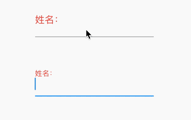
当输入框是空而且没有焦点时,labelText显示在输入框上边,当获取焦点或者不为空时labelText往上移动一点,labelStyle参数表示文本样式,具体参考TextStyle, 用法如下:
TextField(
  decoration: InputDecoration(
    labelText: '姓名:',
    labelStyle: TextStyle(color:Colors.red)
  ),
)
hasFloatingPlaceholder参数控制当输入框获取焦点或者不为空时是否还显示labelText,默认为true,显示。
helperText显示在输入框的左下部,用于提示用户,helperStyle参数表示文本样式.
 TextField(
   decoration: InputDecoration(
     helperText: '用户名长度为6-10个字母',
     helperStyle: TextStyle(color: Colors.blue),
     helperMaxLines: 1
   ),
 )
hintText是当输入框为空时的提示,不为空时不在显示:
 TextField(
   decoration: InputDecoration(
     hintText: '请输入用户名',
     hintStyle: TextStyle(color: Colors.grey),
     hintMaxLines: 1
   ),
 )
errorText显示在输入框的左下部,默认字体为红色,用法如下:
TextField(
  decoration: InputDecoration(
    errorText: '用户名输入错误',
    errorStyle: TextStyle(fontSize: 12),
    errorMaxLines: 1,
    errorBorder: OutlineInputBorder(borderSide: BorderSide(color: Colors.red)),
  ),
)
prefix系列的组件是输入框前面的部分:
 TextField(
   decoration: InputDecoration(
     prefixIcon: Icon(Icons.person)
   ),
 )
注意prefix和icon的区别,icon是在输入框边框的外部,而prefix在里面。
suffix和prefix相反,suffix在输入框的尾部:
TextField(
  decoration: InputDecoration(
      suffixIcon: Icon(Icons.person)
  ),
)
counter组件统计输入框文字的个数,counter仅仅是展示效果,不具备自动统计字数的功能:
var _textFieldValue = '';
TextField(
  onChanged: (value){
    setState(() {
      _textFieldValue = value;
    });
  },
  decoration: InputDecoration(
    counterText: '${_textFieldValue.length}/32'
  ),
)
filled为true时,输入框将会被fillColor填充,仿QQ登录输入框代码如下:
 Container(
   height: 60,
   width: 250,
   child: TextField(
     decoration: InputDecoration(
       fillColor: Color(0x30cccccc),
       filled: true,
       enabledBorder: OutlineInputBorder(
           borderSide: BorderSide(color: Color(0x00FF0000)),
           borderRadius: BorderRadius.all(Radius.circular(100))),
       hintText: 'QQ号/手机号/邮箱',
       focusedBorder: OutlineInputBorder(
           borderSide: BorderSide(color: Color(0x00000000)),
           borderRadius: BorderRadius.all(Radius.circular(100))),
     ),
   ),
 )
controller是输入框文本编辑的控制器,可以获取TextField的内容、设置TextField的内容,下面将输入的英文变为大写:
 TextEditingController _controller;

 @override
 void initState() {
   super.initState();
   _controller = TextEditingController()
     ..addListener(() {
       //获取输入框的内容,变为大写
       _controller.text = _controller.text.toUpperCase();

     });
 }

 @override
 Widget build(BuildContext context) {
   return TextField(
     controller: _controller,
   );
 }

 @override
 dispose() {
   super.dispose();
   _controller.dispose();
 }
有时输入框后面带有“清除”功能,需要controller来实现。
- text:通用键盘。
- multiline:当TextField为多行时(maxLines设置大于1),右下角的为“换行” 按键。
- number:数字键盘。
- phone:手机键盘,比数字键盘多"*"和 "#"。
- datetime:在ios上和text一样,在android上出现数字键盘、":"和 "-"。
- emailAddress:邮箱键盘,有"@" 和 "."按键。
- url:url键盘,有"/" 和 "."按键。
- visiblePassword:既有字母又有数字的键盘。
  -  none:android上显示返回键,ios不支持。
  -  unspecified:让操作系统自己决定哪个合适,一般情况下,android显示“完成”或者“返回”。
  -  done:android显示代表“完成”的按钮,ios显示“Done”(中文:完成)。
  -  go:android显示表达用户去向目的地的图标,比如向右的箭头,ios显示“Go”(中文:前往)。
  -  search:android显示表达搜索的按钮,ios显示"Search"(中文:搜索)。
  -  send:android显示表达发送意思的按钮,比如“纸飞机”按钮,ios显示"Send"(中文:发送)。
  -  next:android显示表达“前进”的按钮,比如“向右的箭头”,ios显示"Next"(中文:下一项)。
  -  previous:android显示表达“后退”的按钮,比如“向左的箭头”,ios不支持。
  -  continueAction:android 不支持,ios仅在ios9.0+显示"Continue"(中文:继续)。
  -  join:Android和ios显示"Join"(中文:加入)。
  -  route:android 不支持,ios显示"Route"(中文:路线)。
  -  emergencyCall:android 不支持,ios显示"Emergency Call"(中文:紧急电话)。
  -  newline:android显示表达“换行”的按钮,ios显示”换行“。
   -   words:每一个单词的首字母大写。
   -   sentences:每一句话的首字母大写。
   -   characters:每个字母都大写
   -   none:都小写
这里仅仅控制软键盘是大写模式还是小写模式,你也可以切换大小写,系统并不会改变输入框内的内容。
textAlignVertical表示垂直方向的对齐方式,textDirection表示文本方向:
TextField(
  textAlignVertical: TextAlignVertical.center,
  textDirection: TextDirection.rtl,
)
toolbarOptions表示长按时弹出的菜单,有copy、cut、paste、selectAll,用法如下:
 TextField(
   toolbarOptions: ToolbarOptions(
     copy: true,
     cut: true,
     paste: true,
     selectAll: true
   ),
 )
cursor表示光标,用法如下:
 TextField(
   showCursor: true,
   cursorWidth: 3,
   cursorRadius: Radius.circular(10),
   cursorColor: Colors.red,
 )
将输入框设置为密码框,只需obscureText属性设置true即可:
 TextField(
   obscureText: true,
 )
通过inputFormatters可以限制用户输入的内容,比如只想让用户输入字符,设置如下
 TextField(
   inputFormatters: [
     WhitelistingTextInputFormatter(RegExp("[a-zA-Z]")),
   ],
 )
onChanged是当内容发生变化时回调,onSubmitted是点击回车或者点击软键盘上的完成回调,onTap点击输入框时回调:
 TextField(
   onChanged: (value){
     print('onChanged:$value');
   },
   onEditingComplete: (){
     print('onEditingComplete');
   },

   onTap: (){
     print('onTap');
   },
 )
输入框右下角经常需要字数统计,除了使用上面介绍的方法外,还可以使用buildCounter,建议使用此方法:
 TextField(
   maxLength: 100,
   buildCounter: (
     BuildContext context, {
     int currentLength,
     int maxLength,
     bool isFocused,
   }) {
     return Text(
       '$currentLength/$maxLength',
     );
   },
 )
动态获取焦点:
FocusScope.of(context).requestFocus(_focusNode);
_focusNode为TextField的focusNode:
 _focusNode = FocusNode();

 TextField(
 	focusNode: _focusNode,
 	...
 )
动态失去焦点:
_focusNode.unfocus();
参见:
text_widget_instances.dart
Flutter 提供了 10 多种 Button 类组件,比如 RaisedButton、FlatButton、OutlineButton、DropdownButton、RawMaterialButton、PopupMenuButton、IconButton、BackButton、CloseButton、ButtonBar、ToggleButtons等。
以加粗这几个Button开始介绍. RaisedButton、FlatButton、OutlineButton 基础用法如下:
 RaisedButton(child: Text('RaisedButton'),onPressed: (){},),
 FlatButton(child: Text('FlatButton'),color: Colors.blue,onPressed: (){},),
 OutlineButton(child: Text('OutlineButton'),onPressed: (){},),
这3个组件的用法基本一样,仅仅是展示的外观效果不同,区别是:
- RaisedButton:Material风格”凸起“的按钮。
- FlatButton:扁平的按钮。
- OutlineButton:带边框的按钮。
以 RaisedButton 为例介绍, RaisedButton 有3个回调函数: - onPressed:点击回调。 - onLongPress:长按回调。 - onHighlightChanged:按钮高亮变化回调,当点击或者按住按钮时,按钮出现水波纹效果,水波纹变化时就是高亮状态。
用法如下:
 RaisedButton(
   child: Text('RaisedButton'),
   onPressed: () {
     print('onPressed');
   },
   onLongPress: () {
     print('onLongPress');
   },
   onHighlightChanged: (highlight) {
     print('onHighlightChanged:$highlight');
   },
 )
按钮有两种状态:禁用状态和正常状态。当onPressed不设置或者设置为 null 时为禁用状态,反之为正常状态,禁用状态下不可点击。
| 属性 | 说明 |
|---|---|
| textColor | 正常状态下,字体颜色 |
| color | 正常状态下,背景颜色 |
| disabledTextColor | 禁用状态下,字体颜色 |
| disabledColor | 禁用状态下,背景颜色 |
| highlightColor | 高亮颜色,按下时的颜色 |
| splashColor | 水波纹颜色,按下时会有水波纹效果 |
hover 相关的属性是鼠标悬停时的状态,移动端没有效果,比如 hoverColor 表示鼠标悬停时的颜色。 和 focus 相关的属性是指获取焦点时的状态。 这两种状态在 Android 和 iOS 端基本用不到.
设置阴影:
 RaisedButton(
   child: Text('RaisedButton'),
   onPressed: () {
   },
   elevation: 10.0,
 ),

 RaisedButton(
   child: Text('RaisedButton'),
   onPressed: () {
   },

   elevation: 1.0,
 )
阴影设置为 10 和 1 效果还是很明显的,这是正常状态下的阴影,还有高亮阴影(highlightElevation)和禁用状态阴影(disabledElevation),用法一样。
设置按钮形状:
RaisedButton(
  child: Text('RaisedButton'),
  onPressed: () {},
  shape: BeveledRectangleBorder(
      side: BorderSide(width: 1, color: Colors.red),
      borderRadius: BorderRadius.circular(10)),
  elevation: 1.0,
)
flutter自带许多形状,可参见: ShapeBorder
IconButton 的用法和 RaisedButton 基本一样:
IconButton(icon: Icon(Icons.add),)
Radio为单选控件,基本用法:
 var _radioValue = '1';
 var _radioGroupValue = '';
 _buildEditable() {
   return Radio(
     value: _radioValue,
     groupValue: _radioGroupValue,
     onChanged: (value){
       print('$value');
       setState(() {
         _radioGroupValue = value;
       });
     },
   );
 }
Radio控件本身没有State状态,当value的值和groupValue值相等时,Radio显示选中状态.
通常情况下,有多个单选按钮,当选中一个时,其他自动变为未选中状态:
 var _radioGroupValue = '语文';
 _buildEditable() {
   return Row(
     children: <Widget>[
       Radio(
         value: '语文',
         groupValue: _radioGroupValue,
         onChanged: (value){
           setState(() {
             _radioGroupValue = value;
           });
         },
       ),
       Radio(
         value: '数学',
         groupValue: _radioGroupValue,
         onChanged: (value){
           setState(() {
             _radioGroupValue = value;
           });
         },
       ),
       Radio(
         value: '英语',
         groupValue: _radioGroupValue,
         onChanged: (value){
           setState(() {
             _radioGroupValue = value;
           });
         },
       ),
     ],
   );
 }
activeColor是选中状态下颜色:
 Radio(
   activeColor: Colors.red,
   ...
 )
通常情况下,需要在Radio控件的后面添加说明,用户需要知道自己选择的是什么,当然我们可以直接在Radio后面添加Text控件,不过,Flutter已经为我们提供了相应的控件,就是RadioListTile:
 Row(
   children: <Widget>[
     Flexible(
       child: RadioListTile(
         title: Text('语文'),
         value: '语文',
         groupValue: _radioGroupValue,
         onChanged: (value) {
           setState(() {
             _radioGroupValue = value;
           });
         },
       ),
     ),
     Flexible(
         child: RadioListTile(
       title: Text('数学'),
       value: '数学',
       groupValue: _radioGroupValue,
       onChanged: (value) {
         setState(() {
           _radioGroupValue = value;
         });
       },
     )),
     Flexible(
         child: RadioListTile(
       title: Text('英语'),
       value: '英语',
       groupValue: _radioGroupValue,
       onChanged: (value) {
         setState(() {
           _radioGroupValue = value;
         });
       },
     )),
   ],
 )
Checkbox是勾选框控件,本身不包含任何状态,改变状态需要通过改变value的值改变:
 var _checkValue = false;
 _buildCheckbox(){
   return Checkbox(
     value: _checkValue,
     onChanged: (value){
       setState(() {
         _checkValue = value;
       });
     },
   );
 }
- value值为bool类型,true表示选择状态
- onChanged为发生变化时回调,即点击控件时回调,方法内的参数为新的值
activeColor为激活状态下颜色,是矩形区域内的颜色,checkColor是选中后“对勾”的颜色:
Checkbox(
  activeColor: Colors.red,
  checkColor: Colors.blue,
  ...
)
通常情况下,我们不直接使用Checkbox,而是使用CheckboxListTile,因为我们需要Checkbox后面添加说明:
 Container(
   width: 120,
   child: CheckboxListTile(
     title: Text('kiss dog'),
     value: _checkValue,
     onChanged: (value){
       setState(() {
         _checkValue = value;
       });
     },
   ),
 )
CheckboxListTile默认是充满父组件的,因此需要Container限制其宽度. 一般的习惯是将勾选框放在前面,用法如下:
 CheckboxListTile(
   controlAffinity: ListTileControlAffinity.leading,
   ...
 )
ListTileControlAffinity取值范围说明如下:
- leading:勾选框在开头位置
- trailing:勾选框在结尾位置
- platform:根据平台确定
还可以设置其子标题和第二图标:
CheckboxListTile(
 subtitle: Text('一枚有态度的程序员'),
 secondary: Icon(Icons.person),
 ...
)
secondary一般放置一个图标,位于勾选框的另一边
selected参数设置true,secondary、title和subtitle都会被渲染为activeColor的颜色.
基础用法:
class SliderDemo extends StatefulWidget {
  @override
  _SliderDemoState createState() => _SliderDemoState();
}

class _SliderDemoState extends State<SliderDemo> {
  double _sliderValue = 0;

  @override
  Widget build(BuildContext context) {
    return Scaffold(
      appBar: AppBar(),
      body: Center(
        child: Column(
          mainAxisSize: MainAxisSize.min,
          children: [
            Text('值:$_sliderValue'),
            Slider(
              value: _sliderValue,
              onChanged: (v){
                setState(() {
                  _sliderValue = v;
                });
              },
            )
          ],
        ),
      ),
    );
  }
}
- value:当前值。
- onChanged:滑块值改变时回调。
Slider 默认滑动范围是 0-1,修改为 1-100:
 Slider(
   value: _sliderValue,
   min: 1,
   max: 100,
   onChanged: (v){
     setState(() {
       _sliderValue = v;
     });
   },
 )
设置滑块的滑动为 离散的,即滑动值为 0、25 、50、75 100:
 Slider(
   value: _sliderValue,
   min: 0,
   max: 100,
   divisions: 4,
   onChanged: (v){
     setState(() {
       _sliderValue = v;
     });
   },
 )
设置标签,滑动过程中在其上方显示:
 Slider(
   value: _sliderValue,
   label: '$_sliderValue',
   min: 0,
   max: 100,
   divisions: 4,
   onChanged: (v){
     setState(() {
       _sliderValue = v;
     });
   },
 )
下面是官方给的 Slider 结构图:

- 1 :轨道(Track),1 和 4 是有区别的,1 指的是底部整个轨道,轨道显示了可供用户选择的范围。对于从左到右(LTR)的语言,最小值出现在轨道的最左端,而最大值出现在最右端。对于从右到左(RTL)的语言,此方向是相反的。
- 2:滑块(Thumb),位置指示器,可以沿着轨道移动,显示其位置的选定值。
- 3:标签(label),显示与滑块的位置相对应的特定数字值。
- 4:刻度指示器(Tick mark),表示用户可以将滑块移动到的预定值。
自定义滑块 激活的颜色 和 未激活的颜色:
Slider(
 activeColor: Colors.red,
 inactiveColor: Colors.blue,
 value: _sliderValue,
 label: '$_sliderValue',
 min: 0,
 max: 100,
 divisions: 4,
 onChanged: (v){
   setState(() {
     _sliderValue = v;
   });
 },
)
更细致的自定义:
 SliderTheme(
   data: SliderTheme.of(context).copyWith(
       activeTrackColor: Color(0xff404080),
       thumbColor: Colors.blue,
       overlayColor: Colors.green,
       valueIndicatorColor: Colors.purpleAccent),
   child: Slider(
     value: _sliderValue,
     label: '$_sliderValue',
     min: 0,
     max: 100,
     divisions: 4,
     onChanged: (v) {
       setState(() {
         _sliderValue = v;
       });
     },
   ),
 )
RangeSlider 和 Slider 几乎一样,RangeSlider 是范围滑块,想要选择一段值,可以使用 RangeSlider。
 RangeValues _rangeValues = RangeValues(0, 25);

 RangeSlider(
   values: _rangeValues,
   labels: RangeLabels('${_rangeValues.start}','${_rangeValues.end}'),
   min: 0,
   max: 100,
   divisions: 4,
   onChanged: (v) {
     setState(() {
       _rangeValues = v;
     });
   },
 ),

ios风格的 Slider,使用 CupertinoSlider:
double _sliderValue = 0;
CupertinoSlider(
  value: _sliderValue,
  onChanged: (v) {
    setState(() {
      _sliderValue = v;
    });
  },
)
当然也可以根据平台显示不同风格的Slider,ios平台显示CupertinoSlider效果,其他平台显示Material风格,用法如下:
 Slider.adaptive(
   value: _sliderValue,
   onChanged: (v) {
     setState(() {
       _sliderValue = v;
     });
   },
 )
Switch为material风格的开关组件,基本用法如下:
 var _switchValue = false;
 _buildSwitch(){
   return Switch(
     value: _switchValue,
     onChanged: (value){
       setState(() {
         _switchValue = value;
       });
     },
   );
 }
设置激活状态下thumb及track颜色:
 Switch(
       activeColor: Colors.red,
       activeTrackColor: Colors.blue,
       ...
     )

红色区域为thumb,蓝色区域为track。
thumb区域也可以设置图片:
 Switch(
   activeThumbImage: AssetImage('images/bird.png',),
   ...
 )
有激活状态样式的设置,也有未激活样式的设置:
 Switch(
   inactiveThumbColor: Colors.black54,
   inactiveThumbImage: AssetImage('images/bird.png',),
   inactiveTrackColor: Colors.blue,
   ...
 )
SwitchListTile是Switch和ListTile组合控件:
 var _switchValue = false;
 _buildSwitch(){
   return SwitchListTile(
     title:Text('是否允许4G下载'),
     value: _switchValue,
     onChanged: (value){
       setState(() {
         _switchValue = value;
       });
     },
   );
 }
所有的属性都是Switch和ListTile属性的组合,可到具体控件查看其属性。
CupertinoSwitch是ios风格控件,用法和Switch一样:
 var _switchValue = false;
 _buildSwitch(){
   return CupertinoSwitch(
     value: _switchValue,
     onChanged: (value){
       setState(() {
         _switchValue = value;
       });
     },
   );
 }
LinearProgressIndicator()
设置具体进度值,value的值范围是0-1:
 LinearProgressIndicator(
   value: 0.3,
 )
设置背景颜色及进度值:
 LinearProgressIndicator(
   value: 0.3,
   backgroundColor: Colors.greenAccent,
   valueColor: AlwaysStoppedAnimation<Color>(Colors.red),
 )
CircularProgressIndicator 是圆形进度条,和LinearProgressIndicator用法一样:
CircularProgressIndicator()
设置进度值及颜色值:
CircularProgressIndicator(
  value: 0.3,
  backgroundColor: Colors.greenAccent,
  valueColor: AlwaysStoppedAnimation<Color>(Colors.red),
)
CupertinoActivityIndicator是ios风格的指示器,CupertinoActivityIndicator不能设置进度,只能一直转“菊花”。
 CupertinoActivityIndicator(
   radius: 10,
 )
radius参数是半径,值越大,控件越大。
图片组件是Flutter基础组件之一,和文本组件一样必不可少。图片组件包含Image和Icon两个组件,本质上Icon不属于图片组件,但其外形效果上类似于图片。
在项目中建议优先使用Icon组件,Icon本质上是一种字体,只不过显示的不是文字,而是图标,而Image组件先通过图片解码器将图片解码,Icon有如下优点:
- 通常,图标比图片体积更小,显著的减少App包体积
- 图标不会出现失真或者模糊的现象,例如将20x20的图片,渲染在200x200的屏幕上,图片会失真或模糊,而图标是矢量图,不会失真,就像字体一样
- 多个图标可以存放在一个文件中,方便管理
- 全平台通用
Image组件用于显示图片,图片的来源可以是网络、项目中图片或者设备上的图片.
加载网络图片:
 Image.network(
   'http://pic1.win4000.com/pic/c/cf/cdc983699c.jpg',
 )
加载项目中图片: 首先将图片拷贝到项目中,通常情况下,拷贝到assets/images/目录下,assets/images/目录为手动创建,新建的项目默认是没有此目录的。
设置pubspec.yaml配置文件:
flutter:
   assets:
     - assets/images/

加载图片:
Image.asset('assets/images/aa.jpg')
加载设备上的图片:
要加载设备(手机)上的图片首先需要获取设备图片的路径,由于不同平台的路径不同,可以使用第三方插件获取路径,这里推荐官方的
加载设备上的图片:
Image.file(File('path'))
设置图片的大小:
Image.asset('assets/images/aa.jpg',width: 100,height: 200,),
当Image的大小和图片大小不匹配时,需要设置填充模式fit,设置组件大小为150x150:
 Container(
   color: Colors.red.withOpacity(.3),
   child: Image.asset('assets/images/aa.jpg',width: 150,height: 150),
 )
如果想要图片充满整个区域,设置如下:
 Container(
   color: Colors.red.withOpacity(.3),
   child: Image.asset('assets/images/aa.jpg',width: 150,height: 150,fit: BoxFit.fill,),
 )
有时会造成图片充满整个区域,但图片变形了,使图片等比拉伸,直到两边都充满区域:
 Container(
   color: Colors.red.withOpacity(.3),
   child: Image.asset('assets/images/aa.jpg',width: 150,height: 150,fit: BoxFit.cover,),
 )
fit参数就是设置填充方式,其值介绍如下:
- fill:完全填充,宽高比可能会变。
- contain:等比拉伸,直到一边填充满。
- cover:等比拉伸,直到2边都填充满,此时一边可能超出范围。
- fitWidth:等比拉伸,宽填充满。
- fitHeight:等比拉伸,高填充满。
- none:当组件比图片小时,不拉伸,超出范围截取。
- scaleDown:当组件比图片小时,图片等比缩小,效果和contain一样。

BoxFit.none的裁减和alignment相关,默认居中,
Image.asset(
  'assets/images/aa.jpg',
  width: 150,
  height: 150,
  fit: BoxFit.none,
  alignment: Alignment.centerRight,
),
设置对齐方式:
 Container(
   color: Colors.red.withOpacity(.3),
   child: Image.asset(
     'assets/images/aa.jpg',
     width: 150,
     height: 150,
     alignment: Alignment.centerLeft,
   ),
 ),
color和colorBlendMode用于将颜色和图片进行颜色混合,colorBlendMode表示混合模式,下面介绍的混合模式比较多,浏览一遍即可,此属性可以用于简单的滤镜效果。
- clear:清楚源图像和目标图像。
- color:获取源图像的色相和饱和度以及目标图像的光度。
- colorBurn:将目标的倒数除以源,然后将结果倒数。
- colorDodge:将目标除以源的倒数。
- darken:通过从每个颜色通道中选择最小值来合成源图像和目标图像。
- difference:从每个通道的较大值中减去较小的值。合成黑色没有效果。合成白色会使另一张图像的颜色反转。
- dst:仅绘制目标图像。
- dstATop:将目标图像合成到源图像上,但仅在与源图像重叠的位置合成。
- dstIn:显示目标图像,但仅显示两个图像重叠的位置。不渲染源图像,仅将其视为蒙版。源的颜色通道将被忽略,只有不透明度才起作用。
- dstOut:显示目标图像,但仅显示两个图像不重叠的位置。不渲染源图像,仅将其视为蒙版。源的颜色通道将被忽略,只有不透明度才起作用。
- dstOver:将源图像合成到目标图像下。
- exclusion:从两个图像的总和中减去两个图像的乘积的两倍。
- hardLight:调整源图像和目标图像的成分以使其适合源图像之后,将它们相乘。
- hue:获取源图像的色相,以及目标图像的饱和度和光度。
- lighten:通过从每个颜色通道中选择最大值来合成源图像和目标图像。
- luminosity:获取源图像的亮度,以及目标图像的色相和饱和度。
- modulate:将源图像和目标图像的颜色分量相乘。
- multiply:将源图像和目标图像的分量相乘,包括alpha通道。
- overlay:调整源图像和目标图像的分量以使其适合目标后,将它们相乘。
- plus:对源图像和目标图像的组成部分求和。
- saturation:获取源图像的饱和度以及目标图像的色相和亮度。
- screen:将源图像和目标图像的分量的逆值相乘,然后对结果求逆。
- softLight:对于低于0.5的源值使用colorDodge,对于高于0.5的源值使用colorBurn。
- src:放置目标图像,仅绘制源图像。
- srcATop:将源图像合成到目标图像上,但仅在与目标图像重叠的位置合成。
- srcIn:显示源图像,但仅显示两个图像重叠的位置。目标图像未渲染,仅被视为蒙版。目标的颜色通道将被忽略,只有不透明度才起作用。
- srcOut:显示源图像,但仅显示两个图像不重叠的位置。
- srcOver:将源图像合成到目标图像上。
- xor:将按位异或运算符应用于源图像和目标图像。
repeat表示当组件有空余位置时,将会重复显示图片:
Image.asset(
  'assets/images/aa.jpg',
  width: double.infinity,
  height: 150,
  repeat: ImageRepeat.repeatX,
)
重复的模式有:
- repeat:x,y方向都充满。
- repeatX:x方向充满。
- repeatY:y方向充满。
- noRepeat:不重复。
matchTextDirection设置为true时,图片的绘制方向为TextDirection设置的方向,其父组件必须为Directionality:
Directionality(
    textDirection: TextDirection.rtl,
    child: Image.asset(
      'assets/images/logo.png',
      height: 150,
      matchTextDirection: true,
    )),
上面实现左右镜像效果.
filterQuality表示绘制图像的质量,从高到低为:high->medium->low->none。越高效果越好,越平滑,当然性能损耗越大,默认是low,如果发现图片有锯齿,可以设置此参数。
当加载图片的时候回调frameBuilder,当此参数为null时,此控件将会在图片加载完成后显示,未加载完成时显示空白,尤其在加载网络图片时会更明显。因此此参数可以用于处理图片加载时显示占位图片和加载图片的过渡效果,比如淡入淡出效果。
下面是淡入淡出效果:
Image.network(
  'https://flutter.github.io/assets-for-api-docs/assets/widgets/puffin.jpg',
  frameBuilder: (BuildContext context, Widget child, int frame,
      bool wasSynchronouslyLoaded) {
    if (wasSynchronouslyLoaded) {
      return child;
    }
    return AnimatedOpacity(
      child: child,
      opacity: frame == null ? 0 : 1,
      duration: const Duration(seconds: 2),
      curve: Curves.easeOut,
    );
  },
)
loadingBuilder参数比frameBuilder控制的力度更细,可以获取图片加载的进度,下面的案例显示了加载进度条:
Image.network(
    'https://flutter.github.io/assets-for-api-docs/assets/widgets/puffin.jpg',
    loadingBuilder: (BuildContext context, Widget child,
        ImageChunkEvent loadingProgress) {
  if (loadingProgress == null) {
    return child;
  }
  return Center(
    child: CircularProgressIndicator(
      value: loadingProgress.expectedTotalBytes != null
          ? loadingProgress.cumulativeBytesLoaded /
              loadingProgress.expectedTotalBytes
          : null,
    ),
  );
})
centerSlice用于.9图,.9图用于拉伸图片的特定区域,centerSlice设置的区域(Rect)就是拉伸的区域。.9图通常用于控件大小、宽高比不固定的场景,比如聊天背景图片等:
Container(
    width: 250,
    height: 300,
    decoration: BoxDecoration(
        image: DecorationImage(
            centerSlice: Rect.fromLTWH(20, 20, 10, 10),
            image: AssetImage(
              'assets/images/abc.jpg',
            ),
            fit: BoxFit.fill))),
Icon是图标组件,Icon不具有交互属性,如果想要交互,可以使用IconButton:
Icon(Icons.add),
设置图标的大小和颜色:
 Icon(
   Icons.add,
   size: 40,
   color: Colors.red,
 )
Icons.add是系统提供的图标,创建Flutter项目的时候,pubspec.yaml中默认有如下配置:
uses-material-design: true
可以到 官网查看所有图标
Row 是将子组件以水平方式布局的组件, Column 是将子组件以垂直方式布局的组件。 项目中 8-90% 的页面布局都可以通过 Row 和 Column 来实现。
将3个组件水平排列:
 Row(
   children: <Widget>[
     Container(
       height: 50,
       width: 100,
       color: Colors.red,
     ),
     Container(
       height: 50,
       width: 100,
       color: Colors.green,
     ),
     Container(
       height: 50,
       width: 100,
       color: Colors.blue,
     ),
   ],
 )
将3个组件垂直排列:
Column(
  mainAxisSize: MainAxisSize.min,
  children: <Widget>[
    Container(
      height: 50,
      width: 100,
      color: Colors.red,
    ),
    Container(
      height: 50,
      width: 100,
      color: Colors.green,
    ),
    Container(
      height: 50,
      width: 100,
      color: Colors.blue,
    ),
  ],
)
在 Row 和 Column 中有一个非常重要的概念:主轴( MainAxis ) 和 交叉轴( CrossAxis )
- 主轴就是与组件布局方向一致的轴
- 交叉轴就是与主轴方向垂直的轴
具体到 Row 组件,主轴 是水平方向,交叉轴 是垂直方向。而 Column 与 Row 正好相反,主轴 是垂直方向,交叉轴 是水平方向。
来看下 mainAxisAlignment 属性,此属性表示主轴方向的对齐方式,默认值为 start,表示从组件的开始处布局,此处的开始位置和 textDirection 属性有关,textDirection 表示文本的布局方向,其值包括 ltr(从左到右) 和 rtl(从右到左),当 textDirection = ltr 时,start 表示左侧,当 textDirection = rtl 时,start 表示右侧,:
 Container(
   decoration: BoxDecoration(border: Border.all(color: Colors.black)),
   child: Row(
     children: <Widget>[
       Container(
         height: 50,
         width: 100,
         color: Colors.red,
       ),
       Container(
         height: 50,
         width: 100,
         color: Colors.green,
       ),
       Container(
         height: 50,
         width: 100,
         color: Colors.blue,
       ),
     ],
   ),
 )
主轴对齐方式有6种,效果如下图:

spaceAround 和 spaceEvenly 区别是:
- spaceAround :第一个子控件距开始位置和最后一个子控件距结尾位置是其他子控件间距的一半。
- spaceEvenly : 所有间距一样。
和主轴对齐方式相对应的就是交叉轴对齐方式 crossAxisAlignment ,交叉轴对齐方式默认是居中。
 Container(
       decoration: BoxDecoration(border: Border.all(color: Colors.black)),
       child: Row(
         crossAxisAlignment: CrossAxisAlignment.center,
         children: <Widget>[
           Container(
             height: 50,
             width: 100,
             color: Colors.red,
           ),
           Container(
             height: 100,
             width: 100,
             color: Colors.green,
           ),
           Container(
             height: 150,
             width: 100,
             color: Colors.blue,
           ),
         ],
       ),
     )

交叉轴对齐方式:

mainAxisSize 表示主轴尺寸,有 min 和 max 两种方式,默认是 max。min 表示尽可能小,max 表示尽可能大。
看黑色边框,正好包裹子组件,而 max 效果如下:
textDirection 表示子组件主轴布局方向,值包括 ltr(从左到右) 和 rtl(从右到左):
 Container(
   decoration: BoxDecoration(border: Border.all(color: Colors.black)),
   child: Row(
     textDirection: TextDirection.rtl,
     children: <Widget>[每一个子组件比上一个组件向下偏移30。
       ...
     ],
   ),
 )

verticalDirection 表示子组件交叉轴布局方向:
- up :从底部开始,并垂直堆叠到顶部,对齐方式的 start 在底部,end 在顶部。
- down: 与 up 相反。
 Container(
   decoration: BoxDecoration(border: Border.all(color: Colors.black)),
   child: Row(
     crossAxisAlignment: CrossAxisAlignment.start,
     verticalDirection: VerticalDirection.up,
     children: <Widget>[
       Container(
         height: 50,
         width: 100,
         color: Colors.red,
       ),
       Container(
         height: 100,
         width: 100,
         color: Colors.green,
       ),
       Container(
         height: 150,
         width: 100,
         color: Colors.blue,
       ),
     ],
   ),
 )

想一想这种效果完全可以通过对齐方式实现, 那么为什么还要有 textDirection 和 verticalDirection 这两个属性,官方API文档已经解释了这个问题:
用于消除 MainAxisAlignment.start 和 CrossAxisAlignment.end 值的歧义
叠加布局组件包含 Stack 和 IndexedStack,Stack 组件将子组件叠加显示,根据子组件的顺序依次向上叠加:
Stack(
  children: <Widget>[
    Container(
      height: 200,
      width: 200,
      color: Colors.red,
    ),
    Container(
      height: 170,
      width: 170,
      color: Colors.blue,
    ),
    Container(
      height: 140,
      width: 140,
      color: Colors.yellow,
    )
  ],
)
Stack 对未定位(不被 Positioned 包裹)子组件的大小由 fit 参数决定,默认值是 StackFit.loose ,表示子组件自己决定,StackFit.expand 表示尽可能的大:
 Stack(
   fit: StackFit.expand,
   children: <Widget>[
     Container(
       height: 200,
       width: 200,
       color: Colors.red,
     ),
     Container(
       height: 170,
       width: 170,
       color: Colors.blue,
     ),
     Container(
       height: 140,
       width: 140,
       color: Colors.yellow,
     )
   ],
 )
效果只有黄色(最后一个组件的颜色),并不是其他组件没有绘制,而是另外两个组件被黄色组件覆盖。
Stack 对未定位(不被 Positioned 包裹)子组件的对齐方式由alignment 控制,默认左上角对齐,用法如下:
Stack(
  alignment: AlignmentDirectional.center,
  children: <Widget>[
    Container(
      height: 200,
      width: 200,
      color: Colors.red,
    ),
    Container(
      height: 170,
      width: 170,
      color: Colors.blue,
    ),
    Container(
      height: 140,
      width: 140,
      color: Colors.yellow,
    )
  ],
)
通过 Positioned 定位的子组件:
 Stack(
   alignment: AlignmentDirectional.center,
   children: <Widget>[
     Container(
       height: 200,
       width: 200,
       color: Colors.red,
     ),
     Container(
       height: 170,
       width: 170,
       color: Colors.blue,
     ),
     Positioned(
       left: 30,
       right: 40,
       bottom: 50,
       top: 60,
       child: Container(
         color: Colors.yellow,
       ),
     )
   ],
 )
top 、bottom 、left 、right 四种定位属性,分别表示距离上下左右的距离。
如果子组件超过 Stack 边界由 overflow 控制,默认是裁剪,下面设置总是显示的用法:
 Stack(
   overflow: Overflow.visible,
   children: <Widget>[
     Container(
       height: 200,
       width: 200,
       color: Colors.red,
     ),
     Positioned(
       left: 100,
       top: 100,
       height: 150,
       width: 150,
       child: Container(
         color: Colors.green,
       ),
     )
   ],
 )
IndexedStack 是 Stack 的子类,Stack 是将所有的子组件叠加显示,而 IndexedStack 通过 index 只显示指定索引的子组件:
###4.3 流式布局组件-Wrap
Wrap 为子组件进行水平或者垂直方向布局,且当空间用完时,Wrap 会自动换行,也就是流式布局。
创建多个子控件做为 Wrap 的子控件:
 Wrap(
   children: List.generate(10, (i) {
     double w = 50.0 + 10 * i;
     return Container(
       color: Colors.primaries[i],
       height: 50,
       width: w,
       child: Text('$i'),
     );
   }),
 )
direction 属性控制布局方向,默认为水平方向,设置方向为垂直代码:
  Wrap(
    direction: Axis.vertical,
    children: List.generate(4, (i) {
      double w = 50.0 + 10 * i;
      return Container(
        color: Colors.primaries[i],
        height: 50,
        width: w,
        child: Text('$i'),
      );
    }),
  )
alignment 属性控制主轴对齐方式,crossAxisAlignment 属性控制交叉轴对齐方式,对齐方式只对有剩余空间的行或者列起作用,例如水平方向上正好填充完整,则不管设置主轴对齐方式为什么,看上去的效果都是铺满.
说明 :主轴就是与当前组件方向一致的轴,而交叉轴就是与当前组件方向垂直的轴,如果Wrap的布局方向为水平方向 Axis.horizontal,那么主轴就是水平方向,反之布局方向为垂直方向 Axis.vertical ,主轴就是垂直方向。
Wrap(
	alignment: WrapAlignment.spaceBetween,
	...
)
主轴对齐方式有6种:

spaceAround 和 spaceEvenly 区别是:
- spaceAround:第一个子控件距开始位置和最后一个子控件距结尾位置是其他子控件间距的一半。
- spaceEvenly:所有间距一样。 设置交叉轴对齐代码如下:
Wrap(
	crossAxisAlignment: WrapCrossAlignment.center,
	...
)
如果 Wrap 的主轴方向为水平方向,交叉轴方向则为垂直方向,如果想要看到交叉轴对齐方式的效果需要设置子控件的高不一样:
 Wrap(
   spacing: 5,
   runSpacing: 3,
   crossAxisAlignment: WrapCrossAlignment.center,
   children: List.generate(10, (i) {
     double w = 50.0 + 10 * i;
     double h = 50.0 + 5 * i;
     return Container(
       color: Colors.primaries[i],
       height: h,
       alignment: Alignment.center,
       width: w,
       child: Text('$i'),
     );
   }),
 )
runAlignment 属性控制 Wrap 的交叉抽方向上每一行的对齐方式,下面直接看 runAlignment 6中方式对应的效果图:

runAlignment 和 alignment 的区别:
- alignment :是主轴方向上对齐方式,作用于每一行。
- runAlignment :是交叉轴方向上将每一行看作一个整体的对齐方式。
spacing 和 runSpacing 属性控制Wrap主轴方向和交叉轴方向子控件之间的间隙:
 Wrap(
 	spacing: 5,
     runSpacing: 2,
 	...
 )
textDirection 属性表示 Wrap 主轴方向上子组件的方向,取值范围是 ltr(从左到右) 和 rtl(从右到左),下面是从右到左:
 Wrap(
 	textDirection: TextDirection.rtl,
 	...
 )
verticalDirection 属性表示 Wrap 交叉轴方向上子组件的方向,取值范围是 up(向上) 和 down(向下):
Wrap(
	verticalDirection: VerticalDirection.up,
	...
)

大部分情况下,不会使用到 Flow ,但 Flow 可以调整子组件的位置和大小,结合Matrix4绘制出各种酷炫的效果。
Flow 组件对使用转换矩阵操作子组件经过系统优化,性能非常高效:
 Flow(
   delegate: SimpleFlowDelegate(),
   children: List.generate(5, (index) {
     return Container(
       height: 100,
       color: Colors.primaries[index % Colors.primaries.length],
     );
   }),
 )
delegate 控制子组件的位置和大小,定义如下 :
 class SimpleFlowDelegate extends FlowDelegate {
   @override
   void paintChildren(FlowPaintingContext context) {
     for (int i = 0; i < context.childCount; ++i) {
       context.paintChild(i);
     }
   }

   @override
   bool shouldRepaint(SimpleFlowDelegate oldDelegate) {
     return false;
   }
 }
delegate 要继承 FlowDelegate,重写 paintChildren 和 shouldRepaint 函数,上面直接绘制子组件,效果如下:

只看到一种颜色并不是只绘制了这一个,而是叠加覆盖了,和 Stack 类似,下面让每一个组件有一定的偏移,SimpleFlowDelegate 修改如下:
 class SimpleFlowDelegate extends FlowDelegate {
   @override
   void paintChildren(FlowPaintingContext context) {
     for (int i = 0; i < context.childCount; ++i) {
       context.paintChild(i,transform: Matrix4.translationValues(0,i*30.0,0));
     }
   }

   @override
   bool shouldRepaint(SimpleFlowDelegate oldDelegate) {
     return false;
   }
 }

每一个子组件比上一个组件向下偏移30。
Container 是最常用的组件之一,它是单容器类组件,即仅能包含一个子组件,用于装饰和定位子组件,例如设置背景颜色、形状等。
 Container(
 	child: Text('ykhe'),
  )
设置背景颜色:
 Container(
 	color: Colors.blue,
     child: Text('ykhe'),
 )
设置内边距(padding) 和 外边距(margin):
Container(
      color: Colors.blue,
      child: Container(
        margin: EdgeInsets.all(10),
        padding: EdgeInsets.all(20),
        color: Colors.red,
        child: Text('ykhe'),
      ),
    )
decoration 属性设置子组件的背景颜色、形状等。设置背景为圆形,颜色为蓝色:
 Container(
   child: Text('学习与分享Flutter技术及应用'),
   decoration: BoxDecoration(shape: BoxShape.circle, color: Colors.blue),
 )
默认情况下,圆形的直径等于 Container 窄边长度,相当于在矩形内绘制内切圆。
绘制背景是圆角矩形:
 Container(
         child: Text('学习与分享Flutter技术及应用'),
         padding: EdgeInsets.symmetric(horizontal: 10),
         decoration: BoxDecoration(
             shape: BoxShape.rectangle,
             borderRadius: BorderRadius.all(Radius.circular(20)),
             color: Colors.blue),
       )
除了背景我们可以设置边框效果:
 Container(
         child: Text('老孟,专注分享Flutter技术及应用'),
         padding: EdgeInsets.symmetric(horizontal: 10),
         decoration: BoxDecoration(
           borderRadius: BorderRadius.circular(12),
           border: Border.all(
             color: Colors.blue,
             width: 2,
           ),
         ),
       )
创建圆角图片和圆形图片:
 Container(
       height: 200,
       width: 200,
       decoration: BoxDecoration(
         image:  DecorationImage(
           image: NetworkImage(
               'https://flutter.github.io/assets-for-api-docs/assets/widgets/owl-2.jpg'),
           fit: BoxFit.cover,
         ),
         border: Border.all(
           color: Colors.blue,
           width: 2,
         ),
         borderRadius: BorderRadius.circular(12),
       ),
     )
修改其形状为圆形:
  Container(
        height: 200,
        width: 200,
        decoration: BoxDecoration(
          image: DecorationImage(
            image: NetworkImage(
                'https://flutter.github.io/assets-for-api-docs/assets/widgets/owl-2.jpg'),
            fit: BoxFit.cover,
          ),
          border: Border.all(
            color: Colors.blue,
            width: 2,
          ),
          shape: BoxShape.circle,
        ),
      )
设置对齐方式为居中,背景色为蓝色:
 Container(
         color: Colors.blue,
         child: Text('一个有态度的程序员'),
         alignment: Alignment.center,
       )
注意:设置对齐方式后,Container将会充满其父控件,相当于Android中 match_parent 。
Alignment 已经封装了常用的位置:
topLeft; topCenter; topRight; centerLeft; center; centerRight; bottomLeft; bottomCenter; bottomRight;
通过名字就知道其位置,这里要介绍一下其他的位置,比如在距离左上角1/4处:
 Container(
   alignment: Alignment(-.5,-.5),
   child: Text('分享Flutter技术及应用'),
 )
这里有一个非常重要的坐标系,Alignment 坐标系如下:

设置固定的宽高属性:
 Container(
         color: Colors.blue,
         child: Text('分享Flutter技术及应用'),
         alignment: Alignment.center,
         height: 60,
         width: 250,
       )
通过 constraints 属性设置最大/小宽、高来确定大小,如果不设置,默认最小宽高是0,最大宽高是无限大(double.infinity),约束width代码如下:
 Container(
         color: Colors.blue,
         child: Text('分享Flutter技术及应用'),
         alignment: Alignment.center,
         constraints: BoxConstraints(
           maxHeight: 100,
           maxWidth: 300,
           minHeight: 100,
           minWidth: 100,
         ),
       )
通过transform可以旋转、平移、缩放Container,旋转代码如下:
  Container(
          color: Colors.blue,
          child: Text('分享Flutter技术及应用'),
          alignment: Alignment.center,
          height: 60,
          width: 250,
          transform: Matrix4.rotationZ(0.5),
        )
注意:Matrix4.rotationZ()参数的单位是弧度而不是角度
SizedBox 是具有固定宽高的组件,直接指定具体的宽高:
 SizedBox(
         height: 60,
         width: 200,
         child: Container(
           color: Colors.blue,
           alignment: Alignment.center,
           child: Text('分享Flutter技术及应用'),
         ),
       )
设置尺寸无限大,如下:
 SizedBox(
   height: double.infinity,
   width: double.infinity,
   ...
 )
虽然设置了无限大,子控件是否会无限长呢?不,不会,子控件依然会受到父组件的约束,会扩展到父组件的尺寸,还有一个便捷的方式设置此方式:
 SizedBox.expand(
   child: Text('分享Flutter技术及应用'),
 )
SizedBox 可以没有子组件,但仍然会占用空间,所以 SizedBox 非常适合控制2个组件之间的空隙:
 Column(
           children: <Widget>[
             Container(height: 30,color: Colors.blue,),
             SizedBox(height: 30,),
             Container(height: 30,color: Colors.red,),
           ],
         )
AspectRatio 是固定宽高比的组件:
  Container(
          height: 300,
          width: 300,
          color: Colors.blue,
          alignment: Alignment.center,
          child: AspectRatio(
            aspectRatio: 2 / 1,
            child: Container(color: Colors.red,),
          ),
        )
aspectRatio 是宽高比,可以直接写成分数的形式,也可以写成小数的形式,但建议写成分数的形式,可读性更高.
FractionallySizedBox 是一个相对父组件尺寸的组件,比如占父组件的70%:
 Container(
   height: 200,
   width: 200,
   color: Colors.blue,
   child: FractionallySizedBox(
     widthFactor: .8,
     heightFactor: .3,
     child: Container(
       color: Colors.red,
     ),
   ),
 )
通过 alignment 参数控制子组件显示的位置,默认为居中:
  FractionallySizedBox(
    alignment: Alignment.center,
    ...
  )
Expanded、Flexible 和 Spacer 都是具有权重属性的组件,可以控制 Row、Column、Flex 的子控件如何布局的组件.
Flexible 组件可以控制 Row、Column、Flex 的子控件占满父组件,比如,Row 中有3个子组件,两边的宽是100,中间的占满剩余的空间:
 Row(
       children: <Widget>[
         Container(
           color: Colors.blue,
           height: 50,
           width: 100,
         ),
         Flexible(
             child: Container(
               color: Colors.red,
               height: 50,
             )
         ),
         Container(
           color: Colors.blue,
           height: 50,
           width: 100,
         ),
       ],
     )
还是有3个子组件,第一个占1/6,第二个占2/6,第三个占3/6:
 Column(
       children: <Widget>[
         Flexible(
           flex: 1,
           child: Container(
             color: Colors.blue,
             alignment: Alignment.center,
             child: Text('1 Flex/ 6 Total',style: TextStyle(color: Colors.white),),
           ),
         ),
         Flexible(
           flex: 2,
           child: Container(
             color: Colors.red,
             alignment: Alignment.center,
             child: Text('2 Flex/ 6 Total',style: TextStyle(color: Colors.white),),
           ),
         ),
         Flexible(
           flex: 3,
           child: Container(
             color: Colors.green,
             alignment: Alignment.center,
             child: Text('3 Flex/ 6 Total',style: TextStyle(color: Colors.white),),
           ),
         ),
       ],
     )
子组件占比 = 当前子控件 flex / 所有子组件 flex 之和。
Flexible中 fit 参数表示填满剩余空间的方式,说明如下: - tight:必须(强制)填满剩余空间。 - loose:尽可能大的填满剩余空间,但是可以不填满。
这2个看上去不是很好理解啊,什么叫尽可能大的填满剩余空间?什么时候填满?看下面的例子:
  Row(
        children: <Widget>[
          Container(
            color: Colors.blue,
            height: 50,
            width: 100,
          ),
          Flexible(
              child: Container(
                color: Colors.red,
                height: 50,
  			  child: Text('Container',style: TextStyle(color: Colors.white),),
              )
          ),
          Container(
            color: Colors.blue,
            height: 50,
            width: 100,
          ),
        ],
      )

这段代码是在最上面代码的基础上给中间的红色Container添加了Text子控件,此时红色Container就不在充满空间,再给Container添加对齐方式,代码如下:
 Row(
       children: <Widget>[
         Container(
           color: Colors.blue,
           height: 50,
           width: 100,
         ),
         Flexible(
             child: Container(
               color: Colors.red,
               height: 50,
 			  alignment: Alignment.center,
 			  child: Text('Container',style: TextStyle(color: Colors.white),),
             )
         ),
         Container(
           color: Colors.blue,
           height: 50,
           width: 100,
         ),
       ],
     )

此时又填满剩余空间。
大家是否还记得 Container 组件的大小是如何调整的吗?Container 默认是适配子控件大小的,但当设置对齐方式时 Container 将会填满父组件,因此是否填满剩余空间取决于子组件是否需要填满父组件。
如果把 Flexible 中子组件由 Container 改为 OutlineButton,代码如下:
  Row(
        children: <Widget>[
          Container(
            color: Colors.blue,
            height: 50,
            width: 100,
          ),
          Flexible(
            child: OutlineButton(
              child: Text('OutlineButton'),
            ),
          ),
          Container(
            color: Colors.blue,
            height: 50,
            width: 100,
          ),
        ],
      )
OutlineButton 正常情况下是不充满父组件的,因此最终的效果应该是不填满剩余空间:

下面再来介绍另一个权重组件Expanded ,源代码如下:
 class Expanded extends Flexible {
   /// Creates a widget that expands a child of a [Row], [Column], or [Flex]
   /// so that the child fills the available space along the flex widget's
   /// main axis.
   const Expanded({
     Key key,
     int flex = 1,
     @required Widget child,
   }) : super(key: key, flex: flex, fit: FlexFit.tight, child: child);
 }
Expanded 继承字 Flexible,fit 参数固定为 FlexFit.tight,也就是说 Expanded 必须(强制)填满剩余空间。上面的 OutlineButton 想要充满剩余空间可以直接使用 Expanded :
 Row(
       children: <Widget>[
         Container(
           color: Colors.blue,
           height: 50,
           width: 100,
         ),
         Expanded(
           child: OutlineButton(
             child: Text('OutlineButton'),
           ),
         ),
         Container(
           color: Colors.blue,
           height: 50,
           width: 100,
         ),
       ],
     )

Spacer 也是一个权重组件,源代码如下:
  @override
  Widget build(BuildContext context) {
    return Expanded(
      flex: flex,
      child: const SizedBox.shrink(),
    );
  }
Spacer 的本质也是 Expanded 的实现的,和Expanded的区别是:Expanded 可以设置子控件,而 Spacer 的子控件尺寸是0,因此Spacer适用于撑开 Row、Column、Flex 的子控件的空隙,用法如下:
  Row(
    children: <Widget>[
      Container(width: 100,height: 50,color: Colors.green,),
      Spacer(flex: 2,),
      Container(width: 100,height: 50,color: Colors.blue,),
      Spacer(),
      Container(width: 100,height: 50,color: Colors.red,),
    ],
  )
三个权重组建总结如下:
- Spacer 是通过 Expanded 实现的,Expanded继承自Flexible。
- 填满剩余空间直接使用Expanded更方便。
- Spacer 用于撑开 Row、Column、Flex 的子组件的空隙。
GestureDetector 是手势识别的组件,可以识别点击、双击、长按事件、拖动、缩放等手势。
点击相关事件包括:
- onTapDown:按下时回调
- onTapUp:抬起时回调
- onTap:点击事件回调
- onTapCancel:点击取消事件回调
用法如下:
 GestureDetector(
       onTapDown: (TapDownDetails tapDownDetails) {
         print('onTapDown');
       },
       onTapUp: (TapUpDetails tapUpDetails) {
         print('onTapUp');
       },
       onTap: () {
         print('onTap');
       },
       onTapCancel: () {
         print('onTapCancel');
       },
       child: Center(
         child: Container(
           width: 200,
           height: 200,
           color: Colors.red,
         ),
       ),
     )
按下然后抬起调用顺序:
onTapDown-> onTapUp-> onTap
按下后移动的调用顺序:
onTapDown-> onTapCancel
这种情况下不在调用onTapUp和onTap.
双击是快速且连续2次在同一个位置点击,双击监听使用onDoubleTap方法:
 GestureDetector(
   onDoubleTap: ()=>print('onDoubleTap'),
   child: Center(
     child: Container(
       width: 200,
       height: 200,
       color: Colors.red,
     ),
   ),
 )
当同时监听onTap和onDoubleTap事件时,只会触发一个事件,如果触发onTap事件,onTap将会延迟触发(延迟时间为系统判断是onDoubleTap事件的间隔), 因为系统将会等待一段时间来判断是否为onDoubleTap事件,如果用户只监听了onTap事件则没有延迟。
长按事件(LongPress)包含长按开始、移动、抬起、结束事件,说明如下:
- onLongPressStart:长按开始事件回调
- onLongPressMoveUpdate:长按移动事件回调
- onLongPressUp:长按抬起事件回调
- onLongPressEnd:长按结束事件回调
- onLongPress:长按事件回调
 GestureDetector(
   onLongPressStart: (v) => print('onLongPressStart'),
   onLongPressMoveUpdate: (v) => print('onLongPressMoveUpdate'),
   onLongPressUp: () => print('onLongPressUp'),
   onLongPressEnd: (v) => print('onLongPressEnd'),
   onLongPress: () => print('onLongPress'),
   child: Center(
     child: Container(
       width: 200,
       height: 200,
       color: Colors.red,
     ),
   ),
 )
用户按下->移动->抬起的过程调用如下:
 onLongPressStart->onLongPress->onLongPressMoveUpdate->... ->onLongPressMoveUpdate
  -> onLongPressEnd-> onLongPressUp
垂直/水平拖动事件包括按下、开始、移动更新、结束、取消事件,以垂直为例说明如下:
- onVerticalDragDown:垂直拖动按下事件回调
- onVerticalDragStart:垂直拖动开始事件回调
- onVerticalDragUpdate:指针移动更新事件回调
- onVerticalDragEnd:垂直拖动结束事件回调
- onVerticalDragCancel:垂直拖动取消事件回调
  GestureDetector(
    onVerticalDragStart: (v) => print('onVerticalDragStart'),
    onVerticalDragDown: (v) => print('onVerticalDragDown'),
    onVerticalDragUpdate: (v) => print('onVerticalDragUpdate'),
    onVerticalDragCancel: () => print('onVerticalDragCancel'),
    onVerticalDragEnd: (v) => print('onVerticalDragEnd'),
    child: Center(
      child: Container(
        width: 200,
        height: 200,
        color: Colors.red,
      ),
    ),
  )
用户垂直方向拖动调用顺序如下:
  onVerticalDragDown->onVerticalDragStart->onVerticalDragUpdate-> … -> onVerticalDragUpdate->
  onVerticalDragEnd
缩放(Scale)包含缩放开始、更新、结束。说明如下:
- onScaleStart:缩放开始事件回调。
- onScaleUpdate:缩放更新事件回调。
- onScaleEnd:缩放结束事件回调。
  GestureDetector(
    onScaleStart: (v) => print('onScaleStart'),
    onScaleUpdate: (ScaleUpdateDetails v) => print('onScaleUpdate'),
    onScaleEnd: (v) => print('onScaleEnd'),
    child: Center(
      child: Container(
        width: 200,
        height: 200,
        color: Colors.red,
      ),
    ),
  )
缩放需要2个指针,对于手机就是2个手指进行缩放操作,调用顺序如下:
onScaleStart->onScaleUpdate->…->onScaleUpdate->onScaleEnd
InkWell 组件在用户点击时出现“水波纹”效果,InkWell简单用法:
  InkWell(
          onTap: (){},
          child: Text('这是InkWell点击效果'),
  )
onTap是点击事件回调,如果不设置无法出现“水波纹”效果,效果如下:

设置水波纹颜色:
 InkWell(
 	onTap: () {},
 	splashColor: Colors.red,
 	...
 )

设置高亮颜色颜色:
  InkWell(
  	onTap: () {},
  	highlightColor: Colors.blue,
  	...
  )
高亮颜色是按住时显示的颜色,效果如下:

给字体添加边距和圆角边框,扩大“水波纹”效果:
  InkWell(
          onTap: (){},
          child: Container(
            padding: EdgeInsets.symmetric(horizontal: 20,vertical: 8),
            decoration: BoxDecoration(
              border:Border.all(color: Colors.blue),
              borderRadius: BorderRadius.all(Radius.circular(30))

            ),
            child: Text('这是InkWell点击效果'),
          ),
        )

发现“水波纹”超出的了圆角边框,如何解决这个问题呢? 这时候需要使用Ink来解决:
Ink控件用于在[Material]控件上绘制图像和其他装饰,以便[InkWell]、[InkResponse]控件的“水波纹”效果在其上面显示. 上面的问题修改代码如下:
 Ink(
         decoration: BoxDecoration(
             gradient: LinearGradient(
                 begin: Alignment.topLeft,
                 end: Alignment.bottomRight,
                 colors: [Color(0xFFDE2F21), Color(0xFFEC592F)]),
             borderRadius: BorderRadius.all(Radius.circular(20))),
         child: InkWell(
           borderRadius: BorderRadius.all(Radius.circular(20)),
           child: Container(
             padding: EdgeInsets.symmetric(vertical: 8, horizontal: 20),
             child: Text(
               '这是InkWell的点击效果',
               style: TextStyle(color: Colors.white),
             ),
           ),
           onTap: () {},
         ),
       )
效果:

Listener 是一个监听指针事件的控件,比如按下、移动、释放、取消等指针事件,但Listener无法监听鼠标特有的事件,比如:移入、悬停、移出事件。鼠标事件使用MouseRegion监听。
通常情况下,监听手势事件使用GestureDetector,GestureDetector是更高级的手势事件。
Listener的事件介绍如下:
- onPointerDown:按下时回调
- onPointerMove:移动时回调
- onPointerUp:抬起时回调
 Listener(
   onPointerDown: (PointerDownEvent pointerDownEvent) {
     print('$pointerDownEvent');
   },
   onPointerMove: (PointerMoveEvent pointerMoveEvent) {
     print('$pointerMoveEvent');
   },
   onPointerUp: (PointerUpEvent upEvent) {
     print('$upEvent');
   },
   child: Container(
     height: 200,
     width: 200,
     color: Colors.blue,
     alignment: Alignment.center,
   ),
 )
打印结果如下:
 flutter: PointerDownEvent#68250(position: Offset(170.3, 417.7), localPosition: Offset(63.3, 69.7), timeStamp: 2:34:54.781426, pointer: 15, kind: touch, device: 140265326177760, buttons: 1, down: true, pressure: 0.0, pressureMin: 0.0, pressureMax: 6.7, radiusMajor: 6.7, radiusMin: 5.0, radiusMax: 8.3, orientation: -1.6)

 flutter: PointerMoveEvent#5c647(position: Offset(170.3, 418.0), localPosition: Offset(63.3, 70.0), delta: Offset(0.0, 0.3), timeStamp: 2:34:55.140060, pointer: 15, kind: touch, device: 140265326177760, buttons: 1, down: true, pressure: 0.9, pressureMin: 0.0, pressureMax: 6.7, radiusMajor: 6.7, radiusMin: 5.0, radiusMax: 8.3, orientation: -1.6)
 ..move...

 flutter: PointerUpEvent#15231(position: Offset(198.3, 483.0), localPosition: Offset(91.3, 135.0), timeStamp: 2:34:56.992398, pointer: 15, kind: touch, device: 140265326177760, down: false, pressure: 0.0, pressureMin: 0.0, pressureMax: 6.7, orientation: -1.6)
常用属性说明如下:
- position:相对屏幕的坐标的偏移。
- localPosition:相对当前控件的偏移。
- pressure:按压力度。
- delta:2次指针移动事件的偏移。
- orientation:指针移动方向
6.4 手势识别组件案例 - 进度按钮 进度按钮
6.5 手势识别组件案例 - 画板 画板
ListView 是滚动组件,常用组件之一,用于展示大量数据的列表。 数据较少时,可以直接使用如下方式:
  ListView(
    children: <Widget>[
      _ListItem(title: '1',),
      _ListItem(title: '2',),
      _ListItem(title: '3',),
      _ListItem(title: '4',),
      _ListItem(title: '5',),
      _ListItem(title: '6',),
    ],
  )
_ListItem 定义如下:
  class _ListItem extends StatelessWidget {

    final String title;

    const _ListItem({Key key, this.title}) : super(key: key);
    @override
    Widget build(BuildContext context) {
      return Card(
        child: Container(
          height: 45,
          alignment: Alignment.center,
          child: Text('$title'),
        ),
      );
    }
  }
这种方式一次加载所有的组件,没有“懒加载”,因此当有大量数据时,使用动态创建列表的方式:
 ListView.builder(
   itemBuilder: (BuildContext context, int index) {
     return _ListItem(
       title: '$index',
     );
   },
   itemExtent: 50,
 )
itemExtent 表示每一个Item的高度。
itemCount 表示个数。 在每一项中间增加分割线可以使用如下方式:
  ListView.separated(
    itemBuilder: (BuildContext context, int index) {
      return Container(
        height: 45,
        alignment: Alignment.center,
        child: Text('$index'),
      );
    },
    separatorBuilder: (BuildContext context, int index){
      return Divider();
    },
    itemCount: 30,

  )
scrollDirection 表示滚动方向,默认是垂直方向,可以设置为水平方向。
reverse 表示是否反转滚动方向,比如当前滚动方向是垂直方向,reverse : true,滚动方向为从上倒下,reverse:false,滚动方向为从下倒上。
ListView.builder(
  scrollDirection: Axis.horizontal,
  reverse: false,
  itemBuilder: (BuildContext context, int index) {
    return _ListItem(
      title: '$index',
    );
  },
  itemCount: 30,
  itemExtent: 50,
)
ScrollController 是 ListView 组件的控制器,通过 ScrollController 可以获取当前滚动的位置,也可以滚动到指定的位置:
  class _ListViewDemoState extends State<ListViewDemo> {
    ScrollController _controller;

    @override
    void initState() {
      _controller = ScrollController()
        ..addListener(() {
          print('${_controller.position}');
        });
      super.initState();
    }

    @override
    Widget build(BuildContext context) {
      return ListView.builder(
        controller: _controller,
        reverse: false,
        itemBuilder: (BuildContext context, int index) {
          return _ListItem(
            title: '$index',
          );
        },
        itemCount: 30,
        itemExtent: 50,
      );
    }
  }
跳转到指定位置:
  @override
  Widget build(BuildContext context) {
    return Column(
      children: <Widget>[
        Container(
          child: RaisedButton(
            child: Text('滚动到指定位置'),
            onPressed: () {
              _controller.animateTo(200,
                  duration: Duration(milliseconds: 300), curve: Curves.linear);
            },
          ),
        ),
        Expanded(
          child: ListView.builder(
            controller: _controller,
            reverse: false,
            itemBuilder: (BuildContext context, int index) {
              return _ListItem(
                title: '$index',
              );
            },
            itemCount: 30,
            itemExtent: 50,
          ),
        )
      ],
    );
  }
physics 参数表示当滚动到顶部或者底部时滚动的物理特性,比如设置为不可滚动:
  GridView(
      physics: NeverScrollableScrollPhysics(),
    ···
  )
系统提供的ScrollPhysics有:
- AlwaysScrollableScrollPhysics:总是可以滑动
- NeverScrollableScrollPhysics:禁止滚动
- BouncingScrollPhysics :内容超过一屏 上拉有回弹效果
- ClampingScrollPhysics :包裹内容 不会有回弹
GridView 是一个可滚动的组件。 基本用法如下:
 GridView(
   gridDelegate: SliverGridDelegateWithFixedCrossAxisCount(
     crossAxisCount: 3,
   ),
   children: [
     _createGridViewItem(Colors.primaries[0]),
     _createGridViewItem(Colors.primaries[1]),
     _createGridViewItem(Colors.primaries[2]),
     _createGridViewItem(Colors.primaries[3]),
     _createGridViewItem(Colors.primaries[4]),
     _createGridViewItem(Colors.primaries[5]),
     _createGridViewItem(Colors.primaries[6]),
     _createGridViewItem(Colors.primaries[7]),

   ],
 )
 _createGridViewItem(Color color){
     return Container(
       height: 80,
       color: color,
     );
   }
gridDelegate 参数控制子控件的排列,有2个选择:
- SliverGridDelegateWithFixedCrossAxisCount:交叉轴方向上固定数量,对于垂直方向的GridView来说交叉轴方向指的是水平方向。
- SliverGridDelegateWithMaxCrossAxisExtent:交叉轴方向上尽量大,比如水平方上有500空间,指定此值为150,那么可以放3个,剩余一些空间,此时GridView将会缩小每一个Item,放置4个。
SliverGridDelegateWithFixedCrossAxisCount属性介绍如下:
- crossAxisCount:交叉轴方向上个数。
- mainAxisSpacing:主轴方向上2行之间的间隔。
- crossAxisSpacing:交叉轴方向上之间的间隔。
- childAspectRatio:子控件宽高比。
设置间隔如下:
 GridView(
    gridDelegate: SliverGridDelegateWithFixedCrossAxisCount(
      crossAxisCount: 3,
      crossAxisSpacing: 2,
      mainAxisSpacing: 4
    )
    ...
 )
scrollDirection 表示滚动方向,默认是垂直方向,可以设置为水平方向。
reverse表示是否反转滚动方向,比如当前滚动方向是垂直方向,reverse设置为true,滚动方向为从上倒下,设置为false,滚动方向为从下倒上。 用法如下:
  GridView(
    scrollDirection: Axis.horizontal,
    reverse: true,
    ...
  )
GridView提供了一些快速构建的方法,比如builder,用法如下:
 GridView.builder(
   gridDelegate: SliverGridDelegateWithFixedCrossAxisCount(
     crossAxisCount: 3,
   ),
   itemBuilder: (context, index) {
     return Container(
       height: 80,
       color: Colors.primaries[index % Colors.primaries.length],
     );
   },
   itemCount: 50,
 )
itemBuilder是构建子控件,itemCount指定数据个数。
使用GridView.custom构建:
  GridView.custom(
    gridDelegate: SliverGridDelegateWithFixedCrossAxisCount(
      crossAxisCount: 3,
    ),
    childrenDelegate: SliverChildBuilderDelegate((context, index) {
      return Container(
          height: 80,
          color: Colors.primaries[index % Colors.primaries.length]);
    }, childCount: 50),
  )
使用GridView.count构建:
  GridView.count(
    crossAxisCount: 3,
    children: List.generate(50, (i) {
      return Container(
        height: 80,
        color: Colors.primaries[i % Colors.primaries.length],
      );
    }),
  )
使用GridView.extent构建:
GridView.extent(
  maxCrossAxisExtent: 100,
  children: List.generate(50, (i) {
    return Container(
      height: 80,
      color: Colors.primaries[i % Colors.primaries.length],
    );
  }),
)
controller 和 physics 属性用法同 ListView中一样。
当遇到内容较多时,需要滚动组件进行展示,SingleChildScrollView是一个只能包含单个组件的滚动组件,如果内容较多,建议使用ListView等,因为SingleChildScrollView没有“懒加载”模式,性能不如ListView。
  SingleChildScrollView(
    child: Column(
      children: List.generate(50, (index) {
        return Container(
          height: 150,
          color: Colors.primaries[index % Colors.primaries.length],
        );
      }).toList(),
    ),
  )
设置水平滚动:
  SingleChildScrollView(
    scrollDirection: Axis.horizontal
    ...
  )
reverse参数表示反转滚动方向,并不是有垂直转为水平,而是垂直方向滚动时,默认向下滚动,reverse设置false,滚动方向改为向上,同理水平滚动改为水平向左。
 SingleChildScrollView(
   reverse: false,
   ...
 )
设置内边距Padding:
  SingleChildScrollView(
    padding: EdgeInsets.all(10),
    ...
  )
primary设置为true时,不能设置controller,因为primary true时,controller使用PrimaryScrollController,这种机制带来的好处是父组件可以控制子树中可滚动组件的滚动行为,例如,Scaffold正是使用这种机制在iOS中实现了点击导航栏回到顶部的功能。
也可以设置其他controller:
  SingleChildScrollView(
    controller: ScrollController(),
    ...
  )
controller 和 physics 属性用法同 ListView中一样。
PageView 控件可以实现一个“图片轮播”的效果,PageView 不仅可以水平滑动也可以垂直滑动, 用法如下:
 PageView(
 	children: <Widget>[
 		MyPage1(),
 		MyPage2(),
 		MyPage3(),
     ],
 )

PageView滚动方向默认是水平,可以设置其为垂直方向:
PageView(
	scrollDirection: Axis.vertical,
	...
)
PageView配合PageController可以实现非常酷炫的效果,控制每一个Page不占满:
  PageView(
  	controller: PageController(
  		viewportFraction: 0.9,
  	),
  	...
  )
PageController中属性initialPage表示当前加载第几页,默认第一页。
onPageChanged属性是页面发生变化时的回调,用法如下:
  PageView(
  	onPageChanged: (int index){
  	},
  	...
  )
PageView滚动到最后时希望滚动到第一个页面,这样看起来PageView是无限滚动的:
  List<Widget> pageList = [PageView1(), PageView2(), PageView3()];

  PageView.builder(
  	itemCount: 10000,
  	itemBuilder: (context, index) {
  		return pageList[index % (pageList.length)];
      },
  )
巧妙的利用取余重复构建页面实现PageView无限滚动的效果:

指示器显示总数和当前位置,通过onPageChanged确定当前页数并更新指示器:
  List<String> pageList = ['PageView1', 'PageView2', 'PageView3'];
    int _currentPageIndex = 0;

    _buildPageView() {
      return Center(
        child: Container(
          height: 230,
          child: Stack(
            children: <Widget>[
              PageView.builder(
                onPageChanged: (int index) {
                  setState(() {
                    _currentPageIndex = index % (pageList.length);
                  });
                },
                itemCount: 10000,
                itemBuilder: (context, index) {
                  return _buildPageViewItem(pageList[index % (pageList.length)]);
                },
              ),
              Positioned(
                bottom: 10,
                left: 0,
                right: 0,
                child: Container(
                  child: Row(
                    mainAxisAlignment: MainAxisAlignment.center,
                    children: List.generate(pageList.length, (i) {
                      return Container(
                        margin: EdgeInsets.symmetric(horizontal: 5),
                        width: 10,
                        height: 10,
                        decoration: BoxDecoration(
                            shape: BoxShape.circle,
                            color: _currentPageIndex == i
                                ? Colors.blue
                                : Colors.grey),
                      );
                    }).toList(),
                  ),
                ),
              ),
            ],
          ),
        ),
      );
    }

    _buildPageViewItem(String txt, {Color color = Colors.red}) {
      return Container(
        color: color,
        alignment: Alignment.center,
        child: Text(
          txt,
          style: TextStyle(color: Colors.white, fontSize: 28),
        ),
      );
    }
效果如下:

DataTable控件显示表格数据,DataTable需要设置行和列,用法如下:
 DataTable(
   columns: [
     DataColumn(label: Text('姓名')),
     DataColumn(label: Text('年龄')),
   ],
   rows: [
     DataRow(cells: [
       DataCell(Text('ykhe')),
       DataCell(Text('18')),
     ]),

   ],
 )
columns参数是DataTable的列,rows参数是DataTable的每一行数据.
在添加一行数据,只需要添加一个DataRow即可:
  DataTable(
        ...
        rows: [
          DataRow(cells: [
            DataCell(Text('ykhe')),
            DataCell(Text('18')),
          ]),
          DataRow(cells: [
            DataCell(Text('大黄')),
            DataCell(Text('20')),
          ]),
        ],
      )
在表头显示排序图标:
  DataTable(
    sortColumnIndex: 1,
    sortAscending: true,
    ...
    )
sortColumnIndex参数表示表格显示排序图标的索引,sortAscending参数表示升序或者降序.
这里要注意DataTable本身不能对数据进行排序,这些参数仅仅是外观上的控制。
默认情况下数据是左对齐的,让某一列右对齐只需设置DataColumn中numeric参数true:
   DataTable(
    columns: [
      DataColumn(label: Text('姓名')),
      DataColumn(label: Text('年龄'),numeric: true),
    ],
    ...
    )
设置DataColumn中tooltip参数表示当长安此表头时显示提示:
DataColumn(label: Text('姓名'),tooltip: '长按提示')
onSort回调是用户点击表头(DataColumn)时的回调,onSort中第一个参数columnIndex表示索引,ascending参数表示升序或者降序:
 DataColumn(label: Text('年龄'), onSort: (int columnIndex, bool ascending){
 	//排序算法
 })
可以显示其中一行被选中,设置DataRow中selected参数为true:
  DataRow(
    selected: true,
    ...
  )
onSelectChanged参数是点击每一行数据时的回调:
  DataRow(
  	onSelectChanged: (selected){
  	}
  	...
  )
设置了onSelectChanged参数,在数据的每一行和表头的前面显示勾选框.效果如下:

当然现在点击还不能显示选中的效果,增加选中效果,修改User model类,增加selected属性,表示当前行是否选中:
class User {
  User(this.name, this.age, {this.selected = false});

  String name;
  int age;
  bool selected;
}
修改数据:
  List<User> data = [
    User('老孟', 18),
    User('老孟1', 19,selected: true),
    User('老孟2', 20),
    User('老孟3', 21),
    User('老孟4', 22),
  ];
构建DataTable:
  List<DataRow> dateRows = [];
      for (int i = 0; i < data.length; i++) {
        dateRows.add(DataRow(
          selected: data[i].selected,
          onSelectChanged: (selected){
            setState(() {
              data[i].selected = selected;
            });
          },
          cells: [
            DataCell(Text('${data[i].name}')),
            DataCell(Text('${data[i].age}')),
          ],
        ));
      }
      return DataTable(columns: [
        DataColumn(label: Text('姓名')),
        DataColumn(
          label: Text('年龄'),
        ),
      ], rows: dateRows);

我们并没有对表头的全选/取消全选勾选框进行控制,一个很大的疑问:点击全选/取消全选勾选框,如果都勾选了,真实数据是否也发生变化了,对应本示例就是User中的selected参数是否全部为true,可以肯定的告诉你User中的selected参数已经全部变为true了,那是如何实现的呢?非常简单,每一行的onSelectChanged都被回调了一次。
DataCell是DataRow中每一个子控件,DataCell子控件不一定是文本,也可以是图标等任意组件,我们可以给DataCell设置编辑图标:
DataCell(Text('name'),showEditIcon: true)
当然仅仅是一个图标,placeholder参数也是一样的,设置为true,仅仅是文字的样式变化了,onTap为点击回调:
  DataCell(Text('name'),showEditIcon: true,onTap: (){
    print('DataCell onTap');
  },placeholder: true)
DateTable本身是没有排序功能的,当用户点击表头时对数据按照本列数据进行排序:
数据model类:
 class User {
   User(this.name, this.age);

   final String name;
   final int age;
 }
初始化数据及默认排序:
  List<User> data = [
    User('老孟', 18),
    User('老孟1', 19),
    User('老孟2', 20),
    User('老孟3', 21),
    User('老孟4', 22),
  ];

  var _sortAscending = true;
构建DataTable:
 DataTable(
     sortColumnIndex: 1,
     sortAscending: _sortAscending,
     columns: [
       DataColumn(label: Text('姓名')),
       DataColumn(label: Text('年龄'), onSort: (int columnIndex, bool ascending){
         setState(() {
           _sortAscending = ascending;
           if(ascending){
             data.sort((a, b) => a.age.compareTo(b.age));
           }else {
             data.sort((a, b) => b.age.compareTo(a.age));
           }
         });
       }),
     ],
     rows: data.map((user) {
       return DataRow(cells: [
         DataCell(Text('${user.name}')),
         DataCell(Text('${user.age}')),
       ]);
     }).toList())
如果想给姓名列也加上排序呢,修改如下:
  var _sortAscending = true;
  var _sortColumnIndex =0;
  DataTable(
          sortColumnIndex: _sortColumnIndex,
          sortAscending: _sortAscending,
          columns: [
            DataColumn(label: Text('姓名'),onSort: (int columnIndex, bool ascending){
              setState(() {
                _sortColumnIndex = columnIndex;
                _sortAscending = ascending;
                if(ascending){
                  data.sort((a, b) => a.name.compareTo(b.name));
                }else {
                  data.sort((a, b) => b.name.compareTo(a.name));
                }
              });
            }),
            DataColumn(label: Text('年龄'), onSort: (int columnIndex, bool ascending){
              setState(() {
                _sortColumnIndex = columnIndex;
                _sortAscending = ascending;
                if(ascending){
                  data.sort((a, b) => a.age.compareTo(b.age));
                }else {
                  data.sort((a, b) => b.age.compareTo(a.age));
                }
              });
            }),
          ],
          ...
  )
当表格列比较多的时候,可以使用SingleChildScrollView包裹DataTable,显示不全时滚动显示:
  List<DataRow> dateRows = [];
  for (int i = 0; i < data.length; i++) {
    dateRows.add(DataRow(
      cells: [
        DataCell(Text('${data[i].name}')),
        DataCell(Text('${data[i].age}')),
        DataCell(Text('男')),
        DataCell(Text('2020')),
        DataCell(Text('10')),
      ],
    ));
  }
  return SingleChildScrollView(
    scrollDirection: Axis.horizontal,
    child: DataTable(columns: [
      DataColumn(label: Text('姓名')),
      DataColumn(
        label: Text('年龄'),
      ),
      DataColumn(
        label: Text('性别'),
      ),
      DataColumn(
        label: Text('出生年份'),
      ),
      DataColumn(
        label: Text('出生月份'),
      ),
    ], rows: dateRows),
  );
要同时滚动ListView和GridView的时候可以使用SliverList和SliverGrid
SliverList SliverList用法很简单,只需一个构建函数:
 SliverList(
   delegate: SliverChildBuilderDelegate((content, index) {
     return Container(
       height: 65,
       color: Colors.primaries[index % Colors.primaries.length],
     );
   }, childCount: 5),
 )
SliverGrid 同样SliverGrid的用法如下:
SliverGrid(
gridDelegate: SliverGridDelegateWithFixedCrossAxisCount(
crossAxisCount: 3, crossAxisSpacing: 5, mainAxisSpacing: 3),
delegate: SliverChildBuilderDelegate((BuildContext context, int index) {
return Container(
color: Colors.primaries[index % Colors.primaries.length],
);
}, childCount: 20),
)
此时需要将SliverList和SliverGrid放在一起,使用CustomScrollView:
CustomScrollView(slivers: <Widget>[
SliverList(
delegate: SliverChildBuilderDelegate((content, index) {
return Container(
height: 65,
color: Colors.primaries[index % Colors.primaries.length],
);
}, childCount: 5),
),
SliverGrid(
gridDelegate: SliverGridDelegateWithFixedCrossAxisCount(
crossAxisCount: 3, crossAxisSpacing: 5, mainAxisSpacing: 3),
delegate: SliverChildBuilderDelegate((BuildContext context, int index) {
return Container(
color: Colors.primaries[index % Colors.primaries.length],
);
}, childCount: 20),
)
])
SliverAppBar控件可以实现页面头部区域展开、折叠的效果,类似于Android中的CollapsingToolbarLayout。
先看下SliverAppBar实现的效果,效果图如下:

SliverAppBar控件需要和CustomScrollView搭配使用, SliverAppBar要通常放在slivers的第一位,后面接其他sliver控件。
CustomScrollView(
slivers: <Widget>[
SliverAppBar(
),
//其他sliver控件
],
)
SliverAppBar和其他slivers控件的结构如下:
SliverAppBar中有一个非常重要的参数flexibleSpace,flexibleSpace是SliverAppBar中展开和折叠区域,flexibleSpace与expandedHeight一起使用, expandedHeight表示flexibleSpace的高度:
SliverAppBar(
expandedHeight: 200.0,
flexibleSpace: FlexibleSpaceBar(
),
),
SliverAppBar其他常用属性说明如下:
| 属性 | 说明 |
|---|---|
| leading | 左侧控件,通常情况下为"返回"图标 |
| title | 标题,通常为Text控件 |
| actions | 右侧控件 |
| flexibleSpace | 展开和折叠区域 |
| bottom | 底部控件 |
| elevation | 阴影 |
| backgroundColor | 背景颜色 |
| expandedHeight | 展开区域的高度 |
| floating | 设置为true时,向下滑动时,即使当前CustomScrollView不在顶部,SliverAppBar也会跟着一起向下出现 |
| pinned | 设置为true时,当SliverAppBar内容滑出屏幕时,将始终渲染一个固定在顶部的收起状态 |
| snap | 设置为true时,当手指放开时,SliverAppBar会根据当前的位置进行调整,始终保持展开或收起的状态,此效果在floating=true时生效 |
实现文章开头效果的整体代码如下:
class SliverAppBarDemo extends StatelessWidget {
@override
Widget build(BuildContext context) {
return CustomScrollView(
slivers: <Widget>[
SliverAppBar(
pinned: true,
expandedHeight: 200.0,
flexibleSpace: FlexibleSpaceBar(
title: Text('复仇者联盟'),
background: Image.network(
'http://img.haote.com/upload/20180918/2018091815372344164.jpg',
fit: BoxFit.fitHeight,
),
),
),
SliverFixedExtentList(
itemExtent: 80.0,
delegate: SliverChildBuilderDelegate(
(BuildContext context, int index) {
return Card(
child: Container(
alignment: Alignment.center,
color: Colors.primaries[(index % 18)],
child: Text(''),
),
);
},
),
),
],
);
}
}
SliverPersistentHeader控件当滚动到边缘时根据滚动的距离缩小高度,有点类似 SliverAppBar 的背景效果。 用法如下:
CustomScrollView(
slivers: <Widget>[
SliverPersistentHeader(
delegate: MySliverPersistentHeaderDelegate(),
),
SliverGrid(
gridDelegate: SliverGridDelegateWithFixedCrossAxisCount(
crossAxisCount: 3, crossAxisSpacing: 5, mainAxisSpacing: 3),
delegate:
SliverChildBuilderDelegate((BuildContext context, int index) {
return Container(
color: Colors.primaries[index % Colors.primaries.length],
);
}, childCount: 20),
)
],
)
MySliverPersistentHeaderDelegate定义如下:
class MySliverPersistentHeaderDelegate extends SliverPersistentHeaderDelegate {
@override
Widget build(
BuildContext context, double shrinkOffset, bool overlapsContent) {
return Container(
color: Colors.blue,
alignment: Alignment.center,
child: Text('我是一个SliverPersistentHeader',
style: TextStyle(color: Colors.white)));
}
@override
double get maxExtent => 200.0;
@override
double get minExtent => 100.0;
@override
bool shouldRebuild(SliverPersistentHeaderDelegate oldDelegate) =>
false; // 如果内容需要更新,设置为true
}
SliverPersistentHeader的delegate需要我们自定义,build返回显示的内容,maxExtent和minExtent表示最大和最小值,滚动的时候高度在这个范围内变化。
shouldRebuild表示是否需要更新,如果内容需要变化需要设置为true。

设置悬停在顶部:
SliverPersistentHeader(
pinned: true,
...
)
效果如下:

floating 设置为true时,向下滑动时,即使当前CustomScrollView不在顶部,SliverAppBar也会跟着一起向下出现
pinned 设置为true时,当SliverAppBar内容滑出屏幕时,将始终渲染一个固定在顶部的收起状态
在使用CustomScrollView创建自定义滚动效果的时候,CustomScrollView只能包含sliver系列组件,如果包含普通的组件就需要使用SliverToBoxAdapter包裹:
CustomScrollView(
slivers: <Widget>[
SliverToBoxAdapter(
child: Container(
height: 100,
color: Colors.black,
),
),
SliverList(
delegate: SliverChildBuilderDelegate((content, index) {
return Container(
height: 65,
color: Colors.primaries[index % Colors.primaries.length],
);
}, childCount: 50),
)
],
)

黑色区域就是SliverToBoxAdapter包裹的部分。
CustomScrollView 是使用Sliver组件创建自定义滚动效果的滚动组件。使用场景:
- ListView和GridView相互嵌套场景,ListView嵌套GridView时,需要给GridView指定高度,但我们希望高度随内容而变化(不指定),ListView和GridView使用同一个滚动效果。
- 一个页面顶部是AppBar,然后是GridView,最后是ListView,这3个区域以整体来滚动,AppBar具有吸顶效果。
CustomScrollView就像一个粘合剂,将多个组件粘合在一起,具统一的滚动效果。
Sliver系列组件有很多,比如SliverList、SliverGrid、SliverFixedExtentList、SliverPadding、SliverAppBar等。
在实际业务场景中经常见到这样的布局,顶部是网格布局(GridView),然后是列表布局(ListView),滚动的时候做为一个整体,此场景是无法使用GridView+ListView来实现的,而是需要使用CustomScrollView+SliverGrid+SliverList来实现,实现代码如下:
CustomScrollView(
slivers: <Widget>[
SliverGrid.count(crossAxisCount: 4,children: List.generate(8, (index){
return Container(
color: Colors.primaries[index%Colors.primaries.length],
alignment: Alignment.center,
child: Text('$index',style: TextStyle(color: Colors.white,fontSize: 20),),
);
}).toList(),),
SliverList(
delegate: SliverChildBuilderDelegate((content, index) {
return Container(
height: 85,
alignment: Alignment.center,
color: Colors.primaries[index % Colors.primaries.length],
child: Text('$index',style: TextStyle(color: Colors.white,fontSize: 20),),
);
}, childCount: 25),
)
],
)
实际项目中页面顶部是AppBar,然后是GridView,最后是ListView,这3个区域以整体来滚动,AppBar具有吸顶效果,此效果也是我们经常遇到的,用法如下:
CustomScrollView(
slivers: <Widget>[
SliverAppBar(
pinned: true,
expandedHeight: 230.0,
flexibleSpace: FlexibleSpaceBar(
title: Text('复仇者联盟'),
background: Image.network(
'http://img.haote.com/upload/20180918/2018091815372344164.jpg',
fit: BoxFit.fitHeight,
),
),
),
SliverGrid.count(crossAxisCount: 4,children: List.generate(8, (index){
return Container(
color: Colors.primaries[index%Colors.primaries.length],
alignment: Alignment.center,
child: Text('$index',style: TextStyle(color: Colors.white,fontSize: 20),),
);
}).toList(),),
SliverList(
delegate: SliverChildBuilderDelegate((content, index) {
return Container(
height: 85,
alignment: Alignment.center,
color: Colors.primaries[index % Colors.primaries.length],
child: Text('$index',style: TextStyle(color: Colors.white,fontSize: 20),),
);
}, childCount: 25),
)
],
)
通过scrollDirection和reverse参数控制其滚动方向,用法如下:
CustomScrollView(
scrollDirection: Axis.horizontal,
reverse: true,
...
)
scrollDirection滚动方向,分为垂直和水平方向。
reverse参数表示反转滚动方向,并不是垂直转为水平,而是垂直方向滚动时,默认向下滚动,reverse设置false,滚动方向改为向上,同理水平滚动改为水平向左。
primary设置为true时,不能设置controller,因为primary true时,controller使用PrimaryScrollController,这种机制带来的好处是父组件可以控制子树中可滚动组件的滚动行为,例如,Scaffold正是使用这种机制在iOS中实现了点击导航栏回到顶部的功能。
controller为滚动控制器,可以监听滚到的位置,设置滚动的位置等,用法如下:
_scrollController = ScrollController();
//监听滚动位置
_scrollController.addListener((){
print('${_scrollController.position}');
});
//滚动到指定位置
_scrollController.animateTo(20.0);
CustomScrollView(
controller: _scrollController,
...
)
physics表示可滚动组件的物理滚动特性,具体查看ScrollPhysics
NestedScrollView 可以在其内部嵌套其他滚动视图的滚动视图,其滚动位置是固有链接的。
在普通的[ScrollView]中, 如果有一个Sliver组件容纳了一个[TabBarView],它沿相反的方向滚动(例如,允许用户在标签所代表的页面之间水平滑动,而列表则垂直滚动),则该[TabBarView]内部的任何列表都不会相互作用 与外部[ScrollView]。 例如,浏览内部列表以滚动到顶部不会导致外部[ScrollView]中的[SliverAppBar]折叠以展开。
NestedScrollView(
headerSliverBuilder: (BuildContext context, bool innerBoxIsScrolled) {
return <Widget>[SliverAppBar(
title: Text('老孟'),
)];
},
body: ListView.builder(itemBuilder: (BuildContext context,int index){
return Container(
height: 80,
color: Colors.primaries[index % Colors.primaries.length],
alignment: Alignment.center,
child: Text(
'$index',
style: TextStyle(color: Colors.white, fontSize: 20),
),
);
},itemCount: 20,),
)
NestedScrollView(
headerSliverBuilder: (BuildContext context, bool innerBoxIsScrolled) {
return <Widget>[SliverAppBar(
expandedHeight: 230.0,
pinned: true,
flexibleSpace: FlexibleSpaceBar(
title: Text('复仇者联盟'),
background: Image.network(
'http://img.haote.com/upload/20180918/2018091815372344164.jpg',
fit: BoxFit.fitHeight,
),
),
)];
},
body: ListView.builder(itemBuilder: (BuildContext context,int index){
return Container(
height: 80,
color: Colors.primaries[index % Colors.primaries.length],
alignment: Alignment.center,
child: Text(
'$index',
style: TextStyle(color: Colors.white, fontSize: 20),
),
);
},itemCount: 20,),
)
NestedScrollView(
headerSliverBuilder: (BuildContext context, bool innerBoxIsScrolled) {
return <Widget>[
SliverAppBar(
expandedHeight: 230.0,
pinned: true,
flexibleSpace: Padding(
padding: EdgeInsets.symmetric(vertical: 8),
child: PageView(),
),
),
SliverPersistentHeader(
pinned: true,
delegate: StickyTabBarDelegate(
child: TabBar(
labelColor: Colors.black,
controller: this._tabController,
tabs: <Widget>[
Tab(text: '资讯'),
Tab(text: '技术'),
],
),
),
),
];
},
body: TabBarView(
controller: this._tabController,
children: <Widget>[
RefreshIndicator(
onRefresh: (){
print(('onRefresh'));
},
child: _buildTabNewsList(_newsKey, _newsList),
),
_buildTabNewsList(_technologyKey, _technologyList),
],
),
)
StickyTabBarDelegate 代码如下:
class StickyTabBarDelegate extends SliverPersistentHeaderDelegate {
final TabBar child;
StickyTabBarDelegate({@required this.child});
@override
Widget build(
BuildContext context, double shrinkOffset, bool overlapsContent) {
return Container(
color: Theme.of(context).backgroundColor,
child: this.child,
);
}
@override
double get maxExtent => this.child.preferredSize.height;
@override
double get minExtent => this.child.preferredSize.height;
@override
bool shouldRebuild(SliverPersistentHeaderDelegate oldDelegate) {
return true;
}
}
通过scrollDirection和reverse参数控制其滚动方向,用法如下:
NestedScrollView(
scrollDirection: Axis.horizontal,
reverse: true,
...
)
scrollDirection滚动方向,分为垂直和水平方向。
reverse参数表示反转滚动方向,并不是有垂直转为水平,而是垂直方向滚动时,默认向下滚动,reverse设置false,滚动方向改为向上,同理水平滚动改为水平向左。
controller为滚动控制器,可以监听滚到的位置,设置滚动的位置等,用法如下:
_scrollController = ScrollController();
//监听滚动位置
_scrollController.addListener((){
print('${_scrollController.position}');
});
//滚动到指定位置
_scrollController.animateTo(20.0);
NestedScrollView(
controller: _scrollController,
...
)
结构图:

- 标题
- 选中的日期
- 切换到输入模式
- 年选择菜单
- 月份分页
- 当前时间
- 选中日期
输入模式 结构图:

- 标题
- 选中日期
- 切换 日历模式
- 输入框
点击按钮弹出日期组件:
RaisedButton(
child: Text('弹出日期组件'),
onPressed: () async {
await showDatePicker(
context: context,
initialDate: DateTime.now(),
firstDate: DateTime(2010),
lastDate: DateTime(2025),
);
- initialDate:初始化时间,通常情况下设置为当前时间。
- firstDate:表示开始时间,不能选择此时间前面的时间。
- lastDate:表示结束时间,不能选择此时间之后的时间。
设置日期选择器对话框的模式:
var result = await showDatePicker(
context: context,
initialDate: DateTime.now(),
firstDate: DateTime(2010),
lastDate: DateTime(2025),
initialEntryMode: DatePickerEntryMode.input,
);
直接显示输入模式,默认是日历模式。
设置日历日期选择器的初始显示,包含day和year:
var result = await showDatePicker(
context: context,
initialDate: DateTime.now(),
firstDate: DateTime(2010),
lastDate: DateTime(2025),
initialDatePickerMode: DatePickerMode.year,
);
设置顶部标题、取消按钮、确定按钮 文案:
var result = await showDatePicker(
context: context,
initialDate: DateTime.now(),
firstDate: DateTime(2010),
lastDate: DateTime(2025),
helpText: '选则日期',
cancelText: '取消',
confirmText: '确定',
);
修改 输入模式 下文案:
var result = await showDatePicker(
context: context,
initialDate: DateTime.now(),
firstDate: DateTime(2010),
lastDate: DateTime(2025),
errorFormatText: '错误的日期格式',
errorInvalidText: '日期格式非法',
fieldHintText: '月/日/年',
fieldLabelText: '填写日期',
);
设置可选日期范围:
var result = await showDatePicker(
context: context,
initialDate: DateTime.now(),
firstDate: DateTime(2010),
lastDate: DateTime(2025),
selectableDayPredicate: (date) {
return date.difference(DateTime.now()).inMilliseconds < 0;
},
);
今天以后的日期全部为灰色,不可选状态。
设置深色主题使 builder ,其用于包装对话框窗口小部件以添加继承的窗口小部件,例如Theme,设置深色主题如下:
var result = await showDatePicker(
context: context,
initialDate: DateTime.now(),
firstDate: DateTime(2010),
lastDate: DateTime(2025),
builder: (context,child){
return Theme(
data: ThemeData.dark(),
child: child,
);
}
);
获取选中的日期:
showDatePicker 方法是 Future 方法,点击日期选择控件的确定按钮后,返回选择的日期。
var result = await showDatePicker(
context: context,
initialDate: DateTime.now(),
firstDate: DateTime(2010),
lastDate: DateTime(2025),
);
print('$result');
result 为选择的日期。
日期组件直接显示在页面上,而不是弹出显示:
CalendarDatePicker(
initialDate: DateTime.now(),
firstDate: DateTime(2010),
lastDate: DateTime(2025),
onDateChanged: (d) {
print('$d');
},
)
其参数和 showDatePicker 一样。
选择范围日期使用 showDateRangePicker:
RaisedButton(
child: Text('范围日期'),
onPressed: () async {
var date = showDateRangePicker(context: context, firstDate: DateTime(2010), lastDate: DateTime(2025));
},
),
其参数和 showDatePicker 一样。
范围日期结构图:

- 标题
- 选定的日期范围
- 切换到输入模式
- 月和年标签
- 当前时间
- 开始时间
- 选中时间范围
- 结束时间
国际化都是一个套路,下面以 showDatePicker 为例:
在 pubspec.yaml 中引入:
dependencies:
flutter_localizations:
sdk: flutter
在顶级组件 MaterialApp 添加支持:
MaterialApp(
title: 'Flutter Demo',
localizationsDelegates: [
GlobalMaterialLocalizations.delegate,
GlobalWidgetsLocalizations.delegate,
GlobalCupertinoLocalizations.delegate,
],
supportedLocales: [
const Locale('zh'),
const Locale('en'),
],
...
弹出日期组件:(此时会将系统语音调整为中文)
var result = await showDatePicker(
context: context,
initialDate: DateTime.now(),
firstDate: DateTime(2010),
lastDate: DateTime(2025),
);
此组件只支持中文,不管系统设置语言:
var result = await showDatePicker(
context: context,
initialDate: DateTime.now(),
firstDate: DateTime(2010),
lastDate: DateTime(2025),
locale: Locale('zh')
);
弹出时间组件:
RaisedButton(
child: Text('弹出时间选择器'),
onPressed: () async {
var result =
showTimePicker(context: context, initialTime: TimeOfDay.now());
},
)
设置 交互模式,交互模式包含 时钟模式(默认) 和 输入模式。
var result = showTimePicker(
context: context,
initialTime: TimeOfDay.now(),
initialEntryMode: TimePickerEntryMode.input);
设置顶部标题、取消按钮、确定按钮 文案:
var result = showTimePicker(
context: context,
initialTime: TimeOfDay.now(),
initialEntryMode: TimePickerEntryMode.input,
helpText: '选择时间',
cancelText: '取消',
confirmText: '确定');
设置 24小时 制:
var result = showTimePicker(
context: context,
initialTime: TimeOfDay.now(),
builder: (BuildContext context, Widget child) {
return MediaQuery(
data: MediaQuery.of(context)
.copyWith(alwaysUse24HourFormat: true),
child: child,
);
},
);
设置 黑暗模式 :
var result = showTimePicker(
context: context,
initialTime: TimeOfDay.now(),
builder: (BuildContext context, Widget child) {
return Theme(
data: ThemeData.dark(),
child: child,
);
},
);
国际化 - 参考datepicker介绍
不跟随系统语言,直接指定,比如当前系统语言为中文,指定为英文:
var result = showTimePicker(
context: context,
initialTime: TimeOfDay.now(),
builder: (BuildContext context, Widget child) {
return Localizations(
locale: Locale('en'),
delegates: [
GlobalMaterialLocalizations.delegate,
GlobalWidgetsLocalizations.delegate,
],
child: child,
);
},
);
CupertinoDatePicker 是 iOS风格的日期选择器。
class CupertinoDatePickerDemo extends StatefulWidget {
@override
_CupertinoDatePickerDemoState createState() => _CupertinoDatePickerDemoState();
}
class _CupertinoDatePickerDemoState extends State<CupertinoDatePickerDemo> {
@override
Widget build(BuildContext context) {
return Scaffold(
appBar: AppBar(),
body: Center(
child: Container(
height: 200,
color: Colors.grey.withOpacity(.5),
child: CupertinoDatePicker(
initialDateTime: DateTime.now(),
onDateTimeChanged: (date) {
print('$date');
},
),
),
),
);
}
}
设置最大/小时间:(最大时间为明天,最小时间为昨天:)
CupertinoDatePicker(
initialDateTime: DateTime.now(),
minimumDate: DateTime.now().add(Duration(days: -1)),
maximumDate: DateTime.now().add(Duration(days: 1)),
onDateTimeChanged: (date) {
print('$date');
},
)
设置模式为时间:
CupertinoDatePicker(
mode: CupertinoDatePickerMode.time,
initialDateTime: DateTime.now(),
onDateTimeChanged: (date) {
print('$date');
},
)
设置模式为日期:
CupertinoDatePicker(
mode: CupertinoDatePickerMode.date,
initialDateTime: DateTime.now(),
onDateTimeChanged: (date) {
print('$date');
},
)
设置模式为日期和时间:
CupertinoDatePicker(
mode: CupertinoDatePickerMode.dateAndTime,
initialDateTime: DateTime.now(),
onDateTimeChanged: (date) {
print('$date');
},
)
- time:只显示时间,效果:4 | 14 | PM
- date:只显示日期,效果:July | 13 | 2012
- dateAndTime:时间和日期都显示,效果: Fri Jul 13 | 4 | 14 | PM
使用24小时制:
CupertinoDatePicker(
use24hFormat: true,
initialDateTime: DateTime.now(),
onDateTimeChanged: (date) {
print('$date');
},
)
在 pubspec.yaml 中引入:
dependencies:
flutter_localizations:
sdk: flutter
在顶级组件 MaterialApp 添加支持:
MaterialApp(
title: 'Flutter Demo',
localizationsDelegates: [
GlobalMaterialLocalizations.delegate,
GlobalWidgetsLocalizations.delegate,
GlobalCupertinoLocalizations.delegate,
],
supportedLocales: [
const Locale('zh'),
const Locale('en'),
],
...
组件使用:
CupertinoDatePicker(
initialDateTime: DateTime.now(),
onDateTimeChanged: (date) {
print('$date');
},
)
不跟随系统语言,直接指定,比如当前系统语言为英文,指定为中文:
Localizations(
locale: Locale('zh'),
delegates: [
GlobalMaterialLocalizations.delegate,
GlobalWidgetsLocalizations.delegate,
GlobalCupertinoLocalizations.delegate,
],
child: CupertinoDatePicker(
initialDateTime: DateTime.now(),
onDateTimeChanged: (date) {
print('$date');
},
),
)
CupertinoTimerPicker 是 iOS风格的时间选择器。
CupertinoTimerPicker(onTimerDurationChanged: (time) {
print('$time');
})
设置显示模式:
- CupertinoTimerPickerMode.hm:显示 小时 | 分钟,英文效果16 hours | 14 min
- CupertinoTimerPickerMode.ms: 显示 分钟 | 秒,英文效果14 min | 43 sec
- CupertinoTimerPickerMode.hms:显示 小时 | 分钟 | 秒,英文效果16 hours | 14 min | 43 sec
CupertinoTimerPicker(
mode: CupertinoTimerPickerMode.hm,
onTimerDurationChanged: (time) {
print('$time');
})
默认情况下,CupertinoTimerPicker显示0:0:0,设置显示当前时间:
CupertinoTimerPicker(
initialTimerDuration: Duration(
hours: DateTime.now().hour,
minutes: DateTime.now().minute,
seconds: DateTime.now().second),
onTimerDurationChanged: (time) {
print('$time');
})
设置 分/秒 的间隔:
CupertinoTimerPicker(
minuteInterval: 5,
secondInterval: 5,
onTimerDurationChanged: (time) {
print('$time');
})
不跟随系统语言,直接指定,比如当前系统语言为英文,指定为中文:
Localizations(
locale: Locale('zh'),
delegates: [
GlobalMaterialLocalizations.delegate,
GlobalWidgetsLocalizations.delegate,
GlobalCupertinoLocalizations.delegate,
],
child: CupertinoTimerPicker(onTimerDurationChanged: (time) {
print('$time');
}),
)
在Flutter中提供了两种方式来完成弹出菜单功能。
使用PopupMenuButton,点击时弹出菜单,用法如下:
PopupMenuButton<String>(
itemBuilder: (context) {
return <PopupMenuEntry<String>>[
PopupMenuItem<String>(
value: '语文',
child: Text('语文'),
),
PopupMenuItem<String>(
value: '数学',
child: Text('数学'),
),
PopupMenuItem<String>(
value: '英语',
child: Text('英语'),
),
PopupMenuItem<String>(
value: '生物',
child: Text('生物'),
),
PopupMenuItem<String>(
value: '化学',
child: Text('化学'),
),
];
},
)
设置其初始值:
PopupMenuButton<String>(
initialValue: '语文',
...
)
获取用户选择了某一项的值,或者用户未选中,代码如下:
PopupMenuButton<String>(
onSelected: (value){
print('$value');
},
onCanceled: (){
print('onCanceled');
},
...
)
tooltip是长按时弹出的提示,用法如下:
PopupMenuButton<String>(
tooltip: 'PopupMenuButton',
...
)
设置其阴影值、内边距和弹出菜单的背景颜色:
PopupMenuButton<String>(
elevation: 5,
padding: EdgeInsets.all(5),
color: Colors.red,
...
)
默认情况下,PopupMenuButton显示3个小圆点,我们也可以对齐进行设置,设置文字如下:
PopupMenuButton<String>(
child: Text('学科'),
...
)
也可以设置其他图标:
PopupMenuButton<String>(
icon: Icon(Icons.add),
...
)
设置弹出菜单边框:
PopupMenuButton<String>(
shape: RoundedRectangleBorder(
side: BorderSide(
color: Colors.red
),
borderRadius: BorderRadius.circular(10)
),
...
)
menu有一个非常重要的参数Offset,这个参数是控制菜单弹出的位置,通常情况下,菜单在当前按钮下面展示:
PopupMenuButton<String>(
offset: Offset(0,100),
itemBuilder: (context) {
return <PopupMenuEntry<String>>[
PopupMenuItem<String>(
value: '语文',
child: Text('语文'),
),
PopupMenuItem<String>(
value: '数学',
child: Text('数学'),
),
];
},
)
PopupMenuButton的每一项都需要是PopupMenuEntry类型,PopupMenuEntry为抽象类,其子类有PopupMenuItem、PopupMenuDivider、CheckedPopupMenuItem。
构造函数为:
const PopupMenuItem({
Key? key,
this.value,
this.enabled = true,
this.height = kMinInteractiveDimension,
this.textStyle,
this.mouseCursor,
required this.child,
}) : assert(enabled != null),
assert(height != null),
super(key: key);
参数说明:
- value:当此项选中后,此值将会通过onSelected返回。
- enabled:此项是否可用。
- height:此项的高度
- textStyle:文本样式
- child:子控件
用法示例:
PopupMenuButton<String>(
onSelected: (value) {
print('$value');
},
itemBuilder: (context) {
return <PopupMenuEntry<String>>[
PopupMenuItem<String>(
value: '语文',
enabled: false,
child: Text('语文'),
),
PopupMenuItem<String>(
value: '数学',
textStyle: TextStyle(color: Colors.red),
child: Text('数学'),
),
PopupMenuItem<String>(
value: '英语',
height: 100,
child: Text('英语'),
),
];
},
)
PopupMenuDivider是菜单分割线,用法如下:
PopupMenuButton<String>(
onSelected: (value) {
print('$value');
},
itemBuilder: (context) {
return <PopupMenuEntry<String>>[
PopupMenuItem<String>(
value: '语文',
child: Text('语文'),
),
PopupMenuDivider(),
PopupMenuItem<String>(
value: '数学',
child: Text('数学'),
),
];
},
)
PopupMenuDivider默认高度为16,注意这个高度并不是分割线的高度,而是分割线控件的高度,设置为50代码:
PopupMenuDivider(height: 50,),
CheckedPopupMenuItem是前面带是否选中的控件,本质就是一个ListTile,用法如下:
PopupMenuButton<String>(
onSelected: (value) {
print('$value');
},
itemBuilder: (context) {
return <PopupMenuEntry<String>>[
CheckedPopupMenuItem(
value: '语文',
checked: true,
child: Text('语文'),
),
CheckedPopupMenuItem(
value: '数学',
child: Text('数学'),
),
];
},
)
如果你看下PopupMenuButton的源码会发现,PopupMenuButton也是使用showMenu实现的,用法如下:
showMenu(
context: context,
position: RelativeRect.fill,
items: <PopupMenuEntry>[
PopupMenuItem(child: Text('语文')),
PopupMenuDivider(),
CheckedPopupMenuItem(
child: Text('数学'),
checked: true,
),
PopupMenuDivider(),
PopupMenuItem(child: Text('英语')),
]);
position参数表示弹出的位置,效果如下:

属性和PopupMenuButton基本一样,但使用showMenu需要我们指定位置,所以一般情况下,我们不会直接使用showMenu,而是使用PopupMenuButton,免去了计算位置的过程。
看下PopupMenuButton是如何计算的,有助于帮助我们理解:
final PopupMenuThemeData popupMenuTheme = PopupMenuTheme.of(context);
final RenderBox button = context.findRenderObject();
final RenderBox overlay = Overlay.of(context).context.findRenderObject();
final RelativeRect position = RelativeRect.fromRect(
Rect.fromPoints(
button.localToGlobal(widget.offset, ancestor: overlay),
button.localToGlobal(button.size.bottomRight(Offset.zero), ancestor: overlay),
),
Offset.zero & overlay.size,
);
final List<PopupMenuEntry<T>> items = widget.itemBuilder(context);
根据设计的不同,我们可以选择Material风格的AlertDialog或者Cupertino(ios)风格的CupertinoAlertDialog,
Material风格基础用法如下:
RaisedButton(
child: Text('切换'),
onPressed: () {
showDialog(
context: context,
builder: (context) {
return AlertDialog(
title: Text('提示'),
content: Text('确认删除吗?'),
actions: <Widget>[
FlatButton(child: Text('取消'),onPressed: (){},),
FlatButton(child: Text('确认'),onPressed: (){},),
],
);
});
},
)
AlertDialog的属性相对比较丰富,可以设置title样式、content样式、背景颜色、阴影值,设置是形状:
AlertDialog(
title: Text('提示'),
content: Text('确认删除吗?'),
backgroundColor: Colors.lightBlueAccent,
elevation: 24,
shape: RoundedRectangleBorder(borderRadius: BorderRadius.circular(50)),
actions: <Widget>[
FlatButton(child: Text('取消'),onPressed: (){},),
FlatButton(child: Text('确认'),onPressed: (){},),
],
)
用户点击“取消”或者“确定”按钮后退出对话框,App需要知道知道用户选择了哪个选项,用法如下:
RaisedButton(
child: Text('切换'),
onPressed: () async {
var result = await showDialog(
context: context,
builder: (context) {
return AlertDialog(
title: Text('提示'),
content: Text('确认删除吗?'),
actions: <Widget>[
FlatButton(
child: Text('取消'),
onPressed: () {
Navigator.of(context).pop('cancel');
},
),
FlatButton(
child: Text('确认'),
onPressed: () {
Navigator.of(context).pop('ok');
},
),
],
);
});
print('$result');
},
)
Cupertino(ios)风格基础用法如下:
RaisedButton(
child: Text('切换'),
onPressed: () {
showCupertinoDialog(
context: context,
builder: (context) {
return CupertinoAlertDialog(
title: Text('提示'),
content: Text('确认删除吗?'),
actions: <Widget>[
CupertinoDialogAction(child: Text('取消'),onPressed: (){},),
CupertinoDialogAction(child: Text('确认'),onPressed: (){},),
],
);
});
},
)
showDialog和AlertDialog配合使用展示Material风格对话框,showCupertinoDialog和CupertinoAlertDialog配合使用展示iOS风格对话框,showCupertinoDialog点击空白处是无法退出对话框的,而showDialog点击空白处默认退出对话框,barrierDismissible属性控制点击空白处的行为,用法如下:
showDialog(
barrierDismissible: false,
)
如果你觉得系统提供的这2个风格的对话框不够个性,你可以试试SimpleDialog,用法和AlertDialog基本相同:
SimpleDialog(
title: Text('提示'),
children: <Widget>[
Container(
height: 80,
alignment: Alignment.center,
child: Text('确认删除吗?'),
),
Divider(height: 1,),
FlatButton(
child: Text('取消'),
onPressed: () {
Navigator.of(context).pop('cancel');
},
),
Divider(height: 1,),
FlatButton(
child: Text('确认'),
onPressed: () {
Navigator.of(context).pop('ok');
},
),
],
)
如果你觉得这还是不够个性,那可以祭出终极大招了,直接使用Dialog,Dialog可以定制任何对话框,只需将对话框的内容给child属性:
Dialog(
child: MyDialog(),
)
当然一般情况下,系统提供的对话框就够用了,这几个对话框组件用法基本一样,不同的地方仅仅是灵活性和使用简易程度的不要,Dialog最灵活,但使用起来比AlertDialog复杂一些,AlertDialog使用起来非常简单,但布局和基本样式都已经固定好,不如Dialog灵活。
Flutter中很多组件都有一个叫做shape的属性,类型是ShapeBorder,比如Button类、Card等组件,shape表示控件的形状,系统已经为我们提供了很多形状,对于没有此属性的组件,可以使用 Clip 类组件进行裁减。
斜角矩形边框,用法如下:
RaisedButton(
shape: BeveledRectangleBorder(
side: BorderSide(width: 1, color: Colors.red),
borderRadius: BorderRadius.circular(10)),
child: Text('ykheee'),
onPressed: () {},
)
如果设置的半径比控件还大,就会变成菱形:
RaisedButton(
shape: BeveledRectangleBorder(
side: BorderSide(width: 1, color: Colors.red),
borderRadius: BorderRadius.circular(100)),
child: Text('ykheee'),
onPressed: () {},
)
同理,如果半径设置为0,就是矩形。
RaisedButton(
shape: BeveledRectangleBorder(
side: BorderSide(width: 1, color: Colors.red),
borderRadius: BorderRadius.circular(0)),
child: Text('ykheee'),
onPressed: () {},
)
Border允许单独设置每一个边上的线条样式.
RaisedButton(
shape: Border(
top: BorderSide(color: Colors.red,width: 2)
),
child: Text('ykheee'),
onPressed: () {},
)
设置全部
RaisedButton(
shape: Border(
top: BorderSide(color: Colors.red,width: 10),
right: BorderSide(color: Colors.blue,width: 10),
bottom: BorderSide(color: Colors.yellow,width: 10),
left: BorderSide(color: Colors.green,width: 10),
),
child: Text('ykheee'),
onPressed: () {},
)
BorderDirectional 和Border基本一样,区别就是BorderDirectional带有阅读方向,大部分国家阅读是从左到右,但有的国家是从右到左的,比如阿拉伯等。
RaisedButton(
shape: BorderDirectional(
start: BorderSide(color: Colors.red,width: 2),
end: BorderSide(color: Colors.blue,width: 2),
),
child: Text('ykheee'),
onPressed: () {},
)
圆形
RaisedButton(
shape: CircleBorder(side: BorderSide(color: Colors.red)),
child: Text('ykheee'),
onPressed: () {},
)
圆角矩形
RaisedButton(
shape: RoundedRectangleBorder(
side: BorderSide(color: Colors.red),
borderRadius: BorderRadius.circular(10)),
child: Text('ykhe'),
onPressed: () {},
)
连续的圆角矩形,直线和圆角平滑连续的过渡,和RoundedRectangleBorder相比,圆角效果会小一些。
RaisedButton(
shape: ContinuousRectangleBorder(
side: BorderSide(color: Colors.red),
borderRadius: BorderRadius.circular(20)),
child: Text('ykhe'),
onPressed: () {},
)
##### StadiumBorder 类似足球场的形状,两边圆形,中间矩形
RaisedButton(
shape: StadiumBorder(
side: BorderSide(color: Colors.red),),
child: Text('ykhe'),
onPressed: () {},
)
带外边框
RaisedButton(
shape: OutlineInputBorder(
borderSide: BorderSide(color: Colors.red),
borderRadius: BorderRadius.circular(10),
),
child: Text('ykhe'),
onPressed: () {},
)
下划线边框
RaisedButton(
shape: UnderlineInputBorder(
borderSide: BorderSide(color: Colors.red),
),
child: Text('ykhe'),
onPressed: () {},
)
ClipRect组件使用矩形裁剪子组件,通常情况下,ClipRect作用于CustomPaint 、 CustomSingleChildLayout 、 CustomMultiChildLayout 、 Align 、 Center 、 OverflowBox 、 SizedOverflowBox组件,例如ClipRect作用于Align,可以仅显示上半部分,代码如下:
ClipRect(
child: Align(
alignment: Alignment.topCenter,
heightFactor: 0.5,
child: Container(
height: 150,
width: 150,
child: Image.asset(
'images/1.png',
fit: BoxFit.cover,
),
),
),
)
clipper参数定义裁剪规则,下面具体介绍。
clipBehavior参数定义了裁剪的方式,只有子控件超出父控件的范围才有裁剪的说法,各个方式说明如下:
- none:不裁剪,系统默认值,如果子组件不超出边界,此值没有任何性能消耗。
- hardEdge:裁剪但不应用抗锯齿,速度比none慢一点,但比其他方式快。
- antiAlias:裁剪而且抗锯齿,此方式看起来更平滑,比antiAliasWithSaveLayer快,比hardEdge慢,通常用于处理圆形和弧形裁剪。
- antiAliasWithSaveLayer:裁剪、抗锯齿而且有一个缓冲区,此方式很慢,用到的情况比较少。
ClipRRect组件可以对子组件进行圆角裁剪,默认圆角半径为0,注意ClipRRect有2个R,不是上面介绍的ClipRect。
用法如下:
ClipRRect(
borderRadius: BorderRadius.circular(20),
child: Container(
height: 150,
width: 150,
child: Image.asset(
'images/1.png',
fit: BoxFit.cover,
),
),
)
ClipOval裁剪为椭圆形,椭圆形的大小为正切父组件,因此如果父组件为正方形,切出来是圆形,用法如下:
ClipOval(
child: Container(
height: 150,
width: 250,
child: Image.asset(
'images/1.png',
fit: BoxFit.cover,
),
),
)
ClipPath组件根据路径进行裁剪,我们自定义裁剪路径也可以使用系统提供的,用法如下:
ClipPath.shape(
shape: StadiumBorder(),
child: Container(
height: 150,
width: 250,
child: Image.asset(
'images/1.png',
fit: BoxFit.cover,
),
),
)
shape参数是ShapeBorder类型,系统已经定义了很多形状,介绍如下:
-
RoundedRectangleBorder:圆角矩形
-
ContinuousRectangleBorder:直线和圆角平滑连续的过渡,和RoundedRectangleBorder相比,圆角效果会小一些。
-
StadiumBorder:类似于足球场的形状,两端半圆。
-
BeveledRectangleBorder:斜角矩形。
-
CircleBorder:圆形。
CustomClipper并不是一个组件,而是一个abstract(抽象)类,使用CustomClipper可以绘制出任何我们想要的形状,比如三角形,代码如下:
@override
Widget build(BuildContext context) {
return Center(
child: ClipPath(
clipper: TrianglePath(),
child: Container(
height: 150,
width: 250,
child: Image.asset(
'images/1.png',
fit: BoxFit.cover,
),
),
),
);
}
自定义TrianglePath代码如下:
class TrianglePath extends CustomClipper<Path>{
@override
Path getClip(Size size) {
var path = Path();
path.moveTo(size.width/2, 0);
path.lineTo(0, size.height);
path.lineTo(size.width, size.height);
return path;
}
@override
bool shouldReclip(CustomClipper<Path> oldClipper) {
return true;
}
}
还可以绘制五角星,代码如下:
class StarPath extends CustomClipper<Path> {
StarPath({this.scale = 2.5});
//scale参数表示间隔的点到圆心的缩放比例
final double scale;
double perDegree = 36;
/// 角度转弧度公式
double degree2Radian(double degree) {
return (pi * degree / 180);
}
@override
Path getClip(Size size) {
var R = min(size.width / 2, size.height / 2);
var r = R / scale;
var x = size.width / 2;
var y = size.height / 2;
var path = Path();
path.moveTo(x, y - R);
path.lineTo(x - sin(degree2Radian(perDegree)) * r,
y - cos(degree2Radian(perDegree)) * r);
path.lineTo(x - sin(degree2Radian(perDegree * 2)) * R,
y - cos(degree2Radian(perDegree * 2)) * R);
path.lineTo(x - sin(degree2Radian(perDegree * 3)) * r,
y - cos(degree2Radian(perDegree * 3)) * r);
path.lineTo(x - sin(degree2Radian(perDegree * 4)) * R,
y - cos(degree2Radian(perDegree * 4)) * R);
path.lineTo(x - sin(degree2Radian(perDegree * 5)) * r,
y - cos(degree2Radian(perDegree * 5)) * r);
path.lineTo(x - sin(degree2Radian(perDegree * 6)) * R,
y - cos(degree2Radian(perDegree * 6)) * R);
path.lineTo(x - sin(degree2Radian(perDegree * 7)) * r,
y - cos(degree2Radian(perDegree * 7)) * r);
path.lineTo(x - sin(degree2Radian(perDegree * 8)) * R,
y - cos(degree2Radian(perDegree * 8)) * R);
path.lineTo(x - sin(degree2Radian(perDegree * 9)) * r,
y - cos(degree2Radian(perDegree * 9)) * r);
path.lineTo(x - sin(degree2Radian(perDegree * 10)) * R,
y - cos(degree2Radian(perDegree * 10)) * R);
return path;
}
@override
bool shouldReclip(StarPath oldClipper) {
return oldClipper.scale != this.scale;
}
}
下面用动画动态设置scale,代码如下:
class StartClip extends StatefulWidget {
@override
State<StatefulWidget> createState() => _StartClipState();
}
class _StartClipState extends State<StartClip>
with SingleTickerProviderStateMixin {
AnimationController _controller;
Animation _animation;
@override
void initState() {
_controller =
AnimationController(duration: Duration(seconds: 2), vsync: this)
..addStatusListener((status) {
if (status == AnimationStatus.completed) {
_controller.reverse();
} else if (status == AnimationStatus.dismissed) {
_controller.forward();
}
});
_animation = Tween(begin: 1.0, end: 4.0).animate(_controller);
_controller.forward();
super.initState();
}
@override
Widget build(BuildContext context) {
return Center(
child: AnimatedBuilder(
animation: _animation,
builder: (context, child) {
return ClipPath(
clipper: StarPath(scale: _animation.value),
child: Container(
height: 150,
width: 150,
color: Colors.red,
),
);
}),
);
}
}
拖拽组件包含 Draggable 、LongPressDraggable 和 DragTarget。
Draggable、LongPressDraggable 为可拖拽的组件,LongPressDraggable 继承自Draggable,因此用法和 Draggable 完全一样,唯一的区别就是 LongPressDraggable 触发拖动的方式是长按,而 Draggable 触发拖动的方式是按下。
DragTarget 为拖拽组件的目的地组件。
基础用法:
Draggable(
child: Container(
height: 100,
width: 100,
alignment: Alignment.center,
decoration: BoxDecoration(
color: Colors.red,
borderRadius: BorderRadius.circular(10)
),
child: Text('孟',style: TextStyle(color: Colors.white,fontSize: 18),),
),
feedback: Container(
height: 100,
width: 100,
alignment: Alignment.center,
decoration: BoxDecoration(
color: Colors.blue,
borderRadius: BorderRadius.circular(10)
),
child: Text('ykhe',style: TextStyle(color: Colors.white,fontSize: 18),),
),
)
蓝色的组件是feedback,如果想在拖动的时候子组件显示其他样式可以使用childWhenDragging参数,用法如下:
childWhenDragging: Container(
height: 100,
width: 100,
alignment: Alignment.center,
decoration: BoxDecoration(
color: Colors.grey, borderRadius: BorderRadius.circular(10)),
child: Text(
'ykhe',
style: TextStyle(color: Colors.white, fontSize: 18),
),
),
控制拖动的方向,比如只允许垂直方向移动,代码如下:
Draggable(
axis: Axis.vertical,
...
)
Draggable组件为我们提供了4中拖动过程中的回调事件,用法如下:
Draggable(
onDragStarted: (){
print('onDragStarted');
},
onDragEnd: (DraggableDetails details){
print('onDragEnd:$details');
},
onDraggableCanceled: (Velocity velocity, Offset offset){
print('onDraggableCanceled velocity:$velocity,offset:$offset');
},
onDragCompleted: (){
print('onDragCompleted');
},
...
)
说明如下:
- onDragStarted:开始拖动时回调。
- onDragEnd:拖动结束时回调。
- onDraggableCanceled:未拖动到DragTarget控件上时回调。
- onDragCompleted:拖动到DragTarget控件上时回调。
Draggable有一个data参数,这个参数是和DragTarget配合使用的,当用户将控件拖动到DragTarget时此数据会传递给DragTarget。
DragTarget就像他的名字一样,指定一个目的地,Draggable组件可以拖动到此控件,用法如下:
DragTarget(
builder: (BuildContext context, List<dynamic> candidateData,
List<dynamic> rejectedData) {
...
}
)
当onWillAccept返回true时, candidateData参数的数据是Draggable的data数据.
当onWillAccept返回false时, rejectedData参数的数据是Draggable的data数据.
DragTarget有3个回调,说明如下:
- onWillAccept:拖到该控件上时调用,需要返回true或者false,返回true,松手后会回调onAccept,否则回调onLeave。
- onAccept:onWillAccept返回true时,用户松手后调用。
- onLeave:onWillAccept返回false时,用户松手后调用。
var _dragData;
@override
Widget build(BuildContext context) {
return Center(
child: Column(
children: <Widget>[
_buildDraggable(),
SizedBox(
height: 200,
),
DragTarget<Color>(
builder: (BuildContext context, List<Color> candidateData,
List<dynamic> rejectedData) {
print('candidateData:$candidateData,rejectedData:$rejectedData');
return _dragData == null
? Container(
height: 100,
width: 100,
alignment: Alignment.center,
decoration: BoxDecoration(
borderRadius: BorderRadius.circular(10),
border: Border.all(color: Colors.red)),
)
: Container(
height: 100,
width: 100,
alignment: Alignment.center,
decoration: BoxDecoration(
color: Colors.red,
borderRadius: BorderRadius.circular(10)),
child: Text(
'ykhe',
style: TextStyle(color: Colors.white, fontSize: 18),
),
);
},
onWillAccept: (Color color) {
print('onWillAccept:$color');
return true;
},
onAccept: (Color color) {
setState(() {
_dragData = color;
});
print('onAccept:$color');
},
onLeave: (Color color) {
print('onLeave:$color');
},
),
],
),
);
}
_buildDraggable() {
return Draggable(
data: Color(0x000000FF),
child: Container(
height: 100,
width: 100,
alignment: Alignment.center,
decoration: BoxDecoration(
color: Colors.red, borderRadius: BorderRadius.circular(10)),
child: Text(
'ykhe',
style: TextStyle(color: Colors.white, fontSize: 18),
),
),
feedback: Container(
height: 100,
width: 100,
alignment: Alignment.center,
decoration: BoxDecoration(
color: Colors.blue, borderRadius: BorderRadius.circular(10)),
child: DefaultTextStyle.merge(
style: TextStyle(color: Colors.white, fontSize: 18),
child: Text(
'ykhe',
),
),
),
);
}
使用InteractiveViewer , ,用户可以通过拖动以平移、缩放和拖放子组件.
InteractiveViewer(
child: Image.asset('assets/images/go_board_09x09.png'),
)
alignPanAxis 参数表示是否只在水平和垂直方向上拖拽,默认为false,设置为true,无法沿着对角线(斜着)方向移动。
InteractiveViewer(
alignPanAxis: true,
child: Image.asset('assets/images/go_board_09x09.png'),
)
maxScale 、minScale、scaleEnabled 是缩放相关参数,分别表示最大缩放倍数、最小缩放倍数、是否可以缩放:
InteractiveViewer(
maxScale: 2,
minScale: 1,
scaleEnabled: true,
child: Image.asset('assets/images/go_board_09x09.png'),
)
constrained 参数表示组件树中的约束是否应用于子组件,默认为true,如果设为true,表示子组件是无限制约束,这对子组件的尺寸比 InteractiveViewer 大时非常有用,比如子组件为滚动系列组件。
如下的案例,子组件为 Table,Table 尺寸大于屏幕,必须将constrained设置为 false 以便将其绘制为完整尺寸。超出的屏幕尺寸可以平移到视图中。
class InteractiveViewerDemo extends StatelessWidget {
@override
Widget build(BuildContext context) {
const int _rowCount = 20;
const int _columnCount = 10;
return Scaffold(
appBar: AppBar(),
body: Center(
child: Container(
height: 300,
width: 300,
child: InteractiveViewer(
constrained: false,
child: Table(
columnWidths: <int, TableColumnWidth>{
for (int column = 0; column < _columnCount; column += 1)
column: const FixedColumnWidth(100.0),
},
children: <TableRow>[
for (int row = 0; row < _rowCount; row += 1)
TableRow(
children: <Widget>[
for (int column = 0; column < _columnCount; column += 1)
Container(
height: 50,
color: row % 2 + column % 2 == 1
? Colors.red
: Colors.green,
),
],
),
],
),
),
),
),
);
}
}
回调事件:
- onInteractionStart:当用户开始平移或缩放手势时调用。
- onInteractionUpdate:当用户更新组件上的平移或缩放手势时调用。
- onInteractionEnd:当用户在组件上结束平移或缩放手势时调用。
InteractiveViewer(
child: Image.asset('assets/images/go_board_09x09.png'),
onInteractionStart: (ScaleStartDetails scaleStartDetails){
print('onInteractionStart:$scaleStartDetails');
},
onInteractionUpdate: (ScaleUpdateDetails scaleUpdateDetails){
print('onInteractionUpdate:$scaleUpdateDetails');
},
onInteractionEnd: (ScaleEndDetails endDetails){
print('onInteractionEnd:$endDetails');
},
)
通过 Matrix4 矩阵对其进行变换,比如左移、放大等,添加变换控制器:
import 'dart:math';
import 'package:flutter/material.dart';
///
/// desc:
///
class InteractiveViewerDemo extends StatefulWidget {
@override
_InteractiveViewerDemoState createState() => _InteractiveViewerDemoState();
}
class _InteractiveViewerDemoState extends State<InteractiveViewerDemo> {
final TransformationController _transformationController =
TransformationController();
@override
Widget build(BuildContext context) {
return Scaffold(
appBar: AppBar(),
body: Column(
children: [
Container(
padding: EdgeInsets.symmetric(horizontal: 10.0),
child: Center(
child: InteractiveViewer(
child: Image.asset('assets/images/go_board_09x09.png'),
transformationController: _transformationController,
),
),
),
Expanded(
child: Container(),
),
Row(
children: [
RaisedButton(
child: Text('重置'),
onPressed: () {
_transformationController.value = Matrix4.identity();
},
),
RaisedButton(
child: Text('左移'),
onPressed: () {
var matrix = _transformationController.value.clone();
matrix.translate(-5.0);
_transformationController.value = matrix;
},
),
RaisedButton(
child: Text('放大'),
onPressed: () {
var matrix = _transformationController.value.clone();
matrix.scale(1.5, 1.0, 1.0);
_transformationController.value = matrix;
},
),
],
),
],
),
);
}
}
##10.App 级别组件
在学习Flutter的过程中我们第一个看见的控件应该就是MaterialApp,毕竟创建一个新的Flutter项目的时候,项目第一个组件就是MaterialApp,这是一个Material风格的根控件,基本用法如下:
MaterialApp(
home: Scaffold(
appBar: AppBar(
title: Text('ykhe'),
),
),
)
- home参数是App默认显示的页面.
- title参数是应用程序的描述,在Android上,在任务管理器的应用程序快照上面显示,在IOS上忽略此属性,IOS上任务管理器应用程序快照上面显示的是Info.plist文件中的.
- CFBundleDisplayName。
如果想根据区域显示不同的描述使用onGenerateTitle,用法如下:
MaterialApp(
title: '老孟',
onGenerateTitle: (context) {
var local = Localizations.localeOf(context);
if (local.languageCode == 'zh') {
return '老孟';
}
return 'laomeng';
},
...
)
routes、initialRoute、onGenerateRoute、onUnknownRoute是和路由相关的4个属性,路由简单的理解就是页面,路由的管理通常是指页面的管理,比如跳转、返回等。
MaterialApp按照如下的规则匹配路由:
- 路由为/,home不为null则使用home。
- 使用routes指定的路由。
- 使用onGenerateRoute生成的路由,处理除home和routes以外的路由。
- 如果上面都不匹配则调用onUnknownRoute。
是不是还是比较迷糊,不要紧,看下面的例子:
MaterialApp(
routes: {
'container': (context) => ContainerDemo(),
'fitted': (context) => FittedBoxDemo(),
'icon': (context) => IconDemo(),
},
initialRoute: '/',
home: Scaffold(
appBar: AppBar(
title: Text('老孟'),
),
),
onGenerateRoute: (RouteSettings routeSettings){
print('onGenerateRoute:$routeSettings');
if(routeSettings.name == 'icon'){
return MaterialPageRoute(builder: (context){
return IconDemo();
});
}
},
onUnknownRoute: (RouteSettings routeSettings){
print('onUnknownRoute:$routeSettings');
return MaterialPageRoute(builder: (context){
return IconDemo();
});
},
...
)
initialRoute设置为/,那么加载home页面。
如果initialRoute设置为icon,在routes中存在,所以加载routes中指定的路由,即IconDemo页面。
如果initialRoute设置为icons1,此时routes中并不存在名称为icons1的路由,调用onGenerateRoute,如果onGenerateRoute返回路由页面,则加载此页面,如果返回的是null,且home不为null,则加载home参数指定的页面,如果home为null,则回调onUnknownRoute。
theme、darkTheme、themeMode是关于主题的参数,设置整个App的主题,包括颜色、字体、形状等,修改主题颜色为红色用法如下:
MaterialApp(
theme: ThemeData(
primaryColor: Colors.red
),
darkTheme: ThemeData(
primaryColor: Colors.red
),
themeMode: ThemeMode.dark,
locale、localizationsDelegates、localeListResolutionCallback、localeResolutionCallback、supportedLocales是区域设置和国际化相关的参数,如果App支持多国语言,那么就需要设置这些参数,默认情况下,Flutter仅支持美国英语,如果想要添加其他语言支持则需要指定其他MaterialApp属性,并引入flutter_localizations 包,到2019年4月,flutter_localizations包已经支持52种语言,如果你想让你的应用在iOS上顺利运行,那么你还必须添加“flutter_cupertino_localizations”包。
在pubspec.yaml文件中添加包依赖:
dependencies:
flutter:
sdk: flutter
flutter_localizations:
sdk: flutter
flutter_cupertino_localizations: ^1.0.1
设置如下:
MaterialApp(
localizationsDelegates: [
GlobalMaterialLocalizations.delegate,
GlobalWidgetsLocalizations.delegate,
GlobalCupertinoLocalizations.delegate
],
supportedLocales: [
const Locale('zh', 'CH'),
const Locale('en', 'US'),
],
...
)
- GlobalMaterialLocalizations.delegate :为Material Components库提供了本地化的字符串和其他值。
- GlobalWidgetsLocalizations.delegate:定义widget默认的文本方向,从左到右或从右到左。
- GlobalCupertinoLocalizations.delegate:为Cupertino(ios风格)库提供了本地化的字符串和其他值。
supportedLocales参数指定了当前App支持的语言。
localeResolutionCallback和localeListResolutionCallback都是对语言变化的监听,比如切换系统语言等,localeResolutionCallback和localeListResolutionCallback的区别是localeResolutionCallback返回的第一个参数是当前语言的Locale,而localeListResolutionCallback返回当前手机支持的语言集合,在早期的版本手机没有支持语言的集合,只显示当前语言,在设置->语言和地区的设置选项效果如下:

在早期是没有红色区域的。
因此我们只需使用localeListResolutionCallback即可,通过用户手机支持的语言和当前App支持的语言返回一个语言选项。
通常情况下,如果用户的语言正好是App支持的语言,那么直接返回此语言,如果不支持,则返回一个默认的语言,用法如下:
MaterialApp(
localeListResolutionCallback:
(List<Locale> locales, Iterable<Locale> supportedLocales) {
if (locales.contains('zh')) {
return Locale('zh');
}
return Locale('en');
},
...
)
在App中也可以通过如下方法获取区域设置:
Locale myLocale = Localizations.localeOf(context);
还有几个方便调试的选项,debugShowMaterialGrid:打开网格调试:
MaterialApp(
debugShowMaterialGrid: true,
showPerformanceOverlay:打开性能检测
MaterialApp(
showPerformanceOverlay: true,
右上角有一个DEBUG的标识,这是系统在debug模式下默认显示的,不显示的设置如下:
MaterialApp(
debugShowCheckedModeBanner: true,
...
)
Scaffold实现了Material风格的基本布局结构,它提供了展示drawers、snack bars和bottom sheets的功能。
基本用法如下:
Scaffold(
appBar: AppBar(
title: Text('老孟'),
),
body: Center(
child: Text('一枚有态度的程序员'),
),
)
更多属性请查看AppBar控件详细说明.
顶部蓝色区域就是appBar,通常设置AppBar。
drawer和endDrawer分别表示从左边和右边出现的抽屉式控件,用法如下:
Scaffold(
drawer: Drawer(),
endDrawer: Drawer(),
...
)
更多属性请查看Drawer控件详细说明。
bottomNavigationBar表示底部导航,用法如下
Scaffold(
bottomNavigationBar: BottomNavigationBar(
items: <BottomNavigationBarItem>[
BottomNavigationBarItem(title: Text('首页'),icon: Icon(Icons.home)),
BottomNavigationBarItem(title: Text('书籍'),icon: Icon(Icons.book)),
BottomNavigationBarItem(title: Text('我的'),icon: Icon(Icons.perm_identity)),
],
),
...
)
更多属性请查看BottomNavigationBar控件详细说明.
floatingActionButton默认位于右下角,
Scaffold(
floatingActionButton: FloatingActionButton(),
)
改变其位置,设置按钮嵌入底部导航栏:
Scaffold(
floatingActionButtonLocation: FloatingActionButtonLocation.centerDocked,
floatingActionButton: FloatingActionButton(),
bottomNavigationBar: BottomNavigationBar(
backgroundColor: Colors.yellow,
items: [
BottomNavigationBarItem(icon: Icon(Icons.person),title: Text('老孟')),
BottomNavigationBarItem(icon: Icon(Icons.home),title: Text('程序员'))
],
)
)
persistentFooterButtons位于body之下,bottomNavigationBar之上,不会随着body滚动而滚动,用法如下:
Scaffold(
persistentFooterButtons: <Widget>[
FlatButton(onPressed: (){},child: Text('FlatButton'),),
FlatButton(onPressed: (){},child: Text('FlatButton'),),
FlatButton(onPressed: (){},child: Text('FlatButton'),),
],
)
bottomSheet位于persistentFooterButtons之上,用法如下:
Scaffold(
bottomSheet: BottomSheet(
onClosing: () {},
backgroundColor: Colors.lightBlue,
builder: (context) {
return Container(
height: 150,
alignment: Alignment.center,
child: Text('BottomSheet'),
);
}),
...
)
除了可以设置固定的bottomSheet外,还可以通过showBottomSheet方法弹出此控件,具体查看showBottomSheet的说明。
AppBar是material风格的应用程序栏,结构图如下:

leading属性通常设置返回按钮:
Scaffold(
appBar: AppBar(
leading: BackButton(),
title: Text('老孟'),
),
)
如果leading属性未设置,且Scaffold设置了Drawer则显示打开Drawer的图标,用法如下:
Scaffold(
appBar: AppBar(
title: Text('老孟'),
),
drawer: Drawer(),
)
如果leading属性未设置,Scaffold也未设置Drawer,此时如果有前一个路由,则显示BackButton,设置如下:
@override
Widget build(BuildContext context) {
return Scaffold(
appBar: AppBar(
title: Text('老孟'),
),
body: Center(
child: RaisedButton(
onPressed: () {
Navigator.push(context, MaterialPageRoute(builder: (context) {
return Scaffold(
appBar: AppBar(
title: Text('老孟1'),
),
);
}));
},
),
),
);
}
通过automaticallyImplyLeading属性改变其行为,设置为false将不会自动设置控件,用法如下:
AppBar(
automaticallyImplyLeading: false,
...
)
title属性是应用栏上的标题,一般设置Text文本,用法如下:
AppBar(
title: Text('老孟'),
)
注意title不一定是居中的,在Android平台默认是靠左的,设置居中代码如下:
AppBar(
title: Text('老孟'),
centerTitle: true,
)
actions在程序栏的右边,可以设置多个功能按钮,用法如下:
Scaffold(
appBar: AppBar(
title: Text('老孟'),
actions: <Widget>[
IconButton(icon: Icon(Icons.menu),onPressed: (){},),
IconButton(icon: Icon(Icons.add),onPressed: (){},)
],
)
flexibleSpace属性在AppBar中一般用不到,此控件和AppBar的height保持一致,只有在改变AppBar的尺寸的时候才会出现效果,因此一般用在SliverAppBar中。
bottom属性通常请求下设置TabBar,用法如下:
Scaffold(
appBar: AppBar(
title: Text('老孟'),
bottom:TabBar(
tabs: <Widget>[
Text('语文'),
Text('数学'),
Text('英语'),
Text('体育'),
Text('音乐'),
],
controller: TabController(length: 5,vsync: this),
)
)
)
设置阴影、形状、背景颜色:
AppBar(
elevation: 10,
shape:
RoundedRectangleBorder(borderRadius: BorderRadius.circular(20)),
backgroundColor: Colors.red,
)
设置icon样式及文字样式:
AppBar(
iconTheme:IconThemeData(size: 24),
actionsIconTheme: IconThemeData(size: 24),
textTheme: TextTheme(title: TextStyle(color: Colors.red)),
title: Text('何'),
)
Drawer是一个抽屉导航组件,导航一般使用底部导航BottomNavigationBar或者抽屉导航。
Drawer一般和Scaffold组合使用,用法如下:
Scaffold(
drawer: Drawer(),
)
如果设置了AppBar,而没有设置AppBar的leading属性,在AppBar的左侧默认出现抽屉的图标,用法如下:
Scaffold(
appBar: AppBar(),
drawer: Drawer(),
)
可以通过点击这个抽屉图标或者从屏幕左侧向右侧滑动打开抽屉.
也可以设置Scaffold的endDrawer属性,在右侧显示一个Drawer,代码如下
Scaffold(
endDrawer: Drawer(),
)
通过代码的方式打开Drawer,需要获取Scaffold状态:
child: Text(
'点我,弹出Drawer',
),
onPressed: () {
Scaffold.of(context).openDrawer();
},
)
取消Drawer也很容易,向左滑动即可,当然也可以通过代码的方式控制:()
RaisedButton(
child: Text(
'点我,隐藏Drawer',
),
onPressed: () {
Navigator.of(context).pop();
},
)
Drawer里面可以放置任何组件,但是一般使用ListView,分为DrawerHeader和ListTiles,用法如下:
drawer: Drawer(
child: ListView(
children: <Widget>[
DrawerHeader(),
ListTile(),
ListTile(),
ListTile(),
ListTile(),
],
),
),
BottomNavigationBar 和 BottomNavigationBarItem配合Scaffold控件使用可以实现底部导航效果,类似于微信底部的导航效果,下面是一个简单的底部导航案例:
Scaffold(
bottomNavigationBar: BottomNavigationBar(
items: <BottomNavigationBarItem>[
BottomNavigationBarItem(title: Text('首页'),icon: Icon(Icons.home)),
BottomNavigationBarItem(title: Text('书籍'),icon: Icon(Icons.book)),
BottomNavigationBarItem(title: Text('我的'),icon: Icon(Icons.perm_identity)),
],
),
);
点击其他2个item时没有反应,添加切换效果:
int _currentIndex = 0;
BottomNavigationBar(
onTap: (int index) {
setState(() {
_currentIndex = index;
});
},
currentIndex: _currentIndex,
...
currentIndex代表当前显示导航的索引,当前切换时调用onTap,在onTap回调中调用setState方法改变_currentIndex的值达到切换的效果。
BottomNavigationBar有2种显示模式,其中一种是fixed效果,前面的展示就是fixed效果,这也是默认值,另一种是shifting效果,
BottomNavigationBar(
type:BottomNavigationBarType.shifting,
selectedItemColor: Theme.of(context).primaryColor,
unselectedItemColor: Colors.black,
...
}
我们还可以设置其背景颜色(backgroundColor)、图标大小(iconSize)、选中和未选中图标、字体的颜色,大小等。
如果导航的图标是自己设计的图标,这时仅仅通过BottomNavigationBar是无法实现我们想要的效果的,比如微信的导航的效果,虽然选中和未选中也是颜色的区别,但图标不是Icons自带的图标,想要实现切换2个图标需要BottomNavigationBarItem控件的支持,其中的icon和activeIcon分别代表未选中和选中。
通过切换导航而改变页面是App中最常用的方式,开始构建页面的切换:
int _currentIndex = 0;
Widget _currBody = HomePage();
_onTap(int index) {
switch (index) {
case 0:
_currBody = HomePage();;
break;
case 1:
_currBody = BookPage();
break;
case 2:
_currBody = MyPage();
break;
}
setState(() {
_currentIndex = index;
});
}
Scaffold(
body: _currBody,
bottomNavigationBar: BottomNavigationBar(
onTap: _onTap,
type: BottomNavigationBarType.shifting,
selectedItemColor: Theme.of(context).primaryColor,
unselectedItemColor: Colors.black,
currentIndex: _currentIndex,
items: <BottomNavigationBarItem>[
BottomNavigationBarItem(title: Text('首页'), icon: Icon(Icons.home)),
BottomNavigationBarItem(title: Text('书籍'), icon: Icon(Icons.book)),
BottomNavigationBarItem(title: Text('我的'), icon: Icon(Icons.perm_identity)),
],
),
);
带有可选操作的轻量级消息,在屏幕底部短暂显示,SnackBar一般不单独使用,而是配合Scaffold.of(context).showSnackBar进行弹出展示。
RaisedButton(
onPressed: () {
Scaffold.of(context).showSnackBar(SnackBar(
content: Text('专注分享学习Flutter相关技术'),
));
},
)
设置背景和形状:
Scaffold.of(context).showSnackBar(SnackBar(
backgroundColor: Colors.red,
elevation: 8,
shape: RoundedRectangleBorder(borderRadius: BorderRadius.circular(100)),
content: Text('专注分享Flutter相关技术'),
));
content属性不一定是文字,也可以是其他组件,比如显示一个图标和文字:
Scaffold.of(context).showSnackBar(SnackBar(
content: Row(
children: <Widget>[
Icon(Icons.check,color: Colors.green,),
Text('下载成功')],
),
duration: Duration(seconds: 1),
));
设置显示时间,默认是4秒:
Scaffold.of(context).showSnackBar(SnackBar(
duration: Duration(seconds: 2),
content: Text('专注分享Flutter相关技术'),
));
onVisible属性是在显示的时候调用。
SnackBar的有2种弹出形式,默认是fixed,直接在底部弹出,另一种是floating,悬浮在底部,用法如下:
Scaffold.of(context).showSnackBar(SnackBar(
content: Row(
children: <Widget>[
Icon(Icons.check,color: Colors.green,),
Text('下载成功')],
),
behavior: SnackBarBehavior.floating,
));
SnackBarAction 用在SnackBar中,
Scaffold.of(context).showSnackBar(SnackBar(
action: SnackBarAction(
label: '确定',
onPressed: () {
print('确定');
},
),
content: Text('专注分享Flutter相关技术'),
));
当短时间内多次调用SnackBar方法时,SnackBar消息将会以队列的形式一个一个的弹出,比如下面的代码:
RaisedButton(
child: Text(
'点我,弹出SnackBar',
),
onPressed: () {
List.generate(10, (index){
Scaffold.of(context).showSnackBar(SnackBar(
content: Text('我是消息:$index'),
));
});
},
)
默认情况下每个显示4秒,如果有10个,那么40秒内会一直弹消息,体验明显不友好,我们希望的效果是如果有新的消息时,旧的都消息立刻消失,显示新的消息,只需在弹出新的SnackBar时移除现在的SnackBar,
Scaffold.of(context).removeCurrentSnackBar();
Scaffold.of(context).showSnackBar(...);
Flutter 创建App的时候,所有的组件最后会生成一个组件树,例如如下代码:
void main() {
runApp(MyApp());
}
class MyApp extends StatelessWidget {
@override
Widget build(BuildContext context) {
return MaterialApp(
title: 'Flutter Demo',
theme: ThemeData(
),
home: Scaffold(
body: Text('老孟'),
),
);
}
}
main 函数是应用程序开始的地方,运行 MyApp 组件。生成的组件树如下:

让 Text 组件居中,修改如下:
Scaffold(
body: Center(
child: Text('老孟'),
),
)
生成的组件树如下:

给应用程序添加 AppBar:
Scaffold(
appBar: AppBar(),
body: Center(
child: Text('老孟'),
),
)
生成的组件树如下:

一定要记住 组件树 的概念,这对性能优化、事件(点击、消息等)传递、组件布局等 极其重要。
Flutter 中组件分为 无状态组件(StatelessWidget) 和 有状态组件(StatefulWidget) 两种。它们唯一的区别就是运行时 重新加载 组件的方式不同,StatelessWidget 组件重新加载时重新创建当前组件的实例,而StatefulWidget组件重新加载时不会重新创建实例,而是重新执行 build 函数。 StatelessWidget 组件创建的方式:
class StatelessWidgetDemo extends StatelessWidget {
@override
Widget build(BuildContext context) {
return Container();
}
}
build 函数返回当前组件,此组件一旦创建将不可改变,build 函数只能执行一次。如果想重新绘制此组件,只能重新创建此组件新的实例。
StatefulWidget 组件创建的方式:
class StatefulWidgetDemo extends StatefulWidget {
@override
_StatefulWidgetDemoState createState() => _StatefulWidgetDemoState();
}
class _StatefulWidgetDemoState extends State<StatefulWidgetDemo> {
@override
Widget build(BuildContext context) {
return Container();
}
}
StatefulWidget 组件的创建方式和 StatelessWidget 不同,State<> 中的 build 函数返回当前组件,有状态的组件可以在其生命周期内多次重绘,即多次调用 build 函数,而不是创建一个新的实例。
StatefulWidget 组件重绘需要调用 setstate 方法,setstate 会使其自身及其子组件重绘,所以尽量封装 StatefulWidget 组件,避免无效的重建和重绘,影响性能。
快速书写小技巧:在 Android Studio 和 VS Code 中 输入 stl 然后点击回车,可以快速创建 StatelessWidget 组件,同理输入 stf 点击回车,可以快速创建 StatefulWidget 组件,这是编辑器 Live Templates 的功能。
Flutter 中包含两套风格的组件,分别是 Material 和 Cupertino ,Cupertino 是 iOS风格的组件,命名都带 Cupertino 前缀,比如 CupertinoSlider 、 CupertinoDatePicker 等, Material Design 是由 Google 推出,旨在为手机、平板电脑、台式机和“其他平台”提供更一致、更广泛的“外观和感觉”。
Flutter 使用一套代码在不同的平台上表现一致,它不会根据不同的平台绘制不同的外形,比如使用 AlertDialog 弹出警告框,不管在 Android 上,还是在 iOS上效果是一样。
但有一些功能 Flutter 区分平台,比如 ListView 滑动到底部时继续滑动,Android 底部会出现淡蓝色(默认情况下)拱形,而 iOS 上则没有,这是因为 Flutter 在封装此组件时在代码中区分了平台,所以在查看 Flutter 源码到过程中会经常看到根据不同的平台做不同处理的情况。
##12.动画
动画系统是任何一个UI框架的核心功能,也是开发者学习一个UI框架的重中之重,同时也是比较难掌握的一部分,下面我们就一层一层的揭开 Flutter 动画的面纱。
任何程序的动画原理都是一样的,即:视觉暂留,视觉暂留又叫视觉暂停,人眼在观察景物时,光信号传入大脑神经,需经过一段短暂的时间,光的作用结束后,视觉形象并不立即消失,这种残留的视觉称“后像”,视觉的这一现象则被称为“视觉暂留”。
人眼能保留0.1-0.4秒左右的图像,所以在 1 秒内看到连续的25张图像,人就会感到画面流畅,而 1 秒内看到连续的多少张图像称为 帧率,即 FPS,理论上 达到 24 FPS 画面比较流畅,而Flutter,理论上可以达到 60 FPS。
介绍完了动画系统的基本原理,实现一个蓝色盒子大小从 100 变为 200动画效果:
class AnimationBaseDemo extends StatefulWidget {
@override
_AnimationBaseDemoState createState() => _AnimationBaseDemoState();
}
class _AnimationBaseDemoState extends State<AnimationBaseDemo> {
double _size = 100;
@override
Widget build(BuildContext context) {
return Center(
child: GestureDetector(
onTap: () {
setState(() {
_size = 200;
});
},
child: Container(
height: _size,
width: _size,
color: Colors.blue,
alignment: Alignment.center,
child: Text('点我变大',style: TextStyle(color: Colors.white,fontSize: 18),),
),
),
);
}
}
虽然变大了,但并没有动画效果,而是直接变大的,想要使其一点点放大需要引入 AnimationController,它是动画控制器,控制动画的启动、停止,还可以获取动画的运行状态,AnimationController 通常在 initState 方法中初始化:
class _AnimationBaseDemoState extends State<AnimationBaseDemo> with SingleTickerProviderStateMixin{
double _size = 100;
AnimationController _controller;
@override
void initState() {
super.initState();
_controller = AnimationController(vsync: this,duration: Duration(milliseconds: 500));
}
...
}
这里有两个参数需要设置:
- vsync:当创建 AnimationController 时,需要传递一个vsync参数,存在vsync时会防止屏幕外动画消耗不必要的资源,单个 AnimationController 的时候使用 SingleTickerProviderStateMixin,多个 AnimationController 使用 TickerProviderStateMixin。
- duration:表示动画执行的时间。
修改如下:
class _AnimationBaseDemoState extends State<AnimationBaseDemo> with SingleTickerProviderStateMixin{
double _size = 100;
AnimationController _controller;
@override
void initState() {
super.initState();
_controller = AnimationController(vsync: this,duration: Duration(milliseconds: 500));
}
@override
Widget build(BuildContext context) {
return Center(
child: GestureDetector(
onTap: () {
_controller.forward();
},
child: Container(
height: _size,
width: _size,
color: Colors.blue,
alignment: Alignment.center,
child: Text('点我变大',style: TextStyle(color: Colors.white,fontSize: 18),),
),
),
);
}
@override
void dispose() {
super.dispose();
_controller.dispose();
}
}
点击蓝色盒子的时候不再直接更改大小,而是执行动画_controller.forward()。
另外在State dispose 生命周期中释放 AnimationController。
此时点击蓝色盒子发现并不会变大,StatefulWidget 组件改变外观需要调用 setState,因此给 AnimationController 添加监听:
_controller = AnimationController(vsync: this,duration: Duration(milliseconds: 500))
..addListener(() {
setState(() {
_size = 100+100*_controller.value;
});
});
每一帧都会回调addListener ,在此回调中设置蓝色盒子大小,蓝色的大小是由 100 变到 200,而 AnimationController 的值默认是 0 到 1,所以蓝色大小等于 _size = 100+100*_controller.value.
这就是 Flutter 中最简单动画的实现方式,其中最重要的就是 AnimationController,_controller.value 是当前动画的值,默认从 0 到 1。也可以通过参数形式设置最大值和最小值:
_controller = AnimationController(vsync: this,duration: Duration(milliseconds: 500),lowerBound: 100,upperBound: 200)
..addListener(() {
setState(() {
_size = _controller.value;
});
})
除了使用 addListener 监听每一帧,还可以监听动画状态的变化:
_controller = AnimationController(
vsync: this,
duration: Duration(milliseconds: 500),
lowerBound: 100,
upperBound: 200)
..addStatusListener((status) {
print('status:$status');
})
动画的状态分为四种:
- dismissed:动画停止在开始处。
- forward:动画正在从开始处运行到结束处(正向运行)。
- reverse:动画正在从结束处运行到开始处(反向运行)。
- completed:动画停止在结束处。
再来看下动画的控制方法:
- forward:正向执行动画。
- reverse:反向执行动画。
- repeat:反复执行动画。
- reset:重置动画。
forward 和 reverse 方法中都有 from 参数,这个参数的意义是一样的,表示动画从此值开始执行,而不再是从lowerBound 到 upperBound。比如上面的例子中 from 参数设置 150,那么执行动画时,蓝色盒子瞬间变为 150,然后再慢慢变大到200。
让蓝色盒子大小从 100 到 200,然后再变到 100,再到 200,如此反复:
_controller = AnimationController(
vsync: this,
duration: Duration(milliseconds: 500),
lowerBound: 100,
upperBound: 200)
..addStatusListener((AnimationStatus status) {
if(status == AnimationStatus.completed){
_controller.reverse();
}else if(status == AnimationStatus.dismissed){
_controller.forward();
}
})
..addListener(() {
setState(() {
_size = _controller.value;
});
});
AnimationController 设置的最小/大值类型是 double,如果动画的变化是颜色要如何处理? AnimationController 在执行动画期间返回的值是 0 到 1,颜色从蓝色变为红色方法如下:
_controller =
AnimationController(vsync: this, duration: Duration(milliseconds: 500))
..addListener(() {
setState(() {
_color = Color.lerp(_startColor, _endColor, _controller.value);
});
});
重点是 Color.lerp 方法,此方法是在两种颜色之间线性插值。 完整代码如下:
class TweenDemo extends StatefulWidget {
@override
_TweenDemoState createState() => _TweenDemoState();
}
class _TweenDemoState extends State<TweenDemo>
with SingleTickerProviderStateMixin {
AnimationController _controller;
Color _startColor = Colors.blue;
Color _endColor = Colors.red;
Color _color = Colors.blue;
@override
void initState() {
super.initState();
_controller =
AnimationController(vsync: this, duration: Duration(milliseconds: 500))
..addListener(() {
setState(() {
_color = Color.lerp(_startColor, _endColor, _controller.value);
});
});
}
@override
Widget build(BuildContext context) {
return Center(
child: GestureDetector(
onTap: () {
_controller.forward();
},
child: Container(
height: 100,
width: 100,
color: _color,
alignment: Alignment.center,
child: Text(
'点我变色',
style: TextStyle(color: Colors.white, fontSize: 18),
),
),
),
);
}
@override
void dispose() {
super.dispose();
_controller.dispose();
}
}
Flutter 中把这种从 0 -> 1 转换为 蓝色 -> 红色 行为称之为 Tween(映射)。
使用 Tween 完成动画 蓝色 -> 红色:
class _TweenDemoState extends State<TweenDemo>
with SingleTickerProviderStateMixin {
AnimationController _controller;
Animation<Color> _animation;
@override
void initState() {
super.initState();
_controller =
AnimationController(vsync: this, duration: Duration(milliseconds: 500))
..addListener(() {
setState(() {});
});
_animation =
ColorTween(begin: Colors.blue, end: Colors.red).animate(_controller);
}
@override
Widget build(BuildContext context) {
return Center(
child: GestureDetector(
onTap: () {
_controller.forward();
},
child: Container(
height: 100,
width: 100,
color: _animation.value,
alignment: Alignment.center,
child: Text(
'点我变色',
style: TextStyle(color: Colors.white, fontSize: 18),
),
),
),
);
}
@override
void dispose() {
super.dispose();
_controller.dispose();
}
}
效果和上面是一样的。
Tween 仅仅是映射,动画的控制依然由 AnimationController 控制,因此需要 Tween.animate(_controller) 将控制器传递给Tween。

基本上常用的属性都包含了其对应的 Tween,看一下 ColorTween 的源代码实现:
class ColorTween extends Tween<Color?> {
/// Creates a [Color] tween.
///
/// The [begin] and [end] properties may be null; the null value
/// is treated as transparent.
///
/// We recommend that you do not pass [Colors.transparent] as [begin]
/// or [end] if you want the effect of fading in or out of transparent.
/// Instead prefer null. [Colors.transparent] refers to black transparent and
/// thus will fade out of or into black which is likely unwanted.
ColorTween({ Color? begin, Color? end }) : super(begin: begin, end: end);
/// Returns the value this variable has at the given animation clock value.
@override
Color? lerp(double t) => Color.lerp(begin, end, t);
}
本质上也是使用 Color.lerp 实现的。
动画中还有一个重要的概念就是 Curve,即动画执行曲线。Curve 的作用和 Android 中的 Interpolator(差值器)是一样的,负责控制动画变化的速率,通俗地讲就是使动画的效果能够以匀速、加速、减速、抛物线等各种速率变化。
蓝色盒子大小 100 变大到 200,动画曲线设置为 bounceIn(弹簧效果) :
class CurveDemo extends StatefulWidget {
@override
_CurveDemoState createState() => _CurveDemoState();
}
class _CurveDemoState extends State<CurveDemo>
with SingleTickerProviderStateMixin {
AnimationController _controller;
Animation _animation;
@override
void initState() {
super.initState();
_controller =
AnimationController(vsync: this, duration: Duration(milliseconds: 1000))
..addListener(() {
setState(() {});
});
_animation = Tween(begin: 100.0, end: 200.0)
.chain(CurveTween(curve: Curves.bounceIn))
.animate(_controller);
}
@override
Widget build(BuildContext context) {
return Center(
child: GestureDetector(
onTap: () {
_controller.forward();
},
child: Container(
height: _animation.value,
width: _animation.value,
color: Colors.blue,
alignment: Alignment.center,
child: Text(
'点我变大',
style: TextStyle(color: Colors.white, fontSize: 18),
),
),
),
);
}
@override
void dispose() {
super.dispose();
_controller.dispose();
}
}
系统已经提供了38种常用到动画曲线:常见的如linear,decelerate,bounceIn,bounceOut,elasticIn等.
其余动画效果可以官方文档查看。
通常情况下,这些曲线能够满足 99.99% 的需求,很多时候设计也就是告诉你动画 先快后慢 或者 先慢后快,所以选个类似的就可以了,但有一些 特别 的设计非要一个系统没有的动画曲线,要怎么办?
其实自定义一个动画曲线难点在 数学 上,怎么把数学公式用代码实现才是难点。
下面是一个 楼梯效果 的动画曲线:

自定义动画曲线需要继承 Curve 重写 transformInternal 方法即可:
class _StairsCurve extends Curve {
@override
double transformInternal(double t) {
return t;
}
}
直接返回 t 其实就是线性动画,即 Curves.linear,实现楼梯效果动画代码如下:
class _StairsCurve extends Curve {
//阶梯的数量
final int num;
double _perStairY;
double _perStairX;
_StairsCurve(this.num) {
_perStairY = 1.0 / (num - 1);
_perStairX = 1.0 / num;
}
@override
double transformInternal(double t) {
//floor 求一个最接近它的整数,它的值小于或等于这个浮点数
return _perStairY * (t / _perStairX).floor();
}
}
修改开始处的案例,使用此曲线:
_animation = Tween(begin: 100.0, end: 200.0)
.chain(CurveTween(curve: _StairsCurve(5)))
.animate(_controller);
动画系统的核心是 AnimationController,而且是不可或缺的,动画中必须有 AnimationController, 而 Tween 和 Curve 则是对 AnimationController 的补充,
- Tween 实现了将 AnimationController [0,1]的值映射为其他类型的值,比如颜色、样式等,
- Curve 是 AnimationController 动画执行曲线,默认是线性运行。
将 AnimationController 、 Tween 、Curve 进行关联的方式:
AnimationController _controller;
Animation _animation;
@override
void initState() {
super.initState();
_controller =
AnimationController(vsync: this, duration: Duration(milliseconds: 1000))
..addListener(() {
setState(() {});
});
_animation = Tween(begin: 100.0, end: 200.0)
.animate(_controller);
}
或者:
_animation = _controller.drive(Tween(begin: 100.0, end: 200.0));
加入 Curve :
_animation = Tween(begin: 100.0, end: 200.0)
.chain(CurveTween(curve: Curves.linear))
.animate(_controller);
或者:
_animation = _controller
.drive(CurveTween(curve: Curves.linear))
.drive(Tween(begin: 100.0, end: 200.0));
只需要 Curve :
_animation = CurveTween(curve: Curves.linear)
.animate(_controller);
或者
_animation = _controller.drive(CurveTween(curve: Curves.linear));
一个 AnimationController 可以对应多个 Animation(Tween 或者 Curve),StatefulWidget 组件可以包含多个 AnimationController ,但 SingleTickerProviderStateMixin 需要修改为 TickerProviderStateMixin,改变颜色和大小,由两个 AnimationController 控制:
class MultiControllerDemo extends StatefulWidget {
@override
_MultiControllerDemoState createState() => _MultiControllerDemoState();
}
class _MultiControllerDemoState extends State<MultiControllerDemo>
with TickerProviderStateMixin {
AnimationController _sizeController;
AnimationController _colorController;
Animation<double> _sizeAnimation;
Animation<Color> _colorAnimation;
@override
void initState() {
super.initState();
_sizeController =
AnimationController(vsync: this, duration: Duration(milliseconds: 2000))
..addListener(() {
setState(() {});
});
_sizeAnimation = _sizeController
.drive(CurveTween(curve: Curves.linear))
.drive(Tween(begin: 100.0, end: 200.0));
_colorController =
AnimationController(vsync: this, duration: Duration(milliseconds: 1000))
..addListener(() {
setState(() {});
});
_colorAnimation = _colorController
.drive(CurveTween(curve: Curves.bounceIn))
.drive(ColorTween(begin: Colors.blue, end: Colors.red));
}
@override
Widget build(BuildContext context) {
return Center(
child: GestureDetector(
onTap: () {
_sizeController.forward();
_colorController.forward();
},
child: Container(
height: _sizeAnimation.value,
width: _sizeAnimation.value,
color: _colorAnimation.value,
alignment: Alignment.center,
child: Text(
'点我变化',
style: TextStyle(color: Colors.white, fontSize: 18),
),
),
),
);
}
@override
void dispose() {
super.dispose();
_sizeController.dispose();
_colorController.dispose();
}
}
AnimationController 、Tween 、Curve 是整个动画的基础,Flutter 系统封装了大量了动画组件,但这些组件也是基于此封装的,因为深入了解这三部分比学习使用动画组件更重要,再次对这3个进行总结:
- AnimationController:动画控制器,控制动画的播放、停止等。继承自Animation< double >,是一个特殊的Animation对象,默认情况下它会线性的生成一个0.0到1.0的值,类型只能是 double 类型,不设置动画曲线的情况下,可以设置输出的最小值和最大值。
- Curve:动画曲线,作用和Android中的Interpolator(差值器)类似,负责控制动画变化的速率,通俗地讲就是使动画的效果能够以匀速、加速、减速、抛物线等各种速率变化。
- Tween:将 AnimationController 生成的 [0,1]值映射成其他属性的值,比如颜色、样式等。
完成一个动画效果的过程如下:

- 创建 AnimationController 。
- 如果需要 Tween 或者 Curve,将 AnimationController 与其关联,Tween 和 Curve 并不是必须的,当然大部分情况都需要。
- 将动画值作用于组件,当没有Tween 和 Curve 时,动画值来源于AnimationController,如果有 Tween 和 Curve,动画值来源于 Tween 或者Curve 的 Animation。
Flutter中组合动画使用Interval,Interval继承自Curve,用法如下:
Animation _sizeAnimation = Tween(begin: 100.0, end: 300.0)
.animate(CurvedAnimation(
parent: _animationController, curve: Interval(0.5, 1.0)));
表示_sizeAnimation动画从0.5(一半)开始到结束,如果动画时长为6秒,_sizeAnimation则从第3秒开始。
Interval中begin 和end参数值的范围是0.0到1.0.
下面实现一个先执行颜色变化,在执行大小变化,代码如下:
class AnimationDemo extends StatefulWidget {
@override
State<StatefulWidget> createState() => _AnimationDemo();
}
class _AnimationDemo extends State<AnimationDemo>
with SingleTickerProviderStateMixin {
AnimationController _animationController;
Animation _colorAnimation;
Animation _sizeAnimation;
@override
void initState() {
_animationController =
AnimationController(duration: Duration(seconds: 5), vsync: this)
..addListener((){setState(() {
});});
_colorAnimation = ColorTween(begin: Colors.red, end: Colors.blue).animate(
CurvedAnimation(
parent: _animationController, curve: Interval(0.0, 0.5)));
_sizeAnimation = Tween(begin: 100.0, end: 300.0).animate(CurvedAnimation(
parent: _animationController, curve: Interval(0.5, 1.0)));
//开始动画
_animationController.forward();
super.initState();
}
@override
Widget build(BuildContext context) {
return Center(
child: Column(
mainAxisSize: MainAxisSize.min,
children: <Widget>[
Container(
height: _sizeAnimation.value,
width: _sizeAnimation.value,
color: _colorAnimation.value),
],
),
);
}
@override
void dispose() {
_animationController.dispose();
super.dispose();
}
}
我们也可以设置同时动画,只需将2个Interval的值都改为Interval(0.0, 1.0)。
想象下面的场景,一个红色的盒子,动画时长为6秒,前40%的时间大小从100->200,然后保持200不变20%的时间,最后40%的时间大小从200->300,这种效果通过TweenSequence实现,代码如下:
_animation = TweenSequence([
TweenSequenceItem(
tween: Tween(begin: 100.0, end: 200.0)
.chain(CurveTween(curve: Curves.easeIn)),
weight: 40),
TweenSequenceItem(tween: ConstantTween<double>(200.0), weight: 20),
TweenSequenceItem(tween: Tween(begin: 200.0, end: 300.0), weight: 40),
]).animate(_animationController);
weight表示每一个Tween的权重。
最终效果如下:

Flutter 系统提供了20多个动画组件,只要你把前面 【动画核心】 的文章看明白了,这些组件对你来说是非常轻松的,这些组件大部分都是对常用操作的封装。
回顾上一篇【动画核心】的文章中创建动画三个必须的步骤:
- 创建 AnimationController。
- 监听 AnimationController,调用 setState 刷新UI。
- 释放 AnimationController。
看第二步,每个动画都需要这个步骤,因此对其封装,命名为 MyAnimatedWidget:
class MyAnimatedWidget extends StatefulWidget {
final AnimationController controller;
final Widget child;
const MyAnimatedWidget(
{Key key, @required this.controller, @required this.child})
: super(key: key);
@override
_MyAnimatedWidgetState createState() => _MyAnimatedWidgetState();
}
class _MyAnimatedWidgetState extends State<MyAnimatedWidget> {
@override
void initState() {
super.initState();
widget.controller.addListener(() {
setState(() {});
});
}
@override
Widget build(BuildContext context) {
return widget.child;
}
@override
void dispose() {
super.dispose();
widget.controller.dispose();
}
}
自定义的动画组件只有两个功能:
- 监听 AnimationController,调用 setState 。
- 释放 AnimationController。
其实这个组件不用我们自己封装,因为系统已经封装好了,在学习 Flutter 的过程中自定义组件是非常重要的,因此多封装一些组件,即使是系统已经存在的,用自己和系统的进行对比,可以极大的提高我们自定义组件的能力。
系统封装的类似上面的组件是 AnimatedWidget,此类是抽象类,源代码:
abstract class AnimatedWidget extends StatefulWidget {
/// Creates a widget that rebuilds when the given listenable changes.
///
/// The [listenable] argument is required.
const AnimatedWidget({
Key? key,
required this.listenable,
}) : assert(listenable != null),
super(key: key);
/// The [Listenable] to which this widget is listening.
///
/// Commonly an [Animation] or a [ChangeNotifier].
final Listenable listenable;
/// Override this method to build widgets that depend on the state of the
/// listenable (e.g., the current value of the animation).
@protected
Widget build(BuildContext context);
/// Subclasses typically do not override this method.
@override
_AnimatedState createState() => _AnimatedState();
@override
void debugFillProperties(DiagnosticPropertiesBuilder properties) {
super.debugFillProperties(properties);
properties.add(DiagnosticsProperty<Listenable>('animation', listenable));
}
}
class _AnimatedState extends State<AnimatedWidget> {
@override
void initState() {
super.initState();
widget.listenable.addListener(_handleChange);
}
@override
void didUpdateWidget(AnimatedWidget oldWidget) {
super.didUpdateWidget(oldWidget);
if (widget.listenable != oldWidget.listenable) {
oldWidget.listenable.removeListener(_handleChange);
widget.listenable.addListener(_handleChange);
}
}
@override
void dispose() {
widget.listenable.removeListener(_handleChange);
super.dispose();
}
void _handleChange() {
setState(() {
// The listenable's state is our build state, and it changed already.
});
}
@override
Widget build(BuildContext context) => widget.build(context);
}
区别:
-
我们使用 监听 AnimationController,调用 setState ,而系统使用 Listenable,Listenable 是一个维护侦听器列表的对象,用于通知客户端该对象已被更新。
Listenable 有两个变体: 1. ValueListenable :扩展[Listenable]接口的接口,具有当前值的概念。 2. Animation:一个扩展[ValueListenable]接口的接口,添加方向(正向或反向)的概念。 AnimationController 的继承结构:

AnimationController 也是继承自 Listenable,因此使用 Listenable 适用的范围更广,不仅仅可以用于 Animation ,还可以用于 ChangeNotifier。

由于使用了 Listenable,因此监听和释放使用listenable.addListener 和 listenable.removeListener。
AnimatedWidget 是一个抽象类,不能直接使用,其子类包括:

以 ScaleTransition 为例使用方式:
class AnimationDemo extends StatefulWidget {
@override
State<StatefulWidget> createState() => _AnimationDemo();
}
class _AnimationDemo extends State<AnimationDemo>
with SingleTickerProviderStateMixin {
AnimationController _animationController;
Animation _animation;
@override
void initState() {
_animationController =
AnimationController(duration: Duration(seconds: 2), vsync: this);
_animation = Tween(begin: .5, end: .1).animate(_animationController);
//开始动画
_animationController.forward();
super.initState();
}
@override
Widget build(BuildContext context) {
return ScaleTransition(
scale: _animation,
child: Container(
height: 200,
width: 200,
color: Colors.red,
),
);
}
@override
void dispose() {
_animationController.dispose();
super.dispose();
}
}
和【动画核心】中写法唯一的不同是不需要主动调用 setState。
AnimatedWidget 其他子类的用法类似,不在一一介绍,其他组件的详细用法可到 [widgets_structure]http://laomengit.com/flutter/widgets/widgets_structure.html 中查看。
AnimatedWidget 只是封装了 setState,系统是否有封装 AnimationController、Tween、Curve且自动管理AnimationController的组件呢?有的,此组件就是 ImplicitlyAnimatedWidget,ImplicitlyAnimatedWidget 也是一个抽象类,其子类包括:

以 AnimatedOpacity 为例使用方式:
class AnimatedWidgetDemo extends StatefulWidget {
@override
_AnimatedWidgetDemoState createState() => _AnimatedWidgetDemoState();
}
class _AnimatedWidgetDemoState extends State<AnimatedWidgetDemo> {
double _opacity = 1.0;
@override
Widget build(BuildContext context) {
return Center(
child: AnimatedOpacity(
opacity: _opacity,
duration: Duration(seconds: 2),
child: GestureDetector(
onTap: () {
setState(() {
_opacity = 0;
});
},
child: Container(
height: 60,
width: 150,
color: Colors.blue,
),
),
),
);
}
}
使用 AnimatedOpacity 我们并没有主动创建 AnimationController 和 Tween,是因为 AnimatedOpacity 内部已经创建了。
所以别看 Flutter 内置了20多种动画组件,90% 都是对上面两种方式的封装,分别称为隐式动画组件 和 显示动画组件:
-
隐式动画组件: 只需提供给组件动画开始、结束值,组件创建 AnimationController、Curve、Tween,执行动画,释放AnimationController,我们称之为隐式动画组件,隐式动画组件有: AnimatedAlign、AnimatedContainer、AnimatedDefaultTextStyle、AnimatedOpacity、AnimatedPadding、AnimatedPhysicalModel、AnimatedPositioned、AnimatedPositionedDirectional、AnimatedTheme、SliverAnimatedOpacity、TweenAnimationBuilder、AnimatedContainer 等。
-
显示动画组件: 需要设置 AnimationController,控制动画的执行,使用显式动画可以完成任何隐式动画的效果,甚至功能更丰富一些,不过你需要管理该动画的 AnimationController 生命周期,AnimationController 并不是一个控件,所以需要将其放在 stateful 控件中。显示动画组件有:AlignTransition、AnimatedBuilder、AnimatedModalBarrier、DecoratedBoxTransition、DefaultTextStyleTransition、PositionedTransition、RelativePositionedTransition、RotationTransition、ScaleTransition、SizeTransition、SlideTransition 、FadeTransition 等。
不难看出,使用隐式动画控件,代码更简单,而且无需管理 AnimationController 的生命周期,有人觉得隐式动画组件多方便啊,为什么还要显示动画组件呢?因为:封装的越复杂,使用越简单,往往伴随着功能越不丰富。 比如想让动画一直重复执行,隐式动画组件是无法实现的。
显示动画组件和隐式动画组件中各有一个万能的组件,它们是 AnimatedBuilder 和 TweenAnimationBuilder,当系统中不存在我们想要的动画组件时,可以使用这两个组件,以 AnimatedBuilder 为例,实现 Container 大小和颜色同时动画,
class AnimatedBuilderDemo extends StatefulWidget {
@override
_AnimatedBuilderDemoState createState() => _AnimatedBuilderDemoState();
}
class _AnimatedBuilderDemoState extends State<AnimatedBuilderDemo>
with SingleTickerProviderStateMixin {
AnimationController _controller;
Animation<Color> _colorAnimation;
Animation<Size> _sizeAnimation;
@override
void initState() {
_controller =
AnimationController(vsync: this, duration: Duration(seconds: 2));
_colorAnimation =
ColorTween(begin: Colors.blue, end: Colors.red).animate(_controller);
_sizeAnimation =
SizeTween(begin: Size(100.0, 50.0), end: Size(200.0, 100.0))
.animate(_controller);
_controller.forward();
super.initState();
}
@override
void dispose() {
_controller.dispose();
super.dispose();
}
@override
Widget build(BuildContext context) {
return Center(
child: AnimatedBuilder(
animation: _controller,
builder: (context, widget) {
return Container(
width: _sizeAnimation.value.width,
height: _sizeAnimation.value.height,
color: _colorAnimation.value,
);
},
),
);
}
}
AnimatedBuilder 和 TweenAnimationBuilder 本质上和其他动画组件没有区别,只是给了我们更高的灵活性。
Flutter 内置的动画组件分为两种:隐式动画组件 和 显示动画组件 ,显示动画组件只封装了 setState 方法,需要开发者创建 AnimationController,并管理 AnimationController。隐式动画组件封装了 AnimationController、Curve、Tween,只需提供给组件动画开始、结束值,其余由系统管理.
隐式动画组件可以完成效果,显示动画组件都可以完成,那么什么时候使用隐式动画组件?什么时候使用显示动画组件?
- 判断你的动画组件是否一直重复,比如一直转圈的loading动画,如果是选择显式动画。
- 判断你的动画组件是否需要多个组件联动,如果是选择显式动画。
- 判断你的动画组件是否需要组合动画,如果是选择显式动画。
- 如果上面三个条件都是否,就选择隐式动画组件,判断是否已经内置动画组件,如果没有,使用 TweenAnimationBuilder,有就直接使用内置动画组件。
- 选择显式动画组件,判断是否已经内置动画组件,如果没有,使用 AnimatedBuilder,有就直接使用内置动画组件。
逻辑图如下:

还有一个简单的区分办法:如果你的动画相对比较简单,动画从一种状态过渡到另一种状态,不需要单独控制 AnimationController,这种情况下,隐式动画组件一般可以就可以实现。
不过也没有必要特别纠结使用隐式动画组件还是显示动画组件,不管使用哪一种,实现效果即可。
AnimatedList提供了一种简单的方式使列表数据发生变化时加入过渡动画,
下面是一种动画效果:

AnimatedList主要属性如下表。
| 属性 | 说明 |
|---|---|
| itemBuilder | 一个函数,列表的每一个索引会调用,这个函数有一个animation参数,可以设置成任何一个动画 |
| initialItemCount | item的个数 |
| scrollDirection | 滚动方向,默认垂直 |
| controller | scroll控制器 |
列表数据的插入和删除有进出场动画需要调用AnimatedListState指定的方法,只删除原数据并调用setState方法是没有动画效果的,对应方法如下:
AnimatedListState.insertItem AnimatedListState.removeItem
AnimatedListState是AnimatedList的状态类,获取AnimatedListState有两个方法:
- 通过AnimatedList.of(context)方法,代码如下:
AnimatedList.of(context).insertItem(index);
AnimatedList.of(context).removeItem(index, (context,animation)=>{});
- 通过设置key,用法如下:
final GlobalKey<AnimatedListState> _listKey = GlobalKey<AnimatedListState>();
AnimatedList(
key: _listKey,
initialItemCount: _list.length,
itemBuilder: (BuildContext context, int index, Animation animation) {
return _buildItem(_list[index].toString(), animation);
},
)
调用如下:
_listKey.currentState.insertItem(_index);
需要注意的是AnimatedListState.insertItem或者AnimatedListState.removeItem并不会更新实际数据,需要手动处理。 下面的代码实现了“左进右出”的动画效果:
class AnimatedListDemo extends StatefulWidget {
@override
State<StatefulWidget> createState() => _AnimatedListDemo();
}
class _AnimatedListDemo extends State<AnimatedListDemo>
with SingleTickerProviderStateMixin {
List<int> _list = [];
final GlobalKey<AnimatedListState> _listKey = GlobalKey<AnimatedListState>();
void _addItem() {
final int _index = _list.length;
_list.insert(_index, _index);
_listKey.currentState.insertItem(_index);
}
void _removeItem() {
final int _index = _list.length - 1;
var item = _list[_index].toString();
_listKey.currentState.removeItem(
_index, (context, animation) => _buildItem(item, animation));
_list.removeAt(_index);
}
Widget _buildItem(String _item, Animation _animation) {
return SlideTransition(
position: _animation.drive(CurveTween(curve: Curves.easeIn)).drive(Tween<Offset>(begin: Offset(1,1),end: Offset(0,1))),
child: Card(
child: ListTile(
title: Text(
_item,
),
),
),
);
}
@override
Widget build(BuildContext context) {
return Scaffold(
body: AnimatedList(
key: _listKey,
initialItemCount: _list.length,
itemBuilder: (BuildContext context, int index, Animation animation) {
return _buildItem(_list[index].toString(), animation);
},
),
floatingActionButton: Row(
mainAxisAlignment: MainAxisAlignment.center,
crossAxisAlignment: CrossAxisAlignment.center,
children: <Widget>[
FloatingActionButton(
onPressed: () => _addItem(),
child: Icon(Icons.add),
),
SizedBox(
width: 60,
),
FloatingActionButton(
onPressed: () => _removeItem(),
child: Icon(Icons.remove),
),
],
),
);
}
}
实现从上掉落的效果,只需将_buildItem方法代码修改如下即可:
Widget _buildItem(String _item, Animation _animation) {
return SizeTransition(
sizeFactor: _animation,
child: Card(
child: ListTile(
title: Text(
_item,
),
),
),
);
}
Hero是我们常用的过渡动画,当用户点击一张图片,切换到另一个页面时,这个页面也有此图,那么使用Hero组件就在合适不过了.

上面效果实现的列表页面代码如下:
class HeroDemo extends StatefulWidget {
@override
State<StatefulWidget> createState() => _HeroDemo();
}
class _HeroDemo extends State<HeroDemo> {
@override
Widget build(BuildContext context) {
return Scaffold(
body: GridView(
gridDelegate: SliverGridDelegateWithFixedCrossAxisCount(
crossAxisCount: 3, crossAxisSpacing: 5, mainAxisSpacing: 3),
children: List.generate(10, (index) {
if (index == 6) {
return InkWell(
onTap: () {
Navigator.push(
context,
new MaterialPageRoute(
builder: (context) => new _Hero1Demo()));
},
child: Hero(
tag: 'hero',
child: Container(
child: Image.asset(
'images/bird.png',
fit: BoxFit.fitWidth,
),
),
),
);
}
return Container(
color: Colors.red,
);
}),
),
);
}
}
第二个页面代码如下:
class _Hero1Demo extends StatelessWidget {
@override
Widget build(BuildContext context) {
return Scaffold(
appBar: AppBar(),
body: Container(
alignment: Alignment.topCenter,
child: Hero(
tag: 'hero',
child: Container(
child: Image.asset(
'images/bird.png',
),
),
)),
);
}
}
2个页面都有Hero控件,且tag参数一致。
在 Flutter 1.17 发布大会上,Flutter 团队还发布了新的 Animations 软件包,该软件包提供了实现新的 Material motion 规范的预构建动画。
[Material motion 规范]https://material.io/design/motion/the-motion-system.html
引入插件,版本号请到 pub 上查看最新版本号:
animations: ^1.1.1
容器转换模式设计用于包含容器的UI元素之间的转换。此模式在两个UI元素之间创建可见连接。
案例:构建GridView,点击其中一项时跳转到期详情页面:
GridView.builder(
padding: EdgeInsets.all(8),
gridDelegate: SliverGridDelegateWithFixedCrossAxisCount(
crossAxisCount: 2, crossAxisSpacing: 2, mainAxisSpacing: 4),
itemBuilder: (context, index) {
return OpenContainer(
transitionDuration: _duration,
closedBuilder: (BuildContext _, VoidCallback openContainer) {
return Container(
child: Image.asset(
'assets/images/b.jpg',
fit: BoxFit.fitWidth,
),
);
},
openBuilder: (BuildContext context, VoidCallback _) {
return _DetailPage();
},
);
},
itemCount: 50,
)
使用 OpenContainer 组件,closedBuilder 表示关闭状态时到组件,在这里表示 GridView Item,openBuilder 表示点击要跳转的页面,这里表示详情页面。
详情页面代码如下:
class _DetailPage extends StatelessWidget {
@override
Widget build(BuildContext context) {
return Scaffold(
appBar: AppBar(),
body: Container(
width: double.infinity,
height: double.infinity,
child: Image.asset(
'assets/images/b.jpg',
fit: BoxFit.cover,
),
),
);
}
}
构建ListView
ListView.builder(
itemBuilder: (context, index) {
return OpenContainer(
transitionDuration: _duration,
closedBuilder: (BuildContext _, VoidCallback openContainer) {
return Card(
child: Container(
height: 45,
alignment: Alignment.center,
child: Text('$index'),
),
);
},
openBuilder: (BuildContext context, VoidCallback _) {
return _DetailPage();
},
);
},
itemCount: 50,
)
也可以是一个按钮,比如 floatingActionButton
Scaffold(
body: _buildListView(),
floatingActionButton: OpenContainer(
openBuilder: (BuildContext context, VoidCallback _) {
return _DetailPage();
},
transitionDuration: _duration,
closedElevation: 6.0,
closedShape: const RoundedRectangleBorder(
borderRadius: BorderRadius.all(
Radius.circular(50),
),
),
closedColor: Theme.of(context).colorScheme.secondary,
closedBuilder: (BuildContext context, VoidCallback openContainer) {
return SizedBox(
height: 50,
width: 50,
child: Center(
child: Icon(
Icons.add,
color: Theme.of(context).colorScheme.onSecondary,
),
),
);
},
),
)
顶部输入框
Scaffold(
appBar: AppBar(
title: OpenContainer(
transitionDuration: _duration,
closedBuilder: (BuildContext _, VoidCallback openContainer) {
return Container(
width: 300,
height: 45,
padding: EdgeInsets.only(left: 5),
decoration: BoxDecoration(
border: Border.all(color: Colors.grey.withOpacity(.5))),
alignment: Alignment.centerLeft,
child: Icon(Icons.search,color: Colors.black,),
);
},
openBuilder: (BuildContext context, VoidCallback _) {
return _DetailPage();
},
),
),
)
共享轴模式用于具有空间或导航关系的UI元素之间的过渡。此模式在x,y或z轴上使用共享的变换来加强元素之间的关系。
底部导航案例:
@override
Widget build(BuildContext context) {
Widget _child = _OnePage();
switch (_currentIndex) {
case 1:
_child = _TwoPage();
break;
}
return Scaffold(
body: PageTransitionSwitcher(
duration: const Duration(milliseconds: 1500),
reverse: false,
transitionBuilder: (
Widget child,
Animation<double> animation,
Animation<double> secondaryAnimation,
) {
return SharedAxisTransition(
child: child,
animation: animation,
transitionType: SharedAxisTransitionType.horizontal,
secondaryAnimation: secondaryAnimation,
);
},
child: _child,
),
bottomNavigationBar: BottomNavigationBar(
onTap: (int index) {
setState(() {
_currentIndex = index;
});
},
currentIndex: _currentIndex,
items: <BottomNavigationBarItem>[
BottomNavigationBarItem(title: Text('首页'), icon: Icon(Icons.home)),
BottomNavigationBarItem(
title: Text('我的'), icon: Icon(Icons.perm_identity)),
],
),
);
}
类型为 y 轴:
transitionType: SharedAxisTransitionType.vertical,
类型为 z 轴:
transitionType: SharedAxisTransitionType.scaled,
淡入模式用于彼此之间没有密切关系的UI元素之间的过渡。
@override
Widget build(BuildContext context) {
return Scaffold(
appBar: AppBar(title: const Text('Fade through')),
body: PageTransitionSwitcher(
transitionBuilder: (
Widget child,
Animation<double> animation,
Animation<double> secondaryAnimation,
) {
return FadeThroughTransition(
animation: animation,
secondaryAnimation: secondaryAnimation,
child: child,
);
},
child: pageList[pageIndex],
),
bottomNavigationBar: BottomNavigationBar(
currentIndex: pageIndex,
onTap: (int newValue) {
setState(() {
pageIndex = newValue;
});
},
items: const <BottomNavigationBarItem>[
BottomNavigationBarItem(
icon: Icon(Icons.photo_library),
title: Text('Albums'),
),
BottomNavigationBarItem(
icon: Icon(Icons.photo),
title: Text('Photos'),
),
BottomNavigationBarItem(
icon: Icon(Icons.search),
title: Text('Search'),
),
],
),
);
}
效果适用于:
- 底部导航切换
- 刷新列表
- 切换器
淡入淡出模式用于在屏幕范围内进入或退出的UI元素,例如在屏幕**淡入淡出的对话框。
Scaffold(
body: Center(
child: RaisedButton(
onPressed: () {
showModal<void>(
context: context,
builder: (BuildContext context) {
return AlertDialog(
content: const Text('对话框'),
actions: <Widget>[
FlatButton(
onPressed: () {
Navigator.of(context).pop();
},
child: const Text('取消'),
),
FlatButton(
onPressed: () {
Navigator.of(context).pop();
},
child: const Text('确定'),
),
],
);
},
);
},
color: Theme.of(context).colorScheme.primary,
textColor: Theme.of(context).colorScheme.onPrimary,
child: const Text('弹出对话框'),
),
),
)
适用场景:
- dialog
- menu
- snackbar
- FloatingActionButton
转场 就是从当前页面跳转到另一个页面,跳转页面在 Flutter 中通过 Navigator,跳转到新页面如下:
Navigator.push(context, MaterialPageRoute(builder: (context) {
return _TwoPage();
}));
回退到前一个页面:
Navigator.pop(context);
Flutter 提供了两个转场动画,分别为 MaterialPageRoute 和 CupertinoPageRoute, MaterialPageRoute 根据不同的平台显示不同的效果,Android效果为从下到上,iOS效果为从左到右。CupertinoPageRoute 不分平台,都是从左到右。
使用 MaterialPageRoute 案例如下:
class NavigationAnimation extends StatelessWidget {
@override
Widget build(BuildContext context) {
return Scaffold(
appBar: AppBar(),
body: Center(
child: OutlineButton(
child: Text('跳转'),
onPressed: () {
Navigator.push(context, CupertinoPageRoute(builder: (context) {
return _TwoPage();
}));
},
),
),
);
}
}
class _TwoPage extends StatelessWidget {
@override
Widget build(BuildContext context) {
return Scaffold(
appBar: AppBar(),
body: Container(
color: Colors.blue,
),
);
}
}
如果要自定义转场动画如何做?
自定义任何组件都是一样的,如果系统有类似的,直接看源代码是如何实现的,然后按照它的模版自定义组件。
看 MaterialPageRoute 的继承关系:

PageRoute 的继承关系:

MaterialPageRoute 和 CupertinoPageRoute 都是继承PageRoute,所以重点是 PageRoute,
PageRoute 是一个抽象类,其子类还有一个 PageRouteBuilder,看其名字就知道这是一个可以自定义动画效果,PageRouteBuilder源代码:

pageBuilder 表示跳转的页面。
transitionsBuilder 表示页面的动画效果,默认值代码:
Widget _defaultTransitionsBuilder(BuildContext context, Animation<double> animation, Animation<double> secondaryAnimation, Widget child) {
return child;
}
通过源代码发现,默认情况下没有动画效果。
自定义转场动画只需修改transitionsBuilder即可:
Navigator.push(
context,
PageRouteBuilder(pageBuilder: (
BuildContext context,
Animation<double> animation,
Animation<double> secondaryAnimation,
) {
return _TwoPage();
}, transitionsBuilder: (BuildContext context,
Animation<double> animation,
Animation<double> secondaryAnimation,
Widget child) {
return SlideTransition(
position: Tween(begin: Offset(-1, 0), end: Offset(0, 0))
.animate(animation),
child: child,
);
}));
将其封装,方便使用:
class LeftToRightPageRoute extends PageRouteBuilder {
final Widget newPage;
LeftToRightPageRoute(this.newPage)
: super(
pageBuilder: (
BuildContext context,
Animation<double> animation,
Animation<double> secondaryAnimation,
) =>
newPage,
transitionsBuilder: (
BuildContext context,
Animation<double> animation,
Animation<double> secondaryAnimation,
Widget child,
) =>
SlideTransition(
position: Tween(begin: Offset(-1, 0), end: Offset(0, 0))
.animate(animation),
child: child,
),
);
}
使用:
Navigator.push(context, LeftToRightPageRoute(_TwoPage()));
不仅是这些平移动画,前面所学的旋转、缩放等动画直接替换 SlideTransition 即可。
上面的动画只对新的页面进行了动画,如果想实现当前页面被新页面从顶部顶出的效果,实现方式如下:
class CustomPageRoute extends PageRouteBuilder {
final Widget currentPage;
final Widget newPage;
CustomPageRoute(this.currentPage, this.newPage)
: super(
pageBuilder: (
BuildContext context,
Animation<double> animation,
Animation<double> secondaryAnimation,
) =>
currentPage,
transitionsBuilder: (
BuildContext context,
Animation<double> animation,
Animation<double> secondaryAnimation,
Widget child,
) =>
Stack(
children: <Widget>[
SlideTransition(
position: new Tween<Offset>(
begin: const Offset(0, 0),
end: const Offset(0, -1),
).animate(animation),
child: currentPage,
),
SlideTransition(
position: new Tween<Offset>(
begin: const Offset(0, 1),
end: Offset(0, 0),
).animate(animation),
child: newPage,
)
],
),
);
}
本质就是对两个页面做动画处理,使用:
Navigator.push(context, CustomPageRoute(this, _TwoPage()));
类似“孔雀开屏”的动画效果,打开新的页面时,新的页面从屏幕右上角以圆形逐渐打开到全屏.
在使用Navigator进入一个新的页面时,通常用法如下:
Navigator.of(context).push(MaterialPageRoute(
builder: (context){
return PageB();
}
));
MaterialPageRoute就包含了切换页面时的动画效果,在iOS上效果是左右滑动切换,在Android上效果是上下滑动,如果想要自定义切换效果如何实现呢?答案是使用PageRouteBuilder,用法如下:
Navigator.of(context).push(PageRouteBuilder(pageBuilder:
(BuildContext context, Animation<double> animation,
Animation<double> secondaryAnimation) {
...
}));
在pageBuilder函数中使用animation返回新页面的动画效果即可。
新的页面以圆形效果逐渐打开,注意并没有缩放效果,所以新的页面是被裁减的,新的页面以右上角为圆心,半径逐渐变大进行裁切,就是我们想要的效果。
通过上面的分析,使用ClipPath对新的页面进行裁切:
Navigator.of(context).push(PageRouteBuilder(pageBuilder:
(BuildContext context, Animation<double> animation,
Animation<double> secondaryAnimation) {
return AnimatedBuilder(
animation: animation,
builder: (context, child) {
return ClipPath(
clipper: CirclePath(animation.value),
child: child,
);
},
child: PageB(),
);
}));
重点是CirclePath,这就是裁切的路径,
class CirclePath extends CustomClipper<Path> {
CirclePath(this.value);
final double value;
@override
Path getClip(Size size) {
var path = Path();
double radius =
value * sqrt(size.height * size.height + size.width * size.width);
path.addOval(Rect.fromLTRB(
size.width - radius, -radius, size.width + radius, radius));
return path;
}
@override
bool shouldReclip(CustomClipper<Path> oldClipper) {
return true;
}
}
由于Path没有直接添加圆形的API函数,因此使用椭圆方法,只需将椭圆的矩形区域设置为正方形,那么裁切出来的就是圆形。
半径的最大值并不是屏幕的宽或者高,而是屏幕的对角线长度。
由于是从右上角开始,而且裁切的矩形区域必须是正方形,所以裁切的矩形区域是超出页面区域的。
如果很多页面都用到了这个效果,可以进行封装,类似于MaterialPageRoute,封装如下:
class CirclePageRoute extends PageRoute {
CirclePageRoute({
@required this.builder,
this.transitionDuration = const Duration(milliseconds: 500),
this.opaque = true,
this.barrierDismissible = false,
this.barrierColor,
this.barrierLabel,
this.maintainState = true,
});
final WidgetBuilder builder;
@override
final Duration transitionDuration;
@override
final bool opaque;
@override
final bool barrierDismissible;
@override
final Color barrierColor;
@override
final String barrierLabel;
@override
final bool maintainState;
@override
Widget buildPage(BuildContext context, Animation<double> animation,
Animation<double> secondaryAnimation) {
return AnimatedBuilder(
animation: animation,
builder: (context, child) {
return ClipPath(
clipper: CirclePath(animation.value),
child: child,
);
},
child: builder(context),
);
}
}
使用:
Navigator.of(context).push(CirclePageRoute(builder: (context) {
return PageB();
}));
自定义动画分为两种:组合动画 和 自绘动画
- 组合动画就是多个组件或者多个动画控制器组成一个新的动画,就是将基础动画组件进行拼接的过程。
- 自绘动画就是使用 Canvas 进行绘制,并与动画控制器进行联动。
下面一步一步绘制渐变进度圆环,先根据进度绘制一个静态的圆环:
class _CircleProgressPainter extends CustomPainter {
final double progress;
_CircleProgressPainter(this.progress);
Paint _paint = Paint()
..style = PaintingStyle.stroke
..strokeWidth = 10
..color = Colors.blue;
@override
void paint(Canvas canvas, Size size) {
double radius = min(size.width, size.height) / 2;
canvas.drawArc(Rect.fromLTWH(0, 0, radius * 2, radius * 2), -pi / 2,
pi * 2 * progress, false, _paint);
}
@override
bool shouldRepaint(CustomPainter oldDelegate) {
return true;
}
}
使用:
Container(
height: 150,
width: 150,
child: CustomPaint(
painter: _CircleProgressPainter(.3),
child: Center(child: Text('30%')),
),
)
将蓝色修改为渐变色,_CircleProgressPainter修改如下:
@override
void paint(Canvas canvas, Size size) {
double radius = min(size.width, size.height) / 2;
Gradient gradient = SweepGradient(
endAngle: pi * 2 * progress,
colors: [
Color(0xFFD32D2F),
Color(0xFFEA4886),
],
);
var rect = Rect.fromLTWH(0, 0, radius * 2, radius * 2);
_paint.shader = gradient.createShader(rect);
canvas.drawArc(Rect.fromLTWH(0, 0, radius * 2, radius * 2), -pi / 2,
pi * 2 * progress, false, _paint);
}
发现渐变色是从水平方向开始的,而圆形进度是从垂直方向顶部开始,修改渐变色从垂直方向顶部开始:
Gradient gradient = SweepGradient(
startAngle: -pi / 2,
endAngle: pi * 2 * progress,
colors: [
Color(0xFFD32D2F),
Color(0xFFEA4886),
],
);
渐变色设置 startAngle 参数,但却无效,效果没有发生变化,不知道是否是用法不对?因此只能换一个思路实现,旋转 canvas:
@override
void paint(Canvas canvas, Size size) {
double radius = min(size.width, size.height) / 2;
Gradient gradient = SweepGradient(
startAngle: -pi / 2,
endAngle: pi * 2 * progress,
colors: [
Color(0xFFD32D2F),
Color(0xFFEA4886),
],
);
var rect = Rect.fromLTWH(0, 0, radius * 2, radius * 2);
_paint.shader = gradient.createShader(rect);
canvas.save();
canvas.rotate(-pi / 2);
canvas.drawArc(Rect.fromLTWH(0, 0, radius * 2, radius * 2), -pi / 2,
pi * 2 * progress, false, _paint);
canvas.restore();
}
画布的旋转是以左上角为原点,所以先向下平移,再旋转:
@override
void paint(Canvas canvas, Size size) {
double radius = min(size.width, size.height) / 2;
Gradient gradient = SweepGradient(
startAngle: -pi / 2,
endAngle: pi * 2 * progress,
colors: [
Color(0xFFD32D2F),
Color(0xFFEA4886),
],
);
var rect = Rect.fromLTWH(0, 0, radius * 2, radius * 2);
_paint.shader = gradient.createShader(rect);
canvas.save();
canvas.translate(0.0, size.height);
canvas.rotate(-pi / 2);
canvas.drawArc(rect, 0, pi * 2 * progress, false, _paint);
canvas.restore();
}
静态圆环绘制完成了,只需给其加上动画控制器,改变进度即可:
@override
Widget build(BuildContext context) {
return Scaffold(
body: Center(
child: Container(
width: 150,
height: 150,
child: TweenAnimationBuilder(
tween: Tween(begin: 0.0, end: 1.0),
duration: Duration(seconds: 3),
builder: (BuildContext context, double value, Widget child) {
return CustomPaint(
painter: _CircleProgressPainter(value),
child: Center(child: Text('${(value * 100).floor()}%')),
);
},
),
),
),
);
}
进度圆环的两端是矩形,修改为圆形:
Paint _paint = Paint()
..style = PaintingStyle.stroke
..strokeWidth = 10
..strokeCap = StrokeCap.round;
Flutter 路由管理中有两个非常重要的概念:
- Route:路由是应用程序页面的抽象,对应 Android 中 Activity 和 iOS 中的 ViewController,由 Navigator 管理。
- Navigator:Navigator 是一个组件,管理和维护一个基于堆栈的历史记录,通过 push 和 pop 进行页面的跳转。
假设现在有2个页面 A 和 B,A中有一个按钮,点击跳转到 B 页面,A 页面代码:
class APage extends StatelessWidget {
@override
Widget build(BuildContext context) {
return Container(
alignment: Alignment.center,
child: RaisedButton(
child: Text('A 页面'),
onPressed: () {
Navigator.of(context).push(MaterialPageRoute(builder: (context) {
return BPage();
}));
},
),
);
}
}
B 页面代码:
class BPage extends StatelessWidget {
@override
Widget build(BuildContext context) {
return Scaffold(
body: Container(
alignment: Alignment.center,
child: RaisedButton(
child: Text('B 页面'),
onPressed: () {
},
),
),
);
}
}

当应用程序位于A页面时,路由堆栈中只有A,点击按钮跳转到B页面,路由堆栈中有 B 和 A,且 B 处于栈顶。

点击 B 页面的按钮返回到 A 页面,修改 B 页面按钮点击事件:
RaisedButton(
child: Text('B 页面'),
onPressed: () {
Navigator.of(context).pop();
},
)
路由堆栈的变化:

上面案例的效果是从 B 页面跳转到 A 页面,那是否也可以使用 push 方法?修改 B 页面按钮点击事件:
RaisedButton(
child: Text('B 页面'),
onPressed: () {
Navigator.of(context).push(MaterialPageRoute(builder: (context) {
return APage();
}));
},
)
从效果上看也可以跳转到 A 页面,路由堆栈:

那是否可以使用 push 代替 pop 呢? 答案肯定是不可以的,
- 试想如下场景,进入购物App,展示购物列表,点击其中一个进入商品详细页面,使用 push 再次进入购物列表,然后在进入商品详细页面...,如此反复,路由堆栈中将会存放大量的购物列表和商品详细页面的路由,点击返回按钮,会将反复显示购物列表和商品详细页面。
- 页面切换时路由动画 push 和 pop 是不同。
上面案例如果点击 A 页面按钮直接调用 pop 会如何?
RaisedButton(
child: Text('A 页面'),
onPressed: () {
Navigator.of(context).pop();
},
)

此时路由堆栈为空,没有可显示的页面,应用程序将会退出或者黑屏,好的用户体验不应如此,此时可以使用 maybePop,maybePop 只在路由堆栈有可弹出路由时才会弹出路由。
上面的案例在 A 页面执行maybePop:
RaisedButton(
child: Text('A 页面'),
onPressed: () {
Navigator.of(context).maybePop();
},
)
点击后不会出现弹出路由,因为当前路由堆栈中只有 A,在 B页面执行maybePop,将会返回到 A 页面。
也可以通过 canPop 判断当前是否可以 pop:
RaisedButton(
child: Text('B 页面'),
onPressed: () {
if(Navigator.of(context).canPop()){
Navigator.of(context).pop();
}
},
)
pushNamed 是命名路由的方式,需要在 MaterialApp 中配置路由名称:
MaterialApp(
title: 'Flutter Demo',
routes: <String, WidgetBuilder>{
'/A': (context) => APage(),
'/B': (context) => BPage(),
},
home: Scaffold(
body: APage(),
),
)
从 A 跳转到 B:
RaisedButton(
child: Text('A 页面'),
onPressed: () {
Navigator.of(context).pushNamed('/B');
},
)
pushReplacementNamed 和 popAndPushNamed
有A、B、C 三个页面,A页面通过 pushNamed 跳转到 B:
RaisedButton(
child: Text('A 页面'),
onPressed: () {
Navigator.of(context).pushNamed('/B');
},
)
B 通过 pushReplacementNamed 跳转到 C:
RaisedButton(
child: Text('B 页面'),
onPressed: () {
Navigator.of(context).pushReplacementNamed('/C');
},
)
点击 C 页面按钮执行 pop:
RaisedButton(
child: Text('C 页面'),
onPressed: () {
if(Navigator.of(context).canPop()){
Navigator.of(context).pop();
}
},
)

点击 C 页面按钮直接返回到了 A 页面,而不是 B 页面,因为 B 页面使用 pushReplacementNamed 跳转,路由堆栈变化:

B 页面跳转到 C 页面,使用 popAndPushNamed:
RaisedButton(
child: Text('B 页面'),
onPressed: () {
Navigator.of(context).popAndPushNamed('/C');
},
)
popAndPushNamed 路由堆栈和 pushReplacementNamed 是一样,唯一的区别就是 popAndPushNamed 有 B 页面退出动画。
适用场景:
- 欢迎页面:应用程序打开后首先进入欢迎界面,然后进入首页,进入首页后不应该再进入欢迎界面。
- 登录页面:登录成功后进入相关页面,此时按返回按钮,不应再进入登录页面。
有如下场景,应用程序进入首页,点击登录进入登录页面,然后进入注册页面或者忘记密码页面...,登录成功后进入其他页面,此时不希望返回到登录相关页面,此场景可以使用 pushNamedAndRemoveUntil。
有A、B、C、D 四个页面,A 通过push进入 B 页面,B 通过push进入 C 页面,C 通过 pushNamedAndRemoveUntil 进入 D 页面同时删除路由堆栈中直到 /B 的路由,C 页面代码:
RaisedButton(
child: Text('C 页面'),
onPressed: () {
Navigator.of(context).pushNamedAndRemoveUntil('/D', ModalRoute.withName('/B'));
},
),
D 页面按钮执行 pop:
RaisedButton(
child: Text('D 页面'),
onPressed: () {
Navigator.of(context).pop();
},
)

从 C 页面跳转到 D 页面路由堆栈变化:

Navigator.of(context).pushNamedAndRemoveUntil('/D', ModalRoute.withName('/B'));
表示跳转到 D 页面,同时删除D 到 B 直接所有的路由,如果删除所有路由,只保存 D:
Navigator.of(context).pushNamedAndRemoveUntil('/D', (Route route)=>false);
路由堆栈变化:

有如下场景,在入职新公司的时候,需要填写各种信息,这些信息分为不同部分,比如基本信息、工作信息、家庭信息等,这些不同模块在不同页面,填写信息时可以返回上一页,也可以取消,取消返回到首页,此场景可以使用 popUntil,一直 pop 到指定的页面。
有A、B、C、D 四个页面,D 页面通过 popUntil 一直返回到 A 页面,D 页面代码:
RaisedButton(
child: Text('D 页面'),
onPressed: () {
Navigator.of(context).popUntil(ModalRoute.withName('/A'));
},
)

路由堆栈变化:

有如下场景,商品列表页面,点击跳转到商品详情页面,商品详情页面需要商品的唯一id或者商品详情数据,有两种方式传递数据:
第一种:通过构造函数方式:
class ProductDetail extends StatelessWidget {
final ProductInfo productInfo;
const ProductDetail({Key key, this.productInfo}) : super(key: key);
@override
Widget build(BuildContext context) {
return Container();
}
}
跳转代码:
Navigator.of(context).push(MaterialPageRoute(builder: (context){
return ProductDetail(productInfo: productInfo,);
}));
此种方式无法用于命名路由的跳转方式。
第二种:通过命名路由设置参数的方式:
A 页面传递数据,
RaisedButton(
child: Text('A 页面'),
onPressed: () {
Navigator.of(context).pushNamed('/B',arguments: '来自A');
},
)
B 页面通过 ModalRoute.of(context).settings.arguments 接收数据:
RaisedButton(
child: Text('${ModalRoute.of(context).settings.arguments}'),
onPressed: () {
Navigator.of(context).pushNamed('/C');
},
)
返回数据 B 页面返回代码:
RaisedButton(
child: Text('${ModalRoute.of(context).settings.arguments}'),
onPressed: () {
Navigator.of(context).pop('从B返回');
},
)
A 页面接收返回的数据:
class APage extends StatefulWidget {
@override
_APageState createState() => _APageState();
}
class _APageState extends State<APage> {
String _string = 'A 页面';
@override
Widget build(BuildContext context) {
return Scaffold(
body: Container(
alignment: Alignment.center,
child: RaisedButton(
child: Text(_string),
onPressed: () async {
var result =
await Navigator.of(context).pushNamed('/B', arguments: '来自A');
setState(() {
_string = result;
});
},
),
),
);
}
}
push 相关方法返回 Future 类型,使用 await 等待返回结果。
很多时候我们需要监听路由堆栈的变化,这样可以自定义路由堆栈、方便分析异常日志等。 监听路由堆栈的变化使用 RouteObserver ,首先在 MaterialApp 组件中添加 navigatorObservers:
void main() {
runApp(MyApp());
}
RouteObserver<PageRoute> routeObserver = RouteObserver<PageRoute>();
class MyApp extends StatelessWidget {
@override
Widget build(BuildContext context) {
return MaterialApp(
...
navigatorObservers: [routeObserver],
home: HomePage(),
);
}
}
监听页面设置如下:
class ARouteObserverDemo extends StatefulWidget {
@override
_RouteObserverDemoState createState() => _RouteObserverDemoState();
}
class _RouteObserverDemoState extends State<ARouteObserverDemo> with RouteAware {
@override
void didChangeDependencies() {
super.didChangeDependencies();
routeObserver.subscribe(this, ModalRoute.of(context));
}
@override
Widget build(BuildContext context) {
return Scaffold(
body: Container(
alignment: Alignment.center,
child: RaisedButton(
child: Text('A RouteObserver'),
onPressed: () {
Navigator.of(context).pushNamed('/BRouteObserver');
},
),
),
);
}
@override
void dispose() {
super.dispose();
routeObserver.unsubscribe(this);
}
@override
void didPush() {
final route = ModalRoute.of(context).settings.name;
print('A-didPush route: $route');
}
@override
void didPopNext() {
final route = ModalRoute.of(context).settings.name;
print('A-didPopNext route: $route');
}
@override
void didPushNext() {
final route = ModalRoute.of(context).settings.name;
print('A-didPushNext route: $route');
}
@override
void didPop() {
final route = ModalRoute.of(context).settings.name;
print('A-didPop route: $route');
}
}
其中 didPush、didPushNext、didPopNext、didPop 为路由堆栈变化的回调。 从 A 页面跳转到 ARouteObserverDemo 页面,日志输出如下:
flutter: A-didPush route: /ARouteObserver
进入此页面只调用了 didPush。
从 ARouteObserverDemo 页面跳转到 BRouteObserverDemo 页面(同 ARouteObserverDemo 页面,设置了监听),日志输出如下:
flutter: A-didPushNext route: /ARouteObserver
flutter: B-didPush route: /BRouteObserver
先调用了 ARouteObserverDemo 页面的 didPushNext,然后调用了 BRouteObserverDemo 页面的 didPush。 从 BRouteObserverDemo 页面执行 pop 返回 ARouteObserverDemo 页面,日志输出如下:
flutter: A-didPopNext route: /ARouteObserver
flutter: B-didPop route: /BRouteObserver
先调用了 ARouteObserverDemo 页面的 didPopNext,然后调用了 BRouteObserverDemo 页面的 didPop。
上面的案例仅仅是页面级别的路由堆栈变化,如果想知道整个应用程序路由堆栈变化如何处理?
一种方法是写一个监听路由堆栈的基类,所有页面继承此基类。此方法对源代码的侵入性非常高。
还有一种方法是自定义 RouteObserver,继承RouteObserver并重写其中的方法:
class MyRouteObserver<R extends Route<dynamic>> extends RouteObserver<R> {
@override
void didPush(Route route, Route previousRoute) {
super.didPush(route, previousRoute);
print('didPush route: $route,previousRoute:$previousRoute');
}
@override
void didPop(Route route, Route previousRoute) {
super.didPop(route, previousRoute);
print('didPop route: $route,previousRoute:$previousRoute');
}
@override
void didReplace({Route newRoute, Route oldRoute}) {
super.didReplace(newRoute: newRoute, oldRoute: oldRoute);
print('didReplace newRoute: $newRoute,oldRoute:$oldRoute');
}
@override
void didRemove(Route route, Route previousRoute) {
super.didRemove(route, previousRoute);
print('didRemove route: $route,previousRoute:$previousRoute');
}
@override
void didStartUserGesture(Route route, Route previousRoute) {
super.didStartUserGesture(route, previousRoute);
print('didStartUserGesture route: $route,previousRoute:$previousRoute');
}
@override
void didStopUserGesture() {
super.didStopUserGesture();
print('didStopUserGesture');
}
}
使用:
void main() {
runApp(MyApp());
}
MyRouteObserver<PageRoute> myRouteObserver = MyRouteObserver<PageRoute>();
class MyApp extends StatelessWidget {
@override
Widget build(BuildContext context) {
return MaterialApp(
title: 'Flutter Demo',
navigatorObservers: [myRouteObserver],
initialRoute: '/A',
home: APage(),
);
}
}
此时从 A 页面 跳转到 B 页面,日志输出如下:
flutter: didPush route: MaterialPageRoute<dynamic>(RouteSettings("/B", 来自A), animation: AnimationController#6d429(▶ 0.000; for MaterialPageRoute<dynamic>(/B))),previousRoute:MaterialPageRoute<dynamic>(RouteSettings("/A", null), animation: AnimationController#e60f7(⏭ 1.000; paused; for MaterialPageRoute<dynamic>(/A)))
WillPopScope用于处理是否离开当前页面,在Flutter中有多种方式可以离开当前页面,比如AppBar、CupertinoNavigationBar上面的返回按钮,点击将会回到前一个页面,在Android手机上点击实体(虚拟)返回按钮,也将会回到前一个页面,此功能对于iOS程序员来说可能特别容易忽略。
以下几种情况我们会用到WillPopScope:
- 需要询问用户是否退出。
- App中有多个Navigator,想要的是让其中一个 Navigator 退出,而不是直接让在 Widget tree 底层的 Navigator 退出
在Android App中最开始的页面点击后退按钮,默认会关闭当前activity并回到桌面,我们希望此时弹出对话框或者给出提示“再次点击退出”,避免用户的误操作。
WillPopScope(
onWillPop: () async => showDialog(
context: context,
builder: (context) =>
AlertDialog(title: Text('你确定要退出吗?'), actions: <Widget>[
RaisedButton(
child: Text('退出'),
onPressed: () => Navigator.of(context).pop(true)),
RaisedButton(
child: Text('取消'),
onPressed: () => Navigator.of(context).pop(false)),
])),
child: Container(
alignment: Alignment.center,
child: Text('点击后退按钮,询问是否退出。'),
))
我们也可以把效果做成快速点击2次退出:
DateTime _lastQuitTime;
WillPopScope(
onWillPop: () async {
if (_lastQuitTime == null ||
DateTime.now().difference(_lastQuitTime).inSeconds > 1) {
print('再按一次 Back 按钮退出');
Scaffold.of(context)
.showSnackBar(SnackBar(content: Text('再按一次 Back 按钮退出')));
_lastQuitTime = DateTime.now();
return false;
} else {
print('退出');
Navigator.of(context).pop(true);
return true;
}
},
child: Container(
alignment: Alignment.center,
child: Text('点击后退按钮,询问是否退出。'),
))
Navigator 是管理路由的控件,通常情况下直接使用Navigator.of(context)的方法来跳转页面,之所以可以直接使用Navigator.of(context)是因为在WidgetsApp中使用了此控件,应用程序的根控件通常是MaterialApp,MaterialApp包含WidgetsApp,所以可以直接使用Navigator的相关属性。
Navigator用法非常简单,如下:
Navigator(
initialRoute: '/',
onGenerateRoute: (RouteSettings settings) {
WidgetBuilder builder;
switch (settings.name) {
case 'home':
builder = (context) => PageA();
break;
case 'user':
builder = (context) => PageB();
break;
}
return MaterialPageRoute(builder: builder, settings: settings);
},
)
initialRoute表示初始化路由,onGenerateRoute表示根据RouteSettings生成路由。
那么在什么情况下需要使用Navigator?在需要局部页面跳转的地方使用Navigator,如下面的场景:
头条客户端每一个新闻下面都有一个“叉号”,点击弹出相关信息,点击其中的局部,会在当前小窗户内跳转到举报页面,效果如下:

此场景就是使用Navigator的典型场景,点击举报,并不是全屏切换页面,而是仅仅在当前弹出的页面进行切换。
首页代码如下:
@override
Widget build(BuildContext context) {
return Center(
child: Container(
height: 350,
width: 300,
child: Navigator(
initialRoute: '/',
onGenerateRoute: (RouteSettings settins) {
WidgetBuilder builder;
switch (settins.name) {
case '/':
builder = (context) => PageC();
break;
}
return MaterialPageRoute(builder: builder);
},
),
),
);
}
Navigator的初始化路由为PageC页面,PageC页面代码如下:
class PageC extends StatelessWidget {
@override
Widget build(BuildContext context) {
return Center(
child: Card(
child: Column(
children: <Widget>[
_buildItem(Icons.clear, '不感兴趣', '减少这类内容'),
Divider(),
_buildItem(Icons.access_alarm, '举报', '标题夸张,内容质量差 等',
showArrow: true, onPress: () {
Navigator.of(context).push(MaterialPageRoute(builder: (context) {
return PageD();
}));
}),
Divider(),
_buildItem(Icons.perm_identity, '拉黑作者:新华网客户端', ''),
Divider(),
_buildItem(Icons.account_circle, '屏蔽', '军事视频、驾驶员等'),
],
),
),
);
}
_buildItem(IconData iconData, String title, String content,
{bool showArrow = false, Function onPress}) {
return Row(
children: <Widget>[
Icon(iconData),
SizedBox(
width: 20,
),
Expanded(
child: Column(
crossAxisAlignment: CrossAxisAlignment.start,
children: <Widget>[
Text(
title,
style: TextStyle(fontSize: 18),
),
Text(
content,
style: TextStyle(
color: Colors.black.withOpacity(.5), fontSize: 14),
)
],
),
),
!showArrow
? Container()
: IconButton(
icon: Icon(Icons.arrow_forward_ios),
iconSize: 16,
onPressed: onPress,
),
],
);
}
}
PageC页面跳转到PageD页面,PageD页面代码如下:
class PageD extends StatelessWidget {
@override
Widget build(BuildContext context) {
return Container(
height: 200,
width: 250,
color: Colors.grey.withOpacity(.5),
child: Column(
children: <Widget>[
Row(
children: <Widget>[
IconButton(
icon: Icon(Icons.arrow_back_ios),
onPressed: () {
Navigator.of(context).pop();
},
),
Text('返回'),
SizedBox(
width: 30,
),
Text('举报'),
],
),
],
),
);
}
}
最终实现了局部跳转效果,只在中间区域变化,其他区域不变。
还有一个典型到应用场景就Tab内跳转,效果如下:

底部导航一直存在,每个tab都有自己的导航器。 首页代码如下:
class TabMain extends StatefulWidget {
@override
State<StatefulWidget> createState() => _TabMainState();
}
class _TabMainState extends State<TabMain> {
int _currentIndex = 0;
@override
Widget build(BuildContext context) {
return Scaffold(
body: IndexedStack(
index: _currentIndex,
children: <Widget>[
TabNavigator(0),
TabNavigator(1),
TabNavigator(2),
],
),
bottomNavigationBar: BottomNavigationBar(
onTap: (int index) {
setState(() {
_currentIndex = index;
});
},
currentIndex: _currentIndex,
items: <BottomNavigationBarItem>[
BottomNavigationBarItem(title: Text('首页'), icon: Icon(Icons.home)),
BottomNavigationBarItem(title: Text('书籍'), icon: Icon(Icons.book)),
BottomNavigationBarItem(
title: Text('我的'), icon: Icon(Icons.perm_identity)),
],
),
);
}
}
首页定义了3个tab及切换效果。 定义TabNavigator:
class TabNavigator extends StatelessWidget {
TabNavigator(this.index);
final int index;
@override
Widget build(BuildContext context) {
return Navigator(
initialRoute: '/',
onGenerateRoute: (RouteSettings settins) {
WidgetBuilder builder;
switch (settins.name) {
case '/':
builder = (context) => ListPage(index);
break;
}
return MaterialPageRoute(builder: builder);
},
);
}
}
列表页面,此页面一般为List页面,点击其中一个跳转到相关详情页面,这里为了简便,只放了一个跳转按钮:
class ListPage extends StatelessWidget {
ListPage(this.index);
final int index;
@override
Widget build(BuildContext context) {
return Scaffold(
appBar: AppBar(),
body: Center(
child: RaisedButton(
child: Text('$index'),
onPressed: () {
Navigator.of(context).push(MaterialPageRoute(builder: (context) {
return DetailPage();
}));
},
),
),
);
}
}
详情页面:
class DetailPage extends StatelessWidget {
@override
Widget build(BuildContext context) {
return Scaffold(
appBar: AppBar(),
body: Center(
child: Text('DetailPage'),
),
);
}
}
我们的App通常是在MaterialApp和CupertinoApp下,MaterialApp和CupertinoApp本身有一个Navigator,所以默认情况下调用Navigator.pop或者Navigator.push就是在操作此Navigator。不过在一些情况下,我们希望有自己定义的Navigator,比如如下场景:
- 在页面底部有一个常驻bar,其上展示内容,这个常驻bar就需要一个自己的Navigator。
- 在使用TabView、BottomNavigationBar、CupertinoTabView这些组件时,希望有多个Tab,但每个Tab中有自己的导航行为,这时需要给每一个Tab加一个Navigator。
首页:
class MyHomePage extends StatefulWidget {
MyHomePage({Key key, this.title}) : super(key: key);
final String title;
@override
_MyHomePageState createState() => _MyHomePageState();
}
class _MyHomePageState extends State<MyHomePage> {
GlobalKey<NavigatorState> _key = GlobalKey();
@override
Widget build(BuildContext context) {
return Scaffold(
body: WillPopScope(
onWillPop: () async {
if (_key.currentState.canPop()) {
_key.currentState.pop();
return false;
}
return true;
},
child: Column(
children: <Widget>[
Expanded(
child: Navigator(
key: _key,
onGenerateRoute: (RouteSettings settings) =>
MaterialPageRoute(builder: (context) {
return OnePage();
}),
),
),
Container(
height: 50,
color: Colors.blue,
alignment: Alignment.center,
child: Text('底部Bar'),
)
],
)),
);
}
}
第一个页面:
class OnePage extends StatelessWidget {
@override
Widget build(BuildContext context) {
return Scaffold(
body: Center(
child: Container(
child: RaisedButton(
child: Text('去下一个页面'),
onPressed: () {
Navigator.push(context, MaterialPageRoute(builder: (context) {
return TwoPage();
}));
},
),
),
),
);
}
}
第二个页面:
class TwoPage extends StatelessWidget {
@override
Widget build(BuildContext context) {
return Scaffold(
body: Center(
child: Container(
child: Text('这是第二个页面'),
),
),
);
}
}
使用TabView、BottomNavigationBar、CupertinoTabView这些组件时也是一样的原理,只需在每一个Tab中加入Navigator,不要忘记指定key。
###14.1 文件系统目录 - path_provider
不同的平台对应的文件系统是不同的,比如文件路径,因此 Flutter 中获取文件路径需要原生支持,原生端通过 MethodChannel 传递文件路径到 Flutter,如果没有特殊的需求,推荐大家使用 Google 官方维护的插件 path_provider。
pub 地址:https://pub.flutter-io.cn/packages/path_provider
Github 地址:https://github.com/flutter/plugins/tree/master/packages/path_provider/path_provider
在项目的 pubspec.yaml 文件中添加依赖:
dependencies:
path_provider: ^1.6.14
执行命令:
flutter pub get
path_provider (版本:1.6.14)提供了8个方法获取不同的文件路径,目前 Flutter(Flutter 1.20.1 • channel stable )只发布了正式版本的 Android 和 iOS,因此下面仅介绍 Android 和 iOS 平台的文件路径。
getTemporaryDirectory
临时目录,适用于下载的缓存文件,此目录随时可以清除,此目录为应用程序私有目录,其他应用程序无法访问此目录。
Android 上对应getCacheDir。
iOS上对应NSCachesDirectory。
getApplicationSupportDirectory
应用程序可以在其中放置应用程序支持文件的目录的路径。
将此文件用于您不想向用户公开的文件。 您的应用不应将此目录用于存放用户数据文件。
在iOS上,对应NSApplicationSupportDirectory ,如果此目录不存在,则会自动创建。 在Android上,对应getFilesDir。
getLibraryDirectory
应用程序可以在其中存储持久性文件,备份文件以及对用户不可见的文件的目录路径,例如storage.sqlite.db。
在Android上,此函数抛出[UnsupportedError]异常,没有等效项路径存在。
getApplicationDocumentsDirectory
应用程序可能在其中放置用户生成的数据或应用程序无法重新创建的数据的目录路径。
在iOS上,对应NSDocumentDirectory API。 如果数据不是用户生成的,考虑使用[getApplicationSupportDirectory]。
在Android上,对应getDataDirectory API。 如果要让用户看到数据,请考虑改用[getExternalStorageDirectory]。
getExternalStorageDirectory
应用程序可以访问顶级存储的目录的路径。由于此功能仅在Android上可用,因此应在发出此函数调用之前确定当前操作系统。
在iOS上,此功能会引发[UnsupportedError]异常,因为无法在应用程序的沙箱外部访问。
在Android上,对应getExternalFilesDir(null)。
getExternalCacheDirectories
存储特定于应用程序的外部缓存数据的目录的路径。 这些路径通常位于外部存储(如单独的分区或SD卡)上。 电话可能具有多个可用的存储目录。 由于此功能仅在Android上可用,因此应在发出此函数调用之前确定当前操作系统。 在iOS上,此功能会抛出UnsupportedError,因为这是不可能的在应用程序的沙箱外部访问。
在Android上,对应Context.getExternalCacheDirs()或API Level 低于19的Context.getExternalCacheDir()。
getExternalStorageDirectories
可以存储应用程序特定数据的目录的路径。 这些路径通常位于外部存储(如单独的分区或SD卡)上。 由于此功能仅在Android上可用,因此应在发出此函数调用之前确定当前操作系统。 在iOS上,此功能会抛出UnsupportedError,因为这是不可能的在应用程序的沙箱外部访问。 在Android上,对应Context.getExternalFilesDirs(String type)或API Level 低于19的Context.getExternalFilesDir(String type)。
getDownloadsDirectory
存储下载文件的目录的路径,这通常仅与台式机操作系统有关。 在Android和iOS上,此函数将引发[UnsupportedError]异常。
如果没有 Android 或者 iOS开发经验,看完上面的说明应该是一脸懵逼的,这么多路径到底用哪个?有什么区别?下面从 Android 和 iOS 平台的角度介绍其文件路径,最后给出路径使用的建议以及使用过程中需要注意的事项。
Android 文件存储分为内部存储和外部存储。
用于保存应用的私有文件,其他应用无法访问这些数据,创建的文件在此应用的包名目录下,没有 root 权限 的手机无法在手机的 文件管理 应用中看到此目录,不过可以通过 Android Studio 工具查看,路径为:data/data/包名.
包名下具体的目录结构:
- cache 目录:对应 getTemporaryDirectory 方法,用于缓存文件,此目录随时可能被系统清除。
- files 目录:对应 getApplicationSupportDirectory 方法。
- code_cache:此目录存储 Flutter 相关代码和资源。 flutter_engine/skia:Flutter 渲染引擎。 flutter_guidePVWGWK/flutter_guide/build/flutter_assets:Flutter 资源文件。
- shared_prefs: SharePreferences 的默认路径。
- app_flutter:对应 getApplicationDocumentsDirectory方法。
- app_flutter/dbName:使用 sqlite 的默认路径,sqlite 也可以指定位置。
SharePreferences 和 sqlite 是两种保存数据的第三方插件。
内部存储的特点:
- 安全性,其他应用无法访问这些数据。
- 当应用卸载的时候,这些数据也会被删除,避免垃圾文件。
- 不需要申请额外权限。
- 存储的空间有限,此目录数据随时可能被系统清除,也可以通过 设置 中的 清除数据 可以清除此目录数据。
- 国内特色,不同手机厂商对此目录做了不同的限制,比如总体大小限制、单个应用程序所占空间大小限制、清除数据策略不同等。
外部存储可以通过手机的 文件管理 应用查看.
这里面有一个特殊的目录:Android/data/包名.这个目录和内部存储目录非常相似,一个包名代表一个应用程序.
- cache:缓存目录,对应 getExternalCacheDirectories 方法。
- files:对应 getExternalStorageDirectories 方法。
此目录的特点:
- 当应用卸载的时候,这些数据也会被删除,避免垃圾文件。
- 不需要申请额外权限。
- 空间大且不会被系统清除,通过 设置 中的 清除数据 可以清除此目录数据。
- 用户可以直接对文件进行删除、导入操作。
外部存储除了 Android/data/ 目录,还有和此目录同级的目录,特点:
- 所有应用程序均可访问。
- 用户可以直接对文件进行删除、导入操作。
- 需要申请读写权限。
Android 官方对此目录的管理越来越严格, Android 11 系统已经开始强制执行分区存储,详情见:https://developer.android.com/preview/privacy/storage?hl=zh-cn
上面说了这么多,总结如下:
- SharePreferences 和 sqlite 数据建议存放在内部存储,插件已经帮我们完成了,无需手动处理。
- 严格保密的数据,比如用户数据,建议存放在内部存储,对应 getApplicationSupportDirectory 方法。
- 其余所有的数据建议存放 Android/data/包名/ ,对应 getExternalCacheDirectories 和 getExternalStorageDirectories 方法。
iOS 文件存储相比 Android 要简单的多,因为 iOS 对用户隐私保护非常严格,每个 iOS 应用程序都有一个单独的文件系统,而且只能在对应的文件系统中进行操作,此区域被称为沙盒。
每个应用沙盒含有3个文件夹:Documents, Library 和 tmp.
-
Documents:应用程序数据文件写入到这个目录下。这个目录用于存储用户数据。保存应用程序的重要数据文件和用户数据文件等。iTunes 同步时会备份该目录,对应 getApplicationDocumentsDirectory 方法。
-
Library:对应 getLibraryDirectory 方法。
- Caches:保存应用程序使用时产生的支持文件、缓存文件、日志文件等,比如下载的音乐,视频,SDWebImage缓存等。对应 getTemporaryDirectory 方法。
- Preferences:包含应用程序的偏好设置文件,iCloud会备份设置信息。
- Application Support:对应 getApplicationSupportDirectory 方法。
-
tmp:存放临时文件,不会被备份,而且这个文件下的数据有可能随时被清除的可能,按照官方说法每三天清理一次缓存数据
import 'dart:io';
import 'package:flutter/material.dart';
import 'package:path_provider/path_provider.dart';
///
/// desc:
///
class PathProviderDemo extends StatefulWidget {
@override
_PathProviderDemoState createState() => _PathProviderDemoState();
}
class _PathProviderDemoState extends State<PathProviderDemo> {
Future<Directory> _tempDirectory;
Future<Directory> _appSupportDirectory;
Future<Directory> _appLibraryDirectory;
Future<Directory> _appDocumentsDirectory;
Future<Directory> _externalStorageDirectory;
Future<List<Directory>> _externalStorageDirectories;
Future<List<Directory>> _externalCacheDirectories;
Future<Directory> _downloadDirectory;
@override
void initState() {
super.initState();
setState(() {
_tempDirectory = getTemporaryDirectory();
_appSupportDirectory = getApplicationSupportDirectory();
_appLibraryDirectory = getLibraryDirectory();
_appDocumentsDirectory = getApplicationDocumentsDirectory();
_externalStorageDirectory = getExternalStorageDirectory();
_externalCacheDirectories = getExternalCacheDirectories();
_externalStorageDirectories = getExternalStorageDirectories();
_downloadDirectory = getDownloadsDirectory();
});
}
Widget _buildDirectory(
BuildContext context, AsyncSnapshot<Directory> snapshot) {
Text text = const Text('');
if (snapshot.connectionState == ConnectionState.done) {
if (snapshot.hasError) {
text = Text('Error: ${snapshot.error}');
} else if (snapshot.hasData) {
text = Text('path: ${snapshot.data.path}');
} else {
text = const Text('path unavailable');
}
}
return Padding(padding: EdgeInsets.symmetric(horizontal: 16), child: text);
}
Widget _buildDirectories(
BuildContext context, AsyncSnapshot<List<Directory>> snapshot) {
Text text = const Text('');
if (snapshot.connectionState == ConnectionState.done) {
if (snapshot.hasError) {
text = Text('Error: ${snapshot.error}');
} else if (snapshot.hasData) {
final String combined =
snapshot.data.map((Directory d) => d.path).join(', ');
text = Text('paths: $combined');
} else {
text = const Text('path unavailable');
}
}
return Padding(
padding: const EdgeInsets.symmetric(horizontal: 16), child: text);
}
Widget _buildItem(String title, Future<Directory> future) {
return Column(
crossAxisAlignment: CrossAxisAlignment.start,
children: [
Padding(
padding: const EdgeInsets.symmetric(horizontal: 16),
child: Text(title),
),
FutureBuilder<Directory>(future: future, builder: _buildDirectory),
],
);
}
Widget _buildItem1(String title, Future<List<Directory>> future) {
return Column(
crossAxisAlignment: CrossAxisAlignment.start,
children: [
Padding(
padding: const EdgeInsets.symmetric(horizontal: 16),
child: Text(title),
),
FutureBuilder<List<Directory>>(
future: future,
builder: _buildDirectories),
],
);
}
@override
Widget build(BuildContext context) {
return Scaffold(
appBar: AppBar(),
body: Center(
child: ListView(
itemExtent: 120,
children: <Widget>[
_buildItem('getTemporaryDirectory', _tempDirectory),
_buildItem('getApplicationSupportDirectory', _appSupportDirectory),
_buildItem('getLibraryDirectory', _appLibraryDirectory),
_buildItem(
'getApplicationDocumentsDirectory', _appDocumentsDirectory),
_buildItem(
'getExternalStorageDirectory', _externalStorageDirectory),
_buildItem('getDownloadsDirectory', _downloadDirectory),
_buildItem1('getExternalStorageDirectories',_externalStorageDirectories),
_buildItem1('getExternalCacheDirectories',_externalCacheDirectories),
],
),
),
);
}
}
Android 系统各个路径:

iOS 系统各个路径:

创建
创建文件夹:
_createDir() async {
Directory documentsDirectory = await getApplicationDocumentsDirectory();
String path = '${documentsDirectory.path}${Platform.pathSeparator}dirName';
var dir = Directory(path);
var exist = dir.existsSync();
if (exist) {
print('当前文件夹已经存在');
} else {
var result = await dir.create();
print('$result');
}
}
Platform.pathSeparator表示路径分隔符,对于Android和iOS来说表示‘/’。
create 中有一个可选参数 recursive ,默认值为 false,false 表示只能创建最后一级文件夹,如果创建 “dir1/dir2” 这种嵌套文件夹,recursive为 false 时将抛出异常,设置为 true 可以创建嵌套文件夹。下面在根目录创建“dir1/dir2”文件夹,代码如下:
var dir2 =await Directory('${documentsDirectory.path}${Platform.pathSeparator}dir1${Platform.pathSeparator}dir2${Platform.pathSeparator}')
.create(recursive: true);
遍历 遍历文件夹下文件:
_dirList() async {
Directory documentsDirectory = await getApplicationDocumentsDirectory();
String path = '${documentsDirectory.path}${Platform.pathSeparator}dirName';
Stream<FileSystemEntity> fileList = Directory(path).list();
await for(FileSystemEntity fileSystemEntity in fileList){
print('$fileSystemEntity');
}
}
可选参数recursive,默认值为false,表示只遍历当前目录;设置为true时表示遍历当前目录及子目录。
判断文件的类型:
await for(FileSystemEntity fileSystemEntity in fileList){
print('$fileSystemEntity');
FileSystemEntityType type = FileSystemEntity.typeSync(fileSystemEntity.path);
}
文件的类型:
- file:文件
- directory:文件夹
- link:链接文件
- notFound:未知
重命名 重命名文件夹名称:
_dirRename() async{
Directory documentsDirectory = await getApplicationDocumentsDirectory();
String path = '${documentsDirectory.path}${Platform.pathSeparator}dirName';
var dir = Directory(path);
var dir3= await dir.rename('${dir.parent.absolute.path}${Platform.pathSeparator}dir3');
}
删除 删除文件夹:
_deleteDir() async {
Directory documentsDirectory = await getApplicationDocumentsDirectory();
String path = '${documentsDirectory.path}${Platform.pathSeparator}dir3';
var dir = await Directory(path).delete();
}
delete中有一个可选参数recursive,默认值为false,为false时如果删除的文件夹下还有内容将无法删除,抛出异常;设置为true时,删除当前文件夹及文件夹下所有内容
创建 创建一个 file.txt 文件:
_createFile() async {
Directory documentsDirectory = await getApplicationDocumentsDirectory();
String path = '${documentsDirectory.path}${Platform.pathSeparator}dirName${Platform.pathSeparator}file.txt';
var file = await File(path).create(recursive: true);
}
create 中有一个可选参数 recursive,默认值为 false,为 false 时只创建文件,文件夹路径不存在抛出异常;设置为 true 时,创建文件及不存在的路径文件夹。
写入数据
向 file.txt 文件写入字符串:
file.writeAsString(' Flutter');
向 file.txt 文件写入 bytes 数据:
file.writeAsBytes(Utf8Encoder().convert(" Flutter bytes 格式"));
上面两种方法都是覆盖写入,向末尾追加内容:
file.openWrite(mode: FileMode.append).write('Flutter 追加到末尾');
读取数据
一行一行的读取数据:
List<String> lines = await file.readAsLines();
lines.forEach((element) {
print('$element');
});
读取 bytes 并转换为String:
Utf8Decoder().convert(await file.readAsBytes());
删除 删除文件:
file.delete();
读取项目中文件,比如 asset/json/data.json 文件,data.json 文件中为 json 格式数据,数据为:
[
{
"title":"致Flutter初学者",
"desc":"很多东西的学习,尽快入坑学习、动手实践远比畏畏缩缩、进度停留了解阶段要好得多,这是一个很简单的道理,可是偏偏很多人不明白或者做不到。",
"url":"http://laomengit.com/",
"tags":""
},
{
"title":"Flutter 学习路线图",
"desc":"Flutter越来越火,学习Flutter的人越来越多,对于刚接触Flutter的人来说最重要的是如何学习Flutter,重点学习Flutter的哪些内容",
"url":"http://laomengit.com/flutter/roadmap.html",
"tags":""
},
{
"title":"Flutter App 升级功能",
"desc":"应用程序升级功能是App的基础功能之一,如果没有此功能会造成用户无法升级,应用程序的bug或者新功能老用户无法触达,甚至损失这部分用户。",
"url":"http://laomengit.com/flutter/articles/app_upgrade.html",
"tags":""
},
{
"title":"Flutter绘制玫瑰",
"desc":"Flutter绘制玫瑰",
"url":"http://laomengit.com/flutter/articles/rose.html",
"tags":""
}
]
读取数据并转换:
_loadAsset(BuildContext context) async{
var jsonStr = await DefaultAssetBundle.of(context)
.loadString('assets/json/data.json');
var list = json.decode(jsonStr);
list.forEach((element) {
print('$element');
});
}
在项目的 pubspec.yaml 文件中添加配置:
assets:
- assets/json/
保存数据到本地磁盘是应用程序常用功能之一,比如保存用户登录信息、用户配置信息等。而保存这些信息通常使用 shared_preferences,它保存数据的形式为 Key-Value(键值对),支持 Android 和 iOS。shared_preferences 是一个第三方插件,在 Android 中使用 SharedPreferences,在 iOS中使用 NSUserDefaults。
为什么要使用 shared_preferences ?如下场景,在设置页面中有多个标识,比如是否允许4G下载、主题、字体大小等,希望这些设置改变后退出应用程序,再次进入,这些设置依然有效。
首先将这些设置保存在内存中明显无法达到要求,因为退出应用程序内存也会释放,那上传到服务器呢?再次进入的时候拉取服务器配置数据,这种方案有两个弊端:
- 用户的在无网络的情况下失效。
- 响应延迟,消耗不必要的流量。
基于以上需求,这些配置需要持久化的保存在本地,而 shared_preferences 就是最受欢迎的框架之一, 适用于简单数据的持久化,复杂且大量数据的持久化建议使用 SQLite。
shared_preferences 持久化保存数据,但在一下情况下会删除数据:
- 卸载应用程序
- 在设置中清除应用数据
在项目的 pubspec.yaml 文件中添加依赖:
dependencies:
shared_preferences: ^0.5.8
执行命令:
flutter pub get
shared_preferences 支持的数据类型有 int、double、bool、string、stringList。
int
保存数据:
_saveData() async {
var prefs = await SharedPreferences.getInstance();
prefs.setInt('Key_Int', 12);
}
读取数据:
Future<int> _readData() async {
var prefs = await SharedPreferences.getInstance();
var result = prefs.getInt('Key_Int');
return result ?? 0;
}
double
保存数据:
_saveData() async {
var prefs = await SharedPreferences.getInstance();
prefs.setDouble('Key_Double', 12.0);
}
读取数据:
Future<double> _readData() async {
var prefs = await SharedPreferences.getInstance();
var result = prefs.getDouble('Key_Double');
return result ?? 0.0;
}
bool
保存数据:
_saveData() async {
var prefs = await SharedPreferences.getInstance();
prefs.setBool('Key_Bool', true);
}
读取数据:
Future<bool> _readData() async {
var prefs = await SharedPreferences.getInstance();
var result = prefs.getBool('Key_Bool');
return result ?? false;
}
** String** 保存数据:
_saveData() async {
var prefs = await SharedPreferences.getInstance();
prefs.setString('Key', 'laomeng');
}
读取数据:
Future<String> _readData() async {
var prefs = await SharedPreferences.getInstance();
var result = prefs.getString('Key');
return result ?? '';
}
stringList 保存数据:
_saveData() async {
var prefs = await SharedPreferences.getInstance();
prefs.setStringList('Key_StringList', ['laomeng','Flutter']);
}
读取数据:
Future<List<String>> _readData() async {
var prefs = await SharedPreferences.getInstance();
var result = prefs.getStringList('Key_StringList');
return result ?? [];
}
上面读取数据时都有如下操作:
return result ?? '';
因为读取数据时,如果没有当前 Key 则返回 null,所以使用 ?? 操作符,如果 result 为 null,则返回 ?? 操作符后面的值。
删除指定 Key 的数据:
Future<bool> _deleteData() async {
var prefs = await SharedPreferences.getInstance();
prefs.remove('Key');
}
清除所有数据:
Future<bool> _clearData() async {
var prefs = await SharedPreferences.getInstance();
prefs.clear();
}
此方法谨慎使用。
获取所有的 Key:
Future<Set<String>> _getKeys() async {
var prefs = await SharedPreferences.getInstance();
var keys = prefs.getKeys();
return keys ?? [];
}
检测 Key 是否存在:
Future<bool> _containsKey() async {
var prefs = await SharedPreferences.getInstance();
return prefs.containsKey('Key') ?? false;
}
保存数据到本地是应用程序非常重要的功能之一,比如如下场景:一个新闻类或者博客类的应用程序,打开后进入首页,如果本地没有保存数据,则需要通过网络获取数据,在返回数据之前,用户看到的是空白页面,而如果本地保存了部分新闻,则显示这部分数据,等待最新的数据返回时在刷新即可,对用户体验来说,明显第二种体验更佳。
SQLite 是目前最受欢迎的本地存储框架之一,此篇文章将会介绍如何使用 SQLite 保存、查询、删除数据等。
SQLite pub地址:https://pub.flutter-io.cn/packages/sqflite SQLite Github:https://github.com/tekartik/sqflite SQLite 讲解:https://www.sqlitetutorial.net/
如果您对数据库和 SQL 语句相关知识有一点了解,下面的讲解会比较容易理解,如果对数据库和 SQL 语句相关知识一点不了解,那下面的讲解理解起来可能会有一定的难度。
那是否需要先去学习数据库和 SQL 语句相关知识?我觉得没有必要,应用程序使用的数据库和 SQL 语句相关知识都是非常基础的,比如打开数据库、创建表、SQL 查询语句、更新语句、删除语句等,这些都是固定的格式,固定语句记住即可。
SQLite 并不是 Flutter 系统自带的,而是一个第三方插件,在项目的 pubspec.yaml 文件中添加依赖:
dependencies:
sqflite: ^1.3.1
path_provider: ^1.6.11
执行命令:
flutter pub get
使用 SQLite 创建数据库的时候需要本地路径做为参数,所以添加path_provider 插件获取本地路径。
使用 SQLite 并不是一定要使用单例模式,单例模式是为了保证整个应用程序仅有一个数据库实例和全局访问。
class DBProvider{
static final DBProvider _singleton = DBProvider._internal();
factory DBProvider() {
return _singleton;
}
DBProvider._internal();
}
初始化数据库
import 'dart:io';
import 'package:path/path.dart';
import 'package:path_provider/path_provider.dart';
import 'package:sqflite/sqflite.dart';
class DBProvider {
static final DBProvider _singleton = DBProvider._internal();
factory DBProvider() {
return _singleton;
}
DBProvider._internal();
static Database _db;
Future<Database> get db async {
if (_db != null) {
return _db;
}
_db = await _initDB();
return _db;
}
Future<Database> _initDB() async {
Directory documentsDirectory = await getApplicationDocumentsDirectory();
String path = join(documentsDirectory.path, 'dbName');
return await openDatabase(path,
version: 1, onCreate: _onCreate, onUpgrade: _onUpgrade);
}
///
/// 创建Table
///
Future _onCreate(Database db, int version) async {}
///
/// 更新Table
///
Future _onUpgrade(Database db, int oldVersion, int newVersion) async {}
}
创建 Table,Table 代表一张表,下面创建一张用户表,表列有 id(唯一标识)、name(姓名)、age(年龄)、sex(性别)。
///
/// 创建Table
///
Future _onCreate(Database db, int version) async {
return await db.execute("CREATE TABLE User ("
"id integer primary key AUTOINCREMENT,"
"name TEXT,"
"age TEXT,"
"sex integer"
")");
}
先创建一个 User 的 Model 类,用于数据的保存:
class User {
int id;
String name;
int age;
int sex;
User({this.id, this.name, this.age, this.sex});
User.fromJson(Map<String, dynamic> json) {
id = json['id'];
name = json['name'];
age = json['age'];
sex = json['sex'];
}
Map<String, dynamic> toJson() {
final Map<String, dynamic> data = new Map<String, dynamic>();
data['id'] = this.id;
data['name'] = this.name;
data['age'] = this.age;
data['sex'] = this.sex;
return data;
}
}
保存数据:
Future saveData(User user) async {
var _db = await db;
return await _db.insert('User', user.toJson());
}
案例:输入姓名、年龄、性别,点击保存
class _AddUser extends StatefulWidget {
@override
__AddUserState createState() => __AddUserState();
}
class __AddUserState extends State<_AddUser> {
String _radioGroupValue = '0';
TextEditingController _nameController;
TextEditingController _ageController;
@override
void initState() {
super.initState();
_nameController = TextEditingController();
_ageController = TextEditingController();
}
@override
Widget build(BuildContext context) {
return Scaffold(
appBar: AppBar(
title: Text('保存数据'),
),
body: Column(
children: <Widget>[
Row(
children: <Widget>[
Text('姓名:'),
Flexible(
child: TextField(
controller: _nameController,
),
),
],
),
Row(
children: <Widget>[
Text('年龄:'),
Flexible(
child: TextField(
controller: _ageController,
),
),
],
),
Row(
children: <Widget>[
Text('性别:'),
Flexible(
child: RadioListTile(
title: Text('男'),
value: '0',
groupValue: _radioGroupValue,
onChanged: (value) {
setState(() {
_radioGroupValue = value;
});
},
),
),
Flexible(
child: RadioListTile(
title: Text('女'),
value: '1',
groupValue: _radioGroupValue,
onChanged: (value) {
setState(() {
_radioGroupValue = value;
});
},
),
),
],
),
Builder(
builder: (context) {
return RaisedButton(
child: Text('保存'),
onPressed: () async {
var user = User(
name: '${_nameController.text}',
age: int.parse('${_ageController.text}'),
sex: int.parse('$_radioGroupValue'));
int result = await DBProvider().saveData(user);
if (result > 0) {
Scaffold.of(context).showSnackBar(SnackBar(
content: Text('保存数据成功,result:$result'),
));
} else {
Scaffold.of(context).showSnackBar(SnackBar(
content: Text('保存数据失败,result:$result'),
));
}
},
);
},
)
],
),
);
}
}
使用 SQL 语句保存数据:
Future rawInsert(User user) async {
var _db = await db;
return await _db.rawInsert(
'INSERT Into User (name,age,sex) VALUES (?,?,?)',[user.name,user.age,user.sex]);
}
查询全部数据:
Future<List<User>> findAll() async {
var _db = await db;
List<Map<String, dynamic>> result = await _db.query('User');
return result.isNotEmpty ? result.map((e) {
return User.fromJson(e);
}).toList():[];
}
将查询的数据显示在表格上:
class DatabaseDemo extends StatefulWidget {
@override
_DatabaseDemoState createState() => _DatabaseDemoState();
}
class _DatabaseDemoState extends State<DatabaseDemo> {
List<User> _list = [];
@override
void initState() {
super.initState();
_loadData();
}
_loadData() async {
_list = await DBProvider().findAll();
setState(() {});
}
@override
Widget build(BuildContext context) {
return Scaffold(
appBar: AppBar(
title: Text('Sqlite Demo'),
),
body: Column(
children: <Widget>[
Row(
children: <Widget>[
RaisedButton(
child: Text('查询数据'),
onPressed: (){
_loadData();
},
),
RaisedButton(
child: Text('添加数据'),
onPressed: (){
Navigator.of(context).push(MaterialPageRoute(builder: (context){
return _AddUser();
}));
},
),
],
),
Table(
children: [
TableRow(children: [
TableCell(child: Text('id')),
TableCell(child: Text('姓名')),
TableCell(child: Text('年龄')),
TableCell(child: Text('性别')),
]),
..._list.map((user) {
return TableRow(children: [
TableCell(child: Text('${user.id}')),
TableCell(child: Text('${user.name}')),
TableCell(child: Text('${user.age}')),
TableCell(child: Text(user.sex == 0 ? '男' : '女')),
]);
}).toList()
],
)
],
),
);
}
}
根据条件查询,比如查询年龄为12的数据:
Future<List<User>> find(int age) async {
var _db = await db;
List<Map<String, dynamic>> result =
await _db.query('User', where: 'age = ?', whereArgs: [age]);
return result.isNotEmpty ? result.map((e) {
return User.fromJson(e);
}).toList():[];
}
使用:
_loadData() async {
_list = await DBProvider().find(12);
setState(() {});
}
根据 User id 更新数据:
Future<int> update(User user) async {
var _db = await db;
return await _db
.update('User', user.toJson(), where: 'id = ?', whereArgs: [user.id]);
}
跳转到修改数据页面:
RaisedButton(
child: Text('修改第一行数据'),
onPressed: () {
if (_list.length > 1) {
Navigator.of(context)
.push(MaterialPageRoute(builder: (context) {
return _AddUser(
user: _list[0],
);
}));
}
},
),
保存修改的数据:
RaisedButton(
child: Text('保存'),
onPressed: () async {
var user = User(
name: '${_nameController.text}',
age: int.parse('${_ageController.text}'),
sex: int.parse('$_radioGroupValue'));
if (widget.user == null) {
_saveData(context,user);
} else {
_updateData(context,user);
}
},
)
_updateData(BuildContext context,User user) async {
user.id = widget.user.id;
int result = await DBProvider().update(user);
if (result > 0) {
Scaffold.of(context).showSnackBar(SnackBar(
content: Text('修改数据成功,result:$result'),
));
} else {
Scaffold.of(context).showSnackBar(SnackBar(
content: Text('修改数据失败,result:$result'),
));
}
}
根据 id 删除符合条件的数据:
Future<int> delete(int id) async {
var _db = await db;
return await _db.delete('User', where: 'id = ?', whereArgs: [id]);
}
删除第一行数据,删除成功后刷新数据:
RaisedButton(
child: Text('删除第一行数据'),
onPressed: () async {
if (_list.length > 0) {
await DBProvider().delete(_list[0].id);
_loadData();
}
},
),
删除全部数据:
Future<int> deleteAll() async {
var _db = await db;
return await _db.delete('User');
}
我们介绍了 SQLite 的基本用法,数据的增删改查是使用频率最高的,SQLite 还有一些高级的查询语句,比如分组、联合查询等,这些用到的频率不多。
SQLite 创建成功后会在本地创建一个 db_name.db 的文件,文件的目录就是初始化数据库时设置的目录。
本文介绍如何使用 HttpClient 进行网络请求,HttpClient 是 Dart标准库的一部分,无需引入第三方,但其本身功能较弱,对开发者不友好,使用比较麻烦,因此并不建议直接使用 HttpClient 进行网络请求。
使用 HttpClient 进行网络请求步骤如下:
- 创建HttpClient:
import 'dart:io';
var httpClient = new HttpClient();
HttpClient需要导入dart:io包
2.构建Uri:
var uri = Uri(scheme: 'https',host: 'www.xxx.com', queryParameters: {
'params1:': '',
'params2:': '',
});
- host:表示服务器的域名
- queryParameters:表示请求参数
3.打开http连接
HttpClientRequest request = await httpClient.getUrl(uri);
4.如果需要,设置 header,也可不设置:
request.headers.add('name', 'value');
5.关闭请求,等待响应
HttpClientResponse response = await request.close();
6.解析返回的数据:
String responseBody = await response.transform(utf8.decoder).join();
下面通过 HttpClient 获取 https://github.com/781238222/flutter-do/blob/master/README.md 内容:
import 'dart:convert';
import 'dart:io';
import 'package:flutter/material.dart';
///
/// desc:
///
class HttpClientDemo extends StatefulWidget {
@override
_HttpClientDemoState createState() => _HttpClientDemoState();
}
class _HttpClientDemoState extends State<HttpClientDemo> {
String _data;
getData() async {
var httpClient = new HttpClient();
var uri = Uri(
scheme: 'https',
host: 'github.com',
path: '781238222/flutter-do/blob/master/README.md');
HttpClientRequest request = await httpClient.getUrl(uri);
request.headers.add('name', 'value');
HttpClientResponse response = await request.close();
String responseBody = await response.transform(utf8.decoder).join();
print('responseBody:$responseBody');
setState(() {
_data = responseBody;
});
}
@override
void initState() {
super.initState();
getData();
}
@override
Widget build(BuildContext context) {
return Scaffold(
appBar: AppBar(
title: Text('HttpClient'),
),
body: Center(
child: Text('$_data'),
),
);
}
}
http 是一个可组合,基于Future的库,用于HTTP请求。该软件包包含高级功能和类,可轻松使用HTTP资源。它是多平台的,并且支持移动设备,台式机和浏览器。此软件包为官方出品。
pub 地址:https://pub.dev/packages/http Github 地址:https://github.com/dart-lang/http
在 pubspec.yaml 中添加如下依赖:
dependencies:
http: ^0.12.2
执行命令:
flutter pub get
发起 get 请求:
import 'package:http/http.dart';
var http = Client();
Response response = await http.get('https://github.com/781238222/flutter-do/blob/master/README.md');
print('Response status: ${response.statusCode}');
print('Response body: ${response.body}');
为了方便阅读,将包作为 http 调用:
import 'package:http/http.dart' as http;
http.Response response = await client.get('https://github.com/781238222/flutter-do/blob/master/README.md');
print('Response status: ${response.statusCode}');
print('Response body: ${response.body}');
发起post请求:
var url = 'https://example.com/whatsit/create';
var response = await http.post(url, body: {'name': 'doodle', 'color': 'blue'});
下面通过 http 获取 https://github.com/781238222/flutter-do/blob/master/README.md 内容:
import 'package:flutter/material.dart';
import 'package:http/http.dart' as http;
///
/// desc:
///
class HttpPluginDemo extends StatefulWidget {
@override
_HttpPluginDemoState createState() => _HttpPluginDemoState();
}
class _HttpPluginDemoState extends State<HttpPluginDemo> {
String _data;
getData() async {
var client = http.Client();
http.Response response = await client
.get('https://github.com/781238222/flutter-do/blob/master/README.md');
setState(() {
_data = response.body;
});
}
@override
void initState() {
super.initState();
getData();
}
@override
Widget build(BuildContext context) {
return Scaffold(
appBar: AppBar(
title: Text('HttpPluginDemo'),
),
body: Center(
child: Text('$_data'),
),
);
}
}
dio 是一个强大的Dart Http请求库,支持Restful API、FormData、拦截器、请求取消、Cookie管理、文件上传/下载、超时、自定义适配器等...
pub 地址:https://pub.flutter-io.cn/packages/dio Github 地址:https://github.com/flutterchina/dio
在 pubspec.yaml 中添加如下依赖:
dependencies:
dio: ^3.0.10
执行命令:
flutter pub get
发起 get 请求:
Response response=await Dio().get('https://xxx.com/test?name=\'laomeng\'&page=1');
print(response.data.toString());
请求参数也可通过如下方式:
Response response=await Dio().get("https://xxx.com/test",queryParameters: {'name':'laomeng','page':1});
发起 post 请求:
Response response=await Dio().post("https://xxx.com/test",queryParameters: {'name':'laomeng','page':1});
发送 FormData :
var formData = FormData.fromMap({
"name": "laomeng",
"page": 1,
});
Response response=await Dio().post('https://xxx.com/test',data:formData );
上传文件:
var formData = FormData.fromMap({
'name': 'laomeng',
'file': await MultipartFile.fromFile("./text.txt",filename: "upload.txt"),
'files': [
await MultipartFile.fromFile("./text1.txt", filename: "text1.txt"),
await MultipartFile.fromFile("./text2.txt", filename: "text2.txt"),
]
});
Response response=await Dio().post('https://xxx.com/test',data:formData );
监听上传进度:
response = await Dio().post(
'https://xxx.com/test',
data: formData,
onSendProgress: (int sent, int total) {
print("$sent $total");
},
);
拦截器可以在请求前或响应之后做统一的预处理,比如给所有的请求的header添加token等。添加 打印日志 拦截器,网络请求的相关信息会打印到控制台,方便调试和定位问题:
_dio = Dio(options)..interceptors.add(LogInterceptor());
LogInterceptor 是 Dio 包自带的拦截器。
自定义拦截器:
class MyInterceptor extends Interceptor{
@override
Future onRequest(RequestOptions options) {
// TODO: implement onRequest
return super.onRequest(options);
}
@override
Future onResponse(Response response) {
// TODO: implement onResponse
return super.onResponse(response);
}
@override
Future onError(DioError err) {
// TODO: implement onError
return super.onError(err);
}
}
onRequest 请求前调用,一般是添加请求的公共部分,比如添加 token:
@override
Future onRequest(RequestOptions options) {
options.headers['token'] = 'token';
return super.onRequest(options);
}
onResponse 响应后调用,一般用于通用数据解析等。
onError 请求发生异常时调用,一般用于异常功能处理。
通过 cancel token 取消请求:
CancelToken cancelToken = CancelToken();
Response response = await Dio().post("https://xxx.com/test",
queryParameters: {'name': 'laomeng', 'page': 1},
cancelToken: cancelToken);
取消:
cancelToken.cancel();
使用 Dio 的时候通常会创建一个单例并设置默认配置:
///
/// des: dio 封装
///
class HttpManager {
factory HttpManager() => _getInstance();
static HttpManager _instance;
Dio get http => _dio;
Dio _dio;
static const int CONNECT_TIMEOUT = 50000;
static const int RECEIVE_TIMEOUT = 30000;
static _getInstance() {
if (_instance == null) {
_instance = HttpManager._();
}
return _instance;
}
///
/// 初始化
///
HttpManager._() {
var options = BaseOptions(
connectTimeout: CONNECT_TIMEOUT, receiveTimeout: RECEIVE_TIMEOUT);
_dio = Dio(options)..interceptors.add(LogInterceptor());
}
}
使用:
HttpManager().http.post('');
网络请求返回的数据通常是 json 格式,因此将 json 格式转换为 model 格外重要。 假设 json 字符串如下:
{
"name": "flutter",
"age": 2,
"email": "[email protected]"
}
定义其对应Model类:User
class User {
final String name;
final int age;
final String email;
User({this.name, this.age, this.email});
@override
String toString() {
return 'name:$name,age:$age,email:$email';
}
}
解析:
String jsonStr = "{\"name\":\"laomeng\",\"age\":12,\"email\":\"[email protected]\"}";
var jsonMap = json.decode(jsonStr);
var user =
User(name: jsonMap['name'], age: jsonMap['age'], email: jsonMap['email']);
print('$user');
控制台输出:
flutter: name:laomeng,age:12,email:[email protected]
上面的案例中,json 仅有3个字断,实际业务中往往有10多个属性,通过手写的方式不仅容易出错,而且效率极低。
因此就想到了类似 Gson 框架,通过 json直接生成 Model 对象,但由于 Flutter 禁止使用反射,所以类似 Gson 这样通过反射进行序列化的方式是行不通了。
类似 Gson 框架需要使用运行时反射,这在Flutter中是禁用的。运行时反射会干扰Dart的tree shaking_。使用_tree shaking,我们可以在发版时“去除”未使用的代码。这可以显着优化应用程序的大小。
机智如Google官方,当然也注意到了此问题,因此 Google 官方提供了一套解决方案:json_serializable。
在pubspec.yaml添加开发依赖:
dev_dependencies:
json_serializable: ^3.0.0
build_runner: ^1.6.1
注意,这个是开发依赖项,它是开发过程中的一些辅助工具,依赖添加到 dev_dependencies 而不是 dependencies。添加完依赖后执行“flutter packages get”,执行完毕就可以使用 json_serializable了。
User 修改如下:
import 'package:json_annotation/json_annotation.dart';
part 'user.g.dart';
///
/// desc:
///
@JsonSerializable()
class User {
final String name;
final int age;
final String email;
User({this.name, this.age, this.email});
factory User.fromJson(Map<String, dynamic> srcJson) =>
_$UserFromJson(srcJson);
toJson() => _$UserToJson(this);
@override
String toString() {
return 'name:$name,age:$age,email:$email';
}
}
1、加入 part 'user.g.dart'; 2、在需要转换的实体 dart 类 前加入 @JsonSerializable() 注解,标识需要 json序列化处理 3、fromJson()、toJson() 方法的写法是固定模式,按模板修改即可 4、user.g.dart 和 文件名 需要保持一致,否则执行以下命令无效
执行完成后会在 user.dart 同级目录下生成 user.g.dart 文件.
此方式比较繁琐,并不推荐使用。
打开 https://app.quicktype.io/ 网站: 只需填写 类名 和 json 格式的字符串即可,中间生成相关代码,拷贝到项目即可。
-
在 Android Studio 中安装 JsonToDart 插件,打开 Preferences(Mac)或者 Setting(Window),选择 Plugins,搜索 JsonToDart
-
点击 Install(上图已经安装),安装完成后重启即可,如果搜索不到可以到官网下载本地安装
-
选定目录,点击右键,选择 New->Json to Dart,或者使用快捷键:
- Windows:ALT + Shift + D
- Mac:Option + Shift + D
弹出对话框
在对话框内填入 json Generate
Flutter 与 Native 端通信有如下3个方法:
- MethodChannel:Flutter 与 Native 端相互调用,调用后可以返回结果,可以 Native 端主动调用,也可以Flutter主动调用,属于双向通信。此方式为最常用的方式, Native 端调用需要在主线程中执行。
- BasicMessageChannel:用于使用指定的编解码器对消息进行编码和解码,属于双向通信,可以 Native 端主动调用,也可以Flutter主动调用。
- EventChannel:用于数据流(event streams)的通信, Native 端主动发送数据给 Flutter,通常用于状态的监听,比如网络变化、传感器数据等。

Flutter 与 Native 端通信是异步的。
flutter 端
Flutter 端创建 MethodChannel 通道,用于与原生端通信:
var channel = MethodChannel('com.flutter.guide.MethodChannel');
com.flutter.guide.MethodChannel 是 MethodChannel 的名称,原生端要与之对应。
发送消息:
var result = await channel.invokeMethod('sendData',{'name': 'ykheeeeee', 'age': 18})
- 第一个参数表示method,方法名称,原生端会解析此参数。
- 第二个参数表示参数,类型任意,多个参数通常使用Map。
- 返回 Future,原生端返回的数据
Android端 android 下创建 MethodChannelDemo:
package com.flutter.guide
import io.flutter.plugin.common.BinaryMessenger
import io.flutter.plugin.common.MethodCall
import io.flutter.plugin.common.MethodChannel
/**
* des:
*/
class MethodChannelDemo(messenger: BinaryMessenger): MethodChannel.MethodCallHandler {
private var channel: MethodChannel
init {
channel = MethodChannel(messenger, "com.flutter.guide.MethodChannel")
channel.setMethodCallHandler(this)
}
override fun onMethodCall(call: MethodCall, result: MethodChannel.Result) {
}
}
onMethodCall 方法在 Flutter 端调用 invokeMethod 方法回调,解析方法如下:
override fun onMethodCall(call: MethodCall, result: MethodChannel.Result) {
if (call.method == "sendData") {
val name = call.argument("name") as String?
val age = call.argument("age") as Int?
var map = mapOf("name" to "hello,$name",
"age" to "$age"
)
result.success(map)
}
}
- call.method 字符串就是 invokeMethod 方法传入的 method。
- call.argument 是 invokeMethod 传入的参数,由于 Flutter 端传入的是 Map,所以上面的解析按照 Map 解析。
- result.success() 是返回给 Flutter 的结果。
flutter 端解析:
var result = await channel
.invokeMethod('sendData', {'name': 'laomeng', 'age': 18});
var name = result['name'];
var age = result['age'];
两端的解析要相互对应。
在 MainActivity 启动:
class MainActivity : FlutterActivity() {
override fun configureFlutterEngine(flutterEngine: FlutterEngine) {
super.configureFlutterEngine(flutterEngine)
MethodChannelDemo(flutterEngine.dartExecutor.binaryMessenger)
}
}
Flutter 端接收数据
@override
void initState() {
super.initState();
channel.setMethodCallHandler((call) {
setState(() {
_nativeData = call.arguments['count'];
});
});
}
Android 发送数据
原生端启动定时器,每隔一秒向 Flutter 发送数据,Android 端代码:
private var channel: MethodChannel
private var count = 0
init {
channel = MethodChannel(messenger, "com.flutter.guide.MethodChannel")
channel.setMethodCallHandler(this)
startTimer()
}
fun startTimer() {
var timer = Timer().schedule(timerTask {
activity.runOnUiThread {
// 注意:Android 端发送数据要在主现场中调用
var map = mapOf("count" to count++)
channel.invokeMethod("timer", map)
}
}, 0, 1000)
}
Flutter 端创建 MethodChannel 通道,用于与原生端通信:
var channel = BasicMessageChannel('com.flutter.guide.BasicMessageChannel',StandardMessageCodec());
com.flutter.guide.BasicMessageChannel 是 BasicMessageChannel 的名称,原生端要与之对应。
发送消息:
var result = await channel.send({'name': 'laomeng', 'age': 18});
- 参数类型任意,多个参数通常使用Map。
- 返回 Future,原生端返回的数据。
完整代码:
class BasicMessageChannelDemo extends StatefulWidget {
@override
_BasicMessageChannelDemoState createState()
=> _BasicMessageChannelDemoState();
}
class _BasicMessageChannelDemoState extends State<BasicMessageChannelDemo> {
var channel = BasicMessageChannel('com.flutter.guide.BasicMessageChannel',StandardMessageCodec());
var _data;
@override
Widget build(BuildContext context) {
return Scaffold(
appBar: AppBar(),
body: Column(
children: [
SizedBox(
height: 50,
),
RaisedButton(
child: Text('发送数据到原生'),
onPressed: () async {
var result = await channel.send({'name': 'laomeng', 'age': 18});
var name = result['name'];
var age = result['age'];
setState(() {
_data = '$name,$age';
});
},
),
Text('原生返回数据:$_data'),
],
),
);
}
}
android 下创建 BasicMessageChannelDemo:
class BasicMessageChannelDemo(messenger: BinaryMessenger) : BasicMessageChannel.MessageHandler<Any> {
private var channel: BasicMessageChannel<Any>
init {
channel = BasicMessageChannel(messenger, "com.flutter.guide.BasicMessageChannel", StandardMessageCodec())
channel.setMessageHandler(this)
}
override fun onMessage(message: Any?, reply: BasicMessageChannel.Reply<Any>) {
val name = (message as Map<String, Any>)["name"]
val age = (message as Map<String, Any>)["age"]
var map = mapOf("name" to "hello,$name",
"age" to "$age"
)
reply.reply(map)
}
}
onMessage 方法在 Flutter 端调用 send 方法后调用.
- message 是传入的参数,由于 Flutter 端传入的是 Map,所以上面的解析按照 Map 解析
- reply.reply() 是返回给 Flutter 的结果
Flutter 端解析:
var result = await channel.send({'name': 'laomeng', 'age': 18});
var name = result['name'];
var age = result['age'];
两端的解析要相互对应。
在 MainActivity 启动:
class MainActivity : FlutterActivity() {
override fun configureFlutterEngine(flutterEngine: FlutterEngine) {
super.configureFlutterEngine(flutterEngine)
BasicMessageChannelDemo(flutterEngine.dartExecutor.binaryMessenger)
}
}
Flutter 端接收数据
@override
void initState() {
super.initState();
channel.setMessageHandler((message) {
setState(() {
_nativeData = message['count'];
});
});
}
Android 发送数据 原生端启动定时器,每隔一秒向 Flutter 发送数据,Android 端代码:
class BasicMessageChannelDemo(var activity: Activity, messenger: BinaryMessenger) : BasicMessageChannel.MessageHandler<Any> {
private var channel: BasicMessageChannel<Any>
private var count = 0
init {
channel = BasicMessageChannel(messenger, "com.flutter.guide.BasicMessageChannel", StandardMessageCodec())
channel.setMessageHandler(this)
startTimer()
}
fun startTimer() {
var timer = Timer().schedule(timerTask {
activity.runOnUiThread {
var map = mapOf("count" to count++)
channel.send(map,object :BasicMessageChannel.Reply<Any>{
override fun reply(reply: Any?) {
}
})
}
}, 0, 1000)
}
override fun onMessage(message: Any?, reply: BasicMessageChannel.Reply<Any>) {
val name = (message as Map<String, Any>)["name"]
val age = (message as Map<String, Any>)["age"]
var map = mapOf("name" to "hello,$name",
"age" to "$age"
)
reply.reply(map)
}
}
启动修改如下:
class MainActivity : FlutterActivity() {
override fun configureFlutterEngine(flutterEngine: FlutterEngine) {
super.configureFlutterEngine(flutterEngine)
BasicMessageChannelDemo(this,flutterEngine.dartExecutor.binaryMessenger)
flutterEngine.plugins.add(MyPlugin())
}
}
Flutter端创建 EventChannel通道,用于与原生通信:
var _eventChannel = EventChannel('com.flutter.guide.EventChannel');
com.flutter.guide.EventChannel 是 EventChannel 的名称,原生端要与之对应。
监听原生端发送的消息:
var _data;
@override
void initState() {
super.initState();
_eventChannel.receiveBroadcastStream().listen(_onData);
}
_onData(event){
setState(() {
_data = event;
});
}
Flutter 端完整代码:
class EventChannelDemo extends StatefulWidget {
@override
_EventChannelDemoState createState() => _EventChannelDemoState();
}
class _EventChannelDemoState extends State<EventChannelDemo> {
var _eventChannel = EventChannel('com.flutter.guide.EventChannel');
var _data;
@override
void initState() {
super.initState();
_eventChannel.receiveBroadcastStream().listen(_onData);
}
_onData(event){
setState(() {
_data = event;
});
}
@override
Widget build(BuildContext context) {
return Scaffold(
appBar: AppBar(),
body: Center(
child: Text('$_data'),
),
);
}
}
android 下创建 EventChannelDemo:
class EventChannelDemo(var activity: Activity, messenger: BinaryMessenger):EventChannel.StreamHandler {
private var channel: EventChannel
private var index = 0
private var events: EventChannel.EventSink? = null
init {
channel = EventChannel(messenger, "com.flutter.guide.EventChannel")
channel.setStreamHandler(this)
startTimer()
}
fun startTimer() {
var timer = Timer().schedule(timerTask {
index++
var map = mapOf("name" to "laomeng${index}",
"age" to "${index}"
)
activity.runOnUiThread {
events?.success(map)
}
}, 0, 1000)
}
override fun onListen(arguments: Any?, events: EventChannel.EventSink?) {
this.events = events
}
override fun onCancel(arguments: Any?) {
this.events = null
}
}
在 MainActivity 启动:
class MainActivity : FlutterActivity() {
override fun configureFlutterEngine(flutterEngine: FlutterEngine) {
super.configureFlutterEngine(flutterEngine)
EventChannelDemo(this,flutterEngine.dartExecutor.binaryMessenger)
}
}
Flutter可以以源代码或AAR的方法嵌入到Android原生项目.
- 将 Flutter 页面加载到 MainActivity(默认启动页) 中,只需让 MainActivity 继承 FlutterActivity 即可。
注意:FlutterActivity的包名是io.flutter.embedding.android.FlutterActivity
startActivity(Intent(this, FlutterActivity::class.java))
or
startActivity(FlutterActivity.createDefaultIntent(this))
如果有多个Flutter页面,如何指定跳转:
startActivity(
FlutterActivity
.withNewEngine()
.initialRoute("one_page")
.build(this)
加载 FlutterActivity 页面时明显看到一段时间的黑屏,这段时间主要是启动 Flutter 引擎.
为了减少 FlutterActivity 页面的延迟时间和多个 FlutterActivity 实例内存一直增长问题,我们可以使用 Flutter 引擎(FlutterEngine)缓存,在启动 FlutterActivity 前先启动 Flutter 引擎,然后使用缓存的引擎加载页面,通常将其放在 Application 中:
class MyApplication : Application() {
lateinit var flutterEngine: FlutterEngine
override fun onCreate() {
super.onCreate()
flutterEngine = FlutterEngine(this)
flutterEngine.dartExecutor.executeDartEntrypoint(
DartExecutor.DartEntrypoint.createDefault()
)
FlutterEngineCache
.getInstance()
.put("engine_id", flutterEngine)
}
}
使用缓存的引擎:
startActivity(
FlutterActivity
.withCachedEngine("engine_id")
.build(this)
)
可以在启动缓存引擎时指定其初始路由:
flutterEngine = FlutterEngine(this)
flutterEngine.navigationChannel.setInitialRoute("one_page")
flutterEngine.dartExecutor.executeDartEntrypoint(
DartExecutor.DartEntrypoint.createDefault()
)
FlutterEngineCache
.getInstance()
.put("engine_id", flutterEngine)
如果使用缓存引擎在FlutterActivity(或 FlutterFragment)指定不同路由,如何处理?这时需要创建一个 method channel,flutter 接收具体消息从而切换不同的路由。
添加到 Fragment 代码:
class MainActivity : AppCompatActivity() {
override fun onCreate(savedInstanceState: Bundle?) {
super.onCreate(savedInstanceState)
setContentView(R.layout.activity_main)
val fragment = FlutterFragment.createDefault()
supportFragmentManager
.beginTransaction()
.add(R.id.fragment_container, fragment)
.commit()
}
}
通常情况下,需要将 Activity 的生命周期透传给 FlutterFragment:
class MainActivity : AppCompatActivity() {
override fun onPostResume() {
super.onPostResume()
flutterFragment!!.onPostResume()
}
override fun onNewIntent(@NonNull intent: Intent) {
flutterFragment!!.onNewIntent(intent)
}
override fun onBackPressed() {
flutterFragment!!.onBackPressed()
}
override fun onRequestPermissionsResult(
requestCode: Int,
permissions: Array<String?>,
grantResults: IntArray
) {
flutterFragment!!.onRequestPermissionsResult(
requestCode,
permissions,
grantResults
)
}
override fun onUserLeaveHint() {
flutterFragment!!.onUserLeaveHint()
}
override fun onTrimMemory(level: Int) {
super.onTrimMemory(level)
flutterFragment!!.onTrimMemory(level)
}
}
指定引擎路由:
val fragment = FlutterFragment
.withNewEngine()
.initialRoute("one_page")
.build<FlutterFragment>()
supportFragmentManager
.beginTransaction()
.add(R.id.fragment_container, fragment)
.commit()
class MyApplication : Application() {
lateinit var flutterEngine: FlutterEngine
override fun onCreate() {
super.onCreate()
flutterEngine = FlutterEngine(this)
flutterEngine.dartExecutor.executeDartEntrypoint(
DartExecutor.DartEntrypoint.createDefault()
)
FlutterEngineCache
.getInstance()
.put("engine_id", flutterEngine)
}
}
使用:
val fragment = FlutterFragment
.withCachedEngine("engine_id")
.build<FlutterFragment>()
supportFragmentManager
.beginTransaction()
.add(R.id.fragment_container, fragment)
.commit()
初始化缓存引擎的路由:
flutterEngine = FlutterEngine(this)
flutterEngine.navigationChannel.setInitialRoute("one_page")
flutterEngine.dartExecutor.executeDartEntrypoint(
DartExecutor.DartEntrypoint.createDefault()
)
FlutterEngineCache
.getInstance()
.put("engine_id", flutterEngine)
FlutterFragment 的渲染模式有两种:SurfaceView 和 TextureView,默认是 SurfaceView,SurfaceView 的性能比 TextureView 好,但其层次结构必须在最顶层或最底层,而且在 Android N之前的Android版本上,无法对 SurfaceView 进行动画处理,因为它们的布局和渲染与其他 View 层次结构不同步,因此要合理选择渲染模式,渲染模式设置方法如下:
val fragment = FlutterFragment
.withNewEngine()
.renderMode(RenderMode.texture)
.build<FlutterFragment>()
val fragment = FlutterFragment
.withNewEngine()
.transparencyMode(TransparencyMode.transparent)
.build<FlutterFragment>()
因为 Flutter 本身没有设置透明,设置Flutter 透明:
@override
Widget build(BuildContext context) {
return Scaffold(
appBar: AppBar(
title: Text(widget.title),
),
backgroundColor: Colors.transparent,
...
);
}
###16.1 添加国际化支持
flutter_localizations:
sdk: flutter
应用程序实现切换语言功能只需将 MaterialApp 中 locale 属性作为一个变量,切换不同的 Locale 即可达到切换语言的目的.
Intl 官方出品,包含用于处理国际化/本地化消息,日期和数字格式和解析,双向文本以及其他国际化问题。
Android Studio 和 VS Code 都有 Flutter Intl 插件,方便接入。
Android Studio -> File -> Setting -> Plugins -> 搜索Flutter Intl. 安装重启即可。
dev_dependencies:
...
flutter_localizations:
sdk: flutter
flutter pub get.
Tool->Flutter Intl ->Initalize for the project:
成功后,在 pubspec.yaml末尾增加:
flutter_intl:
enabled: true
在lib下生成generated 和 l10n:
- generated包下的intl目录默认生成 messages_all.dart 和 messages_en.dart 文件,messages开头的文件无需手动修改,是自动生成的。
- generated包下的 I10n.dart 是Localizations和Delegate的实现,无需手动修改,是自动生成的。
- l10n包下存在一个intl_en.arb文件,文案存放在此处。
Tool->Flutter Intl -> Add Locale:
在pubspec.yaml文件中添加包依赖:
dependencies:
flutter:
sdk: flutter
flutter_localizations:
sdk: flutter
MaterialApp 修改如下:
MaterialApp(
...
localizationsDelegates: [
S.delegate,
GlobalMaterialLocalizations.delegate,
GlobalWidgetsLocalizations.delegate,
GlobalCupertinoLocalizations.delegate,
],
supportedLocales: S.delegate.supportedLocales,
...
)
添加一个 title 文案,intl_en.arb:
{
"title": "hello word"
}
intl_zh.arb:
{
"title": "你好"
}
按 command + s 保存,generated 目录下相关文件将会重新生成。
使用:
class LocalizationDemo extends StatelessWidget {
@override
Widget build(BuildContext context) {
return Scaffold(
body: Center(
child: Text('${S.of(context).title}'),
),
);
}
}
Intl 还可以进行日期和数字格式化等, 具体功能可参考官方文档:https://github.com/dart-lang/intl


 React
React
 Typescript
 Django
 Laravel
 Facebook
 Microsoft
 Google
 Alibaba
 D3
D3
 Tencent