Giter Site home page Giter Site logo

mddatatable's Introduction

Live demo http://iamisti.github.io/mdDataTable/

Angular material table. Complete implementation of google material design based on angular material components. This component is optimized for speed, and it's faster then other similar implementations, since it generates a native html table, and browsers are optimized for tables.

Angular2 and Angular2 Material version of this plugin is under development. If you want to be notified for the first release, please star the project here: md-data-table2

Usage statistics

NPM NPM

Build Status Code Climate Test Coverage Dependency Status Codacy Badge

Install

  1. bower install md-data-table or npm install md-data-table or download the source.
  2. Make sure the mdDataTable (notice the camelCase typing) lib is loaded. It's served in three different files: md-data-table-style.css, md-data-table.js, md-data-table-templates.js
  3. Add mdDataTable as a dependency of your app.

Load it from CDN (with example of version 1.8.0)

https://cdnjs.cloudflare.com/ajax/libs/md-data-table/1.8.0/md-data-table-templates.min.js

https://cdnjs.cloudflare.com/ajax/libs/md-data-table/1.8.0/md-data-table.min.js

https://cdnjs.cloudflare.com/ajax/libs/md-data-table/1.8.0/md-data-table-style.css

UI&UX driven by google data table

http://www.google.com/design/spec/components/data-tables.html

Table of contents

Overview

Table attributes

  • selectable-rows
  • virtual-repeat
  • delete-row-callback
  • selected-row-callback
  • animate-sort-icon
  • ripple-effect
  • ! title-overflow-handler
  • table-card
  • paginated-rows
  • alternate-headers
  • mdt-row
  • mdt-row-paginator
  • mdt-row-paginator-error-message
  • mdt-row-paginator-no-results-message
  • mdt-trigger-request
  • mdt-translations
  • mdt-loading-indicator

Column attributes (mdt-column)

  • align-rule
  • column-definition
  • column-filter
  • exclude-from-column-selector
  • hide-column-by-default

Row attributes (mdt-row)

  • table-row-id

Cell attributes (mdt-cell)

  • ! inline-menu
  • editable-field
  • html-content

Custom cell content (mdt-custom-cell)

  • column-key

Overview

In its simplest form, a data table contains a top row of column names, and rows for data.

A selected table row

Table attributes

Global attributes for the table

Available Params Type Details
selectable-rows Boolean optional, checkboxes accompany each row if need to select or manipulate data
virtual-repeat Boolean optional, when set, virtual scrolling will be applied to the table. You must set a fixed height to the .md-virtual-repeat-container class in order to make it work properly. Since virtual scrolling is working with fixed height.
delete-row-callback Function optional, callback function when deleting rows. The callback will be called with the array of the deleted row ids. Don't forget to specify table-row-id for mdt-row. If you do, it will return the deleted rows data.
selected-row-callback Function optional, callback function when selecting rows. The callback will be called with the array of the selected row ids. Don't forget to specify table-row-id for mdt-row. If you do, it will return the selected rows data.
alt tag
Available Params Type Details
animate-sort-icon Boolean optional, if enabled, sort icon will be animated on change
ripple-effect Boolean optional, if enabled, ripple effect will be applied on the column names when clicked
Table with an ascending sorted column
Available Params ChildParams Type Details
title-overflow-handler String optional, Sometimes, column names don’t fit in a container in between columns. There are two options to handle this
(default) truncateColumnNames - Shorten the column name and display it in full on hover
useHorizontalScrollingOnTable - Display the full column name and enable horizontal scrolling in the table container
Long column names truncated with an ellipse
Hovering over a truncated column name
Available Params ChildParams Type Details
table-card Object optional, tables can be embedded within a card, with table navigation and data manipulation tools available at the top and bottom.
title String The title of the table card
actionIcons Boolean Card action icons (header and footer)
visible Boolean The visibility of the table card
columnSelector Boolean enables the column selection for the table (you can disable certain columns from the list selection, using exclude-from-column-selector, see the related docs)
Table card with header and footer
Available Params ChildParams Type Details
paginated-rows Object optional, if set, then basic pagination will applied to the bottom of the table.
isEnabled Boolean Optional, if provided then basic pagination will applied to the bottom of the table
rowsPerPageValues Array Optional, if provided then it will apply the rows per page values from the given arguments. Example: [5,10,20]
Table card with header and footer
Available Params ChildParams Type Details
alternate-headers String optional, some table cards may require headers with actions instead of titles. Two possible approaches to this are to display persistent actions, or a contextual header that activates when items are selected
persistentActions - Shows persistent action buttons in header
contextual - Shows contextual content depending on what has been selected
persistent and contextual headers
Available Params ChildParams Type Details
mdt-row Object optional, makes possible to provide row data by passing the information through this attribute. Makes it possible to listen on data changes.
data Array required, The input data
table-row-id-key String Integer
table-row-class-name Function optional, callback that defines the classname of a row.
column-keys Array required, property names of the passed data array. Makes it possible to configure which property should go in which column.
mdt-translations Object optional, makes it possible to provide a custom translated texts in the table.
rowsPerPage String When you need to select the amount of rows visible on the page, this label appears next to the dropdown
largeEditDialog.saveButtonLabel String When edit mode is on, in the modal you can click on a button which has the 'Save' label.
largeEditDialog.cancelButtonLabel String When edit mode is on, in the modal you can click on a button which has the : 'Cancel' label.
mdt-loading-indicator Object optional, if set then loading indicator can be customised.
color String Passing a css compatible format as a color will set the color for the loading indicator (e.g.: 'red' or '#008bd2', '#000')
Html support is available for mdt-row, see more: Custom cell content (mdt-custom-cell)
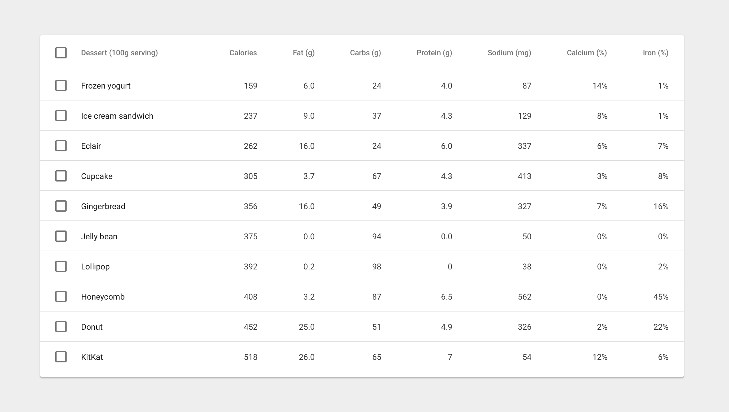
Example usage for mdt-row attribute:

<mdt-table
    selectable-rows="true"
    table-card="{title: Nutrition, actionIcons: true}"
    mdt-row="{
        'data': filteredItems,
        'table-row-id-key': 'id',
        'column-keys': ['name', 'calories', 'fat', 'carbs', 'protein', 'sodium', 'calcium', 'iron']
    }">

    <mdt-header-row>
        <mdt-column>Dessert (100g serving)</mdt-column>
        <mdt-column>Type</mdt-column>
        <mdt-column>Calories</mdt-column>
        <mdt-column sortable-rows-default>Fat (g)</mdt-column>
        <mdt-column>Carbs (g)</mdt-column>
        <mdt-column>Protein (g)</mdt-column>
    </mdt-header-row>

    <!-- notice we didn't provide mdt-row here -->
</mdt-table>
Available Params Type Details
mdt-row-paginator Function optional, makes possible to provide a callback function which returns a promise, providing the data for the table. Has two parameters: page and pageSize (an optional parameter is options as a third parameter, which can have columnFilter property when column-filter is used or columnSort when you turn on column sorting feature
mdt-row-paginator-error-message String optional, overrides default error mesasge when promise gets rejected by the paginator function.
mdt-row-paginator-no-results-message String optional, overrides default 'no results' message when there are no results in the table.
mdt-trigger-request function(loadPageCallback) optional, if mdt-row-paginator set, provides a callback function for manually triggering an ajax request. Can be useful when you want to populate the results in the table manually. (e.g.: having a search field in your page which then can trigger a new request in the table to show the results based on that filter.

Example usage for mdt-row-paginator attribute:

<mdt-table
    paginated-rows="{isEnabled: true, rowsPerPageValues: [5,10,20,100]}"
    mdt-row-paginator="paginatorCallback(page, pageSize, options)"
    mdt-row-paginator-error-message="Error happened during loading nutritions."
    mdt-row="{
        'table-row-id-key': 'fields.item_id',
        'column-keys': [
            'fields.item_name',
            'fields.nf_calories',
            'fields.nf_total_fat',
            'fields.nf_total_carbohydrate',
            'fields.nf_protein',
            'fields.nf_sodium',
            'fields.nf_calcium_dv',
            'fields.nf_iron_dv'
        ],
    }">

    <mdt-header-row>
        <mdt-column align-rule="left">Dessert (100g serving)</mdt-column>
        <mdt-column align-rule="right">Calories</mdt-column>
        <mdt-column align-rule="right">Fat (g)</mdt-column>
        <mdt-column align-rule="right">Carbs (g)</mdt-column>
        <mdt-column align-rule="right">Protein (g)</mdt-column>
        <mdt-column align-rule="right">Sodium (mg)</mdt-column>
        <mdt-column align-rule="right">Calcium (%)</mdt-column>
        <mdt-column align-rule="right">Iron (%)</mdt-column>
    </mdt-header-row>
</mdt-table>

Column attributes

mdt-column attributes

Available Params ChildPArams Type Details
align-rule String if provided, align the text to the needed direction for the entire column (note, that it aligns the data that belongs to the column)
(default) left left-align content
right right-align content
Available Params Type Details
column-definition String if provided, display a tooltip on hover. If sorting is enabled, display a light sort icon upon hover, which indicates that the column is sortable.
Column definition on hover
Available Params ChildPArams Type Details
sortable-rows-default - When column-sort is applied to the table, it marks the column as the default sorting column
column-sort Boolean Object
column-sort true false
column-sort comparator in case of object, specifying a 'comparator' property which is a function for sorting the column data's. As every compare function, it gets two parameters and return with the compared result (-1,1,0)
Available Params ChildPArams Type Details
column-filter Object if provided, user can activate column filter feature on the selected column.
valuesProviderCallback Function required, function which provides the values into the column filter. It must return with a promise which resolves an array of strings/objects.
valuesTransformerCallback Function optional, function which transforms the provided objects into strings to be able to show it visually in the column filter.
placeholderText Text optional, placeholder which will show up as a default text (available only for chips and dropdown filter types
filterType Text optional, defines the type of the filter you want to use. Available options are: chips, checkbox, dropdown. If you don't specify it, the default will be chips
exclude-from-column-selector Boolean optional, excludes the column from the column selection feature
hide-column-by-default Boolean optional, make column unselected by default in the column selection panel

When filters are applied to the columns, a third parameter will be applied to the mdt-row-paginator callback function.

Data-Row attributes

mdt-row attributes

Available Params Type Details
table-row-id String Integer

Custom cell content

mdt-custom-cell attributes

If you are using mdt-row attribute to load your data (which is only way of you are dealing with ajax contents), you can now have custom content for each cells you defined. Important information:

You can still access your scope variables/functions with accessing clientScope within the mdt-custom-cell directive. The value of the cell can be accessed by accessing value inside the directive. Accessing rowId also possible if you specified it with table-row-id-key.

Available Params ChildParams Type Details
column-key String required, specifies the column in the rows.
There is only one scope variable that you can use in your template, and it's called value. Check the example.

Example usage for mdt-custom-cell:

<mdt-table>
    <mdt-table mdt-row="{'data': filteredItems,
                      'table-row-id-key': 'id',
                      'column-keys': ['name', 'calories', 'fat', 'carbs', 'protein', 'sodium', 'calcium', 'iron']}">
        <mdt-header-row>
            <mdt-column align-rule="left">Dessert (100g serving)</mdt-column>
            <mdt-column align-rule="right">Calories</mdt-column>
            <mdt-column align-rule="right">Fat (g)</mdt-column>
            <mdt-column align-rule="right">Carbs (g)</mdt-column>
            <mdt-column align-rule="right">Protein (g)</mdt-column>
            <mdt-column align-rule="right">Sodium (mg)</mdt-column>
            <mdt-column align-rule="right">Calcium (%)</mdt-column>
            <mdt-column align-rule="right">Iron (%)</mdt-column>
        </mdt-header-row>

        <!-- here you have your own, customised cell for every 'protein' column -->
        <mdt-custom-cell column-key="protein">
            <span ng-class="{'red': value > 5, 'green': value <= 5}">{{value}}</span>
            <span ng-click="clientScope.myMethodToExecute()">click here</span>
            
            <span>This is the row id for this column: {{rowId}}</span>
        </mdt-custom-cell>
    </mdt-table>
</mdt-table>

Data-Cell attributes

mdt-cell attributes

Available Params ChildParams Type Details
inline-menu Array if provided, users can select from a predefined list of options. In this scenario, a menu component directly embedded in the table
A table with inline menus
An expanded inline menu
Available Params ChildParams Type Details
editable-field String if provided, provides basic text editing. Include editable fields within a table and denote them using placeholder text(if empty). You can use a simple edit dialog with just a text field, or display a full dialog component on click.
smallEditDialog - A simple, one-field edit dialog on click
largeEditDialog - A complex, flexible edit edit dialog on click
editable-field-title String If set, then it sets the title of the dialog. (only for largeEditDialog)
editable-field-max-length Number if set, then it sets the maximum length of the field.
An editable table cell with placeholder text
A simple, one-field edit dialog
A complex, flexible edit dialog
Icon-based edit affordance
Available Params ChildParams Type Details
html-content Boolean When the cell content is not a simple value (html content)

Example usage:

<mdt-table
    selectable-rows="true"
    table-card="{title: Nutrition, actionIcons: true}">

    <mdt-header-row>
        <!-- defining column descriptions, align content to the left -->
        <mdt-column
            align-rule="left"
            column-definition="The total amount of food energy in the given serving size.">
            Dessert (100g serving)
        </mdt-column>

        <!-- in case of inline menu (INLINE-MENU FEATURE DOES NOT EXIST YET) -->
        <mdt-column inline-menu="[ {iceCream: 'Ice Cream', pastry: 'Pastry', other: 'Other'} ]">Type</mdt-column>

        <!-- inline text editing (EDITABLE-FIELDS FEATURE DOES NOT EXIST YET) -->
        <mdt-column editable-field="textInput">
            Calories
        </mdt-column>

        <!-- in case of sortable columns, we can set the defaultly sortable column -->
        <mdt-column sortable-rows-default>
            Fat (g)
        </mdt-column>
        <mdt-column>Carbs (g)</mdt-column>
        <mdt-column>Protein (g)</mdt-column>
    </mdt-header-row>

    <mdt-row ng-repeat="nutrition in nutritionList">
        <mdt-cell>Frozen Joghurt</mdt-cell>
        <mdt-cell>159</mdt-cell>
        <mdt-cell>6</mdt-cell>
        <mdt-cell>24</mdt-cell>
        <mdt-cell>4</mdt-cell>
        <mdt-cell>87</mdt-cell>
    </mdt-row>

</mdt-table>

mddatatable's People

Contributors

anlgt avatar aortyl avatar coopernewby avatar datak1d avatar dbkaplun avatar gjr-qm avatar helvio88 avatar iamisti avatar jeffzmartin avatar leocaseiro avatar loganarnett avatar omgimalexis avatar pacoita avatar willsoto avatar

Stargazers

 avatar  avatar  avatar  avatar  avatar  avatar  avatar  avatar  avatar  avatar  avatar  avatar  avatar  avatar  avatar  avatar  avatar  avatar  avatar  avatar  avatar  avatar  avatar  avatar  avatar  avatar  avatar  avatar  avatar  avatar  avatar  avatar  avatar  avatar  avatar  avatar  avatar  avatar  avatar  avatar  avatar  avatar  avatar  avatar  avatar  avatar  avatar  avatar  avatar  avatar  avatar  avatar  avatar  avatar  avatar  avatar  avatar  avatar  avatar  avatar  avatar  avatar  avatar  avatar  avatar  avatar  avatar  avatar  avatar  avatar  avatar  avatar  avatar  avatar  avatar  avatar  avatar  avatar  avatar  avatar  avatar  avatar  avatar  avatar  avatar  avatar  avatar  avatar  avatar  avatar  avatar  avatar  avatar  avatar  avatar  avatar  avatar  avatar  avatar  avatar

Watchers

 avatar  avatar  avatar  avatar  avatar  avatar  avatar  avatar  avatar  avatar  avatar  avatar  avatar  avatar  avatar  avatar  avatar  avatar  avatar  avatar  avatar  avatar  avatar  avatar  avatar  avatar  avatar  avatar  avatar  avatar  avatar  avatar  avatar  avatar  avatar  avatar  avatar  avatar  avatar  avatar  avatar  avatar  avatar

mddatatable's Issues

Controller 'mdDataTable', required by directive 'mdDataTableHeaderRow', can't be found!

Hi, thanks for creating this module! Unfortunately, I'm having a little trouble using it. I took your example usage of the mdDataTable and put it in my view and (after including your module in my project), and get the following error. Any ideas of what I might be missing? Thanks!

Error: [$compile:ctreq] Controller 'mdDataTable', required by directive 'mdDataTableHeaderRow', can't be found!

DEMO > search, search is not working

just copied everything from the demo and the search is not working.

had to change from {{(filteredItems = (nutritionList | filter: filterName))}}

to {{filteredItems = (nutritionList | filter: filterName)}}

(bracket around filteredItems)

Sort direction doesn't reset when clicking a different column

Hi,

Great datatable! I like it when the Google guidelines are used as much as possible.

The issue is that when you have a column sorted descending and you click another column, the sort direction for the new column still is descending, but the arrow is pointing in the ascending direction. I when you click another column, the initial direction should always be ascending.

Want me to make a pull request to fix it?

Support for angular material virtual repeat

Any thoughts on adding support for virtual repeat?
I think it'd go very well with adding vertical scrolling with a fixed header. Effectively laying the groundwork for performant infinity scrolling.

(DEMO > search) TypeError: _.get is not a function

TypeError: _.get is not a function
at md-data-table.js:244
at Function.m.each.m.forEach (underscore-min.js:5)
at addRawDataToStorage (md-data-table.js:243)
at Object.fn (md-data-table.js:233)
at r.$digest (angular.min.js:131)
at r.$apply (angular.min.js:134)
at g (angular.min.js:88)
at R (angular.min.js:92)
at XMLHttpRequest.v.onload (angular.min.js:93)

HTML:

<md-card style="margin:0px">
        <md-subheader>Filter by search</md-subheader>

        <md-input-container style="margin:15px;">
            <label>Search</label>
            <input type="text" ng-model="filterName">
        </md-input-container>

        <div ng-hide="true">
            {{(filteredItems = (nutritionList | filter: filterName))}}
        </div>
    </md-card>
    <mdt-table
        paginated-rows="{isEnabled: true, rowsPerPageValues: [5,10,20,50]}"
        mdt-row-paginator-error-message="Error happened during loading nutritions."
        mdt-row="{
                'data': filteredItems,
                'table-row-id-key': 'id',
                'column-keys': ['name', 'calories', 'fat', 'carbs', 'protein', 'sodium', 'calcium', 'iron']
        }">
        <mdt-header-row>
            <mdt-column align-rule="left">Dessert (100g serving)</mdt-column>
            <mdt-column align-rule="right">Calories</mdt-column>
            <mdt-column align-rule="right">Fat (g)</mdt-column>
            <mdt-column align-rule="right">Carbs (g)</mdt-column>
            <mdt-column align-rule="right">Protein (g)</mdt-column>
            <mdt-column align-rule="right">Sodium (mg)</mdt-column>
            <mdt-column align-rule="right">Calcium (%)</mdt-column>
            <mdt-column align-rule="right">Iron (%)</mdt-column>
        </mdt-header-row>
    </mdt-table>

tested with dependencies:

"dependencies": {
    "jquery": "~2.1.4",
    "angular-material": "master",
    "components-font-awesome": "master",
    "angular-messages": "~1.4.8",
    "angular-route": "~1.4.8",
    "angular-loader": "~1.4.0",
    "angular-mocks": "~1.4.8",
    "angular-paging": "~2.1.0",
    "ngmap": "~1.16.7",
    "angular-environment": "~1.0.3",
    "mdDataTable": "~1.2.0",
    "underscore": "~1.8.3",
    "lodash": "~3.10.1",
    "angular-aria": "~1.4.9",
    "angular-animate": "~1.4.9"
  }

Any ideas ?

Header/sorting ideas

Just some ideas that will make the table a little more attractive:

  • animating the sort icon when changing sort direction
  • put a ripple effect when clicking a sortable header (it's an element with button behaviour)

I can implement it if you want,

can we have Edit icon with Checkbox for opening dialog ?

Hi

Thanks for putting up really a workable solution for loading tabular data . i wanted to edit row by providing an icon on most rite with check box

basically m moving to angular material from traditional design and in that design i have edit icon with check box m trying to use it with provided data table but not able to make it ?

can u help me

html-content affects column sorting

Thanks for the effort updating this great feature. I came up with the issue using a basic structure (slightly simplified version):

<md-data-table selectable-rows="true" sortable-columns="true" animate-sort-icon="true">
    <md-data-table-header-row>
        <md-data-table-column sortable-rows-default> {{lo.Type}} </md-data-table-column>
        <md-data-table-column align-rule="left"> {{lo.Name}} </md-data-table-column>
    </md-data-table-header-row>

    <md-data-table-row ng-repeat="item in si.items">
        <md-data-table-cell html-content="true">
            <!-- BUG: sorting not working on this column -->
            {{item.ItemType)}}
        </md-data-table-cell>
        <md-data-table-cell>{{item.Name}}</md-data-table-cell>
    </md-data-table-row>
</md-data-table>

And I did some further experiments. After added the html-content="true" to any of the md-data-table-cell, it will prevent sorting from re-rendering the whole column, even when I clicked the header of the same column. However, all other rows are still being correctly sorted.

I'm doing so because I want to insert different md-icons (basically different names of the icon) into the cells, there might be other better approaches. Please suggest if you know any :)

BTW, I'm still using v1.0 as I had some errores when using later versions. I didn't have the time to test whether the error came from some conflicts as I'm also using Angular-material.

TypeError: Cannot read property 'hasOwnProperty' of undefined
at new mdtPaginationHelper (md-data-table.js:200)
...

Multiple directives asking for transclusion

I am getting the following error when trying to use md-data-table in my project.

Error: [$compile:multidir] Multiple directives [mdButton, mdButton (module: material.components.button)] asking for transclusion

Is this because of mdButton directives in both ngMaterial and md-data table? How can I fix this?

Column header binding

I believe it's a new issue introduced since 1.0.x.

Tested using the demo codepen, with {{$scope.Calories = "Calories";}}.

Bind element will be shown as the row content {{header}} rather than desired values set in js.

<mdt-header-row>
    <mdt-column>
        {{header}}
    </mdt-column>
</mdt-header-row>

Correct me if I'm supposed to use something else instead.

Rows are not cleared if data updated

Oops, it's me again. This is a strange one.

If the data for table rows are re-assigned, old rows are not deleted. Demo is available here (note the change after 2 seconds).

I had a look at the code, it seems that angular.js did try to remove the old data/row (If you set a break point around Line 27530 (search the comment "remove leftover items"). I don't know why this is happening, as I saw $scope.rowDataStorage = [] in mdtRowDirective. And I'm confused about why the pagination works when change the number per page choice.

First release: 26th of July

Angular data table implementation of google material design. This component is UNDER DEVELOPMENT. First release: 26th of July ??

How do I add buttons per row

Hi there,

Another question was that I saw your docs and didn't really see in the configuration how I am supposed to configure a column such that it has icon buttons where I can set ng-click attributes to controller methods on my scope.

Is this possible on your table?

Amarish

Ajax + custom fields

Need a feature to use Ajax loading and virtual repeat...
For example I need to show all record from database with custom html fileld (additional actions for example)
Can you help to realize that?

Project init

Hi,

I forked the project but can't achieve to lauch gulp correctly. Seems to have a problem with bower's path directory or something like this...
I ran npm install && bower install. Is there anything else I forgot ?

Cannot use md-data-table in strict mode

Hi! I tried using the table. Our application uses the javascript 'strict mode' but because of that I get the following errors:

Error: [$injector:strictdi] mdDataTableDirective is not using explicit annotation and cannot be invoked in strict mode (...)
angular.js:12416 Error: [$injector:strictdi] mdDataTableHeaderRowDirective is not using explicit annotation and cannot be invoked in strict mode (...)
angular.js:12416 Error: [$injector:strictdi] mdDataTableColumnDirective is not using explicit annotation and cannot be invoked in strict mode (...)
angular.js:12416 Error: [$injector:strictdi] mdDataTableRowDirective is not using explicit annotation and cannot be invoked in strict mode (...)
angular.js:12416 Error: [$injector:strictdi] mdDataTableCellDirective is not using explicit annotation and cannot be invoked in strict mode (...)

Table holding on to past results - revealed when sorting

I am using the table to hold search results. When I perform a search, the table behaves as I expect. However, if I do a column sort, I will see results from previous searches mixed in.
Is there a way to clear out past results from the table? Clearly, replacing the model object is not doing the trick :)

sort-value property to allow sorting when used HTML or filtered value

In my case the value of the cell does not allow proper sorting:

<md-data-table-cell>
     {{ node.size | bytes }}
</md-data-table-cell>

This may return eg "9MiB" and "1GiB". I need to sort in bytes. This is my proposal.

<md-data-table-cell sort-value="node.size">
      {{ node.size | bytes }}
</md-data-table-cell>

Unable to resolve in Bower

bower.json

{
"name": "myProject",
"description": "My Project",
"version": "0.0.1",
"homepage": "...",
"license": "MIT",
"private": true,
"dependencies": {
"angular": "^1.4.x",
"angular-animate": "^1.4.x",
"angular-aria": "^1.4.x",
"angular-material": "^0.9.x",
"material-design-icons": "2.0.x",
"angular-ui-router": "^0.2.15",
"md-data-table": "0.0.0"
}
}

$ bower install
bower md-data-table#0.0.0 not-cached git://github.com/iamisti/md-data-table.git#0.0.0
bower md-data-table#0.0.0 resolve git://github.com/iamisti/md-data-table.git#0.0.0
bower md-data-table#0.0.0 ENORESTARGET No tag found that was able to satisfy 0.0.0

Additional error details:
No versions found in git://github.com/iamisti/md-data-table.git

usage

Olá,

Meu nome é Johnny e gostaria de usar o md-data-table no meu projeto de estudo. Fiz a instalação através do "bower install". Porém não consigo implementar. Pode meu ajudar?

Grato!

using filters in ajax loaded fields

Hi,
Is there a way to apply filters to ajax loaded table content ? something like
'column-keys': [
'speed | bytes',
],
and the possibility to concatenate two fields of the reply into one columns like {{ loaded_bytes }} of {{ total_bytes }}

Obviously i can modify my backend code to implement this but i think that implement it in mdDataTable would be better
Thanks in advance

Fixed table heading

Fiexed table heading and only scroll the table body. Table should occupy its parent's element height.

leave check-box checked while clicking on the row also

vertical scroll

I see, there is a table horizontal scrollbar for column scroll.
Do you plan to develop a vertical scrollbar feature with fixed row header?

Edit row by clicking on edit pencil in row

Hi,

I am searching for the option to have an edit action on each row. I mean by having an edit icon at the end of the row with action to edit the cell's in a row. So, not by selecting the row first and then have an action to edit the the cell's of the row, but directly a dialog after clicking on the edit pencil.
In case no i could ask some developers to help you, but it would be graet if you can guide them while developing this function.

Let me know what you think.

Greetings and my compliments for this very good data table. In my opnion one of the best in the sense of following the google guideleines.

Does md-data-table work with the versions below?

Having issues with my karma tests and I'm trying to resolve and think it's a versioning issue.

Are you able to confirm if they work with the following?
Angular 1.4.7
Angular-Material 0.11.1

Thanks!

[BUG] Error when used ngClass in mdDataTableRow

Example:

                <md-data-table-row ng-repeat="node in nodes | orderBy:['type', 'name']"
                                   ng-class="{'ani-slide': nodes != null}">

Error is:

Error: [$parse:syntax] Syntax Error: Token '{' is an unexpected token at column 19 of the expression [{anislide: nodes} {'selectedRow': getRowOptions().selected}] starting at [{'selectedRow': getRowOptions().selected}].
http://errors.angularjs.org/1.4.4/$parse/syntax?p0=%7B&p1=is%20an%20unexpected%20token&p2=19&p3=%7Banislide%3A%20nodes%7D%20%7B'selectedRow'%3A%20getRowOptions().selected%7D&p4=%7B'selectedRow'%3A%20getRowOptions().sele

Can you put single .js on bower rather than whole project?

Hi there,

I saw your demo and since I'm going with angular-material I would like to use your data table.

I cloned your repository and after npm install and bower install, did a gulp on the main directory. Most tasks except the test and run server tasks seemed to work. However, I don't see anything like a dist folder with a file like md-data-table.js that I can include in my project. I saw the same project when I tried to do bower install md-data-table.

I was wondering if it would be possible for you to put this project on bower in such a way that rather than the user pulling the entire project with dependencies, it would be extremely helpful if after a bower-install I could just include 1 .js file and 1 .css file into my project in order to use your module.

FYI

I got this output when I ran gulp

[19:04:57] Using gulpfile ~/Dev/third_party_modules/md-data-table/gulpfile.js
[19:04:57] Starting 'default'...
[19:04:57] Starting 'start development webserver'...
[19:04:57] Finished 'start development webserver' after 6.41 ms
[19:04:57] Starting 'build'...
[19:04:57] Starting 'test'...
[19:04:57] Starting 'unit'...
[19:04:57] Server started http://localhost:9000
[19:04:57] LiveReload started on port 35729
[19:04:57] Starting Karma server...

/home/amarish/Dev/third_party_modules/md-data-table/node_modules/karma/node_modules/di/lib/injector.js:9
throw error('No provider for "' + name + '"!');
^
Error: No provider for "framework:jasmine-jquery"! (Resolving: framework:jasmine-jquery)
at error (/home/amarish/Dev/third_party_modules/md-data-table/node_modules/karma/node_modules/di/lib/injector.js:22:68)
at Object.parent.get (/home/amarish/Dev/third_party_modules/md-data-table/node_modules/karma/node_modules/di/lib/injector.js:9:13)
at [object Object].get (/home/amarish/Dev/third_party_modules/md-data-table/node_modules/karma/node_modules/di/lib/injector.js:54:19)
at /home/amarish/Dev/third_party_modules/md-data-table/node_modules/karma/lib/server.js:321:14
at Array.forEach (native)
at Object.exports.start (/home/amarish/Dev/third_party_modules/md-data-table/node_modules/karma/lib/server.js:320:21)
at Object. (/home/amarish/Dev/third_party_modules/md-data-table/node_modules/gulp-karma/lib/background.js:3:8)
at Module._compile (module.js:456:26)
at Object.Module._extensions..js (module.js:474:10)
at Module.load (module.js:356:32)
at Function.Module._load (module.js:312:12)
at Function.Module.runMain (module.js:497:10)
at startup (node.js:119:16)
at node.js:902:3

[19:04:58] 'unit' errored after 957 ms
[19:04:58] Error in plugin 'gulp-karma'

Others components within 'md-data-table-cell' no longer work.

Previously it was possible to use a md-button inside the . But this is no longer possible, since the transclude does not meet this requirement.

Follow the code in md-data-table.js:

transclude(function (clone) {
//TODO: better idea?
var cellValue = $parse(clone.html().replace('{{', '').replace('}}', ''))($scope);
mdDataTableRowCtrl.addToRowDataStorage(cellValue);
});

Editable Field Not working

I am trying to use your "editable-field" for "md-data-table-cell" and the cell remains the same. I took the demo project and tried to edit to playaround it

Refresh

Hi, is there a way to refresh the table via ajax with an external button?

Replace mdt-row attribute with mdt-row element

It would be more consistent if a row is defined by mdt-row element no matter where the data comes from. An AJAX response should update $scope collection and the rest is up to Angular. ;)

Recommend Projects

  • React photo React

    A declarative, efficient, and flexible JavaScript library for building user interfaces.

  • Vue.js photo Vue.js

    🖖 Vue.js is a progressive, incrementally-adoptable JavaScript framework for building UI on the web.

  • Typescript photo Typescript

    TypeScript is a superset of JavaScript that compiles to clean JavaScript output.

  • TensorFlow photo TensorFlow

    An Open Source Machine Learning Framework for Everyone

  • Django photo Django

    The Web framework for perfectionists with deadlines.

  • D3 photo D3

    Bring data to life with SVG, Canvas and HTML. 📊📈🎉

Recommend Topics

  • javascript

    JavaScript (JS) is a lightweight interpreted programming language with first-class functions.

  • web

    Some thing interesting about web. New door for the world.

  • server

    A server is a program made to process requests and deliver data to clients.

  • Machine learning

    Machine learning is a way of modeling and interpreting data that allows a piece of software to respond intelligently.

  • Game

    Some thing interesting about game, make everyone happy.

Recommend Org

  • Facebook photo Facebook

    We are working to build community through open source technology. NB: members must have two-factor auth.

  • Microsoft photo Microsoft

    Open source projects and samples from Microsoft.

  • Google photo Google

    Google ❤️ Open Source for everyone.

  • D3 photo D3

    Data-Driven Documents codes.