jameslnewell / styled-components-breakpoint Goto Github PK
View Code? Open in Web Editor NEWUtility function for using breakpoints with styled-components 💅.
Utility function for using breakpoints with styled-components 💅.
My example:
This fragment of code is working correctly:
const centered = css`
  ${Column} {
    &:first-child ${StyledLink} {
      margin: 0 0 0 auto;
    }

    &:last-child ${StyledLink} {
      margin: 0 auto 0 0;
    }
  }
`

const Example = styled('div')`
  ${breakpoint('md')`
    ${props => props.centered && centered};
  `}
`
But I have an error on this, which is a much better solution for my project:
const centered = css`
  ${breakpoint('md')`
    ${Column} {
      &:first-child ${StyledLink} {
        margin: 0 0 0 auto;
      }

      &:last-child ${StyledLink} {
        margin: 0 auto 0 0;
      }
    }
 `}
`

const Example = styled('div')`
  ${props => props.centered && centered};
`
The result of the second one is that no margin will be assigned which is completely wrong
Hello!
Is there a way to use this in JSX?
For instance, I want to change the aspect ratio of the cards.
<CardMedia
  aspectRatio={breakpoint('tablet') ? 'square' : 'wide'}
  image={object.image}
/>
If not, It could be a really good improvement.
Thanks!
With 3.0.0-preview.20
${breakpoint("tablet")`
    padding: ${rem("40px")} ${rem("20px")} ${rem("100px")} ${rem("20px")};
    flex-direction: row;
  `}
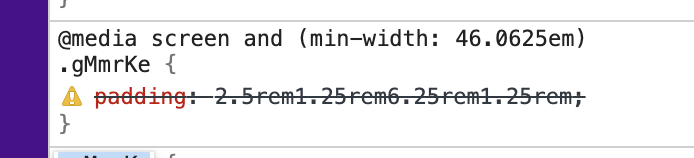
This used to work in 2.1.1
Great tool! Just thought it could get even better if it could also support media types (screen, speech, print, all) to cover all the bases.
Source: https://developer.mozilla.org/en-US/docs/Web/CSS/@media
so I discover errors more quickly
The npm page for this library lists these instructions for setting the types for themed breakpoints:
import {DefaultTheme} from 'styled-components';

declare module 'styled-components' {
  export interface DefaultTheme {
    breakpoints: {
      [name in 'xs' | 'sm' | 'md' | 'lg' | 'xl']: number;
    };
  }
}
However, even after doing this, the only valid types to pass to breakpoint() are desktop, tablet, and mobile. Is this functionality currently working? The types look hardcoded to those original values:
export declare const breakpoint: (breakpointA: import("./types").DefaultBreakpointName, breakpointB?: "mobile" | "tablet" | "desktop" | undefined) => CSSFunction;
Prettier doesn't seems to work with css inside the template string.
As a workaround, seems possible to enable formatting by using the styled-components helper function css
export const SC = styled.div`
  ${breakpoint('lg')`${css`
    height: 100%;
  `}`}
`;
but as you can see, is doesn't look good, any alternatives?
I've noticed that template literal doesn't work properly with the breakpoint method.
My source code, that leads me to the problem:
 ${breakpoint('md')`
    &:hover {
      color: ${({ theme }) => theme.colors.green};
      background-color: ${({ theme }) => theme.colors.darkGrey_2};
    }
  `};
As a result, the dynamic values are concatenated into one string.
Dev tools result:

Probably the issue is caused by missing spread operator on interpolations here:
TS7016: Could not find a declaration file for module 'styled-components-breakpoint'. 'node_modules/styled-components-breakpoint/dist/cjs/index.js' implicitly has an 'any' type.
to be consistent with styled-components-spacing which accepts any units (via a string)
From:
  ${({theme}) => breakpoint('lg', theme.breakpoints)`
    font-size: 24px;
  `}
To:
  ${breakpoint('lg')`
    font-size: 24px;
    width: ${({width}) => `${width}px`};
  `}
by changing breakpoint to be a fn that returns a fn.
Hi,
After sucessfully used the styled-components-breakpoint in React in the past, I wanted to add styled-components-breakpoint to my components in NextJS.
When I use it, it throws an webpack error:
TypeError: styled_components_breakpoint__WEBPACK_IMPORTED_MODULE_4___default(...) is not a function
Component:
import breakpoint from 'styled-components-breakpoint';

const Logo = styled.img`
display: block;

${breakpoint('mobile')`
    width: 100%;
`}

${breakpoint('tablet')`
    width: 60%;
`}

${breakpoint('desktop')`
    width: 30%;
`}
;
next.config.js:
// next.config.js const withOptimizedImages = require('next-optimized-images'); const path = require('path'); module.exports = withOptimizedImages({ webpack(config) { config.resolve.alias.images = path.join(__dirname, 'public/images'); return config; }, });
Why is it throwing an error? I can use styled-components perfectly without breakpoints and webpack compiles...
Hi,
v3 is already released, can you fix the warning? There should not be any breaking changes
npm WARN [email protected] requires a peer of styled-components@^1 || ^2.0.0-3 but none is installed. You must install peer dependencies yourself.
It seems that styled-system is moving to use break-points with units (again?) https://styled-system.com/guides/migrating#changes
The theme.breakpoints object must specify CSS units. Numbers are no longer converted to pixel values.
This I guess will break https://github.com/jameslnewell/styled-components-breakpoint/blob/master/src/core.js#L49
Is it a goal of this project to be compatible with styled-system as well?
In any case. Can I 'globally' change the toCSS mapping function to avoid the situation highlighted in L49 above?
<Body size="lg" color={{desktop: 'primary.500', tablet: 'primary.100'}}>Expected:
@media (min-width: 36.0625em)
<style>…</style>
.gOOjhT {
    color: #ccf2ed;
}
@media (min-width: 75.0625em)
<style>…</style>
.gOOjhT {
    color: #00c0a5;
}
Actual:
@media (min-width: 75.0625em)
<style>…</style>
.gOOjhT {
    color: #00c0a5;
}
@media (min-width: 36.0625em)
<style>…</style>
.gOOjhT {
    color: #ccf2ed;
}Hi, can you please add a licence file to the project? Also, am I correct assuming the project is under MIT licence just the file is missing? (package.json indicates MIT, that's why I think so)
trying to apply a change of color from breakpoint md using the following styling:
part of my components/Button.js
import React from "react";
import styled from "styled-components";
import breakpoint from "styled-components-breakpoint";

const StyledButtonAddRemove = styled(Button)`
  color: ${({ theme }) => theme.colors.type};
  background-color: ${({ theme }) => theme.colors.typeInverse};

  ${breakpoint("md")`
    color: ${({ theme }) => theme.colors.typeInverse};
    background-color: ${({ theme }) => theme.colors.type};
  `}
`;
part of my ./theme.js
const colors = {
  type: "hsl(0, 0%, 100%)",
  typeInverse: "hsl(0, 0%, 0%)"
};
After rendering I see the following in the my dev tools while inspecting desktop:
@media screen and (min-width: 48em)
.bDBudy {
    color: hsl(0,0%,0%)hsl(0,0%,100%);
}
while I was expecting to see:
@media screen and (min-width: 48em)
.bDBudy {
    color: hsl(0,0%,0%);
    background-color: hsl(0,0%,100%);
}
It does seem to work when I replace the reference to my them by hard coded colors:
import React from "react";
import styled from "styled-components";
import breakpoint from "styled-components-breakpoint";

const StyledButtonAddRemove = styled(Button)`
  color: ${({ theme }) => theme.colors.type};
  background-color: ${({ theme }) => theme.colors.typeInverse};

  ${breakpoint("md")`
    color: red;
    background-color: blue;
  `}
`;
this renders as
@media screen and (min-width: 48em)
.gzeeqj {
    color: red;
    background-color: blue;
}
ThemeProvider is added in App.js
I would like to be able to use the theme colors. How can I achieve this?
Currently the Peer dependency for styled-components on the v3 is set to <= 4 which leads to warnings on styled-components v5:
styled-components-breakpoint/package.json
Line 25 in 2204a87
When breakpoint string contains two variables like this:
${breakpoint('tablet')
background: ${'grey'};
color: ${'white'};
}
the string pattern start and end chars are missing because I don't know how to escape them in this editor 😃
rendering breaks and results in combined value:
background: greywhite;
Hi everyone! Probably this project is dead. If you need a useful and modern tool for media queries I suggest using Styled Breakpoints. It's a powerful, simple, customizable, and tiny (747kb) library with TypeScript support. Enjoy!)
Hi @jameslnewell,
I was just wondering if there was a way to do something like this:
@media (min-width: 46.0625em) and (max-width: 64.0625em) { ... }Thanks!
Thanks for the wonderful solution, I've created a Grid component and would like to change the direction of flex based on breakpoint but I am getting value as [object, object]
<div **direction="[object Object]"** class="Grid-sc-9kgu6b-0 vwGqw" size="100" wrap="nowrap">
const flexDirection = ({ direction }) => map(direction, val => (console.log(val), flex-direction: ${val};));
const Grid = styled.div
${width};
display: flex;
align-items: ${props => props.alignItems};
align-content: ${props => props.alignContent};
&&& {
${flexDirection};
}
flex-wrap: ${props => props.wrap};
justify-content: ${props => props.justifyContent};
&.debug * {
	outline: 1px solid red;
}
;
<Grid direction={{ mobile: "column-reverse", tablet: "row", desktop: "row" }}>
Is it possible to use breakpoints with the following syntax.
styled.button(...)
import styled from 'styled-components/macro'
import themeGet from '@styled-system/theme-get'
import breakpoint from 'styled-components-breakpoint'

import {
  border,
  layout,
  shadow,
  space,
  typography,
  variant,
} from 'styled-system'

const Button = styled.button(
  props => ({
    cursor: 'pointer',
    height: '4.25rem',
    'min-width': '200px',
    outline: 'none',
    'text-transform': 'uppercase',
    transition: 'transform 0.05s, background-color 0.3s',
    'user-select': 'none',
    '&[disabled]': {
      cursor: 'not-allowed',
      'pointer-events': 'none',
    },
    '&:focus': {
      outline: 'none',
    },
    '&::-moz-focus-inner': {
      border: 'none',
    },
    '&:active': {
      transform: 'translateY(2px)',
    },
    '& > a': {
      color: 'inherit',
      '&:hover': {
        color: 'inherit',
        'text-decoration': 'none',
      },
    },
    '& + &': {
      'margin-left': `${themeGet('space.2', 0)(props)}px`,
    },
    borderRadius: `${themeGet('radii.normal', 0)(props)}px`,
    border: '1px solid transparent',
  }),
  space,
  typography,
  layout,
  border,
  shadow,
  variant({
    scale: 'buttons',
  }),
)

Button.defaultProps = {
  variant: 'secondary',
}

export default Button
You'd normally put the query as a key:
{
   ...
   "@media (min-width: 46.0625em)": {
      width: 3
  },
  ...
}
But I'm not sure to have get that string from the lib, is it possible is it only possible when using templates?
ps: I don't need themeable breakpoints
Hi,
How easy would it be to avoid outputting empty @media blocks? A colleague and I had a go at it but couldn't work out how to determine if the block would be empty before handing off to the css constructor.
Here's a VS Code snippet to facilitate the day-to-day workflow with styled-components-breakpoint.
There's 2 versions:
break: just the "wrapper" syntaxbreakselected: wrapps on selected textBonus: choose the breakpoint by snippet choices. :)
{
  "styled-components-breakpoint": {
    "prefix": "break",
      "body": [
        "${breakpoint('${1|sm,md,lg,xl,xxl|}')`",
        "\t$0",
        "`}"
      ],
    "description": "Shortcut to make a styled-components-breakpoint breakpoint"
  },

  "styled-components-breakpoint selected": {
    "prefix": "breakselected",
      "body": [
        "${breakpoint('${1|sm,md,lg,xl,xxl|}')`",
        "\t$TM_SELECTED_TEXT$0",
        "`}"
      ],
    "description": "Shortcut to make a styled-components-breakpoint of selected code"
  },
}
Why no "xs" breakpoint on choices? Mobile first.
 React
React
A declarative, efficient, and flexible JavaScript library for building user interfaces.
🖖 Vue.js is a progressive, incrementally-adoptable JavaScript framework for building UI on the web.
 Typescript
TypeScript is a superset of JavaScript that compiles to clean JavaScript output.
An Open Source Machine Learning Framework for Everyone
 Django
The Web framework for perfectionists with deadlines.
 Laravel
A PHP framework for web artisans
Bring data to life with SVG, Canvas and HTML. 📊📈🎉
JavaScript (JS) is a lightweight interpreted programming language with first-class functions.
Some thing interesting about web. New door for the world.
A server is a program made to process requests and deliver data to clients.
Machine learning is a way of modeling and interpreting data that allows a piece of software to respond intelligently.
Some thing interesting about visualization, use data art
Some thing interesting about game, make everyone happy.
 Facebook
We are working to build community through open source technology. NB: members must have two-factor auth.
 Microsoft
Open source projects and samples from Microsoft.
 Google
Google ❤️ Open Source for everyone.
 Alibaba
Alibaba Open Source for everyone
 D3
D3
Data-Driven Documents codes.
 Tencent
China tencent open source team.