
A simple, pretty navbar for your Vue projects.


Vue 3 is supported from v5.0.0 and beyond (current master). To use vue-navigation-bar with Vue 2, use v4.1.0.
yarn add vue-navigation-barOr you can include it through the browser at the bottom of your page along with the css:
<script src="https://unpkg.com/vue-navigation-bar/dist/vue-navigation-bar.min.js"></script>

<link
  rel="stylesheet"
  type="text/css"
  href="https://unpkg.com/vue-navigation-bar/dist/vue-navigation-bar.css"
/>import { createApp } from 'vue';
import VueNavigationBar from 'vue-navigation-bar';
import 'vue-navigation-bar/dist/vue-navigation-bar.css';
const app = createApp(App);
app.component('vue-navigation-bar', VueNavigationBar);Often when starting a new project I like to get together the main foundation pieces first. A main part of that process is working on the main navbar.
This component is meant to help with that process - it gives you a standard looking navigation bar for for your app that can be easily defined using JSON or a just an array of objects.
vue-navigation-bar is meant to be used for the 80% of cases that exist when you need a standard navbar for your app/website. The layout has the brand-image anchored on the left side, and two slots for menu-options that push and pull based on designation.
I know there are lots of other styles that navbar's can be, for instance the brand-image could be in the middle - but this component won't be allowing you to do that at the moment - so if that's your thing then I would probably look to roll out something on your own, or fork this to apply to your needs if possible. That being said, the actual css here is very easy to override - I'm using BEM with SASS ( .scss ) and have the style skeleton posted below - so you should be able to style it quite nicely without issue. I've put a lot of time in placing sensible defaults that should work well against any style.
The trade-off is that the initialization and usage of this component is very easy and won't force you to do anything except declare the structure initially and declare a few css styles as necessary.
vue-navigation-bar is compatible with both vue-router projects and non- vue-router projects - just make sure to pass in true for the isUsingVueRouter option if you're using vue-router.
The component will work well with frontend component frameworks. I'm using Bootstrap 4 in the demo page and have it sitting in a container - that helps keep it from stretching too far across the page - although that may be the style you're going for, so have at it.
<template>
  <vue-navigation-bar :options="navbarOptions" />
</template>

<script>
import brandImage from '../src/assets/images/lockup-color.png'

export default {
    ...
    data() {
      return {
        navbarOptions: {
          elementId: "main-navbar",
          isUsingVueRouter: true,
          mobileBreakpoint: 992,
          brandImagePath: "./",
          brandImage,
          brandImageAltText: "brand-image",
          collapseButtonOpenColor: "#661c23",
          collapseButtonCloseColor: "#661c23",
          showBrandImageInMobilePopup: true,
          ariaLabelMainNav: "Main Navigation",
          tooltipAnimationType: "shift-away",
          tooltipPlacement: "bottom",
          menuOptionsLeft: [
            {
              type: "link",
              text: "Why Dunder Mifflin",
              arrowColor: "#659CC8",
              subMenuOptions: [
                {
                  isLinkAction: true,
                  type: "link",
                  text: "About",
                  subText: "Stupid corporate wet blankets. Like booze ever killed anyone.",
                  path: { name: "about" },
                  iconLeft: '<i class="fa fa-star fa-fw"></i>'
                },
                {
                  type: "hr",
                },
                {
                  type: "link",
                  text: "Locations",
                  subText: "You\'re a presentation tool!",
                  path: { name: "locations" },
                  arrowColor: "#659CC8",
                },
                {
                  type: "hr",
                },
                {
                  type: "link",
                  text: "Blog",
                  subText: "I enjoy having breakfast in bed. I like waking up to the smell of bacon. Sue me.",
                  path: { name: "blog" }
                },
              ]
            },
            {
              type: "link",
              text: "Contact",
              subMenuOptions: [
                {
                  type: "link",
                  text: "Customer Service",
                  path: { name: "customer-service" },
                },
                {
                  type: "link",
                  text: "Accounting",
                  path: { name: "accounting" },
                },
                {
                  type: "hr",
                },
                {
                  type: "link",
                  text: "Reception",
                  path: { name: "reception"},
                  iconLeft: '<svg id="i-telephone" xmlns="http://www.w3.org/2000/svg" viewBox="0 0 32 32" width="32" height="32" fill="none" stroke="currentcolor" stroke-linecap="round" stroke-linejoin="round" stroke-width="2"> <path d="M3 12 C3 5 10 5 16 5 22 5 29 5 29 12 29 20 22 11 22 11 L10 11 C10 11 3 20 3 12 Z M11 14 C11 14 6 19 6 28 L26 28 C26 19 21 14 21 14 L11 14 Z" /> <circle cx="16" cy="21" r="4" /> </svg>',
                },
              ]
            },
            {
              type: "link",
              text: "Pricing",
              path: { name: "pricing"},
              iconRight: '<i class="fa fa-long-arrow-right fa-fw"></i>',
            },
          ],
          menuOptionsRight: [
            {
              type: "button",
              text: "Signup",
              path: { name: "signup" },
              class: "button-red"
            },
            {
              type: "button",
              text: "Login",
              path: { name: "login" },
              iconRight: '<svg id="i-arrow-right" xmlns="http://www.w3.org/2000/svg" viewBox="0 0 32 32" width="32" height="32" fill="none" stroke="currentcolor" stroke-linecap="round" stroke-linejoin="round" stroke-width="2"> <path d="M22 6 L30 16 22 26 M30 16 L2 16" /> </svg>'
            }
          ]
        }
      }
    }
    ...
}
</script>

<style lang="scss">
  .vnb {
    .button-red {
      background: #ff3b30;

      &:hover {
        background: darken(#ff3b30, 10%);
      }
    }
  }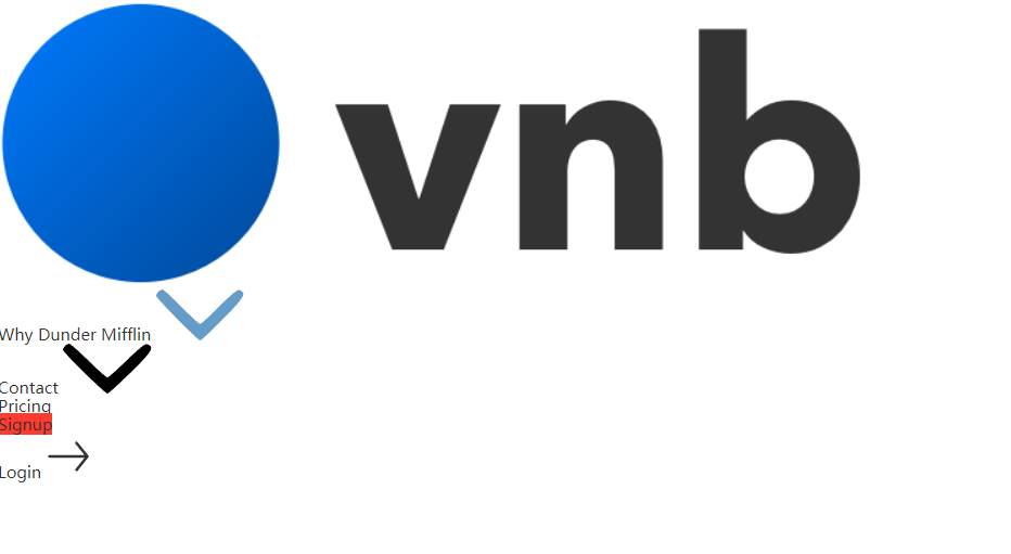
</style>Above is a basic usage example. You'll see that a lot of the work is actually just declaring your options object.
In the style section you'll see that I provide a button class to color a button in the navbar. This is done like this to give you the most control over the button color and other pseudo properties. In this case, I want one of my buttons to be red, so I provide a class in my options object and then style the class appropriately like this:
Note - the first example uses basic css , the second example is the same thing just using sass nesting - same result.
.vnb .button-red {
  background: #ff3b30;
}

.vnb .button-red:hover {
  background: #fc0d00;
}
.vnb {
.button-red {
background: #ff3b30;
&:hover {
background: darken(#ff3b30, 10%);
}
}
}You can make a bunch of button-color classes and set them up just like above.
Take a look at the ./example folder in this project - it has the complete working example that you see in the demo.(FYI - the vue-router setup there is really rudimentary so all the different pages aren't real - doesn't affect the demo.)
You may need to adjust your brand-image a bit - that's normal as brand images come in different shapes and sizes - go ahead and set a max-width or max-height in pixels using this selector: .vnb__brand-image-wrapper__link__image . Even a little margin may help. For instance, the base I have it at is max-height: 34px; - should work for most cases.
Sometimes you may want your links to perform an action instead of following a link. To do this, add the isLinkAction property to your menuOption and it'll emit the vnb-item-clicked event with the text property of the menuOption . This will suppress the path option so the link no longer goes anywhere, but instead just sends the event. Checkout the example page to see this in action.
| prop | type | required | default | possible values | description |
|---|---|---|---|---|---|
| elementId | String | no | A generated uuid | This value will be set as the id of the instance |
|
| isUsingVueRouter | Boolean | no | false | If you want to use vue-router, set this to true and all links will automatically be <router-link></router-link> |
|
| mobileBreakpoint | Number | no | 992 | Width at which the navbar turns into the mobile version | |
| brandImagePath | String or Object | no | '/' | Link path of menu-option. If you have isUsingVueRouter === true, then this needs to be an Object with a name property or just a String of your path. Otherwise, just provide a String. link |
|
| brandImage | Image | no | import your image here to use your brand image |
||
| brandImageAltText | String | no | 'brand-image' | The alt tag text for your brand image |
|
| collapseButtonImageOpen | Image | no | A hamburger icon | import your image here |
|
| collapseButtonImageClose | Image | no | A times icon | import your image here |
|
| collapseButtonOpenColor | String | no | #373737 |
CSS hex - #FFF. Only applicable if you don't supply a collapseButtonImageOpen. |
|
| collapseButtonCloseColor | String | no | #373737 |
CSS hex - #FFF. Only applicable if you don't supply a collapseButtonImageClose. |
|
| showBrandImageInMobilePopup | Boolean | no | false | If you want to show your brand logo in the mobile popup | |
| ariaLabelMainNav | String | no | 'Main Navigation' | The aria-label value for the main navbar element |
|
| tooltipAnimationType | String | no | 'shift-away' | 'shift-away', 'shift-toward', 'scale', 'perspective' | See tippy.js docs |
| tooltipPlacement | String | no | 'bottom' | 'top', 'bottom', 'left', 'right' ... and more. | See tippy.js docs for the complete list. Also, make sure to cross reference with popper.js's options. The tooltip dropdown will always drop in the direction you set here. |
| menuOptionsLeft | Object | no | {} | Menu options that will be pulled to the left towards the brand-image |
|
| menuOptionsLeft.type | String | yes | 'link', 'button', 'spacer', 'dropdown' | What type of link will this menu-option be? link will be a link, button will be a button, spacer will be a spacer with a width of 30px , dropdown will create a dropdown on desktop and a ul/li list on mobile. dropdown only works on menuOptions, not subMenuOptions. |
|
| menuOptionsLeft.text | String | yes | Text of menu-option | ||
| menuOptionsLeft.path | String or Object | no | Link path of menu-option. If you have isUsingVueRouter === true, then this needs to be an Object with at least a name property or just a String of your path. Otherwise, just provide a String. Not applicable to dropdown menuOption types. Do not use when setting isLinkAction. |
||
| menuOptionsLeft.arrowColor | String | no | CSS hex - #FFF. This styles the little chevron icon. |
||
| menuOptionsLeft.class | String | no | Only for menuOptionsLeft.type === 'button' - provide a class name so you can style your buttons |
||
| menuOptionsLeft.isLinkAction | Boolean | no | false | When true, any path option of the menuOption will not fire - instead, you'll be able to register for the @vnb-item-clicked event which will spit you out the text value of your menuOption . That way, you can do an action you may want to trigger. |
|
| menuOptionsLeft.iconLeft | HTML String | no | Only for menuOptionsLeft.type === 'link or menuOptionsLeft.type === 'dropdown'. HTML string of the icon you want to use. See more info on the Icon section of the README. |
||
| menuOptionsLeft.iconRight | HTML String | no | Only for menuOptionsLeft.type === 'link or menuOptionsLeft.type === 'dropdown'. HTML string of the icon you want to use. See more info on the Icon section of the README. |
||
| menuOptionsLeft.subMenuOptions | Object | no | Sub-menu-options that will be shown | ||
| menuOptionsLeft.subMenuOptions.type | String | yes | 'link', 'hr' | What type of link will this sub-menu-option be? link will be a link, hr will be a hr spacer |
|
| menuOptionsLeft.subMenuOptions.text | String | yes | Text of sub-menu-option | ||
| menuOptionsLeft.subMenuOptions.subText | String | no | Sub text of sub-menu-option | ||
| menuOptionsLeft.subMenuOptions.path | String | no | Link path of sub-menu-option | ||
| menuOptionsLeft.subMenuOptions.iconLeft | HTML String | no | HTML string of the icon you want to use. See more info on the Icon section of the README. |
||
| menuOptionsLeft.subMenuOptions.iconRight | HTML String | no | HTML string of the icon you want to use. See more info on the Icon section of the README. |
||
| menuOptionsRight | Object | no | {} | Menu options that will be pushed to the right of the navbar. See above - all menuOptionsLeft apply |
| event | value | description |
|---|---|---|
| vnb-mobile-popup-shown | null | Emitted when the mobile popup is shown |
| vnb-mobile-popup-hidden | null | Emitted when the mobile popup is hidden |
| vnb-item-clicked | String, menuOption.text |
Emitted when a menu option is clicked. Listen to this event to then trigger a function based on the returned value, which is the text value of the menuOption that was clicked. |
| method | parameters | description |
|---|---|---|
| closeMobilePopup | Close the mobile popup | |
| showMobilePopup | Show the mobile popup |
Note - to call these methods set a ref on your <vue-navigation-bar /> , something like this: <vue-navigation-bar :ref="myNavbar" /> . Then, manually call the methods like this in your javascript: this.$refs.myNavbar.closeMobilePopup() .
| name | description |
|---|---|
| custom-section | Use this to provide custom content in the navbar. Checkout the example code - in the commented-out section is an example search-bar setup. |
.vnb {
  &__brand-image-wrapper {
    &__link {
      &__image {
      }
    }
  }

  &__menu-options {
    &--left {
    }

    &--right {
    }

    &__option {
      &__link {
        &:hover {
        }

        &__icon {
          svg {
          }

          &--left {
          }

          &--right {
          }
        }
      }

      &__arrow {
        &--hover {
        }
      }

      &__button {
        &__icon {
          svg {
          }

          &--left {
          }

          &--right {
          }
        }
      }

      &__spacer {
      }
    }
  }

  &__sub-menu-options {
    &__option {
      &__link {
        &:hover {
        }

        &__icon {
          svg {
          }

          &--left {
          }

          &--right {
          }
        }

        &__text-wrapper {
          &__text {
          }

          &__sub-text {
          }
        }
      }

      &__hr {
      }
    }
  }

  &__collapse-button {
    &:hover {
    }

    &__image {
    }
  }

  &__popup {
    &__top {
      &__image {
      }

      &__close-button {
        &:hover {
        }

        &__image {
        }
      }
    }

    &__bottom {
      &__custom-section {
      }

      &__menu-options {
        &__option {
          &:not(:last-child) {
          }

          &__link {
            &:hover {
            }

            &--no-highlight {
              &:hover {
              }
            }

            &__icon {
              svg {
              }

              &--left {
              }

              &--right {
              }
            }
          }
        }
      }

      &__sub-menu-options {
        &__option {
          &__link {
            &:hover {
            }

            &__sub-text {
            }
          }
        }
      }
    }
  }
}

.vnb-button {
  &:hover {
  }
}So right now to use icons in some of the options, you need to pass in full HTML strings which get rendered as HTML in the desktop version of the navbar.
In the demo I use this really great set of svg icons called bytesize-icons. You can just copy the <svg></svg> code and pass it in your initialization object. You can do the same thing with the FontAwesome style of <i class="fa fa-star"></i> . In the future I'll be looking at a way to pass in full components as icons. Right now, passing in svg icons works well and does the job. Check out the .example folder to see how I have it in the demo.
Throughout the development of this component I've been making sure to allow for proper a11y options to be set when possible. This means things like aria-haspopup and aria-expanded are set on the popup-menus, aria-label 's are set on the elements, and any user can come through and use the navbar nicely using the tab button. Of course there can probably be improvements on this front, so I'll keep an eye on it myself and look for any pull-requests that improve it.
To have this work with a browser like IE11, stick this at the bottom of your index.html
<script src="https://cdnjs.cloudflare.com/ajax/libs/babel-core/5.6.15/browser-polyfill.min.js"></script>Or, you can install babel-polyfill and import that in the main script of your app. You can read more about babel-polyfill here. In the example folder I use the external script method.
# Install dependencies
yarn

# Serve with hot reload
yarn dev

# Run the tests
yarn test

# Build demo page
yarn build:example

# Build library
yarn build:library

# Build everything and run tests
yarn build-
Add an optional search input bar.What I've done is add an optionalslotnamedcustom-section. Use thisslotto add whatever custom content you want to show in the nav bar. In the demo, I have an example search bar shown. Look at the./examplefolder to check it out. - See if there's a way to let users pass a component for an icon and not be limited to HTML strings of the icon they want.
- Add more thorough tests.
- Add
prettier, andeslintto the project. Pretty much mirror the settings from something like this. - Fix the awful nesting job I did with the
SCSSBEMnesting. I took the nesting way too far - really I should only need to go one level deep - maybe two. Anyways - I'll get to this soon - sorry about that until then. It's not anything too bad, but I've grown since then and realized the error in my ways ha.
Go ahead and fork the project! Submit an issue if needed. Have fun!
Thank you to Stripe for making that sick navbar - absolutely filthy. A lot of my styling is inspired by them - although I'm definitely butchering it. Also to Bootstrap - I've used Bootstrap and their navbar for many years and drew inspiration from lessons I've learned using it.


 React
React
 Typescript
 Django
 Laravel
 Facebook
 Microsoft
 Google
 Alibaba
 D3
D3
 Tencent