Giter Site home page Giter Site logo

react-multi-select's Introduction

React Multi Select Component

Note (9/30/2022): I clearly haven't maintained this component in years. I think this is likely a good candidate to transfer the repo to someone else if anyone wants to take it over. There's likely much better options out there today, but if someone wants this, I expect we can do something here. -- BrianGenisio at Gmail

Animated GIF demo

Storybook Demo

Installation:

npm install --save @khanacademy/react-multi-select yarn add @khanacademy/react-multi-select

Usage:

See the examples in /src/stories/index.js for how to use the component, but here is a minimum required setups:

import React from 'react';
import MultiSelect from "@khanacademy/react-multi-select";

const options = [
  {label: "One", value: 1},
  {label: "Two", value: 2},
  {label: "Three", value: 3},
];

class Consumer extends React.Component {
  state = {
    selected: [],
  }

  render() {
    const {selected} = this.state;

    return <MultiSelect
      options={options}
      selected={selected}
      onSelectedChanged={selected => this.setState({selected})}
    />
  }
}

i18n:

You can override the strings to be whatever you want, including translations for your languages.

<StatefulMultiSelect
    overrideStrings={{
        selectSomeItems: "Select Some items...",
        allItemsAreSelected: "All Items are Selected",
        selectAll: "Select All",
        search: "Search",
    }}
/>

react-multi-select's People

Contributors

ajohnson-ventera avatar alexanderchan avatar andylhansen avatar briangenisio avatar kevgathuku avatar thomas-lee avatar tymchenkooleksandr avatar

Stargazers

 avatar  avatar  avatar  avatar  avatar  avatar  avatar  avatar  avatar  avatar  avatar  avatar  avatar  avatar  avatar  avatar  avatar  avatar  avatar  avatar  avatar  avatar  avatar  avatar  avatar  avatar  avatar  avatar  avatar  avatar  avatar  avatar  avatar  avatar  avatar  avatar  avatar  avatar  avatar  avatar  avatar  avatar  avatar  avatar  avatar  avatar  avatar  avatar  avatar  avatar  avatar  avatar  avatar  avatar  avatar  avatar  avatar  avatar  avatar  avatar  avatar  avatar  avatar  avatar  avatar  avatar  avatar  avatar  avatar  avatar  avatar  avatar  avatar  avatar  avatar  avatar  avatar  avatar  avatar  avatar  avatar  avatar  avatar  avatar  avatar  avatar  avatar  avatar  avatar  avatar  avatar  avatar  avatar  avatar  avatar  avatar  avatar  avatar  avatar  avatar

Watchers

 avatar  avatar  avatar  avatar  avatar  avatar  avatar  avatar  avatar  avatar  avatar  avatar  avatar  avatar  avatar  avatar  avatar  avatar  avatar  avatar  avatar  avatar  avatar  avatar  avatar  avatar  avatar  avatar  avatar  avatar  avatar  avatar  avatar  avatar  avatar  avatar  avatar  avatar  avatar  avatar  avatar  avatar  avatar  avatar  avatar  avatar  avatar  avatar  avatar  avatar  avatar  avatar  avatar  avatar  avatar  avatar  avatar  avatar  avatar  avatar  avatar  avatar  avatar  avatar  avatar  avatar  avatar  avatar

react-multi-select's Issues

Wants to apply multi select in Multiple input fields

I am trying to apply this multi select in multiple input drop down but for every drop down it's giving same values after selection, SO how we can apply this to multiple input fields. So how can i make this multi select to each input field in a form .

Add a demo for this application

The documentation for this component is kind of all over the place and the storybook doesn't describe much. Can someone show how to simply implement this into React as a single, usable component? Right now, there's many different files that must be included. It'd be nice to have a single component demo that doesn't utilize Material-UI core, just the component in itself.

No ability to remove the Search functionality.

There should be same way to not display the Search option. Currently, it's always rendered, even when I have 3 items in the dropdown. I can't even easily display: none because of its inline style which can't be overwritten, and there is no class on the elements.

Hide Select All Checkbox When Searching

I was wondering if it's currently possible to hide "Select All" checkbox as soon as the search box gains focus? If not, then I have a couple of suggestions for this request.

  1. Hide "Select All" checkbox.
  2. Or. When you are searching, and you click on "Select All", only the search results are selected and not everything in the list.

Custom filter function

I need the ability to set the custom function for searching, because fuzzy-match-utils does not work with Cyrillic.
Please, add prop like filterOptions in react-select.

Adding Image to the label

Hi, I'm trying to add an image in front of each option, my array of options look like that:

const icons = [
{ img: mbaltimeter, label: "altimeter", value: "altimeter" },
{ img: mbball, label: "ball", value: "ball" },
{ img: mbbatton, label: "batton", value: "batton" },
{ img: mbbike, label: "bike", value: "bike" },
]

as you can see I have Img holding the variable that imports the image path, the label and the value.
How can I show the image in each option in front of the label?

Thank you.

Broken styles

Hi,

I have an issue using this component.
It works fine on first render but when I refresh the page, all my app page styles are broken.

It works fine on development environment but the bug appear on build version. No error log in the console.

It works fine if I import @kenshooui/react-multi-select/dist/style.css in my .scss files instead of importing to JS files.

Thanks !

React version : ^16.6.3
React Multi Select version : ^1.0.69

Webpack freaking out on react-tag-editor

./~/react-tag-editor/src/index.jsx
Module parse failed: /Users/x74f/vendor-portal-web/node_modules/react-tag-editor/src/index.jsx Unexpected token (124:9)
You may need an appropriate loader to handle this file type.
| var inputSize = Math.max(props.value? props.value.length: 0, this.props.minInputSize)
|
| return <Field ref="field" {...props} inputProps={{size: inputSize}}/>
| },
|

I have triple-checked my babel loader and it is configured to handle JSX files.

Any thoughts?

Default value checkbox is not selected

Steps to Reproduce :

  1. Populate the 'selected' attribute
  2. Note the rendered component displays the selected values in the input field
  3. Note the equivalent checkboxes are not selected by default

Expected Result :

The selected values checkboxes should also be selected by default.

It may simply be that this use case was not considered. The current iteration appears to expect that the checkboxes are selected by user interaction. Is there a way to fix this that I am missing?

Accessibility improvements suggestion & code

Hello, this is an awesome dropdown library, exactly what I have been searching for a long time. Thank you for putting it together!

I see that there are already many accessibility features included, but may I add that most of keyboard-only users expect drop downs to open when they are in focus, by pressing ether space bar or enter (instead of key down as it's done right now).

Reference link: https://www.w3.org/TR/2017/NOTE-wai-aria-practices-1.1-20171214/examples/menubar/menubar-1/menubar-1.html#

Would you be so kind and update this block of code to also include space bar and enter?

In dropdown.js

            switch (e.which) {
                case 27:
                    // Escape
                    _this.toggleExpanded(false);
                    break;
                case 38:
                    // Up Arrow
                    _this.toggleExpanded(false);
                    break;
                case 13: // Enter Key      <-----updated line
                case 32: // Space           <-----updated line
                case 40: // Down Arrow
                    _this.toggleExpanded(true);
                    break;
                default:
                    return;
            }```


scroll bar issue

in the long list view the scroll bar isn't working properly. when clicked on the down scroll it never comes down instead it repeatedly scroll from the top

By default checked

Hi @BrianGenisio,

Is there a way i can keep some of my items checked in the dropdown by default? I am passing data from server and i want to show some of them checked. Please help. Its urgent.

Support for Select All Filtered

Can we add the capability to select all filtered options?

Currently, it's possible to filter options using keywords, which updates SelectList accordingly. However, the SelectItem associated with the "select all" checkbox only operates on the original options, rather than the filtered options.

{hasSelectAll &&
<SelectItem
focused={focusIndex === 0}
checked={this.allAreSelected()}
option={selectAllOption}
onSelectionChanged={this.selectAllChanged}
onClick={() => this.handleItemClicked(0)}
ItemRenderer={ItemRenderer}
disabled={disabled}
/>
}

To accomplish this goal, we can make some changes to the allAreSelected(), selectAll, and selectNone methods in SelectPanel to make use of this.filteredOptions() instead of props.options.

renaming this component

Hello Team,

could you please rename this package to some acceptable name in industry standards. khan academy is not a name which someone in a company would be pleased with. Thanks.

z-index of dropdown causing issues

The dropdown z-index is set to 1. I have other elements on my page that are set higher than that, and thus they are displayed on top of the dropdown, which is undesirable. Ideally, this should be exposed in a way that makes it easy to override. For now, my work-around was to add the following to my CSS to override it:

.dropdown-content {
	z-index: 3 !important;
}

scrollbar can't scroll

When I use the multi-select component, after the scroll bar appears in the drop-down, the scroll bar is pulled to the bottom, and when the scroll bar is clicked again near the bottom, the scroll bar always jumps from the top to the bottom quickly, and the scroll bar cannot be moved. Effect. Can you provide me with a solution?

demo for using the application

Hi Team,

Could you please let me know how to use this component. I am getting error in the following line import {storiesOf} from '@kadira/storybook'; while I am trying to build the bundle. Could you please help with the same.

Infinite scrolling item

Hello guys, thanks for this package, so help me a lot.

it is possible for this package to implement infinite scrolling ? i mean, it will paginate to server to fetch more data
because i dont see any handling for scrolling

Thanks

"All items are selected" displayed when all items aren't selected

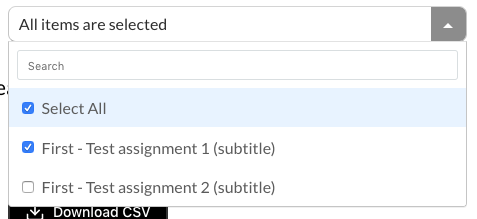
I've got a form with several multi-select components on it and the options for some of them are dependent on which options are selected in others. The problem I'm running into is when I check and uncheck options in the select that is depended on, the other select seems to end up in a state where some but not all options are selected, but it shows all options as selected.

Here's a screenshot of what I mean:
Screen Shot 2020-01-09 at 12 44 00 PM

And the code for the form:

import React, { FC, useState, useMemo, useCallback } from "react";
import styled from "styled-components/macro";
import MultiSelect from "@khanacademy/react-multi-select";
import { IoIosCalendar } from "react-icons/io";
import { FiDownload } from "react-icons/fi";
import Form from "./Form";
import Row from "./Row";
import useAsyncEffect from "../utils/useAsyncEffect";
import getTeachers from "../api/teachers/getTeachers";
import Teacher from "shared/lib/types/Teacher";
import capitalizeFirst from "shared/lib/utils/capitalizeFirst";
import getAssignmentCategories from "../api/assignments/getAssignmentCategories";
import AssignmentCategory from "shared/lib/types/AssignmentCategory";
import getAllUnits from "../api/units/getAllUnits";
import Unit from "shared/lib/types/Unit";
import Assignment from "shared/lib/types/Assignment";
import getAllAssignments from "../api/assignments/getAllAssignments";
import LabeledSwitch from "./LabeledSwitch";
import DateInput from "./DateInput";
import Column from "./Column";
import BlockButton from "./BlockButton";
import ResponseCsvOptions from "shared/lib/types/ResponseCsvOptions";

interface Props {
  onSubmit(value: Value): any;
}

interface Data {
  teachers: Teacher[];
  categories: AssignmentCategory[];
  units: Unit[];
  assignments: Assignment[];
}

export type Value = ResponseCsvOptions;

const CsvExportForm: FC<Props> = props => {
  const { onSubmit, ...rest } = props;
  const [data, setData] = useState<Data | null>(null);
  const [value, setValue] = useState<Value>({
    startDate: null,
    endDate: null,
    teacherIds: [],
    unitIds: [],
    assignmentIds: [],
    categoryIds: [],
    includeTeacherUnits: false
  });

  useAsyncEffect(async () => {
    const teachers = await getTeachers();
    const categories = await getAssignmentCategories();
    const units = await getAllUnits();
    const assignments = await getAllAssignments();

    setData({
      teachers,
      categories,
      units,
      assignments
    });
  }, []);

  const teacherOptions = useMemo(() => {
    if (!data) {
      return [];
    }
    return data.teachers.map(teacher => ({
      value: teacher.id,
      label: `${capitalizeFirst(teacher.firstName)} ${capitalizeFirst(
        teacher.lastName
      )}`
    }));
  }, [data]);

  const unitOptions = useMemo(() => {
    if (!data) {
      return [];
    }
    return data.units
      .filter(unit => {
        // Skip units that belong to unselected teachers
        if (unit.teacherId && !value.teacherIds.includes(unit.teacherId)) {
          return false;
        }

        // Skip units that belong to unselected categories
        if (unit.categoryId) {
          return value.categoryIds.includes(unit.categoryId);
        } else {
          // Only show teacher units if the teacher authored switch is on
          return value.includeTeacherUnits;
        }
      })
      .map(unit => ({
        value: unit.id,
        label: unit.name
      }));
  }, [data, value]);

  const assignmentOptions = useMemo(() => {
    if (!data) {
      return [];
    }
    return data.assignments
      .filter(assignment => {
        return value.unitIds.includes(assignment.unitId);
      })
      .map(assignment => ({
        value: assignment.id,
        label: `${assignment.title} (${assignment.subTitle})`
      }));
  }, [data, value]);

  const handleTeachersChange = useCallback(
    (teacherIds: number[]) => {
      setValue(value => {
        if (!data) {
          return value;
        }
        const newUnitIds = value.unitIds.filter(unitId => {
          const unit = data.units.find(unit => unit.id === unitId);
          if (!unit) {
            return false;
          }
          if (unit.teacherId) {
            return (
              value.includeTeacherUnits && teacherIds.includes(unit.teacherId)
            );
          }
          return true;
        });

        return { ...value, teacherIds, unitIds: newUnitIds };
      });
    },
    [data]
  );

  const handleUnitsChange = useCallback((unitIds: number[]) => {
    setValue(value => ({ ...value, unitIds }));
  }, []);

  const handleAssignmentsChange = useCallback((assignmentIds: number[]) => {
    setValue(value => ({ ...value, assignmentIds }));
  }, []);

  const handleCategoriesChange = useCallback((categoryId: number) => {
    setValue(value => {
      const { categoryIds } = value;
      let newCategoryIds;

      if (categoryIds.includes(categoryId)) {
        newCategoryIds = categoryIds.filter(id => id !== categoryId);
      } else {
        newCategoryIds = [...categoryIds, categoryId];
      }

      return {
        ...value,
        categoryIds: newCategoryIds
      };
    });
  }, []);

  const handleTeacherUnitsChange = useCallback((teacherUnits: boolean) => {
    setValue(value => ({ ...value, includeTeacherUnits: teacherUnits }));
  }, []);

  const handleSubmit = useCallback(() => {
    onSubmit(value);
  }, [onSubmit, value]);

  if (!data) {
    return null;
  }

  return (
    <Form {...rest} onSubmit={handleSubmit}>
      <SectionLabel>Date Range</SectionLabel>
      <Section>
        <DateInputColumn>
          <DateInputLabel>Start</DateInputLabel>
          <StyledDateInput placeholder="mm/dd/yyyy" />
          <IoIosCalendar size={28} />
        </DateInputColumn>

        <DateInputColumn>
          <DateInputLabel>End</DateInputLabel>
          <StyledDateInput placeholder="mm/dd/yyyy" />
          <IoIosCalendar size={28} />
        </DateInputColumn>
      </Section>

      <SectionLabel>Products</SectionLabel>
      <Section>
        {data.categories.map(category => (
          <LabeledSwitch
            key={category.id}
            checked={value.categoryIds.includes(category.id)}
            onChange={() => handleCategoriesChange(category.id)}
          >
            {category.name}
          </LabeledSwitch>
        ))}
        <LabeledSwitch
          checked={value.includeTeacherUnits}
          onChange={handleTeacherUnitsChange}
        >
          TEACHER AUTHORED
        </LabeledSwitch>
      </Section>

      <SectionLabel>Units</SectionLabel>
      <Section>
        <MultiSelect
          selected={value.unitIds}
          options={unitOptions}
          onSelectedChanged={handleUnitsChange}
        />
      </Section>

      <SectionLabel>Assignments</SectionLabel>
      <Section>
        <MultiSelect
          selected={value.assignmentIds}
          options={assignmentOptions}
          onSelectedChanged={handleAssignmentsChange}
        />
      </Section>

      <SectionLabel>Teachers</SectionLabel>
      <Section>
        <MultiSelect
          selected={value.teacherIds}
          options={teacherOptions}
          onSelectedChanged={handleTeachersChange}
        />
      </Section>

      <DownloadButton>
        <FiDownload size={20} />
        Download CSV
      </DownloadButton>
    </Form>
  );
};

export default styled(CsvExportForm)`
  .multi-select {
    width: 459px;
  }

  .dropdown-heading {
    border-radius: 8px !important;
  }

  .dropdown-heading-dropdown-arrow {
    background-color: #979797;
    width: 35px !important;
    padding-right: 0 !important;
  }

  .dropdown-heading-dropdown-arrow > span {
    border-color: white transparent transparent !important;
  }

  .dropdown[aria-expanded="true"] .dropdown-heading-dropdown-arrow > span {
    border-color: transparent transparent white !important;
  }
`;

const SectionLabel = styled("h3")`
  color: #000000;
  font-family: Lato;
  font-size: 21px;
  line-height: 25px;
  margin-bottom: 20px;
  font-weight: normal;
`;

const Section = styled(Row)`
  padding-left: 23px;
  margin-bottom: 32px;

  ${LabeledSwitch} + ${LabeledSwitch} {
    margin-left: 40px;
  }
`;

const StyledDateInput = styled(DateInput)`
  input {
    height: 37px;
    width: 219px;
    border: 1px solid #979797;
    border-radius: 8px;
    background-color: #ffffff;
    padding-left: 8px;
  }

  input::placeholder {
    color: #000000;
    font-size: 14px;
    line-height: 17px;
  }
`;

const DateInputColumn = styled(Column)`
  position: relative;

  & + & {
    margin-left: 21px;
  }

  svg {
    pointer-events: none;
    position: absolute;
    right: 13px;
    top: 24px;
  }
`;

const DateInputLabel = styled("label")`
  color: #7e7e7e;
  font-size: 14px;
  font-weight: 900;
  margin-bottom: 3px;
  margin-left: 8px;
`;

const DownloadButton = styled(BlockButton)`
  width: 160px;
  background-color: #000000;
  color: #fff;
  font-size: 14px;
  font-weight: 500;
  margin-left: 23px;

  svg {
    margin-right: 8px;
  }
`;

Warning: componentWillUpdate has been renamed, and is not recommended for use.

I get the following warning when using this code. Can someone please update this?
Warning: componentWillUpdate has been renamed, and is not recommended for use. See https://fb.me/react-unsafe-component-lifecycles for details.

  • Move data fetching code or side effects to componentDidUpdate.
  • Rename componentWillUpdate to UNSAFE_componentWillUpdate to suppress this warning in non-strict mode. In React 17.x, only the UNSAFE_ name will work. To rename all deprecated lifecycles to their new names, you can run npx react-codemod rename-unsafe-lifecycles in your project source folder.

Please update the following components: Dropdown

Feature request: "option groups"

Hey friends 👋 Any plans for the ability to do "option groups"? Alternatively: can I do this now with one of the fancy rendering props?

Thanks!

customized option shape

Hi,

is it possible to have value and 'label' to be an object? The problem I am facing is what we have in the dropdown needs to have the value as an object so we can make some api calls based on some of the values in the value object. However, it looks like selected needs to match the label value to work correctly (check and unchecked items and etc). Are there any pointers on how to achieve this?

Thanks.

Cant change css on click

Cant change style while click on multi select, it shows always green colour.

How can i change style?

Thanks

Uncaught TypeError: Cannot read property 'string' of undefined

i copied whole file from src/stries/index.js, and import like that
import React, { Component } from 'react';
import { storiesOf } from '@kadira/storybook';
import MultiSelect from '@khanacademy/react-multi-select';
import type { Option } from '@khanacademy/react-multi-select';
but its giving error Uncaught TypeError: Cannot read property 'string' of undefined
i am not understanding it

clear all button

Hi how can we add clear all button
also i don't want to hide options if they are more than width of select box i wanna show on next line can i do that

Warning: Updating a style property during rerender .... To avoid this, don't mix shorthand and non-shorthand properties

index.js:1 Warning: Updating a style property during rerender (borderColor) when a conflicting property is set (border) can lead to styling bugs. To avoid this, don't mix shorthand and non-shorthand properties for the same value; instead, replace the shorthand with separate values.
in div (created by Dropdown)
in Dropdown (created by MultiSelect)
in div (created by MultiSelect)

Disable feature

we want to freeze the value,like other components disable feature .Can you give us some help,thanks.

Request: lighter font on drop down options

Hello!
On the drop down menu, the options seem to be bold. I tried to use css to make it lighter, but it seems to have no effect.
Screen Shot 2019-06-05 at 2 57 57 PM

The ability to change the font weight would allow for a cleaner looking application.
Thanks!

ReferenceError: _selectItem2 is not defined

Hello. Thank you for developing this very useful component.

I just ran the usual build process for my app and started seeing the following issue in the app:

Uncaught (in promise) ReferenceError: _selectItem2 is not defined

A revert to v0.3.1 caused the issue to go away.

I looked over the most recent commits and saw the following:

Screen Shot 2019-05-29 at 10 04 30 AM

Those lines were removed but the export on Line 199 remained

exports.SelectItem = _selectItem2.default;

I don't know which is right (if the vars were removed correctly and line 199 was not also removed or if those lines should not have been removed), but I didn't see an issue shown here about it so I figured I'd create one.

Thanks.

Select one value by default

Hi there,

I want to select one value by default. Below is my code. Please help me it's urgent.

const benefit = [ {label: "High Trust", value: "High Trust"}, {label: "Low Trust", value: "Low Trust"}, {label: "Medium Trust", value: "Medium Trust"} ];

<li> <label>Trust Level</label> <Dropdown options={benefit} onSelectedChanged={this.handleBenefitChanged.bind(this)} selected={this.state.filterValues.Benefits} /> </li>

When I did log this this.state.filterValues.Benefits[1] I am getting Low Trust.

react-multi-select, select some of Item

hi sir,
this is my option value,
const options = [
{label: "One", value: 1},
{label: "Two", value: 2},
{label: "Three", value: 3},
];

I send two value through props, this two value selected ,when render the element, Please help me,
data = [
{label: "One", value: 1},
{label: "Two", value: 2}]

i18n

Hello,
is it possible to translate the lables Select some items..., Select All and All items are selected?

Cheers

Add props to documentation

Hey! Great job here :)

I checked the src files and saw that there are many props that are not in the documentation.

I can handle this if you guys want.

Recommend Projects

  • React photo React

    A declarative, efficient, and flexible JavaScript library for building user interfaces.

  • Vue.js photo Vue.js

    🖖 Vue.js is a progressive, incrementally-adoptable JavaScript framework for building UI on the web.

  • Typescript photo Typescript

    TypeScript is a superset of JavaScript that compiles to clean JavaScript output.

  • TensorFlow photo TensorFlow

    An Open Source Machine Learning Framework for Everyone

  • Django photo Django

    The Web framework for perfectionists with deadlines.

  • D3 photo D3

    Bring data to life with SVG, Canvas and HTML. 📊📈🎉

Recommend Topics

  • javascript

    JavaScript (JS) is a lightweight interpreted programming language with first-class functions.

  • web

    Some thing interesting about web. New door for the world.

  • server

    A server is a program made to process requests and deliver data to clients.

  • Machine learning

    Machine learning is a way of modeling and interpreting data that allows a piece of software to respond intelligently.

  • Game

    Some thing interesting about game, make everyone happy.

Recommend Org

  • Facebook photo Facebook

    We are working to build community through open source technology. NB: members must have two-factor auth.

  • Microsoft photo Microsoft

    Open source projects and samples from Microsoft.

  • Google photo Google

    Google ❤️ Open Source for everyone.

  • D3 photo D3

    Data-Driven Documents codes.