documenting / taking notes every topic of the tutorial
CSS_ZeroToHero
- CSS stands for Cascading Style Sheet.
- It is a language used to give styling and design to websites
- It is the standard for styling websites, used by most/all website across the globe
- It usually goes hand-in-hand with HTML, while CSS3 (lates version) brings lots of new feature to table
There are many reasons to use CSS,such as:
- Styling
- Layout & Design
- Animations
- Font Changes
- Organization
- Grid Systems
- typically, a file is saved in the
.cssformat, and linked to using an HTML tag. - CSS selectors can be used to address parts of the page style and use.
- HTML Elements are given Class and ID attributes, which are then used to manipulate in CSS.
- It typically follows this method:Select, then Edit.


- Selector - points to the HTML element you want to style
- Declaration block - contains one or more declarations separated by semicolons
";". - each declaration includes a CSS property name and a value, separated by a colon
":". - Multiple CSS declarations are separated wih semicolons, and declaration blocks are sorrounded by curly braces.
- Selectors are used to find or select the HTML elements you want to style
- Selectors are ways of grabbing and manipulating HTML
- There are many different ways to select, however they all turn out the same way.
- Different selectors have different applications.
- Simple selectors - Select elements based on name, id,class
- Combinator Selectors - Select elements based on a specific relationship between them
- Psedo-class selectors - select elements based on a certain state.
- Pseudo-elements selectors - select and style a part of an element
- Attribute selectors - select elements based on an attribute or attribute value
 HTML
HTML
 CSS
CSS
 WEB Output
- you can select entire elements without any special characters.
- This applies to all of the elements with that tag on the page.
- it ranks on the bottom of the specificity scale.
 HTML
HTML
 CSS
CSS
 WEB Output
- this is used to select elements with a certain class name.
- can be used on any and all elements with that class.
- can be used multiple times, and is select with the
.symbol
You can also specify that only specific HTML elements should be affected by a class.
p.center {
  text-align: center;
  color: red;
}
HTML elements can also refer to more than one class
<p class="center large">This paragraph refers to two classes.</p>
 HTML
HTML
 CSS
CSS
 WEB Output
- this is used to select elements with a certain ID name.
- Can be used on any and all elements with that ID
- unlike classes,it can only be used on one element at a time,and is selected with
#symbol.However, It is possible to use more than once, - an ID name
cannot start with a number!
- The universal selector
*selects all HTML elements on the page
* {
  text-align: center;
  color: blue;
}
- The grouping selector selects all the HTML elements with the same style definitions.
- It will be better to group the selectors, to minimize the code.
h1, h2, p {
  text-align: center;
  color: red;
}
- External CSS
- Internal CSS
- Inline CSS
External CSS
<link rel="stylesheet" href="mystyle.css">
Internal CSS
<link rel="stylesheet" href="mystyle.css">
Internal CSS
<head>
<style>
body {
  background-color: linen;
}

h1 {
  color: maroon;
  margin-left: 40px;
}
</style>
</head>
Inline CSS
<h1 style="color:blue;text-align:center;">This is a heading</h1>
<p style="color:red;">This is a paragraph.</p>
Note:
What style will be used when there is more than one style specified for an HTML element?
All the styles in a page will "cascade" into a new "virtual" style sheet by the following rules, where number one has the highest priority:
- Inline style (inside an HTML element)
- External and Internal style sheets ( in the head section)
- Browser default so, an inline style has the highest priority, and will override external and internal styles and browser defaults
<code?>Last Rule and Specificity * Universal Selector
sample:
p{
  color:red;
}


p{
  color :blue
}
-ma oooverwrite yung first declaration.dito na papasuk yung last rule.ang susundin na style or declaration ng selector is yung nasa bottom part or last entry.
It there are two or more conflicting CSS rules that point to the same element, the browser follows some rules to determine which one is most specific and therefore wins out.
Think of specificity as a score/rank that determines which style declarations are ultimately applied to an element.
The universal selector(*) has low specificity, while ID selectors are highly specific!
Specificity is a common reason why you CSS- rules dont apply to some elements, although you think they should
Every selector has its place in the specificity hierarchy. There are four categories which define the specificity level of a selector:
- Inline styles - An inline style is attached directly to the element to be styled
<h1 style="color: #ffffff;">
-
IDs - an ID is a unique identifier to the page elements, such as #navbar
-
Classes, attributes and pseudo-classes - This category includes .classes, [attributes] and pseudo-classes such as :hover ,:focus etc.
-
Elements and pseudo-elements - this category includes element names and pseudo-elements, such as h1, div, :before and :after
Memorize how to calculate specificity!
Start at 0, and 1000 for style attribute, add 100 for each ID, add 10 for each attribute, class or pseudo-class, and 1 for each element name or pseudo-element.
sample:
A: h1
B: #content h1
C: <div id="content"><h1 style="color: #ffffff">Heading</h1></div>
- the specificity of A is 1 (one element)
- the specificity of B is 101 (one ID reference and one element)
- the specificity of C is 1000(inline styling)
Equal specificity:the latest rule counts- if the same rule is written twice into the external style sheet, then the lower rule in the style sheet is closer to the element to be styled, and therefore wil be applied:
h1 {background-color: yellow;}
h1 {background-color: red;}
the latter rule is always applied ID selectors have a higher specificity than attribute selectors
div#a {background-color: green;}
#a {background-color: yellow;}
div[id=a] {background-color: blue;}
the first rule is more specific than the other two, and will be applied.
Contextual selectors are more specific than a single element selector the embedded style sheet is closer to the element to be styled.
From external CSS file:
#content h1 {background-color: red;}

In HTML file:
<style>
#content h1 {
  background-color: yellow;
}
</style>
the latter rule will be applied
a class selector beats any number of element selectors
- a class selector such as .intro beats h1,p,div etc:
.intro {background-color: yellow;}
h1 {background-color: red;}
The universal selector and inherited values have a specificity of 0 - body and similar have a zero specificity. Inherited values also have a specificity of 0.
a pseudo-class is used to define a special state of an element.
- style an element when a user mouss over it
- style visisted and unvisited links differently
- style an element when it gets focus
selector:pseudo-class {
  property: value;
}
/* unvisited link */
a:link {
  color: #FF0000;
}

/* visited link */
a:visited {
  color: #00FF00;
}

/* mouse over link */
a:hover {
  color: #FF00FF;
}

/* selected link */
a:active {
  color: #0000FF;
}
Note:
a:hover Must come after a:link and a:visited in the CSS defination in order to be effective!a:active Must come after a a:hover in the CSS definition in order to be effective! Pseudo-class names are not case-sensitive.
Pseudo-classes can be combined with CSS classes: When you hover over the link in the example,it will change color:
a.highlight:hover {
  color: #ff0000;
}
hover over a div element to show a <p> element (like a tooltip)
p { display: none; background-color: yellow; padding: 20px; }
div:hover p { display: block; }
the :first-child pseudo-class matches a specified element that is the first child of another element.
ul li:first-child {
  color: red;
}
The :lang pseudo-class allows you to define special rules for different languages.
Notes:
- div - used to group multiple elements
- span - used to group inline content
- children inherit styles from parent, unless have their own styles.
- color, background-color,background
- color names
- rgb,rgba
- hex
- visual studio code color options
- external resources
color properties
-control the color of the element
color background
-control the background color of the element
#first{
  color:white;
  background-color:black;
}
color names > 140
color:red;
color:green;
etc..
/*ctrl + tab(triger vs code suggestion*/
RGB (red,green,blue) 0-255
color:rgb(255,0,0) /*red*/
RGBA A-opacity/transparency 0-1
color:rgba(0,255,0,0.5)
HSL
Hex Value #RRGGBB
123456789 A(10) B(11) C(12) D(13) E(14) F(15)
10 11 12 13 14 15
#FF0000 - red
#00ff00 - green
color:#ff0000
- absolute,relative
- pixels
- em,rem
- vw ,vh
- font-size, height, width
Pixels
-Absolute values, one dot on the screen
FONT-SIZE
-control size of the font
WIDTH
-control width of the element
HEIGHT
-control height of an element

h1{
  background:rgb(170, 78, 78);
  color:rgba(255,255,255,0.1);
  font-size:100px;
  width: 500px;
  height:500px;
}
% - parent
-relative unit/value. Depends on the parent

/* parent element */
.container{
  background:#c54343;
  width:200px;
  height: 200px;
}

/* child element */
.containerTwo{
background:rgb(92, 92, 194);
width: 50%;
height: 50%;
}
/*

em - relative depends on parent

1em = 16px default browser style;

1em = base value

*/

/* parent element */
div {
  font-size: 10px;
}
/* relative element */
.relative {
  font-size: 2em;
}

/* absolute element */
.absolute {
  font-size: 32px;
}
/*

rem - relative depends on root

1em = 16px default browser style;

*/

/* root element */
html{
  font-size: 32px;
}
/* parent element */
div {
  font-size: 10px;
}
/* relative element */
.relative {
  font-size: 2rem;
}
/* absolute element */
.absolute {
  font-size: 32px;
}
/*

vh - height - percent of the screen

vw - width - percent of the screen

*/

.header{
  width: 50vw;
  height:50vh;
  background: red;
}
.banner{
  width: 100vw;
  height:100vh;
  background: blue;
}
/*

calc()

perform math operations + - *

mix and match values

*/

/* reset default margin */
* {
  margin: 0;
}

.navbar {
  background: blue;
  height: 100px;
  color: white;
  font-size: 3rem;
}

.banner {
  background: red;
  min-height: calc(100vh - 100px);
}
- properties
- font-stack, generic family
- google fonts
/*

font-size font-family

*/

body {
font-family: helvetica;
}
h1 {
font-family: verdana;
}
/*

font-stack generic-family

serif, sans-serif, cursive, fantasy, monospace

*/
A font stack is a list of fonts in the CSS font-family declaration. ... A font stack allows you to control the look of the fonts on the web page even if the site visitor's computer doesn't have the initial font that you called for

body {
  font-family: helvetica;
}
h1 {
  font-family: 'Courier New', Courier, monospace
}
/*

Google Fonts

*/

@import url('https://fonts.googleapis.com/css2?family=Fuggles&display=swap');

body {
  font-family: helvetica;
}
h1 {
  font-family: 'Fuggles', cursive;
  font-size:4rem;
  word-spacing: .5rem;
}
/*

font-weight

font-style

*/

/* font-weight */
span:nth-child(1) {
  font-weight: 100;
}
span:nth-child(2) {
  font-weight: 200;
}
span:nth-child(3) {
  font-weight: 300;
}
span:nth-child(4) {
  font-weight: 400;
}
span:nth-child(5) {
  font-weight: 500;
}
span:nth-child(6) {
  font-weight: 600;
}
span:nth-child(7) {
  font-weight: 700;
}
span:nth-child(8) {
  font-weight: 800;
}
span:nth-child(9) {
  font-weight: 900;
}
p:nth-child(1) {
  font-weight: lighter;
}
p:nth-child(2) {
  font-weight: normal;
}
p:nth-child(3) {
  font-weight: bold;
}
p:nth-child(4) {
  font-weight: bolder;
}
/* font-style */
.italic {
  font-style: italic;
}
.oblique {
  font-style: oblique;
}
/*

text-align

*/

* {
  margin: 1rem;
  padding: 0;
  box-sizing: border-box;
  font-family: 'Courier New', Courier, monospace;
  text-align: right;
}

.main {
  text-align: center;
}

.two {
  text-align: left;
}
/*

text-indent

*/

* {
  margin: 1rem;
  padding: 0;
  box-sizing: border-box;
  font-family: 'Courier New', Courier, monospace;
}

.one {
  text-indent: 10rem;
}
/*

line-height (relative)

letter-spacing

word-spacing

text-transform

text-decoration

*/

* {
  margin: 1rem;
  padding: 0;
  box-sizing: border-box;
}
a {
  font-size: 5rem;
  text-decoration: none;
  color: royalblue;
}
h2 {
  text-transform: uppercase;
  text-decoration: line-through;
}
.one {
  line-height: 35px;
  text-decoration: underline;
}
.two {
  letter-spacing: 3px;
  text-decoration: overline;
}
.three {
  word-spacing: 2rem;
  text-decoration: line-through;
}
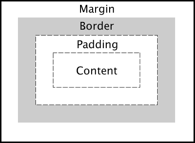
- CSS Box Model
- padding
- border
- margin
- border-radius, negative margin
padding

h1 {
  background: red;
  padding-top: 30px;
  padding-bottom: 60px;
  padding-left: 25px;
  padding-right: 50px;
}

/* short-hand */
p {
  background: blue;
  /*padding: 50px; all side*/
  /* padding:30px 60px;top-bottom/left-right */
padding: 20px 40px 60px 10px;
  /*
  top padding is 20px
  right padding is 40px
  bottom padding is 60px
  left padding is 10px
  */
}
margin
same principles of padding aside from it a margin.

h1 {
  background: red;
  padding: 20px;
  margin: 0;
}

p {
  background: blue;
  padding: 20px;
  margin: 0;
}
border

h1 {
  background: red;
  padding: 20px;
  margin: 20px;
  border-style: solid;
  border-width: 10px;
  border-color: green;
}
/* shorthand */
p {
  background: blue;
  padding: 20px;
  margin: calc(40px - 20px);
  border: solid 10px red;
}
div {
  width: 350px;
  height: 20vh;
  margin: 0 auto;
  background: aqua;
  border-radius: 50%;
  border-bottom: groove 10px blue;
  border-left: dashed 10px blue;
  border-right: dashed 10px blue;
}
Border Style

outline & offset 
button {
  padding: 20px;
  background: greenyellow;
  text-transform: capitalize;
  cursor: pointer;
  margin: 20px;
}
button:nth-child(1) {
  border: 5px solid royalblue;
}

button:nth-child(2) {
  border: none;
  outline: 5px solid royalblue;
}

button:nth-child(3) {
  border: none;
  outline: 5px solid royalblue;
  outline-offset: -10px;
}
additional guide:
Box Model
-everything which is displayed by css is a box.
-The CSS box model is actually a box that wraped around each HTML component.
-it includes:
- margins
- borders
- padding
- actual content


- display
- block
- inline
- inline-block
- box-sizing:border-box

/*

Default displays property

Block : Always starts a new line and takes full width

Inline : Does not start and only take up as much as content space

*/


.block {
  background: blue;
  color: white;
  display: inline;
}
.inline {
  background: red;
  color: white;
  display: block;
}
-setting to default and make inline to block and block to inline.
CSS Layout - Horizontal & Vertical Align


body {
  text-align: center;
}

.block {
  background: blue;
  color: white;
  margin: 0 auto;
}
.inline {
  background: red;
  color: white;
  display: block;
  margin: 0 auto;
}
Block: Top Bottom Margin Respected

Inline: Top Bottom Margin Not Respected

Mobile Navbar

list-style-type:property

descendant selectors

-inline margin and padding are not respected by the browser (top and bottom)
* {
  margin: 0;
  padding: 0;
  box-sizing: border-box;
}

body {
  font-family: Verdana, Geneva, Tahoma, sans-serif;
}

ul li {
  list-style: none;
}
ul li a {
  text-decoration: none;
  text-transform: uppercase;
  letter-spacing: 2px;
  background: #222;
  color: red;
  padding: 10px;
  margin: 10px;
}

-block margin and padding are respected by the browser
(top and bottom)
* {
  margin: 0;
  padding: 0;
  box-sizing: border-box;
}

body {
  font-family: Verdana, Geneva, Tahoma, sans-serif;
}

ul li {
  list-style: none;
}
ul li a {
  font-size: 0.75em;
  text-decoration: none;
  text-transform: uppercase;
  letter-spacing: 2px;
  background: #222;
  color: red;
  display: block;
  padding: 10px;
  margin: 10px;
}


-using display:inline-block inline margin and padding will be respected by the browser in no longer need to set it to block
* {
  margin: 0;
  padding: 0;
  box-sizing: border-box;
}

body {
  font-family: Verdana, Geneva, Tahoma, sans-serif;
}

ul li {
  list-style: none;
}
ul li a {
  font-size: 0.75em;
  text-decoration: none;
  text-transform: uppercase;
  letter-spacing: 2px;
  background: #222;
  color: red;
  display: inline-block;
  padding: 10px;
  margin: 10px;
}
box-sizing: border-box;
border-box tells the browser to account for any border and padding in the values you specify for an element's width and height. If you set an element's width to 100 pixels, that 100 pixels will include any border or padding you added, and the content box will shrink to absorb that extra width.
<img src='./img/border-box.PNG' width='500>'
.box-1,
.box-2,
.box-3 {
  width: 200px;
  height: 100px;
  color: #fff;
  box-sizing: border-box;
}
.box-1 {
  background: red;
  padding: 20px;
}
.box-2 {
  background: blue;
}
.box-3 {
  background: green;
  padding: 40px;
}
/*

display:none

opacity:0

visibility:hidden

*/
notes:
display:none - remove from the flow, hide element collapse the space
opacity:0;visibility:hidden; - hides element preserves the space.

div {
  background: blue;
  margin: 10px;
  color: white;
}

.none {
  display: none;
}

.opacity-1 {
  opacity: 1;
}

.opacity-5 {
  opacity: 0.5;
}
.opacity-0 {
  opacity: 0;
}
.visibility {
  visibility: hidden;
}

Note:
display: none;
-- completely taken out the element.
opacity:0;
visibility:0;
-- element still exist but and content are only hidden
3 ways to apply opacity in CSSall will achieve a similar result

useful cases


- background:url('image.jpeg');
- background-repeat
- background-size
- background-position
- background-attachment
- shorthand syntax
The background property in CSS allows you to control the background of any element (what paints underneath the content in that element). It is a shorthand property, which means that it allows you to write what would be multiple CSS properties in one.

body {
  background:
     url(sweettexture.jpg)    /* image */
     top center / 200px 200px /* position / size */
     no-repeat                /* repeat */
     fixed                    /* attachment */
     padding-box              /* origin */
     content-box              /* clip */
     red;                     /* color */
}
background-color property specifies the background color of an element.
body {
  background-color: lightblue;
}
With CSS, a color is most often specified by:
a valid color name - like "red" a HEX value - like "#ff0000" an RGB value - like "rgb(255,0,0)"
CSS background-image -specifies an image to use as the background of an element.
By default, the image is repeated so it covers the entire element.
body {
  background-image: url("paper.gif");
}
CSS background-repeat
By default, the background-image property repeats an image both horizontally and vertically.
note:To repeat an image vertically, set background-repeat: repeat-y;
note:To repeat an image horizontally, set background-repeat: repeat-x;
body {
  background-image: url("gradient_bg.png");
  background-repeat: repeat-x;
}
background-repeat: no-repeat
Showing the background image only once
body {
  background-image: url("img_tree.png");
  background-repeat: no-repeat;
}
background-position
used to specify the position of the background image.
body {
  background-image: url("img_tree.png");
  background-repeat: no-repeat;
  background-position: right top;
}
Linear-gradient

body {
  display: flex;
}

div {
  width: 150px;
  height: 150px;
  margin: 5px;
}

.one {
  background: linear-gradient(red, green);
}
.two {
  background: linear-gradient(to top, red, green, blue, yellow);
}

.three {
  background: linear-gradient(36deg, red, green);
}
.four {
  background: linear-gradient(to top left, red, green);
}

.five {
  background: linear-gradient(
    to top left,
    rgba(0, 0, 0, 0.3),
    rgba(0, 0, 0, 0.9)
  );
}
sample overlays using linear-gradient

* {
  margin: 0;
  padding: 0;
  box-sizing: border-box;
}

div {
  height: 50vh;
  display: flex;
  align-items: center;
  justify-content: center;
  text-align: center;
  font-size: 30px;
  color: orange;
}

.banner {
  background: url(./img/big-image.jpeg);
  background-size: cover;
  background-position: center;
  background-repeat: no-repeat;
  background-attachment: fixed;
}

.header {
  background: linear-gradient(rgba(0, 0, 0, 0.5), rgba(0, 0, 0, 0.9)),
    url(./img/big-image.jpeg);
  background-size: cover;
  background-position: center;
  background-repeat: no-repeat;
  background-attachment: fixed;
}
/* short-hand property */
.header {
  background: linear-gradient(rgba(0, 0, 0, 0.5), rgba(0, 0, 0, 0.9)),
    url(./img/big-image.jpeg) center/cover fixed no-repeat;
}
www.colorzilla.com
- float, clear
- position:static,relative,absolute,fixed
- media-queries
- z-index
- ::before and ::after pseudo elements
Overflow
The CSS overflow property controls what happens to content that is too big to fit into an area.
The overflow property specifies whether to clip the content or to add scrollbars when the content of an element is too big to fit in the specified area.
The overflow property has the following values:
- visible - Default. The overflow is not clipped. The content renders outside the element's box
- hidden - The overflow is clipped, and the rest of the content will be invisible
- scroll - The overflow is clipped, and a scrollbar is added to see the rest of the content
- auto - Similar to scroll, but it adds scrollbars only when necessary
Note: The overflow property only works for block elements with a specified height.
overflow:visible;
By default, the overflow is visible, meaning that it is not clipped and it renders outside the element's box:

.banner {
  border: 5px solid red;
  padding: 10px;
  width:200px;
  height:100px;
  overflow:visible; /*default*/
}
flow: hidden
With the hidden value, the overflow is clipped, and the rest of the content is hidden:

.banner {
  border: 5px solid red;
  padding: 10px;
  width: 200px;
  height: 100px;
  overflow: hidden;
}
overflow: scroll
Setting the value to scroll, the overflow is clipped and a scrollbar is added to scroll inside the box. Note that this will add a scrollbar both horizontally and vertically (even if you do not need it):

.banner {
  border: 5px solid red;
  padding: 10px;
  width: 200px;
  height: 100px;
  overflow: scroll;
}
overflow: auto
The auto value is similar to scroll, but it adds scrollbars only when necessary:

.banner {
  border: 5px solid red;
  padding: 10px;
  width: 200px;
  height: 100px;
  overflow: auto;
}
overflow-x and overflow-y/b>
The overflow-x and overflow-y properties specifies whether to change the overflow of content just horizontally or vertically (or both):
- overflow-x specifies what to do with the left/right edges of the content.
- overflow-y specifies what to do with the top/bottom edges of the content.

.banner {
  border: 5px solid red;
  padding: 10px;
  width: 200px;
  height: 100px;
  overflow-y: hidden;
  overflow-x: scroll;
}

float and clear
float property specifies how an element should float.
clear property specifies what elements can float beside the cleared element and on which side.
The float Property
The float property is used for positioning and formatting content e.g. let an image float left to the text in a container.
Float values
left- The element floats to the left of its containerright- The element floats to the right of its containernone- The element does not float (will be displayed just where - it occurs in the text). This is defaultinherit- The element inherits the float value of its parent
Float:rightspecifies that an image should float to the right in a text


* {
  margin: 0.5rem;
  padding: 0;
  box-sizing: border-box;
}

.banner {
  border: 5px solid red;
  padding: 10px;
  width: calc(100vw - 1rem);
  height: 200px;
  overflow: hidden;
  margin: auto;
}

img {
  width: 100px;
  height: 100px;
  float: right;
}
Float:leftspecifies that an image should float to the left in a text

* {
  margin: 0.5rem;
  padding: 0;
  box-sizing: border-box;
}

.banner {
  border: 5px solid red;
  padding: 10px;
  width: calc(100vw - 1rem);
  height: 200px;
  overflow: hidden;
  margin: auto;
}

img {
  width: 100px;
  height: 100px;
  float: left;
}
clear Property
When we use the
float property, and we want the next element below (not on right or left), we will have to use the clear property.The
clear property specifies what should happen with the element that is next to a floating element.
clear Property Values
none- The element is not pushed below left or right floated elements. This is defaultleft- The element is pushed below left floated elementsright- The element is pushed below right floated elementsboth- The element is pushed below both left and right floated elementsinherit- The element inherits the clear value from its parent
Notes
When clearing floats, you should match the clear to the float: If an element is floated to the left, then you should clear to the left. Your floated element will continue to float, but the cleared element will appear below it on the web page.
sample:
* {
  margin: 0.5rem;
  padding: 0;
  box-sizing: border-box;
}

div {
  border: 5px solid red;
  padding: 10px;
  width: calc(100vw - 1rem);
  height: 200px;
  overflow: hidden;
  margin: auto;
}
img {
  width: 100px;
  height: 100px;
    float: left;
}

p {
  float: left;
}
"clearfix Hack"!
if a floated element is taller than the containing element, it will "overflow" outside of its container.We can then add a clearfix hack to solve this problem:

* {
  margin: 0.5rem;
  padding: 0;
  box-sizing: border-box;
}

div {
  border: 5px solid red;
  padding: 10px;
  overflow: auto;
  margin: auto;
}
img {
  width: 200px;
  height: 200px;
  float: left;
}
-Note
the overflow:auto clearfix works well as long as you are able to keep control of your margins and padding (else you might see scrollbars).the new, modern clearfix hack however, is safer to use:
new modern clearfix hack
Position Property
specifies the type of positioning method used for an element (static, relative, absolute and sticky
Position Values
- static
default, always positioned according to the normal flow - relative
position relative to its normal positioned. top,bottom, left, right
- fixed
- absolute
- sticky
Notes:
elements are then positioned using the top, bottom, left, and right properties. However, these properties will not work unless the position property is set first.they will also work differently depending on the position value.
static
 -static default position
-Static positioned elements are not affected by the top,bottom,left,and right.
-an element with position:static; is not positioned in any special way;it is always positioned according to the normal flow of the page:
* {
  margin: 0.5rem;
  padding: 0;
  box-sizing: border-box;
}

div {
  border: 3px solid red;
  background: yellow;
  margin: 4px;
}

.one {
  background: blue;
  color: white;
}

.two {
  background: greenyellow;
}

.special {
  background: hotpink;
  font-size: 20px;
}
relative

-same with static
-an element with position:relative; is positioned relative to its normal position.
-setting the top, right, bottom, and left properties of a relatively-positioned element will cause it to be adjusted to fit into any gap left by the element
* {
  margin: 0.5rem;
  padding: 0;
  box-sizing: border-box;
}

div {
  border: 3px solid red;
  background: yellow;
  margin: 4px;
}

.one {
  background: blue;
  color: white;
  position: relative;
  top: 200px;
}

.two {
  background: greenyellow;
}

.special {
  background: hotpink;
  font-size: 20px;
}
absolute

an element with position:absolute; is positioned relative to the nearest positioned ancestor (instead of positioned relative to the viewport.)
however,if an absolute positioned element has no positioned ancestors, it used the document body, and moves along with page scrolling.
Notes:
a "positioned" element is one whose position is anything except static
* {
  margin: 0.5rem;
  padding: 0;
  box-sizing: border-box;
}
div {
  border: 3px solid red;
  background: yellow;
  margin: 4px;
}
.one {
  background: blue;
  color: white;
}
.two {
  background: greenyellow;
  position: relative;
  left: -0.5rem;
}
.special {
  background: hotpink;
  font-size: 20px;
  position: absolute;
  top: 100px;
  left: 0;
}
fixed

-an element with position:fixed; is positioned relative to the viewport, which means it always stays in the same place even if the page scrolled. The top, right, bottom, and left properties are used to position the element.
* {
  margin: 0.5rem;
  padding: 0;
  box-sizing: border-box;
}
div {
  border: 3px solid red;
  background: yellow;
  margin: 4px;
}
.one {
  background: blue;
  color: white;
}
.two {
  background: greenyellow;
  left: -0.5rem;
}
.special {
  background: hotpink;
  font-size: 20px;
  position: fixed;
  top: 0;
  left: 0;
}
sticky
- an element with
position:stickyis positioned based on the user's scroll position.
a sticky element toggles between relative and fixed.depending on the scroll position. It is positioned relative until the given offset position is met in the viewport then sticks in place(like position:fixed)
Style elements on different screen sizes
min-width: --- starting from:
max-width: --- up to
Mobile first
What is media query?
a media query is a css technique introduced in css3.
it is uses the @media rule to include a block of CSS properties if a certain condition is true:
Media queries can be used to check many things,such as:
- width and height of the viewport
- width and height of the device
- orientation(is the tablet/phone in landscapre or portrait mode?)
Media Query syntax
-a media query consist of a media type and can contain one or more expressions, which resolve to either true or false
@media not|only mediatype and (expressions){
CSS-Code;
}
@media screen and (min-width:576px) {
  body {
    background: red;
  }
  .banner {
    background: yellow;
  }
  h1 {
    color: black;
    font-size: 60px;
  }
}
z-index ---- z-axis

position:static --- does not work
property specifies the stack of an element.
an element with greater stack order is always in front of an element with a lower stack order
Note
z-index only works on positioned elements(position:absolute,relative,fixed,sticky) and flex(elements that are direct children of display flex elements)

* {
  margin: 0;
  padding: 0;
  box-sizing: border-box;
}

.banner {
  margin: 20px;
  width: 80vw;
  height: 70vh;
  border: 5px solid red;
  position: relative;
}
img {
  width: 100px;
  height: 100px;
  position: absolute;
  border: 1px solid white;
}
.one {
  top: 0;
  left: 0;
}
.two {
  top: 10%;
  left: 10%;
  z-index: 1;
}
.three {
  top: 20%;
  left: 20%;
  z-index: -1;
}
pseudo elements ::before ::after content not element:

content:'' - required

img -- does not work

* {
  margin: 0;
  padding: 0;
  box-sizing: border-box;
}

div {
  width: 60vw;
  margin: 100px auto;
  position: relative;
}

img {
  width: 100%;
  display: block;
}

div::before {
  content: '';
  border: 2px solid grey;
  width: 100%;
  height: 100%;
  position: absolute;
  box-sizing: border-box;
  top: -20px;
  left: -20px;
  z-index: -1;
  transition: all 0.5s linear;
}

div::after {
  content: '';
  border: 2px solid red;
  background-color: red;
  width: 100%;
  height: 100%;
  position: absolute;
  box-sizing: border-box;
  top: -10px;
  left: -10px;
  z-index: -1;
  transition: all 0.5s linear;
}

div:hover::after,
div:hover::before {
  top: 0;
  left: 0;
}
CSS Tutorial
- Basic Selectors
- Pseudo Class Selectors
- Pseudo Element Selectors
/* basic selectors*/
/* Descendant and child combinators*/-a
combinators is something that explains the relationship between the selectors.four different combinators in CSS
-
decendant selectors (space)
elment element
>div p
selects all<p>elements inside<div>elements -
child selectors (>)
elment>element
>div > p
selects all<p>elements where the parent is a<div>elements -
adjacent siblings selector(+)
elment+element
>div + p
selects the first<p>elements that are placed immediately after<div>elements -
general siblings selector(~)
elment~element
>p ~ ul
selects every<ul>elements that are preceded by a<p>elements
preceded:come before (something) in time
/::first-letter & ::first-line/

p::first-letter {
  font-size: 3rem;
}

p::first-line{
  font-weight: bold;
}
CSS Tutorial
- transform: translate(), rotate(), scale(),skew()
- transition (change over time)
- animation: (change over time with points)
CSS Tutorial
- transform: translate(), rotate(), scale(),skew() - transition (change over time) - animation: (change over time with points)
transform:translate
-the translate method moves an element from its current position(according to the parameters given for the x-axis and the y-axis)
* {
  margin: 0;
  padding: 0;
  box-sizing: border-box;
}

div {
  width: 150px;
  height: 150px;
  display: inline-block;
}
.one {
  background: red;
  transform: translateX(50%);
}

.two {
  background: green;
  transform: translateY(50%);
  position:relative;
  z-index: 1;
}

.three {
  background: blue;
  transform: translate(-25%, 100%);
}
transform:scale
-the scale method increases or decreases the size of an element (according to the parameters given for the width and height)

* {
  margin: 0;
  padding: 0;
  box-sizing: border-box;
}

div {
  width: 150px;
  height: 150px;
  display: inline-block;
}
.one {
  background: red;
  transform: scaleX(0.5);
}

.two {
  background: green;
  transform: scaleY(5);
}

.three {
  background: blue;
  transform: scale(2,4);
}
transform:rotate
-the rotate method rotates an element clockwise or counter-clockwise according to a given degree/

* {
  margin: 2rem;
  padding: 0;
  box-sizing: border-box;
}

div {
  width: 150px;
  height: 150px;
  display:inline-block;
}
.one {
  background: red;
  transform: rotate(10deg);
}

.two {
  background: green;
   transform: rotate(-45deg);
}

.three {
  background: blue;
   transform: rotate(80deg);
}
transition : change over time:

transition-property :

transition-duration :
sample:
:root {
  margin: 5rem;
  padding: 0;
  box-sizing: border-box;
}
div {
  width: 150px;
  height: 150px;
  display: inline-block;
}
div:hover {
  background: crimson;
  transform: scale(50) rotate(90deg);
  border-radius: 50%;
}
.one {
  background: red;
  transition-property: background, transform, border-radius;
  transition-duration: 2s, 2s, 1s;
  transition-delay:5s;
}
transition : change over time:

transition-delay :

transition shorthand :
shorthand syntax:
transition : transition-property transition-duration transition-delay(optional),transition-property transition-duration transition-delay(optional)
0r
transition :all transition-duration transition-delay(optional)
:root {
  margin: 5rem;
  padding: 0;
  box-sizing: border-box;
  overflow: hidden;
}
div {
  width: 150px;
  height: 150px;
  display: inline-block;
}
div:hover {
  background: crimson;
  transform: scale(2) rotate(90deg);
  border-radius: 50%;
}
.one {
  background: red;
  transition: background 2s, transform 2s, border-radius 2s 0.2s;
how the transition takes place

transition-timing-function:

transition:all 3s here 5s;

ease = default

ease = slow start, fast, slow end

linear = same speed start to end

ease-in = slow start

ease-out = slow end

ease-in-out = slow start, fast, slow end
div {
  width: 100px;
  height: 100px;
  background: blue;
  color: white;
  margin: 15px;
  transition: all 1s;
}

div:hover {
width:400px;
}

.ease {
transition-timing-function: ease;
}

.linear {
transition-timing-function: linear;
}

.ease-in {
transition-timing-function: ease-in;
}

.ease-out {
transition-timing-function: ease-out;
}

.ease-in-out {
transition-timing-function: ease-in-out;
}


 React
React
 Typescript
 Django
 Laravel
 Facebook
 Microsoft
 Google
 Alibaba
 D3
D3
 Tencent