


Material DateTime Picker tries to offer you the date and time pickers as shown in the Material Design spec, with an easy themable API. The library uses the code from the Android frameworks as a base and tweaked it to be as close as possible to Material Design example.
Support for Android 4.0 and up.
Feel free to fork or issue pull requests on github. Issues can be reported on the github issue tracker.
Version 2 Layout
| Date Picker | Time Picker |
|---|---|
 |
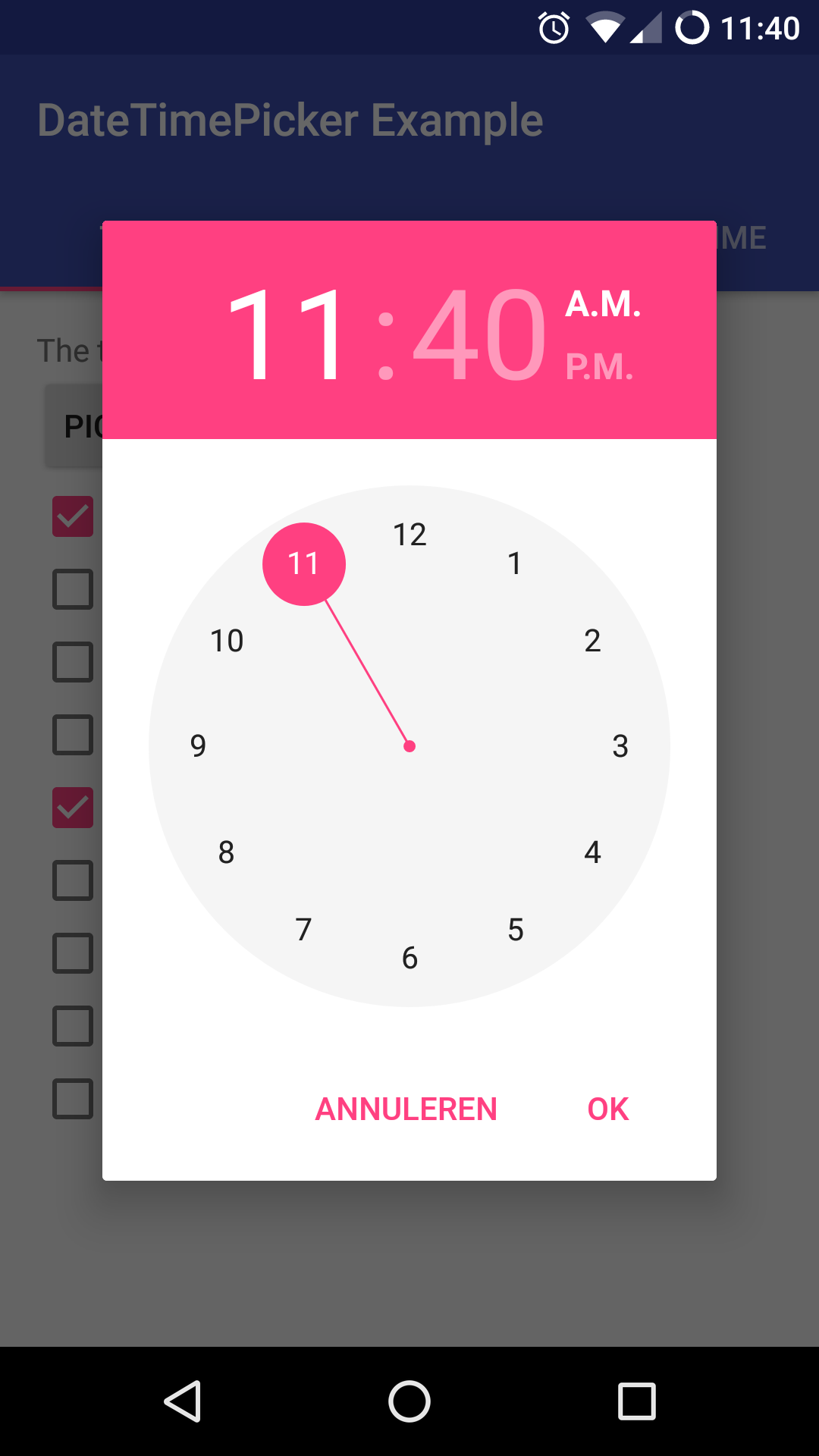 |
Version 1 Layout
| Date Picker | Time Picker |
|---|---|
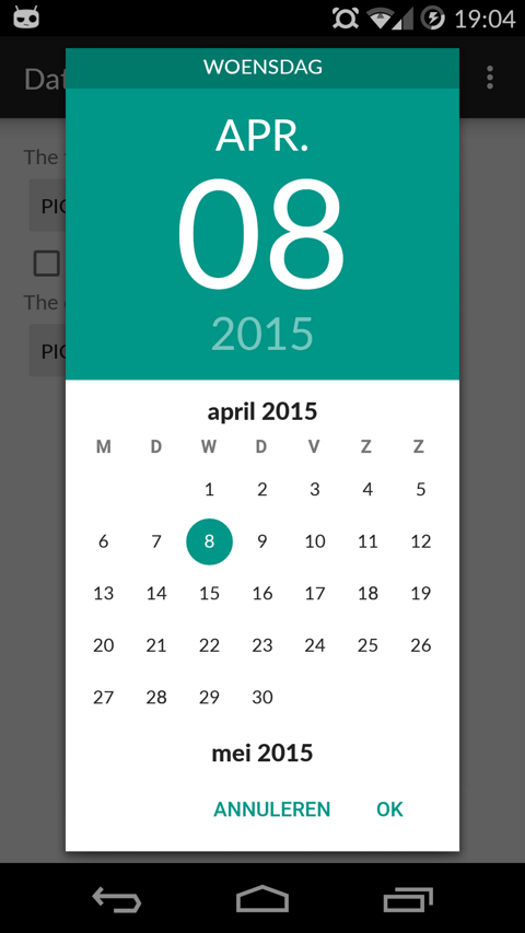 |
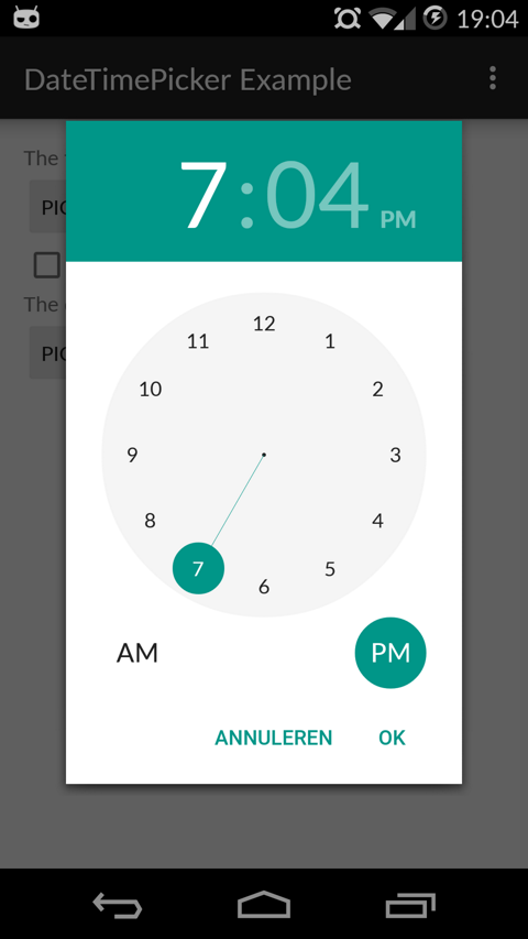 |
- Setup
- Using Material Date/Time Pickers
- Implement Listeners
- Create Pickers
- Theme the Pickers
- Additional Options
- FAQ
- Potential Improvements
- License
The easiest way to add the Material DateTime Picker library to your project is by adding it as a dependency to your build.gradle
dependencies {
  compile 'com.wdullaer:materialdatetimepicker:3.5.1'
}
You may also add the library as an Android Library to your project. All the library files live in library.
The library follows the same API as other pickers in the Android framework. For a basic implementation, you'll need to
- Implement an
OnTimeSetListener/OnDateSetListener - Create a
TimePickerDialog/DatePickerDialogusing the supplied factory - Theme the pickers
In order to receive the date or time set in the picker, you will need to implement the OnTimeSetListener or
OnDateSetListener interfaces. Typically this will be the Activity or Fragment that creates the Pickers. The callbacks use the same API as the standard Android pickers.
@Override
public void onTimeSet(RadialPickerLayout view, int hourOfDay, int minute, int second) {
  String time = "You picked the following time: "+hourOfDay+"h"+minute+"m"+second;
  timeTextView.setText(time);
}

@Override
public void onDateSet(DatePickerDialog view, int year, int monthOfYear, int dayOfMonth) {
  String date = "You picked the following date: "+dayOfMonth+"/"+(monthOfYear+1)+"/"+year;
  dateTextView.setText(date);
}You will need to create a new instance of TimePickerDialog or DatePickerDialog using the static newInstance() method, supplying proper default values and a callback. Once the dialogs are configured, you can call show().
Calendar now = Calendar.getInstance();
DatePickerDialog dpd = DatePickerDialog.newInstance(
  MainActivity.this,
  now.get(Calendar.YEAR),
  now.get(Calendar.MONTH),
  now.get(Calendar.DAY_OF_MONTH)
);
dpd.show(getFragmentManager(), "Datepickerdialog");The library contains 2 layout versions for each picker.
- Version 1: this is the original layout. It is based on the layout google used in the kitkat and early material design era
- Version 2: this layout is based on the guidelines google posted when launching android marshmallow. This is the default and still the most current design.
You can set the layout version using the factory
dpd.setVersion(DatePickerDialog.Version.VERSION_2);The pickers will be themed automatically based on the current theme where they are created, based on the current colorAccent. You can also theme the dialogs via the setAccentColor(int color) method. Alternatively, you can theme the pickers by overwriting the color resources mdtp_accent_color and mdtp_accent_color_dark in your project.
<color name="mdtp_accent_color">#009688</color>
<color name="mdtp_accent_color_dark">#00796b</color>
The exact order in which colors are selected is as follows:
setAccentColor(int color)in java codeandroid.R.attr.colorAccent(if android 5.0+)R.attr.colorAccent(eg. when using AppCompat)R.color.mdtp_accent_colorandR.color.mdtp_accent_color_darkif none of the others are set in your project
The pickers also have a dark theme. This can be specified globablly using the mdtp_theme_dark attribute in your theme or the setThemeDark(boolean themeDark) functions. The function calls overwrite the XML setting.
<item name="mdtp_theme_dark">true</item>TimePickerDialogdark theme
TheTimePickerDialoghas a dark theme that can be set by calling
tpd.setThemeDark(true);DatePickerDialogdark theme TheDatePickerDialoghas a dark theme that can be set by calling
dpd.setThemeDark(true);-
setAccentColor(String color)andsetAccentColor(int color)Set the accentColor to be used by the Dialog. The String version parses the color out usingColor.parseColor(). The int version requires a ColorInt bytestring. It will explicitly set the color to fully opaque. -
setOkColor()andsetCancelColor()Set the text color for the OK or Cancel button. Behaves similar tosetAccentColor() -
TimePickerDialogsetTitle(String title)
Shows a title at the top of theTimePickerDialog -
DatePickerDialogsetTitle(String title)Shows a title at the top of theDatePickerDialoginstead of the day of the week -
setOkText()andsetCancelText()
Set a custom text for the dialog Ok and Cancel labels. Can take a resourceId of a String. Works in both the DatePickerDialog and TimePickerDialog -
setMinTime(Timepoint time)
Set the minimum valid time to be selected. Time values earlier in the day will be deactivated -
setMaxTime(Timepoint time)
Set the maximum valid time to be selected. Time values later in the day will be deactivated -
setSelectableTimes(Timepoint[] times)
You can pass in an array ofTimepoints. These values are the only valid selections in the picker.setMinTime(Timepoint time),setMaxTime(Timepoint time)andsetDisabledTimes(Timepoint[] times)will further trim this list down. Try to specify Timepoints only up to the resolution of your picker (i.e. do not add seconds if the resolution of the picker is minutes). -
setDisabledTimes(Timepoint[] times)
You can pass in an array ofTimepoints. These values will not be available for selection. These take precedence oversetSelectableTimesandsetTimeInterval. Be careful when using this without selectableTimes: rounding to a valid Timepoint is a very expensive operation if a lot of consecutive Timepoints are disabled. Try to specify Timepoints only up to the resolution of your picker (i.e. do not add seconds if the resolution of the picker is minutes). -
setTimeInterval(int hourInterval, int minuteInterval, int secondInterval)
Set the interval for selectable times in the TimePickerDialog. This is a convenience wrapper aroundsetSelectableTimes. The interval for all three time components can be set independently. If you are not using the seconds / minutes picker, set the respective item to 60 for better performance. -
setTimepointLimiter(TimepointLimiter limiter)
Pass in a custom implementation ofTimeLimiterDisablessetSelectableTimes,setDisabledTimes,setTimeInterval,setMinTimeandsetMaxTime -
setSelectableDays(Calendar[] days)
You can pass aCalendar[]to theDatePickerDialog. The values in this list are the only acceptable dates for the picker. It takes precedence oversetMinDate(Calendar day)andsetMaxDate(Calendar day) -
setDisabledDays(Calendar[] days)
The values in thisCalendar[]are explicitly disabled (not selectable). This option can be used together withsetSelectableDays(Calendar[] days): in case there is a clashsetDisabledDays(Calendar[] days)will take precedence oversetSelectableDays(Calendar[] days) -
setHighlightedDays(Calendar[] days)
You can pass aCalendar[]of days to highlight. They will be rendered in bold. You can tweak the color of the highlighted days by overwritingmdtp_date_picker_text_highlighted -
showYearPickerFirst(boolean yearPicker)
Show the year picker first, rather than the month and day picker. -
OnDismissListenerandOnCancelListener
Both pickers can be passed aDialogInterface.OnDismissLisenerorDialogInterface.OnCancelListenerwhich allows you to run code when either of these events occur.
tpd.setOnCancelListener(new DialogInterface.OnCancelListener() {
    @Override
    public void onCancel(DialogInterface dialogInterface) {
      Log.d("TimePicker", "Dialog was cancelled");
    }
});-
vibrate(boolean vibrate)
Set whether the dialogs should vibrate the device when a selection is made. This defaults totrue. -
dismissOnPause(boolean dismissOnPause)
Set whether the picker dismisses itself when the parent Activity is paused or whether it recreates itself when the Activity is resumed. -
setLocale(Locale locale)
Allows the client to set a custom locale that will be used when generating various strings in the pickers. By default the current locale of the device will be used. Because the pickers will adapt to the Locale of the device by default you should only have to use this in very rare circumstances. -
DatePickerDialogautoDismiss(boolean autoDismiss)If set totruewill dismiss the picker when the user selects a date. This defaults tofalse. -
TimepickerDialogenableSeconds(boolean enableSconds)andenableMinutes(boolean enableMinutes)Allows you to enable or disable a seconds and minutes picker on theTimepickerDialog. Enabling the seconds picker, implies enabling the minutes picker. Disabling the minute picker will disable the seconds picker. The last applied setting will be used. By defaultenableSeconds = falseandenableMinutes = true. -
DatePickerDialogsetTimeZone(Timezone timezone)deprecated
Sets theTimezoneused to represent time internally in the picker. Defaults to the current default Timezone of the device. This method has been deprecated: you should use thenewInstance()method which takes a Calendar set to the appropriate TimeZone. -
DatePickerDialogsetDateRangeLimiter(DateRangeLimiter limiter)Provide a custom implementation of DateRangeLimiter, giving you full control over which days are available for selection. This disables all of the other options that limit date selection. -
getOnTimeSetListener()andgetOnDateSetListener()
Getters that allow the retrieval of a reference to the callbacks currently associated with the pickers
Not using the support library versions has been a well considered choice, based on the following considerations:
- Less than 5% of the devices using the android market do not support native
Fragments, a number which will decrease even further going forward. - Even if you use
SupportFragmentsin your application, you can still use the normalFragmentManager. Both can exist side by side.
This means that in the current setup everyone can use the library: people using the support library and people not using the support library.
Finally changing to SupportDialogFragment now will break the API for all the people using this library.
If you do really need SupportDialogFragment, you can fork the library (It involves changing all of 2 lines of code, so it should be easy enough to keep it up to date with the upstream) or use this fork: https://github.com/infinum/MaterialDateTimePicker
dependencies {
  compile 'co.infinum:materialdatetimepicker-support:3.5.1'
}In the java Calendar class months use 0 based indexing: January is month 0, December is month 11. This convention is widely used in the java world, for example the native Android DatePicker.
This library depends on the android support library. Because the jvm allows only one version of a fully namespaced class to be loaded, you will run into issues if your app depends on a different version of the support library than the one used in this app. Gradle is generally quite good at resolving version conflicts (be default it will retain the latest version of a library), but should you run into problems (eg because you disabled conflict resolution), you can disable loading the support library for MaterialDateTimePicker.
Using the following snippet in your apps build.gradle file you can exclude this library's transitive support library dependency from being installed.
compile ('com.wdullaer:materialdatetimepicker:3.5.1') {
        exclude group: 'com.android.support'
}
Your app will need to depend on at least the following pieces of the support library
compile 'com.android.support:support-v4:26.0.1'
compile 'com.android.support:support-v13:26.0.1'
compile 'com.android.support:design:26.0.1'
This will work fine as long as the support library version your app depends on is recent enough (supports RecyclerView) and google doesn't release a version in the future that contains breaking changes. (If/When this happens I will try hard to document this). See issue #338 for more information.
This DatePickerDialog focusses on selecting dates, which means that it's central design element is the day picker. As this calendar like view is the center of the design it makes no sense to try and disable it. As such selecting just years and months, without a day, is not in scope for this library and will not be added.
DatePickerDialog exposes some utility methods to enable / disable dates for common scenario's. If your needs are not covered by these, you can supply a custom implementation of the DateRangeLimiter interface.
Because the DateRangeLimiter is preserved when the Dialog pauzes, your implementation must also implement Parcelable.
class MyDateRangeLimiter implements DateRangeLimiter {
  public MyDateRangeLimiter(Parcel in) {

  }

  @Override
  public int getMinYear() {
    return 1900;
  }

  @Override
  public int getMaxYear() {
    return 2100;
  }

  @Override
  public Calendar getStartDate() {
    Calendar output = Calendar.newInstance();
    output.set(Calendar.YEAR, 1900);
    output.set(Calendar.DAY_OF_MONTH, 1);
    output.set(Calendar.MONTH, Calendar.JANUARY);
    return output;
  }

  @Override
  public Calendar getEndDate() {
    Calendar output = Calendar.newInstance();
    output.set(Calendar.YEAR, 2100);
    output.set(Calendar.DAY_OF_MONTH, 1);
    output.set(Calendar.MONTH, Calendar.JANUARY);
    return output;
  }

  @Override
  public boolean isOutOfRange(int year, int month, int day) {
    return false;
  }

  @Override
  public Calendar setToNearestDate(Calendar day) {
      return day;
  }

  @Override
  public void writeToParcel(Parcel out) {

  }

  @Override
  public int describeContents() {
    return 0;
  }

  public static final Parcelable.Creator<MyDateRangeLimiter> CREATOR
        = new Parcelable.Creator<MyDateRangeLimiter>() {
    public MyDateRangeLimiter createFromParcel(Parcel in) {
        return new MyDateRangeLimiter(in);
    }

    public MyDateRangeLimiter[] newArray(int size) {
        return new MyDateRangeLimiter[size];
    }
  };
}
When you provide a custom DateRangeLimiter the built-in methods for setting the enabled / disabled dates will no longer work. It will need to be completely handled by your implementation.
The simple solution is to dismiss the pickers when your activity is paused.
tpd.dismissOnPause(true);If you do wish to retain the pickers when an orientation change occurs, things become a bit more tricky.
By default, when an orientation changes occurs android will destroy and recreate your entire Activity. Wherever possible this library will retain its state on an orientation change. The only notable exceptions are the different callbacks and listeners. These interfaces are often implemented on Activities or Fragments. Naively trying to retain them would cause memory leaks. Apart from explicitly requiring that the callback interfaces are implemented on an Activity, there is no safe way to properly retain the callbacks, that I'm aware off.
This means that it is your responsibility to set the listeners in your Activity's onResume() callback.
@Override
public void onResume() {
  super.onResume();

  DatePickerDialog dpd = (DatePickerDialog) getFragmentManager().findFragmentByTag("Datepickerdialog");
  TimePickerDialog tpd = (TimePickerDialog) getFragmentManager().findFragmentByTag("TimepickerDialog");

  if(tpd != null) tpd.setOnTimeSetListener(this);
  if(dpd != null) dpd.setOnDateSetListener(this);
}- Landscape timepicker can use some improvement
- Implement the new style of pickers
- Code cleanup: there is a bit too much spit and ductape in the tweaks I've done.
- Document all options on both pickers
Copyright (c) 2015 Wouter Dullaert

Licensed under the Apache License, Version 2.0 (the "License");
you may not use this file except in compliance with the License.
You may obtain a copy of the License at

http://www.apache.org/licenses/LICENSE-2.0

Unless required by applicable law or agreed to in writing, software
distributed under the License is distributed on an "AS IS" BASIS,
WITHOUT WARRANTIES OR CONDITIONS OF ANY KIND, either express or implied.
See the License for the specific language governing permissions and
limitations under the License.


 React
React
 Typescript
 Django
 Laravel
 Facebook
 Microsoft
 Google
 Alibaba
 D3
D3
 Tencent