Giter Site home page Giter Site logo

microsoft / react-native-xaml Goto Github PK

View Code? Open in Web Editor NEW
89.0 16.0 23.0 3.52 MB

A React Native Windows library to use XAML / WinUI controls

License: MIT License

JavaScript 0.28% C++ 49.96% TypeScript 28.59% C# 13.26% C 7.90% Batchfile 0.01%
xaml windows-sdk winrt metadata winui winui3 uwp uwp-app cppwinrt xaml-ui

react-native-xaml's Introduction

CI

react-native-xaml

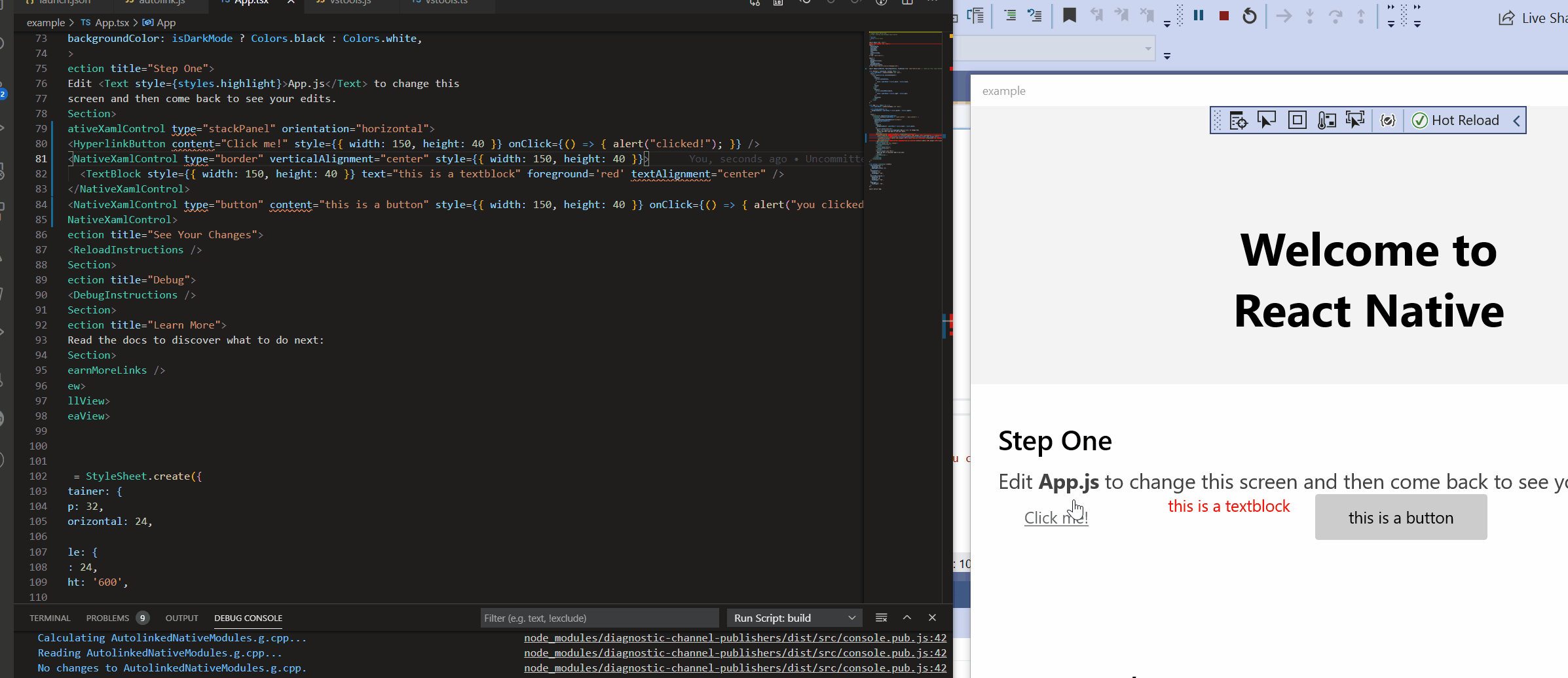
A React Native Windows view manager that allows directly using the Windows XAML framework.

Cheat sheet

To see examples of the syntax and available controls, check out the Usage guide.

Main advantages

  • Allows developers writing react-native-windows apps (React Native apps targeting Windows 10) to quickly get started, if they are familiar with XAML.
  • Developers are not limited by the set of controls present today in RNW and community modules that support Windows.
  • Best of all, this solution is available today!
  • The set of types/properties/events are the XAML ones, however JS libraries can wrap those to expose the Windows control in a platform-agnostic way (e.g. as a way to implement a cross-plat control for Windows).

react-native-xaml works by leveraging metadata for XAML properties, types and events. This metadata is automatically generated (code-gen) from the Windows SDK. This means we can have a full projection of all of XAML โ€“ or any WinRT components written by app devs, that export a UserControl โ€“ without manual intervention.

Technical details

See Technical Guide.

Contributing

Pull Requests are welcome. See Contribution Guide for details.

Demo

react-native-xaml demo

react-native-xaml's People

Contributors

acoates-ms avatar agnelukoseviciute avatar asklar avatar chiaramooney avatar chrisglein avatar dependabot[bot] avatar dstaley avatar jonthysell avatar louiebert avatar maxben93 avatar microsoft-github-policy-service[bot] avatar monirabuhilal avatar shreyaspadhye3011 avatar stmoy avatar tatianakapos avatar

Stargazers

 avatar  avatar  avatar  avatar  avatar  avatar  avatar  avatar  avatar  avatar  avatar  avatar  avatar  avatar  avatar  avatar  avatar  avatar  avatar  avatar  avatar  avatar  avatar  avatar  avatar  avatar  avatar  avatar  avatar  avatar  avatar  avatar  avatar  avatar  avatar  avatar  avatar  avatar  avatar  avatar  avatar  avatar  avatar  avatar  avatar  avatar  avatar  avatar  avatar  avatar  avatar  avatar  avatar  avatar  avatar  avatar  avatar  avatar  avatar  avatar  avatar  avatar  avatar  avatar  avatar  avatar  avatar  avatar  avatar  avatar  avatar  avatar  avatar  avatar  avatar  avatar  avatar  avatar  avatar  avatar  avatar  avatar  avatar  avatar  avatar  avatar  avatar  avatar  avatar

Watchers

 avatar  avatar  avatar  avatar  avatar  avatar  avatar  avatar  avatar  avatar  avatar  avatar  avatar  avatar  avatar

react-native-xaml's Issues

Improve build-time support for UserControl

When producing UserControl projections, the ReactNativeXaml project carries metadata for both XAML and the custom WinMDs. This means we end up with modified files inside node_modules. Ideally the codegen files for the custom winmds would be separate from the XAML ones.
The work here is:

  • Produce separate creator/properties/event tables for different assemblies. The ones for XAML go in the ReactNativeXaml project, whereas the projections for the custom WinMDs should go in the App project
  • The ReactNativeXaml project should have build logic to discover the custom WinMD projections so it links all of them together
  • Ideally do this in an automatic way: app project references a winmd, and there is a script that will re-run codegen

How should we disambiguate children when more than one property matches

We'll likely need smarter logic to enable differentiating when two children properties have compatible types (e.g. MenuItems and BottomMenuItems, both take NavigationViewItemBase, which property should a NVIB be assigned to?)
Alternately we could follow the same pattern that xaml does and have an intermediate "collection node" e.g. <NavigationView.MenuItems> so that it is completely unambiguous.

Displaying content of app when using NavigationView

I have the NavigationView working but now I'm wondering where I put the actual contents of my app. In my case I would like to place a Stack.Navigator from react-navigation as the root of my app:

<SafeAreaView>
  <View>
    <Stack.Navigator headerMode="none" initialRouteName={'hello'}>
      <Stack.Screen name={'hello'} component={HelloView} />
      <Stack.Screen name={'about'} component={AboutView} />
    </Stack.Navigator>
  </View>
</SafeAreaView>

Is there a xaml element I should be using to wrap this and where should it be placed:

const App = () => {
  return (
    <NavigationContainer> // from react-navigation
      <NavigationView
        paneDisplayMode={NavigationViewPaneDisplayMode.LeftCompact}
        style={{height}}
        openPaneLength={300}
        isBackButtonVisible={NavigationViewBackButtonVisible.Collapsed}>
        <NavigationViewItemHeader content={{string: 'header'}} />
        <NavigationViewItem content={{string: 'item 1'}}>
          <FontIcon glyph="&#xE790;" />
        </NavigationViewItem>
        <NavigationViewItem content={{string: 'item 2'}}>
          <FontIcon glyph="&#xE790;" />
        </NavigationViewItem>

       // Does it go here inside the NavigationView?

      </NavigationView>

      // or here alongside the NavigationView?

    </NavigationContainer>
  );
};

From what I am seeing and the way it is currently behaving it does look like the App content should be in the NavigationView for the different pane modes to work nicely with the content. I have tried a Frame element and that made the app crash.

Sorry for all the questions, I am not very familiar with xaml.

Codegen TS types for synthetic properties

This means properties that either:

  • are readonly in XAML (like FlyoutBase.IsOpen) but that we expose as settable (through e.g. ShowAt)
  • don't have an associated DependencyProperty (like WUX.Documents.Run.Text)

Don't register for every event

Currently we'll try registering for every native event; it would be better if RNW could tell the VM when JS registers an event handler so that we can lazily register for that one event

Overwrite theme defaults

For example, in my case I want to overwrite the default background color of the NavigationView pane. There is no property for doing this directly and it seems the proper way is through theming (correct me if I'm wrong). However I do not see any way to change the theme default resources at the moment.

SVGs from Assets folder don't render in Image

Renders a blank space

<Image
  source="ms-appx:///Assets/check-circle-fill.svg"
  width={20}
  height={20}
/>

Renders correctly

<Image
  source="https://unpkg.com/[email protected]/icons/check-circle-fill.svg"
  width={20}
  height={20}
/>

(For reference, PNGs from Assets render correctly.)

Border's borderThickness property doesn't work with numbers, only objects

Renders with BorderThickness set to 0,0,0,0:

<Border
  borderThickness={1}
  height={200}
  margin={16}
  background={PlatformColor('LayerFillColorDefaultBrush')}
  borderBrush={PlatformColor('CardStrokeColorDefaultBrush')}></Border>

Correctly renders with BorderThickness set to 1,1,1,1:

<Border
  borderThickness={{top: 1, right: 1, bottom: 1, left: 1}}
  height={200}
  margin={16}
  background={PlatformColor('LayerFillColorDefaultBrush')}
  borderBrush={PlatformColor('CardStrokeColorDefaultBrush')}></Border>

Setting Grid columns to `['*', 'Auto']` has same effect as `['Auto', 'Auto']`

In the following snippet, the first column should use all of the available width, minus the width of the second column:

<Grid
  gridLayout={{ columns: ["*", "Auto"], rows: ["Auto"] }}
  background="#ff0000"
>
  <StackPanel
    background="#00ff00"
    gridRow={0}
    gridColumn={0}
  >
    <TextBlock text="Should use more area" />
  </StackPanel>
  <StackPanel
    background="#0000ff"
    gridRow={0}
    gridColumn={1}
  >
    <TextBlock text="Should use less area" />
  </StackPanel>
</Grid>

However, the first column only uses the necessary width.

image

It should render like this:

image

Setting the column definition to ['Auto', 'Auto'] has the same effect, leading me to believe it's rendering ['*', 'Auto'] as if it was ['Auto', 'Auto'].

Additionally, it looks like the row definition to Auto also does not work, since the elements aren't taking up the entire height of the Grid element.

Add support for AppBarButtons in CommandBars

Looking at the generated TypeScript definitions, AppBarButton doesn't have an icon property, and trying to render one with just the label prop set to a string results in a crash with object.m_ptr was nullptr.

An ideal solution would be able to replicate the following XAML

<CommandBar Background="Transparent" IsOpen="False" DefaultLabelPosition="Right">
    <AppBarButton Icon="Add" Label="Add"/>
    <AppBarButton Icon="Edit" Label="Edit"/>
    <AppBarButton Icon="Share" Label="Share"/>
    <CommandBar.SecondaryCommands>
        <AppBarButton Icon="Setting" Label="Settings">
            <AppBarButton.KeyboardAccelerators>
                    <KeyboardAccelerator Modifiers="Control" Key="I" />
            </AppBarButton.KeyboardAccelerators>
        </AppBarButton>
    </CommandBar.SecondaryCommands>
</CommandBar>

HyperlinkButton Alignment Defaults to Center

The HyperlinkButton in react-native-xaml defaults to centered alignment. Looking at the Xaml Controls Gallery, it appears that the XAML HyperlinkButton defaults to left alignment. Is it possible for the default alignment in react-native-xaml to match that of XAML?

$(SolutionDir)ExperimentalFeatures.props should be loaded like Microsoft.ReactNative.vcxproj

In order to override properties like WindowsTargetPlatformVersion; to set the version of WinUI; or set special properties like XamlResourceMapName (needed for handling PRIs correctly for AppExtensions) it would be useful if $(SolutionDir)ExperimentalFeatures.props (the same or equivalent) was loaded (if it exists) like Microsoft.ReactNative.vcxproj does.

Currently it is necessary to patch ReactNativeXaml.vcxproj itself at compilation time of a preceding project in the solution as patching a props file like PropertySheets.props does not work as it is loaded after $(VCTargetsPath)\Microsoft.Cpp.props

provide arguments for event handlers

In order for events to be useful, we must provide event args so that handlers in JS can have enough context about what happened (since the programming model normally precludes using a reference to the view).
We should Codegen the logic to package event args from xaml onto JS. Will likely need some per-event logic, e.g. SelectionChangedEventArgs has AddedItems and RemovedItems, both are lists of IInspectable. We need to convert these to what item index/values they represent in the parent collection.

NavigationView example

Could you please provide an example of how to setup a simple NavigationView with a few NavigationViewItems? I'm racking my brain and can't figure out how this is expected to done. What props are needed and how it should be it be structured would be super helpful.

Currently I have this which crashes the app instantely:

      <NavigationView
        name="nvSample5"
        height={460}
        header={{string: 'This is Header Text'}}
        paneDisplayMode={NavigationViewPaneDisplayMode.Auto}
        isTabStop={false}
        onSelectionChanged={(event: NativeSyntheticEvent<undefined>) => {}}>
        <NavigationViewItem content={{string: 'Menu Item1'}} />
        <NavigationViewItem content={{string: 'Menu Item2'}} />
      </NavigationView>

Shapes sizes don't take effect until hot reload

Seems like something requires a re-layout. At first, shapes don't render. If you then change the width and height props, it shows up ok:

  <StackPanel>
      <Ellipse height={20} 
        width={40}  fill="yellow" stroke="black" 
        strokeThickness={2} />
      <Rectangle width={101} height={100} fill="blue" stroke="red"
        strokeThickness={3} />
  </StackPanel>

image

Evaluate how to allow using FlyoutBase/MenuFlyout

FlyoutBase and MenuFlyout are not FrameworkElements (they're DOs); so the RNW API won't be able to create them
What can be done to enable non-FE DOs to be used/created in RNX?
One idea is to create a UserControl that mimics the properties on MenuFlyout and others, and copies those props to a wrapped MenuFlyout (and the UserControl has 0 measure).
That way the element can be created by the view manager and later on when AddChildren is called we can remove it from the tree, get the wrapped MenuFlyout, and attach it to the parent via the ContextFlyout or AttachedFlyout properties

Fill out Remove/Replace logic

Right now RemoveChild/RemoveAllChildren/ReplaceChild only work for some types
We need similar logic than what's in AddChild

If we do #53 we might get this for free

Add some way to provide "lightweight" styling to xaml controls

Maybe add a way to apply resources to the xaml control, such as:

<NativeXamlControl 
    type="Button"
    content="Hello"
    ResourceButtonForegroundPressed={PlatformColor('SystemControlAcrylicWindowBrush')}
    ResourceButtonForeground="red" />

Which would be mapped roughly to this XAML (created by code rather than markup obviously)

<Button>
  <Button.Resources>
       <StaticResource x:Key="ButtonForegroundPressed" ResourceKey="SystemControlAcrylicWindowBrush"/>
       <SolidColorBrush x:Key="ButtonForeground" Color="red"/>
  </Button.Resources>
  <Button.Content>Hello</Button.Content>
</Button>

Can't add React Native content to a native react-native-xaml element

This is because XAML doesn't know about Yoga layout

image

 <BitmapIcon 
      uriSource="https://microsoft.github.io/react-native-windows/img/homepage/cross-platform.png" 
      showAsMonochrome={false} width={51} height={50} />
<NavigationView>
  <NavigationViewItem content={{string: "item1"}} />
  <NavigationViewItem content={{string: "item2"}} />
  <View style={{ borderColor: "red", borderWidth: 4}}>
    <Text>Border text</Text>
    <Text>hello world hello world hello world hello world hello world hello world hello world hello world hello world hello world hello world hello world hello world hello world hello world hello world hello world hello world hello world hello world hello world hello world hello world hello world hello world hello world hello world hello world hello world hello world </Text>
  </View>
</NavigationView>

Page Freeze when using react-native-xaml

When loading the react-native-xaml page in React Native Gallery the page renders all of the correct content but is frozen -- the user is unable to scroll. If I adjust the size of the app window, then the page unfreezes and the user can scroll through the content of the page as normal. This behavior doesn't happen on other gallery pages and seemed to appear after I added the NavigationView component to the page.

Set up NavigationView to have NavigationViewItems of Icon + Text

I am having a hard time setting up and configuring a NavigationView. I would like to have a NavigationView made up of NavigationViewItems which are an Icon next to the menu item text. The first thing I noticed is that there is no icon prop on NavigationViewItem so I can 't do the same mapping as the Home NavigatinViewItem in this below xaml example:

<muxc:NavigationView x:Name="NavView" Loaded="NavView_Loaded" ItemInvoked="NavView_ItemInvoked" BackRequested="NavView_BackRequested">
    <muxc:NavigationView.MenuItems>
        <muxc:NavigationViewItem Tag="home" Icon="Home" Content="Home"/>
        <muxc:NavigationViewItemSeparator/>
        <muxc:NavigationViewItemHeader x:Name="MainPagesHeader" Content="Main pages"/>
        <muxc:NavigationViewItem Tag="apps" Content="Apps">
            <muxc:NavigationViewItem.Icon>
                <FontIcon FontFamily="Segoe MDL2 Assets" Glyph="&#xEB3C;"/>
            </muxc:NavigationViewItem.Icon>
        </muxc:NavigationViewItem>
        <muxc:NavigationViewItem Tag="games" Content="Games">
            <muxc:NavigationViewItem.Icon>
                <FontIcon FontFamily="Segoe MDL2 Assets" Glyph="&#xE7FC;"/>
            </muxc:NavigationViewItem.Icon>
        </muxc:NavigationViewItem>
        <muxc:NavigationViewItem Tag="music" Icon="Audio" Content="Music"/>
    </muxc:NavigationView.MenuItems>
</muxc:NavigationView>

I can get this to work from your example in the docs. But like said, I am missing the Icon prop:

<NavigationView
  paneDisplayMode={NavigationViewPaneDisplayMode.LeftCompact}
  style={{height}}
  openPaneLength={250}
  isBackButtonVisible={NavigationViewBackButtonVisible.Collapsed}>
  <NavigationViewItem content={{string: 'item 1'}} />
  <NavigationViewItem content={{string: 'item 2'}} />
</NavigationView>;

Which looks like this:
sample1

Therefore I try this expecting the FontIcon to show up next to the content specified in the NavigationViewItem:

<NavigationView
  paneDisplayMode={NavigationViewPaneDisplayMode.LeftCompact}
  style={{height}}
  openPaneLength={250}
  isBackButtonVisible={NavigationViewBackButtonVisible.Collapsed}>
  <NavigationViewItem content={{string: 'item 1'}}>
    <NavigationViewItem>
      <FontIcon glyph="&#xE790;" />
    </NavigationViewItem>
  </NavigationViewItem>
  <NavigationViewItem content={{string: 'item 2'}} />
</NavigationView>;

Which gives this (hides the content and only shows the icon):
sample2

And finally trying to add the content in a TextBlock like this:

<NavigationView
  paneDisplayMode={NavigationViewPaneDisplayMode.LeftCompact}
  style={{height}}
  openPaneLength={250}
  isBackButtonVisible={NavigationViewBackButtonVisible.Collapsed}>
  <NavigationViewItem content={{string: 'item 1'}}>
    <NavigationViewItem>
      <FontIcon glyph="&#xE790;" />
      <TextBlock text="this is a textblock" />
    </NavigationViewItem>
  </NavigationViewItem>
  <NavigationViewItem content={{string: 'item 2'}} />
</NavigationView>;

Which rashes the app without visible errors if I'm using npx react-native run-windows or pops this open if I'm building from VS:
sample3

When I click ok it opens a new window of VS that says a debugger session is taking longer than expected

Allow registering for KeyUp/KeyDown

Currently RNW registers onKeyUp/onKeyDown, so react-native-xaml can't register the same JS event name. For the time being, these events are not codegen'd. We should figure out a way to allow using these events.

fontSize has no effect on `<Run>`

<TextBlock>
  <Run fontSize={48} text="Text should be large" />
</TextBlock>

The above renders the text in the default font size rather than the larger size specified by fontSize.

Feature Request: Support QueryIcon Prop for AutoSuggestBox

The XAML AutoSuggestBox offers the QueryIcon prop so that developers can specify an icon to display on the right hand side of the text box. When the QueryIcon prop is set to "Find", a search icon appears and a search box experience in XAML is created. Would it be possible to add this prop to the react-native-xaml AutoSuggestBox so that a similar search box experience could be created?

Screenshot from XAML Controls Gallery
image

Layout issue after closing and opening NavigationView

There seems to be a an issue with laying out the xaml components. When I first build my app with the below code:

const App = () => {
  const {height, width} = useWindowDimensions();
  const isLarge = width >= 700;
  return (
    <NavigationView
      paneDisplayMode={
        isLarge
          ? NavigationViewPaneDisplayMode.Left
          : NavigationViewPaneDisplayMode.LeftCompact
      }
      style={{height}}
      resources={{
        NavigationViewDefaultPaneBackground: '#00fff1',
        NavigationViewExpandedPaneBackground: '#00fff1',
      }}>
      <NavigationViewItemHeader content={{string: 'Header'}} />
      <NavigationViewItemSeparator />
      <NavigationViewItem content={{string: 'Home'}}>
        <FontIcon glyph="&#xE790;" />
      </NavigationViewItem>
      <NavigationViewItemSeparator />
      <NavigationViewItem content={{string: 'About'}}>
        <FontIcon glyph="&#xE790;" />
      </NavigationViewItem>
      <Text>hi</Text>
    </NavigationView>
  );
};
export default App;

The NavigationViewItem all seem to be correctly positioned. After closing and opening the navigation pane they all shift to the left.

NOTE: the issue happens regardless of using useWindowDimensions and setting a dynamic height and dynamic paneDisplayMode

Attached is a video of this occurring:
https://user-images.githubusercontent.com/28982554/114101682-af11fd80-988b-11eb-97d5-9b47b47ed9cb.mp4

Move to RNW 0.64-preview.13

This has IViewManagerCreateWithProperties which enables us to remove the delegating ContentControl everwhere
Will need to rework some stuff for FlyoutBases once that's ready to go in

BitmapIcon with uriSource crashing app

๐Ÿ‘‹๐Ÿป I'm trying to use a BitmapIcon like so:

<BitmapIcon uriSource="./home.svg" />

This crashes the app. I tried with a png too and same result.

GridLength enum doesn't support Auto

GridLength can be 'Auto', '*', a number, or a string in the form of n* where n is an integer. Currently only numbers or '*' is allowed.

Should probably be (note that the n* form requires TypeScript 4.1):

type GridLength = 'Auto' | '*' | `${number}*` | number;

Recommend Projects

  • React photo React

    A declarative, efficient, and flexible JavaScript library for building user interfaces.

  • Vue.js photo Vue.js

    ๐Ÿ–– Vue.js is a progressive, incrementally-adoptable JavaScript framework for building UI on the web.

  • Typescript photo Typescript

    TypeScript is a superset of JavaScript that compiles to clean JavaScript output.

  • TensorFlow photo TensorFlow

    An Open Source Machine Learning Framework for Everyone

  • Django photo Django

    The Web framework for perfectionists with deadlines.

  • D3 photo D3

    Bring data to life with SVG, Canvas and HTML. ๐Ÿ“Š๐Ÿ“ˆ๐ŸŽ‰

Recommend Topics

  • javascript

    JavaScript (JS) is a lightweight interpreted programming language with first-class functions.

  • web

    Some thing interesting about web. New door for the world.

  • server

    A server is a program made to process requests and deliver data to clients.

  • Machine learning

    Machine learning is a way of modeling and interpreting data that allows a piece of software to respond intelligently.

  • Game

    Some thing interesting about game, make everyone happy.

Recommend Org

  • Facebook photo Facebook

    We are working to build community through open source technology. NB: members must have two-factor auth.

  • Microsoft photo Microsoft

    Open source projects and samples from Microsoft.

  • Google photo Google

    Google โค๏ธ Open Source for everyone.

  • D3 photo D3

    Data-Driven Documents codes.