

by: Oege Dijk
This package makes it convenient to quickly explain the workings of a (scikit-learn compatible) fitted machine learning model using either interactive plots in e.g. Jupyter Notebook or deploying an interactive dashboard (based on Flask/Dash) that allows you to quickly explore the impact of different features on model predictions. Example deployed at: titanicexplainer.herokuapp.com, detailed documentation at explainerdashboard.readthedocs.io, example notebook on how to launch dashboard for different models here, and an example notebook on how to interact with the explainer object here.
In a lot of organizations, especially governmental, but with the GDPR also increasingly in private sector, it is becoming more and more important to be able to explain the inner workings of your machine learning algorithms. Customers have to some extent a right to an explanation why they were selected, and more and more internal and external regulators require it. With recent innovations in explainable AI (e.g. SHAP values) the old black box trope is nog longer valid, but it can still take quite a bit of data wrangling and plot manipulation to get the explanations out of a model. This library aims to make this easy.
The goal is manyfold:
- Make it easy for data scientists to quickly inspect the workings and performance of their model in a few lines of code
- Make it possible for non data scientist stakeholders such as managers, directors, internal and external watchdogs to interactively inspect the inner workings of the model without having to depend on a data scientist to generate every plot and table
- Make it easy to build an application that explains individual predictions of your model for customers that ask for an explanation
- Explain the inner workings of the model to the people working with it so that they gain understanding what the model does and doesn't do. This is important so that they can gain an intuition for when the model is likely missing information and may have to be overruled.
The library includes:
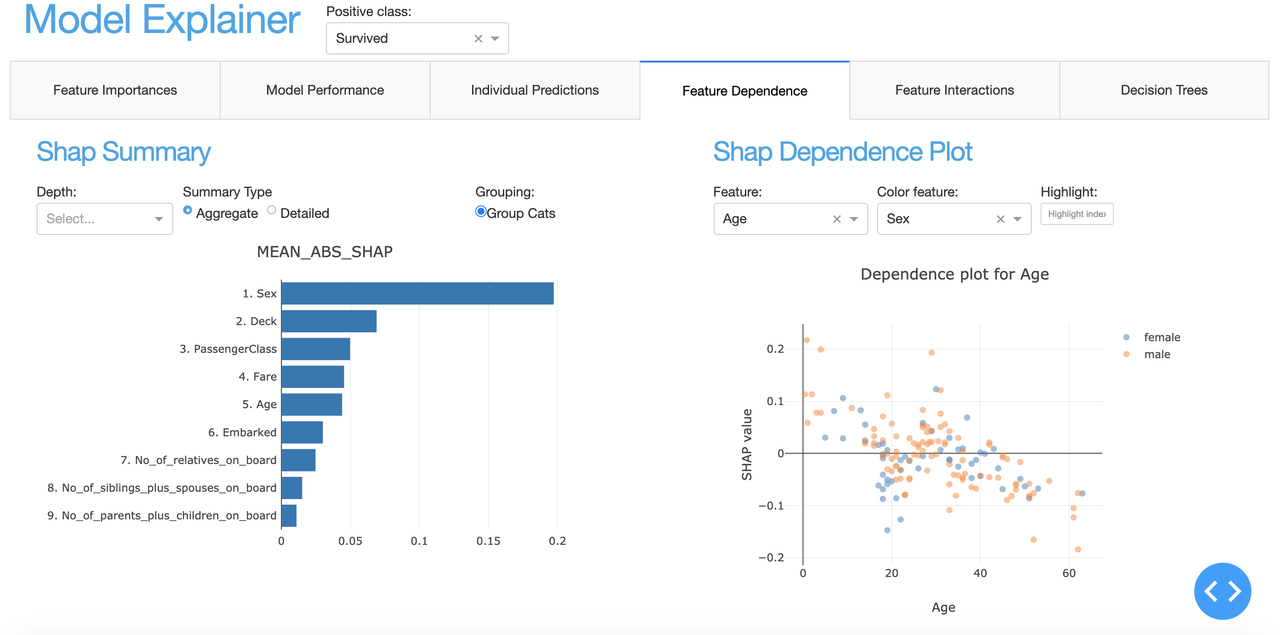
- Shap values (i.e. what is the contributions of each feature to each individual prediction?)
- Permutation importances (how much does the model metric deteriorate when you shuffle a feature?)
- Partial dependence plots (how does the model prediction change when you vary a single feature?
- Shap interaction values (decompose the shap value into a direct effect an interaction effects)
- For Random Forests: what is the prediction of each individual decision tree, and what is the path through each tree? (using
dtreeviz) - Plus for classifiers: precision plots, confusion matrix, ROC AUC plot, PR AUC plot, etc
- For regression models: goodness-of-fit plots, residual plots, etc.
The library is designed to be modular so that it should be easy to design your own interactive dashboards with plotly dash, with most of the work of calculating and formatting data, and rendering plots and tables handled by explainerdashboard, so that you can focus on the layout, logic of the interactions, and project specific textual explanations of the dashboard. (i.e. design it so that it will be interpretable for business users in your organization, not just data scientists)
Alternatively, there is a built-in standard dashboard with pre-built tabs that you can select individually. Fitting a model, building the explainer object, building the dashboard, and then running it can be as simple as:
ExplainerDashboard(ClassifierExplainer(RandomForestClassifier().fit(X_train, y_train), X_test, y_test)).run()
Or a slightly more explicit example with some extra parameters to group categorical variables, show proper names for row indexes, and display classification labels:
from sklearn.ensemble import RandomForestClassifier

from explainerdashboard.explainers import *
from explainerdashboard.dashboards import *
from explainerdashboard.datasets import *

X_train, y_train, X_test, y_test = titanic_survive()
train_names, test_names = titanic_names()

model = RandomForestClassifier(n_estimators=50, max_depth=5)
model.fit(X_train, y_train)

explainer = RandomForestClassifierExplainer(model, X_test, y_test,
                                cats=['Sex', 'Deck', 'Embarked'],
                                idxs=test_names,
                                labels=['Not survived', 'Survived'])

db = ExplainerDashboard(explainer, title="Titanic Explainer",
                        importances=True,
                        model_summary=True,  # you can switch off individual tabs
                        contributions=True,
                        shap_dependence=True,
                        shap_interaction=False,
                        decision_trees=False)
db.run(port=8051)
When working inside jupyter you can use JupyterExplainerDashboard() instead
to use JupyterDash instead of dash.Dash() to start the app.
You can also use e.g. InlineExplainer(explainer).tab.dependence() to see a
single specific tab or component inline in your notebook.
You can install the package through pip:
pip install explainerdashboard
Documentation can be found at explainerdashboard.readthedocs.io.
Example notebook on how to launch dashboards for different model types here: dashboard_examples.ipynb.
Example notebook on how to interact with the explainer object here: explainer_examples.ipynb.
Example notebook on how to design a custom dashboard: custom_examples.ipynb.
Finally an example is deployed at: titanicexplainer.herokuapp.com. (source code on github here)
The package works by first constructing an Explainer object. You can then use
this Explainer to manually call different plots, or pass it on to an ExplainerDashboard
object. You construct the Explainer instancefrom your fitted model, a feature matrix X,
and optionally the corresponding target values y.
In addition you can pass:
metric: permutation importances get calculated against a particular metric (for regression defaults tor2_scoreand for classification toroc_auc_score)shap: type of shap explainer to use. e.g. 'tree' forshap.TreeExplainer(...), or 'linear', 'kernel', etc (defaults to 'guess')X_background: background data to use for shap explainer (most tree based models don't need this), if not given useXinsteadmodel_output: for classification models either 'logodds' or 'probability', defaults to 'probability'cats: a list of onehot encoded variables (e.g. if encoded as 'Gender_Female', 'Gender_Male' you would passcats=['Gender']). This allows you to group the onehotencoded columns together in various plots with the argumentcats=True.idxs: a list of indentifiers for each row in your dataset. This makes it easier to look up predictions for specific id's.descriptions: a dictionary of descriptions of the meaning of individual variables.labels: for classifier models a list of labels for the classes of your model.na_fill: Value used to fill in missing values (default to -999)
E.g.:
X_train, y_train, X_test, y_test = titanic_survive()
train_names, test_names = titanic_names()

model = RandomForestClassifier(n_estimators=50, max_depth=5)
model.fit(X_train, y_train)

explainer = RandomForestClassifierExplainer(model, X_test, y_test,
                                X_background=None, model_output='probability',
                                cats=['Sex', 'Deck', 'Embarked'],
                                idxs=test_names,
                                labels=['Not survived', 'Survived'])
You can then easily inspect the model using various plot function, such as e.g.:
explainer.plot_confusion_matrix(cutoff=0.6, normalized=True)explainer.plot_importances(cats=True)explainer.plot_pdp('PassengerClass', index=0)explainer.plot_shap_dependence('Age'), etc.
See the explainer_examples.ipynb, dashboard_examples.ipynband documentation for more details and all the possible plots and tables you can generate.
Once you have constructed an Explainer object, you can then pass this along to an ExplainerDashboard that builds an interactive Plotly Dash analytical dashboard for easily exploring the various plots and analysis mentioned earlier.
You can use a series of booleans to switch on or off certain tabs of the dashboard. (Calculating shap interaction values can take quite a bit of time if you have a large dataset with a lot of features, so if you are not really interested in them, it may make sense to switch that tab off.)
db = ExplainerDashboard(explainer, 'Titanic Explainer`,
                        model_summary=True,
                        contributions=True,
                        shap_dependence=True,
                        shap_interaction=False,
                        shadow_trees=True)
You then start the dashboard on a particular port with db.run(port=8050).
If you wish to use e.g. gunicorn to deploy the dashboard you should add server = db.app.server to your code to expose the Flask server. You can then start the server with e.g. gunicorn dashboard:server (assuming the file you defined the dashboard in was called dashboard.py).
It may take some time to calculate all the properties of the Explainer (especially shap interaction values). However all properties get calculated lazily, so they are only calculated when you call a plot or table that depends on them. To save startup time you can save the Explainer to disk with e.g. joblib and then load the Explainer with pre-calculated properties whenever you wish to start the dashboard.
You can find an example dashboard at titanicexplainer.herokuapp.com (may take some time to load due to serverless deployment)
(source code at https://github.com/oegedijk/explainingtitanic)