


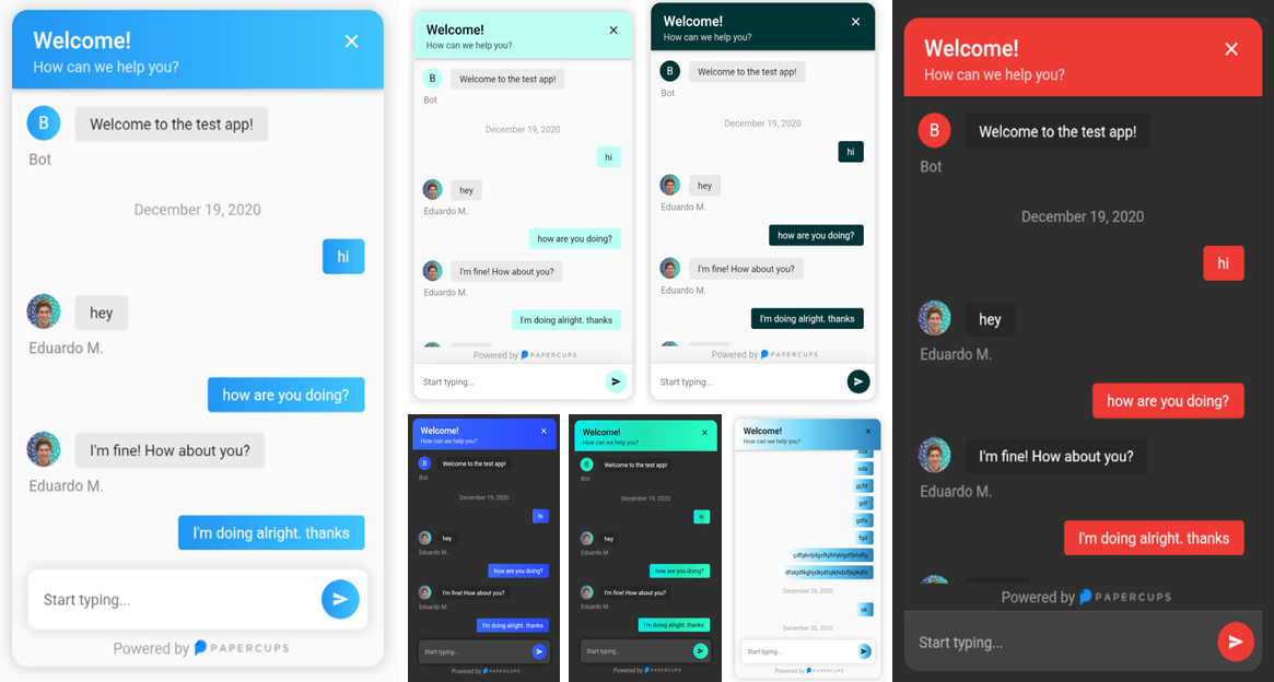


Compatible with all platforms: Windows, Android, Linux, MacOS, and iOS
To get started simply add papercups_flutter: and the latest version to your pubspec.yaml.
Then run flutter pub get
🎉 Done, It's that simple.
Integration with your app requires just a few lines of code, add the following widget wherever you want your papercups chat window to be:
import 'package:papercups_flutter/papercups_flutter.dart';

PapercupsWidget(
  props: PapercupsProps(
    accountId: "xxxxxxxx-xxxxxxx-xxxx-xxxxxx", //Your account id goes here.
  ),
),
That should get you up and running in just a few seconds ⚡️.
| Parameter | Type | Value | Default |
|---|---|---|---|
props |
PapercupsProps |
Required. This is where all of the config for the chat is contained. | N/A |
dateLocale |
String |
Locale for the date, use the locales from the intl package. |
"en-US" |
timeagoLocale |
dynamic |
Check timeago messages for the available classes. |
N/A |
| Prop | Type | Value | Default |
|---|---|---|---|
accountId |
String |
Required. Your Papercups account token. | N/A |
baseUrl |
String |
The base URL of your API if you're self-hosting Papercups. Ensure you do not include the protocol (https) of a trailing dash (/). | "app.papercups.io" |
customer |
PapercupsCustomerMetadata |
Identifying information for the customer, including name, email, externalId, and otherMetadata (for any custom fields). |
N/A |
closeIcon |
Widget |
The close button displayed in the header section. | N/A |
closeAction |
VoidCallback |
The function to handle closing the widget. If not null, close button will be shown. | N/A |
scrollEnabled |
bool |
Whether or not to allow scrolling. | true |
floatingSendMessage |
bool |
Wether to have the message box floating. | false |
requireEmailUpfront |
bool |
If you want to require unidentified customers to provide their email before they can message you. Not recommended for apps. | false |
sendIcon |
Widget |
Message send icon in the chat text field. | N/A |
onMessageBubbleTap |
void Function(PapercupsMessage) |
Function to handle message bubble tap action. | N/A |
style |
PapercupsStyle |
Class used to customize the widget appearance. | PapercupsStyle() |
translations |
PapercupsIntl |
If you want to override the default EN translations displayed by the widget. |
PapercupsIntl() |
| Parameters | Type | Value | Default |
|---|---|---|---|
email |
String |
The customer's email | N/A |
externalId |
String |
The customer's external ID | N/A |
name |
String |
The customer's name | N/A |
otherMetadata |
Map<String, dynamic> |
Extra metadata to pass such as OS info, app version, etc. | N/A |
| Parameters | Type | Value | Default |
primaryColor |
Color |
The theme color of the chat widget. | Papercups blue:Color(0xFF1890FF) |
primaryGradient |
Gradient |
Gradient to specify, should be used instead of primaryColor. DO NOT USE BOTH! |
N/A |
backgroundColor |
Color |
Color used in the background of the entire widget. | Theme.of(context).canvasColor |
titleStyle |
TextStyle |
The text style of the title at the top of the chat widget. | TextStyle(
color: textColor, // Using computeLuminance
fontSize: 21,
fontWeight: FontWeight.w600,
) |
titleAlign |
TextAlign |
The widget title alignment. | TextAlign.left |
subtitleStyle |
TextStyle |
The chat widget sub title text style. | TextStyle(
color: props.style.titleStyle?.color?.withOpacity(0.8),
) |
headerHeight |
double |
The chat widget header height. | N/A |
headerPadding |
EdgeInsetsGeometry |
The chat widget header padding. | EdgeInsets.only(
top: 16,
right: 20,
left: 20,
bottom: 12,
) |
noConnectionIcon |
Widget |
The widget displayed in the chat when there's no Internet connection. | Icon(
Icons.wifi_off_rounded,
size: 100,
color: Colors.grey,
) |
noConnectionTextStyle |
TextStyle |
The text style of the text displayed in the chat widget when there's no Internet connection. | Theme.of(context).textTheme.headlineSmall?.copyWith(color: code.grey) |
requireEmailUpfrontInputDecoration |
InputDecoration |
The input decoration of the require email text field. | InputDecoration(
border: UnderlineInputBorder(
borderSide: BorderSide(
color: Theme.of(context).dividerColor,
width: 0.5,
style: BorderStyle.solid,
),
),
enabledBorder: UnderlineInputBorder(
borderSide: BorderSide(
color: Theme.of(context).dividerColor,
width: 0.5,
style: BorderStyle.solid,
),
),
focusedBorder: UnderlineInputBorder(
borderSide: BorderSide(
color: Theme.of(context).dividerColor,
width: 0.5,
style: BorderStyle.solid,
),
),
hintText: widget.props.translations.enterEmailPlaceholder,
hintStyle: widget.props.style.requireEmailUpfrontInputHintStyle,
), |
requireEmailUpfrontKeyboardAppearance |
Brightness |
The keyboard brightness of the require email text field. | Brightness.light |
requireEmailUpfrontInputHintStyle |
TextStyle |
The text style of the require email text field hint. | TextStyle(fontSize: 14) |
requireEmailUpfrontInputTextStyle |
TextStyle |
The text style of the require email text field. | N/A |
floatingSendMessageBoxDecoration |
BoxDecoration |
The box decoration of the message text field when floatingSendMessage prop is true. |
BoxDecoration(
  borderRadius: BorderRadius.circular(10),
  boxShadow: [
    BoxShadow(
      blurRadius: 10,
      color: Theme.of(context).brightness == Brightness.light
          ? Colors.grey.withOpacity(0.4)
          : Colors.black.withOpacity(0.8),
    ),
  ],
) |
sendMessageBoxDecoration |
BoxDecoration |
The box decoration of the message text field. | BoxDecoration(
color: Theme.of(context).cardColor,
border: widget.showDivider
? Border(
top: BorderSide(color: Theme.of(context).dividerColor),
)
: null,
boxShadow: [
BoxShadow(
blurRadius: 30,
color: Theme.of(context).shadowColor.withOpacity(0.1),
)
],
) |
sendMessageKeyboardAppearance |
Brightness |
The keyboard brightness of the send message text field. | Brightness.light |
sendMessagePlaceholderInputDecoration |
InputDecoration |
The input decoration of the message text field. | InputDecoration(
border: InputBorder.none,
hintText: widget.props.translations.newMessagePlaceholder,
hintStyle: widget.props.style.sendMessagePlaceholderTextStyle,
) |
sendMessagePlaceholderTextStyle |
TextStyle |
The text style of the message text field input hint text. | TextStyle(fontSize: 14) |
sendMessageInputTextStyle |
TextStyle |
The text style of the message text field input. | N/A |
botBubbleBoxDecoration |
BoxDecoration |
The box decoration of the bot chat bubbles. | BoxDecoration(
color: Theme.of(context).brightness == Brightness.light
? brighten(Theme.of(context).disabledColor, 80)
: const Color(0xff282828,
),
borderRadius: BorderRadius.circular(4),
) |
botBubbleTextStyle |
TextStyle |
The text style of the bot chat bubbles. | TextStyle(
color: Theme.of(context).textTheme.bodyLarge?.color,
) |
botAttachmentBoxDecoration |
BoxDecoration |
The box decoration of the bot attachment (images, files) chat bubbles. | BoxDecoration(
borderRadius: BorderRadius.circular(5),
color: Theme.of(context).brightness == Brightness.light
? brighten(Theme.of(context).disabledColor, 70)
: Color(0xff282828,
),
) |
botAttachmentTextStyle |
TextStyle |
The text style of the bot attachments file name. | TextStyle(
color: Theme.of(context).textTheme.bodyLarge?.color,
) |
botBubbleUsernameTextStyle |
TextStyle |
The text style of bot user name displayed below its chat bubbles. | TextStyle(
color: Theme.of(context).textTheme.bodyLarge?.color?.withOpacity(0.5),
fontSize: 14,
) |
userBubbleBoxDecoration |
BoxDecoration |
The box decoration of the user chat bubbles. | BoxDecoration(
color: widget.props.style.primaryColor,
gradient: widget.props.style.primaryGradient,
borderRadius: BorderRadius.circular(4),
) |
userBubbleTextStyle |
TextStyle |
The text style of the user chat bubbles. | TextStyle(color: widget.textColor)primaryColor, textColor can be either Colors.black or Colors.white. |
userAttachmentBoxDecoration |
BoxDecoration |
The box decoration of the user attachment (images, files) chat bubbles. | BoxDecoration(
borderRadius: BorderRadius.circular(5),
color: darken(widget.props.style.primaryColor!, 20),
) |
userAttachmentTextStyle |
TextStyle |
The text style of the user attachments file name. | TextStyle(color: widget.textColor)primaryColor, textColor can be either Colors.black or Colors.white. |
userBubbleSentAtTextStyle |
TextStyle |
The text style of the "Sent x ago" (or "Sending...") text displayed below the latest user chat bubble. | TextStyle(color: Colors.grey) |
chatBubbleTimeTextStyle |
TextStyle |
The text style of the time stamp displayed (on tap) next to the any chat bubble. | TextStyle(
color: Theme.of(context).textTheme.bodyLarge?.color?.withAlpha(100),
fontSize: 10,
) |
chatBubbleFullDateTextStyle |
TextStyle |
The text style of the date displayed centered in the chat before the chat bubbles of a given day. | TextStyle(color: Colors.grey) |
chatUploadingAlertTextStyle |
TextStyle |
The text style of the alert shown when an attachment is being uploaded. | Theme.of(context).textTheme.bodyMedium |
chatUploadingAlertBackgroundColor |
Color |
The background color of the alert shown when an attachment is being uploaded. | BottomAppBarTheme.of(context).color! |
chatUploadErrorAlertTextStyle |
TextStyle |
The text style of the error alert shown when an attachment failed to upload. | Theme.of(context).textTheme.bodyMedium |
chatUploadErrorAlertBackgroundColor |
Color |
The background color of the error alert shown when an attachment failed to upload. | BottomAppBarTheme.of(context).color! |
chatNoConnectionAlertTextStyle |
TextStyle |
The text style of the alert shown when the chat is displayed but no Internet connection is available. | Theme.of(context).textTheme.bodyMedium |
chatNoConnectionAlertBackgroundColor |
Color |
The background color of the alert shown when the chat is displayed but no Internet connection is available. | BottomAppBarTheme.of(context).color! |
chatCopiedTextAlertTextStyle |
TextStyle |
The text style of the alert shown when a chat bubble gets long pressed and its text copied. | Theme.of(context).textTheme.bodyMedium |
chatCopiedTextAlertBackgroundColor |
Color |
The background color of the alert shown when a chat bubble gets long pressed and its text copied. | BottomAppBarTheme.of(context).color! |
| Parameters | Type | Value | Default |
|---|---|---|---|
attachmentNamePlaceholder |
String |
Text displayed when an attachment doesn't have a file name | "No Name" |
attachmentUploadErrorText |
String |
Error message displayed when an attachment could not be uploaded | "Failed to upload attachment" |
attachmentUploadedText |
String |
Text displayed when an attachment has been uploaded | "Attachment uploaded" |
attachmentUploadingText |
String |
Text displayed when an attachment is been uploaded | "Uploading..." |
companyName |
String |
Company name to show on greeting | "Bot" |
enterEmailPlaceholder |
String |
This is the placeholder text in the email input section | "Enter your email" |
fileText |
String |
Text displayed on the tile where the user decides to upload a file | "File" |
greeting |
String |
An optional initial message to greet your customers with | N/A |
historyFetchErrorText |
String |
Error message displayed when the customer history couldn't be fetched | "There was an issue retrieving your details. Please try again!" |
imageText |
String |
Text displayed on the tile where the user decides to upload an image | "Image" |
loadingText |
String |
Text displayed when the chat is loading | "Loading..." |
newMessagePlaceholder |
String |
The placeholder text in the new message input | "Start typing..." |
noConnectionText |
String |
The placeholder text in the new message input | "No Connection" |
retryButtonLabel |
String |
Label used in the retry button when the chat history couldn't be fetched | "Retry" |
sendingText |
String |
Text to show while message is sending | "Sending..." |
sentText |
String |
Text to show when the message is sent | "Sent" |
subtitle |
String |
The subtitle in the header of your chat widget | "How can we help you?" |
textCopiedText |
String |
Text displayed when a text has been copied after long press on a chat bubble | "Text copied to clipboard" |
title |
String |
The title in the header of your chat widget | "Welcome!" |
uploadedText |
String |
Text displayed after the percentage value of an attachment being uploaded | "uploaded" |


![dependabot[bot] avatar](https://avatars.githubusercontent.com/in/29110?v=4 "dependabot[bot]")


 React
React
 Typescript
 Django
 Laravel
 Facebook
 Microsoft
 Google
 Alibaba
 D3
D3
 Tencent