A Masonry component leveraging CSS and native React rendering, for fast, responsive masonry layouts

Existing solutions like React wrapped DeSandro Masonry, while popular, don't actually leverage React's highly optimized Virtual DOM renderer and in DeSandro Masonry's case, actually renders elements twice before showing the layout. All of this is ok but we found it to lead to a slow, "laggy" user experience that would occasionally miss-render our layout.
Our need for a simple Masonry layout that was fast, used React's Virtual DOM without needing jQuery or other dependencies led us to explore what we could do with the latest techniques using just CSS within a React Component.
Between flexbox, css columns, css grid we settled on plain ol' div's and a dab of flexbox that allows for "fluid" responsive layouts by default but most importantly is true to Reacts rendering lifecycle.
react-masonry-css Is a React Component with a simple interface to order items into the desired columns at specified breakpoints. With minimal CSS this leads to a quick, reliable solution that also has great browser support along with rendering performance.
- Responsive! ..always
- IE 10+
- No Dependencies - Which means no need for jQuery!
- Works with existing CSS animations on your elements, like fading in on first load
- CSS powered (Faster to render)
- Allows for Gaps (Gutters) between elements
- Works with elements with different widths
- Sorting based on height - This kills performance, so if you don't need it we're here for you
Add react-masonry-css to your project:
npm install react-masonry-cssIn your React Component...
import Masonry from 'react-masonry-css'

//...

<Masonry
  breakpointCols={3}
  className="my-masonry-grid"
  columnClassName="my-masonry-grid_column">
  {/* array of JSX items */}
</Masonry>
And, CSS:
.my-masonry-grid {
  display: -webkit-box; /* Not needed if autoprefixing */
  display: -ms-flexbox; /* Not needed if autoprefixing */
  display: flex;
  margin-left: -30px; /* gutter size offset */
  width: auto;
}
.my-masonry-grid_column {
  padding-left: 30px; /* gutter size */
  background-clip: padding-box;
}

/* Style your items */
.my-masonry-grid_column > div { /* change div to reference your elements you put in <Masonry> */
  background: grey;
  margin-bottom: 30px;
}Different columns can be specified by passing an object containing key's of the window widths and their value as the number of columns. To have a fallback value, use the default key.
const breakpointColumnsObj = {
  default: 4,
  1100: 3,
  700: 2,
  500: 1
};

//...

<Masonry
  breakpointCols={breakpointColumnsObj}
  className="my-masonry-grid"
  columnClassName="my-masonry-grid_column"
>
  <div>My Element</div>
  <div>My Element</div>
  <div>My Element</div>
  <div>My Element</div>
</Masonry>breakpointCols={{default: 4, 800: 2}}optional (defaults to 2 columns)classNamefor the containercolumnClassNameclass name added to each generated column
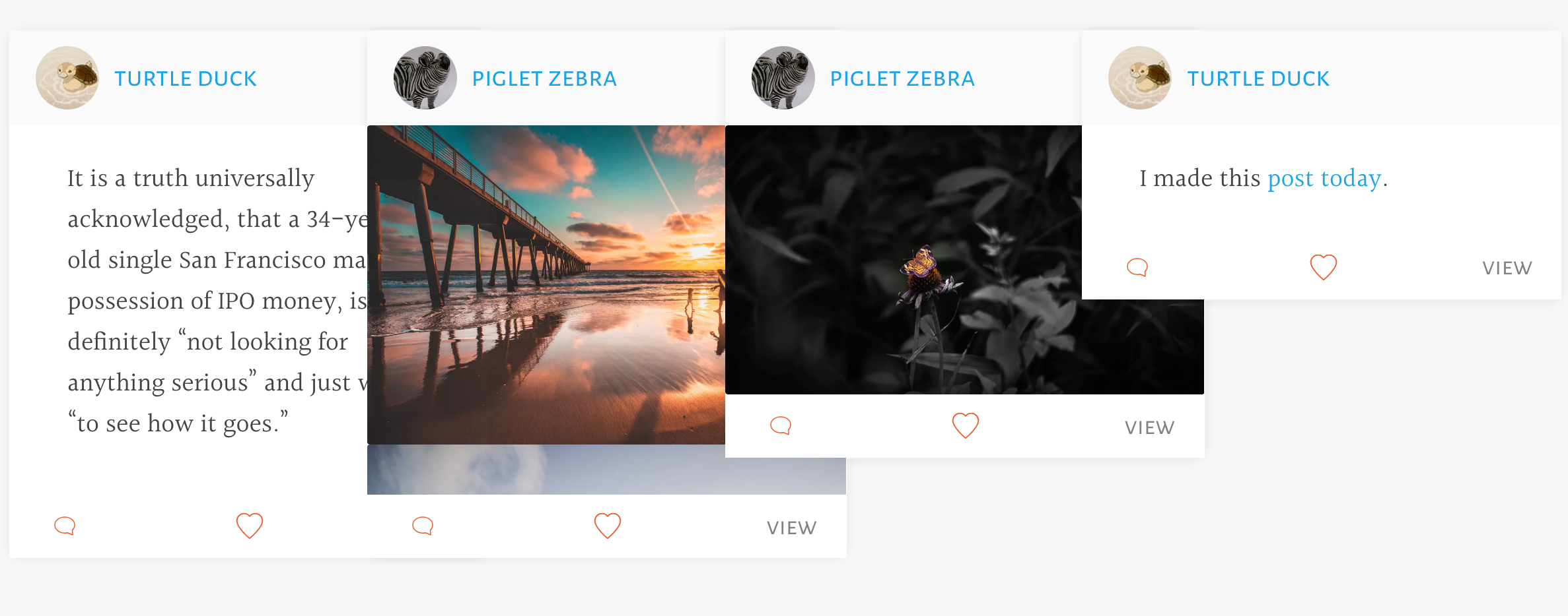
https://paulcollett.github.io/react-masonry-css/demo/
outputting an array of items:
var items = [
  {id: 1, name: 'My First Item'},
  {id: 2, name: 'Another item'},
  {id: 3, name: 'Third Item'},
  {id: 4, name: 'Here is the Fourth'},
  {id: 5, name: 'High Five'}
];

// Convert array to JSX items
items = items.map(function(item) {
  return <div key={item.id}>{item.name}</div>
});

<Masonry
  breakpointCols={myBreakpointsAndCols}
  className="my-masonry-grid"
  columnClassName="my-masonry-grid_column"
>
  {items}
</Masonry>We can add the following to the above CSS to further adjust the layout between screen sizes.
/* Optional, different gutter size on mobile */
@media (max-width: 800px) {
  .my-masonry-grid {
    margin-left: -15px; /* gutter size offset */
  }
  .my-masonry-grid_column {
    padding-left: 15px; /* gutter size offset */
  }
  .my-masonry-grid_column > div {
    margin-bottom: 15px; /* space between items */
  }
}You can use react-masonry-css with Preact when using preact/compat
Improve your frontend builds with dynamic placeholder images and dummy text from DummyJs.com. https://www.npmjs.com/package/dummyjs
https://github.com/paulcollett/react-masonry-css/issues/
Contact me direct:


![dependabot[bot] avatar](https://avatars.githubusercontent.com/in/29110?v=4 "dependabot[bot]")


 React
React
 Typescript
 Django
 Laravel
 Facebook
 Microsoft
 Google
 Alibaba
 D3
D3
 Tencent