Giter Site home page Giter Site logo

petal_components's Introduction

Petal Components

petal.build

Petal is a set of HEEX components that makes it easy for Phoenix developers to build beautiful web apps. Think Bootstrap or MUI, but written in HEEX using Tailwind CSS classes. Work in both live and dead (controller) views.

Hex Version Hex Docs

View the docs

About

Petal stands for:

Some components like Dropdowns require Javascript to work. We default to Alpine JS (17kb) but you can choose to use Phoenix.LiveView.JS as an alternative (though this will only work in live environments like live views or live components).

Documentation

For full documentation, visit petal.build.

Try it out

We have a fresh Phoenix boilerplate template with Petal Components ready to go if you would like to get your hands dirty.

VSCode Snippets Extension

Install our VSCode extension to gain access to 65+ snippets for all of the components.

Roadmap

Layout

  • container

Form components

  • text input
  • select dropdown
  • textarea
  • checkbox
  • radios
  • errors
  • labels
  • file upload
  • text variants (email, password, tel)
  • color input
  • range input
  • time, datetime, & date input
  • multiple select (see checkbox group)
  • switch
  • input help text
  • input prefix and postfix
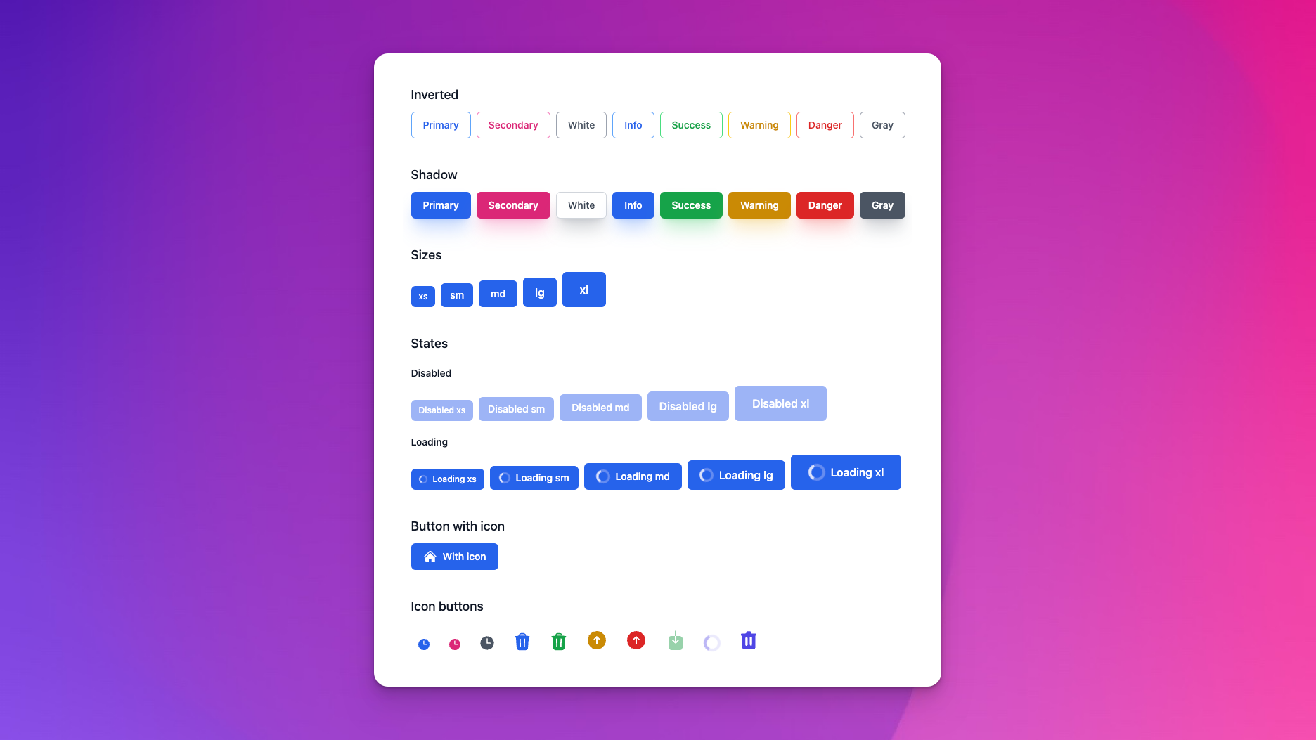
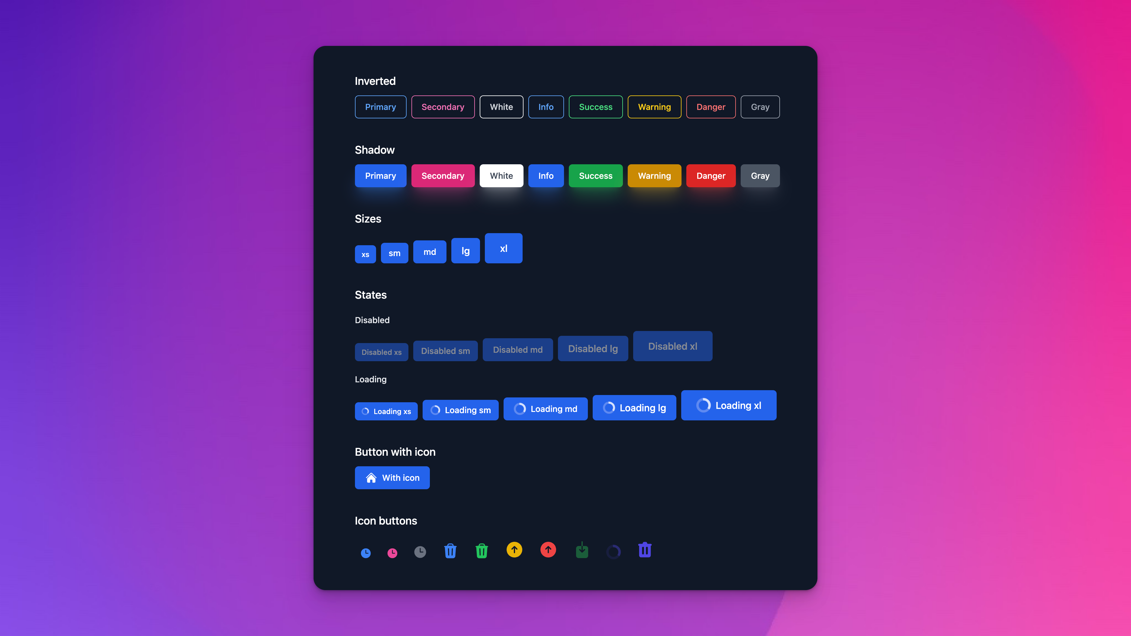
Buttons

  • basic button
  • change size
  • change color
  • loading state (with spinner)
  • filled vs outline
  • button group

Misc

  • menu dropdown
  • avatar
  • alerts
  • tables
  • cards
  • breadcrumbs
  • modal
  • slide over
  • spinners
  • accordion
  • pagination
  • badges
  • progress
  • links
  • tooltips

FAQ

Q: Do I need Alpine JS? A: No we have designed the components to use either Alpine JS or LiveView.JS.

Q: What if I want to use my own components too? A: You can install this library and import only the components you need.

# The recommended option is to import every single component
use PetalComponents

# But you can get more granular. eg.

# Import Button so you can now create `<.button>` components
import PetalComponents.Button

# Or just alias if you already have a `def button` HEEX component. With alias you now write the Petal component like this: `<Button.button>`
alias PetalComponents.Button

Q: Does this increase my CSS filesize? A: Tailwind will scan any folders you specify and hoover up CSS classes from files to include in your final CSS file. You specify the folders in tailwind.config.js. By default, we instruct you to just scan the whole Petal Components library:

const colors = require("tailwindcss/colors");

module.exports = {
  purge: [
    "../lib/*_web/**/*.*ex",
    "./js/**/*.js",

    // We need to include the Petal dependency so the classes get picked up by JIT.
    "../deps/petal_components/**/*.*ex"
  ],

  ... rest of file omitted

You might be worried that if you don't use every component you'll have unused CSS classes. But we believe it's so small it won't matter. Our petal.build site's CSS file totals just 25kb.

If you really want to you can instruct Tailwind to just scan the components you use:

"../deps/petal_components/lib/button.ex",
"../deps/petal_components/lib/alert.ex",

Q: Can I customize the components? A: Yes! You can customize the components by overriding the CSS classes. For example, if you want to change the color of the button you can do this:

.pc-button {
  @apply inline-flex items-center justify-center font-semibold tracking-wider uppercase transition duration-150 ease-in-out border-2 rounded-none focus:outline-none;
}
.pc-button--primary {
  @apply text-black border-black bg-primary-400 hover:bg-primary-700 focus:bg-primary-700 active:bg-primary-800 focus:shadow-primary-500/50;
}

Contributing

If you'd like to help out we've got a Phoenix umbrella app that allows you to easily contribute to Petal Components (which is installed as a git submodule). If you create a new component then feel free to submit a PR. Ideally one from the roadmap but we're open to any new components that would benefit others!

petal_components's People

Contributors

balajir avatar bobbiebarker avatar braidonw avatar cleaver avatar dependabot[bot] avatar doughsay avatar dvic avatar forest avatar fredwu avatar gsperka avatar guess avatar hengermax avatar jpramassini avatar kristofka avatar mindok avatar mitkins avatar mohammedzeglam-pg avatar moogle19 avatar mplatts avatar mrdotb avatar nhobes avatar periclesd avatar philipgiuliani avatar remco-schoeman avatar robinboers avatar sezaru avatar tamanugi avatar tegon avatar thomasbrus avatar wigny avatar

Stargazers

 avatar  avatar  avatar  avatar  avatar  avatar  avatar  avatar  avatar  avatar  avatar  avatar  avatar  avatar  avatar  avatar  avatar  avatar  avatar  avatar  avatar  avatar  avatar  avatar  avatar  avatar  avatar  avatar  avatar  avatar  avatar  avatar  avatar  avatar  avatar  avatar  avatar  avatar  avatar  avatar  avatar  avatar  avatar  avatar  avatar  avatar  avatar  avatar  avatar  avatar  avatar  avatar  avatar  avatar  avatar  avatar  avatar  avatar  avatar  avatar  avatar  avatar  avatar  avatar  avatar  avatar  avatar  avatar  avatar  avatar  avatar  avatar  avatar  avatar  avatar  avatar  avatar  avatar  avatar  avatar  avatar  avatar  avatar  avatar  avatar  avatar  avatar  avatar  avatar  avatar  avatar  avatar  avatar  avatar  avatar  avatar  avatar  avatar  avatar  avatar

Watchers

 avatar  avatar  avatar  avatar  avatar  avatar  avatar  avatar  avatar  avatar  avatar  avatar  avatar  avatar  avatar  avatar  avatar

petal_components's Issues

how to add dynamics routes?

<.link label="Log in" link_type="button" class=""  to={Routes.user_session_path(@conn, :new)} /> 

This component throws error.

lib/petal_boilerplate_web/templates/user_registration/new.html.heex:20:1: expected closing `}` for expression

How to add dynamic routes in to?

Mix task to "eject" components

Sometimes you want to use a component as a starting point and modify it heavily.

Example: I want to modify the <.card> component.

mix petal_components:eject card

And it generates a copy of the card component into my live folder.

Alerts look weird when size is "md" lower

image

I removed items-center because when you had an alert with multiple of lines of text it looked weird. However I forgot that you can change the sizes. Need to either make the icon smaller for the lower sizes or adjust the padding top on the text to work

phx-debounce="blur" doesn't have any affect

Hello,
I use petal_components, they are so great and helpful. I have this issue of form errors, they just spit immediately when you just touch any field in that form, or to be specific, when you just tab out of any field, all other fields show errors of invalid or can't be blank or whatever error specified for that field if it is required. I added phx-debounce="blur" but it didn't affect at all. I added for each <.form_field ... phx-debounce="blur" /> didn't affect and also in text_input function itself.

Beginner friendly contribution?

Are there some low hanging fruits that could get beginner involved?

Or maybe a couple of decent sized issues that could be highlighted as per plan of the maintainers of library?

Would love to contribute. Need a direction.

Does this slow down the rendering of components?

https://github.com/petalframework/petal_components/blob/main/lib/petal_components/form.ex#L90

All the components are defined in one huge case statement.

Usually , in other frameworks, such approaches use templates rather than invoking the components directly in case statement. Otherwise, they would load all the components and then hide some, based on Switch, pollluting the dom).
Hence only one of the templates is invoked (hence faster loading)

See ng-template for example in Angular.

My concern is -

  1. If i have a lot of components in switch case, does it slow down elixir in determining which template to load?
    Because morphdom of phoenix removes the element and replaces it again in LiveView (i hope i understand this correctly 😅)

Dialog components

I implemented this small javascript library as a replacement of browsers standard alert/confirm/prompt components, and thought that it would be a good idea in integrate it with petal components. For that they'd likely need to share styling options. Let me know if there's interest in adding this functionality to petal.

Icons are missing chevron_up_down

I noticed the chevron-up-down icon is missing from the set. I believe it's because it was accidentally missing from the available svg's in the heroicons repo's optimized folder.

I noticed the optimized folder has change structure and so I think the heroicons mix task will need to be updated to handle the change.

REQUEST: Help text for form inputs

Hello,

It would be awesome to have built-in support to help text form input fields. Ideally, we could add an explicit "form_field_help" and an optional help= attr for the all-inclusive option.

Of those above names that are agreeable, I could offer a PR, but it will take me quite a while.

Thanks!

Use git tags for versions

It would be nice to add a git tag for each (new) version.
This would make viewing changes between two versions easier (e.g. git diff v0.15.0 v0.16.0).

Explicit color customization not working

I tried to customize my color theme with explicit colors for primary and secondary in tailwind.config.js:

  theme: {
    extend: {
      colors: {
        primary: "#034EA2",
        secondary: "#563600",
      }
    },
  },

Then, the color primary is ignored in this component:

<.button color="primary" label="Primary" />

Nevertheless, if I define primary with an alias like

        primary: colors.violet,

It works perfectly.

I am not sure if this is a bug in the button component or if I am doing something wrong or if I am missing a prevous step to make it working.

Regards.

Version 0.18.3.

Accordion iterating over the items doesn't work

<.container>
  <.accordion>
    <%= for i <- 1..3 do %>
      <:item heading="Hi">Bye</:item>
    <% end %>
  </.accordion>
</.container>

Produces error: invalid slot entry <:item>. A slot entry must be a direct child of a component.

Chris Mccord confirmed this will never be supported: phoenixframework/phoenix_live_view#1870

The alternative is something like this:

def alert(assigns) do
  ~H"""
  <div class="alert alert-danger">
    <ul>
       <%= for error <- @errors do %>
         <li><%= render_slot(error, error) %></li>
       <% end %>
     </ul>
  </div>
  """
end
<.alert errors={["really bad error message"]}>
  <:error let={error}>
    Some Error <%= error %>
  </:error>
</.alert>

So maybe we should do something like this:

<.accordion items={[
  %{heading: "Foo", content: "Some <b>html</b>"},
  %{heading: "Bar", content: "Some <b>html</b>"},
]}>
  <:item let={item}>
    <%= raw(item.content) %>
  </:item>
</.accordion>

Modal - should be able to pass a target to close_modal

Allow modals to target @myself for when a modal is inside a live_component.

<.modal title="Modal" close_modal_target={@myself}>
    <.p>Content</.p>
</.modal>
# In the component code something like:
JS.push("close_modal", target: @close_modal_target)

Component wrappers for the Surface library

Would you consider a feature of creating a layer of wrappers to be able to use Petal's component styles with the Surface library?

Otherwise Petal components don't seem to be friendly to Surface:

# Surface:

<Form for={:user}>
  <Field name={:email}>
    <Label>E-mail</Label>
    <TextInput value={@user["email"]}/>
  </Field>
</Form>

# Petal:

<.form let={f} for={:user}>
  <.form_label form={f} field={:email}/>
  <.text_input form={f} field={:email}/>
  <.form_field_error form={f} field={:email}/>
</.form>

Or is there some other suggested way of doing this that I am missing?

Styles not being applied on a project from starter template.

image

this was changed in live.html.heex

<.container class="my-10">
  <.alert
    color="info"
    class="mb-5"
    label={live_flash(@flash, :info)}
    phx-click="lv:clear-flash"
    phx-value-key="info"
  />

  <.alert
    color="danger"
    class="mb-5"
    label={live_flash(@flash, :error)}
    phx-click="lv:clear-flash"
    phx-value-key="error"
  />

  <%= @inner_content %>
</.container>

non styled page is seen. What am I missing?

class vs color_class attributes in headings undocumented?

According to documentation I understand that to change a color in a heading I should use attribute class. But I needed to use color_class to effectively change the color (I discoveed it diving in the code). Using attribute class, the color is overriden by color text-gray-900.

Version 0.18.3.

Better intersection of class attributes

I would be nice that components filter out class attributes that are custom assigned.
Overriding classes does not always work.
Function for assigning class for example to <.td> element, could check if user assigned px-2 and therefore not assigning px-6.

Control over whitespace after components

This is sort of a general HTML problem I face all the time, but is exacerbated by component libraries like this and I was wondering if there is an elegant way to fix this.

Imagine you want to render a comma separated list of links ( tags). So, simplified:

<a>foo</a>, <a>bar</a>, <a>baz</a>

DeepinScreenshot_select-area_20220214143237

This works, because you can directly put the comma after the tag, without any whitespace. But if you're using a component library (such as this one), the link component usually ends up outputting extra whitespace or a newline after the component. Example:

<.link to="/" label="foo" />, <.link to="/" label="bar" />, <.link to="/" label="baz" />

DeepinScreenshot_select-area_20220214143254

This doesn't render correctly, there's a space between the end of the link and the comma.

The only recourse I generally have is to just manually construct the HTML, which sticks out like a sore thumb. Is it possible to remove the trailing space/newline from the link component?

Add tags to the card content

Hi,

I think the <.card_content> component should allow a tags attributes. Something like this

<.card_content category="My category" heading="Awesome heading" tags={[tag1, tag2, ..., tagn]}>
</.card_content>

The tag being a <.badge color="primary" variant="outline">

Is it a pull request interesting for you ?

Is there a roadmap ?

When will tables be added?
I am willing to contribute. Broad pointers should do on where to look.

Out of curiousity, Is there a broader roadmap ?

Compilation warnings with live_view 0.18.1

When the petal boilerplate template project is compiled using most recent live_view 0.18.1, the following warnings are generated:

==> petal_components
Compiling 25 files (.ex)
warning: you are accessing the variable "translate_error" inside a LiveView template.

Using variables in HEEx templates are discouraged as they disable change tracking. You are only allowed to access variables defined by Elixir control-flow structures, such as if/case/for, or those defined by the special attributes :let/:if/:for.

Instead of:

    def add(assigns) do
      result = assigns.a + assigns.b
      ~H"the result is: <%= result %>"
    end

You must do:

    def add(assigns) do
      assigns = assign(assigns, :result, assigns.a + assigns.b)
      ~H"the result is: <%= @result %>"
    end

  lib/petal_components/form.ex:411: PetalComponents.Form.form_field_error/1

warning: you are accessing the variable "item" inside a LiveView template.

Using variables in HEEx templates are discouraged as they disable change tracking. You are only allowed to access variables defined by Elixir control-flow structures, such as if/case/for, or those defined by the special attributes :let/:if/:for.

Instead of:

    def add(assigns) do
      result = assigns.a + assigns.b
      ~H"the result is: <%= result %>"
    end

You must do:

    def add(assigns) do
      assigns = assign(assigns, :result, assigns.a + assigns.b)
      ~H"the result is: <%= @result %>"
    end

  lib/petal_components/accordion.ex:61: PetalComponents.Accordion.accordion/1

warning: you are accessing the variable "item" inside a LiveView template.

Using variables in HEEx templates are discouraged as they disable change tracking. You are only allowed to access variables defined by Elixir control-flow structures, such as if/case/for, or those defined by the special attributes :let/:if/:for.

Instead of:

    def add(assigns) do
      result = assigns.a + assigns.b
      ~H"the result is: <%= result %>"
    end

You must do:

    def add(assigns) do
      assigns = assign(assigns, :result, assigns.a + assigns.b)
      ~H"the result is: <%= @result %>"
    end

  lib/petal_components/accordion.ex:85: PetalComponents.Accordion.accordion/1

warning: Phoenix.LiveView.assign/3 is undefined or private
  lib/petal_components/helpers.ex:22: PetalComponents.Helpers.assign_rest/2

warning: Phoenix.LiveView.Helpers.assigns_to_attributes/2 is undefined or private
  lib/petal_components/helpers.ex:25: PetalComponents.Helpers.assign_rest/2

Also getting this error:

lib/.../live/page_live.ex:143: function link/1 imported from both PetalComponents.Link and Phoenix.Component, call is ambiguous

Migrating to LiveView 0.18

LiveView is about to introduce a link helper when 0.18 releases (excerpt from LiveView Changelog)

v0.18 includes a number of new function components which replace their EEx expression counterparts <%= ... %>. For example, live_redirect, live_patch, and Phoenix.HTML's link have been replaced by a unified Phoenix.Component.link/1 function component:

<.link href="https://myapp.com">my app</.link>
<.link navigate={@path}>remount</.link>
<.link patch={@path}>patch</.link>

This conflicts with Petal's own link helper and leads to these errors:

== Compilation error in file lib/petal_boilerplate_web/live/page_live.ex ==
** (CompileError) lib/petal_boilerplate_web/live/page_live.ex:143: function link/1 imported from both PetalComponents.Link and Phoenix.LiveView.Helpers, call is ambiguous

I can prepare a PR to fix this. We just need to discuss the solution. Am I correct that renaming a link helper in Petal is the best solution, and we just need to figure out the new name or is there a better one?

Button type is not passed on

When using PetalComponents.Button the "type" attribute Is not passed on.

For example <.button type="button" label="Back"/> renders the button tag without the type attribute.

The type attribute with the value "button" must be used in situations where the button shouldn't submit a form in LiveView.

REQUEST: Search Multi select

Apologies if this is the wrong place to ask.

Petal components is awesome and very comprehensive. One missing bit for me is the absence of a field input for "live" search and (optionally) multi-select. This is extremely useful for cases with more options than can be managed with checkboxes.

Would this be a welcome addition? I have a specific use case for it in an upcoming personal project and will try to contribute it if I can.

Thanks!

screenshot-tailwindcomponents com-2022 10 12-14_06_47

P.S. In case anyone is looking this is a multi-select without search that could work for their use case, consider: https://fly.io/phoenix-files/liveview-multi-select/

a possible better way to declare attributes

From phoenixframework/phoenix_live_view#1506, we can see the roadmap of HEEx:

  • slots
  • declarative assigns
  • formatter
  • catalogue

Slots and flomatter are ready. The next one would be declarative assigns which we can get some info from phoenixframework/phoenix_live_view#1747.

The PR by msaraiva declares syntax like this:

attr :id, :any, required: true
attr :name, :any, required: true
attr :email, :any

I think PETAL components can emulate this kind of syntax with functions. For example:

def container(assigns) do
  assigns =
    assigns
    |> attr(:class, :string)
    |> attr(:padding, :enum, values: [:always, :sm], default: :sm)
    |> attr(:breakpoint, :boolean, default: false)
    |> attr(:extra, :rest, exclude: [:class, :padding, :breakpoint])

  ~H"""
  <div
    class={
      @breakpoint
      |> container_class()
      |> merge_class(@class)
    }
    {@extra}
  >
    <div class={padding_class(@padding)}>
      <%= render_slot(@inner_block) %>
    </div>
  </div>
  """
end

defp container_class(true), do: "container mx-auto"
defp container_class(false), do: "mx-auto"

defp padding_class(:always), do: "px-4 sm:px-6 lg:px-8"
defp padding_class(:sm), do: "sm:px-6 lg:px-8"

Then, in the future, when declarative assigns is ready, the migration would be smooth.

I'm using a helper in my own repo, maybe PETAL components can use it and improve it:

defmodule UIHelper do
  import Phoenix.LiveView, only: [assign: 3, assign_new: 3]
  import Phoenix.LiveView.Helpers, only: [assigns_to_attributes: 2]

  @doc """
  Emulate the official API which is coming soon.

  Read more at https://github.com/phoenixframework/phoenix_live_view/pull/1747

  ## Example

  def button(assigns) do
    assigns =
      assigns
      |> attr(:class, :string)
      |> attr(:extra, :rest, exclude: [:class])

    ~H\"\"\"
    <button class={@class} {@extra}>
      <%= render_slot(@inner_block) %>
    </table>
    \"\"\"
  end

  ## Supported types

  + `:integer`
  + `:float`
  + `:number`
  + `:boolean`
  + `:atom`
  + `:string`
  + `:any`
  + `:enum` with `:values` option
  + `:rest` with `:exclude` option

  ## Options

  + `:required`
  + `:default`
  + `:values` - only useful for `:enum` type.
  + `:exclude` - only useful for `:rest` type.

  """
  def attr(assigns, name, type, opts \\ []) do
    required = Keyword.get(opts, :required, false)
    default = Keyword.get(opts, :default, default_of(type))

    assigns =
      if required do
        if Map.has_key?(assigns, name) do
          assigns
        else
          raise ArgumentError, "attribute #{inspect(name)} is required"
        end
      else
        assign_new(assigns, name, fn -> default end)
      end

    assigns =
      case type do
        :rest ->
          excluded_keys = Keyword.fetch!(opts, :exclude)
          rest = assigns_to_attributes(assigns, excluded_keys)
          assign(assigns, name, rest)

        :enum ->
          values = Keyword.fetch!(opts, :values)
          value = Map.get(assigns, name)

          if value in values do
            assigns
          else
            raise ArgumentError,
                  "the value of attribute #{inspect(name)} should be one of #{inspect(values)}"
          end

        :any ->
          assigns

        expected_type ->
          value = Map.get(assigns, name)

          if type_of(value) == expected_type do
            assigns
          else
            raise ArgumentError, "attribute #{inspect(name)} should be #{inspect(type)}"
          end
      end

    assigns
  end

  defp type_of(nil), do: :missing

  defp type_of(term) do
    cond do
      is_integer(term) -> :integer
      is_float(term) -> :float
      is_number(term) -> :number
      is_boolean(term) -> :boolean
      is_binary(term) -> :string
      true -> :unknown
    end
  end

  defp default_of(type) do
    case type do
      :integer -> 0
      :float -> 0.0
      :number -> 0
      :boolean -> false
      :string -> ""
      _ -> nil
    end
  end

  @doc """
  """
  def merge_class(old, new) do
    merge_as_simple_value(old, new)
  end

  defp merge_as_simple_value(default, new) do
    [default, new]
    |> Enum.join(" ")
    |> String.trim()
  end
end

form_field_error breaks on unsafe_unique validation error

on following changeset

#Ecto.Changeset<
  action: :insert,
  changes: %{
    email: "[email protected]",
    first_name: "b",
    inserted_by_id: 1,
    last_name: "b",
    password: "**redacted**",
    updated_by_id: 1
  },
  errors: [email: {"no", [validation: :unsafe_unique, fields: [:email]]}],
  data: #Quailx.Accounts.User<>,
  valid?: false
>

warning: the fallback message translator for the form_field_error function cannot handle the given value.

Hint: you can set up the error_translator_function to route all errors to your application helpers:

config :petal_components, :error_translator_function, {MyAppWeb.ErrorHelpers, :translate_error}

Given value: [:email]

Exception: cannot convert the given list to a string.

To be converted to a string, a list must either be empty or only
contain the following elements:

  • strings
  • integers representing Unicode code points
  • a list containing one of these three elements

Please check the given list or call inspect/1 to get the list representation, got:

[:email]

FYI fails to compile on HEAD from phoenix_live_view

I have been running on 0.18.0-dev of phoenix_live_view (commit e24527536890be2f0565c4a6d122a89e819df58e and later) for the bug fixes to the heex formatter. Obviously this is a pre-release commit, but I wanted to let you know that petal_components fails to compile.

❯ mix deps.compile petal_components
==> petal_components
Compiling 25 files (.ex)

== Compilation error in file lib/petal_components/modal.ex ==
** (CompileError) lib/petal_components/modal.ex:77: cannot find or invoke local \\/2 inside match. Only macros can be invoked in a match and they must be defined before their invocation. Called as: js \\ %JS{}
    (phoenix_live_view 0.18.0-dev) expanding macro: Phoenix.Component.__pattern__!/2
    lib/petal_components/modal.ex:77: PetalComponents.Modal.hide_modal/1
could not compile dependency :petal_components, "mix compile" failed. Errors may have been logged above. You can recompile this dependency with "mix deps.compile petal_components", update it with "mix deps.update petal_components" or clean it with "mix deps.clean petal_components"

Everything works fine on 0.17.9 assuming once you downgrade you run mix deps.compile phoenix_live_view first.

Custom classes override existing classes (help avoid "!important")

My first naive approach would be something like this:

defmodule Class do
  @doc """
  Builds a class based on a set of default classes and specified overrides for them
  """
  def build_class(defaults, overrides) when is_binary(defaults),
    do: build_class(String.split(defaults), overrides)

  def build_class(defaults, overrides) when is_binary(overrides),
    do: build_class(defaults, String.split(overrides))

  def build_class(defaults, overrides) when is_list(defaults) and is_list(overrides) do
    defaults_map = get_class_map(defaults)
    overrides_map = get_class_map(overrides)

    Map.merge(defaults_map, overrides_map)
    |> Map.values()
    |> Enum.join(" ")
  end

  # Converts a list of classes to a map identified by their class name prefix
  defp get_class_map(classes) do
    classes
    |> Enum.map(fn class -> {get_class_id(class), class} end)
    |> Map.new()
  end

  # Gets the prefix of a class name (without the part after the last `-` character)
  defp get_class_id(class) do
    class
    |> String.reverse()
    |> String.split("-", parts: 2, trim: true)
    |> case do
      [class] -> class
      [_ | [prefix]] -> prefix
    end
    |> String.reverse()
  end
end

Since the class order is not important, we can split the classnames by whitespace and then put them into a map, identified by their class prefix (everything before the last -, e.g. "p-5 place-items-start" => %{"p" => "p-5", "place-items" => "place-items-start"}).

Then we just merge the overrides map over the defaults map and get the remaining values.

I am not 100% sure if this would always work with tailwindcss and the naming scheme used there.

This also would override class names like table with table-auto during merging, because they share the same prefix, which could also be undesirable.

Originally posted by @moogle19 in #34 (comment)

Why p tag not take extra assigns

i was use alpinejs and i want to change the text but p tag not taking extra assigns and now i think why do not have an extra assigns maybe if you want i could do pr

Pagination broken with less than 5 pages

The pagination element doesn't seem to work correctly when using less than 5 total pages.
I am using it like:

<.pagination link_type="a" path={Routes.dashboard_news_path(@conn, :index)} current_page={1} total_pages={2} />

Screenshot 2022-03-04 at 10 14 09

Add petal to existing live view project error

I've tried adding petal to an existing project but I'm getting a compilation error:

== Compilation error in file lib/questioneer_web/live/question_live/index.ex ==
** (CompileError) lib/questioneer_web/live/question_live/index.html.heex:4: function modal/1 imported from both PetalComponents.Modal and QuestioneerWeb.LiveHelpers, call is ambiguous
    (elixir 1.13.4) expanding macro: Kernel.if/2
    lib/questioneer_web/live/question_live/index.html.heex:3: QuestioneerWeb.QuestionLive.Index.render/1
    (phoenix_live_view 0.17.9) /home/howdoicomputer/workspace/questioneer/lib/questioneer_web/live/question_live/index.ex:1: Phoenix.LiveView.Renderer.__before_compile__/1

It looks like the Phoenix 1.6 project generation creates a helpers file that includes a modal and Petal conflicts with it. I was able to resolve it by removing the import statement for the generated <app>Web.LiveHelpers file.

Which tool do you use to generate the documentation?

First of all, kudos for the project! Wish you all the best!

Mine is a simple question:
which tool (if any) do you use to generate the component documentation?
I am especially interested in the properties section.

Thank you

Recommend Projects

  • React photo React

    A declarative, efficient, and flexible JavaScript library for building user interfaces.

  • Vue.js photo Vue.js

    🖖 Vue.js is a progressive, incrementally-adoptable JavaScript framework for building UI on the web.

  • Typescript photo Typescript

    TypeScript is a superset of JavaScript that compiles to clean JavaScript output.

  • TensorFlow photo TensorFlow

    An Open Source Machine Learning Framework for Everyone

  • Django photo Django

    The Web framework for perfectionists with deadlines.

  • D3 photo D3

    Bring data to life with SVG, Canvas and HTML. 📊📈🎉

Recommend Topics

  • javascript

    JavaScript (JS) is a lightweight interpreted programming language with first-class functions.

  • web

    Some thing interesting about web. New door for the world.

  • server

    A server is a program made to process requests and deliver data to clients.

  • Machine learning

    Machine learning is a way of modeling and interpreting data that allows a piece of software to respond intelligently.

  • Game

    Some thing interesting about game, make everyone happy.

Recommend Org

  • Facebook photo Facebook

    We are working to build community through open source technology. NB: members must have two-factor auth.

  • Microsoft photo Microsoft

    Open source projects and samples from Microsoft.

  • Google photo Google

    Google ❤️ Open Source for everyone.

  • D3 photo D3

    Data-Driven Documents codes.