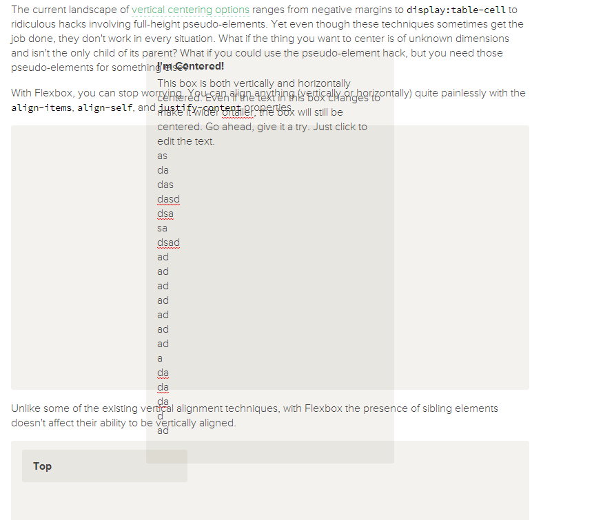
A showcase of problems once hard or impossible to solve with CSS alone, now made trivially easy with Flexbox.
The Solved by Flexbox site can be built with Node.js. If you have Node.js installed on your system, you can run the following commands to build and serve a local copy.
# Clone the git repository and cd into the cloned directory.
git clone https://github.com/philipwalton/solved-by-flexbox.git
cd solved-by-flexbox

# Install the dependencies
npm install

# Build and serve the site at http://localhost:4000
npm start
This starts up a local server on port 4000. To view the site in your browser, navigate to http://localhost:4000. If you want to use a different port, you can pass the port number as an argument to npm start:
npm start -- -p 8080In addition to building the site and serving it locally, this will also listen for any changes and rebuild the site as needed. This allows you to play around with the code, refresh the browser, and see your changes instantly.
The following translations have been graciously provided by the community:
Please note that translations are unofficial and may be inaccurate or out of date. To submit your own translation, please submit a pull request or open an issue and link to your translated content.


 React
React
 Typescript
 Django
 Laravel
 Facebook
 Microsoft
 Google
 Alibaba
 D3
D3
 Tencent