Giter Site home page Giter Site logo

primary-theme / obsidian Goto Github PK

View Code? Open in Web Editor NEW
823.0 823.0 38.0 64.67 MB

Comfy, playful but productive theme for Obsidian. "Primary instantly puts you in a relaxed state that opens the door to creativity and exploration. Wonderfully executed down to the smallest details,"

License: GNU General Public License v3.0

SCSS 99.48% CSS 0.48% JavaScript 0.04%
dark-theme light-theme obsidian-md obsidian-theme theme

obsidian's People

Contributors

ceciliamay avatar corinnekaryiu avatar crashmoney avatar hellerbarde avatar mokkacicc avatar roybcr avatar signynt avatar xotea avatar

Stargazers

 avatar  avatar  avatar  avatar  avatar  avatar  avatar  avatar  avatar  avatar  avatar  avatar  avatar  avatar  avatar  avatar  avatar  avatar  avatar  avatar  avatar  avatar  avatar  avatar  avatar  avatar  avatar  avatar  avatar  avatar  avatar  avatar  avatar  avatar  avatar  avatar  avatar  avatar  avatar  avatar  avatar  avatar  avatar  avatar  avatar  avatar  avatar  avatar  avatar  avatar  avatar  avatar  avatar  avatar  avatar  avatar  avatar  avatar  avatar  avatar  avatar  avatar  avatar  avatar  avatar  avatar  avatar  avatar  avatar  avatar  avatar  avatar  avatar  avatar  avatar  avatar  avatar  avatar  avatar  avatar  avatar  avatar  avatar  avatar  avatar  avatar  avatar  avatar  avatar  avatar  avatar  avatar  avatar  avatar  avatar  avatar  avatar  avatar  avatar  avatar

Watchers

 avatar  avatar  avatar  avatar  avatar  avatar  avatar  avatar  avatar  avatar  avatar  avatar  avatar  avatar  avatar  avatar  avatar  avatar  avatar  avatar  avatar  avatar  avatar  avatar  avatar  avatar  avatar  avatar  avatar  avatar  avatar  avatar  avatar  avatar  avatar

obsidian's Issues

WYSIWYG editor issues

With the new editor being released, I think some issues have popped up:

  1. For some reason there is more color in the syntax highlighting of latex stuff I think. Before the update, I am pretty sure there was NO syntax highlighting. If you added these in yourself then please at least change the colors to fit the current color scheme.
    image

  2. The color of links look different in both the reading mode and the editing mode in WYSIWYG (there are two different modes).
    Reading:
    image

Editing:
image

I just opened up obsidian and found these errors, so if I find any more errors in the future (which there probably are because of the big update) then I will report them in this issue thread!

[Suggestion] don't show active focus line background colors in inactive panes

This may be a personal preference and I don't know any other apps to model this behavior after, but my thinking is that the active line focus background color is a larger call to attention for the active line than the blinking cursor line and their function is to show the user where they are on the screen (where their cursor is/where their characters will go when they begin typing) at any given moment. Having multiple active focus lines on the screen at one time seems counterintuitive in that way because it splits the attention of the user and makes it harder to distinguish where their active cursor location is.

Selecting text within a code-block in edit-mode doesn't highlight.

highlight

When selecting text in a code block, no indicator of whats been highlighted appears. This only happens in edit mode. The cursor also seems to disappear/stop blinking once any text is highlighted.

The text is still selected, and can be copied/pasted/etc, there just isn't any indicator.

[Feature Request] Reduce height of link suggestions on mobile

Currently the suggestion box on mobile, that suggests links to add, obstructs the link you are trying to write (unless you are on the very top of the note). The minimal theme uses this code to prevent this from happening:

.is-mobile .suggestion-container {
    max-height:200px;
}

I've tested out this as a snippet and it works great, so it'd be really useful if this could be added to the theme itself!

Custom checkboxes

This is a beautiful theme!

Would you consider adding another feature that aids visual organization? Custom checkboxes? See #4 here.

image

Don't hide checkboxes

Alot of themes do this, and I'm not sure exactly which rule is making it happen. But checkboxes often get shrunk down to a few pixels:
image

Accessibility/Font sizes

Hello,

I have the font size slider turned all the way up in Obsidian, as I have bad vision.

But this does not affect the font size of menus, dropdowns, sidebars, or especially code blocks inside a note itself.

Is it possible to change all of these sizes as well?

I know you can zoom in to the entire obsidian UI, but then other things blow up and I have to end up scaling font sizes way down, buttons are huge, etc.

Thank you!

Customise padding of preview mode

It would be amazing if there was an option (e.g. with the style settings plugin) to match the padding to the left and right side of the edit mode to preview mode, so that the text is as close to the border of a pane in preview mode as it is in edit mode.

(I'd also be happy to do this with a snippet.)

Default button styling

Looks like buttons without some sort of class applied aren't getting completely styled, and are still getting background-color: var(--interactive-normal), which I don't think your theme has replaced, so the button just looks really out of place:

image

This isn't a big deal; as far as I know buttons are only used in the main app inside modals, and those are styled. But plugins are wily and add them other places.

Several aspects not rendering in native WYSIWYG

I imagine you've had enough of my by now, but just noticed a few other items I wanted to bring to your attention, some of which may belong with Obsidian devs (but I'm not very savvy, so I dunno—feel free to ignore!):

  • tag pills not rendering in edit mode
  • page width tightens up in preview mode, but this is not in WYSIWYG edit mode
  • bullets remain as hyphens in edit vs. preview
  • arrows next to headers different in edit vs. preview mode
  • edit: also noticed large spaces between text and headings

Screen Shot 2021-11-11 at 07 58 21
Screen Shot 2021-11-11 at 07 58 54
Screen Shot 2021-11-11 at 08 40 04
Screen Shot 2021-11-11 at 08 40 10

Numbered sub-bullet points

This is how they are rendered in Live Preview:

image

And this is how they are rendered in Reading/Preview mode:

image

I would like to have point 1A shown as 1.1. in both Live Preview and Reading modes.

I noticed you have this in your theme:

ol {
    list-style-type: decimal;
    margin-left: var(--scale-0-0);
}
ol ol {
    list-style-type: lower-alpha;
}

If I replace lower-alpha by decimal, then point 1A is numbered as 1 only, albeit indented.
What code can I put in a snippet to get point 1A shown as 1.1. or 1.1?

Customizability of header size

Hi! Lovely theme, thank you so much :)
The only gripe I have with it is the size of the headers. I prefer smaller headers like in the Minimal theme. Is it possible to add this to the Style Settings plugin?

[Suggestion] remove active line background focus color from gutter

The only other app I've seen that uses the text input focus styling applies the styling to the div that the text is in rather than also being applied to the gutter which is how it is currently styled in this theme. I don't think styling the gutter is necessary, but maybe it is for some workflows? Curious to know your thoughts!

From Athens Research:
image

image

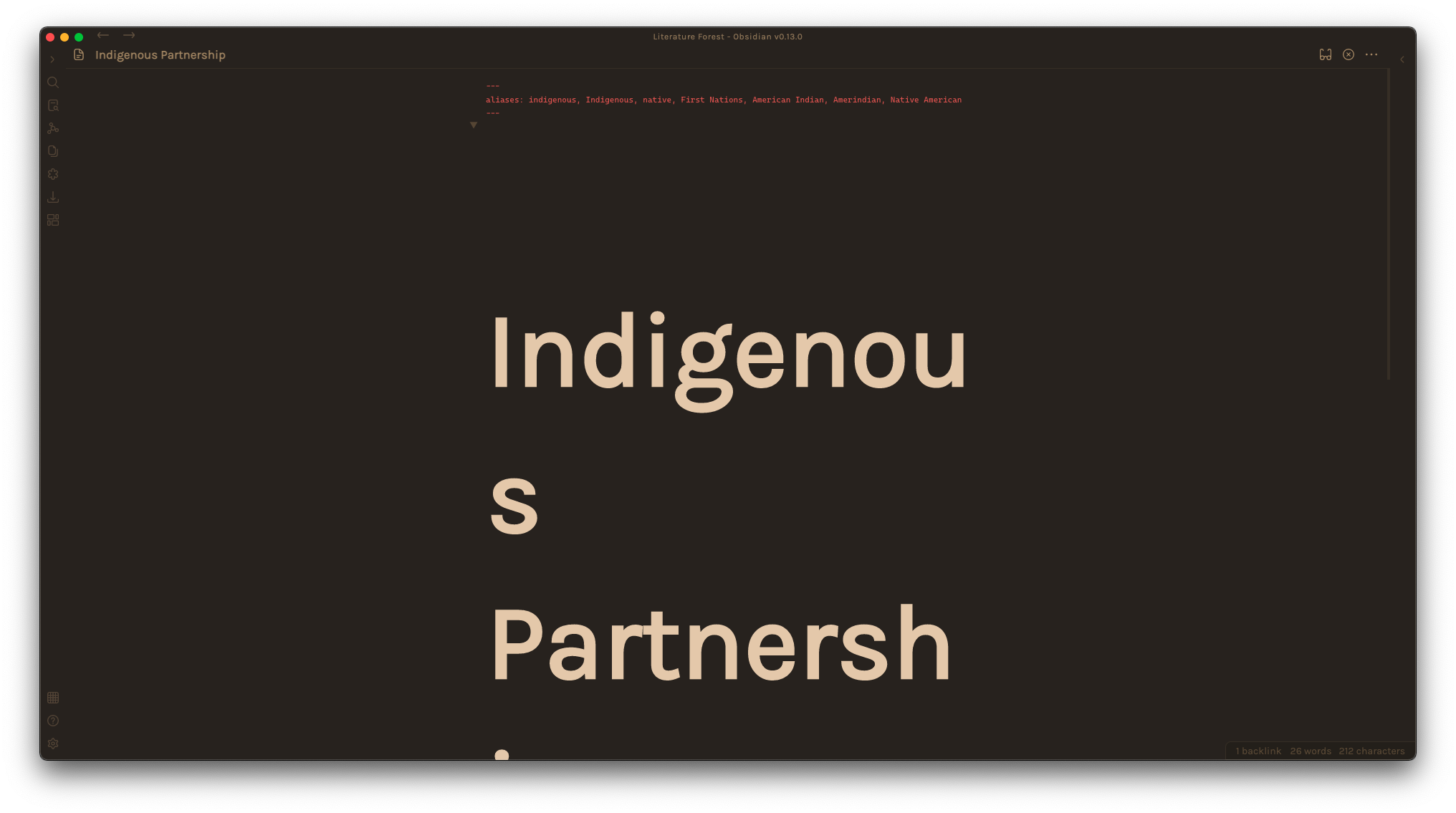
Headers on iOS are displaying too large

First off, beautiful theme, the iconography and use of color between light are dark modes are brilliant and make obsidian even more of a joy to use. There is however one display bug when using the theme on iOS which affects usability; headers (#, ## & ###) are displaying too large at the moment, effectively filling the entire screen/editor region.
headersIssue

Thank you!

Margin Between Blockquotes

Thanks for this great theme! I think there is a small place that can be improved: the margin between successive blockquotes. Now successive blockquotes are attached to each other with zero margin. I think it would look better with some margin space between them. 😄

image

icons and text overlaps

Love that you updated the theme, every problem I had before is fixed (as I can think of).
Buuuut got a new one.
When I search for a note the icon for "create this note" overlaps with the text.

Screenshot 2022-01-25 at 19 52 05

wrong icon on horizontal split

This is a tiny fix if ever there was one, but in the dropdown menu on a note, both vertical and horizontal split have the same icon — the one for a vertical split. The horizontal split icon should be different and, well, horizontal.
2021-12-11 07_08_08-inbox - Obsidian v0 13 7

Minor visual issue iPad settings

The rounded corners in the settings pane on iPad are interrupted by some square ones, as shown in the screenshot:

image

These corners disapear when entering a submenu, such as Appearance or Community Plugins

There's no usability affected, just a minor issue that could be fixed to keep the corners rounded and friendly 😄

Obsidian Version 1.0.5
iPad Pro 2018 11"

Can't navigate properly with arrow keys near the end of a Note (iPad)

As reported by @Signynt for the iPad

I thought I’d share this here first, if you’d rather I make it a github issue let me know: I’ve got a super weird issue that happens on iPad, and doesn’t happen with other themes. I can’t use the arrow keys to navigate properly near the end of the note… This happens in every note. In the gif the only key I’m pressing is the down arrow, and the parts where the cursor stop moving are because it won’t anymore, I’m actually pressing the down arrow continously the entire time.

signynt.bug.report.2021.11.16.mp4

I have replicated the issue and will try to fix it ASAP!

Status bar interference

Status bar floats above right pane/content making it impossible to click "behind" it.

CleanShot 2021-12-25 at 12 35 46

Probably it should "stick" to the left edge of the right pane. You can scroll the content down further, or add an enter or two if needs be, but it's impossible to scroll the right pane further.

Hiding tags is not possible with a css snippet

I prefer to have my tags hidden in my notes, so I use a little css snippet to hide them:

.markdown-preview-view .tag {
    display: none;
}

This snippet works great in most themes, but unfortunately does not have any affect in Primary.
It would be great if this could be fixed in this pleasant and fun theme!

two Panes side by side open the same time for edit

Hello Cecilia.
First, thank you for the beautiful theme you have created.
Since then, I enjoy working with Obsidian even more.
One feature I would still like is to be able to see/edit two "panes" side by side at the same time. How can I set this up? The "split function" always opens a panel only in full screen mode. Thank you in advance for your answer.
Kind regards Wolfgang

Note title

I am not sure how it happens, but sometimes the note title shifts up a bit making it only half visible. To correct it, I place my cursor anywhere in the middle of the note title (so, not at the end of it) and hit the down arrow. I have not seen this happening in any other theme I tried.

note-title

Comments

Comments are broken...or maybe this isn't a comment?:
image

Image not resizing

Hey Cecilia,

Gorgeous theme, congrats!
I noticed that when wanted to resize image size (ie. ![[image.png**|2000**]]) - in preview mode, it does not "apply" the resizing when the theme is being used.

All the best,
Renaud

FR: Improve heading collapsing arrows

Preview Mode

When headings wrap in preview mode and "Fold heading" is enabled in the "Editor" preferences then the text is not properly aligned with itself, which isn't super visually pleasing. This can be fixed by removing the padding of the arrows:

How it looks normally:
image
image

How it looks with the padding removed:
image
image

The padding can easily be removed with:

.markdown-preview-view .heading-collapse-indicator {
    padding: 0 0px;
}

Edit mode

The arrows in Edit mode also aren't very centered, but some padding can fix this.

How it looks normally:
image

How it looks with some padding:
image

[Live Preview Issue] Can't access the end of the file

I test the live preview with the theme, and, I saw I can't access the end of the file
11-14-2021_16-22

It seems to be because of the margin around the heading. Because, when I remove it, I have no problem.

If anyone have this strange bug here is a snippet :

.markdown-preview-view h1,
.HyperMD-header-1,
.cm-header-1,
.markdown-preview-view h2,
.HyperMD-header-2,
.cm-header-2,
.markdown-preview-view h3,
.HyperMD-header-3,
.cm-header-3,
.markdown-preview-view h4,
.HyperMD-header-4,
.cm-header-4,
.markdown-preview-view h5,
.HyperMD-header-5,
.cm-header-5,
.markdown-preview-view h6,
.HyperMD-header-6,
.cm-header-6 {
    margin: 0 !important;
}

Scrollable panel displayed behind icons

Details

In excalidraw, a scrollable panel for object attributes is displayed under zoom icons. Does not occur in default obsidian theme.

excalidraw asked to close their issue, recommending it was theme-related and not from their code.

Environment:

  • iOS 15.1 (2020 iPad Pro 12.9")
  • Excalidraw v1.5.16 in Obsidian v1.0.5
  • Primary theme (couldn't determine version)

Video

excalidraw_obsidian_ipad_bug.mp4

Original issue logged here:

excalidraw/excalidraw#4571

Recommend Projects

  • React photo React

    A declarative, efficient, and flexible JavaScript library for building user interfaces.

  • Vue.js photo Vue.js

    🖖 Vue.js is a progressive, incrementally-adoptable JavaScript framework for building UI on the web.

  • Typescript photo Typescript

    TypeScript is a superset of JavaScript that compiles to clean JavaScript output.

  • TensorFlow photo TensorFlow

    An Open Source Machine Learning Framework for Everyone

  • Django photo Django

    The Web framework for perfectionists with deadlines.

  • D3 photo D3

    Bring data to life with SVG, Canvas and HTML. 📊📈🎉

Recommend Topics

  • javascript

    JavaScript (JS) is a lightweight interpreted programming language with first-class functions.

  • web

    Some thing interesting about web. New door for the world.

  • server

    A server is a program made to process requests and deliver data to clients.

  • Machine learning

    Machine learning is a way of modeling and interpreting data that allows a piece of software to respond intelligently.

  • Game

    Some thing interesting about game, make everyone happy.

Recommend Org

  • Facebook photo Facebook

    We are working to build community through open source technology. NB: members must have two-factor auth.

  • Microsoft photo Microsoft

    Open source projects and samples from Microsoft.

  • Google photo Google

    Google ❤️ Open Source for everyone.

  • D3 photo D3

    Data-Driven Documents codes.