Giter Site home page Giter Site logo

react-native-multi-slider's Introduction

react-native-multi-slider

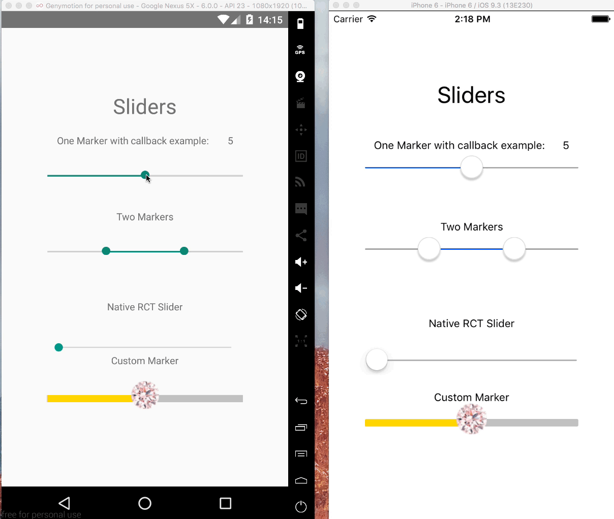
Pure JS react native slider component with one or two markers. Options to customize track, touch area and provide customer markers and callbacks for touch events and value changes.

Examples

cd example/Basic
npm install
react-native run-ios
react-native run-android

Example

Getting Started

Installation

$ npm install --save @ptomasroos/react-native-multi-slider

Usage in a ScrollView

import MultiSlider from '@ptomasroos/react-native-multi-slider';

...

 enableScroll = () => this.setState({ scrollEnabled: true });
 disableScroll = () => this.setState({ scrollEnabled: false });

 render() {
   return (
     <ScrollView scrollEnabled={this.state.scrollEnabled}>
      <MultiSlider
        ...
        onValuesChangeStart={this.disableScroll}
        onValuesChangeFinish={this.enableScroll}
      />
    </ScrollView>
    );

shape up CustomMarker as left and right

In order to make different styles on markers you can set isMarkersSeparated to true, define customMarkerLeft and customMarkerRight in MultiSlider. for example:

<MultiSlider
    ...
    isMarkersSeparated={true}

    customMarkerLeft={(e) => {
         return (<CustomSliderMarkerLeft
          currentValue={e.currentValue}/>)
    }}

    customMarkerRight={(e) => {
         return (<CustomSliderMarkerRight
         currentValue={e.currentValue}/>)
    }}
/>

Partial report of the props

Feel free to contribute to this part of the documentation.

Prop name Default value Type Purpouse
values [0] array of numbers Prefixed values of the slider.
onValuesChangeStart () => {} function Callback when the value starts changing
onValuesChange () => {} function Callback when the value changes
onValuesChangeFinish (values) => {} function Callback when the value stops changing
sliderLength 280 number Length of the slider (?)
touchDimensions {height: 50,width: 50,borderRadius: 15,slipDisplacement: 200} object (?)
enableLabel function Enable the label rendering
customLabel function Component used for rendering a label above the cursors.
customMarker function Component used for the cursor.
customMarkerLeft function Component used for the left cursor.
customMarkerRight function Component used for the right cursor.
isMarkersSeparated boolean See explaination above in the README.md
min 0 number Minimum value available in the slider.
max 10 number Maximum value available in the slider.
step 1 number Step value of the slider.
optionsArray array of numbers Possible values of the slider. Ignores min and max.
{container/track/selected/unselected/ markerContainer/marker/pressedMarker/step/stepLabel/StepMarker} Style style object Styles for the slider
valuePrefix string Prefix added to the value.
valueSuffix string Suffix added to the value.
enabledOne true boolean Enables the first cursor
enabledTwo true boolean Enables the second cursor
stepsAs [] array of objects Use stepsAs when you want to customize the steps-labels. stepsAs expects an array of objects [{index: number, stepLabel: string, prefix: string, suffix: string}]. Where index is for which step you want to customize, and all the other steps will show its index as its stepLabel. Both showSteps and showStepsLabels has to be enabled for stepsAs to be used.
showSteps false boolean Show steps
showStepMarkers true boolean Show steps-markers on the track, showSteps has to be enabled as well
showStepLabels true boolean Show steps-labels underneath the track, showSteps has to be enabled as well
onToggleOne undefined function callback Listener when first cursor toggles.
onToggleTwo undefined function callback Listener when second cursor toggles.
allowOverlap false boolean Allow the overlap within the cursors.
snapped false boolean Use this when you want a fixed position for your markers, this will split the slider in N specific positions
smoothSnapped false boolean Same as snapped but you can move the slider as usual. When released it will go to the nearest marker
vertical false boolean Use vertical orientation instead of horizontal.
markerOffsetX 0 number Offset the cursor(s) on the X axis
markerOffsetY 0 number Offset the cursor(s) on the Y axis
markerSize 0 number It determines the marker margin from the edges of the track, useful to avoid the markers to overflow out of the track.
minMarkerOverlapDistance 0 number if this is > 0 and allowOverlap is false, this value will determine the closest two markers can come to each other (in pixels, not steps). This can be used for cases where you have two markers large cursors and you don't want them to overlap. Note that markers will still overlap at the start if starting values are too near. CANNOT be combined with minMarkerOverlapStepDistance
minMarkerOverlapStepDistance 0 number if this is > 0 and allowOverlap is false, this value will determine the closest two markers can come to each other (in steps, not pixels). This can be used for cases where you have two markers large cursors and you don't want them to overlap. Note that markers will still overlap at the start if starting values are too near. CANNOT be combined with minMarkerOverlapDistance
imageBackgroundSource undefined string Specifies the source as required by ImageBackground
testID string Used to locate this view in end-to-end tests.

Recommendations

For very large min = 0 & max = 99999999 and very small step = 1, the step generation loop generates very large array which can causes a crash. Its better to dynamically generate a step size in those cases.

step = Math.round(Math.abs(max - min) / 100)

Credit #281 (comment)

react-native-multi-slider's People

Contributors

97thjingba avatar aligulen avatar amauryliet avatar aneesa avatar baconcheese113 avatar darkbasic avatar darkwebdev avatar frikkiesnyman avatar gusolsso avatar hosseinmd avatar hurkanyakay avatar iamsoorena avatar jaxgit avatar kif11 avatar mrxrinc avatar olahat90 avatar oleksii-trekhleb-epam avatar peterblitz avatar ptomasroos avatar rainst avatar raynor85 avatar reeywhaar avatar robwalkerco avatar shay-te avatar shrihari1999 avatar sibelius avatar skv-headless avatar stevenvz avatar thiagofsr97 avatar vidit-bhatia avatar

Stargazers

 avatar  avatar  avatar  avatar  avatar  avatar  avatar  avatar  avatar  avatar  avatar  avatar  avatar  avatar  avatar  avatar  avatar  avatar  avatar  avatar  avatar  avatar  avatar  avatar  avatar  avatar  avatar  avatar  avatar  avatar  avatar  avatar  avatar  avatar  avatar  avatar  avatar  avatar  avatar  avatar  avatar  avatar  avatar  avatar  avatar  avatar  avatar  avatar  avatar  avatar  avatar  avatar  avatar  avatar  avatar  avatar  avatar  avatar  avatar  avatar  avatar  avatar  avatar  avatar  avatar  avatar  avatar  avatar  avatar  avatar  avatar  avatar  avatar  avatar  avatar  avatar  avatar  avatar  avatar  avatar  avatar  avatar  avatar  avatar  avatar  avatar  avatar  avatar  avatar  avatar  avatar  avatar  avatar  avatar  avatar  avatar  avatar  avatar  avatar  avatar

Watchers

 avatar  avatar  avatar  avatar  avatar  avatar  avatar  avatar  avatar  avatar

react-native-multi-slider's Issues

Values on multislider always starts at [0, 0] with redux.

Hello!
So my problem is that my markers always start at 0, even though my initial state in my reducer is [18, 25].
Anyone knows how to solve this?

My code looks like this:

class multiSlider extends PureComponent{
    render(){
        const {
            _setSliderState,
            _setSliderValue,
            _sliderState,
            _sliderValue
        } = this.props;
        return(
            <View style={{alignItems: "center", justifyContent: "center"}} >
            
                <MultiSlider
                    values={[_sliderValue[0], _sliderValue[1]]}
                    sliderLength={width - 40}
                    min={18}
                    max={55}
                    onValuesChange={(values) => _setSliderValue(values)}
                    selectedStyle={{
                        backgroundColor: 'rgb(164, 39, 141)',
                    }}
                    trackStyle={{
                        height:5,
                    }}
                    touchDimensions={{
                        height: 200,
                        width: 40,
                        borderRadius: 30,
                        slipDisplacement: 40,
                    }}
                    customMarker={CustomMarker}
                />
            </View>
        )
    }
}

Markers

Which property would I call in order to change the style of the markers?

Currently the markers go over the side of the line and I am trying to get the edge of the marker to touch the edge of the line.

This is what it looks like in case my description wasn't helpful:
https://imgur.com/a/GKp2y

The top image is what I want, the bottom image is what is currently happening.

Custom track style doesn't center the marker

I'm trying to make a slider with a custom trackStyle but whenever I give it a different height, the marker doesn't adjust to the center.
screen shot 2017-09-28 at 11 49 00 am

My slider:

<Multislider
  trackStyle={{height: 15}}/>

Updating from 0.0.8 to 0.0.10 caused onValuesChangeStart to cease functioning- but onValuesChangeFinish still works

Nothing else changed except my updating @ptomasroos/react-native-multi-slider from "0.0.8" to "0.0.10" in package.json and reinstalling/linking the node module.

What's especially weird is that onValuesChangeStart is not firing, but onValuesChangeFinish is- despite me giving them the same exact code save for "Start" and "Finish"

Has anyone else had this problem? It has the same issue regardless of if it's a single-value MultiSlider or a multi-value MultiSlider. I'll provide some of my (relevant) code but, given that it worked in 0.0.8, I'm not sure that it will be of much help.

Settings.js

<SettingsSlider
    multi={false}
    title="Foo"
    onSlidingStart={() => {
        this.setState({sliding: true});
    }}
    onValuesChange={(distance) => {
        this.setProperty('searchDistance', distance)
    }}
    onSlidingStop={() => {
        this.setState({sliding: false});
    }}
    minimumValue={0.1}
    maximumValue={5}
    value={this.state.settings.foo}
    step={0.1}
    valueText={this.state.settings.foo}
/>

SettingsItem.js

class SettingsSlider extends Component {

    checkIfMultiSlider() {
        if (this.props.multi) {
            return (
                <MultiSlider style={{ width: 0.8 * width }} min={this.props.minimumValue} max={this.props.maximumValue} values={[this.props.minSetValue, this.props.maxSetValue]} selectedStyle={{backgroundColor: '#157EFA'}} markerStyle={{borderWidth: 0.5, borderColor: 'lightgray', backgroundColor: '#FFF'}} onValuesChangeStart={() => this.props.onSlidingStart()} onValuesChange={(value) => this.props.onValuesChange(value)} onValuesChangeFinish={() => this.props.onSlidingStop()} />
            );
        } else {
            return (
                <MultiSlider style={{ width: 0.8 * width }} min={this.props.minimumValue} max={this.props.maximumValue} values={[this.props.value]} step={this.props.step} selectedStyle={{backgroundColor: '#157EFA'}} markerStyle={{borderWidth: 0.5, borderColor: 'lightgray', backgroundColor: '#FFF'}} onValuesChangeStart={() => this.props.onSlidingStart()} onValuesChange={(value) => this.props.onValuesChange(value)} onValuesChangeFinish={() => this.props.onSlidingStop()} />
            )
        }
    }

    render() {
        return (
            <TouchableHighlight style={{borderColor: 'lightgray', borderWidth: 1, height: 120, backgroundColor: 'white'}}>
                <View style={{ flex: 1, display: 'flex', flexDirection: 'column', alignItems: 'center', justifyContent: 'space-around' }}>
                    <View style={{ width, display: 'flex', flexDirection: 'row', justifyContent: 'space-between', paddingBottom: this.props.multi ? 70 : 70, paddingTop: this.props.multi ? 30 : 30 }}>
                        <Text style={{marginLeft: 15}}>{this.props.title}</Text>
                        <Text style={{color: 'gray', marginRight: 37}}>{this.props.valueText}</Text>
                    </View>
                    {this.checkIfMultiSlider()}
                </View>
            </TouchableHighlight>
        );
    }

}

Again, this code worked perfectly in 0.0.8. I only included what I thought was relevant but if more is needed I can provide it.

Using native sliders to make range slider

I am trying to make a range slider using the native <Slider> component. My goal is native perf and perfect native look.

My goal is to on press down, it should grab the slider that the press it is closest to. I have been trying for about a day with various stuff but can't figure it out.

I created a snack here: https://snack.expo.io/@noitsnack/rangeslider-cannot-move-one-in-back

I was wondering if you wanted to help me pursue this idea. I'm close but not quit there.

Here is a screenshot, the dot on the left is the slider in the back. I position the sliders on top of each other by using position: 'absolute'.

It leads to some issues, like not being able to slide the one underneath. And preventing overlap is another.

Android(bug):Does not work with Navigator gestures

When Navigator gestures are turned on the gestures take over and the and instead of the slider moving the screen gets dragged to the previous/next scene.

"@ptomasroos/react-native-multi-slider": "0.0.6",

"react": "15.4.1",

"react-native": "0.39.0",

Can't apply smaller width, or padding on right side

image
Hello there.
I'm getting pretty desperate, as I've tried doing everything to make this look, however the right marker always seems to be out of screen. Applying width or padding, or even margin to containerStyles doesn't do the trick.

Here's the code

import React from 'react';
import Slider from '@ptomasroos/react-native-multi-slider';
import theme, { Text } from '@common';
import styled from 'styled-components';

const Container = styled.View`
  height: auto;
  flex: 1;
  margin-top: -15px;
  width: 100%;
`;

const SliderWrapper = styled.View`
  width: 85%;
  padding-right: 40px;
  margin-right: 40px;
  height: auto;
`;

const TimeLabelsWrapper = styled.View`
  flex-direction: row;
  justify-content: space-between;
  width: 100%;
  margin-bottom: 15px;
`;

const TimeLabel = Text.extend`
  width: auto;
`;

const containerStyle = {
  height: 'auto',
};

const trackStyle = {
  height: 5,
  borderRadius: 5,
};

const selectedStyle = {
  backgroundColor: theme.orange,
};

const unselectedStyle = {
  backgroundColor: theme.darkGray,
};

const markerStyle = {
  backgroundColor: theme.primary,
  width: 26,
  height: 26,
  borderRadius: 26,
};

const pressedMarkerStyle = {
  width: 29,
  height: 29,
};

export default function AvailabilitySlider(...props) {
  return (
    <Container>
      <TimeLabelsWrapper>
        <TimeLabel bold size={13}>
          12:00 AM
        </TimeLabel>
        <TimeLabel bold size={13}>
          9:00 AM
        </TimeLabel>
      </TimeLabelsWrapper>

      <SliderWrapper>
        <Slider
          {...props}
          trackStyle={trackStyle}
          containerStyle={containerStyle}
          selectedStyle={selectedStyle}
          unselectedStyle={unselectedStyle}
          markerStyle={markerStyle}
          pressedMarkerStyle={pressedMarkerStyle}
          values={[0, 5]}
        />
      </SliderWrapper>
    </Container>
  );
}

Slider laggy with react-native-navigation

If I use this component alone - it works perfect.
But if I use it with react-native-navigation with drawer enabled, once I swipe react-native-multi-slider - it slides a bit and stuck and then drawer is opening.

Default React Native Slider works perfect with react-native-navigation + drawer without lagging.

Steps to Reproduce

react-native-navigation with drawer enabled + react-native-multi-slider

Expected Behavior

Slider should continue to slide.

Actual Behavior

Slider slides a bit then stack and drawer opens.

Docs

Are there any docs for this? Super confused as the api seems to be the same as this package but there is no reference to it as far as I can see.

Thanks, Jon

Two or more multisliders revert to values={} position on updateState

I have two MultiSliders in a Form which contains an Age Range selector and Height range selector.

Everything works fine until the following steps:

  1. Select (drag the markers) to a desired position from MultiSlider No. 1
  2. Update state onValuesChange
  3. Select (drag the markers) to a desired position from MultiSlider No. 2
  4. Update state onValuesChange

Now MultiSlider No. 1 markers are reverted back to its original position

If now i make changes on MultiSlider No. 2 it reverts markers from MultiSlider No. 1 to its original positions. (without actually updating the state, only the markers are reverted)

    ...
    this.state = {
      ageRange: '21,36',
      ageRangeText: '21-36',
      heightRange: [],
      heightRangeText: HeightConverter(175) + '-' + HeightConverter(190)
    }
    ...

    <MultiSlider key={1} values={[21,36]} step={1} min={18} max={70} sliderLength={SLIDER_WIDTH} 
            onValuesChange={(data) => {
              this.setState({
                ageRange: data[0] + ',' + data[1],
                ageRangeText: data[0] + '-' + data[1]
              });
            }}
          />
     ...
     <MultiSlider key={2} values={[175,190]} step={1} min={140} max={220} onValuesChange={(data) => {
              this.setState({
                heightRange: data,
                heightRangeText: HeightConverter(data[0]) + '-' + HeightConverter(data[1])
              })
            }} 
            sliderLength={SLIDER_WIDTH} />

Tap and move slider

I want to move the slider by tapping on the slider not just sliding by the marker. I can't find any prop or default settings to do it. Please can you help asap.

Stop working on latest RN 0.49.3

Build is successful, but running on Android simulator brings an error:

undefined is not an object (evaluating 'PropTypes.bool')

with references to files in node_modules/react-native-multi-slider/
mockProps.js:15:23
Slider.js:16:24
along with plenty of /metro-bundler/src/Resolver/polifills/require.js

Worked fine on RN 0.48.4
Any suggestions, perhaps?

Custom Marker keeps flickering on every render

I'm trying to set up a slider with a custom marker that moves with a an updating value. But every time a render is called the Custom marker flickers and makes it hard to grab. If I remove the custom marker the standard marker works perfectly, no flickering and easy to grab.

Here is my slider:

<Multislider
  customMarker={() => <Image source={scrubber}/>}
  sliderLength={Dimensions.get('window').width - 40}
  touchDimensions={{width: 50, height: 50}}
  values={[Math.round(slowRacer.currentIndex || 0)]}/>

touchDimensions not used

touchDimensions.height and touchDimensions.width don't seem to be used for anything in MultiSlider.js?

Slider callback not working

Callback value is not updating when sliding bar. It can be seen also on example gif.

Edit1: typos in
sliderOneValuesChangeStart
sliderOneValuesChange
sliderOneValuesChangeFinish

  • first letter was capital. Fixing this causes:
    "undefined is not a function (evaluating 'this.setState({sliderOneChanging:true})')

Bottom margin

Hi,

It looks like the component has a significant bottom margin included with it. Can you please remove it? So the developer can choose whatever margin is needed for the project. Thanks!

Need to update latest version with npm

I'm finding this multi-slider really handy, but the library in npm is out of date; when I install I am not getting your most recent changes. Would you be able to update that?

I would really love to use the enable/disable functionality you added a few months back but I'm not getting those changes when I npm install.

markerStyle not working when I disable the slider

Hello. I am setting enabledOne={false} and/or enabledTwo={false} to disable my component, but my custom markerStyle is returning to the original shape of the marker; i.e. markerStyle is not working when the marker is disabled. However, implementing a customMarker gave me the results I desire, but I think it's not easy for the developer to think of this solution immediately (I spent almost a week thinking about it). I really like your component since it's is almost the only one that provides multiple markers, so I am opening this issue for you to take into consideration this special case and either add it in the documentation or provide a fix for it. Thanks for the amazing component, and wish you more to go!

Marker size on Android

Thank you for library. It's only way to make filters on android, but I have issue.

When I touch marker and release it, marker getting small. For the next time, it will returns to initial size. It is only happened with delay on touch out, only on Android.

I see, it should be like native Android slider (regular size marker - touch in - big size marker - touch out - regular size marker), but it's not. Can you help?

Markers override each other

Hello.
first, thanks for the very useful library.
I have a little problem: when the markers are too close it overrides each other
screenshot from 2018-03-11 10-44-36
Do you have any solution? thanks.

Marker position is shifted for Snapped

When you enable snapped, marker is shifted by one value to the right.
It's not noticeable for high values, but totally not usable when you set max to low value e.g. max={4}.

This is <MultiSlider min={1} max={4} values={[1, 2]} /> but it shows 2 and 3 position.
screen shot 2018-01-04 at 8 56 54 am

There is incorrectly calculated index in converters.js.
I will send PR right away.

error: positionOne is not defined

Hey,

I'm getting an error using your plugin:

screen shot 2018-04-11 at 11 49 46

Looking at the code, shouldn't line 152 of MultiSlider.js be:
var positionOne = valueToPosition(...
not
positionOne = valueToPosition(...

Same goes for positionTwo - line 161.

Doing this fixes my errors.

Add ability to limit how often onValuesChange fires

I'm currently running some calculations every time the value changes when I'm sliding it, but I would like it to only fire the onValuesChange method a couple times every second.

Is there a way to limit this currently? I wasn't able to see anything popping out at me in the source code for this project. If not could it possibly be added?

New npm release

Hello @ptomasroos - It seems that the last npm release is from Aug 17, while many commits came in the past months.
When using the npm latest (0.3.6) I am getting code that break with react 16 and react-native .53. Especially in node_modules/react-native-multi-slider/mockProps.js I have
'use strict';

var React = require('react');
var ReactNative = require('react-native');
var {
  PropTypes // ====> break with react 16
} = React;

Shall we take the latest in master branch rather than the npm latest version ? Any plan to issue a new version in npm ?

Tactac

disable prop for multislider component

Hi and first off thanks for the good component I would love to use on my app, but I cannot at the moment because I can't find a way to disable both markers (I have an edit screen component that must render the slider component 'disabled and greyed out' if user is not in 'edit' mode).
Do you plan to add this functionality in the near future?
Cheers

MultiSlider min, max and values props cannot be reset after first Mount

Hey I have a situation where when the MultiSlider first mounts my max and min values are undefined because the system is still retrieving them. Shortly after they arrive and componentWillReceiveProps is triggered and the proper values set to state . The MultiSlider doesn't seem to react to the state change however and the markers stay at 0,0. The Text components showing the current range are set correctly however, but when I try to move the markers the text components change to a range of 0-0 and the right marker jumps to the far right.

Is there something I'm doing wrong here? Can I get the markers and min/max to update properly?

My Code:

export class RangeMultiSlider extends React.Component{
  constructor(props){
    super(props);
    console.log('this.props', this.props)
    this.state = {
      sliderValues: [this.props.min, this.props.max],
      min: this.props.min,
      max: this.props.max
    };
  }

  onChangeValues = (values) => {
    console.log('Slider values', values)
    //console.log('this.props', this.props)
    this.setState({
      sliderValues: [values[0], values[1]]
    });
  }

  onChangeValuesFinish() {
    if (this.props.currentRefinement.min !== this.state.sliderValues[0] || this.props.currentRefinement.max !== this.state.sliderValues[1]) {
      this.props.refine({min: this.state.sliderValues[0], max: this.state.sliderValues[1]});
    }    
  }

  componentWillReceiveProps(nextProps){
    if(nextProps.min !== this.state.min && nextProps.max !== this.state.max) {
      console.log('nextProps', nextProps)
      this.setState({
        sliderValues: [nextProps.min, nextProps.max],
        min: nextProps.min,
        max: nextProps.max
      });   
    }
  }

  render(){
    console.log('sliderValues', this.state.sliderValues)
    return(
    <View style={{padding:8}}>
      <Text style={{paddingLeft: 10, fontSize: 14, color: Colors.primaryTextColor, alignSelf: 'flex-start' , textAlign: 'left'}}>
        {`${this.props.header}:`}
      </Text>
      <View style={{paddingTop: 20, paddingLeft: 8}}>
        <MultiSlider
          sliderLength={150}
          selectedStyle={{backgroundColor: Colors.mainColor}}
          unselectedStyle={{backgroundColor: 'silver'}}
          containerStyle={{height:10}}
          //trackStyle={{height:10, backgroundColor: 'red'}}
          touchDimensions={{
              height: 40,
              width: 40,
              borderRadius: 20,
              slipDisplacement: 40,
          }}
          onValuesChange={(sliderState) => this.onChangeValues(sliderState)}
          min={this.state.min}
          max={this.state.max}
          //values={[this.props.currentRefinement.min, this.props.currentRefinement.max]}
          onValuesChangeFinish={() => this.onChangeValuesFinish()}
          values={[this.state.sliderValues[0], this.state.sliderValues[1]]}
          step={1}
          customMarker={SliderMarker}/>
      </View>
      <View style={{flexDirection: 'row', justifyContent: 'space-between'}}>
        <Text style={{fontSize: 14, color: Colors.primaryTextColor, textAlign: 'left'}}>
          {this.state.sliderValues[0]}
        </Text>
        <Text style={{fontSize: 14, color: Colors.primaryTextColor , textAlign: 'right'}}>
          {this.state.sliderValues[1]}
        </Text>
      </View>
    </View>
    )
  }
}

Here is the console output:

this.props {refine: ƒ, currentRefinement: {…}, header: "Price", min: undefined, max: undefined}
sliderValues (2) [undefined, undefined]
nextProps {refine: ƒ, currentRefinement: {…}, header: "Price", min: undefined, max: undefined}
sliderValues (2) [undefined, undefined]
nextProps {refine: ƒ, currentRefinement: {…}, header: "Price", min: 7.99, max: 79.99}
sliderValues (2) [7.99, 79.99]

Allow out of range numbers

How can I handle cases when one of the values are out of range?
like the slider's min: 0 max: 100
but the values[1] is 1000

weird bug on multiple values

image

the image above has the following configs

values: [100, 199]
min: 0
max: 299

these values are set dynamically, is this a problem?

Multiple slider

I have a component which use 2 different Slider.
One of the Slider is a simple one with 1 marker, the second one have 2 markers.

<MultiSlider
  values={[this.state.search_distance]}
  onValuesChange={this.searchDistanceValuesChange}
  trackStyle={{height:2}}
  selectedStyle={{backgroundColor: '#f77268'}}
  containerStyle={{height:20,}}
  sliderLength={_width-50}
  customMarker={CustomMarker}
  min={0}
  max={5000}
  step={1}
  allowOverlap
  snapped
/>
<MultiSlider
  values={[this.state.ageRange[0], this.state.ageRange[1]]}
  onValuesChange={this.multiSliderValuesChange}
  trackStyle={{height:2}}
  selectedStyle={{backgroundColor: '#f77268'}}
  containerStyle={{height:20,}}
  sliderLength={_width-50}
  customMarker={CustomMarker}
  min={18}
  max={99}
  step={1}
  allowOverlap
  snapped
/>

When i change the value of the 1 marker slider, everything is ok.
When i change the value of the 2 markers slider, the marker of the first slider move to the left of the track.

When i console.log into componentWillReceiveProps of the library, i see that both instance are called whenever a value is changed.

MultiSlider can't display completely in android

Hi,
Thanks for your react-native-multi-slider.
I use MultiSlider run it in my android emulator but can't display completely.
My package.json info is:
"dependencies": {
"babel-preset-react-native-stage-0": "*",
"react": "^15.3.1",
"react-native": "^0.32.0",
"react-native-carousel": "^0.10.0",
"react-native-form-generator": "^0.9.9",
"react-native-multi-slider": "^0.3.5",
"react-native-navigation": "file:../",
"react-native-picker": "^3.0.5",
"react-native-scrollable-tab-view": "^0.6.0",
"react-native-slider": "^0.9.1",
"react-native-swiper": "^1.4.11",
"react-native-vector-icons": "^2.1.0",
"react-redux": "^4.0.6",
"redux": "^3.0.5",
"redux-logger": "^2.6.1",
"redux-thunk": "^1.0.3",
"rn-bootstrap-buttons": "^1.0.4",
"seamless-immutable": "^5.0.1"
}

Question about moveOne()

`moveOne = gestureState => {
if (!this.props.enabledOne) {
return;
}

var unconfined = gestureState.dx + this.state.pastOne;
var bottom = 0;
var trueTop = this.state.positionTwo - (this.props.allowOverlap ? 0 : this.stepLength);
var top = trueTop === 0 ? 0 : trueTop || this.props.sliderLength;
var confined = unconfined < bottom
  ? bottom
  : unconfined > top ? top : unconfined;`

...

` moveTwo = gestureState => {
if (!this.props.enabledTwo) {
return;
}

var unconfined = gestureState.dx + this.state.pastTwo;
var bottom = this.state.positionOne + (this.props.allowOverlap ? 0 : this.stepLength);
var top = this.props.sliderLength;
var confined = unconfined < bottom
  ? bottom
  : unconfined > top ? top : unconfined;`

In the source code, why does each PanResponder calculate the boundary position in different way? Is there any significant reason that moveOne should calculate trueTop? Isn't it enough
var top = this.state.positionTwo - (this.props.allowOverlap ? 0 : this.stepLength);
without trueTop, looks like more symmetric with moveTwo?

The value range are only for 0 to 10?

I used multi-slider and set the value for example [20,50], bit it doesn't work, it only work when I set value [0.10] or [3,7] .., so it seems the value range are limited in 0~10 ?

Tick marks with snap?

Snap works great but I would like to display tick marks so the user can see where markers should snap to. Is this possible?

sliderValueChangeStart not firing

Should this...

startOne = () => {
    if (this.state.enabledOne) {
      this.props.onValuesChangeStart();
      this.setState({
        onePressed: !this.state.onePressed,
      });
    }
  };

  startTwo = () => {
    if (this.state.enabledTwo) {
      this.props.onValuesChangeStart();
      this.setState({
        twoPressed: !this.state.twoPressed,
      });
    }
  };

be this?

startOne = () => {
    if (this.props.enabledOne) {
      this.props.onValuesChangeStart();
      this.setState({
        onePressed: !this.state.onePressed,
      });
    }
  };

  startTwo = () => {
    if (this.props.enabledTwo) {
      this.props.onValuesChangeStart();
      this.setState({
        twoPressed: !this.state.twoPressed,
      });
    }
  };

Allow custom left/right marker offsets

I want to adjust the left and right properties of markerContainerOne and markerContainerTwo respectively, to mimic the the react-native Slider's marker behavior (which uses marker outer edge as "value indicator", rather than the center of the marker like this component). However it seems the value 24 is hardcoded:

const markerContainerOne = { top: -24, left : trackOneLength - 24 }
const markerContainerTwo = { top: -24, right: trackThreeLength - 24 };

I'm not sure what the best solution to this is, perhaps adding custom offset props?

static defaultProps = {
  markerOffsetX: 0,
  markerOffsetY: 0,
 // ...
}
const { markerOffsetX, markerOffsetY } = this.props;
const markerContainerOne = { top: markerOffsetY - 24, left : trackOneLength + markerOffsetX - 24 }
const markerContainerTwo = { top: markerOffsetY - 24, right: trackThreeLength + markerOffsetX - 24 };

I can then do following to solve my problem.

<MultiSlider markerOffsetX={14} ...

Thoughts on this?

RTL - Touch is reversed

Hey,

I am using the latest version of the react-native-multi-slider on an RTL app.
When testing and using I18nManager.forceRTL(true) the slider looks to function correctly until you try and move one of the markers.

What happens is that if you slide your finger right, the marker goes left. If you slide your finger left, the marker goes right.

I have managed to reproduce this issue on a clean project (iOS + Android).

I searched a bit here and saw that there was a PR for RTL support. I didn't have much time to read the changes but it seems it doesn't work / it stopped working.

Would love if this could be fixed!

Best,
Amit

Vertical Orientation

Does this package support vertical orientation? If not will this be added to the package sometime?

Recommend Projects

  • React photo React

    A declarative, efficient, and flexible JavaScript library for building user interfaces.

  • Vue.js photo Vue.js

    🖖 Vue.js is a progressive, incrementally-adoptable JavaScript framework for building UI on the web.

  • Typescript photo Typescript

    TypeScript is a superset of JavaScript that compiles to clean JavaScript output.

  • TensorFlow photo TensorFlow

    An Open Source Machine Learning Framework for Everyone

  • Django photo Django

    The Web framework for perfectionists with deadlines.

  • D3 photo D3

    Bring data to life with SVG, Canvas and HTML. 📊📈🎉

Recommend Topics

  • javascript

    JavaScript (JS) is a lightweight interpreted programming language with first-class functions.

  • web

    Some thing interesting about web. New door for the world.

  • server

    A server is a program made to process requests and deliver data to clients.

  • Machine learning

    Machine learning is a way of modeling and interpreting data that allows a piece of software to respond intelligently.

  • Game

    Some thing interesting about game, make everyone happy.

Recommend Org

  • Facebook photo Facebook

    We are working to build community through open source technology. NB: members must have two-factor auth.

  • Microsoft photo Microsoft

    Open source projects and samples from Microsoft.

  • Google photo Google

    Google ❤️ Open Source for everyone.

  • D3 photo D3

    Data-Driven Documents codes.