WPF sample with MahApps.Metro v2.0.0 pre-release and IconPacks v3.0.0 pre-release.
This sample needs at least VS 2015 Community Edition.
To create a new icon pack follow these steps.
PackIconCustomIconsKind.cs
namespace WpfAppMahAppsIconPacks.CustomIcons
{
    using System.ComponentModel;

    /// <summary>
    /// List of available icons for use with <see cref="PackIconCustomIcons" />.
    /// </summary>
    public enum PackIconCustomIconsKind
    {
        [Description("Empty placeholder")] None,
        [Description("Awesome custom Icon")] AwesomeIcon
    }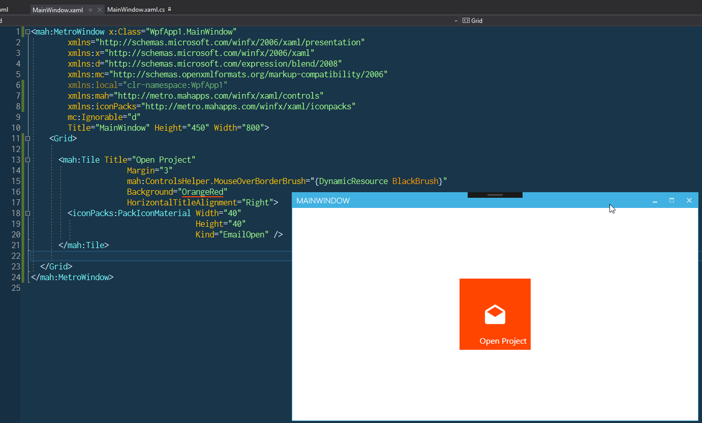
}PackIconCustomIcons.csadding- A default style key
- A factory providing Path data for each key (
PackIconCustomIconsDataFactory)
using System.Windows;
using MahApps.Metro.IconPacks;

namespace WpfAppMahAppsIconPacks.CustomIcons
{
    /// <summary>
    /// CustomIcons Icons
    /// </summary>
    public class PackIconCustomIcons : PackIconControl<PackIconCustomIconsKind>
    {
        static PackIconCustomIcons()
        {
            DefaultStyleKeyProperty.OverrideMetadata(typeof(PackIconCustomIcons), new FrameworkPropertyMetadata(typeof(PackIconCustomIcons)));
        }

        public PackIconCustomIcons() : base(PackIconCustomIconsDataFactory.Create)
        {
        }
    }
}
PackIconCustomIconsDataFactory
using System.Collections.Generic;

namespace WpfAppMahAppsIconPacks.CustomIcons
{
    internal static class PackIconCustomIconsDataFactory
    {
        internal static IDictionary<PackIconCustomIconsKind, string> Create()
        {
            return new Dictionary<PackIconCustomIconsKind, string>
                   {
                       {PackIconCustomIconsKind.None, ""},
                       // SVG path taken from https://materialdesignicons.com/
                       {PackIconCustomIconsKind.AwesomeIcon, "M12,2C6.47,2 2,6.5 2,12A10,10 0 0,0 12,22A10,10 0 0,0 22,12A10,10 0 0,0 12,2M15.6,8.34C16.67,8.34 17.53,9.2 17.53,10.27C17.53,11.34 16.67,12.2 15.6,12.2A1.93,1.93 0 0,1 13.67,10.27C13.66,9.2 14.53,8.34 15.6,8.34M9.6,6.76C10.9,6.76 11.96,7.82 11.96,9.12C11.96,10.42 10.9,11.5 9.6,11.5C8.3,11.5 7.24,10.42 7.24,9.12C7.24,7.81 8.29,6.76 9.6,6.76M9.6,15.89V19.64C7.2,18.89 5.3,17.04 4.46,14.68C5.5,13.56 8.13,13 9.6,13C10.13,13 10.8,13.07 11.5,13.21C9.86,14.08 9.6,15.23 9.6,15.89M12,20C11.72,20 11.46,20 11.2,19.96V15.89C11.2,14.47 14.14,13.76 15.6,13.76C16.67,13.76 18.5,14.15 19.44,14.91C18.27,17.88 15.38,20 12,20Z"},
                   };
        }
    }
}PackIconCustomIcons.xaml
<ResourceDictionary xmlns="http://schemas.microsoft.com/winfx/2006/xaml/presentation"
                    xmlns:x="http://schemas.microsoft.com/winfx/2006/xaml"
                    xmlns:customIcons="clr-namespace:WpfAppMahAppsIconPacks.CustomIcons"
                    xmlns:converter="clr-namespace:MahApps.Metro.IconPacks.Converter;assembly=MahApps.Metro.IconPacks.Core">

    <Style x:Key="MahApps.Metro.Styles.PackIconCustomIcons" TargetType="{x:Type customIcons:PackIconCustomIcons}">
        <Setter Property="Height" Value="16" />
        <Setter Property="Width" Value="16" />
        <Setter Property="Padding" Value="0" />
        <Setter Property="FlowDirection" Value="LeftToRight" />
        <Setter Property="HorizontalAlignment" Value="Left" />
        <Setter Property="VerticalAlignment" Value="Top" />
        <Setter Property="IsTabStop" Value="False" />
        <Setter Property="SnapsToDevicePixels" Value="False" />
        <Setter Property="UseLayoutRounding" Value="False" />
        <Setter Property="Template">
            <Setter.Value>
                <ControlTemplate TargetType="{x:Type customIcons:PackIconCustomIcons}">
                    <Grid>
                        <Border Background="{TemplateBinding Background}"
                                BorderBrush="{TemplateBinding BorderBrush}"
                                BorderThickness="{TemplateBinding BorderThickness}"
                                SnapsToDevicePixels="{TemplateBinding SnapsToDevicePixels}" />
                        <Grid x:Name="PART_InnerGrid"
                              RenderTransformOrigin="0.5 0.5"
                              Margin="{TemplateBinding BorderThickness}">
                            <Grid.RenderTransform>
                                <TransformGroup>
                                    <ScaleTransform x:Name="FlipTransform"
                                                    ScaleX="{Binding RelativeSource={RelativeSource TemplatedParent}, Path=Flip, Mode=OneWay, Converter={converter:FlipToScaleXValueConverter}}"
                                                    ScaleY="{Binding RelativeSource={RelativeSource TemplatedParent}, Path=Flip, Mode=OneWay, Converter={converter:FlipToScaleYValueConverter}}" />
                                    <RotateTransform x:Name="RotationTransform"
                                                     Angle="{Binding RelativeSource={RelativeSource TemplatedParent}, Path=Rotation, Mode=OneWay}" />
                                    <RotateTransform x:Name="SpinTransform" />
                                </TransformGroup>
                            </Grid.RenderTransform>
                            <Viewbox Margin="{TemplateBinding Padding}">
                                <Path Fill="{TemplateBinding Foreground}"
                                      Stretch="Uniform"
                                      Data="{Binding Data, RelativeSource={RelativeSource TemplatedParent}, Mode=OneWay, Converter={converter:NullToUnsetValueConverter}}"
                                      SnapsToDevicePixels="False"
                                      UseLayoutRounding="False" />
                            </Viewbox>
                        </Grid>
                    </Grid>
                </ControlTemplate>
            </Setter.Value>
        </Setter>
    </Style>

</ResourceDictionary>
Generic.xaml
<ResourceDictionary xmlns="http://schemas.microsoft.com/winfx/2006/xaml/presentation"
                    xmlns:x="http://schemas.microsoft.com/winfx/2006/xaml"
                    xmlns:local="clr-namespace:WpfAppMahAppsIconPacks.Themes"
                    xmlns:customIcons="clr-namespace:WpfAppMahAppsIconPacks.CustomIcons">

  <ResourceDictionary.MergedDictionaries>
    <ResourceDictionary Source="pack://application:,,,/WpfAppMahAppsIconPacks;component/Customicons/PackIconCustomIcons.xaml" />
  </ResourceDictionary.MergedDictionaries>

  <Style TargetType="{x:Type customIcons:PackIconCustomIcons}" BasedOn="{StaticResource MahApps.Metro.Styles.PackIconCustomIcons}" />

</ResourceDictionary>You and your users should now have a simple way to use your icon pack in their applications.
<Grid xmlns:customIcons="clr-namespace:WpfAppMahAppsIconPacks.CustomIcons">
    <customIcons:PackIconCustomIcons Width="40" Height="40" Kind="AwesomeIcon" />
</Grid>PackIconCustomIconsExtension.cs
using System.Windows.Markup;
using MahApps.Metro.IconPacks;

namespace WpfAppMahAppsIconPacks.CustomIcons
{
    [MarkupExtensionReturnType(typeof(PackIconCustomIcons))]
    public class CustomIconsExtension : PackIconExtension<PackIconCustomIcons, PackIconCustomIconsKind>
    {
        public CustomIconsExtension()
        {
        }

        public CustomIconsExtension(PackIconCustomIconsKind kind) : base(kind)
        {
        }
    }
}
Which can be then used like
<Grid xmlns:customIcons="clr-namespace:WpfAppMahAppsIconPacks.CustomIcons">
    <Button Content="{customIcons:CustomIcons AwesomeIcon}" />

    <!-- or -->

    <Button Content="{customIcons:CustomIcons Kind=AwesomeIcon}" />
</Grid>


 React
React
 Typescript
 Django
 Laravel
 Facebook
 Microsoft
 Google
 Alibaba
 D3
D3
 Tencent