Giter Site home page Giter Site logo

pythonista7 / sir-modeling-covid-in-bangalore Goto Github PK

View Code? Open in Web Editor NEW
0.0 2.0 1.0 7.08 MB

An attempt to better understand the statistical modeling of pandemics using a basic SIR model.

Jupyter Notebook 100.00%
corona covid sir-model jupyter-notebook kepler-gl geopandas bangalore bengaluru

sir-modeling-covid-in-bangalore's Introduction

SIR-Modeling-Covid-in-Bangalore

Flattening the curve ? Infection is peaking ? Have you wondered what that actually means ?

This notebook is an attempt to simplify and help understand how to model a pandemic using S.I.R Model(Suseptible,Infected,Recovered).The predicted statistics from the notebook maybe inaccurate with real life observations but the intention of this notebook is to convey how avaiable data can be used for the purpose.

What is happening here ?

  1. Data clean-up and extrapolation
    Firstly covid data from late April/early May was collect from a BBMP source which had labeled each ward in Bengaluru with color-coding to indicate sevirity of the the outbreak(this can be found in BBMP.csv). This data coupled with census data of Bengaluru is used to factor in attributes such as population and area size of each ward which maybe a potential factor in the spread of the disease.

  2. SIR Modeling
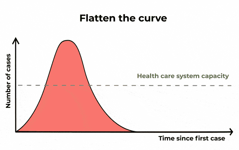
    Both these data are combined and used to model the pandemic using the SIR technique.The data presented in all the graphs is for a set time frame of 90 or 120 days(can be changed for any time-period in the code) and day 0 can be thought of as first day an infection was recorded in the ward, for simplicity can be assumed as May 1st 2020.

  3. Plotting using KeplerGL
    Once we have the data for a time period we plot and visualize it with line plots for each ward , its infection rate and recovery rate.We also plot this data onto the map of Bengaluru with the help of the shapefine (BBMP.GeoJSON) coupled with kepler-gl a powerful geo-visualization tool from uber you can check it out here.

If you do not wish to download and run this notebook but want to view the results you can find the SIR curve plots here and the geo-plot of Bengaluru map here (be sure to view the last few cells of this notebook to use the kepler map for visualization.)

Requriments

  • pandas
  • numpy
  • geopandas
  • keplergl
  • plotly

sir-modeling-covid-in-bangalore's People

Contributors

pythonista7 avatar

Watchers

 avatar  avatar

Forkers

gokuljs

sir-modeling-covid-in-bangalore's Issues

Recommend Projects

  • React photo React

    A declarative, efficient, and flexible JavaScript library for building user interfaces.

  • Vue.js photo Vue.js

    ๐Ÿ–– Vue.js is a progressive, incrementally-adoptable JavaScript framework for building UI on the web.

  • Typescript photo Typescript

    TypeScript is a superset of JavaScript that compiles to clean JavaScript output.

  • TensorFlow photo TensorFlow

    An Open Source Machine Learning Framework for Everyone

  • Django photo Django

    The Web framework for perfectionists with deadlines.

  • D3 photo D3

    Bring data to life with SVG, Canvas and HTML. ๐Ÿ“Š๐Ÿ“ˆ๐ŸŽ‰

Recommend Topics

  • javascript

    JavaScript (JS) is a lightweight interpreted programming language with first-class functions.

  • web

    Some thing interesting about web. New door for the world.

  • server

    A server is a program made to process requests and deliver data to clients.

  • Machine learning

    Machine learning is a way of modeling and interpreting data that allows a piece of software to respond intelligently.

  • Game

    Some thing interesting about game, make everyone happy.

Recommend Org

  • Facebook photo Facebook

    We are working to build community through open source technology. NB: members must have two-factor auth.

  • Microsoft photo Microsoft

    Open source projects and samples from Microsoft.

  • Google photo Google

    Google โค๏ธ Open Source for everyone.

  • D3 photo D3

    Data-Driven Documents codes.