Giter Site home page Giter Site logo

ropensci / iheatmapr Goto Github PK

View Code? Open in Web Editor NEW
267.0 24.0 34.0 19.67 MB

Complex, interactive heatmaps in R

Home Page: https://docs.ropensci.org/iheatmapr

License: Other

R 98.37% TeX 0.46% JavaScript 1.17%
heatmap plotly r interactive-visualizations data-visualization rstats r-package peer-reviewed

iheatmapr's Introduction

R-CMD-check JOSS CRAN License: MIT

iheatmapr

iheatmapr is an R package for building complex, interactive heatmaps using modular building blocks. "Complex" heatmaps are heatmaps in which subplots along the rows or columns of the main heatmap add more information about each row or column. For example, a one column additional heatmap may indicate what group a particular row or column belongs to. Complex heatmaps may also include multiple side by side heatmaps which show different types of data for the same conditions. Interactivity can improve complex heatmaps by providing tooltips with information about each cell and enabling zooming into interesting features. iheatmapr uses the plotly library for interactivity.

While there are already plenty of awesome R packages for making heatmaps, including several great packages for making relatively simple interactive heatmaps (heatmaply and d3heatmap) or complex static heatmaps (ComplexHeatmap), iheatmapr seeks to make it easy to make complex interactive heatmaps.

Installation

To install the CRAN version of iheatmapr:

install.packages("iheatmapr")

To install the github version of iheatmapr:

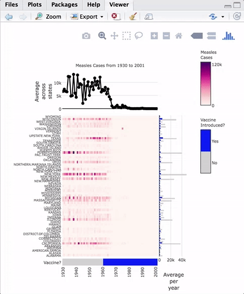
devtools::install_github("ropensci/iheatmapr")

Example Complex Heatmap

As an example of a complex heatmap, we can make a version of the famous vaccines plot from the Wall Street Journal that has been recreated in several other heatmap frameworks in R.

The code to create this heatmap is:

library(iheatmapr)
data(measles, package = "iheatmapr")

main_heatmap(measles, name = "Measles<br>Cases", x_categorical = FALSE,
             layout = list(font = list(size = 8))) %>%
  add_col_groups(ifelse(1930:2001 < 1961,"No","Yes"),
                  side = "bottom", name = "Vaccine<br>Introduced?",
                  title = "Vaccine?",
                  colors = c("lightgray","blue")) %>%
  add_col_labels(ticktext = seq(1930,2000,10),font = list(size = 8)) %>%
  add_row_labels(size = 0.3,font = list(size = 6)) %>% 
  add_col_summary(layout = list(title = "Average<br>across<br>states"),
                  yname = "summary")  %>%                 
  add_col_title("Measles Cases from 1930 to 2001", side= "top") %>%
  add_row_summary(groups = TRUE, 
                  type = "bar",
                  layout = list(title = "Average<br>per<br>year",
                                font = list(size = 8)))
              

Modular components of the plot are added in an iterative fashion to the top, right, left, or bottom of the heatmap. iheatmapr also contains a function (iheatmap) to make a fairly standard heatmap with optional dendrograms and row or column annotation heatmaps (See vignette).

All the plots aligned with the main heatmap horizontally share the same y axis and thus zooming in the y direction within the heatmap will also zoom in to those subplots. The plots aligned vertically share an x axis with that heatmap and zooming horizontally within those plots will be linked.

Hovering over the heatmaps yields a tooltip with the name of the row and column as well as the value represented.

Documentation

See the vignette for a more thorough introduction to the package.

Acknowledgements

This package includes the open source Plotly.js library, which does much of the work of making these interactive plots possible! In creating this package, I also drew inspiration & some code from the great plotly R package; in particular, the code for the iheatmapr htmlwidget is adapted from an earlier version of the plotly R package. Additionally, numerous people at Genentech helped provide feedback and guidance for this project, including but not limited to Justin Finkle, August Guang, Michael Lawrence, Gabe Becker, Steve Lianoglou, Pete Haverty... thanks to all who helped review code and/or provide feedback! This package also went through the on-boarding process for rOpensci -- thanks to the reviewers Carl Ganz and Andee Kaplan and editor Maëlle Salmon for all their helpful feedback!

ropensci_footer

iheatmapr's People

Contributors

ahmohamed avatar alanocallaghan avatar aliciaschep avatar fboehm avatar graceli8 avatar jeroen avatar jvadams avatar karthik avatar maelle avatar mschilli87 avatar oristaszewski avatar

Stargazers

 avatar  avatar  avatar  avatar  avatar  avatar  avatar  avatar  avatar  avatar  avatar  avatar  avatar  avatar  avatar  avatar  avatar  avatar  avatar  avatar  avatar  avatar  avatar  avatar  avatar  avatar  avatar  avatar  avatar  avatar  avatar  avatar  avatar  avatar  avatar  avatar  avatar  avatar  avatar  avatar  avatar  avatar  avatar  avatar  avatar  avatar  avatar  avatar  avatar  avatar  avatar  avatar  avatar  avatar  avatar  avatar  avatar  avatar  avatar  avatar  avatar  avatar  avatar  avatar  avatar  avatar  avatar  avatar  avatar  avatar  avatar  avatar  avatar  avatar  avatar  avatar  avatar  avatar  avatar  avatar  avatar  avatar  avatar  avatar  avatar  avatar  avatar  avatar  avatar  avatar  avatar  avatar  avatar  avatar  avatar  avatar  avatar  avatar  avatar  avatar

Watchers

 avatar  avatar  avatar  avatar  avatar  avatar  avatar  avatar  avatar  avatar  avatar  avatar  avatar  avatar  avatar  avatar  avatar  avatar  avatar  avatar  avatar  avatar  avatar  avatar

iheatmapr's Issues

Question: How to add independent plotly panel as subplot

Hello,
first of all thank you for the great work, super powerful library and very nicely built.

On top of my heatmap, I would like to add a stacked barplot summarizing stats (average value) for groups of columns (each bar spanning all columns of the group), and rows groups at the same time (stacked bars).

Why do I need that ?
I have a lot of columns (~2k) and while using add_col_summary(groups = TRUE) covers my need, it is cluttered by too many points on 'x' axis and overlapping traces. I think a stacked barplot for each group of columns would do better in this case.

I played with add_subplot() and add_col_barplot() but if I did not manage to do what I want.

With add_subplot:

  • I can set type='bar' but I did not manage to control the layout to generate stacked bars
  • I cannot use width to set bar width as argument for plot_ly using ..., it needs to be done on the trace (that's a plotly thing)

With add_col_barplot:

  • 'x' coordinates seem tied to 'one point per column' so I cannot plot one large bar per group of columns.
  • is stacked bars possible using this function ?

Using add_col_barplot, if stacking is possible one solution would be to use a bar for each column (all bars in a group of columns would be similar) but I guess it would be suboptimal (lot of columns).

I managed to generate the barplot as a separate plotly panel but I cannot find a proper way to integrate it on top of the heatmap. Is there any way to integrate an independent plotly panel somewhere around the heatmap ?

I thought I could use the plotly subplot function (with shareX=TRUE) to group the heatmap and my plot but it seems that your library does not depend on plotly R functions so I am not sure if this is possible at all.

Could you point me to the best approach for this situation ?

Thank you very much.

convert complexHeatmap to iheatmap

Hey Alicia,
I recently came across your package and think it's a great improvement for interactive heatmaps.
And I will definitively start using it!

As I read your vignette about complexHeatmap being more or less the static version of iheatmapr I was wondering if there could be a conversion function between the two. Something similar to plotly's ggplotly(). While this is anything but straightforward. A function like this would greatly improve the overall usability as one could rely on already existing heatmaps and there would be no need for learning the plotly approach.
What do you think?

Best,
Hendrik

Feature request: Interactions with htmlwidgets using 'crosstalk'

Hello and thank you for the great work.

As I am planning to integrate a heatmap in a webpage with other htmlwidgets, I am wondering if it would be possible to take advatage of 'crosstalk' for triggering selection of elements (rows or columns) when clicking on cells, or the other way round (showing/hiding/highlighting rows/columns when selected from another widget).

To my knowledge none of the heatmap APIs allow that yet (correct me if I'm wrong), and that would be a killer feature for many applications.

Is that something that could be done easily (I have no idea what it really implies internally) ?

Thank you for your help.

Update plotly.js?

At some point the plotly.js should likely be updated to a more recent version. Will need to assess whether there have been a lot of breaking changes with api and/or new features to take advantage of.

Remove reliance on plotly htmlwidget

So as to avoid issues like #6, I think it would be best to remove plotly r package dependence -- iheatmapr creates the list of inputs needed for plotlyjs, could create an iheatmapr htmlwidget instead of using plotly one. Advantages would be:

  • more control over what happens when plotly js is updated
  • remove crosstalk dependency (not being used with iheatmapr at moment; probably would want a different implementation if it were to be added in future)
  • enabling specialized iheamapr shiny event functions (to take into account information stored witihin Iheatmap object)

gridlines

From email:

"I am using iheatmapr in one of my project. I am stuck with giving grid lines to the chart below. I have tried various methods but no luck."

add_col_barplot color legend not showing up

First, thanks for the great package.
I'm using the package for heatmap with barplot as annotation. I noticed that "showlegend" option seems not functioning for showing color legend when barplot with coloring. Here is an example

library(RColorBrewer)
da = matrix(rnorm(200),nrow=20)
rownames(da) = paste0("A",1:20)
colnames(da) = paste0("B",1:10)

db = data.frame(id=colnames(da), value=runif(10,1,10),group=sample(letters[1:3],10,replace = T), 
            stringsAsFactors = F)
g = db$group
glev = unique(g)
colors = brewer.pal(length(glev), "Paired")
gcolor = factor(g, labels=colors)

main_heatmap(da, name = "Score", x_categorical = TRUE,y_categorical=TRUE) %>%
  add_col_labels(font = list(size = 12)) %>%
  add_row_labels(size = 0.1,font = list(size = 12), side="right")%>%
  add_col_barplot(y=db$value, color=gcolor, tracename='Group',showlegend=TRUE)

One option would be to use add_col_annotation(data.frame("Groups" = g), colors=list("Groups"=colors)) to get the legend. I try to avoid this option. Thanks in advance

Deploying Shiny apps that use iheatmapr

Hello,

I'm currently unable to deploy a Shiny app that uses the iheatmapr package to shinyapps.io. I've been able to deploy other apps that don't use the package, and I can run apps that use iheatmapr locally. When I try to deploy, I get this error:

Error: Unhandled Exception: Child Task 542254620 failed: Error parsing manifest: Unable to determine package source for Bioconductor package iheatmapr: Repository must be specified

I'm able to replicate this error by just adding library(iheatmapr) to the old faithful geyser data shiny app.

Thanks,

Stephen

save_iheatmap example is not working

The example for function save_iheatmap is not working.

library(iheatmapr)
mat <- matrix(rnorm(24), nrow = 6)
hm <- iheatmap(mat)
## Not run: 
save_iheatmap(hm)
Error in (function (classes, fdef, mtable)  : 
  unable to find an inherited method for function ‘save_iheatmap’ for signature ‘"IheatmapHorizontal", "missing"’
packageVersion("iheatmapr")
[1] ‘0.4.4’
packageVersion("plotly")
[1] ‘4.7.1.9000’

Run travis regularly

Setup travis to run either regularly or in response to plotly updates, to avoid problems like #6

Also setup travis to use cran & dev versions of plotly

"add_row_annotation" , how to assign custom colors

Hello,
I'm writing because I've been using iheatmapr a lot with very good results, but lately I've been struggling to assign custom colors to add_row_annotation.
I've been using:
add_row_annotation(data_heatmap, data.frame("Clusters" = data_df$cluster),
side = "left", colors = list("Clusters"=c("darkcyan","purple",
"darkgreen","darkred",
"black","gray","orange")))

Where data_heatmap is a nice iheatmap, with 4 columns, and data_df$cluster contains 6 group names (one per row of the heatmap, length is nrow)
I've been plotting like this without any problem, but lately I have encountered an issue.
Colors of the groups are taken from the color list but not in the order I desire. I cannot get this to work, even assigning the names of the group to each color in the vector. Also, when using some color names these are not recognized nor used.

Now, cheking the documentation, I've seen the color argument explained as "list of color palettes, with one color per annotation column name". So I've been probably using this feature wrong, giving it color names instead of palettes and thinking about my custom groups instead of the columns (and maybe it was working previously because I was using 4 groups and I had 4 columns in the heatmap, and now that I have 4 columns and 6 custom groups is not working)

Being able to assign custom colors to the row annotation would be quite important to me, as I'm adding subplots and column annotation using my custom groups. Hopefully you'll have some insight about this

Thank you so much for your support!

iheatmapr no longer produces a working plotly plot

The yaml file specifying plotly's htmlwidget dependencies is empty in recent versions (plotly/plotly.R@183006c). This code in as_plotly() should fix it (note plotly:::plotlyMainBundle()... it might be worthwhile asking Carson to export that, or some way of producing the plots manually.

I'm submitting a PR but feel free to check it over and/or ask the ropensci team first.

createWidget(name = "plotly",
             x = out,
             width = out$layout$width,
             height = out$layout$height,
             sizingPolicy = sizingPolicy(browser.fill = TRUE,
                                         defaultWidth = "100%",
                                         defaultHeight = 400),
             dependencies = plotly:::plotlyMainBundle(),
             preRenderHook = plotly_build)

reverse color scale

Is it possible to reverse the color scale in one-color gradients so that the darker color correspond to the to lower values and lighter colors correspond to greater values?

Error: pandoc document conversion failed with error 1

Hi Alicia,

I tried to use iheatmapr today, but I ran into an issue with pandoc. Do you think it's possible to avoid the dependency on pandoc? If I recall correctly, pandoc is difficult to install on my server, so I can't easily update it.

I'm using the latest version of iheatmapr installed with devtools::install_github("AliciaSchep/iheatmapr")

When I run:

myplot <- iheatmap(
   data = matrix(runif(100), ncol = 5),
   cluster_cols = "hclust",
   cluster_rows = "hclust",
   name = "myname"
 )
myplot %>% save_iheatmap("myplot.png")

I get:

pandoc: Most RTS options are disabled. Link with -rtsopts to enable them.
Error: pandoc document conversion failed with error 1

pandoc information:

> system("pandoc --version")
pandoc 1.9.4.1
Compiled with citeproc-hs 0.3.4, texmath 0.6.0.6, highlighting-kate 0.5.1.
Syntax highlighting is supported for the following languages:
    Actionscript, Ada, Alert, Alert_indent, Apache, Asn1, Asp, Awk, Bash,
    Bibtex, Boo, C, Changelog, Clojure, Cmake, Coffeescript, Coldfusion,
    Commonlisp, Cpp, Cs, Css, D, Diff, Djangotemplate, Doxygen, Dtd, Eiffel,
    Email, Erlang, Fortran, Fsharp, Gnuassembler, Go, Haskell, Haxe, Html, Ini,
    Java, Javadoc, Javascript, Json, Jsp, Latex, Lex, LiterateHaskell, Lua,
    Makefile, Mandoc, Matlab, Maxima, Metafont, Mips, Modula2, Modula3,
    Monobasic, Nasm, Noweb, Objectivec, Objectivecpp, Ocaml, Octave, Pascal,
    Perl, Php, Pike, Postscript, Prolog, Python, R, Relaxngcompact, Rhtml, Ruby,
    Scala, Scheme, Sci, Sed, Sgml, Sql, SqlMysql, SqlPostgresql, Tcl, Texinfo,
    Verilog, Vhdl, Xml, Xorg, Xslt, Xul, Yacc, Yaml
Copyright (C) 2006-2012 John MacFarlane
Web:  http://johnmacfarlane.net/pandoc
This is free software; see the source for copying conditions.  There is no
warranty, not even for merchantability or fitness for a particular purpose.

R system information:

> devtools::session_info()
Session info -------------------------------------------------------------------
 setting  value
 version  R version 3.4.0 (2017-04-21)
 system   x86_64, linux-gnu
 ui       X11
 language (EN)
 collate  en_US.UTF-8
 tz       <NA>
 date     2017-05-04
Packages -----------------------------------------------------------------------
iheatmapr              * 0.2.5    2017-05-04

Remove legends from the app

We are using iheatmapr and we want to remove the legends from the app.
Before the package was updated we were able to remove the legends but now it seems the functionality is not working.

Error messages when number of rows differ.

Dear Alicia,

I have spotted this possible area where the code could be improved. I have tried placing heat maps side by side using the 'add_main_heatmap' function. The error messages could possibly be improved if the number of rows for the two input matrices are not the same. For example:

library(iheatmapr)

set.seed(12345)

table_1 <- matrix( runif(100 ), nrow=10, ncol=10)

table_2 <- matrix( runif(110 ), nrow=11, ncol=10)

This one works, table 2 trimmed. Perhaps it could be better to warn the users the number of rows differ, but still print the plot.

main_heatmap(table_1) %>%
add_row_clustering( ) %>%
add_col_clustering() %>%
add_main_heatmap( table_2) %>%
add_col_clustering()

This one gave a subscript out of bound error. I guess it could be better to print some warnings or errors?

main_heatmap(table_2) %>%
add_row_clustering( ) %>%
add_col_clustering() %>%
add_main_heatmap( table_1) %>%
add_col_clustering()

This is just a suggestion, not urgent, but I guess it could help other people debug their code a bit quicker. Thank you, iheatmapr is a really useful tool and I use it whenever I can now.

Kind Regards,

Igy

add_col_groups uses continuous scale if all groups are equal

example from README (works fine):

library(iheatmapr)
data(measles, package = "iheatmapr")

main_heatmap(measles, name = "Measles<br>Cases", x_categorical = FALSE,
             layout = list(font = list(size = 8))) %>%
  add_col_groups(ifelse(1930:2001 < 1961,"No","Yes"),
                  side = "bottom", name = "Vaccine<br>Introduced?",
                  title = "Vaccine?",
                  colors = c("lightgray","blue"))

Assume vaccine came later (breaks labelling):

library(iheatmapr)
data(measles, package = "iheatmapr")

main_heatmap(measles, name = "Measles<br>Cases", x_categorical = FALSE,
             layout = list(font = list(size = 8))) %>%
  add_col_groups(ifelse(1930:2001 < 2002,"No","Yes"),
                  side = "bottom", name = "Vaccine<br>Introduced?",
                  title = "Vaccine?",
                  colors = c("lightgray","blue"))

Show_title option of add_row_groups and add_col_groups not working

I am having an issue with the show_title feature of your add_row_groups and add_col_groups methods. The method works perfectly in every aspect except for the addition of the title feature. When I run the code you use on your home page as an example, the result is again an interactive plot without the column groups annotation title of "Vaccine?" (which is in contrast to the image of the interactive heatmap that you have on your homepage). I have included my R session information as well as a screenshot of the image I get from the below code.
measles_cases

library(iheatmapr)
data(measles, package = "iheatmapr")

main_heatmap(measles, name = "Measles
Cases", x_categorical = FALSE,
layout = list(font = list(size = 8))) %>%
add_col_groups(ifelse(1930:2001 < 1961,"No","Yes"),
side = "bottom", name = "Vaccine
Introduced?",
title = "Vaccine?",
colors = c("lightgray","blue")) %>%
add_col_labels(ticktext = seq(1930,2000,10),font = list(size = 8)) %>%
add_row_labels(size = 0.3,font = list(size = 6)) %>%
add_col_summary(layout = list(title = "Average
across
states"),
yname = "summary") %>%
add_col_title("Measles Cases from 1930 to 2001", side= "top") %>%
add_row_summary(groups = TRUE,
type = "bar",
layout = list(title = "Average
per
year",
font = list(size = 8)))

R version 3.4.1 (2017-06-30)
Platform: x86_64-w64-mingw32/x64 (64-bit)
Running under: Windows >= 8 x64 (build 9200)

Matrix products: default

locale:
[1] LC_COLLATE=English_United States.1252 LC_CTYPE=English_United States.1252 LC_MONETARY=English_United States.1252
[4] LC_NUMERIC=C LC_TIME=English_United States.1252

attached base packages:
[1] stats graphics grDevices utils datasets methods base

other attached packages:
[1] iheatmapr_0.4.0

loaded via a namespace (and not attached):
[1] Rcpp_0.12.12 digest_0.6.12 plyr_1.8.4 jsonlite_1.5 stats4_3.4.1
[6] magrittr_1.5 scales_0.5.0 S4Vectors_0.14.4 fastcluster_1.1.24 RColorBrewer_1.1-2
[11] tools_3.4.1 htmlwidgets_0.9 munsell_0.4.3 yaml_2.1.14 parallel_3.4.1
[16] compiler_3.4.1 colorspace_1.3-2 BiocGenerics_0.22.0 htmltools_0.3.6 knitr_1.17

show_colorbar not working

It seems these two codes provide identical result?

main_heatmap(Indometh_patient_cor,name = "Correlation")%>%add_main_heatmap(Indometh_matrix,name = "Indometacin<br>Concentration", show_colorbar = FALSE)

and

main_heatmap(Indometh_patient_cor,name = "Correlation")%>%add_main_heatmap(Indometh_matrix,name = "Indometacin<br>Concentration", show_colorbar = TRUE)

Possible reason:

new_plot <- new("MainHeatmap", xaxis = "x", yaxis = yname, colorbar = name, show_colorbar = TRUE, data = data, text = text, tooltip = tooltip)

The code of show_colorbar is always set to be TRUE within the add_main_heatmap function.

A few questions regarding ModeBar functions

Hi Alicia,
I recently came across iheatmapr package and it is great! very useful and straight forward.

however, I have some questions regarding the functionality of the ModeBar (the bar of plotly designed options, of snapshot, zoom etc).

  1. is there a way to modify which options are being presented to the user? for example if I wouldn't like to allow the png download. I know there is a similar option in plotly, by config, e.g. as shown here
    https://stackoverflow.com/questions/37437808/how-to-custom-or-display-modebar-in-plotly

this doesn't seem to work when I try it in iheatmap r, e.g. like this -

q<-main_heatmap(als_genes_cor)%>%
        add_row_dendro(als_ord_hclust_genes) %>%
        add_col_dendro(als_ord_hclust_genes) %>%
        add_row_labels(side=c("right")) %>%
        add_col_labels() %>%
        config(displaylogo = FALSE,
               modeBarButtonsToRemove = list(
                       'sendDataToCloud',
                       'toImage',
                       'autoScale2d',
                       'resetScale2d',
                       'hoverClosestCartesian',
                       'hoverCompareCartesian'
               ))
        
q

I get this error
Error in config(., displaylogo = FALSE, modeBarButtonsToRemove = list("sendDataToCloud", : could not find function "config"

  1. is there a way to control the output of those options? specifically, I would like to change the size of the plot being downloaded to be larger than the default one.

Thanks alot!

Formatting questions

Great package! It's a great step up from d3heatmap and heatmaply. I'm looking for some ways to do a few things that aren't obvious to me right now:

  1. Control number of digits displayed in hover - having so many digits is not very clean look and I would rather not alter my data source

  2. Add grid lines to enhance contrast and better direct eyes with sparse heatmaps

  3. Add an overall title to individual elements or entire group of maps.

Best regards,

Marlon

not show the legends of col/row annotations

Dear Alicia,
it's really a great tool! I am trying to create a big interactive heatmap with several row and column annotations however I don't need to display the legends of all of them. Is there a way to do it?
I've seen that e.g. in add_*_barplot there is the option showlegend. Is it possible to implement something similar for add_*_annotation or is there a workaround?

add_col_labels and add_row_labels distorting labels

I am using iheatmapr in a shiny app that I'm developing. In the app the user can select rows from a data table to view in two different types of heatmaps. Depending on the number of rows selected, the resulting heatmaps have labels that are either missing or overlapping. I attached two screen shots that demonstrate the problem. I was hoping you knew what was causing this. Any help is appreciated. Thank you!
screen shot 2018-04-06 at 2 36 57 pm
screen shot 2018-04-06 at 2 37 02 pm

downloading static iheatmapr works locally but not on shinyapps.io server

Hi Alicia, and first much gratitude for your help and high responsiveness.

I noticed (what I think is) a bug, when downloading a static instance of iheatmapr - works for a local shiny app, but not on when uploaded to shinyapps.io server.

here's an example reproducible code for a simple app using measles data. also, here's a link to the same exact app on my shinyappsio user, where you could observe the download issue:
url:
https://tomertsaban.shinyapps.io/test_deploy_iheatmapr/

code:
`library(shiny)
library(iheatmapr)
data(measles, package = "iheatmapr")

ui<-fluidPage(
iheatmaprOutput("test"),
downloadButton("download_test","download_heatmap")
)

server<-function(session,input,output){

    heatmap_reactive<-reactive({
            test_heatmap<-main_heatmap(measles, name = "Measles<br>Cases", x_categorical = FALSE,
                         layout = list(font = list(size = 8))) %>%
                    add_col_groups(ifelse(1930:2001 < 1961,"No","Yes"),
                                   side = "bottom", name = "Vaccine<br>Introduced?",
                                   title = "Vaccine?",
                                   colors = c("lightgray","blue")) %>%
                    add_col_labels(ticktext = seq(1930,2000,10),font = list(size = 8)) %>%
                    add_row_labels(size = 0.3,font = list(size = 6)) %>% 
                    add_col_summary(layout = list(title = "Average<br>across<br>states"),
                                    yname = "summary")  %>%                 
                    add_col_title("Measles Cases from 1930 to 2001", side= "top") %>%
                    add_row_summary(groups = TRUE, 
                                    type = "bar",
                                    layout = list(title = "Average<br>per<br>year",
                                                  font = list(size = 8)))
            
    })
    
    output$test<-renderIheatmap(
            
            heatmap_reactive()

    )
    
    output$download_test<-downloadHandler(
            filename ="test_heatmap.png",
            content = function(file){
                    #cormap<-correlation_heatmap() 
                    #cormap <-cormap %>% add_col_title(input$plot_title,side="top")
                    save_iheatmap(heatmap_reactive(),file,vwidth=2000,vheight=1000)
            },
            contentType = "image/png"
    )

}

shinyApp(ui,server)`

I assumed you would like to know about this.
Thanks again!

Color of NA cells

Dear Alicia,

I have got a feature suggestion. At the moment I see that NA values are displayed as the color white in the heat map. Unless I missed it (which could be the case) there is currently no means of changing the color of NA cells in the heat map. Would it be possible to add a feature to change / customise the value of the NA cells? (Been using iheatmapr for many of my projects now. Thank you!)

Kind Regards,

Igy

Support missing values in continuous annotations

First of all, thanks a lot for this awesome package.

Currently, plotting fails with an ambiguous message if row/col annotation is continuous and contains missing values:

library(iheatmapr)
library(datasets)
library(reshape2)

Indometh_matrix <- acast(Indometh, Subject ~ time, value.var = "conc")
Indometh_matrix <- Indometh_matrix[as.character(1:6),]
rownames(Indometh_matrix) <- paste("Patient",rownames(Indometh_matrix))
Indometh_patient_cor <- cor(t(Indometh_matrix))

patient_max_conc <- apply(Indometh_matrix,1,max)
patient_min_conc <- apply(Indometh_matrix,1,min)
patient_groups <- c("A","A","B","A","B","A") # Arbitrary groups

patient_max_conc[[1]] <- NA

iheatmap(Indometh_patient_cor, 
  row_annotation = data.frame("Max" = patient_max_conc))

# Error in if (diverging) { : missing value where TRUE/FALSE needed

The issue stems from these lines not using na.rm=TRUE

tmp_colors <- pick_continuous_colors(zmid = 0,
zmin = min(x[,i]),
zmax = max(x[,i]), p)
}

iheatmapr/R/annotations.R

Lines 161 to 164 in b9fd1bc

tmp_colors <- pick_continuous_colors(zmid = 0,
zmin = min(x[,i]),
zmax = max(x[,i]), p)
}

Alternatively, you can modify pick_conitnuous_colors to accommodate diverging=NA.

Cheers.

How to extract cluster assignment from Iheatmap-class object?

Dear Alicia,

First of all, thanks for this nice package.


I have a question on how to extract cluster assignment from an Iheatmap-class object.

Lets consider the following example:

require(iheatmapr)

nclust <- 3

mtcars %>%
  as.matrix %>%
  main_heatmap %>%
  add_row_clustering(k = nclust) -> hm

Printing hm, I get a nice interactive heatmap with the rows clustered into three groups.

My question is how can I extract the information which row (car is this case) belongs to which cluster.

The best I came up with so far ist the following:

shapes(hm)$row_dendro@data %>%
  cutree(k = nclust) -> clusters

This way, clusters is assigned an integer vector with the cluster assignment named by the corresponding row labels.

However, I see two issues with this approach:

  1. The number of clusters needs to be saved for cutree.
  2. The need to explicitely access a slot using @ tells me there must should be a better way to achieve what I want.

The first point could be resolved by recovering the number of row clusters from the Iheatmap-class object itself.

The best way to do so I found is the following:

colorbars(hm)$`Row<br>Clusters`@ticktext %>%
  length -> nclust

Unfortunately, this emphasizes the second point I made above by seaming even more 'hacky'.

I would highly appreciate any feedback feedback on how to get from hm to clusters without an ugly wrapper function based on the above hacks.

Best regards,
Marcel

Fails with dev scales

With test failures like:

── 1. Failure: can add a row barplot to single horizontal heatmap (@test_barplot.R#5)  ─────────────────────────────────
Not equal to reference from `reference/row_barplot_horizontal.rds`.
Component "data": Component 1: Component 6: Component 2: Attributes: < Component 2: Lengths (162, 160) differ (string compare on first 160) >
Component "data": Component 1: Component 6: Component 2: Attributes: < Component 2: 128 string mismatches >
Component "data": Component 1: Component 6: Component 2: 6 string mismatches

Follow suggestions from rOpensci reviews

  • Add statement of need to README
  • Add reference to BiocInstaller in installation guidance
  • Add examples for setup_colorbar_grid and save_iheatmap
  • Add DOI to references in paper.md
  • Add Travis for Mac
  • Add App-veyor for Windows
  • Add badge in readme for minimum R
  • Explain better the differences between clustering vs clusters vs groups in Vignette
  • Explain better differences between clustering and dendrogram functions in Vignette
  • Fix warning in automated tests?
  • Update description to not start with package name
  • Add contributing guidelines

Scaling and couple of formatting questions

Hello and first of all thanks for the very nice package and your development, it's a real contribution and the complex modular plots approach is really interesting.

Please allow me to make you some questions I have been struggling with, after carefully reviewing the net and the vignette. I can try further pre-processing the data before plotting, but I have decided to ask to make sure the package does not have these functionalities:

  • The color scales of heatmap has confused me from the beginning. While others packages force the scale to a certain range, (-1.5, 1.5) for example, with iheatmapr I see other ranges and I'm afraid that's making the interpretation difficult when plotting data with different ranges. Is there any way of forcing the rescaling of the data to a certain range? In some cases we could see clearer patterns and better compare different plots.

  • I have performed custom clustering of the features in the rows and assigning it with add_row_clusters is working as expected. The reordering is nice, but I was wondering how each element is ordered inside the same cluster. Is there any way of controlling these? For example, within each row cluster plotting the elements sorted in decreasing or increasing order according to some column

  • I have not found any way of adding custom text annotations to the plot. Adding blocks of text, for example to annotate or add information to row/columns clusters would be a nice feature in this modular context.

Thank you for your package and your time

Customized colorbar scale

Is it possible to set the colorscale that most value are white which means that not just the midpoint is white?

feature request: discrete heatmap colorscheme

Dear Alicia,

I came across a roadblock using iheatmapr and would like to request suggest a feature:


Consider the following example:

############
# packages #
############

require(magrittr)
require(reshape2)
require(ggplot2)
require(viridis)


########
# data #
########

cor.dat <-
  mtcars %>%
  scale %>%
  cor %>%
  melt(varnames = c("x", "y"), value.name = "cor")

str(cor.dat)

# 'data.frame':   121 obs. of  3 variables:                                                                              
#  $ x  : Factor w/ 11 levels "mpg","cyl","disp",..: 1 2 3 4 5 6 7 8 9 10 ...                                            
#  $ y  : Factor w/ 11 levels "mpg","cyl","disp",..: 1 1 1 1 1 1 1 1 1 1 ...                                             
#  $ cor: num  1 -0.852 -0.848 -0.776 0.681 ...


####################
# continuous scale #
####################

cor.dat %>%
  ggplot(aes(x, y, fill = cor)) +
    geom_tile() +
    scale_fill_viridis("r") +
    theme_bw(base_size = 18) +
    ggtitle("continuous scale", subtitle = "mtcars (unclustered)")


##################
# discrete scale #
##################

cor.dat %>%
  ggplot(aes(x, y, fill = cut(cor, 3))) +
#-------------------------^^^^...^^^^
    geom_tile() +
    scale_fill_viridis("r", discrete = TRUE) +
#-------------------------^^^^^^^^^^^^^^^^^
    theme_bw(base_size = 18) +
    ggtitle("discrete scale", subtitle = "mtcars (unclustered)")
#------------^^^^^^^^

While I can use iheatmapr to generate a heatmap using a continuous scale colorscheme, I did not manage to make it color the heatmap in a discrete fashion.


In many cases, using a more 'rough' colorscheme can greatly improve the visibility of clusters/groups (in this case correlated, un-correlated and anti-correlated).


The best I could come up with for iheatmapr would be to round/discretize the input data, but this would affect the clustering and not just the visualization. Also, I want to see the real (unrounded) values on mouseover.


As I show above, this is easy to achive in basic ggplot2 by using cut.
So I assume it shouldn't be too hard to add this (IMHO very useful) functionality to iheatmapr.


So what are chances of seeing this implemented in iheatmapr?

With some hints on where to start, I would be willing to assist and try to get a pull request but I don't really know the internals of the classes implementing iheatmaprs modular system.

Cheers,
Marcel

labels on the heatmap

Hi - I'm sure I probably missed the documentation on this. Is there a way to create labels on the heatmap besides the hover over parts? I'm looking for something like treemapify but interactive labels? not sure if this supports that

Adding custom text via layout option fails

I'm attempting to overlay text over the heatmap itself to give additional information (e.g something like this:
image

I believe there's no built-in functionality to do so, so I was trying to use the layout option to add the text via plotly. As a minimum reproducible example, here is a very basic plot:

data <- matrix(c(1, 2, 3, 4), nrow = 2)
plot <- iheatmap(data = data, layout = list(annotations = list(text = "hi", x = 0.5, y = 0.5, xref = "x", yref = "y")))
The heatmap I get looks like this:
image

This looks exactly the same as the same plot with no annotations:
plot <- iheatmap(data = data)
image

I have very little experience with plotly, so this may be on me, but any help would be appreciated! If there is a simpler way to overlay text, please also let me know.

feature request: bar plot of median for 'add_col_summary' and 'add_row_summary'

Dear Ms. Schep,

Currently, the 'add_col_summary' and 'add_row_summary' add a bar plot to the margin of the heat map. The bar plot would indicate the mean value for each column or row, but only the mean value is available. Would it be possible to enable to the user to plot the 'median' value for the bar plot instead please? Even better, it may be useful to let the user to choose which function to use for the bar plot (e.g. sd, var, median, mad etc...).

The package is very useful and I'm already using it for my projects! Thank you! Looking forward to read the paper associated with it.

Yours Sincerely,

Ignatius Pang

save as vector graphic

Hi,

Thanks for this package it's very useful.

Wondering is it possible to save as a vector graphic?

Here's a heatmap of some analysis, saved as pdf.
motifsGainedExpressed.inpeaks.eta0.1.pdf

It seems the matrix is encoded as a raster image. Maybe something I am doing with the pdf device in R?

Thanks!

Ashley

License / copyright information

The LICENSE file only contains a copyright note for the year 2017 only, though there has been code added in 2018.

Also, while having this on rOpenSci seems to imply openness but not necessarily freedom, actually (re-)using this would be much easier given a proper free license. I for example would like to package iheatmapr for GNU Guix to make it available on our institute's computational infrastructure, but this requires me to specify a license.

Also, while I respect anybodies freedom to not release their software as free, I would not want to rely on software that cannot be maintained once the original author doesn't have the resources anymore. 😉

sum option in add_col_summary() & add_row_summary()

Great package!

I'm looking to do something that doesn't seem possible after reading the add_col_summary() and add_row_summary() documentation, which state that the "summary function default is mean, options are mean, median, sd, var, mad, max, min"

It would be very useful to have a sum argument feature for the column and row summaries, particularly when adding a subplot across the top of the heatmap columns. For instance, to sum the population of states by year over time.

If I've missed this feature or its implementation please let me know where to look in the documentation.

Thanks!

Recommend Projects

  • React photo React

    A declarative, efficient, and flexible JavaScript library for building user interfaces.

  • Vue.js photo Vue.js

    🖖 Vue.js is a progressive, incrementally-adoptable JavaScript framework for building UI on the web.

  • Typescript photo Typescript

    TypeScript is a superset of JavaScript that compiles to clean JavaScript output.

  • TensorFlow photo TensorFlow

    An Open Source Machine Learning Framework for Everyone

  • Django photo Django

    The Web framework for perfectionists with deadlines.

  • D3 photo D3

    Bring data to life with SVG, Canvas and HTML. 📊📈🎉

Recommend Topics

  • javascript

    JavaScript (JS) is a lightweight interpreted programming language with first-class functions.

  • web

    Some thing interesting about web. New door for the world.

  • server

    A server is a program made to process requests and deliver data to clients.

  • Machine learning

    Machine learning is a way of modeling and interpreting data that allows a piece of software to respond intelligently.

  • Game

    Some thing interesting about game, make everyone happy.

Recommend Org

  • Facebook photo Facebook

    We are working to build community through open source technology. NB: members must have two-factor auth.

  • Microsoft photo Microsoft

    Open source projects and samples from Microsoft.

  • Google photo Google

    Google ❤️ Open Source for everyone.

  • D3 photo D3

    Data-Driven Documents codes.