


🎉 Elevate your Flutter development experience with Flutter Next! 🎉
Flutter Next is an advanced Flutter package designed to supercharge your Flutter development. It helps you build responsive applications across all platforms with ease and provides a handful of useful extensions.
- 📱 Develop Responsive UIs like a breeze
- 🎨 Add animations with a single line of code
- 🧰 Handful of extensions to boost your productivity
Check out our demo: 🔗 One Page
Join the Flutter Next revolution today and take your Flutter apps to the next level! 🚀
Text(
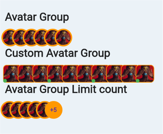
"Avatar Group",
style: TextStyle(fontSize: 30, fontWeight: FontWeight.bold),
),
SizedBox(
height: 15,
),
NextAvatarGroup(
backgroundColor: Colors.orange,
imagesList: List.generate(
6,
(index) => NetworkImage(
"https://images.ctfassets.net/hrltx12pl8hq/qGOnNvgfJIe2MytFdIcTQ/429dd7e2cb176f93bf9b21a8f89edc77/Images.jpg?fit=fill&w=175&h=175&fm=webp"))),
Text(
"Custom Avatar Group",
style: TextStyle(fontSize: 30, fontWeight: FontWeight.bold),
),
SizedBox(
height: 15,
),
NextAvatarGroup(
backgroundColor: Colors.orange,
itemCount: 6,
widthFactor: 0.8,
imagesList: List.generate(
10,
(index) => NetworkImage(
"https://images.ctfassets.net/hrltx12pl8hq/qGOnNvgfJIe2MytFdIcTQ/429dd7e2cb176f93bf9b21a8f89edc77/Images.jpg?fit=fill&w=175&h=175&fm=webp")),
itemBuilder: (context, index, image) => Stack(
children: [
Container(
width: 50,
height: 50,
decoration: BoxDecoration(
image: DecorationImage(image: image),
border: Border.all(color: Colors.orange, width: 1.5),
color: Colors.red,
borderRadius: BorderRadius.circular(10)),
),
if (index % 3 == 0)
Positioned(
bottom: 0,
left: 0,
child: CircleAvatar(
backgroundColor: Colors.green,
radius: 5,
),
)
],
),
),
Text(
"Avatar Group Limit count",
style: TextStyle(fontSize: 30, fontWeight: FontWeight.bold),
),
SizedBox(
height: 15,
),
NextAvatarGroup(
backgroundColor: Colors.orange,
limitTo: 5,
imagesList: List.generate(
10,
(index) => NetworkImage(
"https://images.ctfassets.net/hrltx12pl8hq/qGOnNvgfJIe2MytFdIcTQ/429dd7e2cb176f93bf9b21a8f89edc77/Images.jpg?fit=fill&w=175&h=175&fm=webp")),
widthFactor: 0.5,
)Using this you can know whether widget is hovered or not. Even it works for mobile and every device.
Hover Duration - Duration for returning from hover to normal state
  HoverWidget(
    builder:(context,isHovered)=>Container(child:....)
  )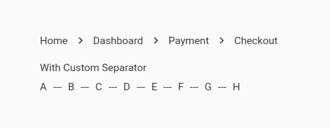
   NextBreadCumb(
      childrens: ["Home", "Dashboard", "Payment", "Checkout"]
          .map((e) => NextBreadCumbItem(child: (isHovered) => Text(e)))
          .toList()),
    SizedBox(height: 20),
    Text("With Custom Separator"),
    SizedBox(height: 10),
    NextBreadCumb(
        seperator: Text("---"),
        childrens: ["A", "B", "C", "D", "E", "F", "G", "H"]
            .map(
              (e) => NextBreadCumbItem(child: (isHovered) => Text(e)),
            )
            .toList()),
Additionally you can provide variant
- Wrap (If exceeds more than width then it will move to next line)
- Scroll (It will scroll horizontally)
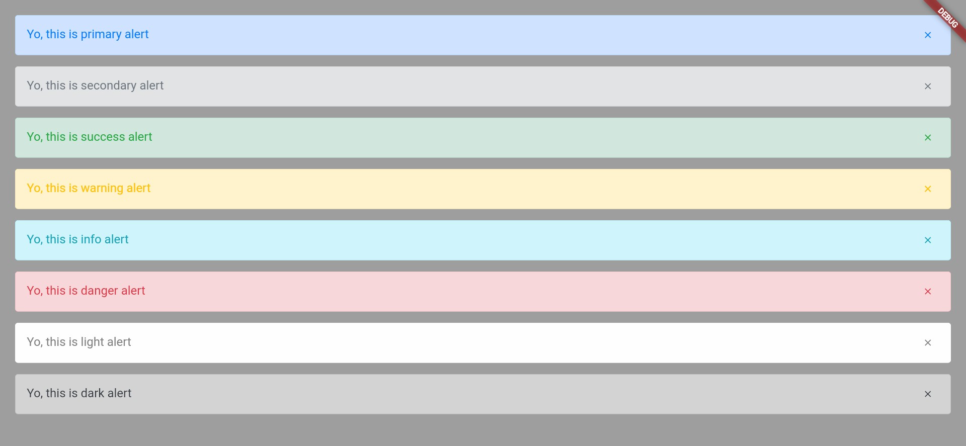
Define an alert by:
  NextAlert(
    child: Text("Yo, this is primary alert"),
    onClosedIconPressed: () {},
    margin: EdgeInsets.only(bottom: 15),
  ),
You can use multiple variant of alerts
  NextAlert(
    variant: NextVariant.secondary,
    child: Text("Yo, this is primary alert"),
    onClosedIconPressed: () {},
    margin: EdgeInsets.only(bottom: 15),
  ),
And you can even define custom,variant should be custom
 NextAlert(
    variant: NextVariant.custom,
    customConfigs: NextAlertColorUtils(
      borderColor: Colors.black,
      backgroundColor: Colors.pink,
      color: Colors.deepOrange,
    ),
    child: Text("Yo, this is primary alert"),
    onClosedIconPressed: () {},
    margin: EdgeInsets.only(bottom: 15),
  ),
|
Extra small <576px |
Small ≥576px |
Medium ≥768px |
Large ≥992px |
Extra large ≥1200px |
|
|---|---|---|---|---|---|
| Max container width | None (auto) | 540px | 720px | 960px | 1140px |
| Class prefix | col- |
col-sm- |
col-md- |
col-lg- |
col-xl- |
NextRow(
  verticalSpacing: 15,
  horizontalSpacing: 15,
  children: [
    "col-12 col-md-6 col-lg-4",
    "col-12 col-md-6 col-lg-4",
    "col-12 col-md-3 col-lg-4 col-sm-6 col-xs-6",
    "col-12 col-md-3 col-lg-4 col-sm-6 col-xs-6"
  ]
      .map((e) => NextCol(
          sizes: e,
          child: Container(
            height: 100,
            decoration: BoxDecoration(color: Colors.orange),
            child: Center(
              child: Text(
                e,
                textAlign: TextAlign.center,
                style: TextStyle(color: Colors.white),
              ),
            ),
            width: double.infinity,
          )))
      .toList())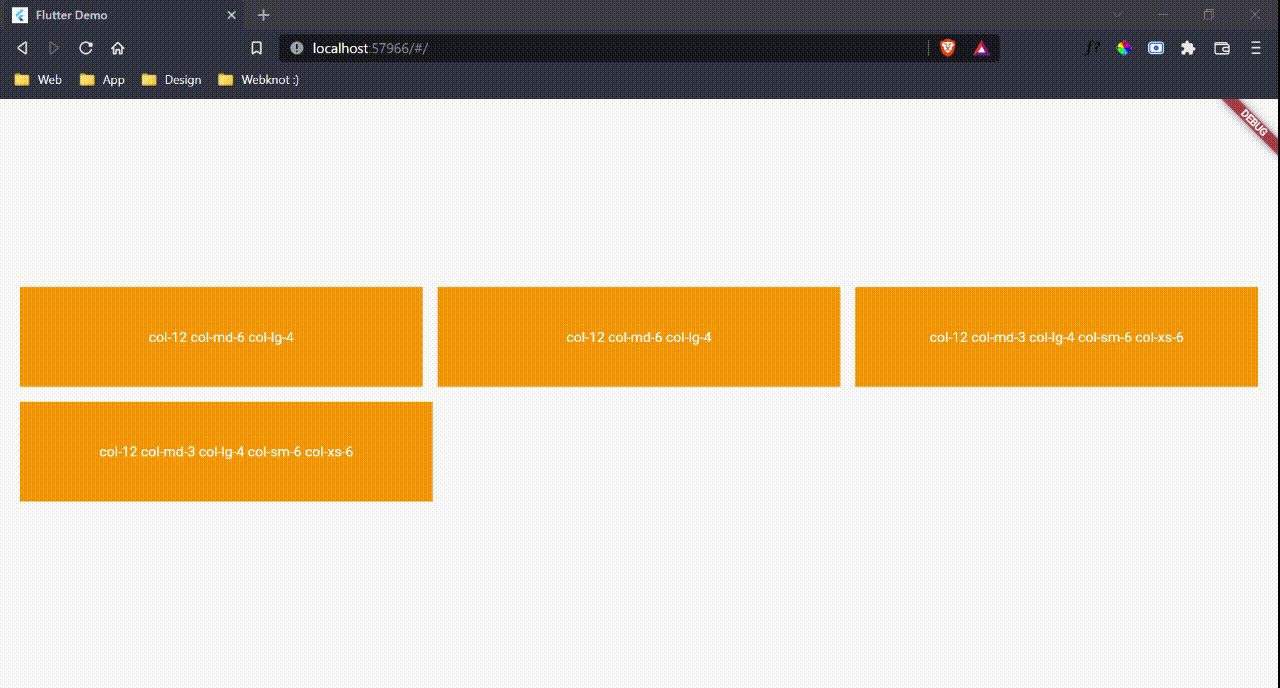
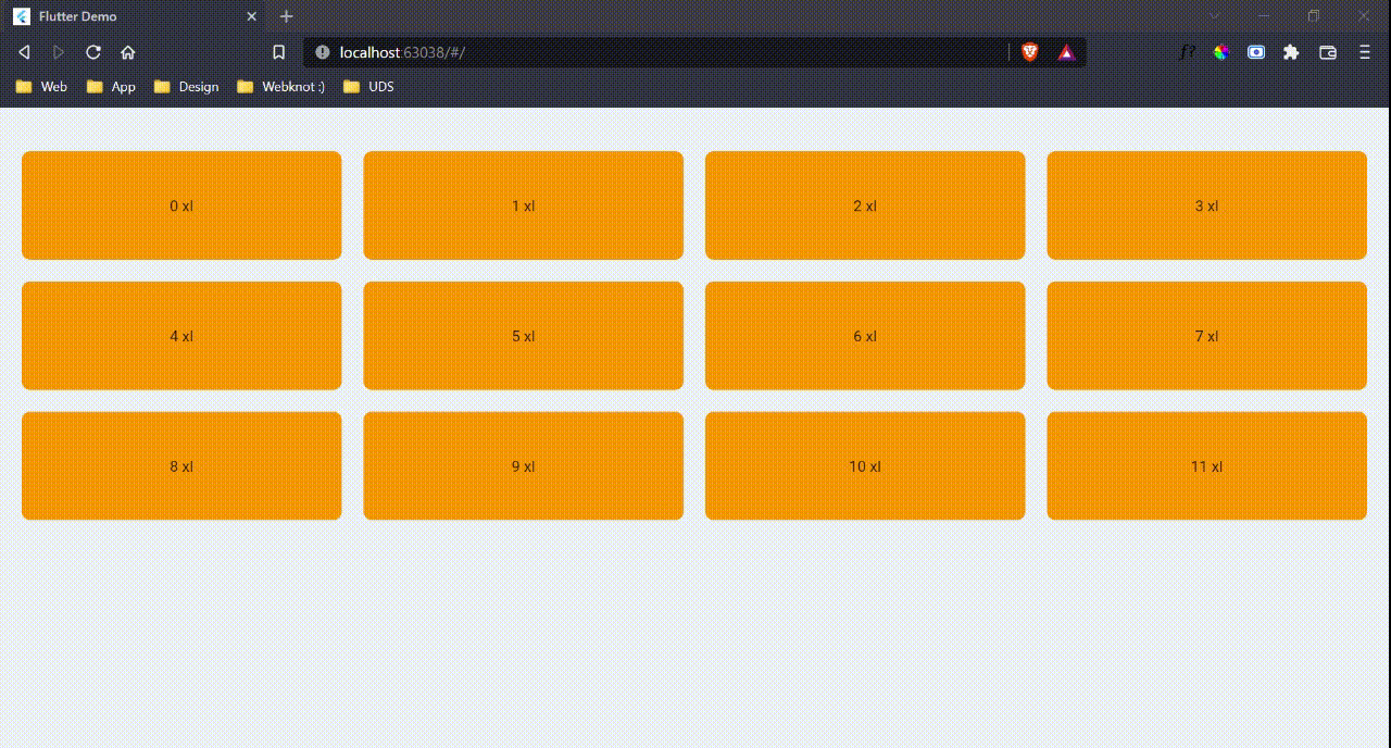
 NextGridView(
  sizes: "col-6 col-md-3 col-lg-4 col-xl-3 col-xs-6",
  childrens: List.generate(
      12,
      (index) => NextGridItem(
          child: Text(
                  "$index ${NextUtils.getPrefixByWidth(context.width)}")
              .center()
              .sizedBox(width: double.infinity, height: 100)
              .addDecoration(BoxDecoration(
                  color: Colors.orange,
borderRadius: BorderRadius.circular(8))))))- Additionaly you can even provide vertical spacing or horizontal spacing and for each children you can even define separate sizes
NextGridItem(
  sizes: "col-12 col-md-6 col-lg-6",
  ....
)|
Extra small <576px |
Small ≥576px |
Medium ≥768px |
Large ≥992px |
X-Large ≥1200px |
XX-Large ≥1400px |
|
|---|---|---|---|---|---|---|
Next Container |
100% | 540px | 720px | 960px | 1140px | 1320px |
- If you pass fluid as true then it will take whole width
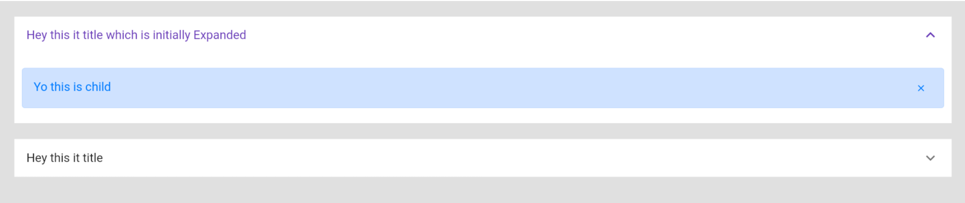
 NextAccordion(
    initiallyExpanded: true,
    backgroundColor: Colors.white,
    collapsedBackgroundColor: Colors.white,
    title: Text("Hey this it title which is initially Expanded"),
    children: [
      Padding(
        padding: EdgeInsets.symmetric(vertical: 20, horizontal: 10),
        child: NextAlert(
          child: Text("Yo this is child"),
        ),
      )
    ],
  ),
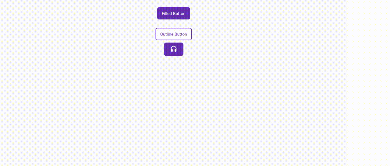
You can customise button by using itemBuilder
   NextButton(
    onPressed: () {},
    style: TextStyle(color: Colors.white),
    child: Text(
      "Filled Button",
      style: TextStyle(color: Colors.white),
    ),
  ),
  SizedBox(height: 20),
  NextButton(
    onPressed: () {},
    variant: NextButtonVariant.outlined,
    child: Text("Outline Button"),
  ),
  NextButton(
    onPressed: () {},
    variant: NextButtonVariant.outlined,
    itemBuilder: (context, isHovered, color) =>
        Icon(Icons.headset_rounded, color: color)
            .paddingSymmetric(horizontal: 20, vertical: 10)
            .decoration(BoxDecoration(
              border:
                  Border.all(color: context.primaryColor, width: 1.5),
              color: !isHovered ? context.primaryColor : Colors.white,
              borderRadius: BorderRadius.circular(8),
            )),
)- the param color in itemBuilder is a color tween between color and outline color provided in button
- Slide Animation
- SlideInLeft
- SlideInRight
- SlideInTop
- SlideInBottom
- Zoom Animation
- ZoomIn
- ZoomOut
- Fade Animation
- FadeInLeft
- FadeInRight
- FadeInTop
- FadeInBottom
- FadeOutLeft
- FadeOutRight
- FadeOutTop
- FadeOutBottom
- Flip Animation
- Flipx
- FlipY
- Bounce Animation
- BounceInLeft
- BounceInRight
- BounceInTop
- BounceInBottom
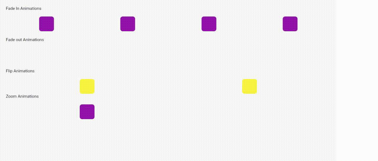
 Text("Fade In Animations").customPadding(bottom: 20),
  Row(
    mainAxisAlignment: MainAxisAlignment.spaceAround,
    children: [
      ContainerThing().fadeIn(
          variant: NextFadeInVariant.fadeInLeft,
          duration: Duration(milliseconds: 600)),
      ContainerThing().fadeIn(
          variant: NextFadeInVariant.fadeInTop,
          duration: Duration(milliseconds: 600)),
      ContainerThing().fadeIn(
          variant: NextFadeInVariant.fadeInBottom,
          duration: Duration(milliseconds: 600)),
      ContainerThing().fadeIn(
          variant: NextFadeInVariant.fadeInRight,
          duration: Duration(milliseconds: 600)),
    ],
  ),
  SizedBox(height: 20),
  Text("Fade out Animations").customPadding(bottom: 20),
  Row(
    mainAxisAlignment: MainAxisAlignment.spaceAround,
    children: [
      ContainerThing(
        color: Colors.red,
      ).fadeOut(
          variant: NextFadeOutVariant.fadeOutLeft,
          duration: Duration(milliseconds: 600)),
      ContainerThing(
        color: Colors.red,
      ).fadeOut(
          variant: NextFadeOutVariant.fadeOutTop,
          duration: Duration(milliseconds: 600)),
      ContainerThing(
        color: Colors.red,
      ).fadeOut(
          variant: NextFadeOutVariant.fadeOutBottom,
          duration: Duration(milliseconds: 600)),
      ContainerThing(
        color: Colors.red,
      ).fadeOut(
          variant: NextFadeOutVariant.fadeOutRight,
          duration: Duration(milliseconds: 600)),
    ],
  ),
  SizedBox(height: 20),
  Text("Flip Animations").customPadding(bottom: 20),
  Row(
    mainAxisAlignment: MainAxisAlignment.spaceAround,
    children: [
      ContainerThing(
        color: Colors.yellow,
      ).flip(
          variant: NextFlipVariant.flipX,
          duration: Duration(milliseconds: 600)),
      ContainerThing(
        color: Colors.yellow,
      ).flip(
          variant: NextFlipVariant.flipY,
          duration: Duration(milliseconds: 600)),
    ],
  ),
  SizedBox(height: 20),
  Text("Zoom Animations").customPadding(bottom: 20),
  Row(
    mainAxisAlignment: MainAxisAlignment.spaceAround,
    children: [
      ContainerThing().zoom(variant: NextZoomVariant.zoomIn),
      ContainerThing().zoom(variant: NextZoomVariant.zoomOut),
    ],
)- Now you can add onTap function easily
Widget().onTap((){
  ....
})- Double Tap
Widget().onDoubleTap((){
  ....
})- On Long press
Widget().onLongPress((){
  ....
})- And center your widget easily
Widget(
  child:...
).center()- And for column/row/stack
[Widget1(),Widget2(),Widget3()].column(
  // Additionally you can provide mainAxis and remaining params here
)- For decoration
Widget().addDecoration(BoxDecoration(
  // Add params here
))- you can even use clipRRect,clipper,safearea etc...
Now access themedata and mediaquery data easily like
  context.themeData
  context.textTheme
  context.buttonTheme
  context.snackBarTheme
Or if you want to develop responsive views w.r.t height and width
  context.height
  context.width
And for colors
  context.primaryColor
  context.backgroundColor
  context.canvasColor
context.dividerColorInstead of
Padding(
  padding: const EdgeInsets.all(20)
  child:Widget(
    child...
  )
)
You can use
Widget(
  child:...
).pad(20)
// Or
Widget(
  child:...
).paddingSymmetric(horizontal:20,vertical:12)
//or
Widget(
  child:...
).customPadding(left:10,right:12)- We provide handful of string extensions
"string".capitalize()// Output is: String"45".toInt()// Output is: 45"45.4".toDouble()// Output is: 45.4"flutter".isInt()//Output is: False"flutter".isDouble()//Output is: False"flutter".toDouble()//Output is: null
false.toggle()//Output is true
  ContainerThing(
    shadows: NextShadow.shadow100()
),- Additionally you can provide customshadow color
  ContainerThing(
    shadows: NextShadow.shadow100(color:Colors.red)
),Feel free to connect with me on these platforms:
Contributions, issues, and feature requests are always welcome! Here's how you can contribute:
- Check out the open issues to find a task you can help with
- Fork the repo and create your branch from
master - Make sure your code adheres to our linting standards
- Submit a pull request and get it reviewed and approved. Welcome to our community!
Please read the contribution guidelines for more information.


 React
React
 Typescript
 Django
 Laravel
 Facebook
 Microsoft
 Google
 Alibaba
 D3
D3
 Tencent