Light css grid and wireframe based on flex property.
Flexo is a lightweight framework for page scaffolding using the css flex property. Flexo helps the developer and designer to create modular web pages quickly.
Flexo
You can directly use the links to use it immediately or you can download Flexo and use the scss file.
On the Flexo site it is possible to configure the .css file!
Link dev(wireframe intergated)
<link rel="stylesheet" href="http://davidemartucci.it/flexo/dev/css/flexo.css">
Link dist(minify)
<link rel="stylesheet" href="http://davidemartucci.it/flexo/dist/css/flexo.min.css">
Npm
npm install @the_martux/flexo -D
Yarn
yarn add @the_martux/flexo -D
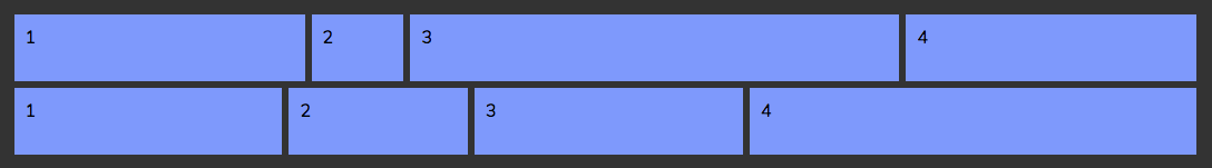
There are five elements that build the grid.
-
Container: this element contains all the rows and can have a fixed or fluid length.
-
Row: contains the box and can have a fixed or fluid length.
-
Box: this element is the grid cell. can be fixed or flexible.
-
Box in: is the contents of the cell. Here it is possible to insert other grids.
-
Flex: is the basic flex property.
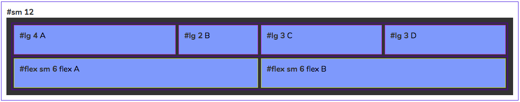
With flexo you can use the wireframe and check the boxes you use during the changing of the device lengths. You should add the wireframe id in the body tag.
The documentation allows you to better understand how to use Flexo classes.
Watch the tutorials to learn more.
Documentation


 React
React
 Typescript
 Django
 Laravel
 Facebook
 Microsoft
 Google
 Alibaba
 D3
D3
 Tencent