Giter Site home page Giter Site logo

round-slider's Introduction

round-slider

A simple round slider webcomponent - demo
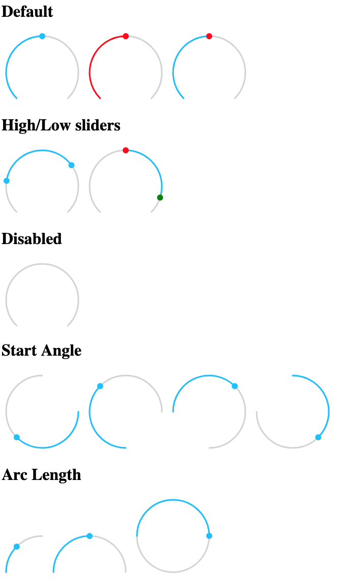
single

Properties

  • value - Required for single slider

  • low - Required for high/low slider

  • high - Required for high/low slider

  • min - Lower limit of values

  • max - Higher limit of values

  • step - Step size of slider

  • startAngle - Angle in degrees at which slider bar starts (default: 135)

  • arcLength - Length in degrees of slider bar (default: 270)

  • handleSize - Radius of handle in pixels (default: 6)

  • handleZoom - The factor the handle size scales when dragged (default: 1.5)

  • disabled - Boolean property disabling the slider (default: false)

  • readonly - Boolean property disabling slider events (default: false)

  • rtl - Boolean property to have the slider move Right to Left (default: false)

  • valueLabel - Value to apply to aria-label property of value handle

  • lowLabel - Value to apply to aria-label property of low handle

  • highLabel - Value to apply to aria-label property of high handle

  • outside - if true a high/low slider will fill up from the outsides in of inside out (default: false)

Events

The slider dispatches two events

  • value-changing when the value is changed but the mouse button is still pressed
  • value-changed on release of mouse button

Both events pass an object as detail with either value, low, or high set to the new value depending on which slider was pulled.

CSS styles

The following css variables can be used to change the styles:

  • --round-slider-path-color - color of bar path
  • --round-slider-bar-color - color of bar
  • --round-slider-handle-color - color of handles
  • --round-slider-low-handle-color - color of low handle (overrides --round-slider-handle-color)
  • --round-slider-high-handle-color - color of high handle (overrides --round-slider-handle-color)
  • --round-slider-low-bar-color - color of low bar when outside is true (overrides --round-slider-bar-color)
  • --round-slider-high-bar-color - color of high bar when outside is true (overrides --round-slider-bar-color)
  • --round-slider-handle-cursor - cursor to use on the handles (default pointer)
  • --round-slider-path-width - bar width in pixels (default: 3)
  • --round-slider-linecap - svg linecaps of bar (default: round)

Examples

See example.html for usage examples. Examples

round-slider's People

Contributors

balloob avatar bramkragten avatar scrounger avatar spacegaier avatar thomasloven avatar zsarnett avatar

Stargazers

 avatar  avatar  avatar  avatar  avatar  avatar  avatar  avatar  avatar  avatar  avatar  avatar  avatar  avatar  avatar  avatar  avatar  avatar  avatar  avatar  avatar  avatar  avatar  avatar  avatar  avatar  avatar  avatar  avatar  avatar  avatar  avatar  avatar  avatar  avatar  avatar  avatar  avatar  avatar  avatar  avatar  avatar  avatar  avatar  avatar  avatar  avatar  avatar  avatar  avatar  avatar  avatar  avatar  avatar  avatar  avatar  avatar  avatar  avatar  avatar  avatar  avatar  avatar  avatar  avatar  avatar  avatar  avatar  avatar  avatar  avatar  avatar  avatar  avatar  avatar  avatar  avatar  avatar  avatar  avatar

Watchers

 avatar  avatar  avatar  avatar

round-slider's Issues

Outside mode issues

This is a follow-up for #21
First of all, thanks for implementing the feature!
Second, I've been testing it and found two issues:

  1. For a single slider mode, the outside parameter has no effect, I would expect it to fill the slider from the opposite end. Example: <round-slider value="50" outside="true">
  2. For a high/low mode, outside="true" works as expected, however outside="false" works exactly the same way as outside="true", I would expect it to act as without the parameter. Example: <round-slider low="20" high="70" outside="false">

Dragging with mouse doesn't work when min and/or max is set

Hi,

I want to use this slider:

<round-slider
      value=40
      arcLength=180
      startAngle=180
      min=38
      max=56
      step=1
    ></round-slider>

It renders well, but dragging with mouse doesn't work.
When I remove min and max it works.
As soon as I use min or max it doesn't.

Can you help me?
BR,
Johannes

Combination of "startangle" and "arclength" is bugged for start angle above 180°

I wanted to modify the slider so that I get a full circle with the start position on top. The combination of "startangle" and "arclength" almost gave me this result. But as soon as I use start angles above 180°, the slider always stops on the left side.

This bug is reproducible by opening the demo page, going to the third slider under "Start Angle" and setting the arc length to more than 270 in the console. When you set the start angle to 180 or below it works as expected.

Feature request: Add a mode to fill the slider from an upper-end

Hi!

Currently, in the single slider mode, the slider is filled with blue from the lower bound (i.e. min) up to value, and with gray color between the value and max. That could represent to the user that something (e.g. a heater) is active below the setpoint. However if you want to represent an AC unit, which is active above the setpoint instead, I think it would be more natural to fill in the upper arc with the color instead of the lower arc.
The rtl does not help with this case because flipping rtl also flips the sides of min and max values which is not desired.

Event propagation

Hi! Please consider setting bubbles:true on the custom events, that would allow to easier create a wrapper element over the round-slider

If value is set to null then the slider cannot be interacted with until value is set to non-null again

This isn't documented from what I could see, but when in single slider mode, the code supports setting value to null. This is different from setting either disabled or readonly, and behaves differently from either of those states. When this happens (when value is null), the handle and the bar are both hidden. However, despite not being either readonly or disabled, clicking on the slider doesn't set the value or position of the handle - the entire component becomes non-interactive and can only be made interactive again by programmatically setting value to an integer.

Setting value to null is actually really useful for representing an undefined state - a feature that would otherwise be missing. My specific use-case is https://github.com/denysdovhan/purifier-card used in Home Assistant to control an air purifier fan - the slider is used to represent & control the fan speed. And many fans can be set to Auto, in which case the actual fan speed isn't known (ie, it's in an undefined state). In many cases I think this may just be an inconvenience for people. But in my case with the fan I have, this actually breaks the component, because exiting out of Auto mode is done via setting the fan speed - which this bug prevents.

In this use-case, it would be useful (and makes most sense to me) to allow clicking anywhere on the slider to set the handle to that position. It would allow switching from an undefined state to a defined value. If that's not wanted by anyone using this component, then arguably they should be setting either readonly or disabled, which are the documented ways of making it non-interactive (possibly in combination to setting value to null if so desired).

Code-wise, I think this is happening because when value is null, then _showHandle is false. This makes sense, and currently results in the handle not being rendered into the DOM at all. However, the code handling clicking on the slider (dragStart()) assumes the node for the handle exists in the DOM tree - which it doesn't. Additionally, while dragStart() checks if disabled is true, it only assumes that if _handleShown is false then readonly is true - however that's a wrong assumption & isn't necessarily the case.

I can think of two possible solutions to this:

  1. If value is null then render the handle regardless, but set it as hidden. When the slider is clicked (and neither readonly or disabled are enabled), position the handle as normal, and then remove the hidden state (doing this last is important to ensure no flickering of the handle in the wrong position).
  2. If value is null then continue to not render the handle. When the slider is clicked (and neither readonly or disabled are enabled), first render the handle, then continue positioning the handle as normal.

To me it looks like the first option would be easiest with the least code changes.

How to use in Home Assistant?

The round-slider-with-a-bulb is default in HA.
As the n00b I am, how do I get the round-slider (without the bulb) into HA (HACS)?

Thanks for your impressive work contributing to HA!

Cheers.

Doesn't work in Firefox 60.9.0esr

Trying out the example in Firefox 60.9.0esr I get:

round-slider:81:8 ReferenceError: customElements is not defined

It would be great if this could also work in Firefox

Recommend Projects

  • React photo React

    A declarative, efficient, and flexible JavaScript library for building user interfaces.

  • Vue.js photo Vue.js

    🖖 Vue.js is a progressive, incrementally-adoptable JavaScript framework for building UI on the web.

  • Typescript photo Typescript

    TypeScript is a superset of JavaScript that compiles to clean JavaScript output.

  • TensorFlow photo TensorFlow

    An Open Source Machine Learning Framework for Everyone

  • Django photo Django

    The Web framework for perfectionists with deadlines.

  • D3 photo D3

    Bring data to life with SVG, Canvas and HTML. 📊📈🎉

Recommend Topics

  • javascript

    JavaScript (JS) is a lightweight interpreted programming language with first-class functions.

  • web

    Some thing interesting about web. New door for the world.

  • server

    A server is a program made to process requests and deliver data to clients.

  • Machine learning

    Machine learning is a way of modeling and interpreting data that allows a piece of software to respond intelligently.

  • Game

    Some thing interesting about game, make everyone happy.

Recommend Org

  • Facebook photo Facebook

    We are working to build community through open source technology. NB: members must have two-factor auth.

  • Microsoft photo Microsoft

    Open source projects and samples from Microsoft.

  • Google photo Google

    Google ❤️ Open Source for everyone.

  • D3 photo D3

    Data-Driven Documents codes.