
A Gmail-like Material Drawer implementation
Based on neokree's MaterialDrawer library. Big thanks to neokree, without him this library would not exist.
- Unlimited Head-Items (Accounts), tested with 100 Head-Items
- Every Head-Item can have its own Menu
- Head-Item listeners for Avatar or Background taps
- Adding and removing Head-Items and Menu-Items at runtime
- Own theme
- Labels
- Normal Sections (with Fragment/Activty start or own onClick listener)
- Bottom-Sections
- Drawer below the toolbar
- Tablet support
- Toolbar overflow support
- More: Setting your own Fragment on Start, etc
https://github.com/madcyph3r/AdvancedMaterialDrawer/raw/master/example-release.apk
or on the play store (Lib-Version 1.1.1)

repositories {
    maven { url 'http://dl.bintray.com/madcyph3r/maven/' }
}

dependencies {
    compile 'de.madcyph3r:materialDrawer:1.1.1@aar'
}compile 'com.android.support:appcompat-v7:21.0.3'
compile 'com.nineoldandroids:library:2.4.0'There are a lot of examples with explanations, how to use the library, here is a small example with one Head-Item. It looks like screenshot three, only in black color.
public class OneHeadItem extends MaterialNavigationDrawer {

    MaterialNavigationDrawer drawer = null;

    @Override
    public int headerType() {
        // set type. you get the available constant from MaterialNavigationDrawer class
        return MaterialNavigationDrawer.DRAWERHEADER_HEADITEMS;
    }

    // called from onCreate(), make your view init here or in your fragment.
    @Override
    public void init(Bundle savedInstanceState) {

        drawer = this;

        MaterialMenu menu = new MaterialMenu();

        // first section is loaded
        MaterialSection section1 = this.newSection("Section 1", this.getResources().getDrawable(R.drawable.ic_favorite_black_36dp), new FragmentIndex(), false, menu);
        MaterialSection section2 = this.newSection("Section 2", this.getResources().getDrawable(R.drawable.ic_list_black_36dp), new FragmentIndex(), false, menu);

        // use bitmap and make a circle photo
        final Bitmap bitmap = BitmapFactory.decodeResource(getResources(), R.drawable.app_drawer_icon);
        final RoundedCornersDrawable drawableAppIcon = new RoundedCornersDrawable(getResources(), bitmap);

        // create Head Item
        MaterialHeadItem headItem = new MaterialHeadItem(this, "F HeadItem", "F Subtitle", drawableAppIcon, R.drawable.mat5, menu);

        // add head Item (menu will be loaded automatically)
        this.addHeadItem(headItem);
    }
}- If you've found an issue, look up the open issues and submit a new one if it isn't yet reported.
- If you like the library press the star ;)
- A Wiki with some Introduction will come soon.
Info: The statusbar is now semi-transparent on lollipop with the latest snapshot. New screenshot will come, with the new release.
5 head-items. Every one has his own menu. (Dark-Style):

Section kinds (section with and without icon, bottom Section, label, devisor, icon color):

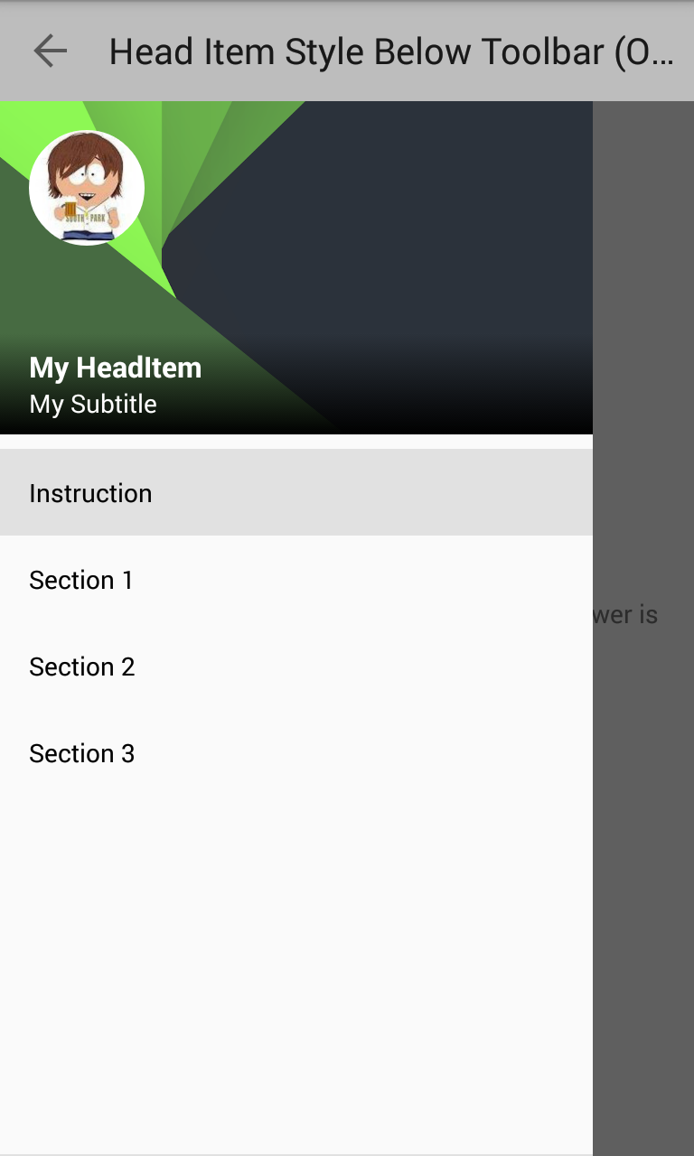
drawer below the toolbar:

Light-Style:

Toolbar (Actionbar) Overflow:

Own Theme:

Custom-Header:

No-Header:

No-Header Below Toolbar:

Selected section sets the toolbar color:

Tablet, drawer is always present (multipaneSupport = true), below toolbar:

Tablet, drawer with hiding, not always open:

Tablet, drawer is always present (multipaneSupport = true):


 React
React
 Typescript
 Django
 Laravel
 Facebook
 Microsoft
 Google
 Alibaba
 D3
D3
 Tencent