Automatically finds the safest path for you to take given some footage.
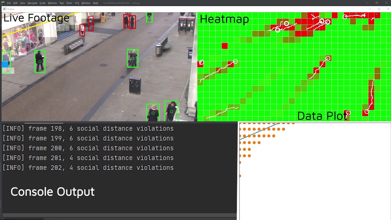
The heatmap shows the overall traffic of a certain location. Green squares represents places that are less frequented while the red squares represents places that are heavily frequented. Two types of circles are also drawn, the thicker ones represent the people that don't follow social distancing guidelines, the thinner ones are those that follow these rules. There is also a trail drawn behind every person, representing the path they have taken and their general direction. The heatmap will compile an average of every frame and update accordingly.
The live footage represents the actual footage the algorithm runs on. Bounding boxes are drawn around the people, a red one would mean that this person is not following social distancing, the green ones are those that follow the rules. The white highlighted area is the best path you can take according to the algorithm, the yellow line is then calculated with that data to show the best straight path you can take. The blue square represents the person that is considered safest, that is further away from the red zones in the heatmaps. The white highlighted area starts pathfinding from the blue square.
The data plot is determined by the white area, generated using recursion starting from the blue square. Each data point in the plot represents one white square. The path (yellow line) is determined by using regression with all the data points, through a function in MatplotLib.
- YOLOv3-608 pretrained models from https://pjreddie.com/darknet/yolo/
- Computer vision with OpenCv
- Linear regression using Numpy.polyfit
- Distances calculated using Scipy.spatial.cdist
- Python 3.9.1
- Imutils==0.5.3
- Numpy==1.19.5
- Scipy==1.6.0
- Opencv-python==4.4.0.46
- Simpy==1.7.1


