Select input component for Ink
Looking for a version compatible with Ink 2.x? Check out this release.
$ npm install ink-select-input
import React from 'react';
import {render} from 'ink';
import SelectInput from 'ink-select-input';
const Demo = () => {
const handleSelect = item => {
// `item` = { label: 'First', value: 'first' }
};
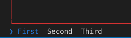
const items = [
{
label: 'First',
value: 'first'
},
{
label: 'Second',
value: 'second'
},
{
label: 'Third',
value: 'third'
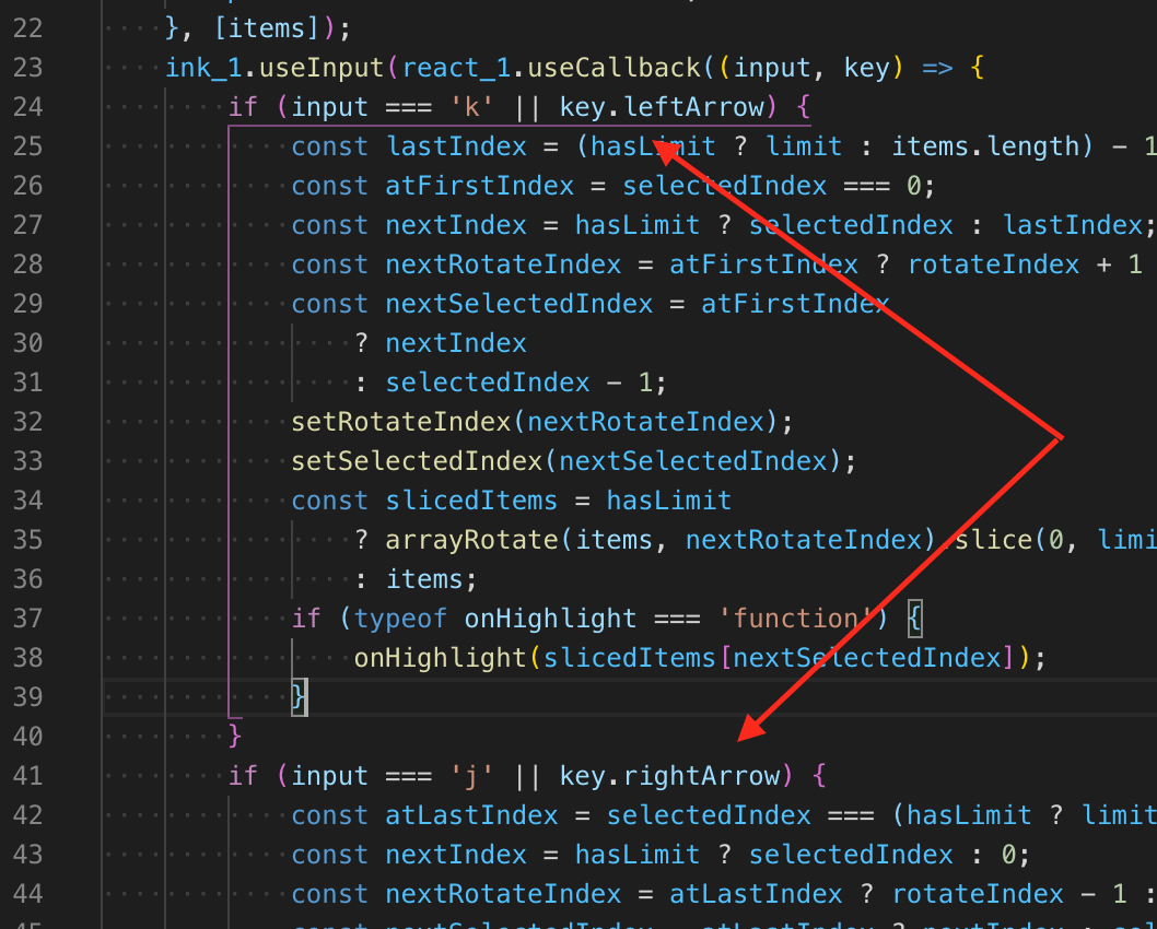
}
];
return <SelectInput items={items} onSelect={handleSelect} />;
};
render(<Demo />);
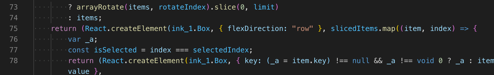
Type: array
Default: []
Items to display in a list. Each item must be an object and have label and value props, it may also optionally have a key prop.
If no key prop is provided, value will be used as the item key.
Type: boolean
Default: true
Listen to user's input. Useful in case there are multiple input components at the same time and input must be "routed" to a specific component.
Type: number
Default: 0
Index of initially-selected item in items array.
Type: number
Number of items to display.
Type: Component
Custom component to override the default indicator component.
Type: Component
Custom component to override the default item component.
Type: function
Function to call when user selects an item. Item object is passed to that function as an argument.
Type: function
Function to call when user highlights an item. Item object is passed to that function as an argument.


 React
React
 Typescript
 Django
 Laravel
 Facebook
 Microsoft
 Google
 Alibaba
 D3
D3
 Tencent