Giter Site home page Giter Site logo

web-padawan / aybolit Goto Github PK

View Code? Open in Web Editor NEW
101.0 10.0 15.0 1.8 MB

Lightweight web components library built with LitElement.

Home Page: https://web-padawan.github.io/aybolit/

License: MIT License

CSS 31.90% JavaScript 67.87% HTML 0.23%
webcomponents web-components custom-elements lit-element bootstrap bulma material

aybolit's Introduction

Aybolit

Aybolit is a lightweight, standards-based, framework agnostic UI components library built with LitElement.

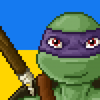
Aybolit is a fictional character from the children's poems by Korney Chukovsky. He is a traveling doctor who treats animals for free, regardless of their injuries. The name may be translated as "Ouch, [it] hurts!"

Live Demo ↗

CircleCI code style: prettier

Overview

Aybolit is based on the modern web standards: Custom Elements, Shadow DOM and CSS Custom Properties. Using these parts of the web platform allows Aybolit to easily solve several common problems which have been around for years:

  1. Proper style scoping and zero global CSS! With Aybolit you are safe to use any CSS class name in your project, and never get any side effects. Forget about the evil hacks like using !important to override 3rd party CSS specificity.

  2. Granular DOM structure. You no longer have to place HTML elements in the specific order to satisfy CSS selectors like input ~ label - these are now implementation detail. The resulting markup is cleaner, easier to read and maintain.

  3. Flexible theming API: custom CSS properties and calc() allow to dynamically change colors at any part of the cascade, and make it possible to auto-adjust level of contrast for elements like buttons and checkboxes.

The mission of Aybolit is to let developers stop reinventing the wheel, and ensure a painless developer experience. Aybolit starts with the basics and provides a few primitive UI components, laying the groundwork for a lot more in future.

Project Structure

Aybolit project is a monorepo and contains the following npm packages:

Check the README of each individual package for more details.

Supported Browsers

Chrome, Firefox 64+ and Safari 11+ are targeted browsers. They all support Custom Elements, Shadow DOM, custom CSS properties and ES modules, and do not need any polyfills.

Any up-to-date Chromium-based browsers, like Samsung Internet, Opera, Vivaldi, Brave, Yandex Browser and many others, are supported too. Microsoft Edge will hopefully join this group later this year.

Internet Explorer is not officially supported. It is generally possible to make web components work in IE11 using polyfills and Babel, but certain things will not work as expected to say the least.

Contact

If you have questions, feedback or anything to share related to the project, feel free to contact me via:

aybolit's People

Contributors

chanar avatar lkraav avatar web-padawan avatar

Stargazers

 avatar  avatar  avatar  avatar  avatar  avatar  avatar  avatar  avatar  avatar  avatar  avatar  avatar  avatar  avatar  avatar  avatar  avatar  avatar  avatar  avatar  avatar  avatar  avatar  avatar  avatar  avatar  avatar  avatar  avatar  avatar  avatar  avatar  avatar  avatar  avatar  avatar  avatar  avatar  avatar  avatar  avatar  avatar  avatar  avatar  avatar  avatar  avatar  avatar  avatar  avatar  avatar  avatar  avatar  avatar  avatar  avatar  avatar  avatar  avatar  avatar  avatar  avatar  avatar  avatar  avatar  avatar  avatar  avatar  avatar  avatar  avatar  avatar  avatar  avatar  avatar  avatar  avatar  avatar  avatar  avatar  avatar  avatar  avatar  avatar  avatar  avatar  avatar  avatar  avatar  avatar  avatar  avatar  avatar  avatar  avatar  avatar  avatar  avatar  avatar

Watchers

 avatar  avatar  avatar  avatar  avatar  avatar  avatar  avatar  avatar  avatar

aybolit's Issues

Using different file and setup structure for packages

  1. Currently, the lit components are compiled with storybook webpack configuration. In case I would like to run webpack-serve from the current lit element project (that I will bring over to packages/my-lit-project), where should I do it? Do you recommend creating custom commands to root level package.json? Also what about production builds. Would you build them in /dist/package/package-name/bundle.js or /packages/package-name/dist/?

  2. Do you have specific recommendations to follow on package file structure. For example my project currently looks something like this like this:

/src/components/component-name.js
/src/components/component-name.scss
/src/theme/vaadin/vaadin-button.js
/src/theme/vaadin/vaadin-button.scss
/src/redux/
/templates/file.html (that put together initial component setups)

webpack-configs.js
netlify.toml
babel.config.js

docs: prevent flash of unstyled content (FOUC)

https://developers.google.com/web/fundamentals/web-components/customelements#prestyle presents a solid strategy that works.

In reality, it seem like 2 rules are needed, for something like a layout component:

vaadin-app-layout:not(:defined) {

	/* Pre-style, give layout, replicate app-drawer's eventual styles, etc. */
	display: block;
	height: 100vh;
	opacity: 0;
}

vaadin-app-layout:defined {
	transition: opacity 0.1s ease-in-out;
}

Even though the example given is for vaadin-app-layout, it's a generic web component upgrade issue, which I didn't know until I experienced it and researched. So wondering if we could add a Documentation note here about it, and present this solution option.

Any better options that you know of, @web-padawan?

Why custom scripts and not webpack for building styles?

Currently the npm run watch takes at least 1 second with minimal setup and only on package. So my questions is why custom scripts runner?

yarn run v1.12.3
$ ./scripts/build-styling.sh
Processing packages/core/scss/switch-base.scss
Processing packages/core/scss/button-base.scss
Processing packages/core/scss/range-base.scss
Processing packages/core/scss/progress-base.scss
Processing packages/core/scss/checkbox-base.scss
Done in 1.18s.

watcher build complete!

Textarea component

This is an "epic" for textarea.

  • base class
  • bootstrap
  • bulma
  • material
  • white-label

Including scss mixins

With aybolit setup, where should I include scss mixins/variables that are being used throughout multiple packages?

Before I used sass-resources-loader in webpack to load the mixins to all scss included.

chore: bump world

Looks like many minor updates available, bump world?

aybolit $ [git:master] yarn outdated
yarn outdated v1.15.2
info Color legend : 
 "<red>"    : Major Update backward-incompatible updates 
 "<yellow>" : Minor Update backward-compatible features 
 "<green>"  : Patch Update backward-compatible bug fixes
Package                         Current Wanted Latest Workspace            Package Type    URL                                                                               
@babel/core                     7.4.0   7.4.3  7.4.3  aybolit-workspace    devDependencies https://babeljs.io/                                                               
@babel/plugin-transform-runtime 7.4.0   7.4.3  7.4.3  aybolit-workspace    devDependencies https://github.com/babel/babel/tree/master/packages/babel-plugin-transform-runtime
@babel/preset-env               7.4.2   7.4.3  7.4.3  aybolit-workspace    devDependencies https://babeljs.io/                                                               
@babel/runtime                  7.4.2   7.4.3  7.4.3  aybolit-workspace    devDependencies https://github.com/babel/babel/tree/master/packages/babel-runtime                 
@open-wc/testing-helpers        0.7.25  0.7.25 0.8.6  @aybolit/core        devDependencies https://github.com/open-wc/open-wc/                                               
@open-wc/testing-helpers        0.7.25  0.7.25 0.8.6  @aybolit/material    devDependencies https://github.com/open-wc/open-wc/                                               
@open-wc/testing-helpers        0.7.25  0.7.25 0.8.6  aybolit-workspace    devDependencies https://github.com/open-wc/open-wc/                                               
@open-wc/testing-helpers        0.7.25  0.7.25 0.8.6  @aybolit/bootstrap   devDependencies https://github.com/open-wc/open-wc/                                               
@open-wc/testing-helpers        0.7.25  0.7.25 0.8.6  @aybolit/bulma       devDependencies https://github.com/open-wc/open-wc/                                               
@pika/pack                      0.3.5   0.3.6  0.3.6  @aybolit/bulma       devDependencies https://www.pikapkg.com/blog/introducing-pika-pack/                               
@pika/pack                      0.3.5   0.3.6  0.3.6  @aybolit/bootstrap   devDependencies https://www.pikapkg.com/blog/introducing-pika-pack/                               
@pika/pack                      0.3.5   0.3.6  0.3.6  @aybolit/core        devDependencies https://www.pikapkg.com/blog/introducing-pika-pack/                               
@pika/pack                      0.3.5   0.3.6  0.3.6  @aybolit/material    devDependencies https://www.pikapkg.com/blog/introducing-pika-pack/                               
@pika/pack                      0.3.5   0.3.6  0.3.6  @aybolit/white-label devDependencies https://www.pikapkg.com/blog/introducing-pika-pack/                               
@storybook/addon-knobs          5.0.5   5.0.6  5.0.6  @aybolit/storybook   dependencies    https://github.com/storybooks/storybook/tree/master/addons/knobs                  
@storybook/addon-knobs          5.0.5   5.0.6  5.0.6  aybolit-workspace    devDependencies https://github.com/storybooks/storybook/tree/master/addons/knobs                  
@storybook/addons               5.0.5   5.0.6  5.0.6  @aybolit/storybook   dependencies    https://github.com/storybooks/storybook/tree/master/lib/addons                    
@storybook/addons               5.0.5   5.0.6  5.0.6  aybolit-workspace    devDependencies https://github.com/storybooks/storybook/tree/master/lib/addons                    
@storybook/core                 5.0.5   5.0.6  5.0.6  aybolit-workspace    devDependencies https://github.com/storybooks/storybook/tree/master/lib/core                      
@storybook/polymer              5.0.5   5.0.6  5.0.6  aybolit-workspace    devDependencies https://github.com/storybooks/storybook/tree/master/app/polymer                   
@storybook/polymer              5.0.5   5.0.6  5.0.6  @aybolit/storybook   dependencies    https://github.com/storybooks/storybook/tree/master/app/polymer                   
@webcomponents/webcomponentsjs  2.2.7   2.2.8  2.2.8  aybolit-workspace    devDependencies https://webcomponents.org/polyfills                                               
command-line-args               5.0.2   5.1.1  5.1.1  @aybolit/sass-render dependencies    https://github.com/75lb/command-line-args#readme                                  
eslint                          5.15.3  5.16.0 5.16.0 aybolit-workspace    devDependencies https://eslint.org                                                                
lerna                           3.13.1  3.13.2 3.13.2 aybolit-workspace    devDependencies https://github.com/lerna/lerna#readme                                             
mocha                           6.0.2   6.1.2  6.1.2  aybolit-workspace    devDependencies https://mochajs.org/                                                              
node-watch                      0.6.0   0.6.1  0.6.1  aybolit-workspace    dependencies    https://github.com/yuanchuan/node-watch#readme                                    
react                           16.8.5  16.8.6 16.8.6 aybolit-workspace    devDependencies https://reactjs.org/                                                              
react-dom                       16.8.5  16.8.6 16.8.6 aybolit-workspace    devDependencies https://reactjs.org/                                                              
sass                            1.17.3  1.18.0 1.18.0 @aybolit/sass-render dependencies    https://github.com/sass/dart-sass                                                 
sinon                           7.3.0   7.3.1  7.3.1  aybolit-workspace    devDependencies https://sinonjs.org/                                                              
Done in 2.88s.

Radio-button component

This is an "epic" for radio-button.

  • base class
  • bootstrap
  • bulma
  • material
  • white-label

Note: radio-group is considered as a possible wrapper. The selection-controller from Material Web Components can be used as alternative, though.

Badge component

This is an "epic" for badge.

  • base class
  • bootstrap
  • bulma
  • material
  • white-label

Text-field component

This is an "epic" for text-field.

  • base class
  • bootstrap
  • bulma
  • material
  • white-label

Simpler package structure

Wanting to dynamically import only a single element not has to deep dive into the dist-src directory:

import('@aybolit/material/dist-src/components/abm-button').then()

I find this uncommon as well as providing a bundled js file as the default index.

Instead, I propose a simplified build where individual components are imported by default both statically and dynamically.

import '@aybolit/material/button'
// equal dynamic import
import('@aybolit/material/button')

If desired, the bundled build would stay but being the non-default alternative

Vaadin Lumo package?

Any plans? Or what would be the alternative integration strategy, if we like Lumo's system in general.

Cannot create pull request. Permission denied

I think I solved some of the issues in a way that might be suitable for both of us. Would you care to take a look with a new pull request? I just need permissions to push my branch.

Recommend Projects

  • React photo React

    A declarative, efficient, and flexible JavaScript library for building user interfaces.

  • Vue.js photo Vue.js

    🖖 Vue.js is a progressive, incrementally-adoptable JavaScript framework for building UI on the web.

  • Typescript photo Typescript

    TypeScript is a superset of JavaScript that compiles to clean JavaScript output.

  • TensorFlow photo TensorFlow

    An Open Source Machine Learning Framework for Everyone

  • Django photo Django

    The Web framework for perfectionists with deadlines.

  • D3 photo D3

    Bring data to life with SVG, Canvas and HTML. 📊📈🎉

Recommend Topics

  • javascript

    JavaScript (JS) is a lightweight interpreted programming language with first-class functions.

  • web

    Some thing interesting about web. New door for the world.

  • server

    A server is a program made to process requests and deliver data to clients.

  • Machine learning

    Machine learning is a way of modeling and interpreting data that allows a piece of software to respond intelligently.

  • Game

    Some thing interesting about game, make everyone happy.

Recommend Org

  • Facebook photo Facebook

    We are working to build community through open source technology. NB: members must have two-factor auth.

  • Microsoft photo Microsoft

    Open source projects and samples from Microsoft.

  • Google photo Google

    Google ❤️ Open Source for everyone.

  • D3 photo D3

    Data-Driven Documents codes.