Giter Site home page Giter Site logo

wojtekmaj / react-date-picker Goto Github PK

View Code? Open in Web Editor NEW
1.2K 13.0 188.0 7.65 MB

A date picker for your React app.

Home Page: https://projects.wojtekmaj.pl/react-date-picker

License: MIT License

HTML 0.21% CSS 2.62% TypeScript 97.16%
react calendar date date-picker month-picker

react-date-picker's Introduction

npm downloads CI

React-Date-Picker

A date picker for your React app.

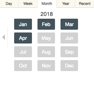
  • Pick days, months, years, or even decades
  • Supports virtually any language
  • No moment.js needed

tl;dr

  • Install by executing npm install react-date-picker or yarn add react-date-picker.
  • Import by adding import DatePicker from 'react-date-picker'.
  • Use by adding <DatePicker />. Use onChange prop for getting new values.

Demo

A minimal demo page can be found in sample directory.

Online demo is also available!

Consider native alternative

If you don't need to support legacy browsers and don't need the advanced features this package provides, consider using native date input instead. It's more accessible, adds no extra weight to your bundle, and works better on mobile devices.

<input aria-label="Date" type="date" />

Looking for a time picker or a datetime picker?

React-Date-Picker will play nicely with React-Time-Picker and React-DateTime-Picker. Check them out!

Getting started

Compatibility

Your project needs to use React 16.3 or later. If you use an older version of React, please refer to the table below to find a suitable React-Date-Picker version.

React version Newest compatible React-Date-Picker version
≥16.3 latest
≥16.0 7.x

React-Calendar, on which React-Date-Picker relies heavily, uses modern web technologies. That's why it's so fast, lightweight and easy to style. This, however, comes at a cost of supporting only modern browsers.

Legacy browsers

If you need to support legacy browsers like Internet Explorer 10, you will need to use Intl.js or another Intl polyfill along with React-Date-Picker.

Installation

Add React-Date-Picker to your project by executing npm install react-date-picker or yarn add react-date-picker.

Usage

Here's an example of basic usage:

import { useState } from 'react';
import DatePicker from 'react-date-picker';

type ValuePiece = Date | null;

type Value = ValuePiece | [ValuePiece, ValuePiece];

function MyApp() {
  const [value, onChange] = useState<Value>(new Date());

  return (
    <div>
      <DatePicker onChange={onChange} value={value} />
    </div>
  );
}

Custom styling

If you want to use default React-Date-Picker and React-Calendar styling to build upon it, you can import them by using:

import 'react-date-picker/dist/DatePicker.css';
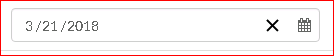
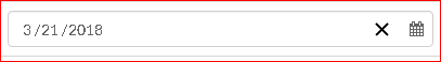
import 'react-calendar/dist/Calendar.css';

User guide

DatePicker

Displays an input field complete with custom inputs, native input, and a calendar.

Props

Prop name Description Default value Example values
autoFocus Automatically focuses the input on mount. n/a true
calendarAriaLabel aria-label for the calendar button. n/a "Toggle calendar"
calendarClassName Class name(s) that will be added along with "react-calendar" to the main React-Calendar <div> element. n/a
  • String: "class1 class2"
  • Array of strings: ["class1", "class2 class3"]
calendarIcon Content of the calendar button. Setting the value explicitly to null will hide the icon. (default icon)
  • String: "Calendar"
  • React element: <CalendarIcon />
  • React function: CalendarIcon
className Class name(s) that will be added along with "react-date-picker" to the main React-Date-Picker <div> element. n/a
  • String: "class1 class2"
  • Array of strings: ["class1", "class2 class3"]
clearAriaLabel aria-label for the clear button. n/a "Clear value"
clearIcon Content of the clear button. Setting the value explicitly to null will hide the icon. (default icon)
  • String: "Clear"
  • React element: <ClearIcon />
  • React function: ClearIcon
closeCalendar Whether to close the calendar on value selection. Note: It's recommended to use shouldCloseCalendar function instead. true false
data-testid data-testid attribute for the main React-Date-Picker <div> element. n/a "date-picker"
dayAriaLabel aria-label for the day input. n/a "Day"
dayPlaceholder placeholder for the day input. "--" "dd"
disableCalendar When set to true, will remove the calendar and the button toggling its visibility. false true
disabled Whether the date picker should be disabled. false true
format Input format based on Unicode Technical Standard #35. Supported values are: y, M, MM, MMM, MMMM, d, dd. Note: When using SSR, setting this prop may help resolving hydration errors caused by locale mismatch between server and client. n/a "y-MM-dd"
id id attribute for the main React-Date-Picker <div> element. n/a "date-picker"
isOpen Whether the calendar should be opened. false true
locale Locale that should be used by the date picker and the calendar. Can be any IETF language tag. Note: When using SSR, setting this prop may help resolving hydration errors caused by locale mismatch between server and client. Server locale/User's browser settings "hu-HU"
maxDate Maximum date that the user can select. Periods partially overlapped by maxDate will also be selectable, although React-Date-Picker will ensure that no later date is selected. n/a Date: new Date()
maxDetail The most detailed calendar view that the user shall see. View defined here also becomes the one on which clicking an item in the calendar will select a date and pass it to onChange. Can be "month", "year", "decade" or "century". "month" "year"
minDate Minimum date that the user can select. Periods partially overlapped by minDate will also be selectable, although React-Date-Picker will ensure that no earlier date is selected. n/a Date: new Date()
monthAriaLabel aria-label for the month input. n/a "Month"
monthPlaceholder placeholder for the month input. "--" "mm"
name Input name. "date" "myCustomName"
nativeInputAriaLabel aria-label for the native date input. n/a "Date"
onCalendarClose Function called when the calendar closes. n/a () => alert('Calendar closed')
onCalendarOpen Function called when the calendar opens. n/a () => alert('Calendar opened')
onChange Function called when the user picks a valid date. If any of the fields were excluded using custom format, new Date(y, 0, 1, 0, 0, 0), where y is the current year, is going to serve as a "base". n/a (value) => alert('New date is: ', value)
onFocus Function called when the user focuses an input. n/a (event) => alert('Focused input: ', event.target.name)
onInvalidChange Function called when the user picks an invalid date. n/a () => alert('Invalid date')
openCalendarOnFocus Whether to open the calendar on input focus. Note: It's recommended to use shouldOpenCalendar function instead. true false
portalContainer Element to render the calendar in using portal. n/a document.getElementById('my-div')
required Whether date input should be required. false true
returnValue Which dates shall be passed by the calendar to the onChange function and onClick{Period} functions. Can be "start", "end" or "range". The latter will cause an array with start and end values to be passed. "start" "range"
shouldCloseCalendar Function called before the calendar closes. reason can be "buttonClick", "escape", "outsideAction", or "select". If it returns false, the calendar will not close. n/a ({ reason }) => reason !== 'outsideAction'
shouldOpenCalendar Function called before the calendar opens. reason can be "buttonClick" or "focus". If it returns false, the calendar will not open. n/a ({ reason }) => reason !== 'focus'
showLeadingZeros Whether leading zeros should be rendered in date inputs. false true
value Input value. Note that if you pass an array of values, only first value will be fully utilized. n/a
  • Date: new Date(2017, 0, 1)
  • String: "2017-01-01"
  • An array of dates: [new Date(2017, 0, 1), new Date(2017, 7, 1)]
  • An array of strings: ["2017-01-01", "2017-08-01"]
yearAriaLabel aria-label for the year input. n/a "Year"
yearPlaceholder aria-label for the year input. "----" "yyyy"

Calendar

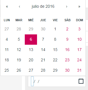
DatePicker component passes all props to React-Calendar, with the exception of className (you can use calendarClassName for that instead). There are tons of customizations you can do! For more information, see Calendar component props.

License

The MIT License.

Author

Wojciech Maj Wojciech Maj

Thank you

Sponsors

Thank you to all our sponsors! Become a sponsor and get your image on our README on GitHub.

Backers

Thank you to all our backers! Become a backer and get your image on our README on GitHub.

Top Contributors

Thank you to all our contributors that helped on this project!

Top Contributors

react-date-picker's People

Contributors

aghoneim92 avatar cvuorinen avatar dependabot[bot] avatar ericdemo07 avatar ftpv87 avatar gwenaelp avatar iamdevlinph avatar isbahahmed avatar ismaeliberal avatar joebourne avatar juancaicedo avatar kapke avatar linusmarco avatar marcofugaro avatar mathieumg avatar mpham-r7 avatar sdob avatar third774 avatar thornyweb avatar wojtekmaj avatar zertz avatar

Stargazers

 avatar  avatar  avatar  avatar  avatar  avatar  avatar  avatar  avatar  avatar  avatar  avatar  avatar  avatar  avatar  avatar  avatar  avatar  avatar  avatar  avatar  avatar  avatar  avatar  avatar  avatar  avatar  avatar  avatar  avatar  avatar  avatar  avatar  avatar  avatar  avatar  avatar  avatar  avatar  avatar  avatar  avatar  avatar  avatar  avatar  avatar  avatar  avatar  avatar  avatar  avatar  avatar  avatar  avatar  avatar  avatar  avatar  avatar  avatar  avatar  avatar  avatar  avatar  avatar  avatar  avatar  avatar  avatar  avatar  avatar  avatar  avatar  avatar  avatar  avatar  avatar  avatar  avatar  avatar  avatar  avatar  avatar  avatar  avatar  avatar  avatar  avatar  avatar  avatar  avatar  avatar  avatar  avatar  avatar  avatar  avatar  avatar  avatar  avatar  avatar

Watchers

 avatar  avatar  avatar  avatar  avatar  avatar  avatar  avatar  avatar  avatar  avatar  avatar  avatar

react-date-picker's Issues

Allow for different date presentation formats - DD-MM-YYYY

It would be really helpful to present date in different formats. At least for the very common ones like MM-DD-YYYY or DD/MM/YYYY. Having the date come first instead of month and using a dash instead of slash.

<DatePicker
	format="dd-mm-yyyy"
	...
/>

Highlight specific day.

I want to implement a holiday list and change the style for the same day in calendar.
Any way to highlight a specific day like Holiday or Holiday list?

Using .less from Yarn install

Hi there! I'm trying to integrate this into a project using .less instead of .css, I've added it using 'yarn add react-date-picker' but I can't figure out how to rebuild it when I got into node_modules/react-date-picker and change the src/entry.js to the .less instead of .css.

I've gotten it to work by editing the dist/entr.js file but i know that isn't the right way to do it.

Any insight would be greatly appreciated.

Support for range

Here's a skeleton of what I currently have: https://codesandbox.io/s/nn6zj9nzp0

I think react-calendar already supports the range picker, would be great if we separate the props for calendar from the react-date-picker props.

maybe something like..

<DatePicker 
  ...
  value={startDate}
  calendarProps={{
    returnValue: "range",
    value: [startDate, endDate]
  }}
/>

<DatePicker 
  ...
  value={endDate}
  calendarProps={{
    returnValue: "range",
    value: [startDate, endDate]
  }}
/>

Accept value as string

I keep getting these three errors:

proxyConsole.js:56 Warning: Failed prop type: Invalid prop `value` supplied to `MonthView`.
    in MonthView
...
./node_modules/react-date-picker/node_modules/react/cjs/react.development.js.Component.setState	@	react.development.js:237
DatePicker._this.closeCalendar	@	DatePicker.js:70
DatePicker._this.onClick	@	DatePicker.js:65
proxyConsole.js:56 Warning: Failed prop type: Invalid prop `value` supplied to `Days`.
    in Days
...
./node_modules/react-date-picker/node_modules/react/cjs/react.development.js.Component.setState @ react.development.js:237
DatePicker._this.closeCalendar @ DatePicker.js:70
DatePicker._this.onClick @ DatePicker.js:65
dates.js:34 Uncaught TypeError: date.getMonth is not a function
  at getMonthIndex (dates.js:34)
    at getBeginOfDay (dates.js:258)
    at getDayRange (dates.js:276)
    at getRange (dates.js:452)
    at getTileClasses (utils.js:93)
    at Days.render (Days.js:72)
    ...

Webpack compilation error: Unexpected token . on ".react-calendar"

Hey guys, I recently upgraded to React 16, in a project based off of an earlier version of React Starter Kit. this lead me to upgrade react-date-picker which I am now getting the following error:

C:\workspace\cand-portal-front\node_modules\react-calendar\dist\Calendar.css:1
(function (exports, require, module, __filename, __dirname) { .react-calendar {
                                                              ^

SyntaxError: Unexpected token .
    at createScript (vm.js:80:10)
    at Object.runInThisContext (vm.js:139:10)
    at Module._compile (module.js:599:28)
    at Object.Module._extensions..js (module.js:646:10)
    at Module.load (module.js:554:32)
    at tryModuleLoad (module.js:497:12)
    at Function.Module._load (module.js:489:3)
    at Module.require (module.js:579:17)
    at require (internal/module.js:11:18)
    at Object.<anonymous> (C:\workspace\cand-portal-front\node_modules\react-date-picker\dist\entry.js:7:1)
    at Module._compile (module.js:635:30)
    at Object.Module._extensions..js (module.js:646:10)
    at Module.load (module.js:554:32)
    at tryModuleLoad (module.js:497:12)
    at Function.Module._load (module.js:489:3)
    at Module.require (module.js:579:17)

Looks like it could be similar to whats expressed here: reactGo/reactGo#850 (comment)

my full webpack config is:


import path from 'path';
import webpack from 'webpack';
import extend from 'extend';
import AssetsPlugin from 'assets-webpack-plugin';

const isDebug = !process.argv.includes('--release');
const isVerbose = process.argv.includes('--verbose');

//
// Common configuration chunk to be used for both
// client-side (client.js) and server-side (server.js) bundles
// -----------------------------------------------------------------------------

const config = {
  context: path.resolve(__dirname, '../src'),

  output: {
    path: path.resolve(__dirname, '../build/public/assets'),
    publicPath: '/assets/',
    sourcePrefix: '  ',
  },

  module: {
    loaders: [
      {
        test: /\.jsx?$/,
        loader: 'babel-loader',
        include: [
          path.resolve(__dirname, '../src'),
        ],
        query: {
          // https://github.com/babel/babel-loader#options
          cacheDirectory: isDebug,

          // https://babeljs.io/docs/usage/options/
          babelrc: false,
          presets: [
            // Latest stable ECMAScript features
            // https://github.com/babel/babel/tree/master/packages/babel-preset-latest
            'latest',
            // Experimental ECMAScript proposals
            // https://github.com/babel/babel/tree/master/packages/babel-preset-stage-0
            'stage-0',
            // JSX, Flow
            // https://github.com/babel/babel/tree/master/packages/babel-preset-react
            'react',
            ...isDebug ? [] : [
              // Optimize React code for the production build
              // https://github.com/thejameskyle/babel-react-optimize
              'react-optimize',
            ],
          ],
          plugins: [
            // Externalise references to helpers and builtins,
            // automatically polyfilling your code without polluting globals.
            // https://github.com/babel/babel/tree/master/packages/babel-plugin-transform-runtime
            'transform-runtime',
            ...!isDebug ? [] : [
              // Adds component stack to warning messages
              // https://github.com/babel/babel/tree/master/packages/babel-plugin-transform-react-jsx-source
              'transform-react-jsx-source',
              // Adds __self attribute to JSX which React will use for some warnings
              // https://github.com/babel/babel/tree/master/packages/babel-plugin-transform-react-jsx-self
              'transform-react-jsx-self',
            ],
          ],
        },
      },
      {
        test: /\.css/,
        loaders: [
          'isomorphic-style-loader',
          `css-loader?${JSON.stringify({
            // CSS Loader https://github.com/webpack/css-loader
            importLoaders: 1,
            sourceMap: isDebug,
            // CSS Modules https://github.com/css-modules/css-modules
            modules: true,
            localIdentName: isDebug ? '[name]-[local]-[hash:base64:5]' : '[hash:base64:5]',
            // CSS Nano http://cssnano.co/options/
            minimize: !isDebug,
          })}`,
          'postcss-loader?pack=default',
        ],
      },
      {
        test: /\.scss$/,
        loaders: [
          'isomorphic-style-loader',
          `css-loader?${JSON.stringify({ sourceMap: isDebug, minimize: !isDebug })}`,
          'postcss-loader?pack=sass',
          'sass-loader',
        ],
      },
      {
        test: /\.json$/,
        loader: 'json-loader',
      },
      {
        test: /\.txt$/,
        loader: 'raw-loader',
      },
      {
        test: /\.graphqls$/,
        loader: 'raw-loader',
      },
      {
        test: /\.(png|jpg|jpeg|gif|svg|woff|woff2)$/,
        loader: 'url-loader',
        query: {
          name: isDebug ? '[path][name].[ext]?[hash]' : '[hash].[ext]',
          limit: 10000,
        },
      },
      {
        test: /\.(eot|ttf|wav|mp3)$/,
        loader: 'file-loader',
        query: {
          name: isDebug ? '[path][name].[ext]?[hash]' : '[hash].[ext]',
        },
      },
    ],
  },

  resolve: {
    root: path.resolve(__dirname, '../src'),
    modulesDirectories: ['node_modules'],
    extensions: ['', '.webpack.js', '.web.js', '.js', '.jsx', '.json'],
  },

  cache: isDebug,
  debug: isDebug,

  stats: {
    colors: true,
    reasons: isDebug,
    hash: isVerbose,
    version: isVerbose,
    timings: true,
    chunks: isVerbose,
    chunkModules: isVerbose,
    cached: isVerbose,
    cachedAssets: isVerbose,
  },

  // The list of plugins for PostCSS
  // https://github.com/postcss/postcss
  postcss(bundler) {
    return {
      default: [
        // Transfer @import rule by inlining content, e.g. @import 'normalize.css'
        // https://github.com/jonathantneal/postcss-partial-import
        require('postcss-partial-import')({ addDependencyTo: bundler }),
        // Allow you to fix url() according to postcss to and/or from options
        // https://github.com/postcss/postcss-url
        require('postcss-url')(),
        // W3C variables, e.g. :root { --color: red; } div { background: var(--color); }
        // https://github.com/postcss/postcss-custom-properties
        require('postcss-custom-properties')(),
        // W3C CSS Custom Media Queries, e.g. @custom-media --small-viewport (max-width: 30em);
        // https://github.com/postcss/postcss-custom-media
        require('postcss-custom-media')(),
        // CSS4 Media Queries, e.g. @media screen and (width >= 500px) and (width <= 1200px) { }
        // https://github.com/postcss/postcss-media-minmax
        require('postcss-media-minmax')(),
        // W3C CSS Custom Selectors, e.g. @custom-selector :--heading h1, h2, h3, h4, h5, h6;
        // https://github.com/postcss/postcss-custom-selectors
        require('postcss-custom-selectors')(),
        // W3C calc() function, e.g. div { height: calc(100px - 2em); }
        // https://github.com/postcss/postcss-calc
        require('postcss-calc')(),
        // Allows you to nest one style rule inside another
        // https://github.com/jonathantneal/postcss-nesting
        require('postcss-nesting')(),
        // Unwraps nested rules like how Sass does it
        // https://github.com/postcss/postcss-nested
        require('postcss-nested')(),
        // W3C color() function, e.g. div { background: color(red alpha(90%)); }
        // https://github.com/postcss/postcss-color-function
        require('postcss-color-function')(),
        // Convert CSS shorthand filters to SVG equivalent, e.g. .blur { filter: blur(4px); }
        // https://github.com/iamvdo/pleeease-filters
        require('pleeease-filters')(),
        // Generate pixel fallback for "rem" units, e.g. div { margin: 2.5rem 2px 3em 100%; }
        // https://github.com/robwierzbowski/node-pixrem
        require('pixrem')(),
        // W3C CSS Level4 :matches() pseudo class, e.g. p:matches(:first-child, .special) { }
        // https://github.com/postcss/postcss-selector-matches
        require('postcss-selector-matches')(),
        // Transforms :not() W3C CSS Level 4 pseudo class to :not() CSS Level 3 selectors
        // https://github.com/postcss/postcss-selector-not
        require('postcss-selector-not')(),
        // Postcss flexbox bug fixer
        // https://github.com/luisrudge/postcss-flexbugs-fixes
        require('postcss-flexbugs-fixes')(),
        // Add vendor prefixes to CSS rules using values from caniuse.com
        // https://github.com/postcss/autoprefixer
        require('autoprefixer')(),
      ],
      sass: [
        require('autoprefixer')(),
      ],
    };
  },
};

//
// Configuration for the client-side bundle (client.js)
// -----------------------------------------------------------------------------

const clientConfig = extend(true, {}, config, {
  entry: './client.js',

  output: {
    filename: isDebug ? '[name].js?[chunkhash]' : '[name].[chunkhash].js',
    chunkFilename: isDebug ? '[name].[id].js?[chunkhash]' : '[name].[id].[chunkhash].js',
  },

  target: 'web',

  plugins: [

    // Define free variables
    // https://webpack.github.io/docs/list-of-plugins.html#defineplugin
    new webpack.DefinePlugin({
      'process.env.NODE_ENV': isDebug ? '"development"' : '"production"',
      'process.env.BROWSER': true,
      __DEV__: isDebug,
    }),

    // Emit a file with assets paths
    // https://github.com/sporto/assets-webpack-plugin#options
    new AssetsPlugin({
      path: path.resolve(__dirname, '../build'),
      filename: 'assets.js',
      processOutput: x => `module.exports = ${JSON.stringify(x)};`,
    }),

    // Assign the module and chunk ids by occurrence count
    // Consistent ordering of modules required if using any hashing ([hash] or [chunkhash])
    // https://webpack.github.io/docs/list-of-plugins.html#occurrenceorderplugin
    new webpack.optimize.OccurrenceOrderPlugin(true),

    ...isDebug ? [] : [
      // Search for equal or similar files and deduplicate them in the output
      // https://webpack.github.io/docs/list-of-plugins.html#dedupeplugin
      new webpack.optimize.DedupePlugin(),

      // Minimize all JavaScript output of chunks
      // https://github.com/mishoo/UglifyJS2#compressor-options
      new webpack.optimize.UglifyJsPlugin({
        compress: {
          screw_ie8: true,
          warnings: isVerbose,
          unused: true
        },
      }),
    ],
  ],

  // Choose a developer tool to enhance debugging
  // http://webpack.github.io/docs/configuration.html#devtool
  devtool: isDebug ? 'source-map' : false,
});

//
// Configuration for the server-side bundle (server.js)
// -----------------------------------------------------------------------------

const serverConfig = extend(true, {}, config, {
  entry: './server.js',

  output: {
    filename: '../../server.js',
    libraryTarget: 'commonjs2',
  },

  target: 'node',

  externals: [
    /^\.\/assets$/,
    (context, request, callback) => {
      const isExternal =
        request.match(/^[@a-z][a-z/.\-0-9]*$/i) &&
        !request.match(/\.(css|less|scss|sss)$/i);
      callback(null, Boolean(isExternal));
    },
  ],

  plugins: [
    // Define free variables
    // https://webpack.github.io/docs/list-of-plugins.html#defineplugin
    new webpack.DefinePlugin({
      'process.env.NODE_ENV': isDebug ? '"development"' : '"production"',
      'process.env.BROWSER': false,
      __DEV__: isDebug,
    }),

    // Adds a banner to the top of each generated chunk
    // https://webpack.github.io/docs/list-of-plugins.html#bannerplugin
    new webpack.BannerPlugin('require("source-map-support").install();',
      { raw: true, entryOnly: false }),

    // Do not create separate chunks of the server bundle
    // https://webpack.github.io/docs/list-of-plugins.html#limitchunkcountplugin
    new webpack.optimize.LimitChunkCountPlugin({ maxChunks: 1 }),
  ],

  node: {
    console: false,
    global: false,
    process: false,
    Buffer: false,
    __filename: false,
    __dirname: false,
  },

  devtool: 'source-map',
});

export default [clientConfig, serverConfig];

P.S. Not sure if I should be filing this issue with you guys or react-calendar
Thanks!

Option to disable date picker control

Can you please add the option to disable the control by exposing a prop
something like disabled = {true}
so that is becomes easy to handle the control based on the use cases

Currently i implemented a solution by setting pointer-events: none; but user can still tab through it and change using the keyboards

Calendar closes on navigation click in Safari and Firefox on macOS

Browsers used: Safari 11.0.1 & Firefox 56.0.2

Steps to reproduce:

  • Click one of the three inputs - day, month or year (NB this is not a problem when you click the calendar icon)
  • Click any of the navigation items (next/previous chevrons or the navigation label)
  • The calendar closes

I've attached a GIF of the behaviour.

date-picker

Prop isOpen does not control opened state of calendar

Based on the description and naming of the isOpen prop it is expected that if the isOpen prop is passed to the component the isOpen prop will control the open/closed state of the calendar. However, that is not the case and the component will open/close regardless of isOpen.

From my testing isOpen appears to work like a trigger and will open/close the calendar if isOpen changes and the calendar isn't already in the implied state of the prop.

value of date doesn't change when using minDate and maxDate properties

Hi,
I have encountered a strange issue today. Consider following two screenshots. I have given condition that second one's minDate = value of first one and when i change date in first one, second one should get defaulted to same date as first one.
image
image
Now if I change date of first one to 3/22, second one's date also get changed to 3/22. PFB screenshots.
image
image
However, if I change date to 3/20 in first one second one's date doesn't get updated. PFB screenshots.
image
image
But if i click on second one (just click on calendar icon), date gets changed to 3/20.
image
What I have observed is date is getting changed at backend but somehow its not getting reflected in datepicker.

Reset Date

Hi Wotejmak,

If I delete the date of dateinput and leave the date empty, the calendar doesn´t change the date internally. I think this can be confusing, I attach image. In my opinion, value should be null, for this case and dispatch onChange.

image

Once the component has a date, there is no way for the user to reset the date.
A reset icon would be a great addition.

Thanks!

locale problem

Hi,
when I set locale to "cs-CZ" input display only day number and nothing else.

When I use "de-DE" which has the same display format "dd.MM.yyyy" it displays value in input correctly.

Any idea?

Ability to pick time?

Hi, Thanks for taking over this project. I'm a user of the former library, and was able to pick time along with date. In this version i'm unable to do so, apologize in advance if this was documented somewhere but can you tell me how I can do this?

Unable to get the /'s in the date display to line up

image
Reproduced in "react-date-picker": "^6.2.0", and 6.2.2

Is it currently possible to target the "/" between the dd/mm/yyyy with css? I am not sure what could be causing this, I had tried toggling all styles around the date picker. The closets thing I had was disabling display: flex on react-date-picker__button__input which works at first but as soon as you click on it, the spacing all collapses and only shows one character each (See below gif).

2017-11-06_18-02-08

I could see having something to target the / helpful to anyone who wants to change the style of how the /'s look. Could have multi colored lines, or change the colors based on some other input (making them red to show users they need to select something)
Any help would be appreciated, thanks!

Restricting the number of digits in any date format

For example If the date format is mm/dd/yyyy , is there a way to restrict the user to enter not more than two digits in mm , dd and not more than 4 digits in yyyy . As per the current version the user is allowed to enter any number of digits irrespective of date format and the user had to tab or click on next segment of the date.
It would be really helpful if you can address this issue.

Thanks
Sunaina

Allow prop to determine if date is required

Currently the inputs for the date-picker are hard-coded as being required. Would you be interested in allowing a prop to determine if the date is required or not?

Only reason I am not just making a PR - I found when not required, the inputs are filled out automatically once you enter a single value (day, month, or year) and also its basically impossible to clear the date.

I'd be happy to dig into it more.

Compatibility with React 17

In React 17, lifecycle methods componentWillMount, componentWillUpdate and componentWillReceiveProps will be deprecated. These are to be replaced with getDerivedStateFromProps static method.

Typings and prop types inheritance

I've seen that there is a lot of typings (and prop types) which are clones of calendar ones. What about using:

  • interface inheritance in terms of typings
  • any way of extending object (spread, Object.assign) in terms of prop types

I think it could make things simpler to maintain. Especially that when the calendar is rendered, it has passed all props from date-picker.

The build/ folder isn't published! Version 6.2.1 is broken!

Hey, somehow on your latest publish the build folder to which points the library when you require it isn't there --> "main": "build/entry.js",.

Maybe is it because build is in the .npmignore, or because the prepublishOnly hook didn't work?

Please publish a patch as soon as possible, for the future maybe include the build in the repo, I think it's safer and many other libraries do it. Or use the files field in package.json to publish only the build folder.

Placeholder text

It would be nice if we could have some placeholder text in the inputs if we don't pass in a default date. Something like:

MM / DD / YYYY

That way we could require the user to pick a date, but show them something in the input by default.

Plugin should accept strings and an empty string when no date is provided

First of all, why does the plugin only accept Date objects? I think it would be easier to work with if it accepted date-like strings as well. Check - https://github.com/Hacker0x01/react-datepicker

This comes in handy when there was no date provided. It should default to an empty box with the placeholder and no bugs. Currently its throwing an error -

"Warning: Failed prop type: Invalid prop value of type String supplied to DateInput, expected instance of Date. in DateInput

Input name

Should have a prop to pass a name to the input field for post/get.

How to define a period range as 'week', 'month', 'year' ?

Hi, thanks for the great lib! I’d like to ask if it is possible to be able to select a predefined period range as ’week’, ‘month’, ‘year’? Some example pics might help what I’m trying to say. I couldn’t find a way to implement such thing with your calendar, would love to hear from you if it is possible? I can see a way of implementing it for month and year through determining the maxDetail props with another button but I can't see a way for selecting week? Thanks for any help.
screen shot 2018-04-06 at 17 16 38
screen shot 2018-04-06 at 17 16 48
screen shot 2018-04-06 at 17 16 57

🏝 Holiday notice

Hey community!
I'll be on holidays from 5.02.2018 to 18.02.2018. During this time I may respond slowly or not at all, depending on my connectivity. Please allow more time for your questions to be answered!

Thanks,
@wojtekmaj

Add ability to use a native datepicker

On all mobile devices (and some browsers), there are native datepickers.

It would be great react-date-picker could be told to just use the native date picker through a prop (useNative={true}).

Let the developer decided when to use native datepicker rather than rect-date-picker trying to decide.

An alternative / extra implementation could be to have a nativeOnMobile={true} where react-date-picker would change to native implemntation for all mobiles, however this is more work in detecting if you are on a mobile device or not.

The currently implementation is to create a wrapper component around react-date-picker that uses either react-date-picker or <input type="date">

March and October get messed up in Safari

2007 ok

2006 broken

Happens only on Safari so far that I've seen. March duplicates itself and replaces April once you go back some years - October does the same to November. Looking into it myself, though if you have any ideas I'd be happy to hear them. Will make a PR if I figure it out.

react-date-picker falls below inputs in bootstrap forms on small screens

Hello,

Nice component, it works very well. However at smaller breakpoints the component itself seems to drop below other inputs? Possibly a z-index issue? See attached.

This is a fairly vanilla Bootstrap 3 form layout.

Not sure where to start to debug it. Any suggestions?

react 16.2.0
react-date-picker 6.5.2

Thanks!

John

date-picker

Calendar closes on drilldown from century to decade, decade to year and year to month

When you drilldown from any view except top level (click a month name to get to month view / click a year to get to year view / click a decade to get to decade view), the calendar closes.

The blur method changed in PR #19 and this may be a side effect.

I am trying to fix it but wonder if you might have any advice. It seems that the event.target of the click registers as being outside of the date-picker when clicking on a month, year or decade to drill down.

Therefore !this.wrapper.contains(event.target) (in the onClick function of DatePicker.jsx) is evaluating to true and this.closeCalendar() is being called.

Could it be something to do with the click handling in the wojtekmaj/react-calendar library that doesn't work with the new blur method?

Thanks for your help.

Error: MonthInput.render() doesn't return something proper

Uncaught Error: MonthInput.render(): A valid React element (or null) must be returned. You may have returned undefined, an array or some other invalid object. at invariant (invariant.js:42) at ReactCompositeComponentWrapper._renderValidatedComponent (ReactCompositeComponent.js:828) at ReactCompositeComponentWrapper.performInitialMount (ReactCompositeComponent.js:361) at ReactCompositeComponentWrapper.mountComponent (ReactCompositeComponent.js:257) at Object.mountComponent (ReactReconciler.js:47) at ReactDOMComponent.mountChildren (ReactMultiChild.js:240) at ReactDOMComponent._createInitialChildren (ReactDOMComponent.js:699) at ReactDOMComponent.mountComponent (ReactDOMComponent.js:524) at Object.mountComponent (ReactReconciler.js:47) at ReactCompositeComponentWrapper.performInitialMount (ReactCompositeComponent.js:370) at ReactCompositeComponentWrapper.mountComponent (ReactCompositeComponent.js:257) at Object.mountComponent (ReactReconciler.js:47) at ReactDOMComponent.mountChildren (ReactMultiChild.js:240) at ReactDOMComponent._createInitialChildren (ReactDOMComponent.js:699) at ReactDOMComponent.mountComponent (ReactDOMComponent.js:524) at Object.mountComponent (ReactReconciler.js:47)

I use it the exact same basic way it was recommended in here. Any idea what might be causing this?

Remove dependence on own <form> element

I have to imagine a lot of use cases involve embedding this input inside another form. Nesting forms is not supported by the spec. Can we, perhaps optionally, not have this component inject its own form element so we can embed it inside other forms with other fields.

Support Custom Input

Hi,

Was wondering if there is appetite for a "customInput" property the same as in another project react-datepicker

This would allow for custom input boxes... for example integration with rmwc input boxes, etc.

If you think this is good, I will develop a PR for you

Thanks,
~ B

Add TypeScript type definitions

Would be great to have TypeScript definitions included with the module. I might try to work on a PR for this, but figured I should open the issue in case someone wants to jump on it before I get around to it.

Module not found

Getting [ Module not found: Error: Can't resolve 'react-date-picker' in '/path/to/*.jsx' ] error.

Here my package.json

"dependencies": {
    ....
    "react": "^16.0.0",
    "react-dom": "^16.0.0",
    "react-date-picker": "^6.2.1",
    "webpack": "^2.0.0",
    ....
}

here my component..

import "./style.less";
import moment from 'moment';
import PropTypes from 'prop-types';
import classnames from "classnames";
import React, {Component} from 'react';
import ReactDatePicker from 'react-date-picker'

class DatePicker extends Component {
    constructor(props) {
        super(props);

        this.handleDateChange = this.handleDateChange.bind(this);

        this.state = {
            startDate: moment()
        }
    }

render() {
  let {label, value, help} = this.props;

  if(!value) value = moment()
  else value = moment(JSON.parse(JSON.parse(value).moment));

 return (
            <div className="input-field rfe-datepicker">
                <div className="row">
                    <div className="col s3"><p className="label">{label}</p></div>
                    <div className="col s4">
                        <div className="qx-input">
                            <ReactDatePicker
                                selected={value}
                                onChange={() => {}}
                            />
                        </div>
                        <p className={classnames("help",{hide:!help})}>{help}</p>
                    </div>
                </div>
            </div>
        );
    }
}

and my webpack config

var path = require("path");
var webpack = require("webpack");
var src = path.join(__dirname, "engine");
var dest = path.join(__dirname, "assets/builder");

module.exports = {
  devtool: "cheap-module-source-map",

  entry: [
    src + "/index.jsx"
  ],

  output: {
    path: dest,
    filename: "bundle.js",
    publicPath: "/assets/builder/"
  },

  resolve: {
    extensions: ["*", ".json", ".js", ".jsx", ".css"],
    modules: ["node_modules", "bower_components", src]
  },

  module: {
    loaders: [
      {test: /\.jsx?$/, loaders: ["babel-loader"], include: src},
      {test: /\.js?$/, loaders: ["babel-loader"], include: src},
      {test: /\.less$/, loader: "style-loader!css-loader!less-loader"},
      {test: /\.css$/, loader: "style-loader!css-loader"},
      {test: /\.jpe?g$|\.gif$|\.png$/, loader: "url-loader"},
      {test: /\.woff(2)?(\?v=[0-9]\.[0-9]\.[0-9])?$/, loader: "url-loader?limit=10000&minetype=application/font-woff"},
      {test: /\.ttf?(\?v=[0-9]\.[0-9]\.[0-9])?$/, loader: "url-loader?limit=10000&minetype=font/ttf"},
      {test: /\.(eot|svg)(\?v=[0-9]\.[0-9]\.[0-9])?$/, loader: "file-loader"}
    ]
  }

};

Missing css in certain unique cases.

In my case, I use a static builder that has real issues with css imported by modules. I need to declare them in the head or import them as a file in my css folders.

To get this one working, my only option was copying the css from the src and pasting it in a new file in my scss file.

It might be handy to have a css link to link to in the head.

Add ability to return an ISO date string

It would be great to return the date as a string, or as a Date().

Date() has a bunch of weird issues around it that can randomly bite people in the butt.

As the datepicker only returns a date, if it could (optionally) be returned as in the ISO date format YYYY-MM-DD it would allow developers to figure out how they wanted to handle the date.

My specific use case, we just care about the date and location. That data is then sent to the server which uses a proper date implementation to give us the correct timezones, offsets, daylight savings etc.

Another use case, is someone could convert it to a moment object on the frontend.

Add onFocus & onBlur events

We are using react-date-picker (love it) in combination with react-redux-forms. In order to make it play right with validation we need to hook into the onClick (focus) and click outside the component (blur).

Passing onClick to the component does nothing - just gets ignored.

recreate:
<DatePicker onClick={() => console.log('hello')} />; // never fires.

Do you know a potential workaround for this?

Directly control the direction of the pop up?

I ran into a situation where the picker popped up above the input even though there was no room in that direction.

Looking at the code it looks like the direction the picker is computed based on overflow involving the body element.

In my case the the body element was at height 0. The picker was inside a modal that was positioned fixed and was the full height and width of the view port. The picker detected an overflow and decided to pop up on top of the input, even though it was already at the top position of my modal.

I worked around this by overriding the class:

.calander {
        top: 100%;
        bottom:auto;
    }
<DatePicker calendarClassName={"calendar"} ... />

I think it would be helpful if we could control the direction of the pop up in someway.

A direct override would be simplest. Something like PopupBehavior: 'auto | top | bottom'.

Alternatively, there could be a callback prop for computing the position.

Recommend Projects

  • React photo React

    A declarative, efficient, and flexible JavaScript library for building user interfaces.

  • Vue.js photo Vue.js

    🖖 Vue.js is a progressive, incrementally-adoptable JavaScript framework for building UI on the web.

  • Typescript photo Typescript

    TypeScript is a superset of JavaScript that compiles to clean JavaScript output.

  • TensorFlow photo TensorFlow

    An Open Source Machine Learning Framework for Everyone

  • Django photo Django

    The Web framework for perfectionists with deadlines.

  • D3 photo D3

    Bring data to life with SVG, Canvas and HTML. 📊📈🎉

Recommend Topics

  • javascript

    JavaScript (JS) is a lightweight interpreted programming language with first-class functions.

  • web

    Some thing interesting about web. New door for the world.

  • server

    A server is a program made to process requests and deliver data to clients.

  • Machine learning

    Machine learning is a way of modeling and interpreting data that allows a piece of software to respond intelligently.

  • Game

    Some thing interesting about game, make everyone happy.

Recommend Org

  • Facebook photo Facebook

    We are working to build community through open source technology. NB: members must have two-factor auth.

  • Microsoft photo Microsoft

    Open source projects and samples from Microsoft.

  • Google photo Google

    Google ❤️ Open Source for everyone.

  • D3 photo D3

    Data-Driven Documents codes.