ycs77 / headlessui-float Goto Github PK
View Code? Open in Web Editor NEWEasily use Headless UI with Floating UI to position floating elements.
Home Page: https://headlessui-float.vercel.app
License: MIT License
Easily use Headless UI with Floating UI to position floating elements.
Home Page: https://headlessui-float.vercel.app
License: MIT License
![dependabot[bot] avatar](https://avatars.githubusercontent.com/in/29110?v=4 "dependabot[bot]")


Hello. First of all - great package!
Could you plz answer, is it possible to set popper width same as reference?
Use Version
Use version when bugs appear:
Describe the bug
The origin class is based on the initial placement and not the detected one (using flip or autoPlacement)
To Reproduce
left at the leftmost side of the screen using tailwindcssOriginClass and Tailwind animationtransform-right classScreenshots

Expected behavior
The popper's transform origin should be changed according to the one resolved
Use Version
Describe the question
Do you have any example on how to make the transition from a popover come from the bottom towards top when the placement has been changed ?
Screenshots
Screenshot is from the demo page, adding a margin top to the popover button until it is stuck at the bottom of the screen

I'm implementing tests to my Tooltip component, but when the test pass, breaks with this error...
how can I mock the ResizeObserver?

Use Version
Use version when bugs appear:
@floating-ui/core: v1.0.0@floating-ui/dom: v1.0.0Describe the bug
When unmount="false" prop is added to headless ui PopoverPanel, the position of the floating element doesn't update
To Reproduce
https://stackblitz.com/edit/github-vfx4en?file=src/components/ExamplePopover.vue
Hey there 👋
Use Version
Use version when bugs appear:
@floating-ui/core: v1.2.6@floating-ui/dom: v1.2.6Describe the bug
Transitions don't work when using composable mode.
I added the transition classes like in the docs, but in combination with <Float composable>. Everything works, but the PopoverPanel (in my case) doesn't transition. It appears without transition.
To Reproduce
Check out the popover demo here: https://stackblitz.com/edit/github-84nbbq?file=src/pages/popover.vue
Expected behavior
The PopoverPanel etc. uses transition when they are specified like in the docs even in composable mode.
Thank you for your work on this package :)
tailwindcssOriginClass not works when tailwindcss prefix is applied in config file.
Use Version
Use version when bugs appear:
Describe the bug
https://stackblitz.com/edit/github-vfx4en-nz2iba?file=src/components/ExamplePopover.vue
If you remove :as="HeroiconsOutlineMenuAlt2" and use the HeroiconsOutlineMenuAlt2 component inside PopoverButton everything works.
In our case we prefer rendering popover button as a custom button component. It would be nice to avoid rendering extra tag around the button.

Using vite 2.9.5, vue-tsc 0.34.10 and typescript 4.6.3
Floating supports virtual elements, which can be used for contextual menus, for example.
How do I achieve this with headlessui-float?
Use Version
Use version when question appear:
Describe the question
I tried to add this package to my project, it all seems to work fine besides the combobox. It only shows the shadows:

I got it fixed by modifieing the HTML in the browser (by adding display: contents; to one of the div's):


Any idea what i'm doing wrong and how to fix it ?
Kind regards,
Niels
Use Version
Use version when bugs appear:
@floating-ui/core: v1.2.6@floating-ui/dom: v1.2.7Describe the bug
Running tests with the file under test using this component causes:
  console.error
    Warning: An update to Float inside a test was not wrapped in act(...).

    When testing, code that causes React state updates should be wrapped into act(...):

    act(() => {
      /* fire events that update state */
    });
    /* assert on the output */

    This ensures that you're testing the behavior the user would see in the browser. Learn more at https://reactjs.org/link/wrap-tests-with-act
        at /home/klampe/dev/slashskills/node_modules/@headlessui-float/react/dist/headlessui-float.cjs:27:11232
        at div
        at OpenClosedProvider (/home/klampe/dev/slashskills/node_modules/@headlessui/react/dist/headlessui.dev.cjs:1011:31)
        at PopoverFn (/home/klampe/dev/slashskills/node_modules/@headlessui/react/dist/headlessui.dev.cjs:4828:54)
There is also an issue over at testing-library/testing-library-docs#1255
It seemed to only show up after the react 18 update, but I'm unsure. Maybe it's even expected, that we need to do that, as the docs don't have any test examples :)
Use Version
Use version when bugs appear:
Describe the bug
When selecting a Listbox option that is wrapped in Float, there seems to be an extra render cycle before the options window closes. This is especially visible in my case as I render a check icon in front of the selected option, which means that this icon can be quickly seen appearing before the options close, causing a visual flash.
To Reproduce
https://stackblitz.com/edit/react-ts-dbrsvf?file=App.tsx
Left Listbox uses Float, right one doesn't. Only the left one has the visible flash mentioned before. If it happens too fast, it can be recorded using the performance tab in chrome devtools.
Expected behavior
No visible flash / immediately closing the options on select.
Use Version
Describe the question
Thank you for this awesome library! It made integration super easy, I really appreciate it.
Is there a way to pin the arrow to the left? Right now the parent element is changing size and so the arrow is changing size, and I'd prefer to keep it pinned on the left. See the video below.
Thanks again!
Screenshots
OriginClassResolver not properly works in rtl direction.
Use Version
@headlessui-float/react: "^0.11.0",
Describe the bug
When using the following popover setup, the package is rendering React.Fragment elements, and attempting to pass styles to them leading to console warnings:
Warning: Invalid prop stylesupplied toReact.Fragment. React.Fragment can only have keyandchildren props.
<Popover>
  {({ open }) => (
    <Float
	 placement="bottom-end"
	 offset={15}
	 arrow={5}
	 transform={false}
	 floatingAs={Fragment}
	 enter="transition ease-out duration-100"
	 enterFrom="transform opacity-0 scale-95"
	 enterTo="transform opacity-100 scale-100"
	 leave="transition ease-in duration-75"
	 leaveFrom="transform opacity-100 scale-100"
	 leaveTo="transform opacity-0 scale-95"
	 tailwindcssOriginClass
     >
	  <Popover.Button as={PrimaryButton} className="uppercase font-bold" size={ButtonSize.M} icon={ArrowUpRightIcon}>
		 <span className="sr-only">{open ? 'Open' : 'Close'} create menu</span>
			 Get Started
		 </Popover.Button>

		 <Popover.Panel className="bg-blue rounded-3xl shadow-lg p-8 text-white">
			 <Float.Arrow as="div" className="absolute bg-blue w-5 h-5 rotate-45" />

			 <div className="relative">
			 	{...}
			 </div>
		 </Popover.Panel>
	 </Float>
	 )}
 </Popover>
Use Version
Use version when bugs appear:
@floating-ui/core: v1.0.0@floating-ui/dom: v1.0.0Describe the bug
TypeError: Cannot read properties of undefined (reading 'current')
use with Popover
<Float placement="bottom-start" flip shift>
To Reproduce
Use Version
Describe the question
I want my ListboxOptions take full width of the parent element, but I cant.
        <Float
            as="div"
            data-testid="float"
            class="w-full"
            placement="bottom"
            :offset="2"
            :shift="2"
            :flip="10"
            :z-index="10"
            tailwindcss-origin-class
        >
          <ListboxButton
              class="relative w-full bg-white">
          </ListboxButton>
          <ListboxOptions
              class="z-10 mt-1 w-full">
            <ListboxOption
                as="template"
                v-slot="{ active, selected }"
            >
              <li class="w-full">
              </li>
            </ListboxOption>
          </ListboxOptions>
        </Float>
It would be great if it was possible to use transition name instead of having to repeat all my transition styling each time I use Float.
Example of how I usually do it in Vue:
<Transition name="fade">

// Fade transition for Vue's transition and transition-group
.fade-enter-active,
.fade-leave-active {
  transition: opacity 0.2s ease;
}

.fade-enter-from,
.fade-leave-to {
  opacity: 0;
}
Use Version
Use version when question appear:
Describe the question
I'm trying to render a HeadlessUI Combobox inside a Popover. For this, I need to teleport the combobox options to the body, so that the dropdown options can overflow the popover, and the popover won't show scrollbars.
However, there's an issue - when clicking any of the combobox options, the popover is immediately closed. I believe it is because of the click outside handler, which now sees the options as being rendered outside of the popover. I saw a mention in HeadlessUI repo that using the Portal from @headlessui/vue instead of the regular Teleport component should help with this. Unfortunately, I don't see that it's possible to customize the portal component for Float. Would you consider supporting something like that? Or perhaps there's another solution to the issue?
Screenshots
If applicable, add screenshots to help explain your problem.
Use Version
Use version when bugs appear:
Describe the bug
Currently we have FloatProps.children = ReactElement[].
This means Float cannot have a single child, which is actually perfectly acceptable.
Is there any reason to restrict the children to be a ReactElement ? Can't they just be ReactNode ?
So I suggest to update the type to ReactElement | ReactElement[] or even ReactNode | ReactNode[] if it's possible.
Use Version
Use version when bugs appear:
Describe the bug
listbox in headlessui's modal does not transfer the focus to the list, nor can it be navigated and it is not possible to click with the mouse.
To Reproduce
Create modal with Dialog headlessui.
Create Listbox like example
<Listbox>
    <Float
        as="div"
        placement="bottom-start"
        portal
        offset={2}
        adaptiveWidth
    >
        <Listbox.Button className="w-full text-right">
            <div className="border-b pb-1.5 px-1 relative">
                {value ? (
                    <span className="block w-full truncate">{value}</span>
                ) : (
                    <span className="block w-full truncate text-gray-400">Select...</span>
                )}
                <span className="absolute inset-y-0 left-1 flex items-center pr-2 pointer-events-none">
                    <ChevronDownIcon className="w-4 h-4 text-gray-400" aria-hidden="true" />
                </span>
            </div>
        </Listbox.Button>

        <Listbox.Options className="w-full" as="div">
            <div className="h-96 bg-white rounded shadow-lg border">
                <Listbox.Option value={'1'} as="div">
                    <div className="py-2 px-2">
                        <span className="block w-full truncate">1</span>
                    </div>
                </Listbox.Option>
                <Listbox.Option value={'2'} as="div">
                    <div className="py-2 px-2">
                        <span className="block w-full truncate">1</span>
                    </div>
                </Listbox.Option>
            </div>
        </Listbox.Options>
    </Float>
</Listbox>
click on button. see yue not can navigate between options
Is your feature request related to a problem? Please describe.
I'm using a combobox that uses all space available.
Right now Float renders a blank div by default, meaning that its width will be width of its content. I want the width of the Float div to take all the space available.
So right now I have to create a dumb component and pass it to Float:
const FullWidthDiv: React.FC = ({children}) => <div className='w-full'>{children}</div>;
<Float as={FullWidthDiv} />
It feel like unnecessary work and accepting/passing className to the div would be more intuitive. Maybe disable (or trigger a warning) that if as is provided because the element itself may not accept className as a prop.
Use Version
Describe the question
I get an issue that only happens when I am using a inside a side panel (using ), is it possible that it can be polluted by the parent one ? Do you have nested examples working ?
Screenshots

Use Version
Question
I have a headless ui popover component in which I render multiple headless ui comboboxes. When I pass portal true for comboboxes and popover altogether, when select any option from combobox, the parent popover perceives this as outside click and closes itself. Any solution for this?
Screenshots


Hi, i am having problems with the menu component inside a table, as you can see in the screenshot the menu is cut by the end of the table, how can i make the menu appear over the borders of the table?
<template>
    <Menu as="div" class="relative inline-block text-left">
        <Float placement="bottom-end">
            <MenuButton
                class="inline-flex w-full justify-center rounded-md bg-black bg-opacity-30 px-4 py-2 text-sm font-medium text-white focus:outline-none focus-visible:ring-2 focus-visible:ring-white focus-visible:ring-opacity-75">
                Ver
                <ChevronDownIcon class="ml-2 -mr-1 h-5 w-5 text-violet-200 hover:text-violet-100" aria-hidden="true" />
            </MenuButton>
            <transition
                enter-active-class="transition duration-100 ease-out"
                enter-from-class="transform scale-95 opacity-0"
                enter-to-class="transform scale-100 opacity-100"
                leave-active-class="transition duration-75 ease-in"
                leave-from-class="transform scale-100 opacity-100"
                leave-to-class="transform scale-95 opacity-0">
                <MenuItems
                    :unmount="false"
                    class="absolute right-0 w-40 origin-top-right divide-y divide-gray-100 rounded-md bg-white shadow-lg ring-1 ring-black ring-opacity-5 focus:outline-none">
                    <div class="px-1 py-1">
                        <slot></slot>
                    </div>
                </MenuItems>
            </transition>
        </Float>
    </Menu>
</template>

<script setup>
    import { Menu, MenuButton, MenuItems } from '@headlessui/vue'
    import { ChevronDownIcon } from '@heroicons/vue/solid'

    import { Float } from '@headlessui-float/vue'
</script>
This is ok

This is not

Thanks for your help.
Use Version
Use version when bugs appear:
Describe the bug
I'm converting the provided example code to be used as a component with properties.
Using props to define placement gives a type error.
To Reproduce
<script` setup lang="ts">
import { Popover, PopoverButton, PopoverPanel } from '@headlessui/vue'
import { Float, FloatArrow } from '@headlessui-float/vue'
import { defineProps } from "vue"

export interface Props {
    placement?: string
    labels?: string[]
    useArrow?: boolean
}

const props = withDefaults(defineProps<Props>(), {
    placement: 'bottom-start',
    labels: () => ['one', 'two'],
    useArrow: false,
})
</script>

<template>
      <Popover>
        <Float :placement="placement"
                :offset="15"
                :shift="6"
                :flip="10"
                :arrow="useArrow"
                portal
                enter="transition duration-200 ease-out"
                enter-from="opacity-0 -translate-y-1"
                enter-to="opacity-100 translate-y-0"
                leave="transition duration-150 ease-in"
                leave-from="opacity-100 translate-y-0"
                leave-to="opacity-0 -translate-y-1"
        >
            <PopoverButton class="px-5 py-2 bg-indigo-50 hover:bg-indigo-100 text-indigo-500 flex justify-center items-center rounded">
                Click me
            </PopoverButton>

            <PopoverPanel class="w-[240px] h-[70px] bg-white border border-gray-200 rounded-md shadow-lg focus:outline-none">
                <FloatArrow v-if="useArrow" class="absolute bg-white w-5 h-5 rotate-45 border border-gray-200" />
                <div class="relative h-full bg-white p-3  rounded-md">
                    Popover & arrow, content...
                </div>
            </PopoverPanel>
        </Float>
      </Popover>
</template>
Screenshots

Expected behavior
Define the property placement as String in the package so the type error would be gone.
Use Version
@floating-ui/core: v1.0.0@floating-ui/dom: v1.0.0Describe the bug
Flip has a weird behavior if using transitions
To Reproduce
flip attributeI saved the blitz here: https://stackblitz.com/edit/github-avrwwh?file=src/pages/transition.jsx
Go to Transition and click the button
You can see the menu opens from the top left when it has space to open, then I scroll and I press it again, now it opens from the top left one last time before opening from the bottom left after that
Screenshots
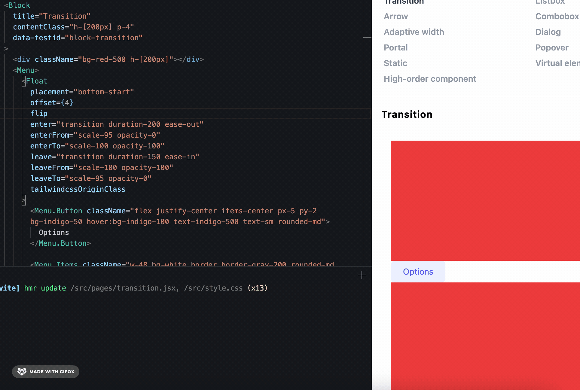
Expected behavior
The block animates from the right spot
package.json
"@headlessui-float/vue": "^0.9.1",
"@headlessui/vue": "^1.7.2",
"@inertiajs/inertia": "^0.11.0",
"vite": "^3.0.0",
Composer.json
"laravel/framework": "^9.19",
"laravel/jetstream": "^2.11",
Installed Jetstream with SSR
https://jetstream.laravel.com/2.x/installation.html#:~:text=php%20artisan%20jetstream%3Ainstall%20inertia%20%2D%2Dssr
Describe the bug
When visiting a page that uses any component with Float, I get the following error in the Inertia SSR Server log:
import { Float } from "@headlessui-float/vue";
         ^^^^^
SyntaxError: Named export 'Float' not found. The requested module '@headlessui-float/vue' is a CommonJS module, which may not support all module.exports as named exports.
CommonJS modules can always be imported via the default export, for example using:

import pkg from '@headlessui-float/vue';
const { Float } = pkg;

    at ModuleJob._instantiate (node:internal/modules/esm/module_job:124:21)
    at async ModuleJob.run (node:internal/modules/esm/module_job:181:5)
    at async Promise.all (index 0)
    at async ESMLoader.import (node:internal/modules/esm/loader:281:24)
    at async Server.<anonymous> (file:///var/www/{projectname}/bootstrap/ssr/ssr.mjs:78:37)
To Reproduce
vite build && vite build --ssr)node bootstrap/ssr/ssr.mjsExpected behavior
There shouldn't be any error pertaining to the import of Float when the Inertia SSR node server is running.
(I unfortunately did not manage to get a MWE up in time (will try to do so tomorrow))
I seem to getting SSR issues when using the Float component, but only when either not setting the as prop, or setting the as prop to "div". If I use Fragrement or span it's fine.
Change the as="div" to as="span" does not yield an error.
Also, if I change all the "span"s to "div"s, it will always error.
THis might be due to me embedding this in a p, for which div is not valid html
import { ChevronDownIcon, ChevronRightIcon } from '@heroicons/react/solid'
import { useState, useRef, ReactNode, Fragment } from 'react'
import { Float } from 'headlessui-float-react'
import Link from 'next/link'

export interface PopoverProps {
  href?: string
  hover?: boolean
  title: string
  children: ReactNode
  arrow?: boolean
  chevron?: boolean
  lazy?: boolean
}

export const Popover = (props: PopoverProps) => {
  const { href, hover, chevron, title, children, arrow, lazy } = props
  const [show, setShow] = useState(false)
  const [shouldRender, setShouldRender] = useState(!lazy)
  const timer = useRef<ReturnType<typeof setTimeout> | null>(null)

  const open = () => {
    if (timer.current !== null) {
      clearTimeout(timer.current)
      timer.current = null
    }

    if (!shouldRender) {
      console.log("I'm going to render the children")
      setShouldRender(true)
    }

    setShow(true)
  }

  const close = () => {
    setShow(false)
  }

  const delayClose = () => {
    timer.current = setTimeout(() => {
      setShow(false)
    }, 150)
  }

  return (
    <span>
      <Float
        as="div"
        strategy="absolute"
        enter="transition ease-out duration-200"
        enterFrom="opacity-0 translate-y-8"
        enterTo="opacity-100 translate-y-0"
        leave="transition ease-in duration-150"
        leaveFrom="opacity-100 translate-y-0"
        leaveTo="opacity-0 translate-y-8"
        placement="bottom-start"
        offset={15}
        shift={6}
        flip={1}
        arrow={arrow}
        portal
        show={show}
      >
        <span
          onMouseEnter={open}
          onMouseLeave={delayClose}
          className={`
                ${show ? '' : 'text-opacity-90'}
                group inline-flex items-center rounded-md text-base font-medium text-orange-300 text-white hover:text-opacity-100 focus:outline-none focus-visible:ring-2 focus-visible:ring-white focus-visible:ring-opacity-75`}
        >
          <Link href={href ?? '#'} passHref>
            <a>{title}</a>
          </Link>
          {chevron && (
            <ChevronDownIcon
              className={`${show ? '' : 'text-opacity-70'}
                  ml-2 h-5 w-5 text-orange-300 transition duration-150 ease-in-out group-hover:text-opacity-80`}
              aria-hidden="true"
            />
          )}
        </span>
        <div
          onMouseEnter={open}
          onMouseLeave={delayClose}
          //  className="absolute left-1/2 z-10 mt-3 w-screen max-w-sm -translate-x-1/2 transform px-4 sm:px-0 lg:max-w-3xl"
        >
          {arrow && (
            <Float.Arrow className="absolute h-5 w-5 rotate-45 border border-gray-200 bg-white " />
          )}
          <div className="max-h-lg max-w-md overflow-y-scroll rounded-lg shadow-lg ring-1 ring-black ring-opacity-5">
            {children}
          </div>
        </div>
      </Float>
    </span>
  )
}Use Version
Use version when bugs appear:
@floating-ui/core: v1.0.0@floating-ui/dom: v1.0.0Describe the bug
Not working
To Reproduce
Open example: https://github.com/ycs77/headlessui-float/tree/497f8a1a31570138cc644be70388b42f6baed54a/examples/example-vue
yarn.lockpackage.json: "@headlessui/vue": "1.7.3",package.json: "vue": "3.2.41",yarn && yarn watch:example:vueScreenshots

Expected behavior
Working, no print error.
Use Version
Use version when bugs appear:
@floating-ui/core: v1.0.0@floating-ui/dom: v1.0.0Describe the bug
When using the adaptive width with the portal option on a Listbox (or Combobox) component the Listbox Options container is too wide.
To Reproduce
https://stackblitz.com/edit/github-uv3nar?file=src/components/ExampleListbox.tsx
Use Version
Use version when bugs appear:
Describe the bug
With the popover component, adding the :focus="true" prop to the PopoverPanel will make the page jump to the top, when clicking on the popover button.
To Reproduce
Alternatively, you can also reproduce this error by just editing the official stackblitz demo, by adding :focus="true" to the popoverPanel, and adding some margin to the page to push the popover button lower in the page.
Expected behavior
The page should not scroll, on popover open. (this is the case when using the popover without the Float wrapper)
Use Version
"vite": "^3.1.0",
"@headlessui-float/vue": "^0.10.0",
"@headlessui/vue": "^1.7.4",
"vue": "^3.2.45"
Describe the bug
Uncaught (in promise) TypeError: Cannot read properties of undefined (reading 'body') occurs in getNearestOverflowAncestor() when opening Listbox.
To Reproduce
See: https://stackblitz.com/edit/github-vfx4en-okqi6n?file=src%2Fcomponents%2FExampleListbox.vue to reproduce (open listbox and view console)
I'm getting the following error on the Float element:
'Float' cannot be used as a JSX component. Its return type 'Element | undefined' is not a valid JSX element.
return (
<Popover>
    <Float //
        placement="top"
        offset={15}
        shift={6}
        flip
        arrow
        portal
        enter="transition duration-200 ease-out"
        enterFrom="opacity-0 -translate-y-1"
        enterTo="opacity-100 translate-y-0"
        leave="transition duration-150 ease-in"
        leaveFrom="opacity-100 translate-y-0"
        leaveTo="opacity-0 -translate-y-1"
    >
        <Popover.Button>{props.children}</Popover.Button>

        <Popover.Panel //
            className={classNames(
                //
                props.overlayClasses,
                'absolute z-50 bg-coolGray-600 rounded-md py-1 px-2  '
            )}
        >
            {props.content}
        </Popover.Panel>
    </Float>
</Popover>
)
Use version when bugs appear:
Describe the bug
Repro URL : https://stackblitz.com/edit/github-k6mhmk?file=package.json
I took your Stackblitz and added the repro below the Listbox & Combobox example.
The components are exactly the same except for the title and the usage of as;
If you set the as property of Float to be a component instead of a string or undefined, the positioning breaks and behave unexpectedly.
To Reproduce
Just set a component as the as property of Float to a component
Use Version
Would it be possible to get an example of how to do a dialog? My main struggle seems to be around headlessui's dialog getting portaled away.
Use Version
Use version when bugs appear:
Describe the bug
When using headless-float with the Combobox and trying to display the Combobox in the Storybook, getting the following error.
Removing <Float></Float> fixes the error.

how can I trigger transition on Vue 3 instead of click?
Use Version
Use version when bugs appear:
@floating-ui/core: v1.0.0@floating-ui/dom: v1.0.0Describe the bug
hide event is emitted before every show event
To Reproduce
hide event is emittedScreenshots

Expected behavior
hide event should be only emitted on closing and not before opening
Use Version
Use version when bugs appear:
Describe the bug
In Next.js, usage of <Float /> creates an SSR issue due to a blank width attribute in the initial styles.
This is fixed by #44
To Reproduce
git clone https://github.com/doseofted/headlessui-float-issue.gitnpm installnpm run devLogs
Warning: Prop `style` did not match. Server: "position:fixed;z-index:9999;top:0;left:0;right:auto;bottom:auto;transform:translate(0px,0px)" Client: "position:fixed;z-index:9999;top:0;left:0;right:auto;bottom:auto;transform:translate(0px,0px);width:"
    at div
    at div
    at eval
...Use Version
Use version when bugs appear:
Describe the bug
In a Popover, when the prop show is specified, the default behavior is disabled. In particular, the Popover's button does not work and useOutsideClick also is not enabled. It is a common use case to want to provide additional showing functionality on top of the existing functionality. For example, we have 3 instances in our codebase where an outside event should close the popover.
To Reproduce
import React, { useState } from "react";
import { Popover } from "@headlessui/react";
import { Float } from "@headlessui-float/react";

export default function Example() {
  const [open, setOpen] = useState(false);

  const toggleMenu = () => setOpen(!open);

  return (
    <div className="flex flex-col gap-2">
      <button className="p-3 border w-[400px]" onClick={toggleMenu}>
        not popover button
      </button>
      <Popover>
        <Float show={open}>
          <Popover.Button className="p-3 border w-[400px]">
            popover button
          </Popover.Button>
          <Popover.Panel className="p-3 border w-[400px]">
            popover panel
          </Popover.Panel>
        </Float>
      </Popover>
    </div>
  );
}Use Version
Use version when question appear:
Describe the question
I'm trying to make a reusable wrapper around the Headless UI's Menu.Button component, but for some reason when I use it, Float doesn't seem able to position the Menu.Items correctly and it just goes to the top left of the screen instead of next to the button itself.
Here's what I'm using:
import { Menu as HeadlessMenu } from '@headlessui/react'

// ....

const Opener: React.FC<OpenerProps> = React.forwardRef<
  HTMLDivElement,
  OpenerProps
>(({ children }, ref) => (
  <HeadlessMenu.Button as={React.Fragment}>
    <children.type {...children.props} ref={ref} />
  </HeadlessMenu.Button>
))
If I change:
<HeadlessMenu.Button as={React.Fragment}>
to:
<HeadlessMenu.Button as="div">
it works, but for my use-case I really want to use a Fragment there instead.
Any thoughts on what I could do to use a Fragment but still get the correct positioning? I thought by passing the ref down into the children that would do it, but apparently not.
In case it helps, here's what I have for my Float component (again this is inside a custom reusable component):
const Wrapper: React.FC<WrapperProps> = ({ children, placement }) => (
  <HeadlessMenu>
    <Float
      offset={10}
      placement={placement}
      portal
      enter="tw-transition tw-ease-out tw-duration-100"
      enterFrom="tw-transform tw-opacity-0 tw-scale-95"
      enterTo="tw-transform tw-opacity-100 tw-scale-100"
      leave="tw-transition tw-ease-in tw-duration-75"
      leaveFrom="tw-transform tw-opacity-100 tw-scale-100"
      leaveTo="tw-transform tw-opacity-0 tw-scale-95"
    >
      {children}
    </Float>
  </HeadlessMenu>
)
Use Version
Use version when bugs appear:
Describe the bug
FloatingUI is not working when a custom component is used as ref, eg:
// Not working
        <PopoverButton as="template">
            <BaseButton>Button </BaseButton>
        </PopoverButton>

// Works
        <PopoverButton as="template">
             <button>Button</button>
        </PopoverButton>
To Reproduce
Please provide a minimal working example (like github repo, codesandbox, stackblitz...), and steps to reproduce the behavior:
TypeError: element.getBoundingClientRect is not a function
    at getBoundingClientRect (floating-ui.dom.esm.js:102:30)
Screenshots

Expected behavior
Button 2 should work exactly as button 1
PS: Nice work on this lib! Have spent way too much time trying to roll my own, switching over currently. Thanks for the work.
When including the arrow component in the HTML element, the arrow doesn't render correctly, this issue can be easily reproduced in the demo page.
<template>
  <Float
    :show="isShowing"
    arrow
    :offset="15"
    placement="bottom"
    ...
  >
    <button
      type="button"
      class="flex justify-center items-center px-5 py-2 bg-indigo-50 text-indigo-500 text-sm rounded-md"
      @mouseenter="isShowing = true"
      @mouseleave="isShowing = false"
    >
      Options
    </button>
    <div class="relative rounded-lg shadow-lg ring-1 w-28 ring-black bg-white ring-opacity-5">
      <FloatArrow class="absolute bg-white w-5 h-5 rotate-45 border border-gray-200"  />
        <button type="button">
          ...
        </button>
     ...
    </div>
  </Float>
</template>

<script lang="ts">
import { defineComponent } from "vue";
import { Float, FloatArrow } from "headlessui-float-vue";

export default defineComponent({
  components: { Float, FloatArrow },
  data() {
    return {
      isShowing: false,
    };
  }
});
</script>
Use Version
Use version when bugs appear:
@floating-ui/core: v1.0.0@floating-ui/dom: v1.0.0Describe the bug
When using shift with a value > 0, the arrow sticks out of the box
To Reproduce
Screenshots

Expected behavior
The arrow should have a minimal left to it does not stick out from the container, depending on its size
I'm currently using twin.macro to compile my tailwind styles at build time. I'm able to work around many of the headless ui components using this example provided by the twin.macro author, but nothing is working for this project.
I understand if this isn't something you're interested in implementing.
If you are, however, I recommend checking out this file. It shows an example of how to set up twin.macro with the Transition component. In the case of Float, maybe it would be possible to accept both a string and a TwStyle type for the properties?
Versions
Describe the bug
Examples from vue-ts not working for combobox.
To Reproduce
Please provide a minimal reproducible example (like github repo, codesandbox, stackblitz...), and steps to reproduce the behavior:
Expected behavior
In listbox select component 'float ui' working works as it should, however same thing doesn't work autocomplete (Combobox options always appears below).
Use Version
Use version when bugs appear:
@floating-ui/core: v1.0.0@floating-ui/dom: v1.0.0Describe the bug
When using headlessui-float with the portal option to render a popover, the popover doesn't receive keyboard focus as it should.
To Reproduce
Toggle the use of a portal with the checkbox, and try navigating with your keyboard.
Is your feature request related to a problem? Please describe.
When using the component as a tooltip, you sometimes want to disable hovering completely but this issue happens:

This is because there is no possibility to pass props to the wrapping div of the floating element
Describe the solution you'd like
Either a prop disabling pointer events on the div, either being able to pass anything to the div, like a className or a style prop, that is added to it
 React
React
A declarative, efficient, and flexible JavaScript library for building user interfaces.
🖖 Vue.js is a progressive, incrementally-adoptable JavaScript framework for building UI on the web.
 Typescript
TypeScript is a superset of JavaScript that compiles to clean JavaScript output.
An Open Source Machine Learning Framework for Everyone
 Django
The Web framework for perfectionists with deadlines.
 Laravel
A PHP framework for web artisans
Bring data to life with SVG, Canvas and HTML. 📊📈🎉
JavaScript (JS) is a lightweight interpreted programming language with first-class functions.
Some thing interesting about web. New door for the world.
A server is a program made to process requests and deliver data to clients.
Machine learning is a way of modeling and interpreting data that allows a piece of software to respond intelligently.
Some thing interesting about visualization, use data art
Some thing interesting about game, make everyone happy.
 Facebook
We are working to build community through open source technology. NB: members must have two-factor auth.
 Microsoft
Open source projects and samples from Microsoft.
 Google
Google ❤️ Open Source for everyone.
 Alibaba
Alibaba Open Source for everyone
 D3
D3
Data-Driven Documents codes.
 Tencent
China tencent open source team.