yulab-smu / enrichplot Goto Github PK
View Code? Open in Web Editor NEWVisualization of Functional Enrichment Result
Home Page: https://yulab-smu.top/biomedical-knowledge-mining-book/
Visualization of Functional Enrichment Result
Home Page: https://yulab-smu.top/biomedical-knowledge-mining-book/
Hi,
Can we add title parameter to upsetplot and make it compatible with ggtitle?
Just like here:
hms-dbmi/UpSetR#76
jonocarroll/UpSetR@ea70aa3
Dear Dr. Yu
Hi, I am very interested to use entichplot to generate the GSEA plot which would save a lot of work for me. But I am very confusing about the geneSetID argument in the gseaplot function.
I noticed you used 1 or 1:3 for that, but what if I want to use my interested gene set where can I find my gene set ID. And whenever I didn't put 1 in that argument I get an error said
Error in if (abs(max.ES) > abs(min.ES)) { : missing value where TRUE/FALSE needed
Many thanks,
Shaowen
Hi, Guangchuang,
I want to use the goplot function to visualize the relationship between selected GO terms. But the parameter (showCategory=) seems to be only numeric type, and can not input a vector of interest like cnetplot function. Is there any other solution?
Hope to get your any advice!
Thanks!
There seems to be a small issue with installation of latest version of enrichplot from github:
Error in loadNamespace(j <- i[[1L]], c(lib.loc, .libPaths()), versionCheck = vI[[j]]) :
namespace 'DOSE' 3.13.0 is being loaded, but >= 3.13.1 is required
The latest version of DOSE available is 3.13.0 though (13 Nov 2019)?! Thank you so much for all the tools and the hard work put into it!
Hello
I am working on RNA-seq data on equine embryos. I did enrichment analysis with GSEA software provide by the Broad Institute.
I am using GO (BP, CC and MF), REACTOME and KEGG to do the analysis.
I would like to use enrichplot after these analysis.
How could I create a enrichresult object to do so?
Thank you
Sincerely yours
Emilie Derisoud
Dear YuLab,
I am trying to change the node text (something like geom_node_text) with the emapplot function of the enrichplot package.
This is what I have unsuccessfully tried from an enrichResult object that is fine:
> ggoBP@result %>% names()
[1] "ID"          "Description" "GeneRatio"   "BgRatio"     "pvalue"
[6] "p.adjust"    "qvalue"      "geneID"      "Count"

> p <- emapplot(ggoBP, layout = "kk", line_scale = 0.2)
> p + geom_node_label(size = 9, repel = T)

Error: geom_label_repel requires the following missing aesthetics: label
Any suggestion would be welcome!
Dear Yu ,
When using ridgeplot to draw a picture, it seems that there are always several items that cannot be drawn for gseresult. This is very strange. After I edit the source code, I still can't draw it.
d1 =data.frame(gs2val.df[sapply(gs2val, length)>2,],stringsAsFactors = F)
d1$category = as.character(d1$category)
ggplot(  d1  , aes_string(x="value", y="category", fill=fill))+
  ggridges::geom_density_ridges( ) +
   scale_fill_continuous(low="red", high="blue", name = fill,guide=guide_colorbar(reverse=TRUE)) +
  xlab(NULL) + ylab(NULL) +  theme_dose()
Thanks a lot!
Hi Guangchuang,
thanks for the excellent package!
I was wondering if you can enable some more customizability in the enrichment map function, emapplot, e.g. to allow considering gene sets that have a not so strict adjusted p-value.
Would it be possible? I guess this can be done at the point where you select out the rows from the enrichResult object,
Line 112 in 7313fe9
Thanks in advance for considering this thought!
Federico
I love the visualization of the cneplots for my GSEA enrichments. Is there a way to implement this with multiple input enrichment lists like is done for dotplots for clustercompare? For example, say I have one pathway that is enriched in three different gene lists. What I would like to do is show shared genes between each list for that pathway using a cneplot where the nodes would be gene lists (instead of standard display of nodes as separate pathways). This would allow for the easy visualization of shared genes within an enriched pathway across different experiments, gene lists, etc. Thanks!!!
I've installed the latest version of R v3.4.3. But the enrichplot package throws this error.
ERROR: this R is version 3.4.3, package 'enrichplot' requires R >= 3.5.0
Dear Yu lab,
Thank you for the nice package you developed. Would it be possible for you to include in the package a function that allows using GSEA results from other softwares? It could be by allowing to create a gseaResult object from a data.frame, for example. I believe a lot of people would use enrichplot more if that was possible.
Best regards,
Leonor
Hello,
Can we run gseNCG function on a vector of sorted genes ( values = log2foldchange,vector names= entrez ID)
Data generated from differential expression analysis results of mus musculus RNA-seq samples (mm10)
Thank you
P.S. : i am getting this error
preparing geneSet collections...
--> Expected input gene ID: 4751,673,9700,9794,472,58508
Error in check_gene_id(geneList, geneSets) :
--> No gene can be mapped....
Hello,
I've tried generating a GO enrichment plot using enrichplot but such error occurred. I guess it is the issue about the lack of package/ outdated version of the package I have but cannot figure out what I missed or has to update.
The full error text is as followings:
Error: 'decode_colour' is not an exported object from 'namespace:farver'
Thank you in advance for your help
Best Regards,
Hi,
I'm trying to install enrichplot on server, with R version 3.6.3, but failed.
The error log is:
ERROR: failed to lock directory ‘/*/R/x86_64-pc-linux-gnu-library/3.6’ for modifying
Do you know how to fix it? Thanks!
Hi GuangchuangYu,
I was running clusterprofiler and enrichplot crashed while plotting a KEGG pathway.
This is the error message:
Error in `$<-.data.frame`(`*tmp*`, "circular", value = FALSE) : replacement has 1 row, data has 0 Calls: getEdges -> getEdges.layout_igraph -> $<- -> $<-.data.frame
I traced it down to emapplot.R line 76.
g <- delete.edges(g, E(g)[wd[, 3] < 0.2])
This line deletes all the edges with a weight smaller than 0.2. In my case this deletes all the edges and crashes the function.
Thank you for putting all the effort into your packages.
Nastasja
Greetings!
Is there any chance you could add an method to apply enrichPlot methods to results generated via external tools?
clusterProfiler and other packages created by your lab already support a number of useful over-representation / GSEA methods, however, there are a very large number of alternative methods and new ones coming out on a regular basis (fgsea, is one I've been using a lot for it's performance and flexibility w.r.t. annotations). It would be great if there were a way to use to nice plotting methods you have developed here on results from some of those methods.
One possible approach might be to split each move most of the plotting functionality for each method into a private method. Two alternative methods could then sit on top of those -- one that maintains the current interface so that code can continue working as-is, and an alternative version of each method that can be used on results from arbitrary methods, so long as the user provides the needed information.
Another possible approach would be to provide one or more public constructors for the enrichResults class, so that typical results from other methods could be easily used to construct an enrichResult instance, which could then be used with the existing plotting functionality.
Thanks for all of your work on these useful packages!
Awesome package so far, I really like it.
I do not fancy the default color scales though. Can you make them customizable?
Hi Dr. Yu,
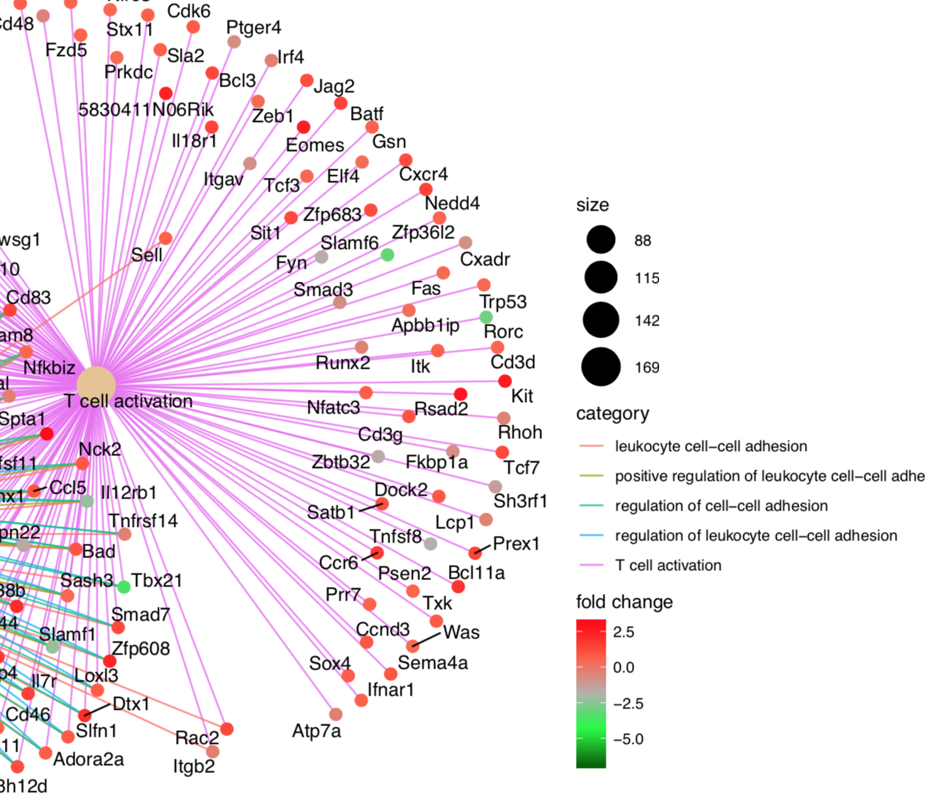
Thank you for your packages which made visualization easy and nice! I'm using cnetplot function to visualize the relationship between genes and GO terms. My issue is the gene names and GO terms on the plots are too large, especially when I show many categories the plot became very messy. Is there a way to change the label size or even font type? Thank you!
emapplot() failed with 0 or 1 records of enrishResult
> class(a)
[1] "enrichResult"
attr(,"package")
[1] "DOSE"

> nrow(a)
[1] 1

> a@result
ID  Description GeneRatio   BgRatio       pvalue   p.adjust     qvalue                geneID Count
GO:0003729 GO:0003729 mRNA binding      5/34 201/12127 0.0002239694 0.01814152 0.01673876 bru1/BicC/egl/osk/swa     5

> enrichplot::emapplot(a)
Error in graph_to_tree(graph, mode = direction) : Graph must be directed
Hello,
I have problems to install enrichplot (both in windows and linux). This is the output when I biocLite('enrichplot'):
package ‘enrichplot’ is not available (for R version 3.4.3)
I am using Bioconductor 3.6 (BiocInstaller 1.28.0), R 3.4.3 (2017-11-30).
Is that a true problem (not available for that R version) or is the error message just a sign that anything went wrong during intsallation?
I appreciate every hint, since I really want to use those nice plots for my manuscript!
x <- enrichGO(xxx)
# api similar to clusterProfiler::compareCluster.
# fun can be GOSemSim::mgoSim, DOSE::doSim etc and specify parameters via the ...
y <- pairwise_termsim(x, fun, ...)
emapplot_cluster(x) # throw error for term similarity matrix not available
emapplot_cluster(y) # plot
只算一次,预先存起来,这个相似性在多个场景下都能使用。
10月份Bioconductor要发布新版本,https://www.bioconductor.org/developers/release-schedule/,这个事情得先做,在新版本中就得是这样的API,免得以后换。
Most of the enrichplot support "enrichresult", "gsearesult" and "compareClusterResult", why not to add such a feature to the emapplot()?
💯
Hi,
It would be nice and useful to use NES instead of either pvalue or qvalue in dotplot when the object is a "gseaResult" one, since p-values are grouped into ranks and you only observe (mostly) one single colour at the legend (scale) color.
Thanks
cnet plot is great.
Can there be option to only plot "the most signifigant" - e.g. those whose foldChange exceeds a threshold?
That said, sometimes I have another measure than foldChange. Can this be made configurable too? For example, I want to use the coefficient of a term in my glm as representation of extent to which my gene is effected. Currently I put a note on the plot saying the the foldChange in the legend is really this coefficient. Should I just pass in fold change but change the label myself using ggplot call something like this
Hi, I am trying to use two different packages, clusterProfiler and enrichplot; the first one works with DOSE 3.4.0 but not wit 3.5.1 (dotplot problem) and enrichplot works with DOSE 3.5.1 but not with 3.4.0. Could you help me to solve this problem? Thank you very much.
Due to the submission of enrichplot to Bioconductor, which forces new submission to depend on devel version of R (3.5.0), the package was rejected to install on current release version of R.
I do want you guys to try this new package and you can follow these steps to install it.
Download ZIP, unzip it and rename enrichplot-master to enrichplot.
or simply using the following command:
git clone https://github.com/GuangchuangYu/enrichplot.git
in MacOS:
cd enrichplot
sed -i "" 's/3.5.0/3.4.0/g' DESCRIPTION
cd ..
in Linux:
cd enrichplot
sed -i 's/3.5.0/3.4.0/g' DESCRIPTION
cd ..
or open enrichplot/DESCRIPTION using your favorite text editor and replace 3.5.0 to 3.4.0.
devtoolsRscript -e 'devtools::install_local("enrichplot")'
Hello,
I am using the cnetplot function in clusterProfiler to plot the top 5 over-represented pathways in my gene list. I would like to increase the font size of the node labels and increase the width of the lines linking genes to their pathway nodes. I can't find a way to do this. There does not seem to be a font.size argument like there are in other clusterProfiler functions. I appreciate clusterProfiler plots can be formatted like ggplot2 objects but I can't find the correct ggplot2 text size parameter to change to increase the node label size in the cnetplot. Attempted code below.
Thank you very much for your help.
cnetplot(reactome, categorySize="pvalue", foldChange = ranks, circular = TRUE, colorEdge = TRUE, showCategory = 5) +
ggplot2::labs(title = "DM vs NG") +
ggplot2::theme(legend.text=element_text(size=16, face = "bold"),
legend.title=element_text(size=16, face = "bold"),
plot.title = element_text(size=20, face = "bold"))
I also tried saving the cnetplot as a ggplot object and then modifying the text size but this does not work
a <- cnetplot(reactome, categorySize="pvalue", foldChange = ranks, circular = TRUE, colorEdge = TRUE, showCategory = 5) +
ggplot2::labs(title = "DM vs NG") +
ggplot2::theme(legend.text=element_text(size=16, face = "bold"),
legend.title=element_text(size=16, face = "bold"),
plot.title = element_text(size=20, face = "bold"))
a$theme$text$size = 20
Is it possible to have the input for cnetplot be a list of gene sets from an enrichment result instead of specifying the number of gene sets to plot? For example, my enrichment result (from enrichGO) has migration and adhesion terms and I would like to visualize the connections of the genes within these terms. However, since the terms are not sequential in the result, I don't think I currently can do that.
Any advice is greatly appreciated! Thanks!
Hi,
I would like to have an igraph object from the graph produced by cnetplot function.
I'm not sure but I think it's possible with the list2graph function.
So, I installed 1.3.2 version of enrichplot packages :
install.packages("devtools")
library(devtools)
install_github("GuangchuangYu/enrichplot")
All function of enrichlot is find by R but not list2graph.
Thank you in advance.
Dear Yu lab,
I am trying to use gseaplot2 to recreate the figures created by the GSEA desktop to obtain better resolution. I ran the GSEA in the desktop version and used the generated xls. file as input for gseaplot2. It cannot be executed. Can you clarify the format of input data for gseaplot2 and what is the geneSetID it requires?
Thank you,
Min
Dear Yu,
I generated a gseaplot2 result via
ego <- gseGO(geneList = ranklist,OrgDb="org.Hs.eg.db",keyType="SYMBOL",ont = 'BP',nPerm = 2000)
p <- gseaplot2(clusters.ego[[x]],geneSetID =1:3, color = c('#ff5f58','#ff7cb3',"#ffae42"), ES_geom = "dot")
I can export it to a tiff or pdf file successfully. But I was not able to export as a ppt file by the export package via
print(p)
graph2ppt(file='gsea.pptx',width=6,height=6)
Thank you in advance.
sessionInfo()
R version 3.6.1 (2019-07-05)
Platform: x86_64-w64-mingw32/x64 (64-bit)
Running under: Windows 7 x64 (build 7601) Service Pack 1
attached base packages:
[1] stats graphics grDevices utils datasets methods base
other attached packages:
[1] export_0.2.2 enrichplot_1.4.0 clusterProfiler_3.12.0
loaded via a namespace (and not attached):
[1] fgsea_1.10.1 colorspace_1.4-1 ggridges_0.5.1 qvalue_2.16.0 flextable_0.5.5 base64enc_0.1-3
[7] rstudioapi_0.10 farver_1.1.0 urltools_1.7.3 graphlayouts_0.5.0 ggrepel_0.8.1 bit64_0.9-7
[13] AnnotationDbi_1.46.1 xml2_1.2.2 splines_3.6.1 GOSemSim_2.10.0 knitr_1.25 polyclip_1.10-0
[19] zeallot_0.1.0 jsonlite_1.6 broom_0.5.2 GO.db_3.8.2 ggforce_0.3.1 shiny_1.3.2
[25] compiler_3.6.1 httr_1.4.1 rvcheck_0.1.3 backports_1.1.5 assertthat_0.2.1 Matrix_1.2-17
[31] lazyeval_0.2.2 later_0.8.0 tweenr_1.0.1 htmltools_0.3.6 prettyunits_1.0.2 tools_3.6.1
[37] igraph_1.2.4.1 gtable_0.3.0 glue_1.3.1 reshape2_1.4.3 DO.db_2.9 dplyr_0.8.3
[43] fastmatch_1.1-0 Rcpp_1.0.2 Biobase_2.44.0 vctrs_0.2.0 nlme_3.1-141 stargazer_5.2.2
[49] crosstalk_1.0.0 ggraph_2.0.0 xfun_0.9 stringr_1.4.0 openxlsx_4.1.0.1 miniUI_0.1.1.1
[55] mime_0.7 lifecycle_0.1.0 DOSE_3.10.2 europepmc_0.3 MASS_7.3-51.4 scales_1.0.0
[61] tidygraph_1.1.2 promises_1.0.1 hms_0.5.1 parallel_3.6.1 RColorBrewer_1.1-2 yaml_2.2.0
[67] memoise_1.1.0 gridExtra_2.3 ggplot2_3.2.1 UpSetR_1.4.0 gdtools_0.2.0 triebeard_0.3.0
[73] stringi_1.4.3 RSQLite_2.1.2 S4Vectors_0.22.1 BiocGenerics_0.30.0 manipulateWidget_0.10.0 zip_2.0.4
[79] BiocParallel_1.18.1 rlang_0.4.0 pkgconfig_2.0.3 systemfonts_0.1.1 rgl_0.100.30 evaluate_0.14
[85] lattice_0.20-38 purrr_0.3.3 htmlwidgets_1.3 rvg_0.2.1 cowplot_1.0.0 bit_1.1-14
[91] tidyselect_0.2.5 plyr_1.8.4 magrittr_1.5 R6_2.4.0 IRanges_2.18.2 generics_0.0.2
[97] DBI_1.0.0 pillar_1.4.2 tibble_2.1.3 crayon_1.3.4 uuid_0.1-2 rmarkdown_1.15
[103] officer_0.3.5 viridis_0.5.1 progress_1.2.2 grid_3.6.1 data.table_1.12.2 blob_1.2.0
[109] webshot_0.5.1 digest_0.6.21 xtable_1.8-4 tidyr_1.0.0 httpuv_1.5.2 gridGraphics_0.4-1
[115] stats4_3.6.1 munsell_0.5.0 viridisLite_0.3.0 ggplotify_0.0.4
Hello
I have problem to install the enrichplot package and the error message is saying : package 'enrichplot' is not available (for R version 3.4.3)
In the user guide it says R >= 3.4.0
So what is the problem then ?
Thank you for your help
Currently the calculation of the color scale is set automagically:
Line 73 in 17dd93f
The problem is that if the supplied fold change vector is skewed (e.g., no down-regulated genes) you get images that are highly misleading from a biological standpoint. A better solution would be to optionally allow to set min, max, and center.
Hello,
Do you know how can I install the package on R 3.4.0?
I get the following error when trying to install through bioconductor:
package ‘enrichplot’ is not available (for R version 3.4.0)
Thanks,
Assaf
I trued to repeat the code in the example of enrichplot package, but I found some difference with cnetplot function and emapplot function.

Gene-Concept Network with repeat by cnetplot function.

Gene-Concept Network with example by cnetplot function.
Enrichment map with repeat by emapplot function

Enrichmentmap with example by emapplot function.
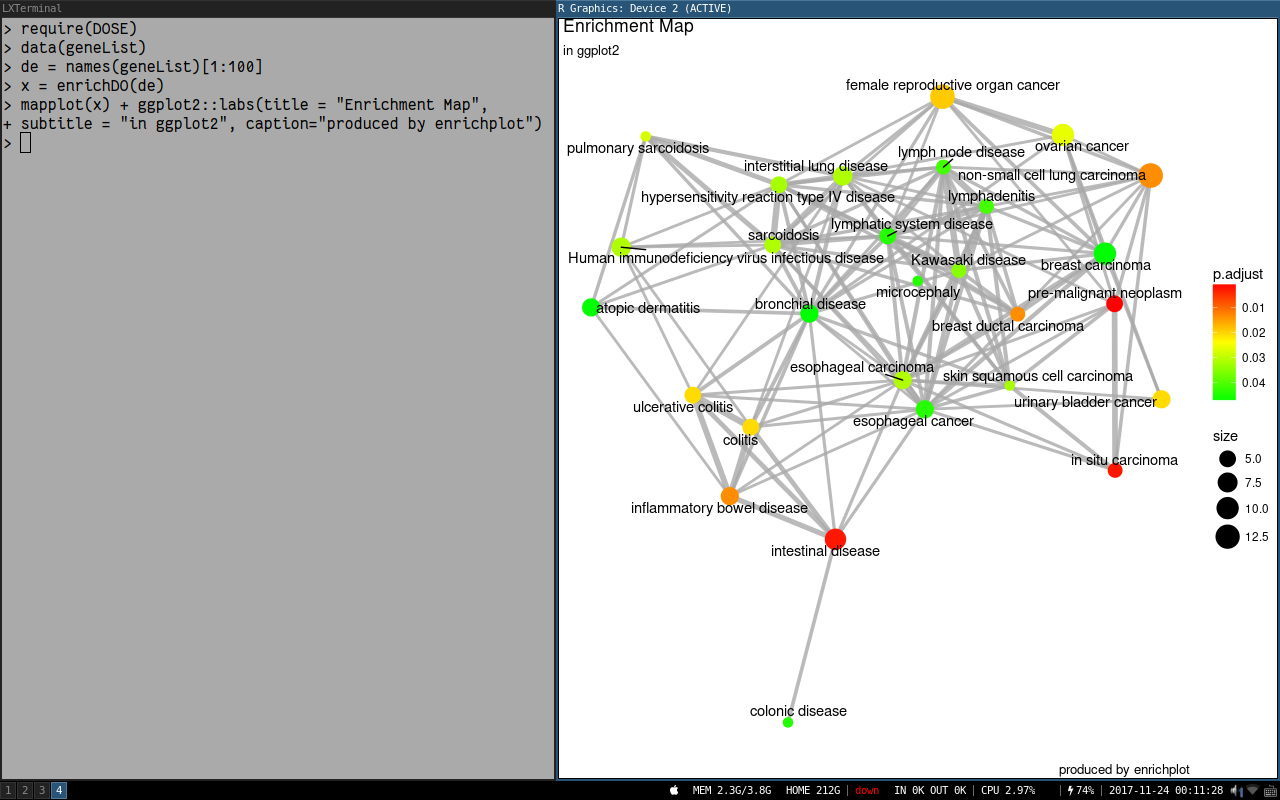
Thanks for this great package! Is it possible to adjust the width of the lines connecting the nodes in an emapplot? For some plots the width of the lines is fine, but for others, when there are many sets of ontology terms all connected to one another it gets messy. Thanks!
Hello! This has only been occurring recently -- but dotplot throws a strange warning when applied to objects of 'gseaResult' ---
wrong orderBy parameter; set to default orderBy = "x"
orderBy appears to be an internal parameter, so it's a bit confusing to get this error when it doesn't appear that there was an obvious way to set 'orderBy' in the first place.
Anyways -- also wanted to say I love the clusterProfiler/enrichPlot suite of tools, thank you for all the work your team does!! Hope this helps!
Reproducible example:
Quiescent.vs.Proliferative.Raw.Counts.txt
# Wrangle count data
counts <- read.table("Data/Quiescent.vs.Proliferative.Raw.Counts.txt", header = T, row.names = 1)
colData <- data.frame(sample = colnames(counts), condition = c(rep("Quiescent", 3), rep("Proliferative", 3)))
colData$condition <- factor(colData$condition, levels = c("Quiescent", "Proliferative"))
dds <- DESeqDataSetFromMatrix(countData = counts, colData = colData, design = ~condition)

# QC
keep <- rowSums(counts(dds)) >= 10
dds <- dds[keep,]

# DGE
dds <- DESeq(dds)
res <- results(dds, contrast = c("condition", "Quiescent", "Proliferative"))
resDF <- as.data.frame(res)
resDF$geneID <- rownames(resDF)

# wrange DGE results
ensembl <- useMart("ensembl",dataset="hsapiens_gene_ensembl", host = "useast.ensembl.org")
map <- getBM(attributes = c("ensembl_gene_id", "description", "external_gene_name"), mart = ensembl)
colnames(map) <- c("geneID", "description", "geneName")
resDF <- merge(x = map, y = resDF, by = "geneID")
resDF <- resDF[,c(3,2,1,4:9)]
resDF$GSEA <- -log10(resDF$padj) * sign(resDF$log2FoldChange)
resDF <- resDF[order(resDF$GSEA, decreasing = T),]

# GSEA
geneList <- resDF$GSEA
names(geneList) <- resDF$geneName
geneList <- geneList[which(! duplicated(names(geneList)))]
geneList <- geneList[which(! is.na(geneList))]
TERM2GENE <- msigdbr()
TERM2GENE <- TERM2GENE[,c(1,5)]
EGMT <- GSEA(geneList = geneList, TERM2GENE = TERM2GENE, pvalueCutoff = .2)

enrichplot::dotplot(EGMT)`
wrong orderBy parameter; set to default orderBy = "x"
Session info:
R version 3.6.0 (2019-04-26)
Platform: x86_64-w64-mingw32/x64 (64-bit)
Running under: Windows 10 x64 (build 17763)

Matrix products: default

locale:
[1] LC_COLLATE=English_United States.1252  LC_CTYPE=English_United States.1252    LC_MONETARY=English_United States.1252
[4] LC_NUMERIC=C                           LC_TIME=English_United States.1252

attached base packages:
[1] parallel  stats4    stats     graphics  grDevices utils     datasets  methods   base

other attached packages:
 [1] pheatmap_1.0.12             biomaRt_2.40.0              msigdbr_6.2.1               tibble_2.1.1
 [5] dplyr_0.8.1                 EnhancedVolcano_1.2.0       ggrepel_0.8.1               ggplot2_3.1.1
 [9] clusterProfiler_3.12.0      DESeq2_1.24.0               SummarizedExperiment_1.14.0 DelayedArray_0.10.0
[13] BiocParallel_1.18.0         matrixStats_0.54.0          Biobase_2.44.0              GenomicRanges_1.36.0
[17] GenomeInfoDb_1.20.0         IRanges_2.18.0              S4Vectors_0.22.0            BiocGenerics_0.30.0

loaded via a namespace (and not attached):
  [1] fgsea_1.10.0           colorspace_1.4-1       ggridges_0.5.1         qvalue_2.16.0          htmlTable_1.13.1
  [6] XVector_0.24.0         base64enc_0.1-3        rstudioapi_0.10        farver_1.1.0           urltools_1.7.3
 [11] bit64_0.9-7            AnnotationDbi_1.46.0   xml2_1.2.0             splines_3.6.0          GOSemSim_2.10.0
 [16] geneplotter_1.62.0     knitr_1.23             polyclip_1.10-0        Formula_1.2-3          jsonlite_1.6
 [21] SMVar_1.3.3            packrat_0.5.0          annotate_1.62.0        cluster_2.0.8          GO.db_3.8.2
 [26] ggforce_0.2.2          BiocManager_1.30.4     compiler_3.6.0         httr_1.4.0             rvcheck_0.1.3
 [31] backports_1.1.4        assertthat_0.2.1       Matrix_1.2-17          lazyeval_0.2.2         limma_3.40.2
 [36] tweenr_1.0.1           acepack_1.4.1          htmltools_0.3.6        prettyunits_1.0.2      tools_3.6.0
 [41] igraph_1.2.4.1         gtable_0.3.0           glue_1.3.1             GenomeInfoDbData_1.2.1 reshape2_1.4.3
 [46] DO.db_2.9              fastmatch_1.1-0        Rcpp_1.0.1             enrichplot_1.4.0       gdata_2.18.0
 [51] ggraph_1.0.2           xfun_0.7               stringr_1.4.0          gtools_3.8.1           XML_3.98-1.19
 [56] DOSE_3.10.0            europepmc_0.3          zlibbioc_1.30.0        MASS_7.3-51.4          scales_1.0.0
 [61] hms_0.4.2              RColorBrewer_1.1-2     curl_3.3               memoise_1.1.0          gridExtra_2.3
 [66] UpSetR_1.4.0           triebeard_0.3.0        rpart_4.1-15           metaMA_3.1.2           latticeExtra_0.6-28
 [71] stringi_1.4.3          RSQLite_2.1.1          genefilter_1.66.0      checkmate_1.9.3        caTools_1.17.1.2
 [76] rlang_0.3.4            pkgconfig_2.0.2        bitops_1.0-6           lattice_0.20-38        purrr_0.3.2
 [81] labeling_0.3           htmlwidgets_1.3        cowplot_0.9.4          bit_1.1-14             tidyselect_0.2.5
 [86] plyr_1.8.4             magrittr_1.5           R6_2.4.0               gplots_3.0.1.1         Hmisc_4.2-0
 [91] DBI_1.0.0              withr_2.1.2            pillar_1.4.0           foreign_0.8-71         survival_2.44-1.1
 [96] RCurl_1.95-4.12        nnet_7.3-12            crayon_1.3.4           KernSmooth_2.23-15     viridis_0.5.1
[101] progress_1.2.2         locfit_1.5-9.1         grid_3.6.0             data.table_1.12.2      blob_1.1.1
[106] digest_0.6.19          xtable_1.8-4           tidyr_0.8.3            gridGraphics_0.4-1     munsell_0.5.0
[111] viridisLite_0.3.0      ggplotify_0.0.3
When orderBy parameter is not explicitly set, it gives unnecessary warning as below:
wrong orderBy parameter; set to default orderBy = "x"
I digged into the code in dotplot.R and it must be coming from these lines:
if (orderBy !=  'x' && !orderBy %in% colnames(df)) {
    message('wrong orderBy parameter; set to default `orderBy = "x"`')
    orderBy <- "x"
}
It seems somehow the default value orderBy="x" is not read.
Hi, Guang chuang:
When I installed your package enrichplot in the R 3.61, I got the error:
namespace 'DOSE' 3.12.0 is being loaded, but >= 3.13.1 is required
But, when I updated 'DOSE', the latest version is 3.12.0 in bioconda. So I have no idea about this, maybe it 's a gap of update in R 3.6?
hope for your reply .
Dear Yu,
I used gesaplot2 to plot multiple gene sets in one sample.
How can I use gesaplot2 to plot one gene set across multiple samples?
I try to use ggplot2 to do this, but I couldn't get the rank in gene list or rank in ordered dataset.
Could you help me?
Thanks a lot.
Hi, Guangchuang,
I downloaded your latest packages (clusterprofiler, DOSE and enrichplot) from you github repository and checked the goplot. I used your embedded dataset (copy and paste) and check the goplot function. The code is as follows:
CODE:
> library(clusterProfiler)
> data(geneList, package="DOSE")
> de <- names(geneList)[abs(geneList) > 2]
> ego <- enrichGO(de, OrgDb = "org.Hs.eg.db", ont="BP", readable=TRUE)
> library(enrichplot)
> goplot(ego)

ERROR MESSAGE:
Error in grid.Call(C_convert, x, as.integer(whatfrom), as.integer(whatto),  :
  行类不对
My R version is 3.4.3.
Thanks!
Hello. I am using clusterProfiler, and enrichPlot to create heatmaps of GO and KEGG, but am running into an issue. Where the enrichGO heatmap is able to display the gene symbols on the heat plot axis, the enrichKEGG heatmap instead displays the gene ID numbers. I've provided the code I used, and the enrichKEGG heatplot for reference. You'll see a list of gene ID's along the Y-axis:
                          `data(geneList, package="DOSE")
                           gene <- names(geneList)
                           gene.df <- bitr(gene, fromType = "ENTREZID",
                                                    toType = c("ENSEMBL", "SYMBOL"),
                                                    OrgDb = org.Hs.eg.
                           de <- names(geneList)[1:60]
                           kk <- enrichKEGG(de, organism     = 'hsa',  pvalueCutoff = 0.05)
                           final_productKEGG_Overrep <- heatplot(kk, foldChange = geneList, showCategory
                                                                                              = 20000)+ ggplot2::coord_flip()

                           final_productKEGG_Overrep`

My first question is simple:
How do you replace the gene ID's with the gene symbol on the axis of an enrichKEGG heatmap?
I was also trying to run a gseGO and gseKEGG on a small number of genes from the DOSE geneList (around 20-30) and I was getting the following error message from a gseGO:
              `  preparing geneSet collections...
                GSEA analysis...
                Error in FUN(X[[i]], ...) :
                  GSEA statistic is not defined when all genes are selected`
And I get this error message from a gseKEGG, even after setting the pValueCutoff to different values, and getting rid of the argument entirely:
                 `preparing geneSet collections...
                 GSEA analysis...
                 no term enriched under specific pvalueCutoff...`
However, this error message does not appear when I run the full DOSE geneList through a gseGO and gseKEGG.
My second question is this:
Are the gseGO and gseKEGG both dependent on sample size, such that geneLists with small sample sizes cannot be performed using these tests? Why else would I get getting these messages?
Hi YuLab,
I am trying to change the font size for the title of the barplot generated by this function but there doesn't seem to be an argument for this, is there any way to do so? Also when I try to add a label for the X-axis with xlab = "x-axis title", it doesn't update this in the rendered plot... Are these functions not possible within barplot.enrichResult?
Thanks!
Hi Guangchuang,
The cnetplot is a really attractive feature. I wonder if it is possible to subset the enrichment object that goes into the cnetplot function?
Case scenario: Run an enrichment analysis with pvalueCutoff = 1, to see all results. Plotting them all would be infeasible. How to subset the enrichment object to, say, first ten most significant terms, and then plot it with cnetplot?
Thanks,
Mikhail
Dear Dr. Yu,
I'm using your Cnetplot in your Cluster Profiler package, one of the enrichGO output I ran on the Cnetplot I found that the color scale skewed towards FC>0. Could you let me know what might be the problem and how to fix it? Thank you in advance.
I was wondering what the red-to-blue gradient should represent (geom_rect in subplot 2).
In broadinstitute's GSEA results, the switch from red to blue happens on the zero-cross of the ranked list metric, as seems intuitive.
This is not the case for gseaplot2. Here, instead intervals are found based on where there are hits (gsdata$position). From glancing at the function, it seems that it tries to put equally many hits (vertical bars) into one shade.
However, from data that is very much enriched on one end, it becomes visible that the min/max ranges are actually the wrong way round.
e.g. in this Example, the first 'hit' was at gene 6028, which falls in the 5th (and last red) interval, while the last blue box is that wide (as I expected the first red one should be):

So, as a minimum this should be turned around; or more probably, the whole finding of intervals should be based on the ranked values instead, unless I'm overlooking something. In this case, please enlighten me.
Hey YuLab,
I was used to do my Over Representation Analysis with the WebGestaltR package and only now discovered your clusterProfiler package. For my next analysis I think I will switch, but for now I need to stick with the results obtained by WebGestalt since I already started downstream analysis with that output. Your enrichplot package has all the plots I would also like to generate. Is there a way to convert the WebGestalt enrichment result (dataframe) into the required object as input for e.g. cnetplot.
Attached find an example dataframe that results from a WebGestalt over representation analysis.
WebGestaltORA_output_example.txt
I used the sample and example from https://yulab-smu.github.io/clusterProfiler-book/chapter12.html.

R version 3.6.2 (2019-12-12) -- "Dark and Stormy Night"
Copyright (C) 2019 The R Foundation for Statistical Computing
Platform: x86_64-pc-linux-gnu (64-bit)
Dr. Guangchuang Yu,
I am facing the same issue with cnetplot and emapplot. I'm unable to see the edges. I did go through the support link https://support.rstudio.com/hc/en-us/articles/200488548-Problem-with-Plots-or-Graphics-Device:.
I tried decreasing the plotting area. But the issue still persists. I really would like to have the cnetplot output for my work.
Kindly help
Thanks,
SJ
A declarative, efficient, and flexible JavaScript library for building user interfaces.
🖖 Vue.js is a progressive, incrementally-adoptable JavaScript framework for building UI on the web.
TypeScript is a superset of JavaScript that compiles to clean JavaScript output.
An Open Source Machine Learning Framework for Everyone
The Web framework for perfectionists with deadlines.
A PHP framework for web artisans
Bring data to life with SVG, Canvas and HTML. 📊📈🎉
JavaScript (JS) is a lightweight interpreted programming language with first-class functions.
Some thing interesting about web. New door for the world.
A server is a program made to process requests and deliver data to clients.
Machine learning is a way of modeling and interpreting data that allows a piece of software to respond intelligently.
Some thing interesting about visualization, use data art
Some thing interesting about game, make everyone happy.
We are working to build community through open source technology. NB: members must have two-factor auth.
Open source projects and samples from Microsoft.
Google ❤️ Open Source for everyone.
Alibaba Open Source for everyone
Data-Driven Documents codes.
China tencent open source team.