Giter Site home page Giter Site logo

zoapp / react-materialcomponents Goto Github PK

View Code? Open in Web Editor NEW
5.0 4.0 3.0 1.62 MB

ZRMC is an ES2017 React wrapper for Material Components Web.

Home Page: https://zoapp.github.io/react-materialcomponents/index.html

License: MIT License

JavaScript 97.59% CSS 2.04% HTML 0.37%
material-components mdc material-design react

react-materialcomponents's Introduction

ZRMC - Zoapp React Material Components

Build Status GitHub license Codacy Badge npm version

ZRMC is a React wrapper for Material Components Web.

Recent updates

ZRMC is actually in Work In Progress. ZRMC was updated to MDC 0.31.0. Some features are missing:

  • Animations of Drawer / Menu / Select
  • Check all component's props to MDC ones
  • Theming
  • Enhance Demos and publish them in github pages
  • Create a bootstrap example

Goal

  • Create a fully compatible React implementation of Material Components for the Web. https://material.io/components/web/
  • Based on MDC Web. ZRMC is using it's CSS library. https://github.com/material-components/material-components-web/
  • ZRMC doesn't use MDC's javascript. ZRMC rewrite components in an ES7 React code. But it follows MDC naming, props and usages.
  • ZRMC try to be as much as possible well documented
  • Our main goal is to maintain it regulary. ZRMC is actually used in a much bigger project (see Zoapp-front).

Getting started

Production

  1. create a React Appp

  2. add ZRMC dependencies

    $ yarn add zrmc
    
  3. add to App.jsx main container:

    import Zrmc, { Content, Toolbar, ToolbarRow, ToolbarSection, ToolbarTitle, Fab, Snackbar } from "zrmc";
    
  4. in the render() function return this

      <Content>
        <Toolbar fixed>
          <ToolbarRow>
            <ToolbarSection align="start" >
              <ToolbarTitle>Title</ToolbarTitle>
            </ToolbarSection>
            <ToolbarSection align="end" shrinkToFit >
              <ToolbarIcon name="search" />
            </ToolbarSection>
          </ToolbarRow>
        </Toolbar>
        <Content>
          <h1>
            Hello world !
          </h1>
        </Content>
        <Fab icon="favorite" onClick={() => { }} />
        <Snackbar message="Hello from snackbar" />
      </Content>
    
  5. Run the code

  6. Enhance it

Development

  1. Install the dependencies:

    $ yarn install
    
  2. You can run the test suite with:

    $ yarn test
    
  3. In addition, you can run the demo project by running:

    $ yarn dev
    

Versioning/Releases

This project adheres to Semantic Versioning 2.0.0. The different versions of this project can be found here: https://github.com/Zoapp/react-materialcomponents/releases. In short, the version number is made of three digits, separated with a dot: x.y.z:

  • x is the number on the left and represents the MAJOR version number. This number should be increased (by one) when a backward incompatible change is added in the project, hence this number does not often change. When you update this number, both the MINOR and PATCH numbers should be reset to 0;
  • y (middle number) represents the MINOR version number. This number should be increased (by one) every time new features are added to the project. When you update this number, the PATCH number should be reset to 0;
  • z (right number) represents the PATCH version number. This number should be increased (by one) every time bug fixes are added to the project. If you have both new features and bug fixes, update the MINOR version.

Release Process (How to create a new release/version?)

In order to create a new release, you can use npm version . Assuming we are at version 0.3.2 and we want to release 0.3.3. Locally, in the master branch, you can run the following command:

$ npm version patch

This command performs the following tasks:

  • bump (update) the version number in package.json
  • create a new commit
  • create a git tag

You can use npm version minor to release 0.4.0 from 0.3.1 (it bumps the second number and resets the last number). You can also use npm version major to release 1.0.0 from 0.3.1. See the previous section about semantic versioning.

Then, you can push to the repository:

$ git push origin master --tag

The tag will be pushed to GitHub and Travis CI will trigger the automatic release process setup on this project (see: .travis.yml).

How to create "development" releases?

Sometimes, you want to create a new release because this project is a dependency of another project you are working on and you want to try the changes you have just made. In that case, it is not recommended to release a new version because you are likely working in a (feature) branch and you should always release new versions from the master branch.

Instead, you can publish a "dev" package locally as described below:

  1. update the version in package.json without commiting it, it is only used to create a unique package, so you can bump the patch number (z in x.y.z)

  2. create the "dev" package:

    $ yarn distribute:dev
    

That's it! You have a .tgz package in the dist/ folder (e.g., zrmc-v0.7.1.tgz). Now you can add this package into your other project by running:

$ yarn add file:/path/to/your/react-materialcomponents/dist/zrmc-v0.7.1.tgz

When you are satisfied with the current state of your feature branch, undo the package.json version change and merge the branch into the master branch. Next, you can go to your master branch, getting the latest commits from GitHub (git pull) and follow the procedure "Release Process (How to create a new release/version?)" to release a "production" package.

In your other project, you can re-add your dependency with yarn but that time, you can directly use its name:

$ yarn add zrmc

Contributing

Please, see the CONTRIBUTING file.

Contributor Code of Conduct

Please note that this project is released with a Contributor Code of Conduct. By participating in this project you agree to abide by its terms. See CODE_OF_CONDUCT file.

License

This project is released under the MIT License. See the bundled LICENSE file for details.

react-materialcomponents's People

Contributors

adilmania avatar arnaud-moncel avatar damien-citaire avatar dependabot[bot] avatar jeffladiray avatar julienusson avatar lodelestra avatar lunika avatar willdurand avatar williamdaconceicao avatar

Stargazers

 avatar  avatar  avatar  avatar  avatar

Watchers

 avatar  avatar  avatar  avatar

react-materialcomponents's Issues

Wrong positioning of Menu in Dialog

When you add a menu/select in a Dialog, the menu position is wrong.
Actually
See the screenshot when you click on the select component the menu "None" is not ok.
What it should be?
The menu "None" should be sticked to the select component.
screen shot 2018-02-25 at 21 07 07

Scrollbar disappear

When
In demo click on Fab or Show Menu or Select example.

What
The scrollbar disappears with an ugly redraw

Instead
Need to display scrollbar but continue to lock screen in background.
See Rmdc.lockScroll / Rmdc.unlockScroll

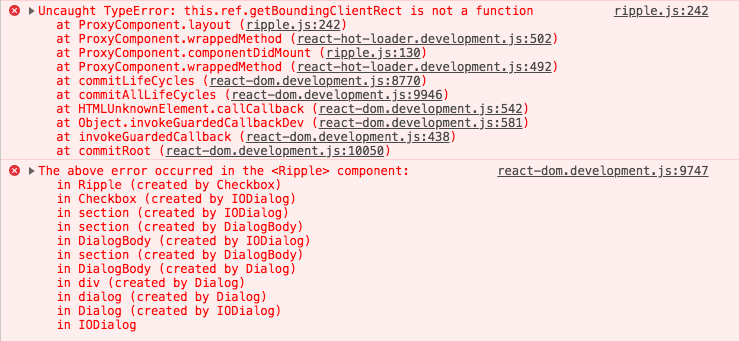
Error related to "getComputedStyle" in dev env

On a fresh clone, I did:

$ yarn install
$ yarn compile:dev
$ yarn start:dev
The above error occurred in the <Select> component:
    in Select
    in div
    in section
    in Unknown (created by Main)
    in main (created by Main)
    in Main (created by App)
    in div (created by Content)
    in Content (created by App)
    in div (created by Content)
    in Content (created by App)
    in App

TypeError: Argument 1 of Window.getComputedStyle is not an object.

Button doesn't spread type attr to child

Context
On a Windows 7 computer, with google chrome installed

What are you trying to achieve or the steps to reproduce ?
Create a Button with type="button" to disable form sending on click

Which result you had ?
type attr is ignored

add Animations (Ripple, Menu, Select, Drawer)

Some components need some cool animations.

  • Most of all Ripple effect
  • Menu / Select an appear/disappear animation
  • Drawer temporary needs an appear/disappear animation also
  • Tabs also need an animation for the bottom line

Provide dialog polyfill

We need a dialog polyfill to
make this library work on all browsers. Currently, we do not ship it within
this lib but it would make sense to do so.

  1. We should add the polyfill as a dependency
  2. The CSS file should be concatenated (see compile:css npm script).
  3. The JavaScript should be imported in src/libs/dialog/index.js

Select : prettier added a regression !!

For children mapping the code was previously:
{Children.map(children, child => React.cloneElement(child, { role: "option" }))}
But Prettier transformed to :

          {Children.map(children, (child) => {
            React.cloneElement(child, { role: "option" });
          })}

That's wrong !!! The children are not rendered

Add Banner component


name: Banner component
about: Display banner for medium priority information


Is your feature request related to a problem? Please describe.
Linked to validation account by email Zoapp/backend#67.

Describe the solution you'd like
After validation, backend redirect on client with qureyParams to notify user about result.
We should display this information with a banner.

should be like this

Rmdc.closeDialog() throws an error

This is an error I got while working on Opla/front, showDialog() works but not closeDialog() apparently.

invariant.js:42 Uncaught Error: unmountComponentAtNode(...): Target container is not a DOM element.
    at invariant (invariant.js:42)
    at Object.unmountComponentAtNode (react-dom.development.js:15297)
    at Object.close (manager.js:88)
    at _class.closeDialog (rmdc.js:226)
    at publishDialog.jsx:108

Error when `Dialog` does not have a `actions` prop

According to the prop types definition, it should be possible to have a dialog without actions, but this causes an error because the Dialog tries to iterate over the actions (.map()). It should be possible to use a Dialog without actions.

CHeckbox not working with statecopy made

I am having a weird issue:
I have a button called assign and when I click on it, a modal with userslist(checkboxes) opens
This modal has a confirm and cancel button. THe buttons functionality should be such as
When I click on confirm, the checked or unchecked data(no matter what selection is made) should save and when I click on cancel any data should revert back to confirmed(saved) data.
I have built my component such that when loading initially, I am copying the state and then the 'copystate' changes are saved to original state when confirmed and when cancelled, original state changes are copied to 'copystate'.
But what is happening is the state is getting updated no matter what change I make in the copystate. and the copystate and original state are having the same data.

Can somebody help me with this:
Below is my render method:

render() {
    const ready = this.state.ready;
    return (
      <div>
        {ready &&
          this.state.data.addOnProducts.map((val, idx) => {
            const userListIndex = val.indexOf()
            return (
              <div key={idx}>
                <button className={`btn btn--rounded btn--assign`} onClick={() => this.openModal(idx)}>
                  {'assign'}
                </button>
                {this.state.showModal && (
                  <CheckboxList
                    key={idx}
                    list={this.state.newData.addOnProducts[this.state.currentAddOnIndex].usersData.usersList}
                    selectHandler={this.assignHandler}
                    //label={this.state.newData.addOnProducts[this.state.currentAddOnIndex].usersData.usersList}
                  />
                )}
              </div>
            );
          })}
      </div>
    );
  }

Below is my assign handler:

assignHandler(idx) {
    const newData = Object.assign({}, this.state.newData);
    console.log('state list',this.state.newData.addOnProducts[this.state.currentAddOnIndex].usersData.usersList);
    console.log('newData list',this.state.newData.addOnProducts[this.state.currentAddOnIndex].usersData.usersList);
    newData.addOnProducts[this.state.currentAddOnIndex].usersData.usersList.map((user, index) => {
      if (index === idx) {
        user.selected = !user.selected;
      }
     return user;
    });
    this.setState(
    {
      newData: Object.assign({}, newData)
    }, function() {
      console.log('state list',this.state.data.addOnProducts[this.state.currentAddOnIndex].usersData.usersList);
      console.log('newData list',this.state.newData.addOnProducts[this.state.currentAddOnIndex].usersData.usersList);
    });
  };

This is Cancel Method:

 cancelAssignUsers() {
        const stateUsersList = Object.assign({}, this.state.data.addOnProducts[this.state.currentAddOnIndex].usersData);
        const newDataCopy = Object.assign({}, this.state.newData);
    console.log(stateUsersList.usersList);
        newDataCopy.addOnProducts[this.state.currentAddOnIndex].usersData.usersList = stateUsersList.usersList;
    console.log(newDataCopy.addOnProducts[this.state.currentAddOnIndex].usersData.usersList);
        this.setState({
          showModal: false,
          newData: Object.assign({}, newDataCopy)
        });
  }

this is my confirm method:

confirmAssignUsers() {
    const newDataUsersList = Object.assign(
      {},
      this.state.newData.addOnProducts[this.state.currentAddOnIndex].usersData
    );
    const stateCopy = Object.assign({}, this.state.data);
    stateCopy.addOnProducts[this.state.currentAddOnIndex].usersData.usersList = newDataUsersList.usersList;
console.log(stateCopy.addOnProducts[this.state.currentAddOnIndex].usersData.usersList);
    this.setState({
      showModal: false,
      data: Object.assign({}, stateCopy)
    });
  }

Theming and SASS mixins

Need to find a way to integrate theming. Actually we use darkTheme prop which is deprecated since MDC 0.30.

Add documentation for releasing the library

We should add the content below to the README.


In order to create a new release, you can use npm version . Assuming we are at version 0.3.2 and we want to release 0.3.3. You can run the following command:

$ npm version patch

This command performs the following tasks:

  • bump (update) the version number in package.json
  • create a git tag

You can use npm version minor to release 0.4.0 from 0.3.1 (it bumps the second number and resets the last number). You can also use npm version major to release 1.0.0 from 0.3.1.

Then, you can push to the repository:

$ git push origin master --tag

The tag will be pushed to GitHub and Travis CI will trigger the automatic release process we have added last week.

Select: onSelected should be onSelect

We should rename the onSelected prop to onSelect to be consistent with the other props in the other components (e.g., onChange).

In addition, it would be nice to specify a value that is the current/selected value.

Open Dialog from an Object definition

Rmdc.openDialog({
  header,
  body,
  actions: [{ title:"Cancel" }], 
  handleAction: handleAction, 
  style: { width: "720px" },
});

Or at min:
Rmdc.openDialog("Hello");

only body is mandatory

Recommend Projects

  • React photo React

    A declarative, efficient, and flexible JavaScript library for building user interfaces.

  • Vue.js photo Vue.js

    ๐Ÿ–– Vue.js is a progressive, incrementally-adoptable JavaScript framework for building UI on the web.

  • Typescript photo Typescript

    TypeScript is a superset of JavaScript that compiles to clean JavaScript output.

  • TensorFlow photo TensorFlow

    An Open Source Machine Learning Framework for Everyone

  • Django photo Django

    The Web framework for perfectionists with deadlines.

  • D3 photo D3

    Bring data to life with SVG, Canvas and HTML. ๐Ÿ“Š๐Ÿ“ˆ๐ŸŽ‰

Recommend Topics

  • javascript

    JavaScript (JS) is a lightweight interpreted programming language with first-class functions.

  • web

    Some thing interesting about web. New door for the world.

  • server

    A server is a program made to process requests and deliver data to clients.

  • Machine learning

    Machine learning is a way of modeling and interpreting data that allows a piece of software to respond intelligently.

  • Game

    Some thing interesting about game, make everyone happy.

Recommend Org

  • Facebook photo Facebook

    We are working to build community through open source technology. NB: members must have two-factor auth.

  • Microsoft photo Microsoft

    Open source projects and samples from Microsoft.

  • Google photo Google

    Google โค๏ธ Open Source for everyone.

  • D3 photo D3

    Data-Driven Documents codes.