https://pubs.acs.org/action/showCitFormats?doi=10.1021%2Facs.jproteome.7b00595
Problems and objectives
- 1 in 8 U.S. women (about 12.4%) will develop invasive breast cancer
- in 2018, 266,120 diagnosed new cases of invasive breast cancer
- Breast cancer has more than one subtypes. We are interested in two subtypes, ER+ and ER-
- Diagnosis and further treatment is depend on these subtypes
- Classification of Breast cancer patients based on their metabolomics profile
- Assess the predictive accuracy of the Deep Learning (DL) to predict estrogen receptor (ER) status from the metabolomics data.

preprocessing:to remove sample to sample variation
pretraining:This step improves the model performance, avoids random initialization of the weights, and selects the best model architecture

Figure 2. (A) Average AUC on 10 hold out test sets of the DL framework against six machine learning algorithms for prediction of ER status from metabolomics data: recursive partitioning and regression trees (RPART) (0.83), linear discriminant analysis (LDA) (0.74), support vector machine (SVM) (0.89), deep learning (DL) (0.93), random forest (RF) (0.89), generalized boosted models (GBM) (0.89), and prediction analysis for microarrays (PAM) (0.88). The above algorithms were run 10 times on different train/test splits. We used pairwise Wilcoxon signed-rank test to estimate the statistical significance of the difference in performance between DL and other methods (∗∗ p < 0.01, ∗ p < 0.1). (B) Bipartite graph of the top 20 important metabolites extracted from DL model and other machine learning algorithms. Large nodes represent the models and small nodes are metabolites. A connection between metabolite and the model means this metabolite is one of the top 20 high importance metabolites extracted by this model.
So, what is the best model? "ALL of them are wrong some of them are useful" George Box
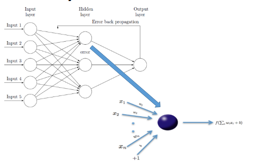

Figure 3. Biological relevance of the DL hidden layers. (A) Activation levels of the high variance nodes extracted from the layer 1 of the DL model. Columns are samples and rows are the top 12 nodes with high variance >0.1. (B) Bipartite graph of enriched significant metabolomics pathways and top hidden nodes. The nodes represent enriched pathways common to all top 12 nodes (green color) in the first hidden layer of DL in KEGG pathway enrichment analysis (FDR< 0.05).

Figure 4. Joint pathway analysis between the top 20 DL metabolites and the highly differentiated enzymes. Only significant pathways with at least five overlapping metabolites are shown. X-axis shows the number of overlapped metabolites with the number of genes (number in parentheses) involved in the same pathway, y-axis shows the adjusted joint P-value calculated from IMPALA tool.(42) The size of the nodes represents the size of metabolomic pathway (number of metabolites involved in that pathway). The color of the nodes represents the database source of these pathways.

Figure 5. Circos plot of Spearman’s correlation values between top 20 DL metabolites and highly differentiated enzymes with cutoff = |0.35|.


