Giter Site home page Giter Site logo

vaadin / vaadin-app-layout Goto Github PK

View Code? Open in Web Editor NEW
9.0 10.0 3.0 4.79 MB

The Web Component for a common application layout. Part of the Vaadin components.

Home Page: https://vaadin.com/components

License: Apache License 2.0

JavaScript 7.01% HTML 92.99%
layout webcomponents web-components custom-elements vaadin

vaadin-app-layout's Introduction

<vaadin-app-layout>

⚠️ Starting from Vaadin 20, the source code and issues for this component are migrated to the vaadin/web-components monorepository. This repository contains the source code and releases of <vaadin-app-layout> for the Vaadin versions 10 to 19.

<vaadin-app-layout> is a Web Component providing a quick and easy way to get a common application layout structure done, part of the Vaadin components.

Live Demo ↗ | API documentation ↗
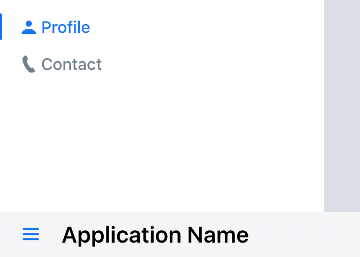
npm version Published on webcomponents.org Published on Vaadin Directory Discord

<vaadin-app-layout>
  <vaadin-drawer-toggle slot="navbar touch-optimized"></vaadin-drawer-toggle>
  <h3 slot="navbar touch-optimized">Application Name</h3>
  <vaadin-tabs orientation="vertical" slot="drawer">
    <vaadin-tab>
      <a href="/profile">
        <iron-icon icon="lumo:user"></iron-icon>
        Profile
      </a>
    </vaadin-tab>
    <vaadin-tab>
      <a href="/contact">
        <iron-icon icon="lumo:phone"></iron-icon>
        Contact
      </a>
    </vaadin-tab>
  </vaadin-tabs>
  <div>Page content</div>
</vaadin-app-layout>

Screenshot of vaadin-app-layout

Screenshot of vaadin-app-layout on mobile

Installation

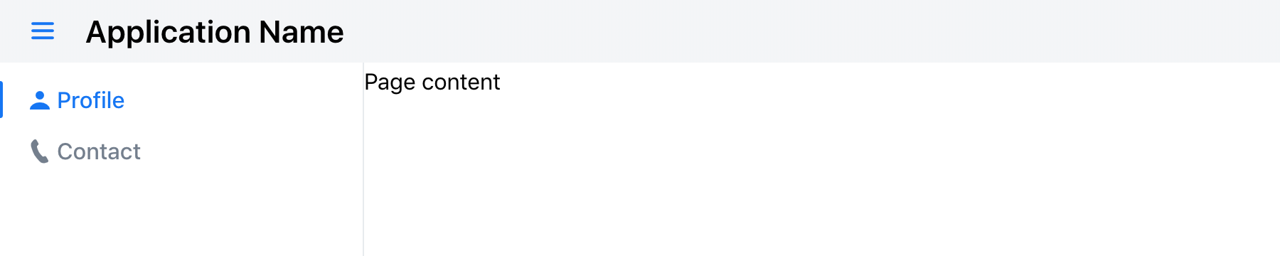
The Vaadin components are distributed as Bower and npm packages. Please note that the version range is the same, as the API has not changed. You should not mix Bower and npm versions in the same application, though.

Unlike the official Polymer Elements, the converted Polymer 3 compatible Vaadin components are only published on npm, not pushed to GitHub repositories.

Polymer 2 and HTML Imports compatible version

Install vaadin-app-layout:

bower i vaadin/vaadin-app-layout --save

Once installed, import it in your application:

<link rel="import" href="bower_components/vaadin-app-layout/vaadin-app-layout.html">
<link rel="import" href="bower_components/vaadin-app-layout/vaadin-drawer.toggle.html">

Polymer 3 and ES Modules compatible version

Install vaadin-app-layout:

npm i @vaadin/vaadin-app-layout --save

Once installed, import it in your application:

import '@vaadin/vaadin-app-layout/vaadin-app-layout.js';
import '@vaadin/vaadin-app-layout/vaadin-drawer-toggle.js';

Getting Started

Vaadin components use the Lumo theme by default.

To use the Material theme, import the correspondent file from the theme/material folder.

Entry points

  • The components with the Lumo theme:

    theme/lumo/vaadin-app-layout.html theme/lumo/vaadin-drawer-toggle.html

  • The components with the Material theme:

    theme/material/vaadin-app-layout.html theme/material/vaadin-drawer-toggle.html

  • Aliases for theme/lumo/vaadin-app-layout.html theme/lumo/vaadin-drawer-toggle.html

    vaadin-app-layout.html vaadin-drawer-toggle.html

Running demos and tests in browser

  1. Fork the vaadin-app-layout repository and clone it locally.

  2. Make sure you have npm installed.

  3. When in the vaadin-app-layout directory, run npm install and then bower install to install dependencies.

  4. Make sure you have polymer-cli installed globally: npm i -g polymer-cli.

  5. Run polymer serve --open, browser will automatically open the component API documentation.

  6. You can also open demo or in-browser tests by adding demo or test to the URL, for example:

Running tests from the command line

  1. When in the vaadin-app-layout directory, run polymer test

Following the coding style

We are using ESLint for linting JavaScript code. You can check if your code is following our standards by running npm run lint, which will automatically lint all .js files as well as JavaScript snippets inside .html files.

Contributing

  • Make sure your code is compliant with our code linters: npm run lint
  • Check that tests are passing: polymer test
  • Submit a pull request with detailed title and description
  • Wait for response from one of Vaadin components team members

License

Apache License 2.0

Vaadin collects development time usage statistics to improve this product. For details and to opt-out, see https://github.com/vaadin/vaadin-usage-statistics.

vaadin-app-layout's People

Contributors

alvarezguille avatar dependabot[bot] avatar diegocardoso avatar jouni avatar phan-thanhdat avatar platosha avatar tomivirkki avatar web-padawan avatar

Stargazers

 avatar  avatar  avatar  avatar  avatar  avatar  avatar  avatar  avatar

Watchers

 avatar  avatar  avatar  avatar  avatar  avatar  avatar  avatar  avatar  avatar

vaadin-app-layout's Issues

App Layout with drawer slot

Next major version for vaadin-app-layout
Includes slots for drawer and navigation bar
Has API to change precedence mode between drawer and navigation bar as shown in following mockups:

  • Full height drawer
    image
  • Full width navigation bar
    image

Close drawer when navigation occurs in mobile

App Layout in mobile screen shows the drawer as overlay, hiding the content.

When the user opens the drawer and clicks in an item which triggers a navigation (that don't trigger a full page reload), then drawer keeps itself opened, and the user would have to tap on the backdrop in order to close it.

It would be a better UX if the drawer would be closed by the component when such thing happens.

See this behavior in action below:
app-layout-navigation

I am not sure if this can be easily achieved in the WC part, but probably could be implemented in the flow element, so I decided to create it here first. If this turns out to be rather too complicated, then we can move this issue to vaadin-app-layout-flow repo.

Remove navbar slot wrappers?

Having every navbar slot wrapped in a dedicated part is surely very flexible for the theming, as it allows the individual alignment and spacing control.

However, not having wrapper slots over the flex children brings more sizing and alignment control for developers. For example, the following would be possible without having to define a theme module:

<!-- Stretch my logo vertically -->
<img slot="branding" style="align-self: stretch;">

<!-- Center the tabs -->
<vaadin-tabs slot="menu" style="margin: auto;"></vaadin-tabs>

Rename drawer-first property

drawer-first does not give a good idea of what it does.

The proposal is to rename it to a String property that accepts two values primary-section="navbar|drawer".

DX test getting started experience

  • The component is successfully taken into use (the component is visible in the app) in a frontend starter (from vaadin.com/start) project in under 5 minutes.

  • The component is successfully taken into use (the component is visible in the app) in a Flow starter (from vaadin.com/start) project in under 5 minutes

  • 3 test subjects

Show how to create a real menu using app-layout

The demos currently demonstrate that you should create a menu as

  <vaadin-tabs slot="menu">
    <vaadin-tab theme="icon-on-top">
      <iron-icon icon="vaadin:home"></iron-icon>
      Page 1
    </vaadin-tab>
    <vaadin-tab theme="icon-on-top">
      <iron-icon icon="vaadin:list"></iron-icon>
      Page 2
    </vaadin-tab>
</vaadin-tabs>

While this looks nice, the menu does not work because there are no <a href> links in it. If you do add <a> tags, you have two options:

  1. Wrap the <vaadin-tab> element so you have
<a>
  <vaadin-tab theme="icon-on-top">
    <iron-icon icon="vaadin:home"></iron-icon>
    Page 1
  </vaadin-tab>
</a>

This renders the options correctly, the link works but keyboard navigation (right-left arrows) and highlighting of vaadin-tabs no longer works. Navigating between the items using tab works and a menu item can be activated using enter.

  1. Wrap the contents of <vaadin-tab>
<vaadin-tab theme="icon-on-top">
  <a>
    <iron-icon icon="vaadin:home"></iron-icon>
    Page 1
  </a>
</vaadin-tab>

This breaks the theme (icon is not on top). Keyboard navigation (left-right) works but selecting/navigating using enter does not.

Please add a demo showing how you should use app-layout in a real application. A workaround using click listeners is not preferable as you then prevent opening the item in a new tab etc.

Keep drawer state on resize

Scenario

  • Drawer is opened
  • User resize window until it hits the overlay breakpoint and drawer gets closed
  • User resize window back to its original position

Expected

  • Drawer restore its previous state and appears opened

Actual

  • Drawer is kept closed

Force flex layout

App Layout makes assumes that the host element is always display: flex.

If a user uses <vaadin-app-layout> as the root element of a design in Vaadin Designer, the tool will override the host with display: block, causing unexpected results.

We could prevent this by enforcing display: flex !important.

Improve documentation

  • Add a comment about usage of the default slot for content
  • do not include the functional API, like connectedCallback etc.
  • Add notes about using the component on the root level (Where in the DOM it is supposed to be used)

Create secondary slot in navbard

Secondary slot would add a possibility for the user to add an extra component at the right side of the navbar.

Should/could provide a way to define the behavior in small screens.

Lumo drawer toggle has arbitrary size and doesn't look nice

This is the issue similar to #106 but now for Lumo.

Let me suggest an improvement which is expected to make drawer toggle look better.

:host {
  width: var(--lumo-size-l);
  height: var(--lumo-size-l);
  min-width: auto;
  margin: 0 var(--lumo-space-m);
  padding: 0;
  background: transparent;
}

See the original code in my webpack starter.

Will submit a PR and update visual tests accordingly.

Make part=content take the full available height

Though the component takes the full height, part="content" is not forced to take the available height.

So if developer declares a <vaadin-app-layout> like this:

<style>
  .page {
    display: flex;
  }
  
  .content {
    flex: 1; 
  }
  
  .menu {
    background: lightgrey;
    width: 200px;
  }
</style>
<!-- ... -->
<vaadin-app-layout>
  <h3 slot="branding">Application Name</h3>
  <vaadin-tabs slot="menu">
      <vaadin-tab>Page 1</vaadin-tab>
      <vaadin-tab>Page 2</vaadin-tab>
  </vaadin-tabs>
  <div class="page">
    <div class="content">
      Page content
    </div>
    <div class="menu">
      <ul>
        <li>Side menu item</li>
        <li>Side menu item</li>
        <li>Side menu item</li>
        <li>Side menu item</li>
      </ul>
    </div>  
  </div>
</vaadin-app-layout>

This would be what they get:

bumpy-resonance glitch me_ 1

Navbar does not apply vertical alignment to items

As a user, I expect vertical alignment in navbar to be supported out of the box.

Currently, part="navbar" is a flex container but it doesn't set alitn-items: center.
Instead we introduce another flex container in the demos, which looks weird:

<style>
  nav {
    display: flex;
    align-items: center;
  }
</style>

Let's consider adding align-items: center to the navbar part for simplicity and better DX.

Dark Theme is broken in Safari and Edge

Steps to reproduce

  1. Create view that extends from AppLayout and have dark Lumo theme
  2. Add tabs.
@Route
@PWA(name = "Project Base for Vaadin Flow with Spring", shortName = "Project Base")
@Theme(value = Lumo.class, variant = Lumo.DARK)
public class MainView extends AppLayout {

    public MainView(@Autowired MessageBean bean) {
        Tabs tabs = new Tabs(new Tab("Home"), new Tab("About"));
        tabs.setOrientation(Tabs.Orientation.HORIZONTAL);
        addToNavbar(tabs);
    }

}

In Chrome tabs have dark background:
Screenshot 2019-09-04 at 10 08 44

but in Safari and Edge tabs have light background:
Screenshot 2019-09-04 at 10 08 52

Material theme in IE11 adds a extra space under the menu

It's not sure whether this is a problem with vaadin-app-layout styles or vaadin-tabs that could be handled in the material theme configuration for vaadin-app-layout.

This is how it looks like in IE11:
screen shot 2018-09-25 at 13 22 03

This is how it looks like in Edge (and other browsers):
screen shot 2018-09-25 at 13 27 33

Hard-coded branding size constrains

Currently, in the core styles, there are hard-coded size constrains for the branding: max-width: 20%; max-height: 100%;.

This could become problematic for certain scenarios, for example, produce accidental text wrapping or downscaling for long images. Applying arbitrary browser scaling for logos often results in a blurry or rough-edged output.

I would suggest to not constrain the developer-provided content whenever possible. Sure any size exceeds and overlaps are problematic, but in case if they are not shown, it is even harder to notice and fix that. The height constrain makes more sense for the navbar content, but the width constrain — looks like it could be removed altogether.

Another idea to consider is to have the navbar height: auto;, so that the height is automatically determined from the content. This guarantees to not produce any height overlaps (since the height would be increased instead), and we would have less magic numbers to maintain.

Related issue: the branding image used in the demo does not have a size defined. With the built-in constrains removed, the image is so big, it exceeds the navbar height and overlaps the content. Suggestion: specify width and height attributes on the image with a suitable size in the demo. It is a generally good practice for the developers to follow.

Change argument name 'touchOptimized' to a more fitting name

I was a bit confused about the parameter touchOptimized of the method addToNavbar(boolean touchOptimized, Component... components). I thought this parameter would improve the handling of the navbar a lot on mobile devices for example or does something very special on mobile.

In the end the API documentation tells:

touchOptimized - if true, the components will be moved to the bottom navbar area on mobile devices.

Maybe a different name for the parameter would be more fitting because it only changes the navbar to bottom on mobile devices?

Prepare for alpha

Current implementation is based on prototype
Tests and demos are missing

Component works with Lumo and Material

It is possible to choose which theme to use as a starting point
The components adapt to the theme’s properties (colors, typography, sizing, spacing, style)

Create use case demos to vaadin.com

  • An example with a large viewport
  • An example with a small viewport
  • An example with a large number of menu items
  • An example with text as the logo/branding
  • An example with an image as the logo/branding

Add support for RTL

Though it can be achieved by adding some styles to navbar and branding parts, App layout could have support by default to RTL.

CSS Rule destroys pointer events on touch devices.

I have a <canvas> element behind the <vaadin-app-layout> slot.
On a touch device, the canvas will only get pointerdown events. pointermove and pointerup events won't get called. When the canvas is located outside of the slot, the events work fine.

I do not understand why, but it seems that the overflow:auto rule on div[part="content"] seems to cause the issue.

[part="content"] {
   flex: auto;
   height: 100%;
   /* overflow: auto; */
   -webkit-overflow-scrolling: touch;
}

In my case replacing the overflow with height: -webkit-fill-available; height: -moz-fill-available; fill-available solved the issue without changing the ui.
But i didn't check that on other examples.

iOS scrolling - support both body and content area scrolling

With “body scrolling” we get the collapsing navbars on iOS (and some other small UX details) and the content scrolling under the app layout navbar (so that we can apply the iOS looking backdrop blur).

With “content area scrolling” we can support full height views that contain their own scrolling regions, like grids for example.

Recommend Projects

  • React photo React

    A declarative, efficient, and flexible JavaScript library for building user interfaces.

  • Vue.js photo Vue.js

    🖖 Vue.js is a progressive, incrementally-adoptable JavaScript framework for building UI on the web.

  • Typescript photo Typescript

    TypeScript is a superset of JavaScript that compiles to clean JavaScript output.

  • TensorFlow photo TensorFlow

    An Open Source Machine Learning Framework for Everyone

  • Django photo Django

    The Web framework for perfectionists with deadlines.

  • D3 photo D3

    Bring data to life with SVG, Canvas and HTML. 📊📈🎉

Recommend Topics

  • javascript

    JavaScript (JS) is a lightweight interpreted programming language with first-class functions.

  • web

    Some thing interesting about web. New door for the world.

  • server

    A server is a program made to process requests and deliver data to clients.

  • Machine learning

    Machine learning is a way of modeling and interpreting data that allows a piece of software to respond intelligently.

  • Game

    Some thing interesting about game, make everyone happy.

Recommend Org

  • Facebook photo Facebook

    We are working to build community through open source technology. NB: members must have two-factor auth.

  • Microsoft photo Microsoft

    Open source projects and samples from Microsoft.

  • Google photo Google

    Google ❤️ Open Source for everyone.

  • D3 photo D3

    Data-Driven Documents codes.