Comments (14)
 zachkinstner
commented on May 11, 2024
zachkinstner
commented on May 11, 2024
The interaction settings provide an option for "Sticky Release Distance". As a first step, please try adjusting that to see if there's a value that seems to work best. The balance here is that the value can't be so low that it becomes easy to accidentally release the slider while dragging it.
from hover-ui-kit.
zachkinstner
commented on May 11, 2024
Beyond that, there might be some more complex ways to improve this.
For example, the slider could become less sensitive to up-and-down cursor movements as the distance between the slider and cursor gets larger. So, as the cursor moves away from its "sticky" selection on the slider's handle, it would become harder to change the current slider value, and thus more likely to stay on its desired value.
from hover-ui-kit.
zachkinstner
commented on May 11, 2024
Potentially interesting idea: allow the slider to auto-release if you hold it still for some unit of time. This may not work well in cases where the tracking is a little jumpy, since it would be harder to determine if the user is actually trying to stay still.
from hover-ui-kit.
 squakmix
commented on May 11, 2024
squakmix
commented on May 11, 2024
Sounds great, I'll give the sticky release distance setting a try. I was imagining something like your last idea; when I sit still in one place with the slider for long enough I want it to release cleanly. I'm not sure if that would be confusing for some users who go a little bit slower though; the wait would have to be long enough that it doesn't accidentally go off for slow users but short enough that its not frustrating for people intentionally using it.
from hover-ui-kit.
 ddutchie
commented on May 11, 2024
ddutchie
commented on May 11, 2024
Could we have an option to reverse the slider. For example 1-24 could go 24-1 with values on opposites of the slider.
from hover-ui-kit.
zachkinstner
commented on May 11, 2024
Started work in the slider-release branch.
from hover-ui-kit.
zachkinstner
commented on May 11, 2024
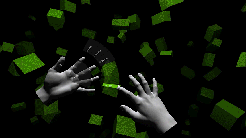
Here's a quick animation showing a slide from hue 90 to about 185, then using the new "precision" sliding to get to 199 (and yes, I was aiming for 200...):
from hover-ui-kit.
zachkinstner
commented on May 11, 2024
the slider could become less sensitive to up-and-down cursor movements as the distance between the slider and cursor gets larger.
The latest commit (referenced above) tries this approach. It seems to work pretty well.
The slider now has a "reaction time" that occurs based on the cursor's distance away. You could think of this like a lagging effect -- when your finger is farther away, the slider handle follows slowly behind the cursor. The basic usage is:
- With your cursor near to the slider handle, move the handle close to the target value.
- Move your cursor away from the slider.
- Move your cursor up/down, and the handle will slowly follow.
- Once the handle hits your target value, move the cursor further away from the slider until the "sticky" selection releases.
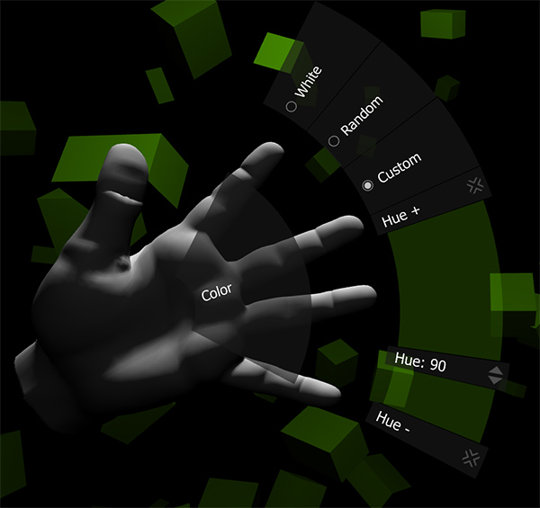
In general, I think there is only so much precision we can expect to achieve with a hand-based menu like Hovercast. The hue slider packs 360 values into a 50% size (of the entire menu arc), and it is pretty difficult to select an exact value. From a developer perspective, you have a few options:
- Use the "steps" feature to ensure the user lands on a round number. For example, the hue slider could use steps so that the slider always stops on a multiple of 10. This is only perceived precision, though.
- Use up to 100% of the entire menu arc for the slider.
- In cases where high precision is vital, try splitting up the sliders. For the hue slider, for example, maybe there is an initial "red", "yellow", "green", etc. radio selection, and then the hue slider's range is narrowed to about 60 units (instead of 360). Or, maybe there is an initial "overall" slider that gets within 20 units, and then a "precision" slider that has a range of +/- 10 units.
from hover-ui-kit.
zachkinstner
commented on May 11, 2024
Another high-precision idea: use a slider, but have a + item above it and a - item below it. Both of these could be "Selection" item types. When you select one of those items, it adjusts the slider by one unit (or however much you specify). These could also be "Sticky" items, and the slider value could just slowly, gradually change until you release the + or - item.
If this seems like a good idea, and would be used often, I could eventually implement it as a built-in feature. Essentially, you'd enable a "fine-tuning" option, maybe with some sub-settings, to define how those + and - buttons behave.
Of course, the ideal would be to make the slider precise enough on its own. As I mentioned above, though, I'm not sure how feasible that will be for all scenarios. There are many external contributing factors, including the user's own hand stability, the tracking device's accuracy, the lighting/environment that affects the device's accuracy, etc.
from hover-ui-kit.
zachkinstner
commented on May 11, 2024
I haven't added any configuration settings for this yet, as I'm hoping to get some feedback first. Here's the key line, in case anyone wants to tweak the behavior:
float reactionTime = (float)Math.Pow(1-vSegState.ReleaseProgressRaw, 5)*6000f+1f;Here, the exponent (currently 5) defines the "curve" of the lagging effect (based upon distance). The 6000f is a millisecond value that defines how long (at the maximum lag) it would take the handle to reach the cursor's current value. When ReleaseProgressRaw is near 1 (cursor is very close to the slider handle) the math works out to a very low reaction time, which makes the handle instantly react to the cursor movements.
Any thoughts/feedback about all this?
from hover-ui-kit.
squakmix
commented on May 11, 2024
I like the concept of "lagging" the slider movements more as the user's interaction finger moves further away, and it appears to work well in the example/demonstration you posted. I tried using the steps feature to solve this problem but ultimately I was unhappy with the limited number of hue options that afforded my users (if the number of steps became too high, I ran into the same issue).
Also, the fine control +/- buttons sound extremely useful. I'd love to have the ability to offer that in my application.
from hover-ui-kit.
zachkinstner
commented on May 11, 2024
(Note: the commit referenced above was meant for issue 14.)
Thanks @squakmix. I'll continue in this direction.
In case you need them right away, those +/- buttons would be feasible to create outside of Hovercast. The buttons would need custom listeners that find the target slider item, and then change its value upon the selection event.
from hover-ui-kit.
zachkinstner
commented on May 11, 2024
The commit referenced above shows how to create the plus/minus buttons for a slider. The key script is DemoColorHuePlusListener. The commit also contains the changes to the demo's Unity files, which you can review within Unity to see how these new items are configured.
I decided to use "sticky" items here. This allows the "increment" event to re-fire (using a timer and the provided "frequency" setting) while the "sticky" item is selected.
from hover-ui-kit.
zachkinstner
commented on May 11, 2024
@zachkinstner wrote:
Potentially interesting idea: allow the slider to auto-release if you hold it still for some unit of time.
@squakmix wrote:
when I sit still in one place with the slider for long enough I want it to release cleanly. I'm not sure if that would be confusing for some users who go a little bit slower though; the wait would have to be long enough that it doesn't accidentally go off for slow users but short enough that its not frustrating for people intentionally using it.
I'm starting to think that this wait-based approach might be better. I haven't reviewed this distance-based approach in a while, but I know that it wasn't feeling quite right when I implemented it. I was going to come back to it before committing it to the master branch.
A wait-based approach probably has its own challenges, but it also solves another problem: stopping a slide/drag interaction that is not restricted to a "slider track". I'd like to maintain consistency throughout the Hover VR Interface Kit, so it's appealing to standardize on one solution.
I'm envisioning a visual indicator that exists on the cursor (as part of Hover.Cursor) -- maybe a radial progress meter, or the classic "pie-slice" countdown. That indicator would begin when you stop, and give you a moment to keep moving again. There might also be some indication of speed -- somehow communicating that, if you slow down enough, the release process will begin.
Thoughts?
from hover-ui-kit.
Related Issues (20)
- How do I add event listeners to an item? HOT 1
- Radio Buttons on the Fly HOT 3
- I can't get started HOT 2
- How to attach the UI to gesture HOT 4
- Question about HoverInputSceneLoader HOT 1
- fail to update value from HoverItemDataSlider HOT 2
- Raycast on Finger HOT 2
- Trying example scenes with Vive HOT 2
- The type or namespace name `UnityStandardAssets' could not be found. Are you missing an assembly reference? HOT 2
- Interaction with Unity UI HOT 1
- TreeUpdate is Glitching Out when using a slider HOT 4
- Multiple Depricated Dependencies HOT 22
- Registering hovercast events HOT 2
- Hololens input HOT 1
- How to use OVR Grabber with the module? HOT 1
- "Hover Layout Arc" doesn't spread child GameObjects but keeps them piled on top of each other HOT 2
- Sprite swap by hovering HOT 3
- Add support for Oculus Hand Tracking *Feature request*
- Support for Unity's XR Interaction Toolkit? HOT 1
- error CS0234: The type or namespace name 'ImageEffects' does not exist in the namespace
Recommend Projects
-
 React
React
A declarative, efficient, and flexible JavaScript library for building user interfaces.
-
Vue.js
🖖 Vue.js is a progressive, incrementally-adoptable JavaScript framework for building UI on the web.
-
 Typescript
TypeScript is a superset of JavaScript that compiles to clean JavaScript output.
-
TensorFlow
An Open Source Machine Learning Framework for Everyone
-
Django
The Web framework for perfectionists with deadlines.
-
 Laravel
A PHP framework for web artisans
-
D3
Bring data to life with SVG, Canvas and HTML. 📊📈🎉
-
Recommend Topics
-
javascript
JavaScript (JS) is a lightweight interpreted programming language with first-class functions.
-
web
Some thing interesting about web. New door for the world.
-
server
A server is a program made to process requests and deliver data to clients.
-
Machine learning
Machine learning is a way of modeling and interpreting data that allows a piece of software to respond intelligently.
-
Visualization
Some thing interesting about visualization, use data art
-
Game
Some thing interesting about game, make everyone happy.
Recommend Org
-
Facebook
We are working to build community through open source technology. NB: members must have two-factor auth.
-
Microsoft
Open source projects and samples from Microsoft.
-
Google
Google ❤️ Open Source for everyone.
-
Alibaba
Alibaba Open Source for everyone
-
D3
Data-Driven Documents codes.
-
Tencent
China tencent open source team.
from hover-ui-kit.