bluefireteam / dashbook Goto Github PK
View Code? Open in Web Editor NEWDevelopment tools to help you building UI on Flutter
License: MIT License
Development tools to help you building UI on Flutter
License: MIT License


I'm going to submit a PR for the null safety support.
It is a common practice to keep such a code in a separate branch, i.e. null-safety, to be able to support the main release in legacy mode whilst the null safety compatible release could be released from its branch.
Please, prepare the branch for null safety support PR.
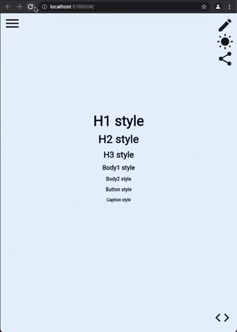
Currently it is quite hard to see which example that has been chosen:

It would be good to have a better contrast between the two texts.
Maybe through color, opacity, or underlining (or a mix of them).
To make it easier for the users of the example site to navigate.
👋 Thanks for creating this package. So far it has been super easy and quick to get it running on the few widgets I have created for my project.
I am new to flutter/dart so forgive the beginner question.
I am wondering if there is a way to setup the file structure so that not all the chapters have to be in the same class?
Just like with the device preview, but having the possibility to set any size instead of the predefined ones.
One useful feature of Storybook is the Docs tab which supports components or MDX.
I feel like one potential way to support this in dashbook is to load the dart docs in an iframe (if web) or a webview (if mobile). Each story could accept a dartDocUrl.
I'm trying to use colorProperty to let users change some widgets color.
The color picker is opened correctly with default color, but when I try to change the color and confirm in "Got it" button, the background page is closed instead of color picker modal.
This is how I'm using the colorProperty:
final bool customize = dc.boolProperty('Customize colors', false);
final Color backgroundColor = dc.colorProperty(
      'backgroundColor',
      Colors.grey,
      visibilityControlProperty: ControlProperty('Customize colors', true),
);
This is what's happening:

On the canvas/preview screen in storybook, users can select the viewport size. It would be nice to have this feature in dashbook. Here's an example:

The options provided are:
Selecting a viewport shrinks the canvas viewport size. I think this helps usability because the developer no longer has to shrink the browser (if they are using chrome) or open devtools.
Right now there are some dependencies that are not updated, which is blocking us from upgrading the freezed-package to the stable version by depending on dashbook. Is it possible to fix this? device_frame in particular:

Adding interactive side panel device info settings would make it possible for users to quickly try out different device settings.
My idea is something akin to this:

If you agree that this is a good idea, you can assign me as I'm taking a stab at this 👍
When viewing a story then navigating back to the list of stories, the list will reset losing any scroll position and chapters become un-expanded. This gets annoying when you have a large set of stories and chapters since you have to scroll down everytime to get to the chapter you want.
During development you will be most likely working on a single chapter at a time so being able to easily go forward and back through to them would save a lot of time and frustration
Platfrom: Linux
Flutter Version: (Channel stable, 2.2.1)
Device: Android Emulator (Pixel 3a)
Reproduction steps:
cd **/dashbook/exampleflutter run --debugProcess exits and the following with Error message is shown:
/flutter/common/flutter/.pub-cache/hosted/pub.dartlang.org/flutter_colorpicker-0.5.0/lib/src/hsv_picker.dart:730:43:
 Error: The parameter 'event' of the method 'AlwaysWinPanGestureRecognizer.addAllowedPointer' has type
 'PointerDownEvent', which does not match the corresponding type, 'PointerEvent', in the overridden method,
 'DragGestureRecognizer.addAllowedPointer'.
Description:
The issue is caused by color picker >= 0.5.0.
There is currently an open issue in the color picker repo.
Fix:
Downgrade flutter_colorpicker to 0.4.0
Local fix:
If you run in to this problem before this issue has been resolved in this repos package you can temporarily solve it buy adding an dependency override caluse to you pubspec.yaml, like this:
dependency_overrides:
  flutter_colorpicker: ^0.4.0
We have actually started using this and feel like it's a nice feature to bake into dashbook.
Poached from flutter_catelog. It allows developers to view a preview of the widget but then also see the source code for that widget.
Here is the library that we are currently using in tandem with dashbook.
Currently navigating through multiple examples is tedious because you need to open the navigation panel every time and find the next example in the list.
An option where the navigation panel could remain always open would make this process much easier.
Dashbook breaks when you add multiple instances of it. I'd like to do this because we are building a design system for multiple brands at the same time and I'd like to be able to switch between them.
The widget just floats away to the right and nothing comes back for it.
A made a gist with a small example (from the video): https://gist.github.com/renefloor/66c4d5011f6ab8c899ce0f36acec1512
Hi
I'm working on a component that receives a prefix/suffix widget. I was trying to add a short set of example widgets to show how this parameter affects the component.
The problem is the options doesn't have an alias, so they are rendered like this:

prefix: context.listProperty(
        'prefix',
        null,
        [
          null,
          Container(
            padding: const EdgeInsets.only(right: 8),
            child:  Icon(Icons.pin_drop, size: 16),
          ),
          Container(
            padding: const EdgeInsets.only(right: 8),
            child:  Icon(Icons.check, size: 16),
          ),
        ],
      ),
I was thinking that a simple alias can resolve this issue.
(Just an example): At the storybook_flutter package there's an Option class, where you can set an alias for each item.
(I've just migrated from this package due to some UI problems that was bothering me)
As per flame-engine/flame#2895 (comment), it is good that we have links generated with _ instead of (which turns out as %20).
Stories of ('Collision Detection') - Story ('Collidable AnimationComponent')
Current Link example:
Collision%20Detection_Collidable%20AnimationComponent
Expected Link example:
Collision_Detection_Collidable_AnimationComponent
THis is one of the low contributors to Flutter Platform Widgets.
The way I understand how this plugin works is that I could combine this with eBay's Golden Toolkit and Flutter Platform Widgets and mock my app screens as unit tests using this plugin before the screen code is created and so I would have a fullvisual for both MaterialApp and CupertinoApp right in my GoldenTests
For those not familiar with eBay's Golden Toolkit, I am able to do scenarios with that plugin so it shouldfit right into the dashbook stuff quite well :)
Good plugin
Currently it is only possible to access the information about a particular example through a small (i) icon in the top-right corner, which presents several challenges:
As a solution to these problems, I suggest a new option where the info panel would be rendered at the bottom part of the screen (the option could also allow to control how much of screen's estate to spend on that panel). The panel should also be "sticky": its visibility should not change when switching between examples.
Yeah, a dash reading a book IDk, this has to have a logo, please.
I'm deploying our Dashbook with Flutter Web, but I'm facing some problems with fonts and custom icons (.ttf)
Building with flutter build web the font-family is Ok, but our font icons don't load.

Building with flutter build web --web-renderer html our icons are loaded correctly, but the font-family is wrong...

@erickzanardo have you had some problem like this?
I'd searched a lot and couldn't find a solution...
Let's make one great flutter dev-tool instead of many!
Hi! first of all, I want to say that I really appreciate the works in this open-source project, I installed it and all other similar packages, and I think it can be great if the work is unified into a single tool which can become popular and a standard for flutter development.
I will list all the projects that I found here:
These 3 have the same goal, a storybookjs inspired package to showcase flutter widgets.
But there are also these projects that if combined with a flutter storybook, can really become a standard tool for every flutter developer:
I am pasting this same issue to all of these projects, if you don't want it, feel free to close it :D
Tell me what you think!
I think there's a bug with properties list..
I'm using dual theme option and the properties list appears just if I change the theme.
Changing between components have the same issue. Always need to change theme once.
When the side panel is sticky, it's easy for the game elements to accidentally paint over it:

Currently I use navigator key in my app to do navigation. It would be great if the navigatorKey was exposed through Dashbook so it can be set onto the MaterialApp.
Dashbook(navigatorKey: globalNavKey, ...)
Reproduce by overriding the app theme font to something bigger and use EdgeInsets.fromLTRB as the padding value.
The pencil icon is unclickable when this happens.
Version: 0.1.13

It would be nice if stories could be broken up by routes, so that a developer could provide links to specific stories in other resources (such as dart docs or design websites). Currently, a user would just be directed to the initial page.
This could be automatically computed from the story name, or an additional route parameter could be added to the storiesOf function.
dashbook.storiesOf('RaisedButton') // Route automatically converted to some type url friendly case.

//or

dashbook.storiesOf('RaisedButton', route: 'raised-button') // Route explicitly defined. We use dashbook as a fullscreen widget
How do we add navigation bar to it?
Right now this hardcoded to kIsWeb here.
If we instead use a call to MediaQuery.of(context).size < 800 or something similar, it can also work on the iPad and other desktop platforms.
Came across this and thought about this project. Shouldn't the pubspec.lock be removed as this would be classified as a library package? See info here.
Originally posted by @Aristomilo in #107 (comment)
Testing gallery components for different screen sizes is easy with the device picker, but further emulating a user's device with setting a text scale factor would be a neat improvement.
I would love to take a stab at it.
I'm trying to access the theme from dashbook and I started receiving null pointers. And them I realised that the constructor Dashbook.dualTheme doesn't assign any value to the variable theme.
final dashbook = Dashbook(
    theme: BahagTheme.light,
  );

dashbook.storiesOf('Colors').decorator(CenterDecorator()).add(
        'Foundation',
        (context) => Padding(
          padding: const EdgeInsets.all(20.0),
          child: Column(
            children: [
              Text(
                'COLORS',
                style: dashbook.theme!.textTheme.headline1!
                    .copyWith(fontSize: 28, color: Colors.black),
              ),
final dashbook = Dashbook.dualTheme(
    light: BahagTheme.light,
    dark: BahagTheme.dark,
  );

dashbook.storiesOf('Colors').decorator(CenterDecorator()).add(
        'Foundation',
        (context) => Padding(
          padding: const EdgeInsets.all(20.0),
          child: Column(
            children: [
              Text(
                'COLORS',
                style: dashbook.theme!.textTheme.headline1!
                    .copyWith(fontSize: 28, color: Colors.black),
              ),
You can see in the printscreen that the private variable _dualTheme exists with both themes assigned, but the variable theme remains unassigned.
Looking at the 2nd property of the following example.

I have changed the list value to include a long text value to show that it does not render correctly.
A few options:
Currently the side bar with all of the stories fill up a large part of the screen, we should shrink it to the content that is inside of it.
It would be nice to have dynamic properties that become visible or hidden based on another property.
For instance, you can have a type property that drives subsequent properties that are visible, such as an additional label only present if that type were selected.
There are several hardcoded texts into Dashbook.
Maybe could be added an i18n strategy to allow custom languages.
 React
React
A declarative, efficient, and flexible JavaScript library for building user interfaces.
🖖 Vue.js is a progressive, incrementally-adoptable JavaScript framework for building UI on the web.
 Typescript
TypeScript is a superset of JavaScript that compiles to clean JavaScript output.
An Open Source Machine Learning Framework for Everyone
 Django
The Web framework for perfectionists with deadlines.
 Laravel
A PHP framework for web artisans
Bring data to life with SVG, Canvas and HTML. 📊📈🎉
JavaScript (JS) is a lightweight interpreted programming language with first-class functions.
Some thing interesting about web. New door for the world.
A server is a program made to process requests and deliver data to clients.
Machine learning is a way of modeling and interpreting data that allows a piece of software to respond intelligently.
Some thing interesting about visualization, use data art
Some thing interesting about game, make everyone happy.
 Facebook
We are working to build community through open source technology. NB: members must have two-factor auth.
 Microsoft
Open source projects and samples from Microsoft.
 Google
Google ❤️ Open Source for everyone.
 Alibaba
Alibaba Open Source for everyone
 D3
D3
Data-Driven Documents codes.
 Tencent
China tencent open source team.