View Code? Open in Web Editor
NEW
BioBombe: Sequentially compressed gene expression features enhances biological signatures
Home Page: https://greenelab.github.io/BioBombe/
License: BSD 3-Clause "New" or "Revised" License
Jupyter Notebook 72.80%
Python 1.57%
R 1.29%
Shell 0.07%
HTML 24.27%
biobombe's People
biobombe's Issues
Related to #163 and specifically #163 (comment)
Also need to explore gene coefficients in both models
Currently, the panels are labeled by gene set, they should be lettered by model type
Currently the results are being read in for all gene sets. They should be read in once, and then visualized and subset.
Probably good to map compressed features with high weights to their respective genesets
Need to update with strip text background color - also should make it so it can be in portrait orientation
Will need to update the author list (and title) on the website once new preprint is posted
related to #181
cc @vincerubinetti
Add correlation estimates for panels E and F
This may alleviate potential confusion between z dimension and z score language
A couple figures are redundant - added with different names
The colors in these figures are not adding anything - they are actually a bit confusing
a more complete description of the directory tree structure will help orient a new viewer to the results.
I will need to determine how to store these results. They are quite large and there are many of them. I am thinking some sort of figshare or zenodo link
This Figure is large. Panels G and H can be moved to a supplement.
The plot generated here needs an updated y axis label. It should read: "Absolute Rank Enrichment"
SVCCA does not seem to work for the sample activation patterns in our models. I will apply SVCCA to the weight matrices instead to see if the results appear more promising.
I am adding a new module 7 in #71 - i will need to update the other module numbers (GTEX and TCGA)
Currently, A and B are plotted on the same row with two columns. I need to make two rows and 1 column instead
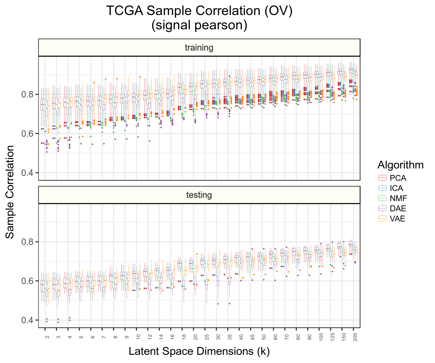
Related to #163 as was previously done in GTEx. Also, box plots can be changed to display different correlations with transformed data in both cases as well
Need to write carefully about this point in README (see #90 ) and especially in the manuscript
I removed the colorblindr dependency in #13 because the package is not currently a conda recipe. Adding back this dependency will require a conda-forge pull request that I will save for a later date.
Switch panels c and d with a and b
Switch labels for panels B and C
Need to predict with top 1 feature
also determine which z the features are coming from
Get scores for all top scoring features across k dimension and algorithm for two publicly available datasets.
See if the score is associated with "separation" of target samples
Can also split out "monocyte" vs other in that plot
Need to add results generated in #89 to an archived resource
Should add points representing raw data in panel C. What is the performance and percent zero coefficients?
After changes are merged in #125 , the function plot_gene_set() will change. I will need to rerun the visualize notebook in the gtex module after the update
Switch panels A and B - also, the two panels currently in A are not in the correct order
I have biobombe scores for many datasets by collections - plot z dimension of max feature
I don't think I need to label all facets - probably just A, B, and C is sufficient
Names of main and supplementary figures need to be updated. Also files should be removed.
as @ajlee21 pointed out in #56 here
Is it worth creating a lookup table with colors -- HEX code as you've done before?
It will be good to update HEX colors in a table lookup. Also related to #14
We are interested in comparing ensemble VAE performance to ensemble multi-algorithm performance in cancertype and mutation prediction.
Answering question of how much additional information is gained through biobombe serial compression vs. lasso on 200 features
For TCGA figure, should visualize change in ROC across k for cancer-type and mutations separately
will drive home the point that different signal is being detected at different k
Instead of plotting weight sum per algorithm, plot average absolute value weight per algorithm
Need to track Neutrophils_HPCA_2 and Monocytes_FANTOM_2 genes


