helgasoft / echarty Goto Github PK
View Code? Open in Web Editor NEWMinimal R/Shiny Interface to ECharts.js
Home Page: https://helgasoft.github.io/echarty/
Minimal R/Shiny Interface to ECharts.js
Home Page: https://helgasoft.github.io/echarty/


Hello again,
I was wondering if it was possible for you to show me how you would go about making 2 connected plots, a river plot and a stacked bar plot that are linked together. I am still figuring out how to do the calls with echarty, so unfortunately, I only have a version that I have been attempting in echarts4r recently that partially works, but appears to currently break in when it comes to the barplot.
##If you want to import from here
data<-read.csv("DirectExample.csv")


#River Plot
data|>group_by(Country)|>e_charts(Year)|>
  e_river(n)|>
  e_legend(right = 5,top = 30,bottom = 100,selector = "inverse",show=TRUE,icon = 'circle',emphasis = list(selectorLabel = list(offset = list(10,0))), align = 'right',type = "scroll",width = 10,orient = "vertical")|>
  e_theme("westeros")|>e_tooltip(trigger = "axis")|>
  e_datazoom(
    type = "slider",
    toolbox = TRUE,
    bottom = 10
  )|>
  e_title("ALL Anthrax Incident Reports by Year", "WAHIS Public Quantitative data from WHO")

#Bar plot
data|>group_by(Country)|>e_charts(Year)|>
  e_bar(n, stack = "group")|>
  e_legend(right = 5,top = 80,selector = "inverse",emphasis = list(selectorLabel = list(offset = list(10,0)), focus = "series"),show=TRUE,icon = 'circle',emphasis = list(selectorLabel = list(offset = list(10,0))), align = 'right',type = "scroll",width = 10,orient = "vertical")|>
  e_x_axis(min = min(data$Year)-1,max = max(data$Year)+1)|>
  e_tooltip()


#Attempt at combining both plots
data|>group_by(Country)|>e_charts(Year)|>
  e_river(n)|>
  e_legend(right = 5,top = 30,bottom = 100,selector = "inverse",show=TRUE,icon = 'circle',emphasis = list(selectorLabel = list(offset = list(10,0))), align = 'right',type = "scroll",width = 10,orient = "vertical")|>
  e_theme("westeros")|>e_tooltip(trigger = "axis")|>
  e_bar(n, stack = "group")|>
  e_x_axis(min = min(data$Year)-1,max = max(data$Year)+1)|>
  e_grid(right = 40, top = 100, width = "30%")
Currently the bar plot is a little buggy, as it doesn't quite show all the stacks. It does appear to work if I do something like this instead, but then the order of the Years is no longer respected.
data |> dplyr::mutate(Year = as.factor(Year)) |> group_by(Country) |> e_chart(Year) |> e_bar(n, stack = "group")Lastly, my attempt at combining the 2 plots, does not work at all. It just produces a white screen. I am wondering if it would be possible for you to show me how you would go about tackling this problem with echarty instead, since I have been noticing a great deal more of versatility in echarty. I apologise for not having originally attempted it at echarty. I am interested to understand the syntax better to use it more regularly.
Thank you for your time
Hi @helgasoft,
Thank you for your work on 1.5. We just installed it but were forced to revert because of breaking changes that were introduced in the update.
The offending line is here:
Line 175 in 07e242e
echarty for all crosstalk data that uses a non-numeric value as a key. Is there a reason for this check, I don't see why it's necessary?Sparse datasets could show exessive empty spaces in a bar chart.
The issue has been repeatedly reported on ECharts (JS) and echarts4r (R) boards.
A solution that consists of preprocessing data and creating a non-linear axis has recently surfaced.
Here we share echarty code related to the subject.
tmp <- "
A, B, C,D
10,10,0,0
0, 7, 8,0
6, 9, 7,6"
df <- read.csv(text=tmp, header=T)

bars <- list(type='bar', seriesLayoutBy='row')
ec.init(df,
  xAxis= list(type= 'category', name=''),
  yAxis= list(name=''),
  series= list(bars, bars, bars)
)

txt <- paste('const df=', df |> ec.init(preset=F) |> ec.inspect(), ';')
jsc <- "function noZero(allSeries) {  // adapted from https://codepen.io/kikon-do/pen/OJrEKBK
  const xAxisLabels = echarts.util.clone(allSeries[0]);
  allSeries.splice(0,1);
  colors =['#5470c6','#91cc75','#fac858'];
  const nDatasets = allSeries.length,
    nDataItems = xAxisLabels.length;
  const seriesCombined = [],
    valuesForLabels = [],
    missingTicks = [],
    hiddenCategories = [], // categories that have no data
    hiddenDatasets = allSeries.flatMap((dataset, index) =>
      dataset.filter((v) => v).length === 0 ? index : []
    );

  let x = 0.5,
    currentLabelValue = 0,
    currentTickValue = 0,
    totalBars = 0;
  for (let dataItemIdx = 0; dataItemIdx < nDataItems; dataItemIdx++) {
    let nItemsForCategory = 0;
    allSeries.forEach(function (seriesData, groupIdx) {
      const val = seriesData[dataItemIdx];
      if (val) {
        seriesCombined.push({ value: val, x, group: groupIdx });
        x++;
        nItemsForCategory++;
        totalBars++;
      }
    });
    currentLabelValue += nItemsForCategory / 2;
    valuesForLabels.push(currentLabelValue);
    currentLabelValue += nItemsForCategory / 2;
    const nMissingTicks = nItemsForCategory - 1;
    missingTicks.push(
      ...Array.from(
        { length: nMissingTicks },
        (_, k) => currentTickValue + k + 1
      )
    );
    currentTickValue += nItemsForCategory;
    if (nItemsForCategory === 0) {
      hiddenCategories.push(dataItemIdx);
    }
  }

  return {
    dataset: [{ source: seriesCombined }],
    visualMap: [
      {
        type: 'piecewise',
        categories: Array.from({ length: nDatasets }, (_, i) =>
          hiddenDatasets.includes(i) ? null : i
        ).filter((x) => x !== null),
        inRange: {
          color: colors.filter((_, i) => !hiddenDatasets.includes(i))
        },
        top: 11,
        right: 10
      }
    ],
    xAxis: [
      {
        // first axis for labels, no tick marks
        type: 'value',
        max: x - 0.5,
        interval: 0.5,
        axisTick: {
          length: 0
        },
        splitLine: {
          show: false
        },
        axisLabel: {
          formatter(value) {
            const idx = valuesForLabels.indexOf(value);
            if (idx >= 0 && hiddenCategories.indexOf(idx) < 0) {
              return xAxisLabels[idx];
            }
            return '';
          },
          fontWeight: 'bold'
        }
      },
      {
        // a secondary axis for ticks only
        data: Array(totalBars).fill(''),
        type: 'category',
        position: 'bottom',
        axisTick: {
          interval(index) {
            if (missingTicks.indexOf(index) >= 0) {
              return false;
            }
            return true;
          },
          length: 8, lineStyle: { width: 3 }
        }
      }
    ],
    yAxis: [{ }],
    series: [{
        type: 'bar',
        encode: { x: 'x', y: 'value'},
    }]
  };
}"
txt <- paste(txt, jsc, 'opts= noZero(df.dataset[0].source); chart.setOption(opts);')
ec.init(js= txt)

tz <- trimZero(df)    # part of echarty Extras($)
ec.init(
  dataset= tz$dataset,
  xAxis= tz$xAxis,
  series= list(list(type= 'bar', encode= list(x= 'x', y= 'value') )),
  visualMap= list(
    type= 'piecewise', top= 10, right= 10,
    categories= sort(unlist(unique(lapply(tz$dataset$source, \(x) x$group)))),
    inRange= list(color= c('blue','green','gold'))
  )
)
Interesting issue raised by @XiangyunHuang on how to define groups inside ECharts timeline.
By default echarty v.1.4.5 supports data grouping by one column only. For timeline this column will define the timeline axis and labels. Here is how it looks:
set.seed(2022)
# echarty requires group column()s last or use dplyr::relocate before group_by
dat <- data.frame(
	x3 = runif(16),
	x4 = runif(16),
	x5 = abs(runif(16)),
	x1 = rep(2020:2023, each = 4),
	x2 = rep(c("A", "A", "B", "B"), 4)
)
library(echarty); library(dplyr)
# preset timeline with one-column grouping
p <- dat |> group_by(x1) |> ec.init(
	tl.series= list(encode= list(x= 'x3', y= 'x5'),
		        symbolSize= ec.clmn(2, scale=30))    # x4 is size, position 2
)
p
# p |> ec.inspect()   # look at presets
But what if, according to @XiangyunHuang, we want to see groups A and B from column x2 inside each timeline year (x1) ?
set.seed(2022)
dat <- data.frame(
	x3 = runif(16),
	x4 = runif(16),
	x5 = abs(runif(16)),
	x1 = rep(2020:2023, each = 4),
	x2 = rep(c("A", "A", "B", "B"), 4)
)
# preset timeline by one-column grouping
library(echarty); library(dplyr)
p <- dat |> group_by(x1) |> ec.init(
	tl.series= list(encode= list(x= 'x3', y= 'x5'),
		        symbolSize= ec.clmn(2, scale=30))
)

# define additional filter transformations and option series based on preset ones
dsf <- list()  # new filters
opts <- list()  # new options
filterIdx <- 0
for (i in 1:length(unique(dat$x1))) {
	snames <- c()
	for (x2 in unique(dat$x2)) {
		dst <- p$x$opts$dataset[[i+1]]  # skip source-dataset (1st)
		dst$transform$config <- list(and= list(
			dst$transform$config,
			list(dimension= 'x2', `=`= x2)
		))
		dsf <- append(dsf, list(dst))
		snames <- c(snames, x2)
	}
	opt <- p$x$opts$options[[i]]
	sss <- lapply(snames, function(s) {
		filterIdx <<- filterIdx + 1
		tmp <- opt$series[[1]]
		tmp$name <- s
		tmp$datasetIndex <- filterIdx
		tmp
	})
	opts <- append(opts, list(list(title= opt$title, series= sss)))
}
p$x$opts$dataset <- append(p$x$opts$dataset[1], dsf)   # keep source-dataset [1]
p$x$opts$options <- opts
p$x$opts$legend <- list(show=TRUE)
p EDIT: this was too good to pass up - solution is now included in echarty with new tl.series attribute groupBy.
Below is code and result. Thank you for the idea, @XiangyunHuang!
if (!requireNamespace('remotes')) install.packages('remotes')
remotes::install_github('helgasoft/echarty')  # install v.1.4.5.9002 from Github

set.seed(2022)
dat <- data.frame(
  x3 = runif(16),
  x4 = runif(16),
  x5 = abs(runif(16)),
  x1 = rep(2020:2023, each = 4),
  x2 = rep(c("A", "A", "B", "B"), 4)
)

library(echarty); library(dplyr)
p <- dat |> group_by(x1) |> ec.init(
  tl.series= list(encode= list(x= 'x3', y= 'x5'),
                  symbolSize= ec.clmn(2, scale=30),
                  groupBy= 'x2')
)
p
If you like this solution, please consider granting a Github star ⭐ to echarty.
Proof of concept - Leaflet map with shapefile polylines. Idea from @Robinlovelace.
We prefer Leaflet map as most versatile. Other options are 'bmap' and gmap, which are based on Baidu and Google and require an API key.
destfile <- tempfile('shape')
download.file('https://apa.ny.gov/gis/GisData/Boundaries/AdirondackParkBoundary2017.zip',
				  destfile, mode='wb', method='curl')
unzip(destfile, exdir='unzipped')  # new unzipped folder under getwd()
# convert shape coords to lat/lng
library(rgdal)
ogr <- readOGR(dsn= 'unzipped', layer= 'AdirondackParkBoundary2017')
tmp <- sp::spTransform(ogr, sp::CRS("+init=epsg:4326"))
# convert lat/lng to ECharts format in dt
dt <- list()
for(i in 1:length(tmp@lines)) {
	df <- as.data.frame(tmp@lines[[i]]@Lines[[1]]@coords)  # Adirondack
	coords <- list()
	for(k in 1:nrow(df)) coords <- append(coords, list(as.numeric(df[k,])))
	dt <- append(dt, list(list(name= paste0('L',i), coords= coords)))
}

library(echarty)
p <- ec.init(load= 'leaflet')
p$x$opts$leaflet <- list(
	zoom= 8, roam= TRUE, center= unlist(dt[[1]]$coords[1]))
p$x$opts$series <- list(
	list(type= 'lines', coordinateSystem= 'leaflet', polyline= TRUE,
		lineStyle= list(width=3), color= 'red',
		#progressiveThreshold= 500, progressive= 200,
		data= dt
	)
	,list(type= 'lines', coordinateSystem= 'leaflet', polyline= TRUE,
		lineStyle= list(width=0), color= 'blue', zlevel= 1,
		data= dt,
		effect= list(show= TRUE, constantSpeed= 20, trailLength= 0.1, symbolSize= 3)
	)
)
p$x$opts$tooltip <- list(show=TRUE)
p 
If you like this solution, please consider granting a Github star ⭐ to echarty.
Is it possible to do a screenshot for the 3D GL plots programmatically?
I would like to create a series of pictures and programmatically save static PNG of those pictures.
As suggested, I have been trying to follow the rather exciting example shown here here using my own dataset
filled_data<-read.csv("example.csv")

setting <- list(show = T,type= "scroll",orient= "horizontal", pageButtonPosition= 'start',
                right= "30%",top = 30,width = 470, icon = 'circle', align= 'left', height='85%')
#Below affects the ordering of the categories in the x-axis (including dates)
tmp <- filled_data |> group_by(zone,dates) |> summarize(ss= n()) |>
  ungroup() |> inner_join(filled_data) |>  arrange(dates) |> group_by(zone) |> group_split()
# fine-tune legends: data by interactions (called groups in this dataset)
cns <- lapply(seq_along(tmp), \(i) { as.list(unique(tmp[[i]]$groups)) })
xax <- lapply(seq_along(tmp), \(i) { as.list(unique(tmp[[i]]$dates)) })


subset(filled_data,is.na(zone) ==  FALSE) %>%
  mutate(dates = as.factor(dates)) %>%
  group_by(zone) |>
  ec.init(
    xAxis = list(name = 'Interaction',nameLocation = 'end',max = max(filled_data$dates),
                 nameTextStyle = list(fontWeight ='bolder'),
                 axisLabel = list(rotate = 346,width = 65,
                                  overflow = 'truncate')),
    yAxis = list(name = "Count",nameLocation = 'start',
                 nameTextStyle = list(fontWeight ='bolder')),
    dataZoom= list(type= 'slider',orient = 'vertical'
                   ,left = '2%'),
    tl.series = list(type  ='bar',stack = "grp",
                     encode = list(x = 'dates',y = 'values'), groupBy= 'groups',
                     emphasis= list(focus= 'series',
                                    itemStyle=list(shadowBlur=10,
                                                   shadowColor='rgba(0,0,0,0.5)'),
                                    label= list(position= 'right',
                                                rotate = 350,
                                                show=TRUE)),
                     title = list(list(left = "80%",top = "1%"),
                                  list(text = "Infection pathway analytics",
                                  left = "10%", top = 10, textStyle = list(fontWeight = "normal", fontSize = 20),
                                  text = "@ Zone",
                                  left = "10%", top = 17, textStyle = list(fontWeight = "normal", fontSize = 14))) ),
    tooltip = list(show = T))|>
  ec.upd({
    options <- lapply(options, \(oo) {
      dix <- oo$series[[1]]$datasetIndex  # from tl.series (bar)
      oo$series <- append(oo$series,
                          list(
                            list(type='pie', name='pop.',
                                 datasetIndex= dix,
                                 encode= list(value='values', itemName='groups'),
                                 center= c('15%', '25%'), radius= '14%',
                                 label= list(show=T), labelLine= list(length=5, length2=0))
                          ))
      oo
    })
  }) %>%
  ec.upd({legend<-setting
  options <- lapply(seq_along(options), \(i) {
    options[[i]]$legend$data <- cns[[i]]  # fine-tune legends: data by interactions
    options[[i]]$xAxis$data <- xax[[i]]
    options[[i]]
  })
  })
This is close to what I need, but I am unable to figure out how to get the pie chart to be working. I am trying to show the distribution of the infection types column (named 'groups' inside this filled_data dataset), but it comes out like this.
Hi!
I am opening this issue to formally request for the code whereby you showcased the amazing 3d scatterplot where the points actually faithfully moved in a realistic manner. My current running example uses echarts4r and does not appear to contain an option for whatever reason, to force the scatterpoints to animate between frames, according to their respective positions.
If it isn't too much to ask, I would also really like to ask what part of your code you use allows for this level of control?
Additionally, I was wondering if you could briefly show me if it is possible to morph between 2 scatterplots in your scatterplot example, on top of that timeline? It seems that echarty is alot more flexible with timelines, so I was wondering if you happened to have the time to quickly show me an example? I really appreciate your time!
I am curious about how to leverage features from echarts using echarty such as emphasis and marker/line size. I am using pretty much the same example as before (I opened this up as a separate issue since I do not know if it is right to squeeze all my issues into one thread).
modifiedanthrax_WAHIS_dataset.csv
remotes::install_github('helgasoft/echarty',force = TRUE)  # get latest
library(echarty)
wahis<-read.csv("modifiedanthrax_WAHIS_dataset.csv")
data2<-wahis %>% mutate(Cases = as.integer(Cases),Deaths = as.integer(Deaths)) %>%
  filter(`Animal Category` == "Domestic" &
           Species %in% c("Cattle","Sheep","Sheep/goats (mixed herd)","Goats","Swine")) %>%
  group_by(Year,Sub_Continent, Country) %>%
  summarise(n = n(),Cases = sum(Cases), Deaths = sum(Deaths)) %>%
  ungroup()


setting <- list(show = T,type= "scroll",orient= "horizontal", pageButtonPosition= 'start',
                right= 5,top = 30, icon = 'circle', align= 'right', height='85%')

data2 |> group_by(Sub_Continent) |> ec.init(
  tooltip= list(show= TRUE),
  tl.series= list(encode = list(x = 'Year',y = 'n',emphasis = list(focus ="series")),type= 'line', groupBy= 'Country'), ##Focus here does not work- probably wrong implementation
  xAxis = list(max = 2023,min = 2009),
  legend = setting,
  # visualMap= list(dimension=2, inRange= list( symbolSize = c(35,5)))
)
My current implementation of focus doesn't work, and I am currently just trying to tinker randomly with the code since I do not believe there is an example using emphasis on the echarty examples site you have kindly provided.
I would really appreciate your guidance regarding this. Thank you for your time.
How to label very large or very small numbers with scientific notation.
Attempt to answer question asked here by @svenb78.
Borrowed JavaScript scientific notation code from here.
# JS code from https://www.cnblogs.com/zhxuxu/p/10634392.html
jscientific <- 'function (value) {
var res = value.toString();
var numN1 = 0;
var numN2 = 1;
var num1=0;
var num2=0;
var t1 = 1;
for(var k=0;k<res.length;k++){
	if(res[k]==".")
		t1 = 0;
	if(t1)
		num1++;
	else
		num2++;
}

if(Math.abs(value)<1 && res.length>4)
{
	for(var i=2; i<res.length; i++){
		if(res[i]=="0"){
			numN2++;
		}else if(res[i]==".")
			continue;
		else
			break;
	}
	var v = parseFloat(value);
	v = v * Math.pow(10,numN2);
	return v.toString() + "e-" + numN2;
}else if(num1>4)
{
	if(res[0]=="-")
		numN1 = num1 - 2;
	else
		numN1 = num1 - 1;
	var v = parseFloat(value);
	v = v / Math.pow(10,numN1);
	if(num2 > 4)
		v = v.toFixed(4);
	return v.toString() + "e" + numN1;
}else
	return parseFloat(value);
}'
sciAxis <- list(axisLabel= list(formatter= htmlwidgets::JS(jscientific)))

library(echarty)
p1 <- data.frame(date= c("2022","2021"), value= c(11000000, 15000000)) |>
	ec.init(ctype='bar', yAxis= sciAxis, grid= list(containLabel= TRUE))
p2 <- data.frame(date= c("2022","2021"), value= c(0.000001, 0.00000044)) |>
	ec.init(ctype='bar', yAxis= sciAxis, grid= list(containLabel= TRUE))
htmltools::browsable(
	ec.util(cmd= 'tabset', large.nums= p1, small.nums= p2)
)
if you like this solution, please consider granting a Github star ⭐ to echarty.
Hi,
It could be interesting to make a comparison with other R package wrapping "Echarts", in particular the popular R package "echarts4r".
This would help new users to choose echarty for their projets instead of echarts4r.
Thanks again for you help regarding #14.
Best,
Felix
Hi @helgasoft,
Wondering how to make each line a specific color given the following:
.data = tibble::tibble(
    Values = rnorm(10),
    Summary = .5,
    line_colors =  c(
      "#9E0142",
      "#D53E4F",
      "#F46D43",
      "#FDAE61",
      "#FEE08B",
      "#E6F598",
      "#ABDDA4",
      "#66C2A5",
      "#3288BD",
      "#5E4FA2"
    )
  )
d <- tidyr::pivot_longer(.data, cols = c(Values, Summary), names_to = "x", values_to = "y")
(e <- echarty::ec.init(df = d[c("x","y")],
                          ctype = 'line',
                          height = "250px"))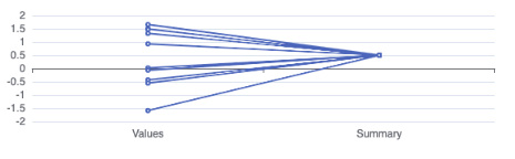
Where each item in line_color will apply to each line in the chart?
Options looks like this:
list(
  xAxis = list(type = "category"),
  yAxis = list(show = TRUE),
  series = list(list(type = "line")),
  dataset = list(list(
    source = list(
      c("x", "y"),
      list("Values", 1.49353270078411),
      list("Summary",
           0.5),
      list("Values", -1.58772182582239),
      list("Summary",
           0.5),
      list("Values", 0.0196705552814059),
      list("Summary",
           0.5),
      list("Values", 1.32158616516178),
      list("Summary",
           0.5),
      list("Values", 1.6560527986586),
      list("Summary",
           0.5),
      list("Values", -0.0651535567587819),
      list("Summary",
           0.5),
      list("Values", 1.47905680442606),
      list("Summary",
           0.5),
      list("Values", -0.43195735851963),
      list("Summary",
           0.5),
      list("Values", -0.553790872613728),
      list("Summary",
           0.5),
      list("Values", 0.927126924190681),
      list("Summary",
           0.5)
    )
  ))
)Hi @helgasoft,
Hope this finds you well!
I'm attempting to add a legend & colors to a parallel plot and I'm finding that grouping the input data (which appears necessary to enable the legend & colors) works to add the legend & colors but the lines are completely distorted.
Any ideas on what's happening here?
mtcars |> head(8) |> tibble::rownames_to_column("ID") |> tibble::remove_rownames() |> dplyr::group_by(ID) |> echarty::ec.init(ctype = "parallel")

This is an interesting question by @ddrogen asked here.
Specifically, how to change some series data live just by toggling legend items ?
Since the need is to update a chart in real time without Shiny, then obviously some Javascript code has to be written.
Here is one solution which relies on additional data preparation and ECharts event handling.
set.seed(222)    # make the chart reproducible
library(dplyr)
data2 <- data.frame(zipcode= as.factor(round(rnorm(10, 87965, 50),0)), program_1 = rnorm(10, 200, 20), program_2 = rnorm(10, 700, 100), program_3 = rnorm(10, 500, 50))
data1 <- data2 %>%
  mutate(total = rowSums(across(where(is.numeric)))) %>%
  mutate(A= round(100*program_1/total,1)) %>%
  mutate(B= round(100*program_2/total,1)) %>%
  mutate(C= round(100*program_3/total,1)) %>%
     #  additional data to cover all combinations
  mutate(AB= round(100*(program_1+program_2)/total,1)) %>%
  mutate(AC= round(100*(program_1+program_3)/total,1)) %>%
  mutate(BC= round(100*(program_2+program_3)/total,1)) %>%

  mutate("per_total"= 100*total/sum(total)) %>%
  arrange(desc(total)) %>%
  mutate(ABC = round(cumsum(per_total),1))  # renamed from 'cum_sum_total'

library(echarty)
p <- data1 |> ec.init(elementId='cid',
                     legend= list(show=TRUE),
    xAxis= list(name = "Zip Code",
      nameLocation = "middle", nameGap=50,
      nameTextStyle = list(color = "#87786B", fontSize = 15),
      axisLabel = list(fontFamily="Arial",
                       interval = 0, rotate = 30,
                       fontSize=12, color="#87786B")),
    yAxis= list(
      list(name="n° of visits", index = 0, show = TRUE,
           nameLocation ="middle",
           nameGap=70, align="right",
           nameTextStyle = list(
             color = "#87786B",
             fontSize = 12),
           axisLabel = list(fontSize=12, color="#87786B")),
      list(name= '%') ),
    series= list(
           list(name='A', type='bar', encode=list(x='zipcode', y='program_1'), stack='g'),
           list(name='B', type='bar', encode=list(x='zipcode', y='program_2'), stack='g'),
           list(name='C', type='bar', encode=list(x='zipcode', y='program_3'), stack='g'),
           list(name = "Cumulative %", type='line', encode=list(x='zipcode', y='ABC'),
                 yAxisIndex= 1, emphasis= list(focus= "series"),
                 label= list(
                        show= TRUE,
                        textStyle = list(fontFamily = "Arial", fontSize = 10))) ),
    tooltip= list(formatter = htmlwidgets::JS("function(params) {
      col = 'ABC'.indexOf(params.seriesName) +1;
      return(params.marker + params.seriesName +
       '<br> Total: ' + params.value[col].toFixed(2) + ' (' +
                                         params.value[col+4] + '%)');}"),
                   textStyle= list(fontFamily="Arial", fontSize=12)),
    animationDuration= 1500,
    toolbox= list(show =TRUE, top=0, right= 10, itemSize=10,
                  emphasis= list(iconStyle= list(textFill= "#6C2C4E")),
                  feature = list(restore=list(show=TRUE), saveAsImage=list(show=TRUE)) )
)  |>
ec.theme('t1', code='{"color": ["#F8AD3B", "#D15425", "#9CAC3B", "#6C2C4E"]}')
p$x$on <- list(list(event= 'legendselectchanged',
      handler= htmlwidgets::JS("function(v) {
      sel = v.selected;
      chart = get_e_charts('cid');
      opt = chart.getOption();
      vals = Object.values(sel).slice(0,3);
      nams = Object.keys(sel).slice(0,3);
      col= ''; i= 0;
      vals.map(x => {if (x) col= col + nams[i]; i++;});
      if (col != '')
         opt.series[3].encode.y = col;  // A or AC or ABC etc.
      chart.setOption(opt, true);  // replace chart
    }")
))
pNote: if you like this solution, please consider granting a Github star ⭐ to echarty.
original gist
Hi @helgasoft,
I'm trying to update the visualMap properties so the dimension can be changed for the visualMap. I created some helper functions for doing so, but it doesn't seem to want to update.
I'm not sure I understand how the proxy objects options are formatted, but it may be something else?
library(shiny); library(echarty)
ec.visualMap <- function(ec,
                         .data,
                         type = 'continuous',
                         calculable = TRUE,
                         inRange = list(color = c('deepskyblue', 'pink', 'pink', 'red')),
                         min = NULL,
                         max = NULL,
                         dimension = 1,
                         top = "middle",
                         textGap = 5,
                         padding = 2,
                         itemHeight = 390,
                         ...) {

  if (ncol(.data)) {
    .dimension <- ec.col_locate(dimension, .data)
    .min <- min %||% min(.data[[.dimension]], na.rm = TRUE)
    .max <- max %||% max(.data[[.dimension]], na.rm = TRUE)
    mods <- list(
      type = type,
      calculable = calculable,
      inRange = inRange,
      min = .min,
      max = .max,
      dimension = ec.dim(.dimension, .data),
      top = top,
      textGap = textGap,
      padding = padding,
      itemHeight = itemHeight,
      ...
    ) |>
      purrr::compact()

    ec$x$opts$visualMap <- mods
  }


  return(ec)
}

`%||%` <- rlang::`%||%`

#' Convert R data dimension into JS dimension
#'
#' @param dim \code{chr/dbl} Column name or index
#' @param ec \code{echarty}
#'
#' @return \code{dbl}
#' @export

ec.dim <- function(dim, ec) {
  UseMethod("ec.dim")
}

ec.data_extract <- function(ec) {
  ec$x$opts$dataset[[1]]$source[-1] |>
    purrr::map(unlist) |>
    as.data.frame.list() |>
    t() |>
    as.data.frame() |>
    tibble::remove_rownames() |>
    rlang::set_names(ec$x$opts$dataset[[1]]$source[[1]])
}

ec.col_locate <- function(x, .data) {
  which(names(.data) == x)
}
#' @export
ec.dim.character <- function(x, ec) {
  ec.col_locate(x, ec) - 1
}
#' @export
ec.dim.numeric <- function(x, ec) {
  x - 1
}
#' @export
ec.dim.default <- function(x, ec) {
  x
}

jsfn <- "() => {
  chart = get_e_charts('pchart');
  serie = chart.getModel().getSeries()[0];
  indices = serie.getRawIndicesByActiveState('active');
  Shiny.setInputValue('axisbrush', indices);
};"
ui <- fluidPage(  ecs.output('pchart'),
                  selectizeInput(inputId = "colormap",
                                 label = "Map color to ",
                                 choices = names(mtcars),
                                 selected = names(mtcars)[1]
                  ))
server <- function(input, output) {
  ids <- c()  # keep track of highlighted lines
  output$pchart <- ecs.render({
    p <- mtcars |> ec.init(ctype= 'parallel') |> ec.theme('dark-mushroom')
    p$x$opts$series[[1]]$emphasis <- list(disabled= FALSE,
                                          lineStyle= list(opacity= 1, width= 3))   # ,color= 'green'
    p$x$opts$visualMap <- list(type= 'continuous', calculable= TRUE,
                               inRange= list(color= c('deepskyblue','pink','red')),
                               min= min(mtcars$mpg), max= max(mtcars$mpg),
                               dimension= 0  # mpg is first column, index 0 in JS
    )
    p$x$on <- list(list(event= 'axisareaselected',
                        handler= htmlwidgets::JS(jsfn) ))
    p
  })
  observeEvent(input$axisbrush, {
    print(input$axisbrush)
  })
  observeEvent(input$pchart_click, {   # echarty built-in event
    id <- input$pchart_click$dataIndex
    p <- ecs.proxy('pchart')
    if (id %in% ids) {
      p$x$opts <- list(type= 'downplay', dataIndex= id)
      ids <<- ids[! ids==id ]
    } else {
      p$x$opts <- list(type= 'highlight', dataIndex= id)
      ids <<- c(ids, id)
    }
    p |> ecs.exec('p_dispatch')
  })

  observeEvent(input$colormap, {
    echarty::ecs.proxy("pchart") |>
      ec.visualMap(dimension = input$colormap, .data =mtcars) |>
      echarty::ecs.exec("p_dispatch")
  }, ignoreInit = TRUE)
}
shinyApp(ui= ui, server= server)
Several programming questions have been addressed already in our Code Gists.
Gists are searchable by keyword. Example: to search for scatter in all gists - do this.
Since search is easier in Issues however, newer code snippets will mostly show up in this thread as comments.
Hi, I am having a similar issue to the one posted by joachim-hansson on Jun 18.
The app closes as soon as I mouseover data in the chart, and I get this warning:
Warning: Error in : No handler registered for type gam_mouseover:echartyParse
3: runApp
2: print.shiny.appobj
1:
Error in (function (name, val, shinysession) :
No handler registered for type gam_mouseover:echartyParse
I have tried adding a mouseover handler as suggested in the Jun 18 issue, but it has no effect.
Likewise I get the same warning/crash when I run this demo from the documentation (including the mouseover handler suggested in response to the Jun 18 issue):
ui <- fluidPage(ecs.output('plot'), textOutput('out1') )
server <- function(input, output, session) {
  output$plot <- ecs.render({
    p <- mtcars |> group_by(cyl) |> ec.init(dataZoom= list(type= 'inside'))
    p$x$on <- list(                     # event(s) with Javascript handler
      list(event= 'legendselectchanged',
           handler= htmlwidgets::JS("(evt) => Shiny.setInputValue('result1',evt.name);"))
    )
    p$x$capture <- 'datazoom'
    p
  })
  observeEvent(input$plot_datazoom, {   # captured event
    output$out1 <- renderText({ paste('Zoom.start:',input$plot_datazoom$batch$start,'%') })
  })
  observeEvent(input$plot_mouseover, {  # built-in event
    output$out1 <- renderText({ toString(input$plot_mouseover) })
  })
  observeEvent(input$result1, {
    output$out1 <- renderText({ paste('legend:',input$result1) })
  })
  observeEvent(input$plot_mouseover, {   # mouseover handler
    cat('\nMover:', toString(input$plot_mouseover$data))
  })
}
shinyApp(ui, server)
I am running R 4.3.1, echarty 1.5.4, shiny 1.7.5.
As a continuation of my earlier question, I was wondering if it there is a way that echarty could let a user set a custom "symbol" for each group within a frame inside a timeline animation?
I have been able to categorize frames within timelines via colour and size thanks to echarty and helgasoft's help, but I was wondering if there was also this other possibility? The only solution I vaguely recall ever seeing was manually adding separate "traces" for each group but I don't think that would be reproducible for varying numbers of groups and esapecially different numbers of frames in timeline.
Apparently ECharts is focusing more on desktop implementations, less on mobile.
For instance more than half of 3D globe examples do not show up on mobile.
Another issue is that a simple touch(click) does not work on mobile devices for 3D Globe.
Luckily, thanks to @7upcat and @uozanyildiz, there is a workaround to enable this behaviour.
However the fix involves commenting out a line in the core library echarts.js - not very practical.
In latest v.5.3.2 this line is #4591 scope.touching = true;.
Here is a mobile JS demo of 3D Globe working with a fixed echarts.js.
Attn @CyprienCambus - in R/echarty same improvement is achieved by replacing library file C:/Users/username/Documents/R/win-library/4.1/echarty/js/echarts.min.js with the fixed one.
Hopefully @pissang & team will address this bug soon. Until then we are planning to incorporate the fix in future releases of echarty.
Can you please advise how to plot the result of an R hierarchical clustering procedure in Echarts via echarty?
Such as,
hc <- hclust(dist(USArrests), "ave")
plot(hc)
dend1 <- as.dendrogram(hc)
Thanks!
Apologies, I would like to ask for some help understanding how I can be leveraging formatter in the following
example.csv
big<-read.csv("example.csv")
big %>% mutate(Percent = Total_Divorces/`Aggregate Marriages`*100) %>%  group_by(Seed) %>% arrange(Year) |> ec.init(
  tooltip= list(show= TRUE,trigger = 'axis', formatter=
                  ec.clmn('Cohort <b>%@</b><br> Year <b>%@</b><br> Percentage  <b> %@% </b>',1,2,8)),
  tl.series= list(encode = list(x = 'Year',y = 'Percent',emphasis = list(focus ="adjacency")),type= 'line'),
  xAxis = list(max = 2023,min = 1980),
  legend = setting,
)
Currently, my version of this timeline plot does not manage to present any of the values that I was meaning to showcase - 'Seed','Year' and 'Percent'.
Hello again,
Thank you very much for your help! It has enabled me to present alot more beautiful and properly intricate plots for my work, and I really appreciate it.
Continuing from your last solution regarding the dataset regarding cases across the world
DirectExample.csv
input <- read.csv("DirectExample.csv")
input |> mutate(
  vleth= scales::rescale(lethality, to = c(0.01,100.00)),
  sleth= scales::rescale(n, to = c(13,36)),
  pleth= lethality *100
) |> na.omit() |>
  group_by(Year) |>
  ec.init(load= 'world', geo= list(roam=T), animation=F,
          tl.series= list(type='scatter', coordinateSystem='geo',
                          name= "reports",
                          encode= list(lng='lon', lat='lat'), symbolSize= ec.clmn('sleth') ),
          visualMap = list(dimension='vleth',
                           inRange = list(symbol = "diamond", bottom= 3, color= c('#6EA5FF','#DB2D12'),colorLightness = c(0.7,0.45), colorSaturation = c(10,300)) ),
          options= list(legend= list(show=T)),
          title = list(list(left="80%", top="1%", textStyle=list(fontSize=30, color='#11111166')),
                       list(text = "Life expectancy and GDP by year",
                            left = "10%", top = 10, textStyle = list(fontWeight = "normal", fontSize = 20))),
          tooltip= list(formatter=
                          ec.clmn('%@<br>Number of Outbreak Incidents: %@<br />Lethality: %R@%', 'Country','n','pleth'))
  ) |> ec.theme("something",code = jsonfile)
This works, and I was beginning to wonder if there was a way to simply colour the countries based off of n (ie what you rescaled as sleth in the previous solution you provided). I realised that you had an example pertaining to that . However, I got a bit confused as to how I would go about doing that. I ended up here, and am not sure how I should be referencing the data for the map to show colours.
#Different type of map??


input |> mutate(
  vleth= scales::rescale(lethality, to = c(0.01,100.00)),
  sleth= scales::rescale(n, to = c(13,36)),
  pleth= lethality *100
) |> na.omit() |>
  group_by(Year) |>
  ec.init(load= 'world', geo= list(roam=T), animation=F,
          tl.series= list(type='map', coordinateSystem='geo',
                          name= "reports",
                          encode= list(lng='lon', lat='lat')),
          visualMap = list(type = 'continuous',calculable = TRUE),
          options= list(legend= list(show=T)),
          title = list(list(left="80%", top="1%", textStyle=list(fontSize=30, color='#11111166')),
                       list(text = "Life expectancy and GDP by year",
                            left = "10%", top = 10, textStyle = list(fontWeight = "normal", fontSize = 20))),
          tooltip= list(formatter=
                          ec.clmn('%@<br>Number of Outbreak Incidents: %@<br />Lethality: %R@%', 'Country','n','pleth'))
  ) |> ec.theme("something",code = jsonfile)
I tried looking at the dataset in your example to try to understand this segment here and how it was perhaps used to point to the data for it to recognise the city names that were being used in your example, but I was not able to access the html link for :
library(rvest)
wp <- read_html('https://www.ined.fr/en/everything_about_population/data/france/population-structure/regions_departments')
wt <- wp %>% html_node('#para_nb_1 > div > div > div > table') %>% html_table(header=TRUE)
wt
So I am not sure how to replicate what you have done here for my dataset here. I would really appreciate if you were able to guide me through that, if possible. Thank you for your help thus far.
How to replicate this ECharts example in R. Answer to question by @cylee0000.
Start by translating the JS code to R with demo(js2r, 'echarty'). Then fix R code:
Result is below. Includes alternative code for cartesian2D view of the same punch card.
#' https://echarts.apache.org/examples/en/editor.html?c=scatter-polar-punchCard
hours <- c('12a', '1a', '2a', '3a', '4a', '5a', '6a','7a', '8a', '9a', '10a', '11a','12p', '1p', '2p', '3p', '4p', '5p','6p', '7p', '8p', '9p', '10p', '11p')
days <- c('Saturday', 'Friday', 'Thursday','Wednesday', 'Tuesday', 'Monday', 'Sunday')
js <- "window.hours = [
    '12a', '1a', '2a', '3a', '4a', '5a', '6a',
    '7a', '8a', '9a', '10a', '11a',
    '12p', '1p', '2p', '3p', '4p', '5p',
    '6p', '7p', '8p', '9p', '10p', '11p'
];
window.days = ['Saturday', 'Friday', 'Thursday','Wednesday', 'Tuesday', 'Monday', 'Sunday'];"
datap <- list(c(0, 0, 5), c(0, 1, 1), c(0, 2, 0), c(0, 3, 0), c(0, 4, 0), c(0, 5, 0), c(0, 6, 0), c(0, 7, 0), c(0, 8, 0), c(0, 9, 0), c(0, 10, 0), c(0, 11, 2), c(0, 12, 4), c(0, 13, 1), c(0, 14, 1), c(0, 15, 3), c(0, 16, 4), c(0, 17, 6), c(0, 18, 4), c(0, 19, 4), c(0, 20, 3), c(0, 21, 3), c(0, 22, 2), c(0, 23, 5), c(1, 0, 7), c(1, 1, 0), c(1, 2, 0), c(1, 3, 0), c(1, 4, 0), c(1, 5, 0), c(1, 6, 0), c(1, 7, 0), c(1, 8, 0), c(1, 9, 0), c(1, 10, 5), c(1, 11, 2), c(1, 12, 2), c(1, 13, 6), c(1, 14, 9), c(1, 15, 11), c(1, 16, 6), c(1, 17, 7), c(1, 18, 8), c(1, 19, 12), c(1, 20, 5), c(1, 21, 5), c(1, 22, 7), c(1, 23, 2), c(2, 0, 1), c(2, 1, 1), c(2, 2, 0), c(2, 3, 0), c(2, 4, 0), c(2, 5, 0), c(2, 6, 0), c(2, 7, 0), c(2, 8, 0), c(2, 9, 0), c(2, 10, 3), c(2, 11, 2), c(2, 12, 1), c(2, 13, 9), c(2, 14, 8), c(2, 15, 10), c(2, 16, 6), c(2, 17, 5), c(2, 18, 5), c(2, 19, 5), c(2, 20, 7), c(2, 21, 4), c(2, 22, 2), c(2, 23, 4), c(3, 0, 7), c(3, 1, 3), c(3, 2, 0), c(3, 3, 0), c(3, 4, 0), c(3, 5, 0), c(3, 6, 0), c(3, 7, 0), c(3, 8, 1), c(3, 9, 0), c(3, 10, 5), c(3, 11, 4), c(3, 12, 7), c(3, 13, 14), c(3, 14, 13), c(3, 15, 12), c(3, 16, 9), c(3, 17, 5), c(3, 18, 5), c(3, 19, 10), c(3, 20, 6), c(3, 21, 4), c(3, 22, 4), c(3, 23, 1), c(4, 0, 1), c(4, 1, 3), c(4, 2, 0), c(4, 3, 0), c(4, 4, 0), c(4, 5, 1), c(4, 6, 0), c(4, 7, 0), c(4, 8, 0), c(4, 9, 2), c(4, 10, 4), c(4, 11, 4), c(4, 12, 2), c(4, 13, 4), c(4, 14, 4), c(4, 15, 14), c(4, 16, 12), c(4, 17, 1), c(4, 18, 8), c(4, 19, 5), c(4, 20, 3), c(4, 21, 7), c(4, 22, 3), c(4, 23, 0), c(5, 0, 2), c(5, 1, 1), c(5, 2, 0), c(5, 3, 3), c(5, 4, 0), c(5, 5, 0), c(5, 6, 0), c(5, 7, 0), c(5, 8, 2), c(5, 9, 0), c(5, 10, 4), c(5, 11, 1), c(5, 12, 5), c(5, 13, 10), c(5, 14, 5), c(5, 15, 7), c(5, 16, 11), c(5, 17, 6), c(5, 18, 0), c(5, 19, 5), c(5, 20, 3), c(5, 21, 4), c(5, 22, 2), c(5, 23, 0), c(6, 0, 1), c(6, 1, 0), c(6, 2, 0), c(6, 3, 0), c(6, 4, 0), c(6, 5, 0), c(6, 6, 0), c(6, 7, 0), c(6, 8, 0), c(6, 9, 0), c(6, 10, 1), c(6, 11, 0), c(6, 12, 2), c(6, 13, 1), c(6, 14, 3), c(6, 15, 4), c(6, 16, 0), c(6, 17, 0), c(6, 18, 0), c(6, 19, 0), c(6, 20, 1), c(6, 21, 2), c(6, 22, 2),
  c(6, 23, 6))
data <- lapply(datap, function(x) c(x[2], x[1],x[3]))

library(echarty)
ec.init( preset=FALSE, js= js,
   title= list(text='Punch Card of Github'),
   legend= list(data= list('Punch Card'),left='right'),
   tooltip= list(position='top',
                 formatter= htmlwidgets::JS("function (params) {
      // 2D:  return (params.value[2] +' commits in '+ hours[params.value[0]] +' of '+ days[params.value[1]]
              return (params.value[2] +' commits in '+ hours[params.value[1]] +' of '+ days[params.value[0]]
    );}"  )),

   # grid= list(left=2, bottom=10, right=10, containLabel=TRUE),
   # xAxis= list(type='category', data= hours, boundaryGap=FALSE, splitLine=list(show=TRUE), axisLine=list(show=FALSE)),
   # yAxis= list(type='category', data= days, axisLine=list(show=FALSE)),

   polar = list(show= TRUE),
   angleAxis = list(data= hours, type= 'category', boundaryGap= FALSE,
     splitLine = list(show= TRUE), axisLine= list(show= FALSE)),
   radiusAxis = list(data= days, type= 'category',
     axisLine = list(show= FALSE), axisLabel= list(rotate= 45)),

   series= list(list(name='Punch Card',  type='scatter',
           symbolSize= ec.clmn(3, scale=2),
           data= datap, coordinateSystem = "polar"  # datap for polar
           #data= data   #  data for cartesian2D
           ,animationDelay= ec.clmn(-1, scale=5)
   ))
)
if you like this solution, please consider granting a Github star ⭐ to echarty.
Hi, I was wondering if it were possible to include more information on say a scatterplot for a time-series
dataset. I have 2 specific questions in mind.
df_<-read.csv("example.csv")
df_ %>% mutate(value = round(value,1))%>%
  group_by(Zone) |>
  ec.init(
    title= list(text= 'Temporal Trends: Contamination/Infection/Colonization Rates Across Hosts, Eggs, and Faeces '),
    xAxis = list(name = 'Time',nameLocation = 'start',
                 nameTextStyle = list(fontWeight ='bolder'),
                 axisLabel = list(rotate = 346,width = 65,
                                  overflow = 'truncate')),
    yAxis = list(max = 100,name = "% compromised",nameLocation = 'start',
                 nameTextStyle = list(fontWeight ='bolder')),
    dataZoom= list(list(type= 'slider',orient = 'vertical'
                   ,left = '2%'),list(type= 'slider',orient = 'horizontal'
                                      ,right = '2%',top='1%', width = '20%')),
    tl.series = list(type  ='line',
                     encode = list(x = 'TimeUnit',y = 'value'), groupBy= 'variable',
                     emphasis= list(focus= 'series',
                                    itemStyle=list(shadowBlur=10,
                                                   shadowColor='rgba(0,0,0,0.5)'),
                                    label= list(position= 'right',
                                                rotate = 350,
                                                show=TRUE))),
    tooltip = list(show = T, trigger = 'axis'))|>
  ec.upd({legend<-setting
  options <- lapply(seq_along(options), \(i) {
    tita<-title
    tita$text <- paste(tita$text, options[[i]]$title$text)
    options[[i]]$title <- tita   # here we set a title for each timeline step
    options[[i]]$legend$data <- cns[[i]]  # fine-tune legends: data by continent
    options[[i]]
  })
  })
There is additional information like Total Hosts, No contaminated, No infected etc that are not currently reflected in my graph. I have been wondering if there would be a way to incorporate that information to give more context to the percentage values that are reflected on the graph. This is because sometimes a rise in percentage of hosts infected from hour X to hour X+1 say in Zone 2 , could be due to the number of hosts having decreased instead of more infected hosts having surfaced. The same goes for contaminated hosts.
The same applies for faeces and eggs.
I did more a ugly and not so wieldable version in plotly a while back and was wondering if there was something similar I could do with echarty.
I am open to suggestions on another way to present this additional information in say another graph in a side by side comparison or something if you believe there is such a method. I understand if this issue is a bit too troublesome, thank you for your consideration and time.
Hi @helgasoft,
I have just a question/thought. For me the interface of echarts4r is a little bit easier for me to understand than echarty. On the other hand echarty seems much more capable of unleash all the features that echarts has. Do you think there is somehow a way to combine the two packages, e.g. by building and lay-outing a chart with a echarts4r and adding features, charts, morphs, etc. with the help of charty?
You have this nice function that translates a js echarts object into an (echarty-) R object. I was thinking of a similar translator function that tranlates an echarts4r-object into a echarty-object.
I know this will probably a much too complicated way to go, but I am curious about your opinion on this.
Thanks in advance!
Using this minimal example:
library(shiny)
library(echarty)

ui <- fluidPage(mainPanel(ecs.output("distPlot"))))

server <- function(input, output) {
  output$distPlot <- ecs.render({cars |> ec.init()})
  print(sessionInfo())
}
shinyApp(ui = ui, server = server)
I get the error below when hoovering a data point in the plot:
Warning: Error in : No handler registered for type distPlot_mouseover:echartyParse
3: runApp
2: print.shiny.appobj
1:
Error in (function (name, val, shinysession) :
No handler registered for type distPlot_mouseover:echartyParse
Session info:
Listening on http://127.0.0.1:5297
R version 4.3.1 (2023-06-16)
Platform: x86_64-pc-linux-gnu (64-bit)
Running under: Ubuntu 22.04.2 LTSMatrix products: default
BLAS: /usr/lib/x86_64-linux-gnu/openblas-pthread/libblas.so.3
LAPACK: /usr/lib/x86_64-linux-gnu/openblas-pthread/libopenblasp-r0.3.20.so; LAPACK version 3.10.0locale:
[1] LC_CTYPE=en_US.UTF-8 LC_NUMERIC=C LC_TIME=en_US.UTF-8
[4] LC_COLLATE=en_US.UTF-8 LC_MONETARY=en_US.UTF-8 LC_MESSAGES=en_US.UTF-8
[7] LC_PAPER=en_US.UTF-8 LC_NAME=C LC_ADDRESS=C
[10] LC_TELEPHONE=C LC_MEASUREMENT=en_US.UTF-8 LC_IDENTIFICATION=Ctime zone: Etc/UTC
tzcode source: system (glibc)attached base packages:
[1] stats graphics grDevices utils datasets methods baseother attached packages:
[1] echarty_1.5.4 shiny_1.7.4loaded via a namespace (and not attached):
[1] jsonlite_1.8.5 dplyr_1.1.2 compiler_4.3.1 crayon_1.5.2 promises_1.2.0.1
[6] tidyselect_1.2.0 Rcpp_1.0.10 later_1.3.1 jquerylib_0.1.4 yaml_2.3.7
[11] fastmap_1.1.1 mime_0.12 R6_2.5.1 generics_0.1.3 htmlwidgets_1.6.2
[16] tibble_3.2.1 bslib_0.5.0 pillar_1.9.0 rlang_1.1.1 utf8_1.2.3
[21] cachem_1.0.8 stringi_1.7.12 httpuv_1.6.11 sass_0.4.6 memoise_2.0.1
[26] cli_3.6.1 withr_2.5.0 magrittr_2.0.3 digest_0.6.31 xtable_1.8-4
[31] remotes_2.4.2 lifecycle_1.0.3 data.tree_1.0.0 vctrs_0.6.3 glue_1.6.2
[36] fansi_1.0.4 tools_4.3.1 pkgconfig_2.0.3 ellipsis_0.3.2 htmltools_0.5.5
Hi @helgasoft,
Hoping you have a tip for how to handle this situation where we want to have specific series elements use their default color and not the visualMap color.
It appears possible based on these extraordinarily vague comments in the example under the Configure Mapping heading in the visualMap options
This stackoverflow shows a similar situation and how to apply visualMap: false to the data object in each series object to mute the visualMap.
However, in the old parallel example below the series objects refer to the datasetIndex instead of the data directly.

Setting an empty data object with just visualMap = FALSE overrides the datasetIndex as the data source and produces a chart with no series.
Any guidance on how to turn off visualMap for specific indices where the datasetIndex is used instead of data? I've added a browser statement to the reprex at the location where it most makes sense to see the echart and apply this modification.
With appreciation for any assistance you are able to offer
library(shiny); library(echarty)
ec.visualMap <- function(ec,
                         .data,
                         type = 'continuous',
                         calculable = TRUE,
                         inRange = list(color = c('deepskyblue', 'pink', 'pink', 'red')),
                         min = NULL,
                         max = NULL,
                         dimension = 1,
                         top = "middle",
                         textGap = 5,
                         padding = 2,
                         itemHeight = 390,
                         ...) {

  if (ncol(.data)) {
    .dimension <- ec.col_locate(dimension, .data)
    .min <- min %||% min(.data[[.dimension]], na.rm = TRUE)
    .max <- max %||% max(.data[[.dimension]], na.rm = TRUE)
    mods <- list(
      type = type,
      calculable = calculable,
      inRange = inRange,
      min = .min,
      max = .max,
      dimension = ec.dim(.dimension, .data),
      top = top,
      textGap = textGap,
      padding = padding,
      itemHeight = itemHeight,
      ...
    ) |>
      purrr::compact()

    ec$x$opts$visualMap <- mods
  }


  return(ec)
}

`%||%` <- rlang::`%||%`

#' Convert R data dimension into JS dimension
#'
#' @param dim \code{chr/dbl} Column name or index
#' @param ec \code{echarty}
#'
#' @return \code{dbl}
#' @export

ec.dim <- function(dim, ec) {
  UseMethod("ec.dim")
}

ec.data_extract <- function(ec) {
  ec$x$opts$dataset[[1]]$source[-1] |>
    purrr::map(unlist) |>
    as.data.frame.list() |>
    t() |>
    as.data.frame() |>
    tibble::remove_rownames() |>
    rlang::set_names(ec$x$opts$dataset[[1]]$source[[1]])
}

ec.col_locate <- function(x, .data) {
  which(names(.data) == x)
}
#' @export
ec.dim.character <- function(x, ec) {
  ec.col_locate(x, ec) - 1
}
#' @export
ec.dim.numeric <- function(x, ec) {
  x - 1
}
#' @export
ec.dim.default <- function(x, ec) {
  x
}
devtools::load_all()
jsfn <- "() => {
  chart = get_e_charts('chart');
  serie = chart.getModel().getSeries()[0];
  indices = serie.getRawIndicesByActiveState('active');
  Shiny.setInputValue('axisbrush', indices);
};"
ui <- fluidPage(  ecs.output('chart'),
                  DT::DTOutput('highlighted'),
                  selectizeInput(inputId = "colormap",
                                 label = "Map color to ",
                                 choices = names(mtcars),
                                 selected = names(mtcars)[1]
                  ),
                  fluidRow(id = "alerts"))
server <- function(input, output) {

  key <- NULL
  isolate({
    .data <- mtcars |>
      head(8) |>
      tibble::rownames_to_column("ID") |>
      # tibble::remove_rownames() |>         # does not affect layout
      dplyr::relocate(ID, .after = dplyr::last_col()) |>    # move grouping column last
      dplyr::group_by(ID)
    key <- .data$ID
    # ct <- crosstalk::SharedData$new(reactiveVal(.data), key = "ID")
    # t_data <- crosstalk::SharedData$new(reactiveVal(.data), key = "ID")
    ct <- CT_data()
    t_data <- CT_data()
  })
  ids <- c()  # keep track of highlighted lines
  output$chart <- ecs.render({


    ct$data_group()
    p <- ct |>
      echarty::ec.init(ctype = "parallel") |>
      ec.theme('dark-mushroom')

    p$x$opts$visualMap <- list(type= 'continuous', calculable= TRUE,
                               inRange= list(color= c('deepskyblue','pink','red')),
                               min= min(mtcars$mpg), max= max(mtcars$mpg),
                               dimension= 0  # mpg is first column, index 0 in JS
    )
    p$x$on <- list(list(event= 'axisareaselected',
                        handler= htmlwidgets::JS(jsfn) ))
    s_order <- purrr::map_chr(p$x$opts$series, ~purrr::pluck(.x, "name"))

    .color = RColorBrewer::brewer.pal(length(s_order), "Set3")

    p$x$opts$color = .color

    p$x$opts$series <- purrr::map(
      p$x$opts$series,
      ~purrr::list_modify(.x, !!!rlang::list2(emphasis = list(
        disabled = FALSE,
        lineStyle = list(opacity = 1, width = 3, visualMap = FALSE)
      )))
    )
    p$x$opts$legend <- purrr::list_modify(p$x$opts$legend, !!!list(
      type = "scroll",
      orient = "horizontal",
      bottom = 0,
      top = NULL,
      icon = "pin",
      itemGap = 5,
      imageWidth = 10,
      imageHeight = 10
    ))
    browser()
    # This produces an empty plot
    # p$x$opts$series <- purrr::imap(p$x$opts$series, \(.x,.y) {
    #   purrr::list_modify(.x, data = list(visualMap = FALSE))
    # })
    p
  })

  # Renders the DT with individually clicked rows from parallel plot highlighted with color
  output$highlighted <- DT::renderDT({
    req(t_data)
    # .data <- t_data$full_data()
    # .rows <- 1:nrow(.data)
    # .colors <- t_data$tracking_cols()$source_col
    # if (shiny::isTruthy(highlighted())) {
    #   browser()
    #
    #   l <- length(highlighted())
    #   .colors <- grDevices::colorRampPalette(do.call(c, color_theme[paste0("scenario_", 1:2)]))(l)
    #   .rows <- 1:l
    #   .data <- .data[c(highlighted() + 1, setdiff(1:nrow(.data), highlighted() + 1)), ]
    # }


    dt <- DT::datatable(
      t_data,
      selection = list(mode = "multiple",
                       target = "row"),
      #style = "bootstrap4",
      filter = list(position = "top"),
      escape = FALSE,
      callback = DT::JS(c(
        "table.on('draw.dt', function(e, datatable){",
        glue::glue("Shiny.setInputValue('highlighted' + '_page', table.page() + 1);"),
        "});"
        # UU::glue_js("if (table.page() != *{(input$policy_chooser_page %||% 1) - 1}*) {"),
        # paste0('setTimeout(function() {table.page(', (input$policy_chooser_page %||% 1) - 1,').draw(false);}, 100);'),
        # "};"
      )),
      extensions = "KeyTable",
      options = list(
        keys = TRUE,
        search = list(regex = TRUE),
        columnDefs = list(
          list(orderSequence = c("desc", "asc"), targets = "_all"),
          list(className = "dt-center", targets = "_all")
        ),
        processing = FALSE,
        pageLength = 10,
        lengthMenu = list(c(5, 10, 25, 50, -1), c("5", "10", "25", "50", "All"))
      )
    )


    dt
  }, server = FALSE)
  observeEvent(input$axisbrush, {
    print(input$axisbrush)
  })
  history <- shinyVirga::rv(
    chart = NULL,
    table = NULL
  )

  dispatch_action <- reactiveVal()
  observeEvent(input$chart_click, {

    .s <- input$chart_click$seriesName
    if (.s %in% history$chart) {
      dispatch_action(list(type= 'downplay', seriesName = .s))
      history$chart <- setdiff(history$chart, .s)
    } else {
      dispatch_action(list(type= 'highlight', seriesName = .s))
      history$chart <- c(history$chart, .s)
    }

    DT::dataTableProxy("highlighted") |>
      DT::selectRows(which(key %in% history$chart))
    history$table <- intersect(key, history$chart)
    #virgaUtils::dbg_msg("chart_click: {.val {paste0(history$table, collapse = ',')}}")
  }, priority = 1)

  observeEvent(sum(t_data$selection()), {
    .selected <- key[t_data$selection()]
    if (length(.selected) < length(history$chart)) {
      now_selected <- setdiff(history$chart, .selected)
      dispatch_action(list(type = "downplay", seriesName = now_selected))
      history$chart <- intersect(history$chart, .selected)
    } else if (length(.selected) > length(history$chart)) {
      dispatch_action(list(type = "highlight", seriesName = setdiff(.selected, history$chart)))
      history$table <- history$chart <- intersect(.selected, history$chart)
    }
    #virgaUtils::dbg_msg("table_click: {.val {paste0(history$table, collapse = ',')}}")
    # if the table is clicked,
  }, priority = 1)


  observeEvent(dispatch_action(), {   # echarty built-in event

    #virgaUtils::dbg_msg("dispatch_action: {.val {dispatch_action()}}")
    # i <- which(t_data$data()[[key]] %in% highlighted())
    # # Select the corresponding row in the table
    # DT::dataTableProxy("highlighted") |>
    #   DT::selectRows(i)
    # # Update the selection in the table data crosstalk object
    # t_data$selection(i)
    p <- echarty::ecs.proxy('chart')

    p$x$opts <- dispatch_action()
    p |> echarty::ecs.exec('p_dispatch')
  })


  observeEvent(input$colormap, {

    echarty::ecs.proxy("chart") |>
      ec.visualMap(dimension = input$colormap, .data = mtcars) |>
      echarty::ecs.exec("p_dispatch")
  }, ignoreInit = TRUE)
}
shinyApp(ui= ui, server= server)
R version 4.2.1 (2022-06-23)
Platform: aarch64-apple-darwin20 (64-bit)
Running under: macOS Ventura 13.1

Matrix products: default
LAPACK: /Library/Frameworks/R.framework/Versions/4.2-arm64/Resources/lib/libRlapack.dylib

locale:
[1] en_US.UTF-8/en_US.UTF-8/en_US.UTF-8/C/en_US.UTF-8/en_US.UTF-8

attached base packages:
[1] stats     graphics  grDevices datasets  utils     methods   base

other attached packages:
[1] dmdu_0.0.0.9001 testthat_3.1.6  echarty_1.4.5   shiny_1.7.4

loaded via a namespace (and not attached):
  [1] colorspace_2.0-3      ellipsis_0.3.2        rprojroot_2.0.3       snakecase_0.11.0
  [5] markdown_1.1          fs_1.5.2              rstudioapi_0.14       roxygen2_7.2.1
  [9] remotes_2.4.2         bit64_4.0.5           DT_0.23               golem_0.3.4
 [13] fansi_1.0.3           lubridate_1.9.0       xml2_1.3.3            cachem_1.0.6
 [17] knitr_1.40            shinytest2_0.2.0.9000 config_0.3.1          pkgload_1.3.0
 [21] jsonlite_1.8.3        yardstick_1.1.0       tippy_1.0.0           readr_2.1.2
 [25] compiler_4.2.1        BOR_0.4.0             httr_1.4.4            assertthat_0.2.1
 [29] fastmap_1.1.0         lazyeval_0.2.2        cli_3.4.1             later_1.3.0
 [33] htmltools_0.5.4       prettyunits_1.1.1     tools_4.2.1           gtable_0.3.1
 [37] glue_1.6.2            dplyr_1.1.0           Rcpp_1.0.9            sortable_0.4.6
 [41] jquerylib_0.1.4       vctrs_0.5.2           crosstalk_1.2.1       parsnip_1.0.2
 [45] xfun_0.36             stringr_1.5.0         ps_1.7.1              brio_1.1.3
 [49] rvest_1.0.3           english_1.2-6         timechange_0.1.1      UU_1.15.0
 [53] mime_0.12             miniUI_0.1.1.1        lifecycle_1.0.3       shinyvalidate_0.1.2
 [57] renv_0.16.0           devtools_2.4.5        scales_1.2.1          vroom_1.5.7
 [61] hms_1.1.2             promises_1.2.0.1      parallel_4.2.1        RColorBrewer_1.1-3
 [65] virgaUtils_0.4.0      curl_4.3.3            rpart.plot_3.1.1      yaml_2.3.5
 [69] memoise_2.0.1         ggplot2_3.3.6         sass_0.4.5            rpart_4.1.16
 [73] stringi_1.7.8         desc_1.4.2            RMySQL_0.10.23        cicerone_1.0.5.9000
 [77] hardhat_1.2.0         pkgbuild_1.3.1        attempt_0.3.1         rlang_1.0.6
 [81] pkgconfig_2.0.3       evaluate_0.16         purrr_1.0.1           patchwork_1.1.1
 [85] htmlwidgets_1.5.4     bit_4.0.4             cowplot_1.1.1         processx_3.7.0
 [89] tidyselect_1.2.0      OpenMCE_1.0.0         shinyVirga_0.15.0     plyr_1.8.7
 [93] magrittr_2.0.3        learnr_0.10.1         R6_2.5.1              generics_0.1.3
 [97] profvis_0.3.7         DBI_1.1.3             pillar_1.8.1          withr_2.5.0
[101] tibble_3.1.8          reactable_0.3.0       crayon_1.5.2          shinyWidgets_0.7.6
[105] bs4Dash_2.2.1         utf8_1.2.2            plotly_4.10.1         tzdb_0.3.0
[109] rmarkdown_2.20        crssDB_1.0.0          urlchecker_1.0.1      tidyrules_0.1.5
[113] usethis_2.1.6         grid_4.2.1            data.table_1.14.2     callr_3.7.2
[117] digest_0.6.30         xtable_1.8-4          tidyr_1.2.1           httpuv_1.6.6
[121] pool_0.1.6            munsell_0.5.0         viridisLite_0.4.1     bslib_0.4.0
[125] sessioninfo_1.2.2     shinyjs_2.1.0
How to duplicate ECharts morphing demo of smooth transition to aggregated data chart, question asked here.
Solution is data preparation in R, then visualization.
library(dplyr)
mc <- mtcars |> filter(cyl<8)
datt <- function(idx) { return(mc[mc$cyl==idx,]$hp) }
colors <- c("blue","red")

oscatter <- list(
  title= list(subtext='mouseover points to morph'),
  xAxis= list(scale=TRUE),
  yAxis= list(scale=TRUE), color= colors,
  series=list(
    list(type='scatter', id=4, dataGroupId=4, data= datt(4),
         universalTransition= list(enabled= TRUE)),
    list(type='scatter', id=6, dataGroupId=6, data= datt(6),
         universalTransition= list(enabled=TRUE))
  )
)
obar <- list(
  title= list(text= 'Average'),
  xAxis= list(type= 'category', data= list('cyl4', 'cyl6')),
  yAxis= list(show= TRUE), color= colors,
  series= list(list(
    type= 'bar', id= 'average', colorBy= 'data',
    data= list(
      list(value= mean(datt(4)), groupId=4),
      list(value= mean(datt(6)), groupId=6)),
    universalTransition=list(enabled= TRUE,
                             seriesKey=c('4', '6'))
  ))
)

# remotes::install_github('helgasoft/echarty')  # get latest
library(echarty)
ec.util(cmd='morph', oscatter, obar)

Do categorical values work for choropleth maps? asked here by @lgnbhl
ECharts seems to ignore non-numerical categories in piecewise choropleths. But numerical categories work.
cns <- countrycode::codelist$country.name.en
cns <- data.frame(
	country = cns,
#	category = sample(LETTERS[1:4], length(cns), replace=TRUE, prob=c(0.1, 0.2, 0.65, 0.05))
	category = sample(1:4, length(cns), replace=TRUE, prob=c(0.1, 0.2, 0.65, 0.05))
)
# set colors for categories
colors <- c('#8b0069','#75c165', '#ce5c5c', '#fbc357')
pieces <- lapply(unique(cns$category), function(x) {
	list(value= x, label= LETTERS[x], color= colors[x])
})

library(echarty)
cns |> ec.init(load= 'world', visualMap= list(type= 'piecewise', pieces=pieces) )
if you like this solution, please consider granting a Github star ⭐ to echarty.
Making a lollipop chart with a mix of bar and scatter charts? Yes, seems the best way.
asked here by @svenb78
library(echarty); library(dplyr)
df <- mtcars
df$mpg_z <- round((df$mpg -mean(df$mpg))/sd(df$mpg), 1)   # deviation
df |> tibble::rownames_to_column("model") |>
	relocate(model,mpg_z) |> arrange(desc(mpg_z)) |> group_by(cyl) |>
ec.init(ctype='bar', title= list(text='lollipop chart')
	,grid= list(containLabel=TRUE)
	,xAxis= list(axisLabel= list(rotate= 66),
                     axisTick= list(alignWithLabel= TRUE))
	,yAxis= list(name='mpg_z', nameLocation='center', nameRotate=90, nameGap=20)
) |>
ec.upd({
	scat <- list()
	series <- lapply(series, function(bar) {
		ss <- bar		# set matching scatter serie
		ss <- within(ss, {
			type <- 'scatter'
			encode <- list(x='model', y='mpg_z')
			label <- list(show=TRUE, formatter= '{@mpg_z}')
			symbolSize <- 20
			itemStyle <- list(opacity= 1)
		})
		scat <<- append(scat, list(ss))
		bar$barWidth <- 3
                bar$barGap <- '-100%'    # center it
		bar })
	series <- append(series, scat)
}) 
if you like this solution, please consider granting a Github star ⭐ to echarty
Interesting case of stacked bar chart, inquiry from @ddrogen.
Most of the work is restructuring the data. Solution shows tooltip with percentage by category.
dt <- data.frame(zipcode =as.factor(1:3),
  cat_a = c(1711, 1116, 1215),
  cat_b = c(276, 1447, 1227),
  cat_c = c(893, 794, 536),
  percent_a = c(42.3, 27.6, 30.1),
  percent_b = c(9.4, 49.1, 41.6),
  percent_c = c(40.2, 35.7, 24.1),
  total_abc= c(2880, 3357, 2978)
)

# data restructuring
library(dplyr)
tmp <- dt |> tidyr::pivot_longer(cols = cat_a:cat_c) |>
	mutate(perc = case_when(name=='cat_a' ~percent_a, name=='cat_b' ~percent_b, TRUE ~percent_c)) |>
	select(zipcode, value, name, perc) |>
	group_by(zipcode, name)

library(echarty)
ec.init(
	title= list(text="Count by ZIP Code"),
	tooltip= list(trigger= "item"),
	legend= list(top= 30, right= 15),
	xAxis= list(type= 'category', name= "ZIP Codes", nameLocation= 'center', nameGap= 25),
	yAxis= list(name= "count"),
	series= lapply(tmp |> group_split(), function(s) {
		list(type= 'bar', stack= 'grp', name= unique(s$name),
			  data= ec.data(s,'values'),
			  # column indexes: 3=name, 2=value, 4=perc
			  tooltip= list(formatter= ec.clmn('%@ = %L@ (%@%)', 3,2,4)) )
	})
)
If you like this solution, please consider granting a Github star ⭐ to echarty.
ECharts is actively developed, with thousands of users, new bugs are promptly reported.
Some postings require translation. In Chrome, right-click on the page and select Translate to English.
Our goal is to package echarty with the latest ECharts library.
Hi @helgasoft,
I've been scouring the echarts options to find an option that can be set on a parallel chart that will style a particular series line as bold, similar to how the dispatchAction({type:'highlight', seriesName: 'Series1'}) method does.
Do you know of a way to make a particular seriesName highlighted upon instantiation that can later be unhighlighted by the downplay action?
Hi,
As mentioned before in another issue regarding a different subject, I am having trouble with getting the legend manipulation to actually work. I checked on another computer this time to see if the issue was consistent on my side and it appears to be so. I manually downloaded the latest version from github on this computer since I have that freedom on this device.
I am not sure what I am doing wrong here. For example, for the following
dataset
remotes::install_github('helgasoft/echarty',force = TRUE)  # get latest
library(echarty)
wahis<-read.csv("modifiedanthrax_WAHIS_dataset.csv")
data2<-wahis %>% mutate(Cases = as.integer(Cases),Deaths = as.integer(Deaths)) %>%
  filter(`Animal Category` == "Domestic" &
           Species %in% c("Cattle","Sheep","Sheep/goats (mixed herd)","Goats","Swine")) %>%
  group_by(Year,Sub_Continent, Country) %>%
  summarise(n = n(),Cases = sum(Cases), Deaths = sum(Deaths)) %>%
  ungroup()


setting <- list(show = T,type= "scroll",orient= "horizontal", pageButtonPosition= 'start',
                right= 5,top = 30, icon = 'circle', align= 'right', height='85%')

data2 |> group_by(Sub_Continent) |> ec.init(
  tooltip= list(show= TRUE),
  tl.series= list(encode = list(x = 'Year',y = 'n',emphasis = list(focus ="series")),type= 'scatter', groupBy= 'Country'),
  xAxis = list(max = 2023,min = 2009),
  legend = setting,
  # visualMap= list(dimension=2, inRange= list( symbolSize = c(35,5)))
)
The legend does not appear to scroll. I appear to have this issue recurring for other echarty plots as well so far and I do not know what is the cause.
Additionally, I wonder if it is possible to make the legend be sensitive to the timeline, and only show the countries that are present within each frame of the timeline?
Any guidance on this issue would be greatly appreciated. Thank you for your patience and help so far.
A declarative, efficient, and flexible JavaScript library for building user interfaces.
🖖 Vue.js is a progressive, incrementally-adoptable JavaScript framework for building UI on the web.
TypeScript is a superset of JavaScript that compiles to clean JavaScript output.
An Open Source Machine Learning Framework for Everyone
The Web framework for perfectionists with deadlines.
A PHP framework for web artisans
Bring data to life with SVG, Canvas and HTML. 📊📈🎉
JavaScript (JS) is a lightweight interpreted programming language with first-class functions.
Some thing interesting about web. New door for the world.
A server is a program made to process requests and deliver data to clients.
Machine learning is a way of modeling and interpreting data that allows a piece of software to respond intelligently.
Some thing interesting about visualization, use data art
Some thing interesting about game, make everyone happy.
We are working to build community through open source technology. NB: members must have two-factor auth.
Open source projects and samples from Microsoft.
Google ❤️ Open Source for everyone.
Alibaba Open Source for everyone
Data-Driven Documents codes.
China tencent open source team.